As I have previously mention on my other posts I used a couple elements to unify my zine which are
- Hierarchy
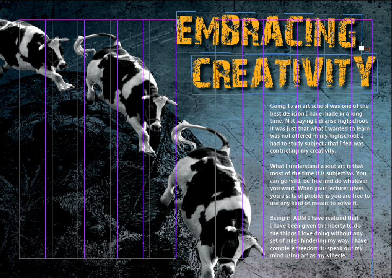
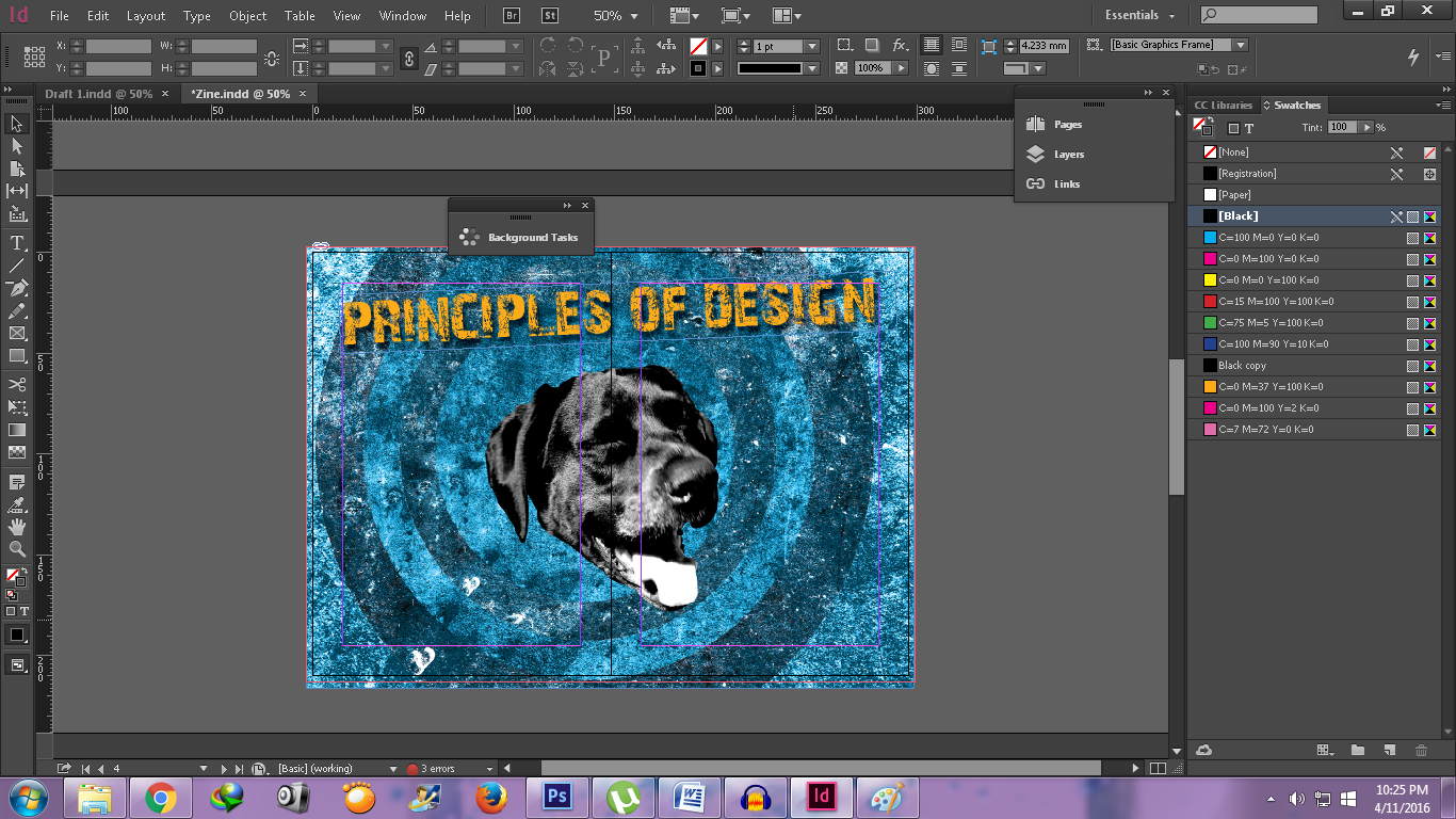
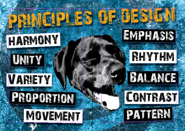
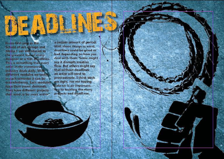
I always have a vocal point in each spread. The cat, the dog’s head, the whipping hand and the moon and cows became the main focus in each composition.
- Colors
I used monochromatic and complementary colors. The monochromatic is used to identify my Rhyme project, the central image (dog’s head, whipping hand, the moon and cows). Then used blue hues on my background so it would complement my orange title text.
- Texture Background
This was a recurring themes in each of my Rhyme project. Besides balancing and giving a rhythm to my spreads, I personally like them, so I decided to keep them
Using Adobe Indesign I added additional titles and texts:
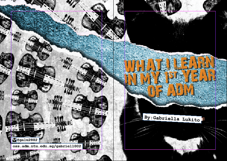
FRONT AND BACK COVER PAGE
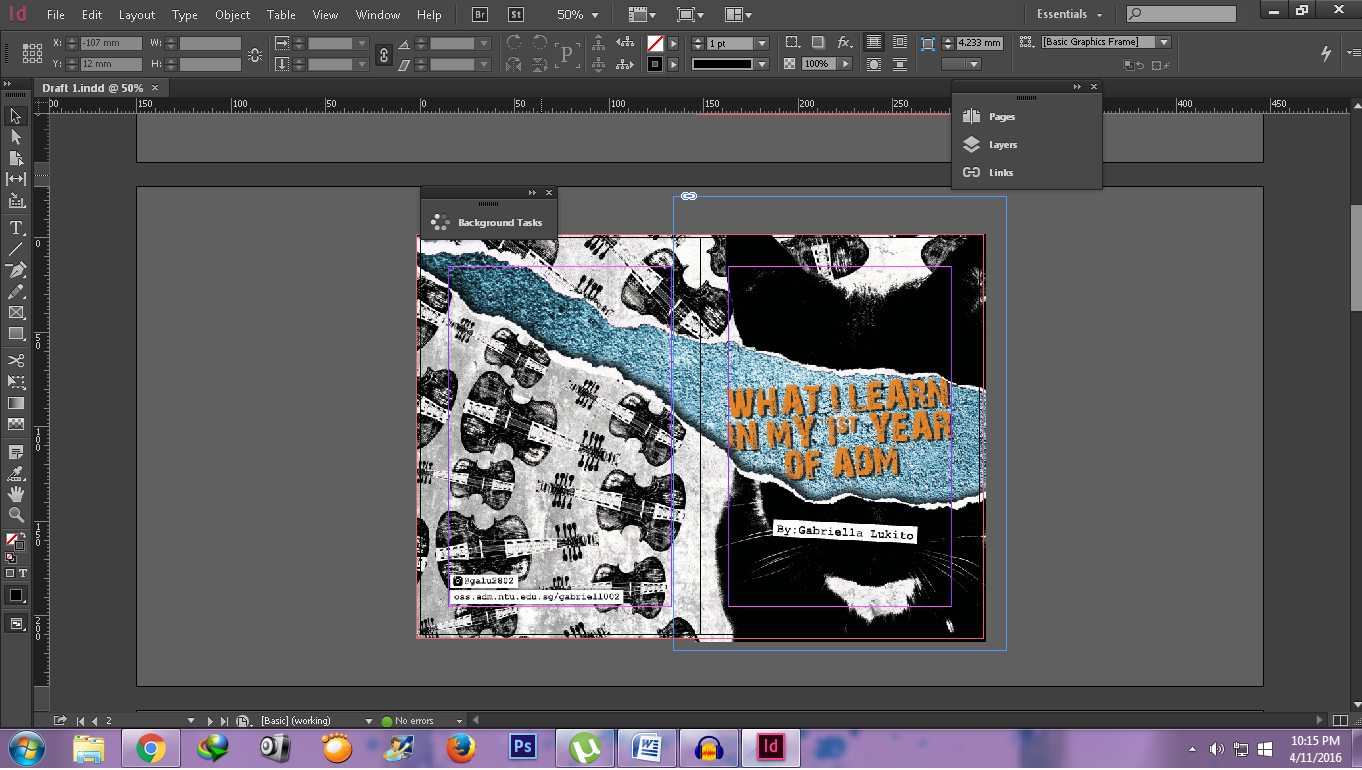
I added my name in the cover page, and added contact information at the back cover.
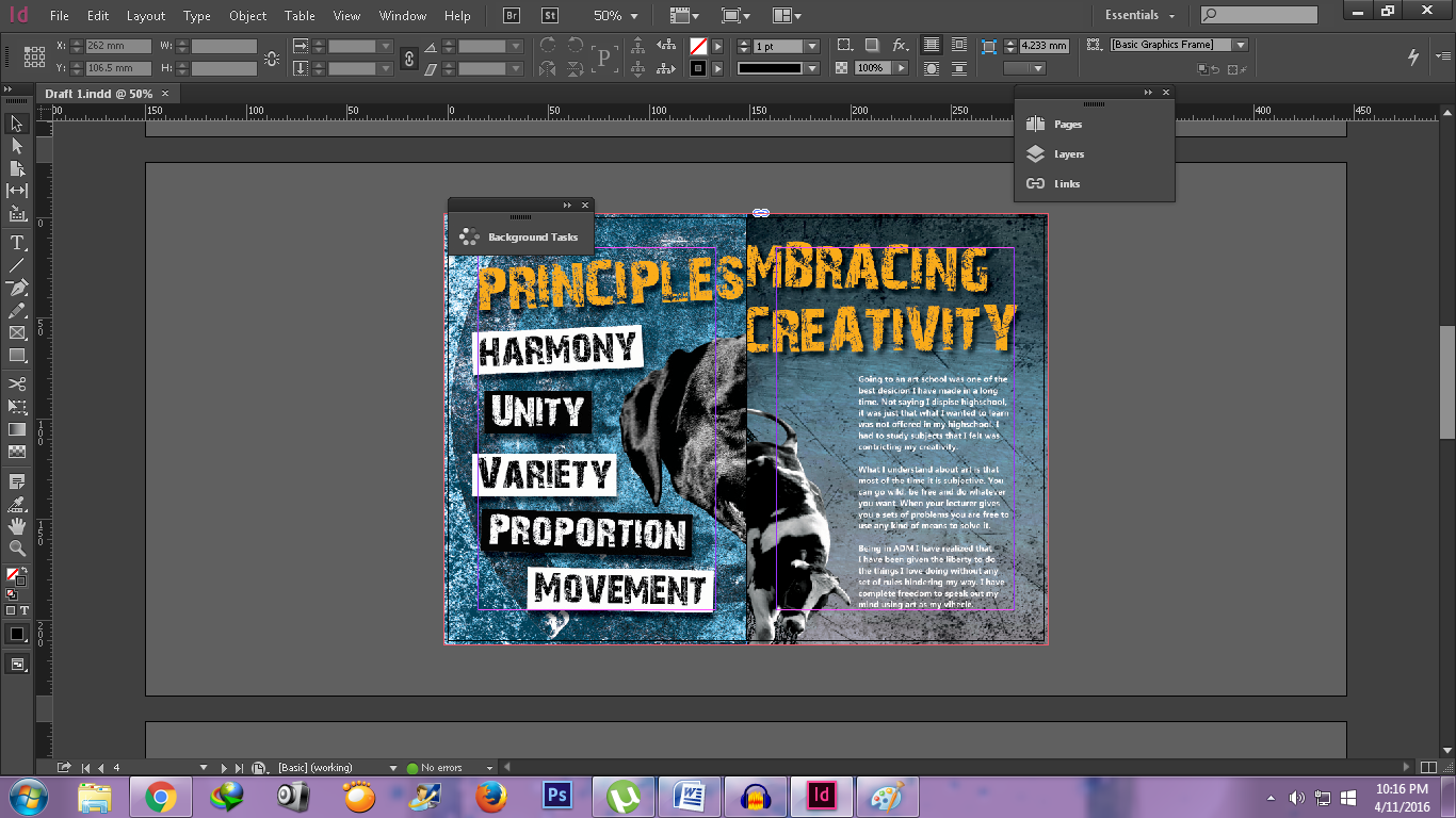
PRINCIPLES OF DESIGN
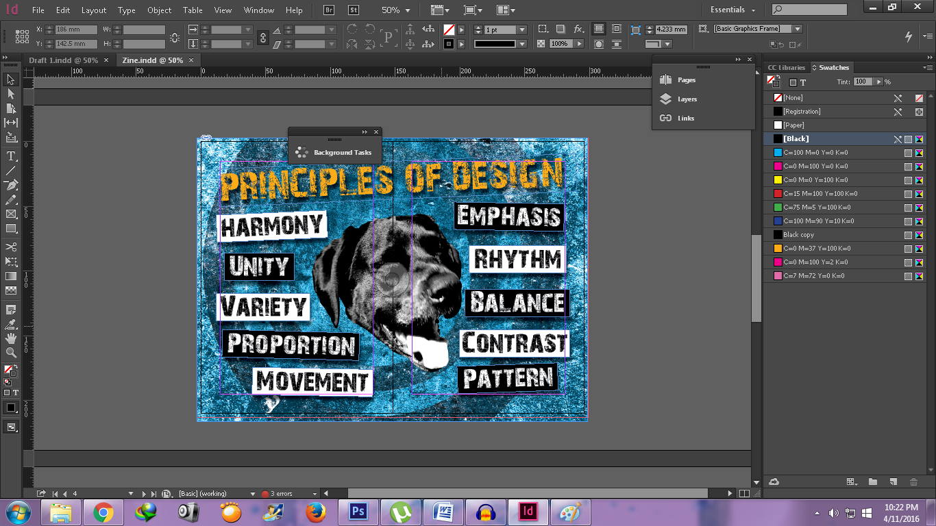
I decided to make boxes for each principle of designs.
DEADLINES
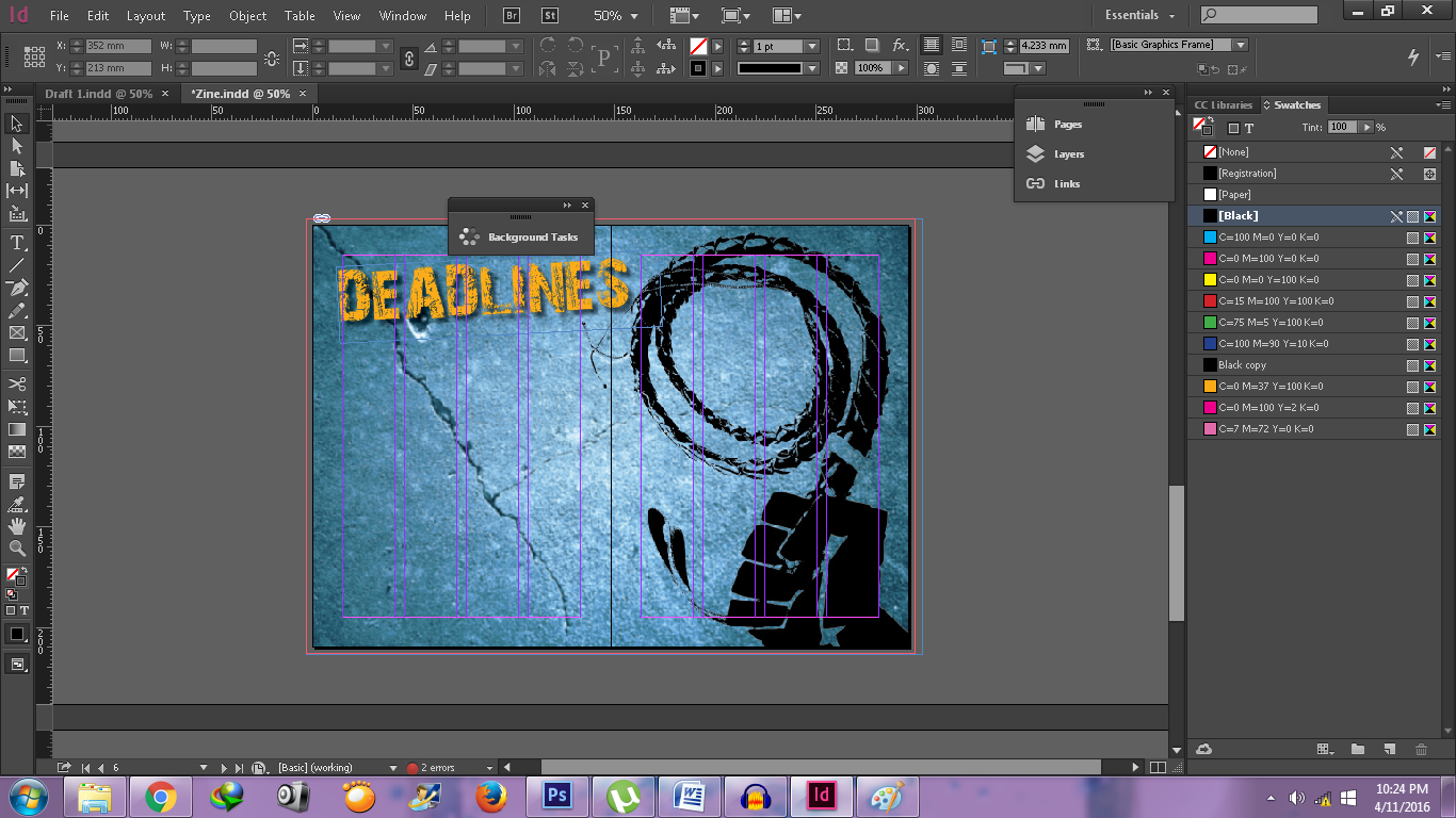
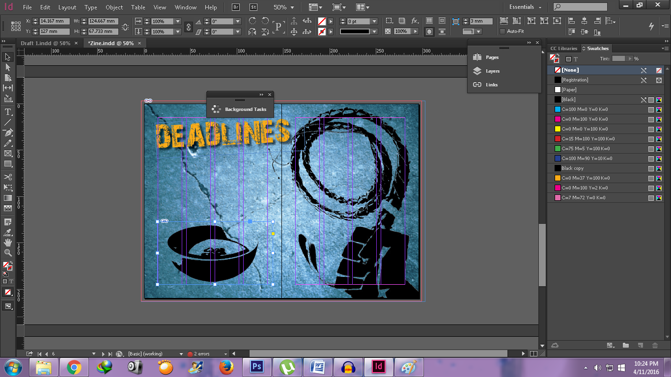
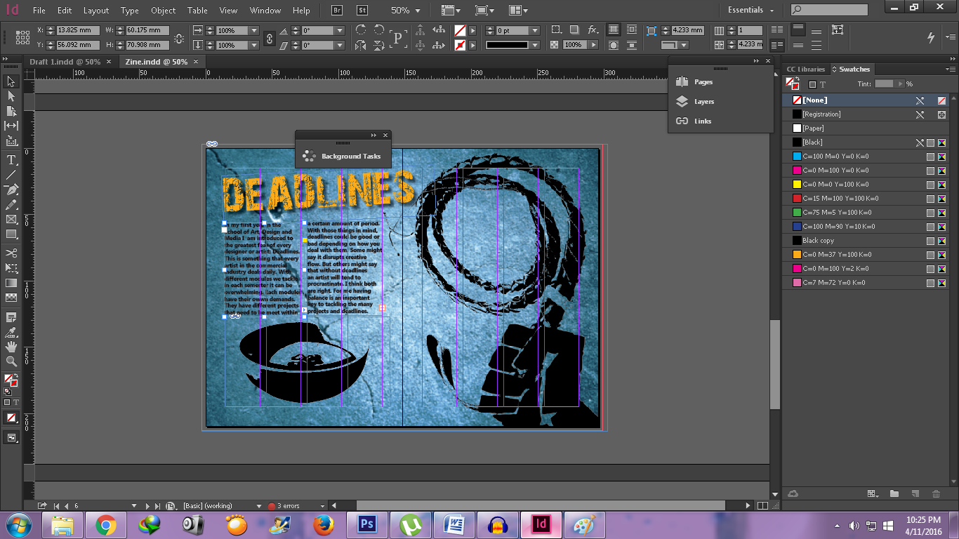
I added a bowl on my “Deadlines” spread because I did not have sufficient text to cover the whole left page.
EMBRACING CREATIVITY
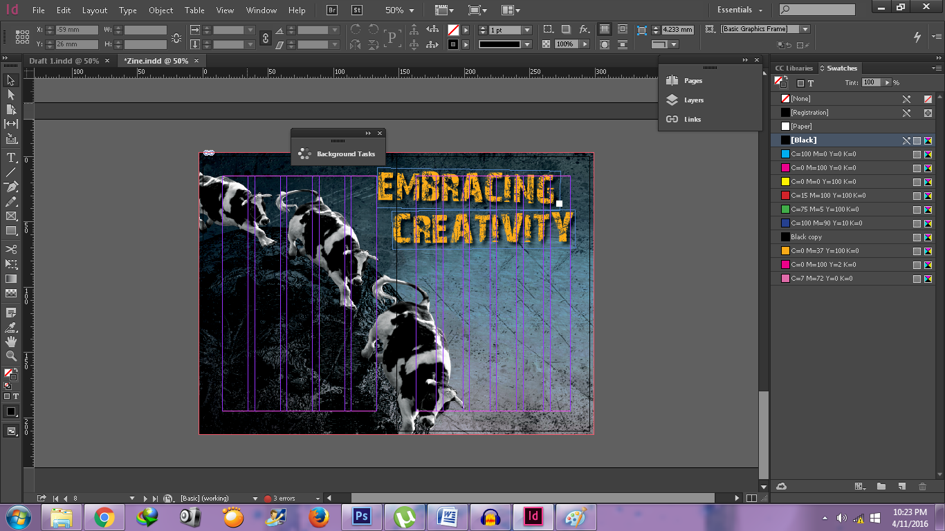
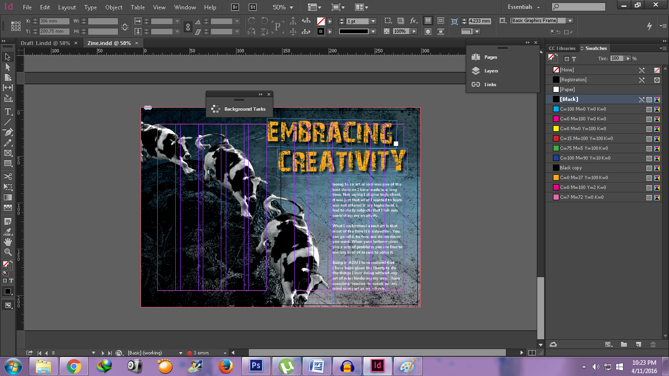
Because the background was quite dark, I decided to change my text color into white so it will be easier to read.
After finishing making my spreads. I rearranging my pages for printing. i rearrange so that I can use saddle back stitch.


Then I export it to a pdf file.
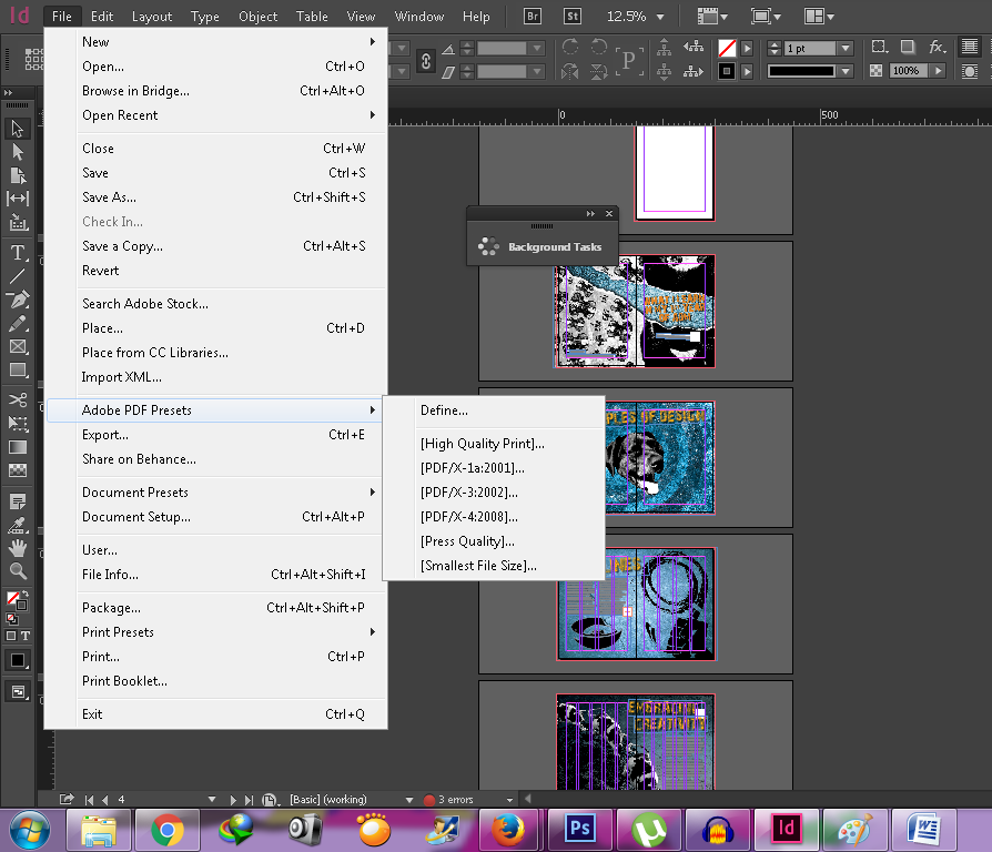
And then print!


I enjoyed my final 2D Foundation project. I will miss this class, because not only I met a lot of friends, but it was one of the few modules that I put a lot effort when doing the projects. See you next time in my next post!