I knew from the beginning I wanted to incorporate my pass 2D Foundation works into my zine, especially my digital works. Because I felt that my digital works represented me trying new things that I was afraid of trying. It was not a hidden secret that I prefer doing my works by hand rather than digitally, because I was uncomfortable with the latter. But eventually it developed into a fear of trying new things and failing at it. So being in the 2D Foundation class, it forced me to the things that I was uncomfortable doing. My digital works are my triumph against my fear.
So far I had two projects that I did digitally. One was the Rhyme project from semester one and the other was the typography project from semester two.
I chose the first one, because I felt it would give me more materials to work with. My mindset was set on using my Rhyme project as not only the background of my zine but also two showcased my progress so far in ADM.
FRONT COVER & BACK COVER
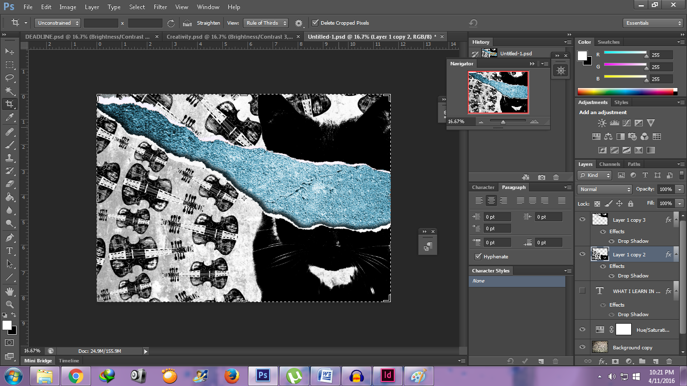
I used the line the cat and the fiddle from the nursery “Hey Diddle Diddle”. However in the sketch I cut the image in have as if I had ripped it. I added some ripped paper so it looked more realistic. I purposely removed the eyes because I felt it would be a bit weird to have it on. Perhaps it would look that I separated top part of its head from its body.
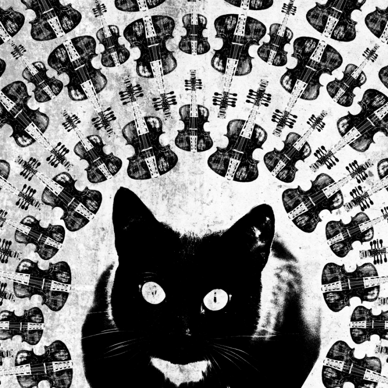
And when the paper ripped it revealed a concrete background. I added the blue hue because I was planning to use orange text so it would complement each other. This is the finished piece that I did in Photoshop before I added the text in InDesign.
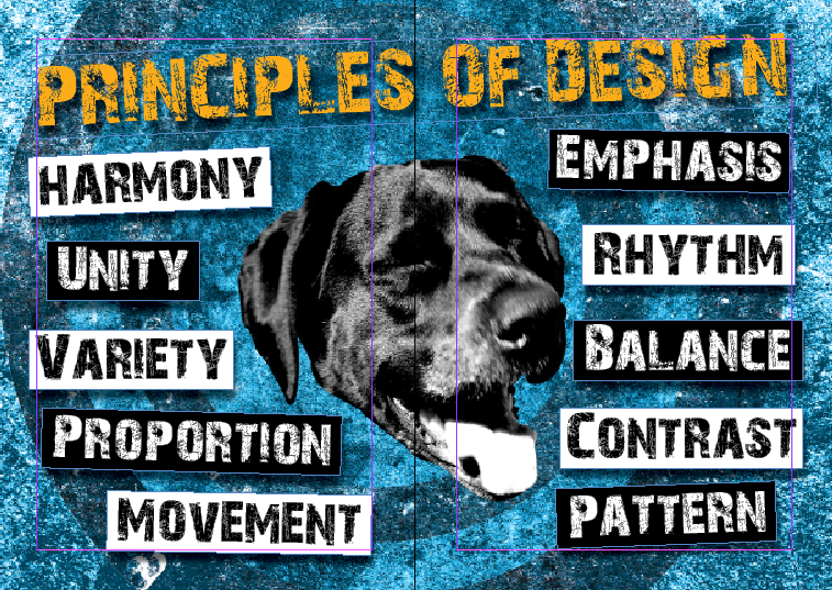
PRINCIPLES OF DESIGN
With this one I used the dog laughed at such a sport image. I wanted the dog to be the vocal point of the composition. The principles will be put around the dog’s head, 5 on each side so it will be balanced. Again I used a blue hue so it will complement the title text that I will add in later. As you can see like the cover pages I still keep the monochromatic colors too.
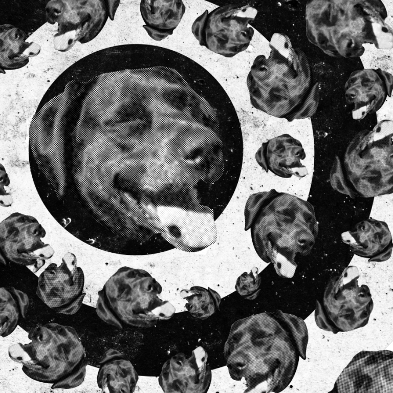
As you noticed I also played with a lot of texture, because I felt if I did not put in textures, the background would be blank and the composition would not be balance. I used texture from asphalt, concrete and black splatter.
DEADLINES
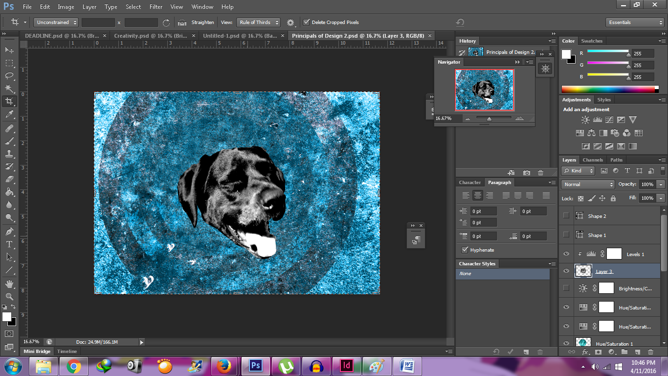
I used a cracked wall for the background and added again the blue hue to unify my zine. To represent my Deadlines” spread I used the hand whipping image from my Rhyme project for the line and she whipped them all soundly and sent them to bed which is from the nursery ”There was an Old Woman Who Lived in a Shoe”. I thin it at more to the ferocity of the subject (in the sense how much I dread deadlines, LOL). I put the whipping hand on the right, so that I can placed my writings on the left.


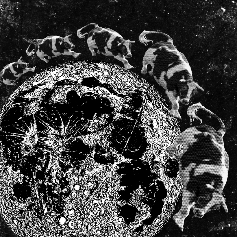
EMBRACING CREATIVITY
I revert using the nursery “Hey Diddle Diddle”, in which this time I used the line the cow jumped over the moon. Just like the “Deadlines” spread I put the image on one of the sides of the spread. However unlike “Deadlines”, I put the cows and moon on the left because I was planning to put my text on the right.