20151103_022345

This is the Final Part, Part III! I use black makers to draw each panel and use color pencils to color in the main vocal point of each panels. Crosshatching was a bitch! Excuse my french. But in all honesty it was very tiring. But it pay off well. It manage to achieve the effect I wanted. Keep in mind that some panels I use different words to describe my ‘Ego’ from my Part I. This is because I wanted the audience to guess what’s the meaning behind my odd use of words before I could explain it to them.

Monkey + Mouse = Mouskey (Extrovert + Introvert = Ambivert)

Monkey : To convey extrovert which means outgoing and sociable, I drew the monkey wearing a summer dress and lots of jewelry. and also drew some sunflower to emphasize it more. And chose the color yellow which conveys cheerfulness.

20151103_022414

Mouse : For introvert, I made the quiet little mouse wear winter clothes. That means that I have the tendency to keep a lot of things to myself. Again, to keep up with the motifs, I use flowers and the color blue to convey that sense of calm but perhaps a bit of loneliness too.

20151103_022420

Mouskey : I combine the mouse and the monkey and created this hideous monster (haha). Use green to convey a sense of harmony in such a contrasting subject but also it’s a combination of the color yellow and blue. I made it wore stripes and piercings, because I have a bit of rock n roll punk in me.

20151103_022430

Fresh – Rotten = Full (Perfectionist – Dark Side = Better Me)

Fresh : I use an apple to be the analogy. I am a perfectionist. I want nothing but the best. So I drew a monkey eating a fresh apple.

20151103_022440

Rotten : In contrast, I still have my dark side (worry, anxiety, etc). So I drew mice surrounding the rotten apple. The mice also signifies that my tendency to keep things to myself more often than not resulting in me developing dark thoughts.

20151103_022445

Full :  I want to be perfect without the unnecessary stress that comes with it. I drew my mouskey holding an x-ray of him being full after eating a lot of apples. That’s me being satisfied.

20151103_022451

Brain x Pocket Watch = Mouskey Lisa? (Ideas x Time = Self Exploration)

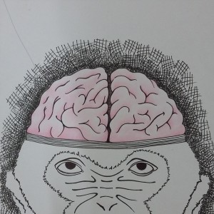
Brain : Brain represents ideas. All artists deals with this on a daily basis. We call it procrastination. How many times did we hit that wall? We get so frustrated when we don’t have any good ideas.

20151103_022512

Pocket Watch : Artists deal with this too. Sometimes I want to throw away the calendar. Deadlines are the worse because essentially we want more time to do our work.

20151103_022506

Mouskey Lisa : This represent art and self exploration, that’s why I drew a parody of Leonardo da Vinci’s Mona Lisa with Mouskey.

20151103_022455

World (Stage) – Depression = Confidence (My World – Depression = Me in 5 years (Travelling, Art Career, but most importantly enjoying life))

World (Stage) : The world is my stage. So I drew a magic show. I feel like being here, I have this sense of freedom that I didn’t feel when I was back in Indonesia. I was free to explore anything.

20151103_022519

Depression : But no matter where I go I still have chains that drag me. In fact it took a lot of courage to enter NTU. But for me to achieve happiness in 5 years I still have to overcome some hurdles. That is why I drew my Mouskey In a sad motion closing his face. Depress, lonely . .

20151103_022523

Confidence : So one day I will be able to find peace and happiness in my life. I drew my Mouskey being excited coming out of the top hat, breaking the chains and overcoming the depression.

20151103_022501


So that’s the end of my Final 2D Project. It was not fun, because I was also facing my own demons. This project served as a reminder that I need to overcome my depression to get to my end game. I hope in 4 years of ADM I am able to achieve this.

Thanks for reading. Bye!


In Part I I’ve deciphered my ‘Ego’, now I’ve left with the question: What medium I want to use to convey my ‘Ego’? Do I want to use hand drawn or digital? A collage perhaps? Abstract? Do I want a narrative or more symbolical? Also I needed to bear in mind what color scheme that I want to use. This questions was echoing in every decision I make in making this project to the point it drove me crazy. Even in deciding the medium there is a certain journey which i broke into three parts.


A. The Fate of Muccha

alfons-mucha3 (1)

I love how the colors complement the graceful line work

At first I was inspired by tarot cards since I was definitely aiming for a more symbolism. And then I wanted to combine it with Art Nouveau. The simple reason why I wanted was because I imagine it would be aesthetically pleasing or in blatant terms it basically ‘look pretty’. I soon realize this was not a good reason for using this medium. In fact it was constraining. Most of the equation that I made had quite a grim or dark atmosphere. On the other hand, Art Nouveau has a light and decorative feel. There would be a sense of mismatch to use this style to convey my story. Even though I’ve made so many drafts of each panel, I ended up not using it.


B. Digital Collage

Whilst experimenting on Art Nouveau style, I also started on experimenting on my Photoshop, perhaps trying to make a collage. However I didn’t use the collage idea. It ended up taking almost 8 hours to make it, apparently I’m still not comfortable with digital work. Considering I had other obligations, I needed to manage my time.


C. Finding Junji Ito

After factoring a lot of things, I decided on a conclusion that I wanted to do hand drawn. But there still the question of what do I use, narrative or symbolism.

Then I drew this things:

20151113_122319

Basically puff balls which represented me in many different aspects. I felt this was the low point of my project.

Then with the help of Shirley she suggested try representing my ‘Ego’ with something similar but not so abstract. She specifically said animals. Then I ponder about it for a couple of days. And admittedly I ponder more on the first equation than any of the others. What kind of animals would represent extrovert and introvert? Then it hit me: a Monkey and a Mouse. Then I combined those two to create a ‘Mouskey’ to represent the ambivert panel.

20151113_122538

From there, I was able to plan out what are the things that needed to be present in my panels. Then I was left with another question, what color best suited to represent my story. Monocromatic? Complementary? Triad? Split?

20151113_123403

My 4 equations done! Now I just need to execute it!

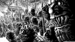
I was again dealt with another stumbling block. Being frustrated I started reading manga. It was then I came across an update of one of my favorite manga by Junji Ito. His style was dark, gruesome, perfect for my project! Then combining it with a more whimsical subject it would create a contrast. Using this comic style and combining it with monochromatic color in each panel to emphasize on the main vocal point.

1spirale1

I love how he use lines to demonstrate a certain feeling. This is a panel from the manga “Uzumaki”

882776bf03ff6a2b24d85f174f2d0248

Black and white gave such a powerful effect

In the end I went for a combination of both narrative and symbolism. The narrative part is the main characters the monkey, the mouse and the mouskey. The symbolistic part is the things that they do in each panels.


Done with Part II, on with Part III!

To be continued in Part III

This project was quite challenging compared to others. It’s because I felt like I was required to be more vulnerable to understand more of my self. It’s very scary, cause I know it’s a subject matter that I try to avoid. You could say I’m quite simple but at the same time quite complex. A long this journey, I made numerous changes in what defines me, what medium that I want to use to express my ‘Ego’ and how I present my ‘Ego’ to my fellow classmates.

(Note: Since my hand writing is very small, I’ll be elaborating with a lot in this post)


There are 4 equation that we were given to solve:

  1. …. + …. = ME
  2. …. –  …. = BETTER ME
  3. …. x …. = IDEAL ME
  4. …. +/- …. = ME IN 5 YEARS


First Equation : What plus what equals to Me? Basically the equation tackles the question of who am I. How do I and others view myself?

In my notes I wrote down the words artist, student, shy person, extrovert and introvert, weirdo, creative, observant and quiet. Then I manage to boil down to this three equation:

A. Creative + Observant = Artist

I think it’s obvious that I identify myself as an artist, I am attending an art school. I feel being an artist the basic things you need to have is creativity and observation. Someone who is willing to explore the boundaries what we define as acceptable is what I see as creativity. Combine with the skill of not only being good at seeing what in front of us but also being sensitive to the surroundings is what I define as being an artist.

B. Assignments + No Sleep = Student

This equation is quite self explanatory. We are almost at the end of the first semester and I have tasted the life of and ADM student. It’s very hectic! Compared to my other friends in other schools in NTU, such as engineering and business, they don’t have much projects. Sure they have homework, but they don’t necessarily have projects that take so much time on which each project in different modules takes a month to do. I have been sleep deprived for the past 2 months, especially during this final submissions.

C. Extrovert + Introvert = Ambivert

20151113_121715

this is one of my earliest skecth that represented extrovert

This is probably something that some of my new friends might realize. I’m an ambivert, which means a combination of both extrovert and introvert type. Ambivert itself is not a real word. The ‘amphi-‘ is taken from the word ‘amphibian’ which refers to animals that are able to live in both land and water, such as frogs. This means at times I might seem very sociable or our-going but at times I enjoy being alone or staying quiet to observe the situation. It depends on the group of people I’m with. If they are more talkative, I tend to be an introvert. However, if they are quiet I tend to take charge and speak out my ideas.20151113_121014

I sketch very lightly. I apologize if it is not clear. This is introvert

In the end I choose the last equation: Extrovert + Introvert = Ambivert. I feel out of the the three, the last represented me the most. Of course I’m an artist and a student, but my friends are all in the same boat as me. And in my opinion the paradox of being both extrovert and introvert makes it interesting. As I said I’m quite a complex creature (haha).


Second Equation : What minus what equals to a Better Me? What do I don’t want in my life? Things that I want to get rid of. Quite a lot actually.

I wrote a lot of words like anxiety, worry, afraid, temperamental, dark thoughts, pessimism, doubts, etc. Basically I want all my dark side and my problems to go away. Then I realize that all this thing are the same. I just want all my negative personality to disappear.

20151113_122113

My personality which during this project that the perfectionist in me was the one I wanted to highlight.

20151113_122213

My dark side. A sinister witch holding my mind.

In fact, I don’t like anything that is out of my control, because those things causes me to be anxious and worry. So there is that side of me that wants everything to go as plan. You can say I’m a control freak. Or a better word for it is a ‘perfectionist’. So the equation that I come up is:

Perfectionist – Dark Side = Better Me


Third Equation : What times what equals to an Ideal Me? What do I want more in life? Something that I’m lacking.

A. Mind x Time = Self Exploration

This is what every artist wants in life: MORE TIME FOR DOING ART. I feel like as beings that have limited time in this earth, ideally we want to spend it doing the things that we love: our PASSION. I was very lucky that I found it in an early age. Some of my friends still struggling with finding what their passion is. I remembered during my scholarship interview that as long as I’m doing art as a career, I’ll be very happy.

B. …. x Money = ….

Money . . . As a foreigner in a foreign country where everything has doubled or tripled in price, it would be logical that I’m struggling financially. But fortunately I manage to have allowance from my scholarship, however I still to spend it wisely, my wallet is quite tight. If you get what I mean. But as you can see, I didn’t finish the equation. Why? Because I was confuse on what I will do with the money. Sure it will make my life easier, but . . . then what? You could say from this project that I don’t really like having lots of money. I like the challenge. Living on a tight budget, being more creative with my spending habits. I learn a lot being in my situation. So in the end I didn’t use this equation.

C. People x Patient = Caring

Well, being a perfectionist comes with a prize: I’m not the most patient person in this world. If things goes wrong, I tend to blame it on others, though not blatantly. It stings for a while, but I don’t hold grudges. Did that when I was younger, ended up having massive headaches. Though I still get annoyed at people when their doing things wrong.

D. Mind x Spiritual Time = Spiritual Growth

20151113_121917

I wanted a skull to represent the mind

Ever since coming to Singapore, I have converted to a Christian. It’s odd considering the fact that I went to Christian schools from kinder garden to high school, but finally decided to convert when I was away from all of that. You can say for the past 15 years I was in denial. I wanted to convert but I had no confidence because I came from a non-Christian family, so I knew I would face some consequences if I converted. But since I’m in Singapore, at least for the time being, I’m avoiding to deal with such issues.

20151113_121914

a chalice, a bible, and a rosary to represent the spiritual journey

So a new ‘Christian baby’ I had to learn all the ‘ropes’. Going to church, reading the Bible and have devotional time each day for God. I sound like I’m complaining, but believe me, I want to do all this things. But at the same time, it was quite a shock adjusting to this kind life. Not only the things I’ve written before, but it made me question all of my actions. The journey that I’m going through and what I want to be in the end of that journey is the reason why I wanted to use this as my final equation.

20151113_122638

A dove on top the skull to represent the Holy Spirit guiding me.

However, I realize something. I felt like this project is not a suitable platform for me to showcase this particular journey. I felt a sense of privacy to it. I felt it would be wrong if I ‘boast’ something like this in front all of my classmates. Yes, it’s not a rational train of thought. I know this project is suppose to make one feel vulnerable. But for the time being, I’m not comfortable to share this issue. I want my intimacy with God to be something I want to keep to myself. And you (as the reader) might thought, this contradict what I’m doing right know. I’m writing it! (haha). But I know not all of my classmates would bother to read each one of our OSS posts. So for you who has taken the time to read this long post, I thank you. You have taken the time to not only read, but keep an open mind.

So with that, in the end I choose the first equation which was:

Ideas x Time = Self Exploration


Fourth Equation : What plus or minus what equals to Me in 5 Years? Something that I want to achieve during this 5 years.

Well I’m 18, so in 5 years I’ll be 23. I’ll spend the 4 years in ADM. But by 23 I think I’m to young to get marry and have children. But I guess I would like to have a boyfriend by that time though. A career in art perhaps? Or even travelling?

I couldn’t choose between career or travelling. But then I thought, “Do I really want to travel? Aren’t I’m doing now? Technically I’m in a foreign country, everyday feels like a new adventure”. And then it continued, “What about career? I thought I’m okay with anything as long as involves the art industry.” Again I felt like those two will eventually happen. But what do I want to achieve in 5 years time?

Then I started rethink. Going through my 3 previous equations. Then I came into a realization. That both travelling and career are my end game. In a sense something that I want to do after 5 years. It’s different from “Me In 5 Years”. Where’s the process? The Journey? What problems that I need to overcome?

20151113_121559

A dark looming figure. Perhaps the devil in me to represent my depression

The obvious answer would be my depression. My unwillingness to take a chance, to move forward, I need to abandon this chains. To achieve a happier life, a life where I can live the fullest, I need to overcome this. So for my final equation :

My World – Depression = Me in 5 years (Travelling, Art Career, but most importantly enjoying life)


So I’ve deciphered my ‘Ego’, now what?

To be continued in Part II

WHAT’S COLOR HARMONIES?


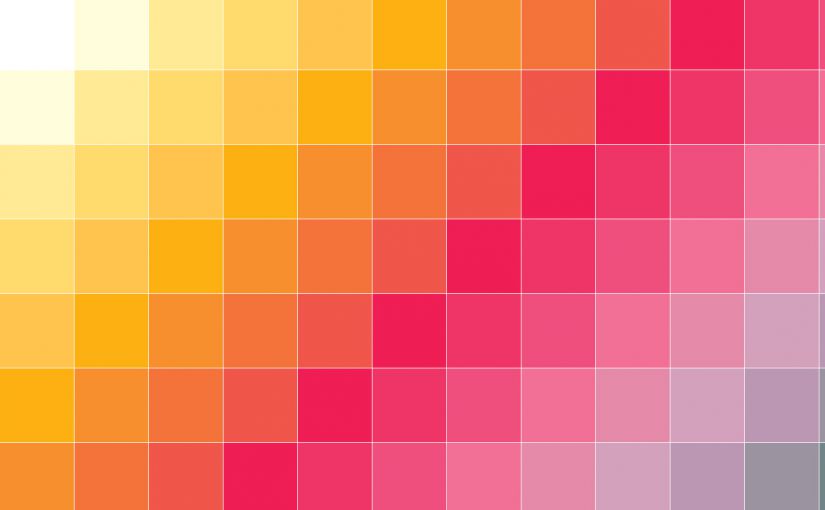
Color harmonies or color palettes basically means the balance between colors. Visual balance can be achieved by combining different colors in a scheme. It can also be achieved using different ratio of colors.

Harmonious color scheme relies on visually pleasing relationships of the three dimensions of color: hue, intensity and value. 4 types of hue harmonies:

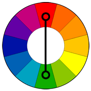
  1. Complementary: using opposite hues.
  2. Triadic: 3 colors which are equally spaced used in combination.
  3. Analogous: the usage of 2 or more similar hues.
  4. Monochromatic: value or intensity of a single color

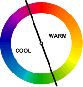
Colors are usually divided to cool and warm colors. Red, yellow and orange are considered warm colors while blue, green and violet are considered cool colors.

warm-cool


TYPES OF COLOR HARMONIES


A. NEUTRAL or ACHROMATIC COLORS

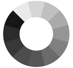
Achromatic means without hue or colorless. That means using white, gray and black.

all harmonies a

 Examples of Achromatic Harmonies:

Black-And-White-Graffiti-Wallpapers-29


B. MONOCHROMATIC HARMONIES

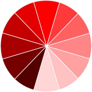
Monochromatic means variance of a hue.

red

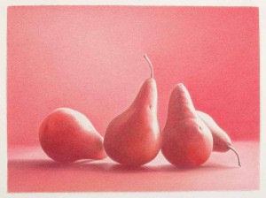
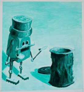
Examples of Monochromatic Harmonies:

artwork_images_1136_549094_martha-alf    IMG_2260

C. ANALOGOUS HARMONIES

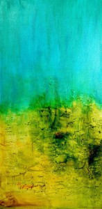
Analogous means the combination of several hues located adjacent to each other on the color circle.

Analogous

Examples of Analogous Harmonies:

1

D. COMPLEMENTARY COLORS

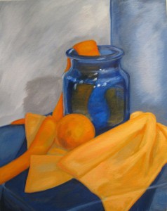
Complementary means the 2 color that opposite each other in the color circle. They are so named because when they are placed next to each other they appear brighter and with great intensity.

Complementary

Examples of Complementary Colors:

complimentary_colors_painting_by_mydarkestfears-d3edfub

E. SPLIT HARMONIES

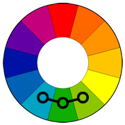
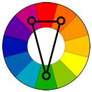
Split harmonies consists of three hues  and two secondary hues located adjacent to the direct compliment of the principle hue.

SplitComplementary

Examples of Split Harmonies:

tumblr_muj4427pTt1rnolxfo1_1280

F. TRIAD HARMONY

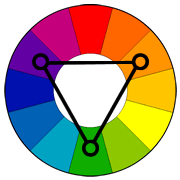
Triad Harmony is using three hues spaced equidistant around the color circle.

Triad

Examples of Triad Harmony:

tetrad

G. TETRAD HARMONY

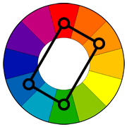
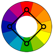
Tetrad Harmony is using four hues that are two sets of complementary.

Tetrad Square

Examples of Tetrad Harmony:

tetrad color harmony black backround-01-01

When asked “What does this color represent?”. You might have the answer right away. But take a moment to think. How did it come to be. How we see color and what each of them represent, perhaps is influenced by society, pop culture and media. Now lets us take a look at some of them see what the meanings that they signify.


Red

Color_icon_red.svg

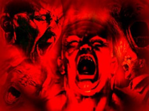
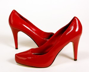
Red is usually associated with powerful emotions such as anger, confidence and courage. More often than not it is used in advertising because it entices the viewer. Coca-cola and KFC are just some of the examples. A lot of sports drink and sports related items use red in their branding because the color red can signify power. Sensuality is also can be represented by red. We often see in movies or in television, even in advertisement women wearing red dress, red high heels and red lips. Those combinations evokes passion and love.

Danger_Level_-_Red anger.red1 IMG_1042

Other shades of red can represent:

Light red love, sexuality and passion.
Pink romance, love, and feminine qualities.
Dark red rage, anger, willpower, leadership, and courage.
Brown stability and masculine qualities.
Reddish-brown harvest and fall.


Orange

2000px-Color_icon_orange_v2.svg

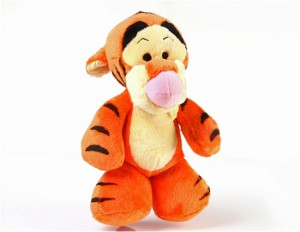
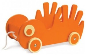
            Orange is a secondary color. It is a combination of red and yellow. It has high visibility and commonly used in advertising food products and toys. Orange itself often represent creativity, enthusiasm, fascination and success.

2013-07-18-0903573361 toy-organizers

Other shades of orange can represent:

Dark orange frustration
Red-orange aggravation
Gold prestige, illumination, wisdom, wealth and high quality.


Yellow

Color_icon_yellow.svg

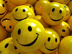
            When you think of yellow you would think of the sun. Hence yellow is the color of sunshine. It can also be associated with joy, happiness, intellect, and energy. We see a lot of nursery painted yellow because it evokes cheerfulness. As a matter of fact a lot of toys are colored yellow. However, as a result yellow has been associated with the term “childish”. It would be wise to avoid using them in high brand advertisement.

3d-smiley-faces F1006YE-5Other shades of yellow can represent:

Dull (dingy) yellow caution, jealousy and sickness.
Light yellow intellect, freshness, and joy.


Green

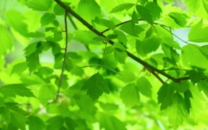
Color_icon_green.svgNature is the thing that people would associate with the color green. Green also symbolizes growth, harmony, safety, freshness, and fertility. Green also can be associated with money especially with dark green. Many examples of the usage of green are for eco-friendly items, and green traffic lights to ensure safety.

851ee1349445b028592c0461e6d3ed8b_largegreen-leaves-and-branches

Other shades of green can represent:

Dark green money, greed, and jealousy.
Yellow-green sickness or cowardice
Aqua healing and protection.


Blue

Color_icon_blue.svg

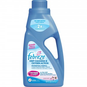
Blue is the color of the sky and sea. It is often associated with depth and stability. It symbolizes trust, loyalty, wisdom, confidence, intelligence, faith, truth, and heaven. Blue has that calming effect on others. But some shade blue can give a sad and gloomy effect. Some examples of the usage of blue that you often see are advertisement of cleaning products and airlines.

spin_prod_683850601 United-Airlines

Other shades of blue can represent:

Light blue health, healing, tranquility, understanding, and softness.
Dark blue knowledge, power, integrity, and seriousness.


Purple

Color_icon_purple.svg

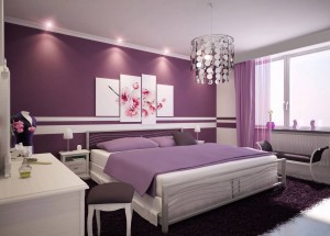
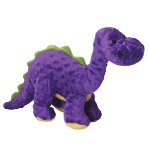
            Purple is the color of royalty. But it can also represent mystery, magic, creativity and wisdom. Purple is a good color to be use in feminine design. And like yellow and orange, we often see toys colored purple.

Best Interior Design Ideas

purple.dinasaur.dog.toy.2

Other shades of purple can represent:

Light purple romantic and nostalgic feelings.
Dark purple evokes gloom, sad feelings, and frustration.


White

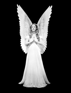
2000px-Blank_square.svgWhite is associated with light, goodness, innocence, purity, and cleanliness. We associate many cleaning products with white. We also associate them with holy spiritual things, such as angels. The medical world often being represented by the color white, as we see a lot of the doctors and nurses uniforms, buildings, rooms and even some of the tools they use are white.

who-makes-a-better-doctor-a-man-or-a-woman_300

angel06_jeanette_macdonald_1930-theredlist


Black

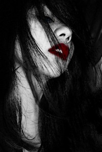
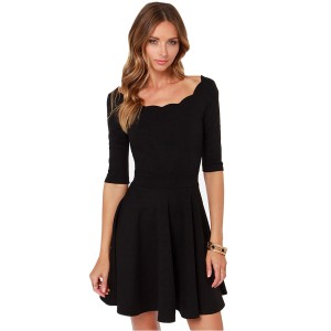
black-windows_542931Black is the opposite of white. As a result is commonly associated with dark, sinister, grief and mysterious emotions. A lot of horror movies, book, comics are depicted in black, and using the color white to give contrast. However it is not only used to depict grim materials but in a lot of fashion black is considered slimming. As such black also depicts elegance, fashionable and luxury.

 dark_angel_by_haruhiakiyama-d576uxb2015-Autumn-winter-sweet-skater-dress-classic-Hepburn-little-black-dresses-brief-style-haoduoyi


In conclusion, colors represent many emotions and can be use as signifiers. We also learn that the media play a huge role in developing how we perceive colors. So express yourselves with color!

HOW I SEE RHYMES
We were given quite an interesting task. Essentially to make images that represent the each rhymes of a nursery, in which we take a look at three nursery: “Hey Diddle Diddle”, “Humpty Dumpty” and “There was an Old Woman Who Lived in The Shoe”.

Guided by the principles of designs that I previously research, which are balance, emphasis, movement, pattern, repetition, proportion, rhythm, unity and variety, I experimented with different lines of the nursery rhyme to make interesting composition.

However, before we could star creating our composition we were told to find different elements that are related to the nursery to create the images. Then to give the effect of either halftones, posterize or threshold using Photoshop or Illustrator. It was very handful to learn more about both of this application, because I believe they will be handy in the near future.

Since each group consist of 7 people are in charge of a nursery, in total we have around 210 images to play around with. And played with them I did.


Hey Diddle Diddle

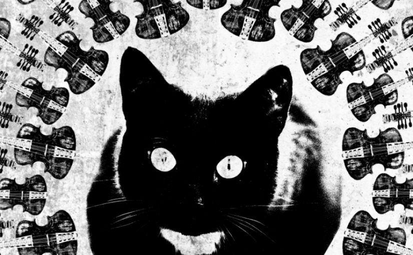
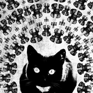
Hey diddle diddle, The Cat and the Fiddle,
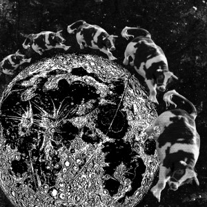
The Cow jump’d over the Moon,
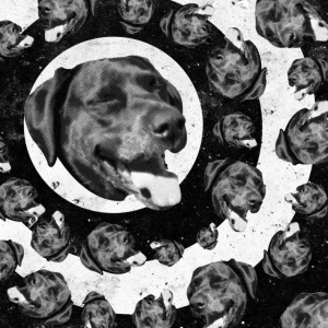
The little dog laugh’d to see such sport,
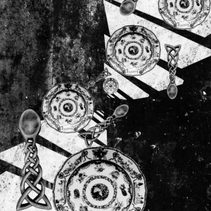
And the Dish ran away with the Spoon.

This was the group I was assign with. As a child I was quite familiar with this rhyme. And I find this nursery very peculiar. What’s the meaning behind it? Compared to the other two, “Hey Diddle Diddle” doesn’t have any explicit meaning. Some say it’s about corruption, others just labelled it another silly rhyme. Even today people guess about the intended message that is hidden behind it. Quite odd indeed.

I used a lot of the radial symmetry in the compositions. A lot of halftones. And loads repetition. I feel dizzy just making them!

Hey diddle diddle, The Cat and the Fiddle

Hey Diddle Diddle! The Cat and The Fiddle

The Cow jump’d over the Moon

The Cow Jump Over The Moon

The little dog laugh’d to see such sport

The Dog Laugh To See Such Sport 2

And the Dish ran away with the Spoon

ggg


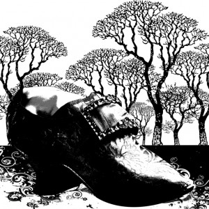
There was an old woman who lived in a shoe

There was an old woman who lived in a shoe.
She had so many children, she didn’t know what to do;
She gave them some broth without any bread;
Then whipped them all soundly and put them to bed.

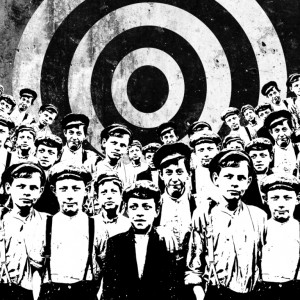
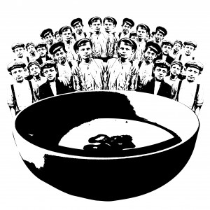
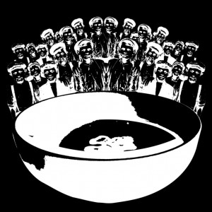
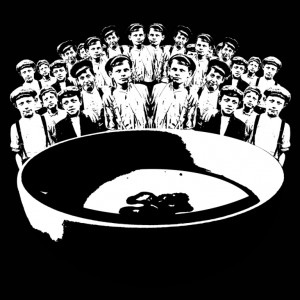
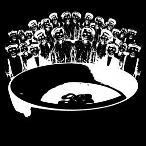
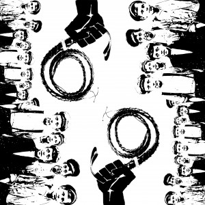
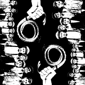
I find this nursery quite depressing. Such a cruel mother? But then again, she had so ‘many’ kids. With this nursery I used a lot of threshold effect to achieve that sense of a dark atmosphere. Compared to “Hey Diddle Diddle” I use less repetition and decided to put less inside each composition. A couple of the lines I experimented with the invert effect. It gave the same composition of different ‘feel’.

There was an old woman who lived in a shoe

There Was An Old Woman Who Lived In A Shoe

She had so many children, she didn’t know what to do

She Have So Many Children She Didn't Know What To Do

She gave them some broth without any bread

She Gave Them Some Broth Without Any Bread She Gave Them Some Broth Without Any Bread 2 She Gave Them Some Broth Without Any Bread 4 She Gave Them Some Broth Without Any Bread 3

Then whipped them all soundly and put them to bed

Then Wipped Them All Soundly And Put Them To Bed 2Then Wipped Them All Soundly And Put Them To Bed


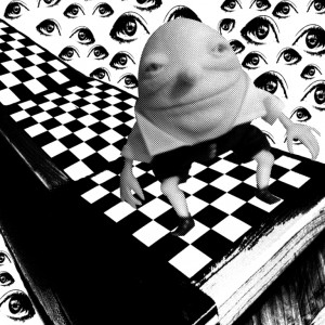
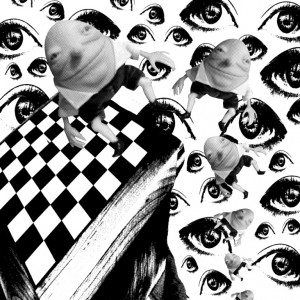
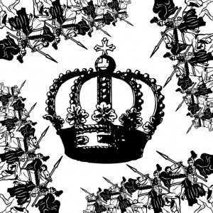
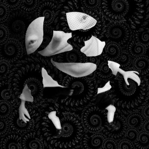
Humpty Dumpty

Humpty Dumpty sat on a wall,
Humpty Dumpty had a great fall.
All the king’s horses and all the king’s men
Couldn’t put Humpty together again

Oh my. This rhyme was a struggle. Indeed it was. Nothing much to say other than this was my least favorite composition. In fact my composition succeeded in living up to rhyme, as in it was quite a ‘disaster’.

Humpty Dumpty sat on a wall

 Humpty Dumpty Sat On A Wall  

Humpty Dumpty had a great fall

Humpty Dumpty Had a Great Fall

All the king’s horses and all the king’s men

All The King's Horses and All The King's Men

Couldn’t put Humpty together again

Couldn't Put Humpty Together Again

Quite honestly I don’t know why I struggled that much with this rhyme.I didn’t have a clear dirrention. I suppose I was much more interested in the other two.

Nonetheless I don’t really find them appalling. I just wanted to use different elements to use in my compositions. They may not look as harmonious as the others, but I’m still proud of them.


Overall this process not only made me learn new things about design, but also on what ‘works’ and sometimes what ‘doesn’t work’ in a composition. How we view something and our mind translates them.

It was exhausting, but really FUN to do!


THE PRINCIPLE OF DESIGN


            If we are talking about the visual arts in one way or another we associate it with design. As visual artists, we more often than not put ourselves inside the viewer’s shoes. We want to invoke something every time others see our work, and be able to understand the message that we want convey. As a result, we think about the composition, what to add and omit, is it coherent and cohesive. So below are the Principles of Design to guide us in creating our artwork.

Balance

Balance means a good distribution of elements, whether it is color, texture or shapes to create a sense of equalization. There are 3 types of balance. The first one is symmetrical balance, which is using similar objects in each side of the image. The second one is asymmetrical balance, and unlike the symmetrical balance the objects that are use may not be similar but are able to achieve equilibrium. The final one is radial balance in which the objects are placed in a radial form.

Mb4416fb8baeb6556280ac639a7f866c1 asymmetrical-balance MS-4222

Emphasis

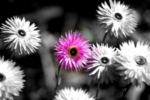
Emphasis is the part of the image that is the central of attention. It’s the thing that immediately draws your eyes. Even in a sea of chaos there must be a vocal point that stands out. It can be achieve by using colors, textures, different shapes, contrast, etc.

103860482 e24e09c0bc817a24ebf3147f46c813b8

Movement

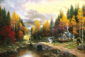
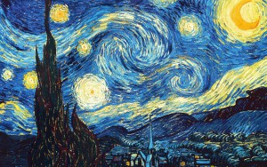
If Emphasis is used to emphasize a particular part of an image, the movement is used to guide the viewer in seeing the artwork. How it creates a path for viewers to follow, often to other vocal points of the artwork. You can use lines, shapes, and colors into the artwork.

the_valley_of_peace the-starry-night-1889(1)

Pattern

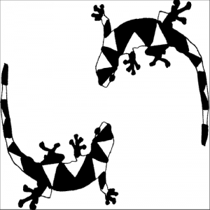
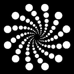
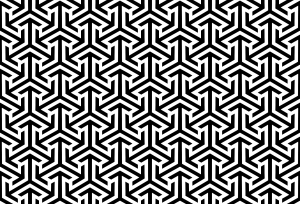
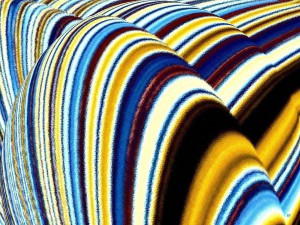
Pattern is a repetition of images or shapes in a design. It can be symbols or objects that are placed all over the artwork.

EGYPT-C-PATTERN swirl_pattern

Proportion

The word proportion certainly relates to size. So it’s a relationship between elements and whether or not it compliments each other. For example how the size of a human head relate with the size of other parts of the human body.

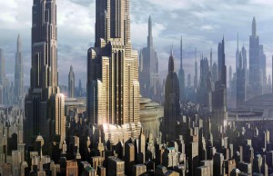
Proportion in art skyscrapers

Rhythm

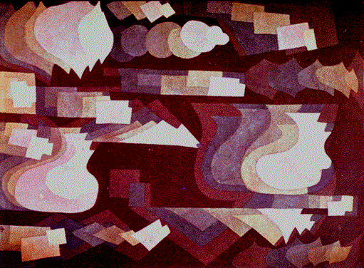
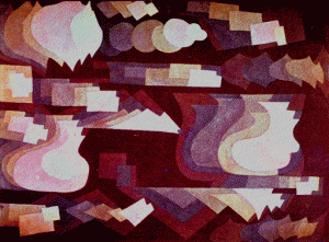
Rhythm can be created by using elements repeatedly to create a flow and a sense of organization. But that doesn’t mean it can’t be chaotic. Rhythm is often used to express a mood like in music or dancing. To keep it from being boring, variety is needed.

rhythm-1-will-borden klee

Variety

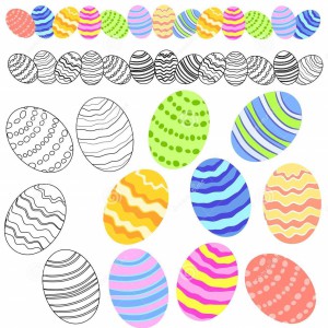
Variety means difference elements of design that are being used to hold the viewer’s attention. A variety of elements can make the design to be interesting.

variety-easter-eggs-clip-art-4008726andy-warhol-marilyn-monroe

Unity

Unity means how harmonious are the elements in an artwork. How well they work together. Not one part can be viewed more important than the whole design. In fact is the main goal of every designer and visual artist to achieve this sense of unity.

delaun 

THE EXPERIMENTATION AND EXPLORATIONS

20150901_172258

20150901_172421

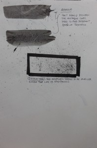
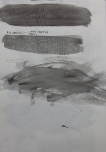
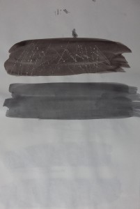
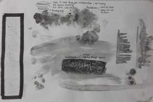
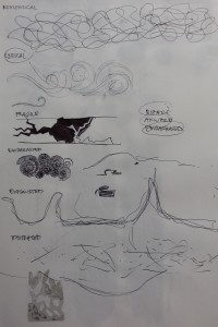
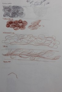
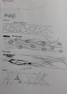
I felt my sketchbook limited my experimentation. As a result I ended up using a lot of different type of medias: different types of pens, papers, copics, paint, etc.

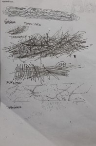
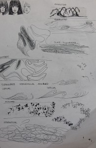
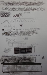
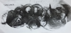
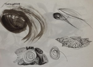
Some emotions was very clear from the beginning. I immediately know what I want on paper. Others was different case. Some needed 2 to 4 different variations, others such as “turbulent” took me 8.

PROGRESS 1

PROGRESS 2

PROGRESS 3

PROGRESS 6

PROGRESS 7

PROGRESS 8

PROGRESS 9

PROGRESS 10

PROGRESS 11

PROGRESS 12

PROGRESS 13

PROGRESS 14

PROGRESS 15

PROGRESS 16

PROGRESS 17

PROGRESS 18

PROGRESS 21

PROGRESS 22

A LINE IS A DOT THAT WENT FOR A WALK

The title says it all. This was a very tedious and time consuming project. However, it was quite interesting and a little fun actually. In a way trying to define 18 emotions made me learn about myself more. How I feel and visualize them and also how to approach them.

As you can see below, I started the process by finding out what each emotions means. At first I tried using the dictionary, but I find some, in fact most of them was easier if I use my own definition.

PROGRESS 4

PROGRESS 5

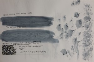
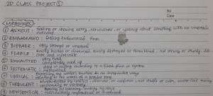
This is a few pictures from my research notes

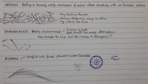
Anxious : Being groggy, worry, very cautious of ones surroundings

Embarrassed :Doing something embarrassing, wanting to run away, to hide from embarrassment

Indecisive: Not being able to decide, going back and forth

Spontaneous : explosive, not thinking to much, expressive

Aggressive : wild, untamed like and animal, anger, temperamental, dangerous

Lyrical : poetry, songs, story that flows together well

Systematic : organize, in order, pattern, a bit of OCD

Fragile : easily breaks, very vunerable

Sensual : sex, pleasure, sexual tension

Sloven : lazy, untidy, all over the place, messy

Exhausted : tired, like your energy is being taken away, plants wilting

Nonsensical : something that does not make sense in your head

Distracted : can not focus, your mind is disperse somewhere else

Psychotic : unstable, mad, can not be sympathetic or empathetic 

Ambiguous : unclear, identity, very foggy

Awkward: the awkward silence, that felling of something doesn’t fit well together

Bizarre: weird, creepy, odd, unusual

Turbulent: disturbance, air and water going in a circular motion, chaotic