Issue for each spread (Choice of content to show)
Before I started on my process from taking the photos, to editing them and then to compiling them within my zine, I had to decide on the actual content which will be on each spread first. And for my zine which is supposed to a photography zine, I decided to use two a5 pages for each spread so the details of each picture could be seen. Hence, with an 8 page zine including the front and back page, I will require three main content to fill the 6 pages of 3 different spreads.
Issue 1: As I have my first one set from my ideation stage, which was the issue with Singaporeans using tissue papers to chope a seat, I had to only think of two more.
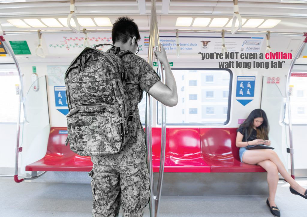
Issue 2: The second issue surfaced pretty quickly as well. Being a guy and having gone through NS, I know very clearly what is one issue that NSFs (national service- full time) will face when they are taking public transport. Especially for guys like me who has a stay-out vocation and are required to travel home in uniform everyday. Because of the social stigma and the countless stomp photos that surfaced throughout the years, most of our NSFs dare not sit on MRT seats although they are equally, or even more entitled to them. Hence, my second issue was to address how in the point of view of NSFs, every MRT seats are “reserved seats” for civilians.
Issue 3: As much as I thought 3 issues will be really easy to fix on, I was really stuck for my third one. It was until the group consultation when I asked my group that Jordan mentioned how students always hog places to study for the examinations. This is actually a very apparent issue. Some of us are guilty of this and we will always see students in Starbucks or quieter cafes with only one cup of drink and taking up the space to study. Hence, my third and last issue will be on students taking up space meant for other purposes to study.
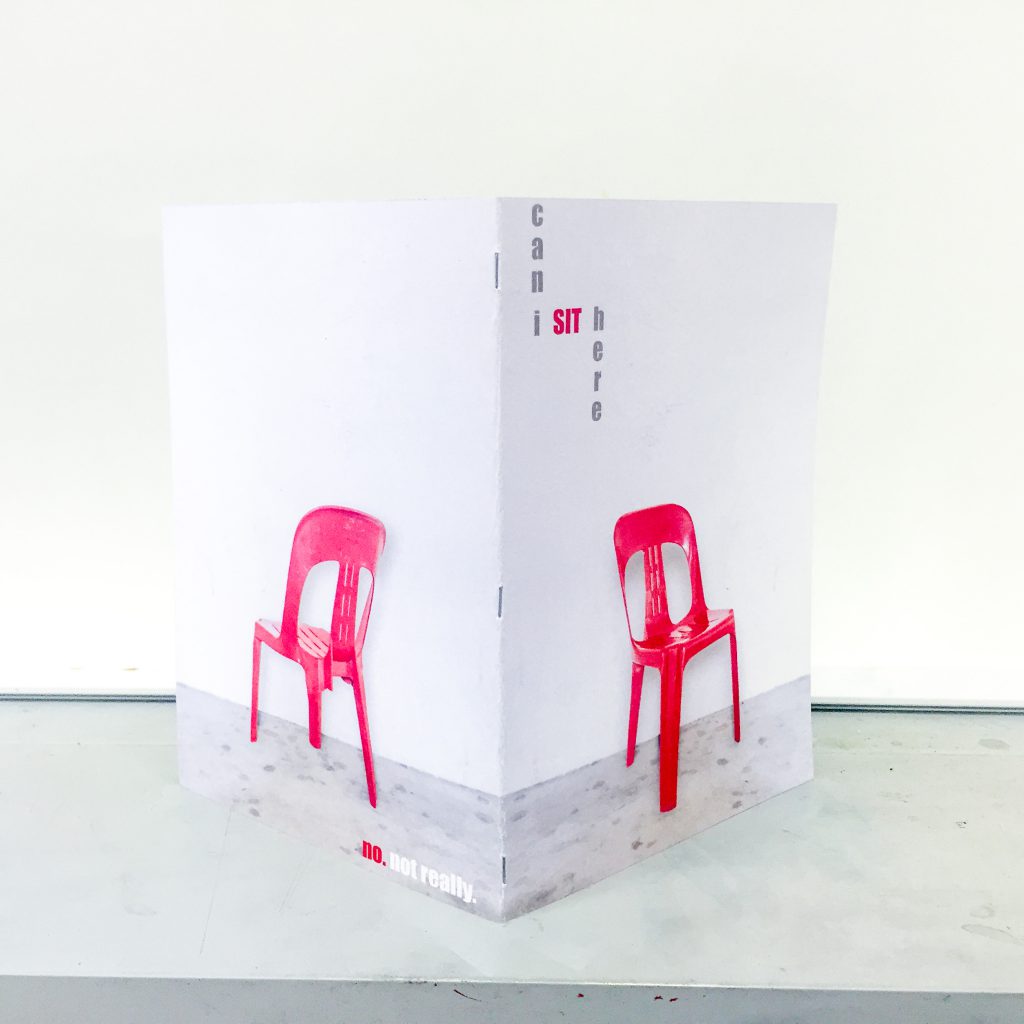
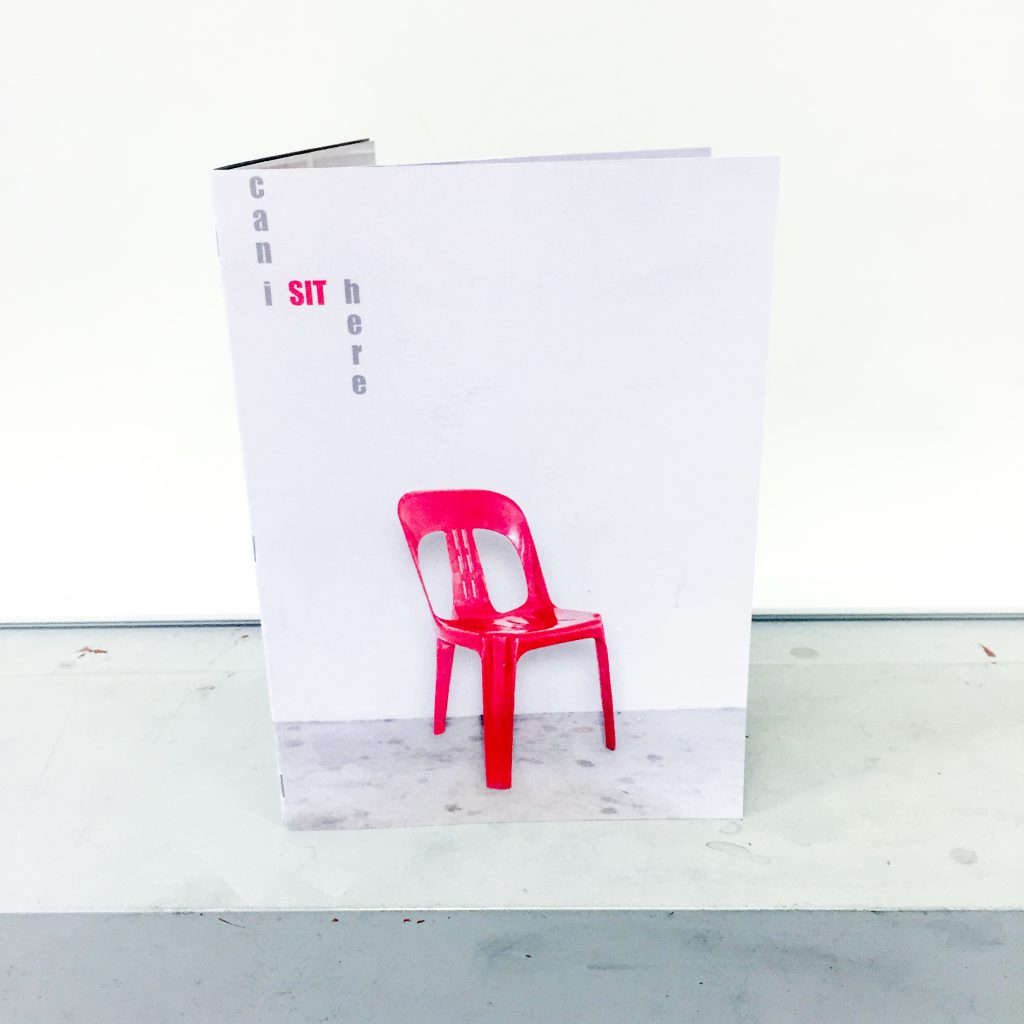
Not forgetting the front and back page of my zine, I really wanted to use a literal point of view of a seat. Like how you see the front of a seat to be normal but when you look at it from a different angle, it actually is not. I was discussing it with Nathalie and she came up with a super brilliant idea. Like from the front view, it looks like a perfectly normal chair, but when we look at it from the back, it is actually a three legged chair and no one is actually able to sit on it. So the front and back page will set the context of the entire zine. Like how for every of the three situations, there are technically available seats but no one can actually or want to, sit on them.
Execution (taking of photographs)
With my ideas all set for each panel’s content, it is down to executing them and actually making it happen. As much as these are very prevalent issues, I wanted every scenario to be ideal and I did not have the luxury of time to wait for each scenario to happen. Hence, I had to call upon my squad of friends for help.
First Spread: Seat Chop-ing
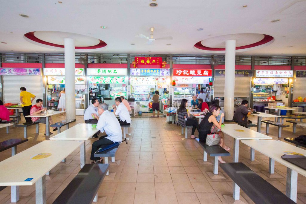
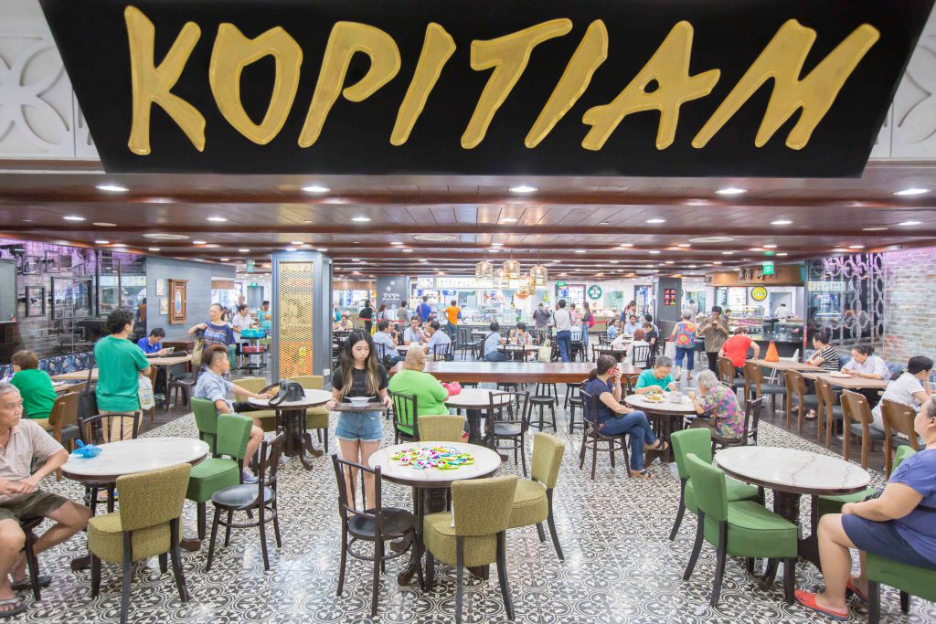
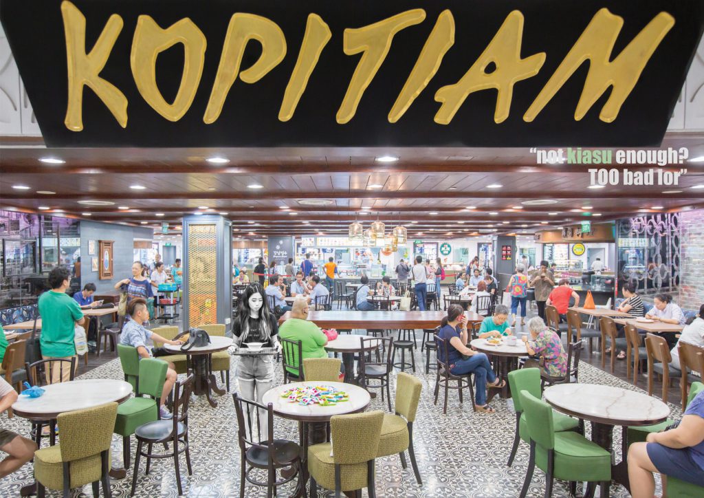
For this panel, I wanted a classic coffeeshop setting as I have always only noticed this happening in coffee shops. I went to one of the more iconic kopitiams during evening time, specifically Tiong Bahru market’s but much to my disappointment, it was super empty.
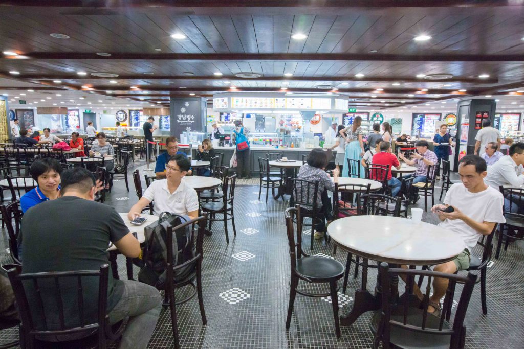
And hence, I had to quickly find an alternative. Luckily for me, Tiong Bahru plaza’s indoor “Kopitiam” was already opened although most part of it is still under renovation. (that being said, they have offers going on for some of the restaurants so go check it out!). To top it off, the kopitiam was relatively filled when I was there. I tried several compositions like this one
and this,
but I was not satisfied with it. Hence, I took a huge step back and stood outside of the Kopitiam and I got a really satisfiable composition.
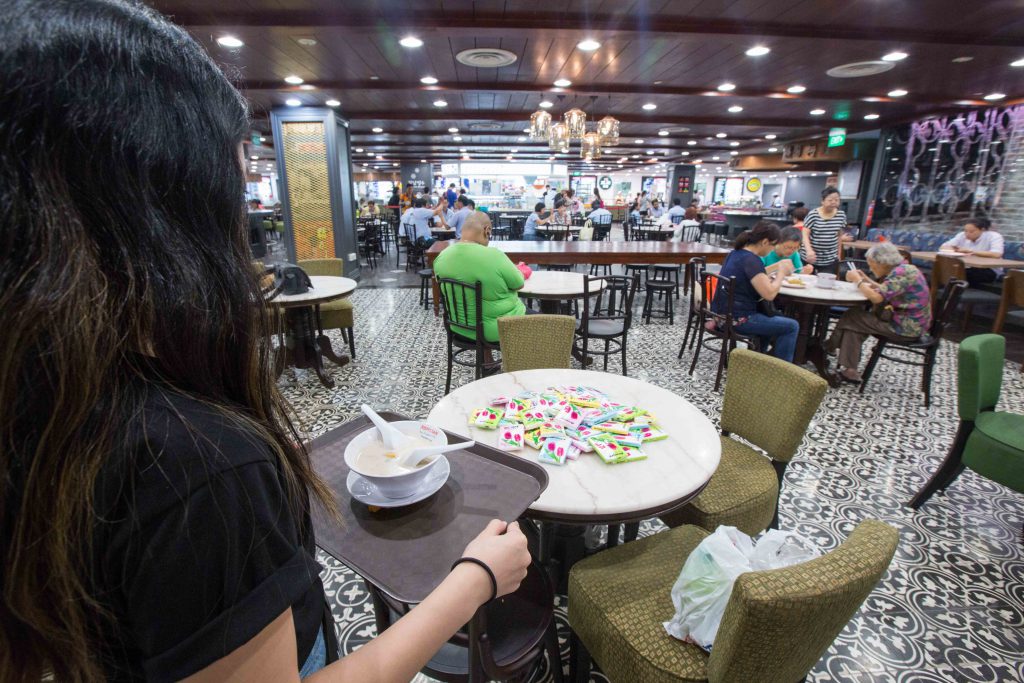
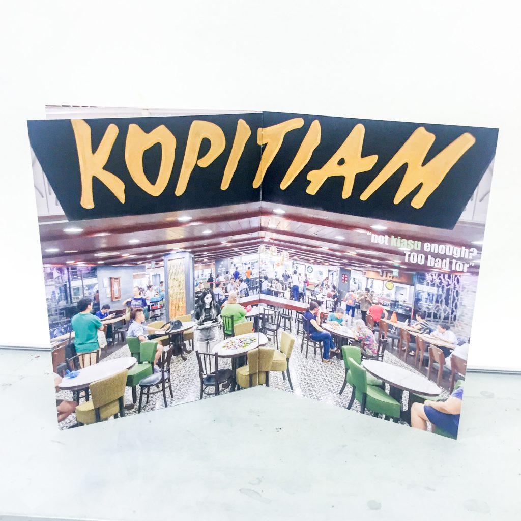
I really liked this particular composition because the sign board that says “Kopitiam” is in your face but really closes the composition well. Also, we are able to see the number of people in the kopitiam and the people queuing in the back ground. And yes, by now, you should have realised the number of packets of tissue papers on the table. I bought a whole big pack of tissue paper for this scene as I wanted to exaggerate the point where Singaporeans actually “sees” a pack of tissue paper filling up the entire table and making it unavailable. Of course, the star of this spread is none other than Nathalie who is “looking for a seat” with her bowl of desert.
P.S. we got a lot of stares while waiting for ALL of the tables to be filled up with our packets of tissues. People must have thought we were selling tissues for a living. Also, special mention to the man in blue shirt with his bag on the table. He is actually the buyer of my lens but I needed his help to fill up the last table.
Second Spread: NSF and MRT seat
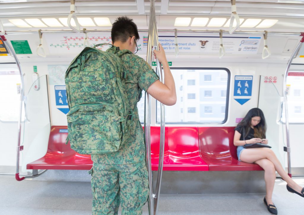
Needless to say, I needed an NSF for this spread in order for this spread to make sense. However, it will be really hard for me to find a volunteer at hours where the train is empty (it has to be empty as I want all of my panels to be exaggerated in some sense to show my point). Hence, I called up one of my friends who is currently still in NS. I am still very grateful for him as he readily agreed and even asked for a day of leave in order to make time for me to use him in my composition.
For this spread, I had a very clear idea of how I wanted to compose this shot. For the NSF to be in the centre of attraction and standing in front of a row of empty seats. For the first shot, we thought it will be nice to show his bag on the MRT flooring to signify that it is heavy and tiring. So here it is.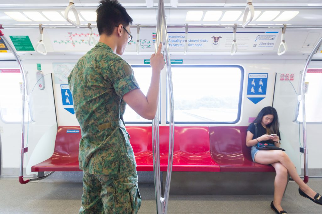
It did not turn out quite as well as expected as the cabin was too narrow and the angle was too tight. Hence, the bag did not show at all. I got my friend to carry his bag for the second shot and it worked out as how I wanted it to.
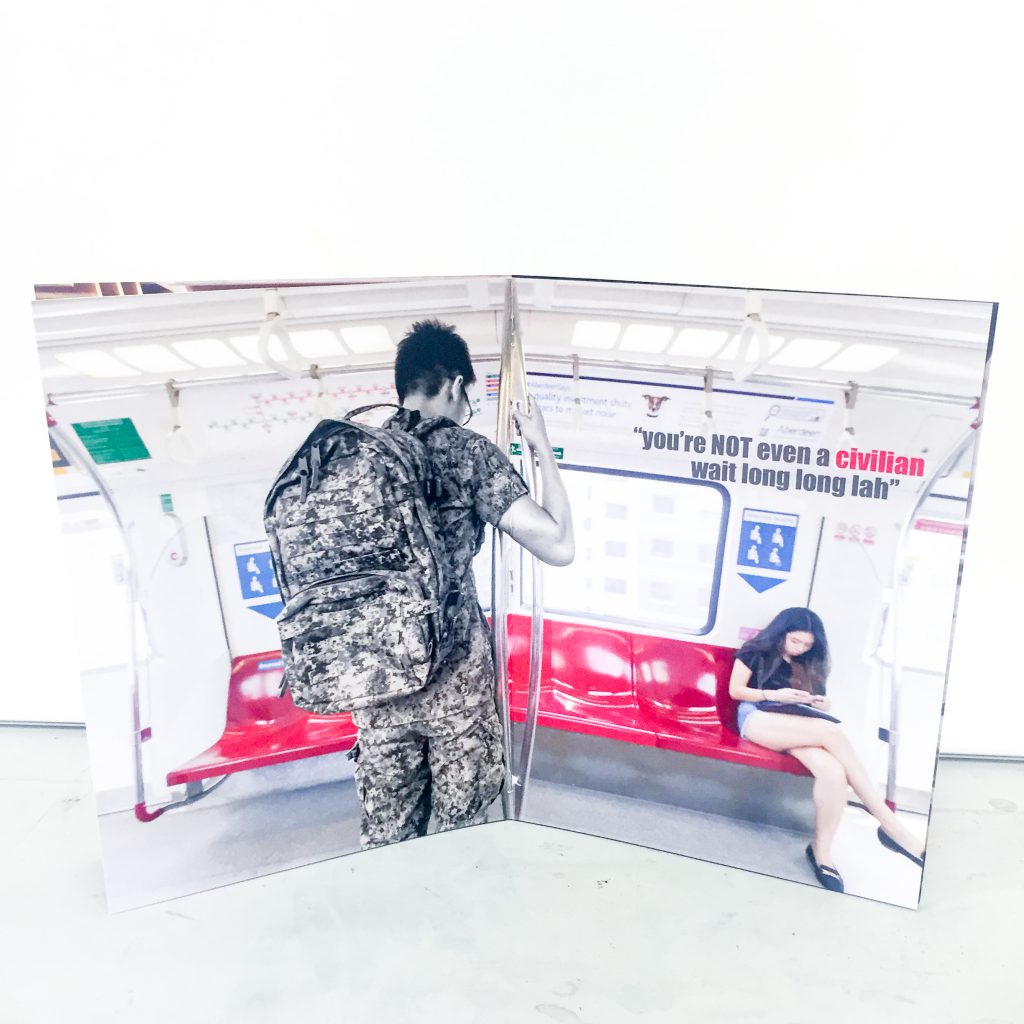
I actually got him to tilt his head slightly down to indicate that he is tired but still unable to sit with all the seats in front of him. As for the “calefare” for this spread, I got Nathalie to sit on the reserved seat. It is to emphasise the point that the MRT is so empty that a normal civilian can sit on the reserved seat but because of the social stigma, the tired NSF does not even dare to take a seat.
P.S. it is quite funny cause for the entire trip to lunch, the MRT was really empty but no matter how many times I asked my friend to take a seat, he really did not want to. For fear that he will be stomped or “caught”. Really think we should respect our NSFs more than this. They give up two years of their prime time to serve our nation and this is what they get in return.
Third Spread: Students studying in food places
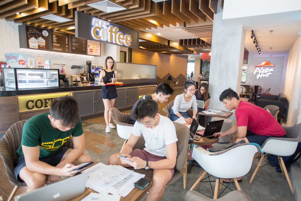
This was the most challenging spread for me to curate. First of all, I needed a public space (and food related specifically) that is relatively empty so I can fill it up with my actors. Secondly, talking about actors, I had to gather sufficient number of people (2 weeks before their finals), all at the same time and day to come together to fill up the space for me. I managed to ask and gather about 8-10 friends (along with the help of Nathalie) for this spread and I am really really thankful for them. Thirdly, I have initially wanted to use Starbucks as it is the most iconic and most people can relate to and I thought 10am will be a good time as no one will be crazy enough to wake up so early. You have no idea how wrong was I. The starbucks at north spine was full and there was a long queue. I mean, I could have just asked all of them to be my casts right? But no, that is way too many people for me to manage. So I had to quickly find another place. Luckily for me, KFC which was right opposite was relatively empty so I gathered all of my “cast” there instead.
So without further ado, here is the few compositions that I had that did not really work out.
This is the vey first one I did. It turned out pretty good but there were some minor issues. First of all, the focus of this picture was too small in frame. She did not stand out enough and we cannot really see the food in her hands. Also, we can see the seats in the background that were empty, so why couldn’t she sit there? Hence, I tried another composition and shot from her back.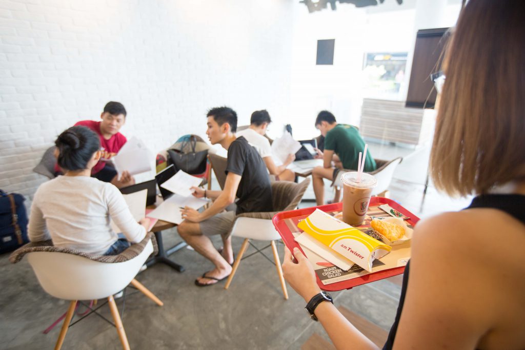
This composition was slightly better as we can see that she is holding a tray of food and is obviously looking for a seat. Also, all of the seats and tables are filled so that is good too. However, one small issue is that this could be any space in the world. There was no indication that this is a place meant for consumption of food. Hence, wasting eight people’s time, I quickly found another composition which worked out as my final one.
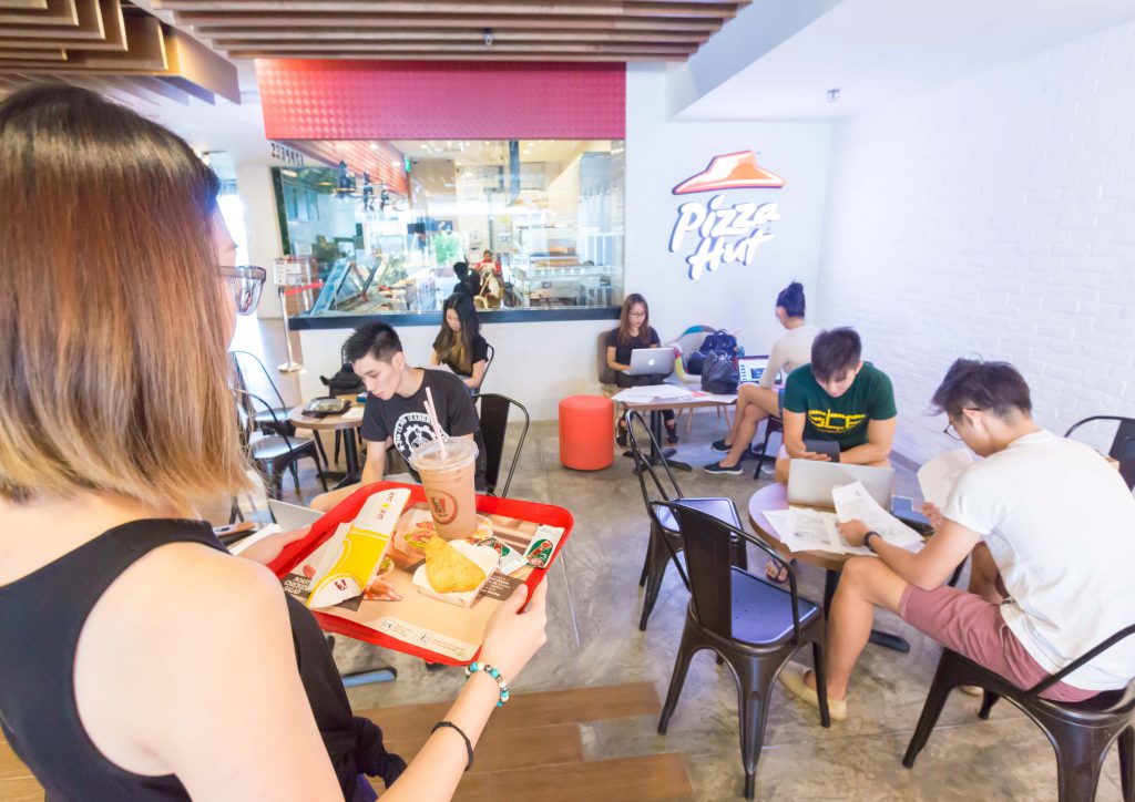
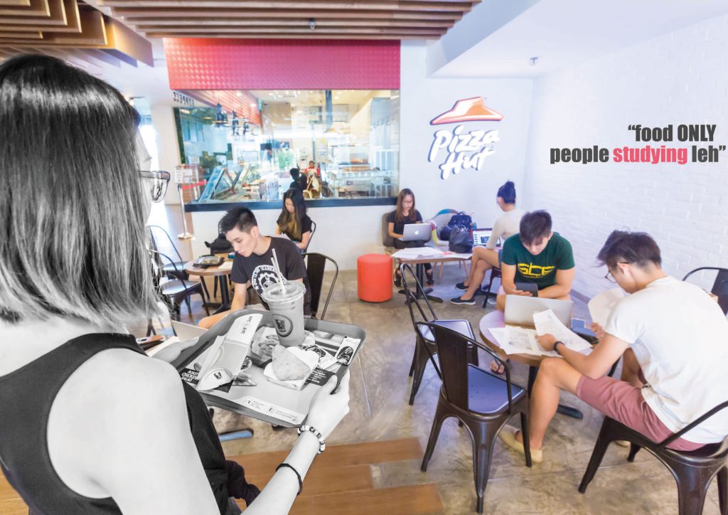
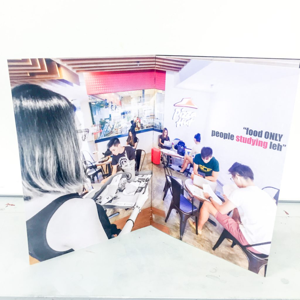
This was taken further in in the KFC/pizza hut. This worked perfectly because I had the “pizza hut” sign in the background and the food and main lead was in full focus. All the tables that were in frame were filled up as well. Hence, I settled on this composition. As to why I needed my “cast”, the way I exaggerated this spread is by showing how all of the students are actually just studying and do not even have a drink or food on the table. But they were taking up so much space with their stuff that even if the main character was willing to share the seat, she wouldn’t have space to put her food down.
Front and back page
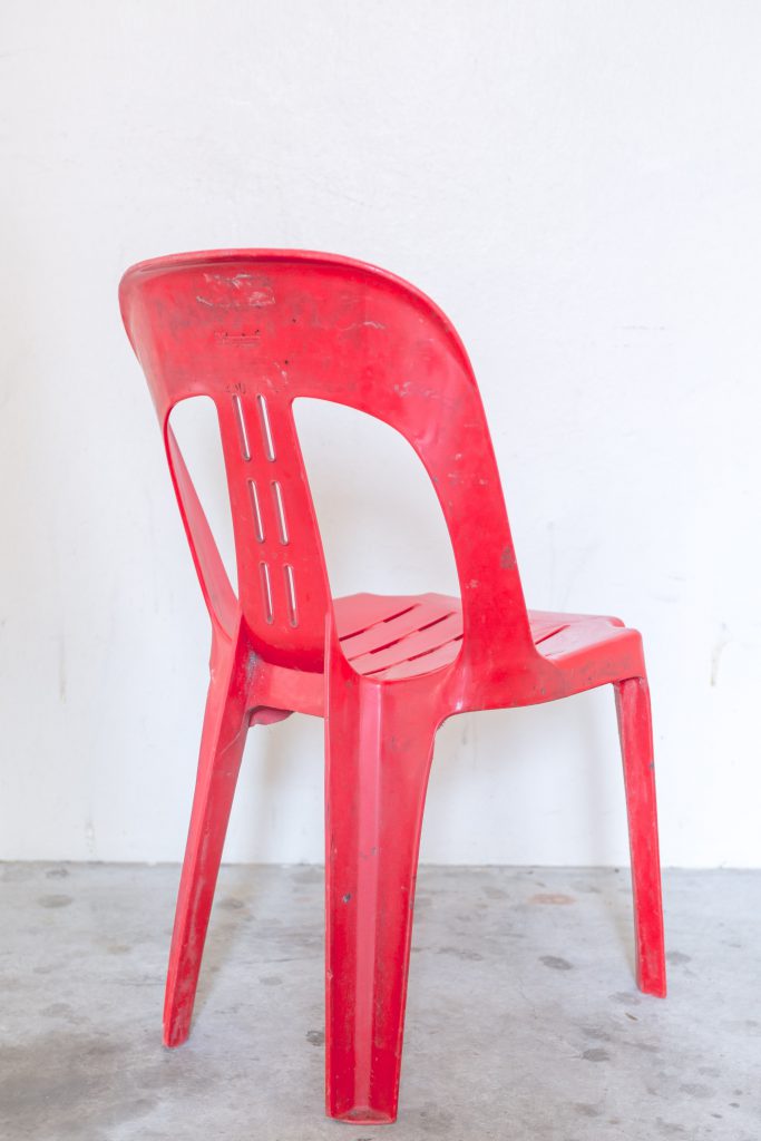
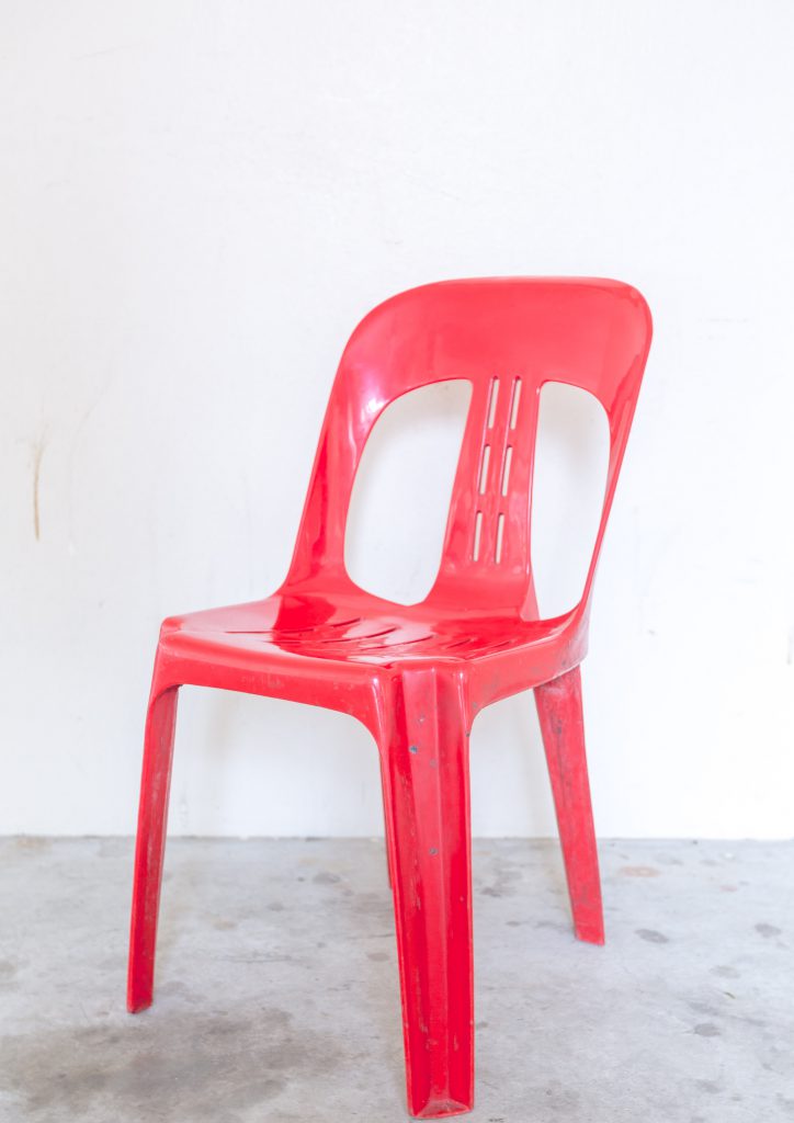
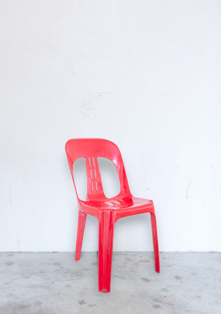
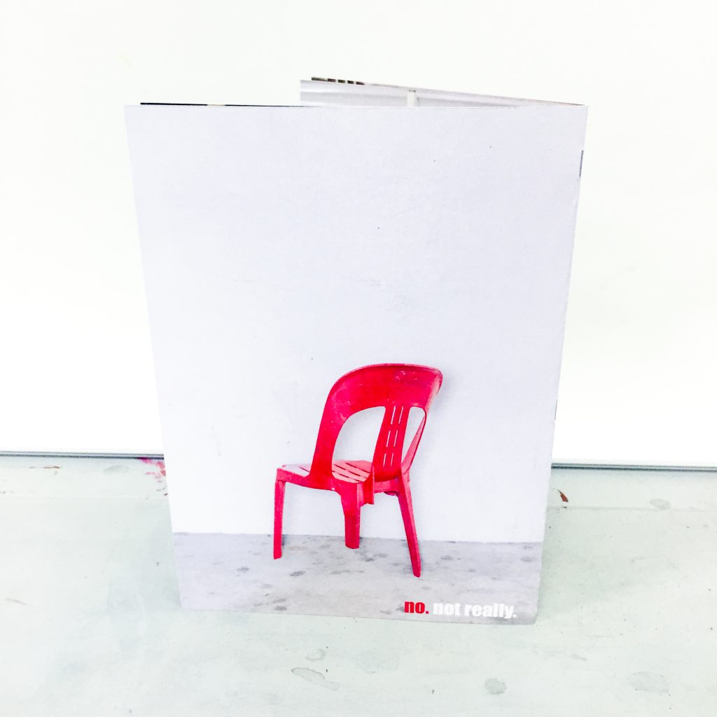
Last but not least, for my front and back page. This was relatively tough as well because I had to actually find a three legged broken chair. I was quite fixated on using the classic Singapore red plastic chair as I have not seen it anywhere else (thanks to Nat for pointing that out) so I went all around to find one. The chairs are actually quite prevalent everywhere but there were none that were broken. I had no choice but to come up with something else. So i thought, photo manipulations right? Why not break the chair in Photoshop and save the trouble and time. So that is what I did. I took a photo of the chair I found from a specific angle so it seems like a normal chair but from the back view, it will turn out to be a three legged one. Here are the two shots that I took.
Supposed-to-exist A2 spread
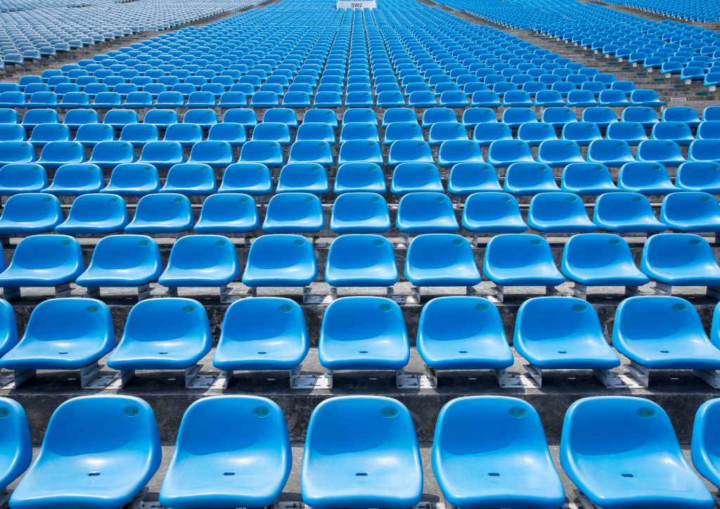
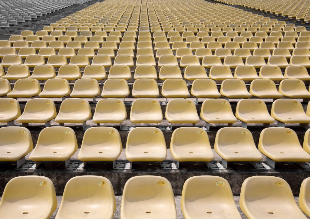
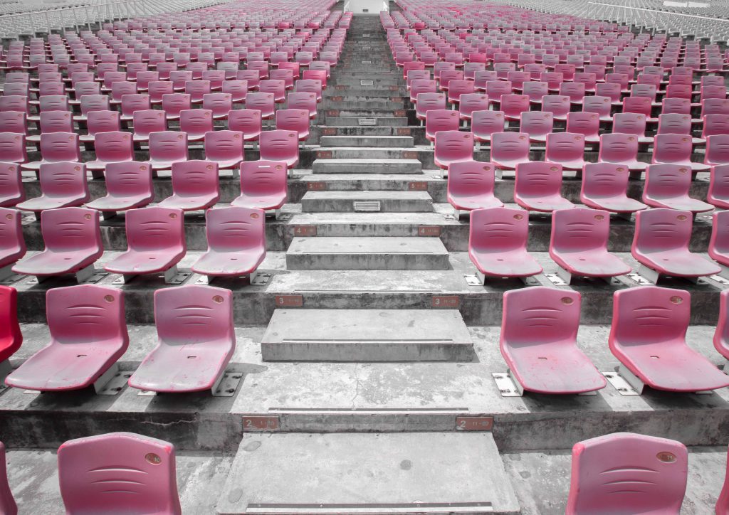
With my initial thought of using the eight page no staple zine, I had to have a picture for my final gigantic A2 spread. From my consultation with Prof Joy, she was telling me to make use of it properly and making sure it encompasses and holds my whole concept together. I wanted to portray how Singapore actually have the ability to make space for more seats for everyone but it is wasted so I thought the Marina platform will be the most apt location. Where else in Singapore will we have such a waste of space that is built with our hard earned money. I mean, we only use the space once a year for National day. ONCE a year with that amount of space taken up. What better way can you actually waste space in such a space constraint country?
So here are some of the shots I took
I mean, just look at the number of chairs man. This is not even half of what is present there. However, thinking further into it, I realised how my thought process for this and the point I want to bring out will not really surface in my viewers’ head if I weren’t there to explain it. And hence, I decided to go with the traditional folding pages and do without the no staple zine.
Process (editing and designing the spreads)
Now with all the photos taken, it was down to editing the pictures and adding necessary texts on them. I will keep this as short as possible and only mention the gist of my thought process. So here goes.
First and cover page
For this page, I made sure that both pages had a background that syncs with each other so it is more apparent that they are the same. In order to achieve this, I had to flip the background so the side with the same lighting will be in the middle.
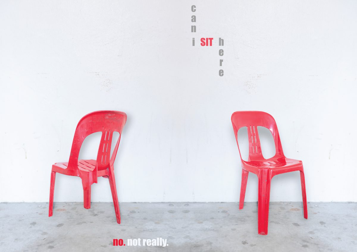
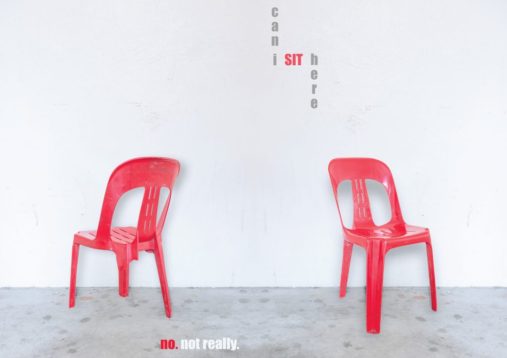
Firstly, the most important point of these two pages is the fact that it is a three legged chair. In order to “break” the chair in photoshop, I went to search for pictures of broken plastic chair on google. It was really disappointing. I mean, I should have expected that. Who in the right mind would take a picture of a broken chair? So I had to do it myself. My process of making this was quite simple. I selected one leg of the chair after I cropped it out from the background and deselected some part of it to make it look jagged and broken. After which, I deleted that selected area and TADAH ! A broken chair from the back view.
For the overall aesthetics and layout, my initial picture had too much of the chair and too little of the background.
I wanted more empty space for the front and back pages to look minimalistic and to have space for the title of my zine. In order to achieve this, I used a picture of the empty wall and scale it to become bigger before superimposing the cropped out chair on it. One small issue was that the chair had no shadow. I had to create a cast shadow for it on photoshop to let it look normal.
So that is it for the layout of the front and back page. As for the type on the front page, I wanted something short but something that can encapsulate the whole idea of the zine. So I came up with “Can I sit here”. Like how typical Singaporeans will ask for permission when they want. I arranged it in a way whereby they form a layout of a chair which will help with the overall concept of the zine.
As for the back page, I wanted to have something that will sum it all but bring across the point that there are some seats which you think or you see that you are able to sit on, but it actually isn’t. And hence, the sentence “no. not really” To answer the question on the first page and also to close off the entire zine.
Second and third page
From this spread on, I had some parts of the composition that is made black and white and they are the protagonist of each spread. It is to signify that they are in a way, “disadvantaged” and rid of their entitlement to the seats. Like for this spread, the seats placed in Pizzahut/KFC is obviously meant for their customers who buys their food. But with the students hogging up the space to study, the customers are left with nowhere to sit.
For this spread’s words, it says “food ONLY. People studying leh”. Not only does it bring attention to my viewers that the antagonists are taking up the space wrongfully by studying, it is also meant to surface an underlying issue that Singaporeans, especially parents, focus too much on academic pursuit and sometimes, even neglect the basic need for food.
Fourth and fifth page
For this spread, the protagonist, which is the NSF, is black and white. Rightfully so because of the fact that he probably deserves the seat more than anyone else in the train for sacrificing two years of his life to serve the nation. However, just because of the social stigma, he dare not sit on the seat. If it was in the US or most other countries, he will be treated like a king and be offered a seat. I really feel that this aspect of Singaporean’s attitude has to change.
For the choice of words, I used “you’re NOT even a civilian. wait long long lah”. This is because, NSFs are always seen as one level below civilians because of how they are always seem to be expected of to serve the nation. And as the years go by, people just take them for granted and stop appreciating them any more. The phrase “wait long long lah” is a very Singaporean term when someone is trying to tell another person that he/she will never get what she wants. So i thought it was quite apt to include the quote here.
Sixth and seventh page
The last two pages of my zine that I will be discussing about is this page about using the tissue papers to reserve seats. For this particular spread, I did the same for the protagonist by making her black and white for her to stand out in the composition. What is different from this spread is that I actually increased the vibrance and clarity for the tissue paper packets to stand out more so it is more obvious.
As for the text, it says “not kiasu enough? TOO bad lor”. Kiasu is a term for Singaporeans who always want to be first in everything. This is to say that if you are not fast enough to make it apparent that you want the seat and actually doing something about it, then it is too bad for you that you cannot get a seat.
Choice of font and color for each of the spreads
For all of the spread, I wanted the picture to speak for itself as it is a photography zine and hence, I chose a relatively simple and clean font called “impact” as it is straightforward and clear with not much complications. I kept it standardised throughout so that they will look uniform and one. For the colors of the fonts, I chose specific words which were the “traits” of the antagonists which caused the protagonist to not have a seat they actually deserve. I picked the color from each of the spread so they will fit into the spread itself.
That is about it for my process of designing the zine.
Choice of paper and binding
Now that everything is done except making the zine physical, I will touch on briefly on my reason for choice of paper and the binding i chose.
For my choice of paper, I chose a 200GSM matte paper. I wanted something thick enough for my zine to feel like it is of quality but at the same time, not too thick that when I fold the pages, it will have ugly creases. Another reason as to why I chose this paper is that when I was looking through the papers that were available in the shop, I realised how the colorful inked parts of the paper were glossy while the rest were matte. I really liked that fact about it as it will help to emphasis the subjects and the focus of each of my spread.
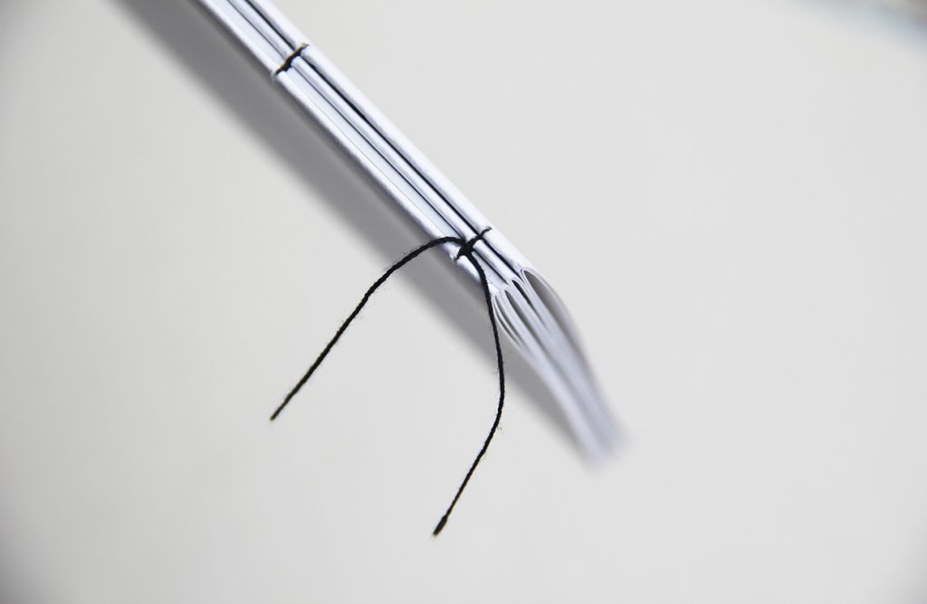
As for the binding, I wanted to sew it on initially so it will look more personal and like, more effort was put into making it. However, I realise that I need them to be tightly secured so that the pages will not show those at the back and destroy the look of each spread and sewing it will not be tight enough. Hence, I resorted to stapling it which worked really well and looked cleaner than expected.
Final deliverables
I have actually explained every concept and reasoning to each spread and the entire zine and hence, I merged both the process post and final into this. So, here are the pictures of the actual zines and there will be nothing to accompany it. Hope you all enjoyed reading my ultra long post of my thought and design process (prolly not) and thank you if you persevered till this point.
