2D Project Three (Zine) Process and Final

Issue for each spread (Choice of content to show)

Before I started on my process from taking the photos, to editing them and then to compiling them within my zine, I had to decide on the actual content which will be on each spread first. And for my zine which is supposed to a photography zine, I decided to use two a5 pages for each spread so the details of each picture could be seen. Hence, with an 8 page zine including the front and back page, I will require three main content to fill the 6 pages of 3 different spreads.

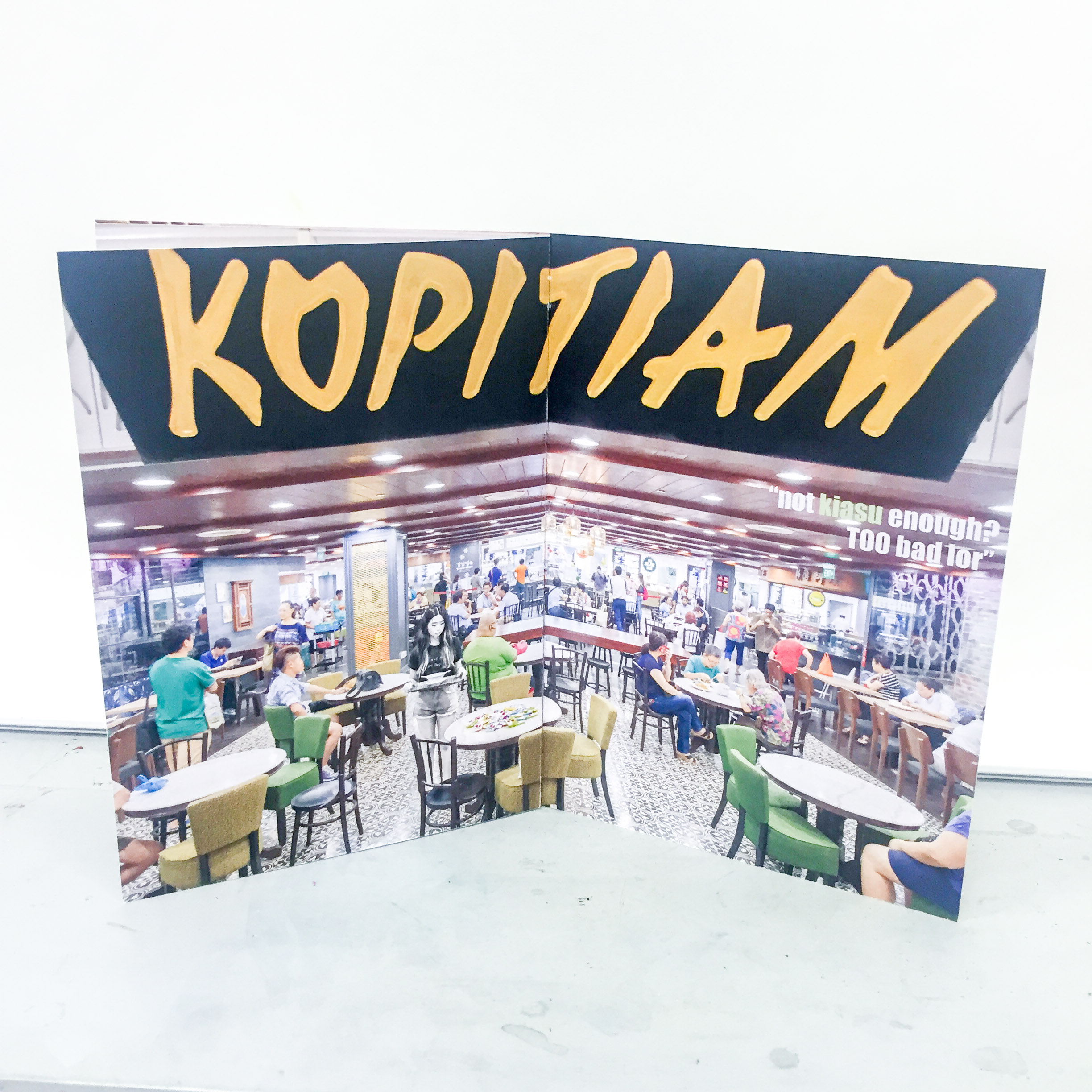
Issue 1: As I have my first one set from my ideation stage, which was the issue with Singaporeans using tissue papers to chope a seat, I had to only think of two more.

Issue 2: The second issue surfaced pretty quickly as well. Being a guy and having gone through NS, I know very clearly what is one issue that NSFs (national service- full time) will face when they are taking public transport. Especially for guys like me who has a stay-out vocation and are required to travel home in uniform everyday. Because of the social stigma and the countless stomp photos that surfaced throughout the years, most of our NSFs dare not sit on MRT seats although they are equally, or even more entitled to them. Hence, my second issue was to address how in the point of view of NSFs, every MRT seats are “reserved seats” for civilians.

Issue 3: As much as I thought 3 issues will be really easy to fix on, I was really stuck for my third one. It was until the group consultation when I asked my group that Jordan mentioned how students always hog places to study for the examinations. This is actually a very apparent issue. Some of us are guilty of this and we will always see students in Starbucks or quieter cafes with only one cup of drink and taking up the space to study. Hence, my third and last issue will be on students taking up space meant for other purposes to study.

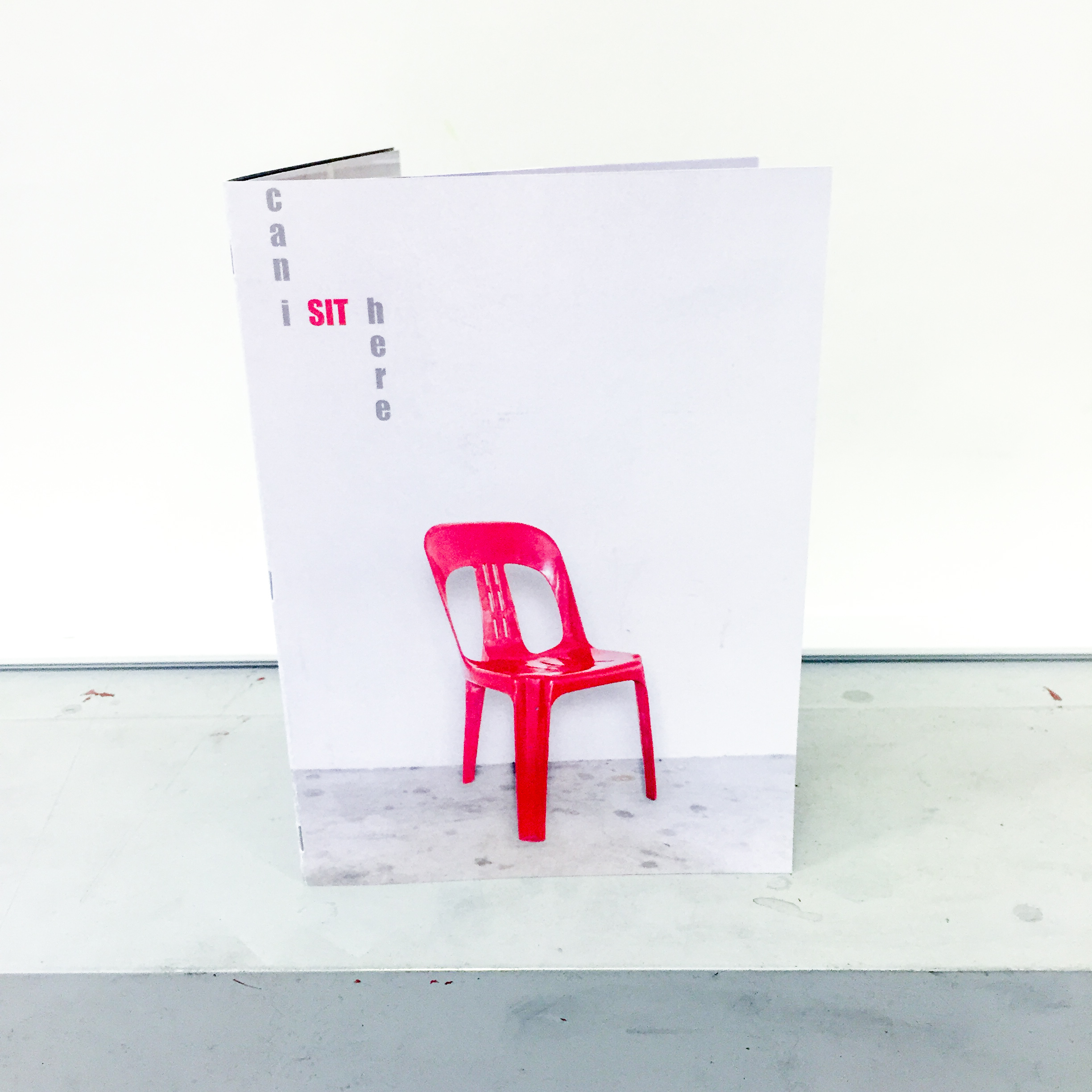
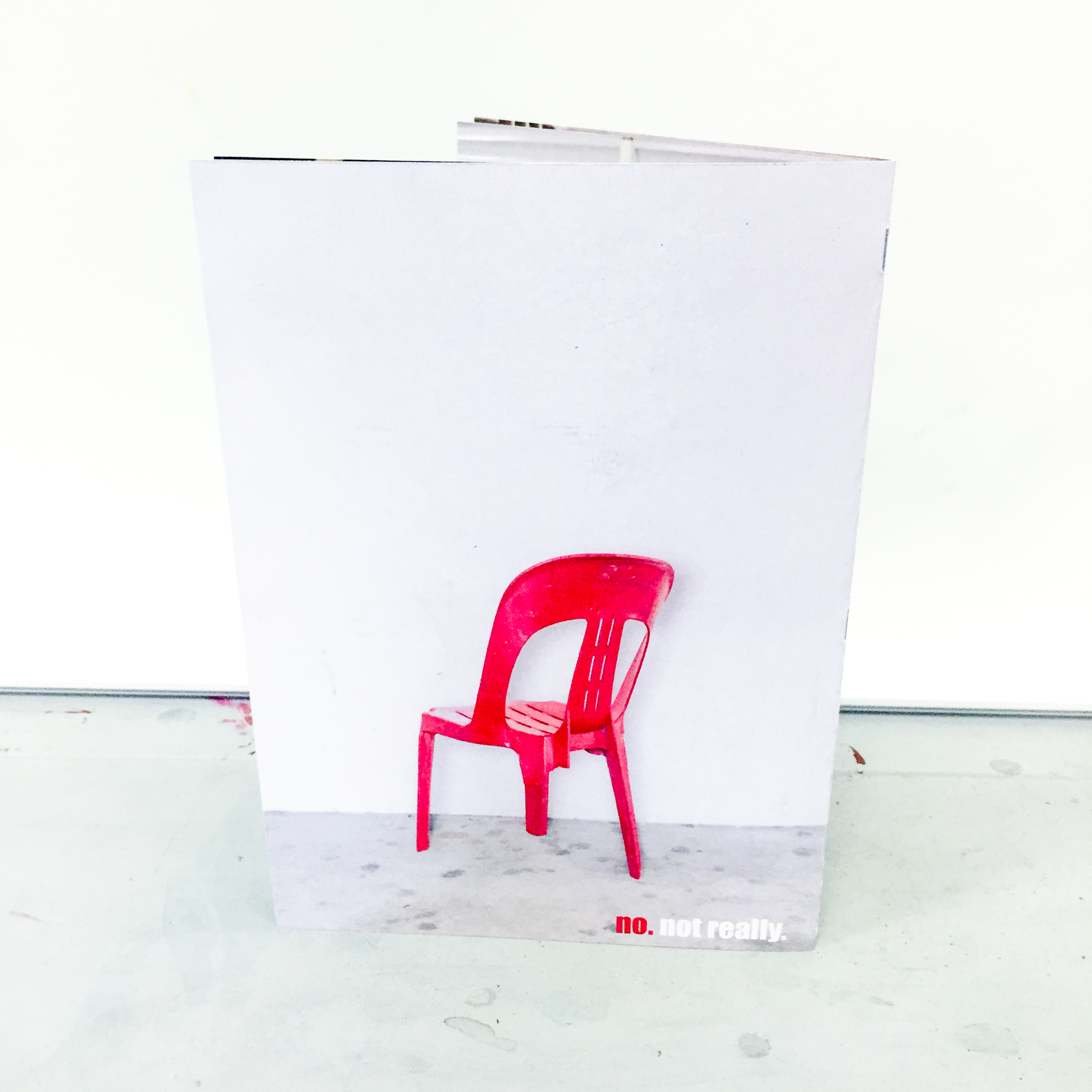
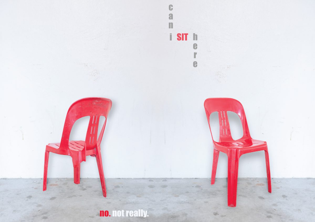
Not forgetting the front and back page of my zine, I really wanted to use a literal point of view of a seat. Like how you see the front of a seat to be normal but when you look at it from a different angle, it actually is not. I was discussing it with Nathalie and she came up with a super brilliant idea. Like from the front view, it looks like a perfectly normal chair, but when we look at it from the back, it is actually a three legged chair and no one is actually able to sit on it. So the front and back page will set the context of the entire zine. Like how for every of the three situations, there are technically available seats but no one can actually or want to, sit on them.


Execution (taking of photographs)

With my ideas all set for each panel’s content, it is down to executing them and actually making it happen. As much as these are very prevalent issues, I wanted every scenario to be ideal and I did not have the luxury of time to wait for each scenario to happen. Hence, I had to call upon my squad of friends for help.


First Spread: Seat Chop-ing

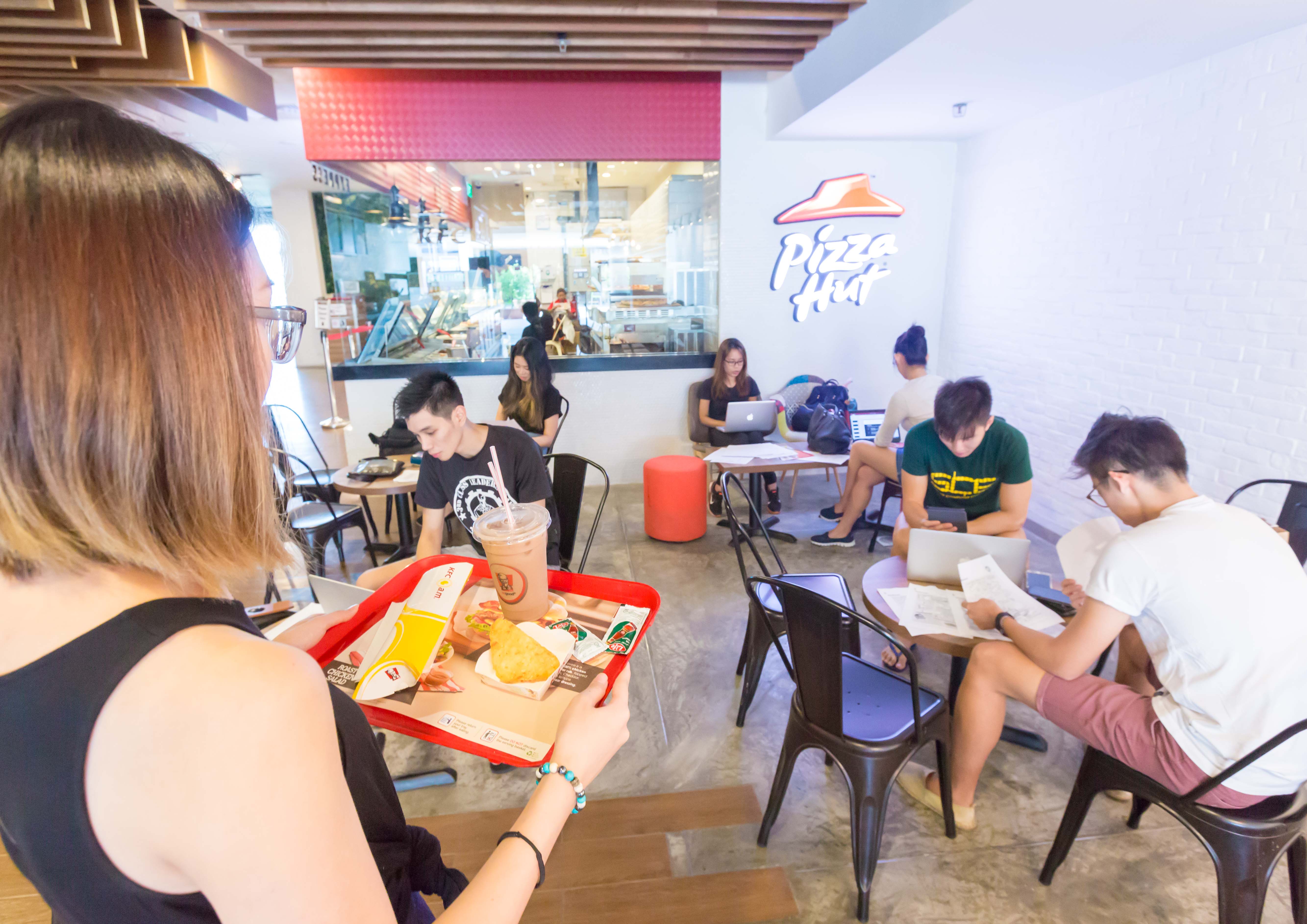
For this panel, I wanted a classic coffeeshop setting as I have always only noticed this happening in coffee shops. I went to one of the more iconic kopitiams during evening time, specifically Tiong Bahru market’s but much to my disappointment, it was super empty.

IMG_7072

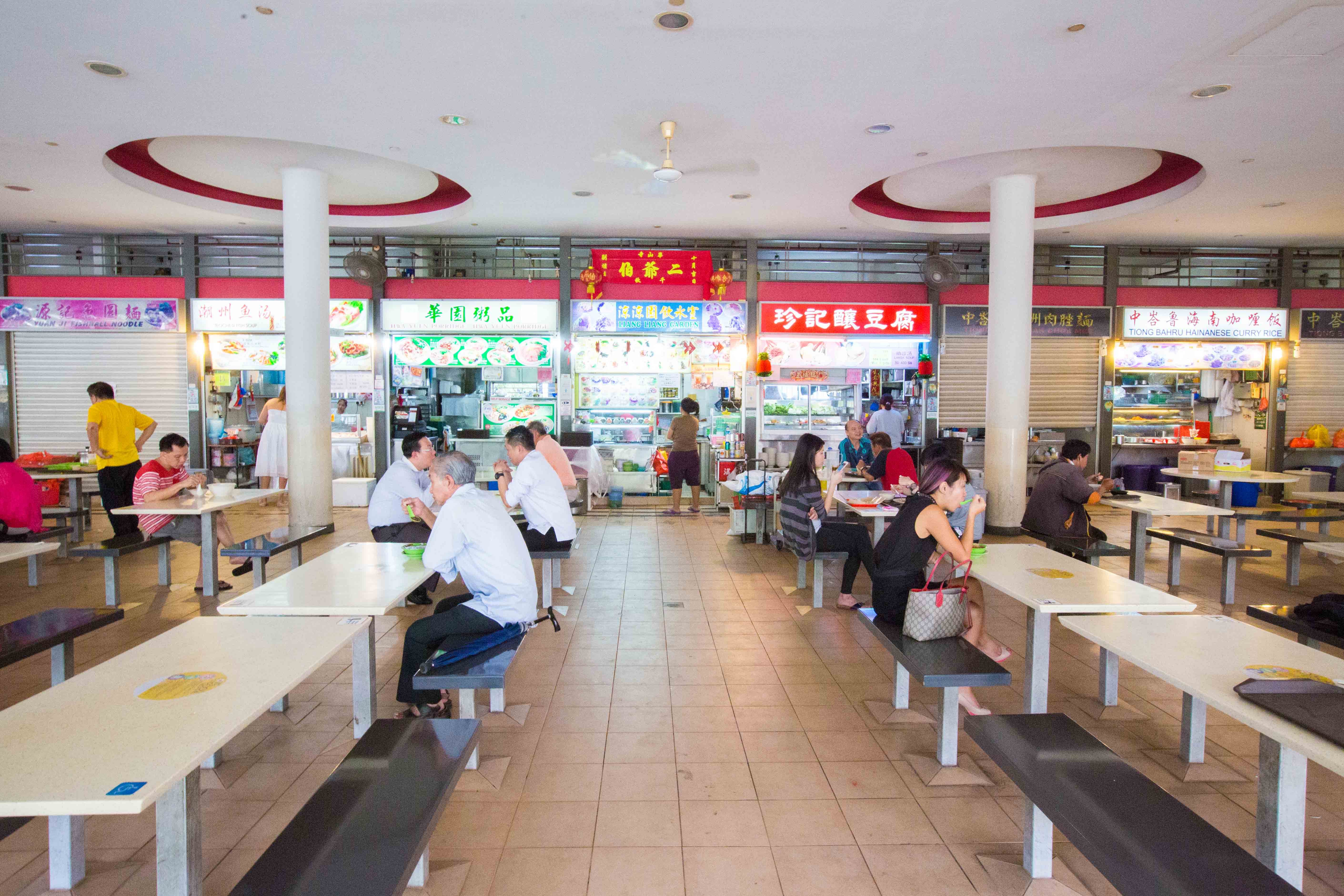
And hence, I had to quickly find an alternative. Luckily for me, Tiong Bahru plaza’s indoor “Kopitiam” was already opened although most part of it is still under renovation. (that being said, they have offers going on for some of the restaurants so go check it out!). To top it off, the kopitiam was relatively filled when I was there. I tried several compositions like this one

IMG_7073

and this,

IMG_7091

but I was not satisfied with it. Hence, I took a huge step back and stood outside of the Kopitiam and I got a really satisfiable composition.

IMG_7089-2

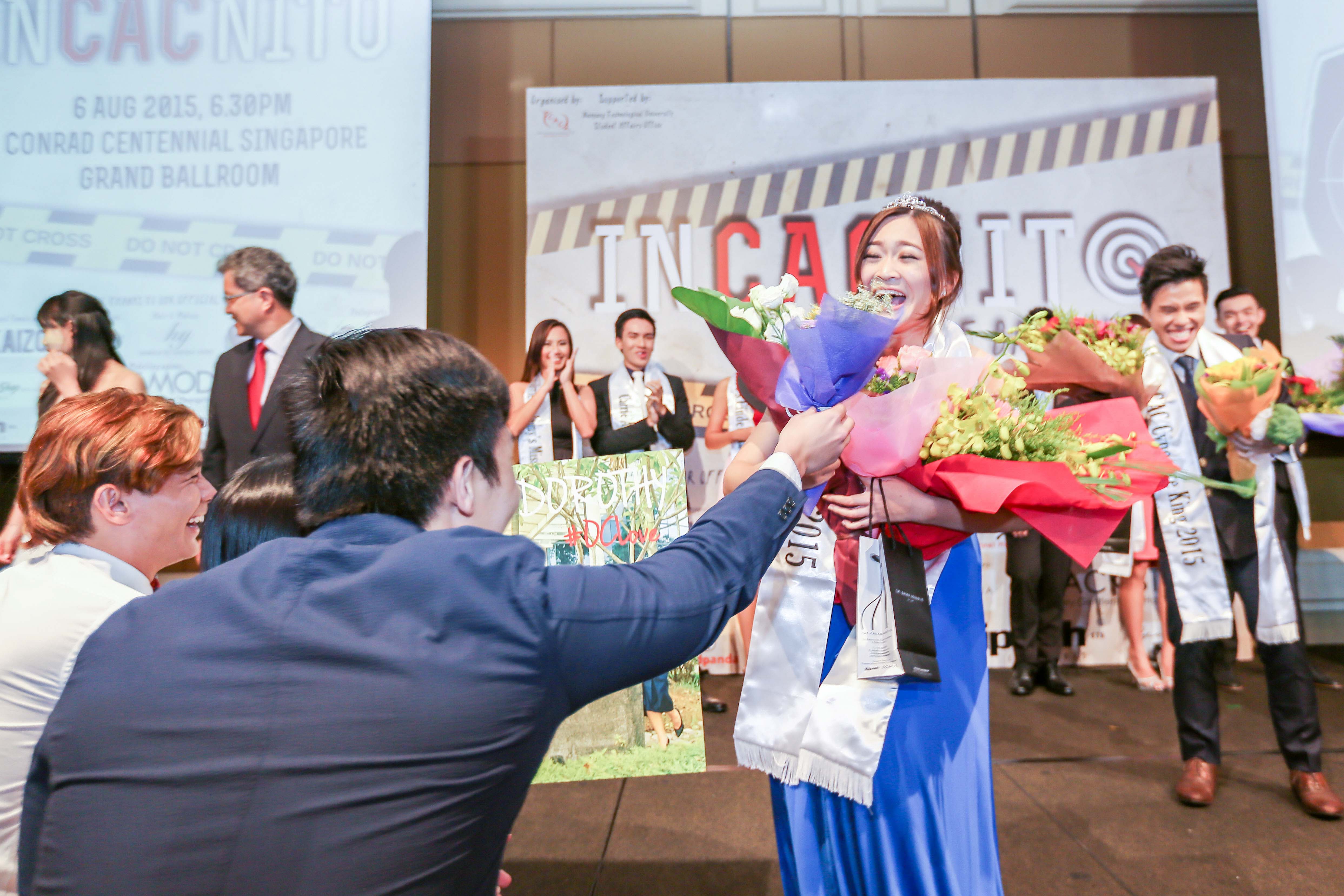
I really liked this particular composition because the sign board that says “Kopitiam” is in your face but really closes the composition well. Also, we are able to see the number of people in the kopitiam and the people queuing in the back ground. And yes, by now, you should have realised the number of packets of tissue papers on the table. I bought a whole big pack of tissue paper for this scene as I wanted to exaggerate the point where Singaporeans actually “sees” a pack of tissue paper filling up the entire table and making it unavailable. Of course, the star of this spread is none other than Nathalie who is “looking for a seat” with her bowl of desert.

P.S. we got a lot of stares while waiting for ALL of the tables to be filled up with our packets of tissues. People must have thought we were selling tissues for a living. Also, special mention to the man in blue shirt with his bag on the table. He is actually the buyer of my lens but I needed his help to fill up the last table.


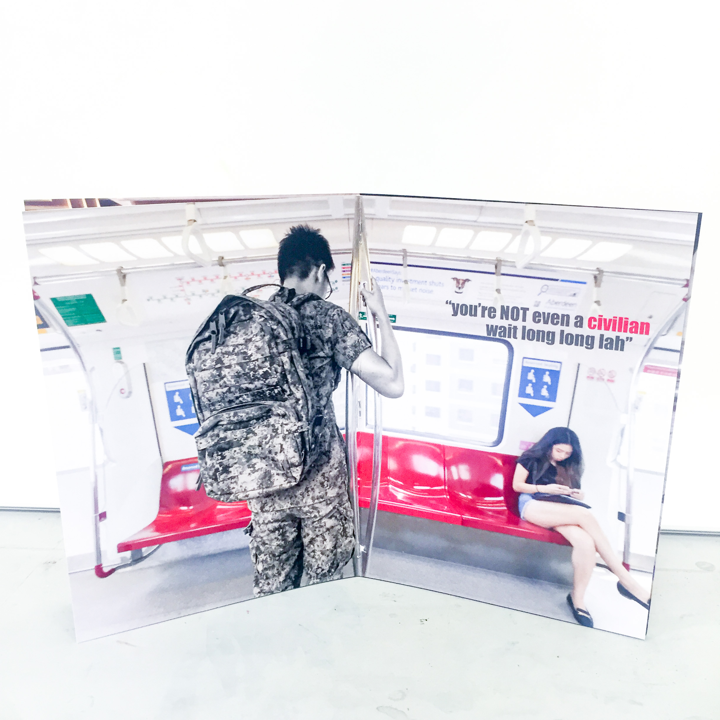
Second Spread: NSF and MRT seat

Needless to say, I needed an NSF for this spread in order for this spread to make sense. However, it will be really hard for me to find a volunteer at hours where the train is empty (it has to be empty as I want all of my panels to be exaggerated in some sense to show my point). Hence, I called up one of my friends who is currently still in NS. I am still very grateful for him as he readily agreed and even asked for a day of leave in order to make time for me to use him in my composition.

For this spread, I had a very clear idea of how I wanted to compose this shot. For the NSF to be in the centre of attraction and standing in front of a row of empty seats. For the first shot, we thought it will be nice to show his bag on the MRT flooring to signify that it is heavy and tiring. So here it is.IMG_6994

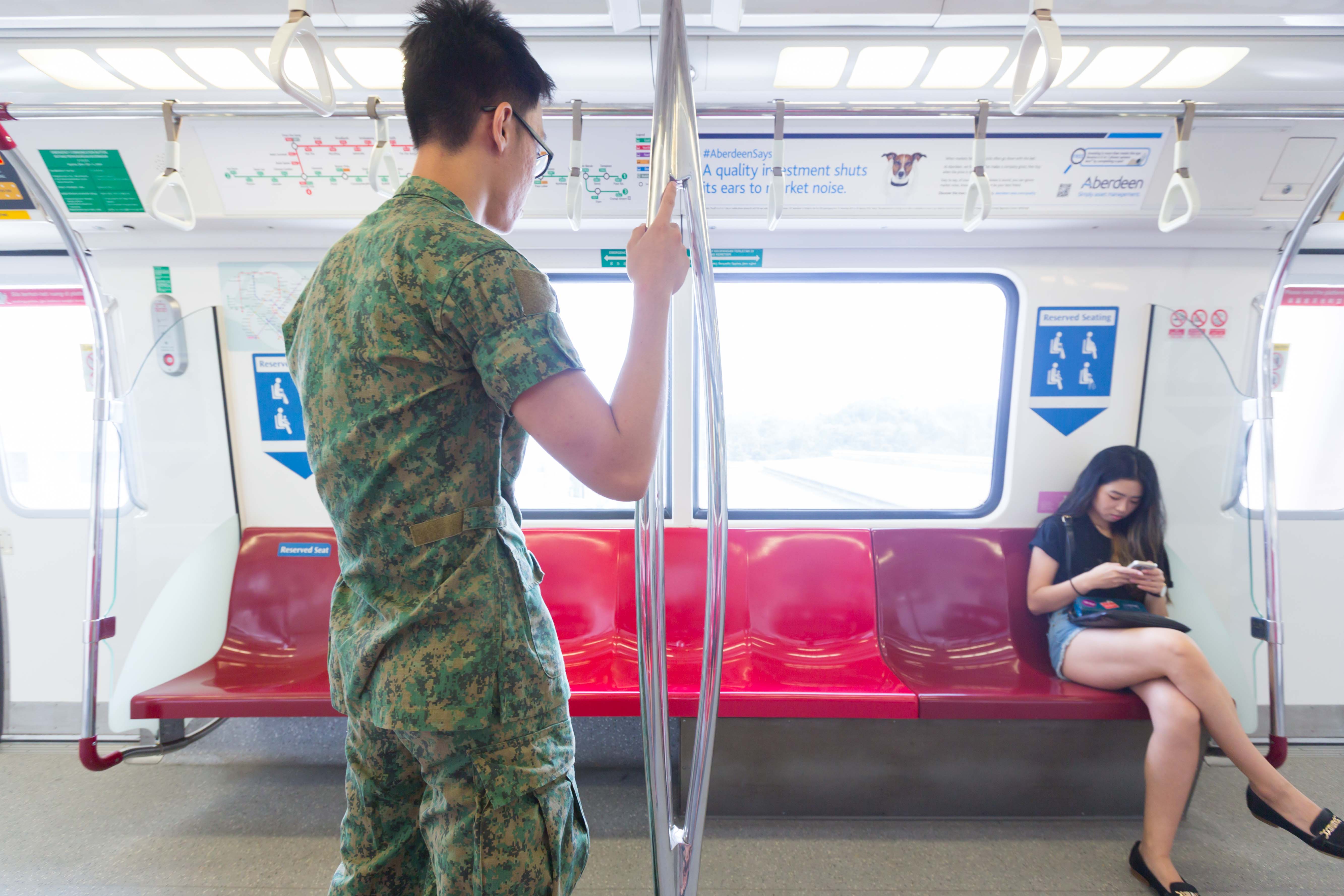
It did not turn out quite as well as expected as the cabin was too narrow and the angle was too tight. Hence, the bag did not show at all. I got my friend to carry his bag for the second shot and it worked out as how I wanted it to.

IMG_7007

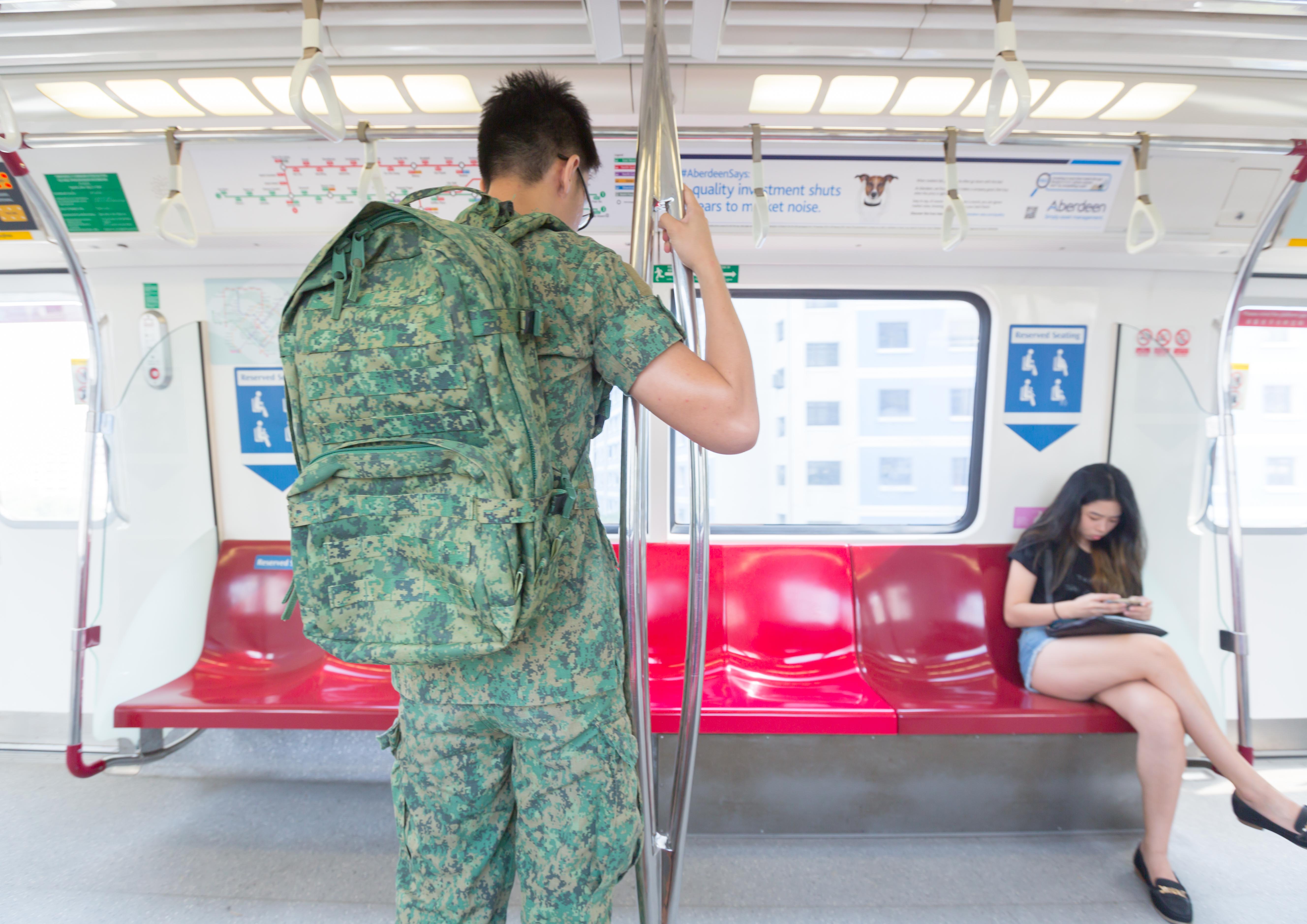
I actually got him to tilt his head slightly down to indicate that he is tired but still unable to sit with all the seats in front of him. As for the “calefare” for this spread, I got Nathalie to sit on the reserved seat. It is to emphasise the point that the MRT is so empty that a normal civilian can sit on the reserved seat but because of the social stigma, the tired NSF does not even dare to take a seat.

P.S. it is quite funny cause for the entire trip to lunch, the MRT was really empty but no matter how many times I asked my friend to take a seat, he really did not want to. For fear that he will be stomped or “caught”. Really think we should respect our NSFs more than this. They give up two years of their prime time to serve our nation and this is what they get in return.


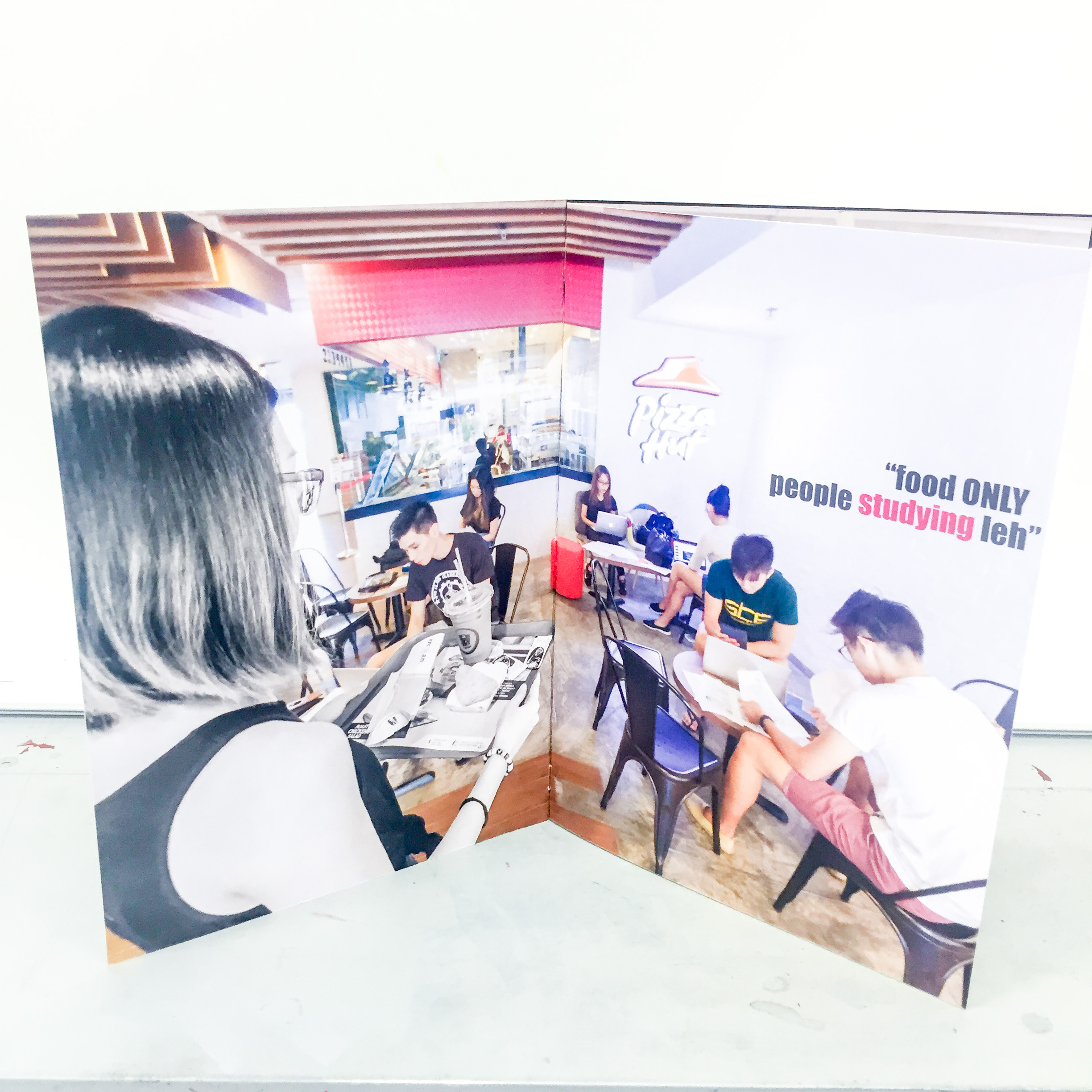
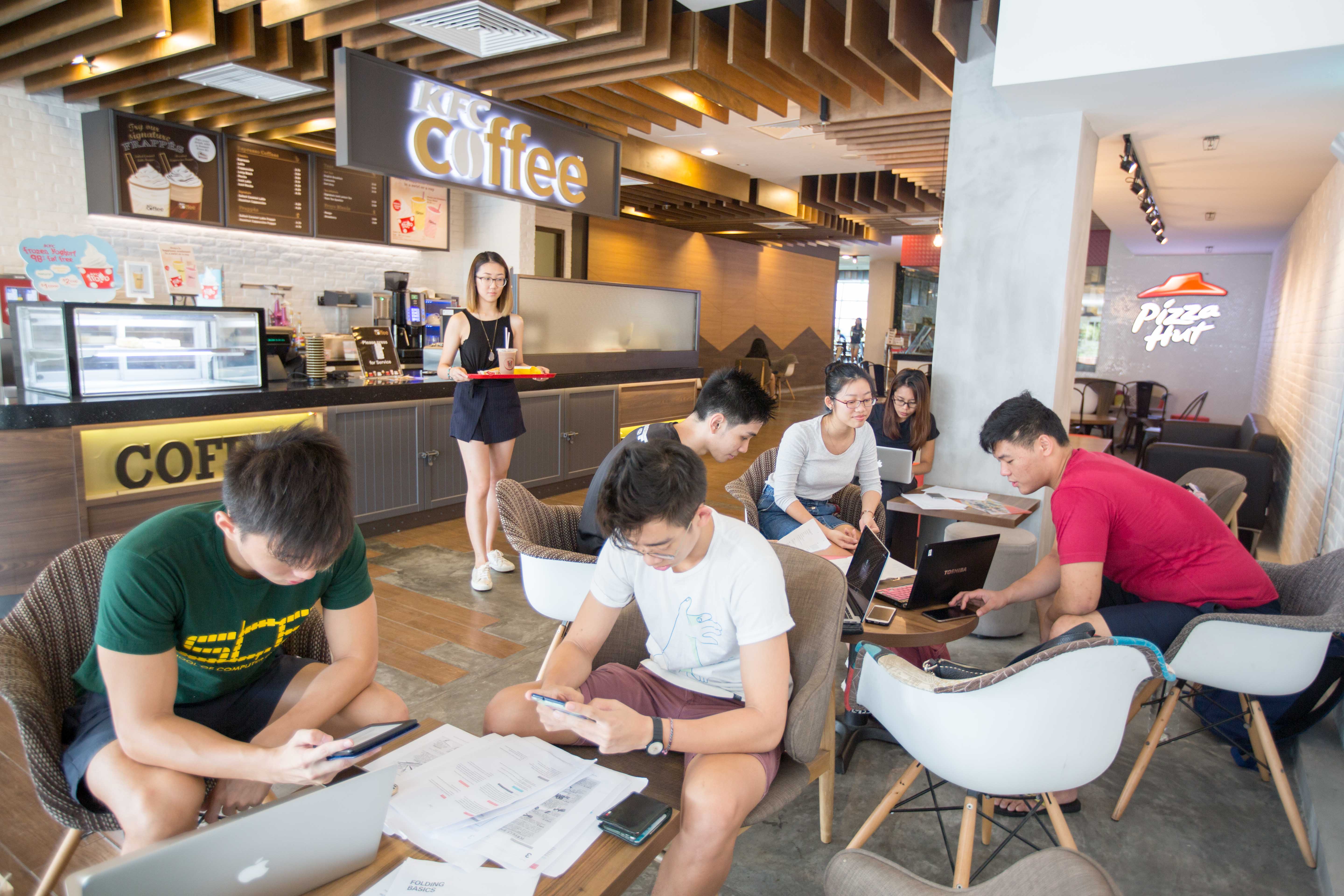
Third Spread: Students studying in food places

This was the most challenging spread for me to curate. First of all, I needed a public space (and food related specifically) that is relatively empty so I can fill it up with my actors. Secondly, talking about actors, I had to gather sufficient number of people (2 weeks before their finals), all at the same time and day to come together to fill up the space for me. I managed to ask and gather about 8-10 friends (along with the help of Nathalie) for this spread and I am really really thankful for them. Thirdly, I have initially wanted to use Starbucks as it is the most iconic and most people can relate to and I thought 10am will be a good time as no one will be crazy enough to wake up so early. You have no idea how wrong was I. The starbucks at north spine was full and there was a long queue. I mean, I could have just asked all of them to be my casts right? But no, that is way too many people for me to manage. So I had to quickly find another place. Luckily for me, KFC which was right opposite was relatively empty so I gathered all of my “cast” there instead.

So without further ado, here is the few compositions that I had that did not really work out.

IMG_6979

This is the vey first one I did. It turned out pretty good but there were some minor issues. First of all, the focus of this picture was too small in frame. She did not stand out enough and we cannot really see the food in her hands. Also, we can see the seats in the background that were empty, so why couldn’t she sit there? Hence, I tried another composition and shot from her back.IMG_6984

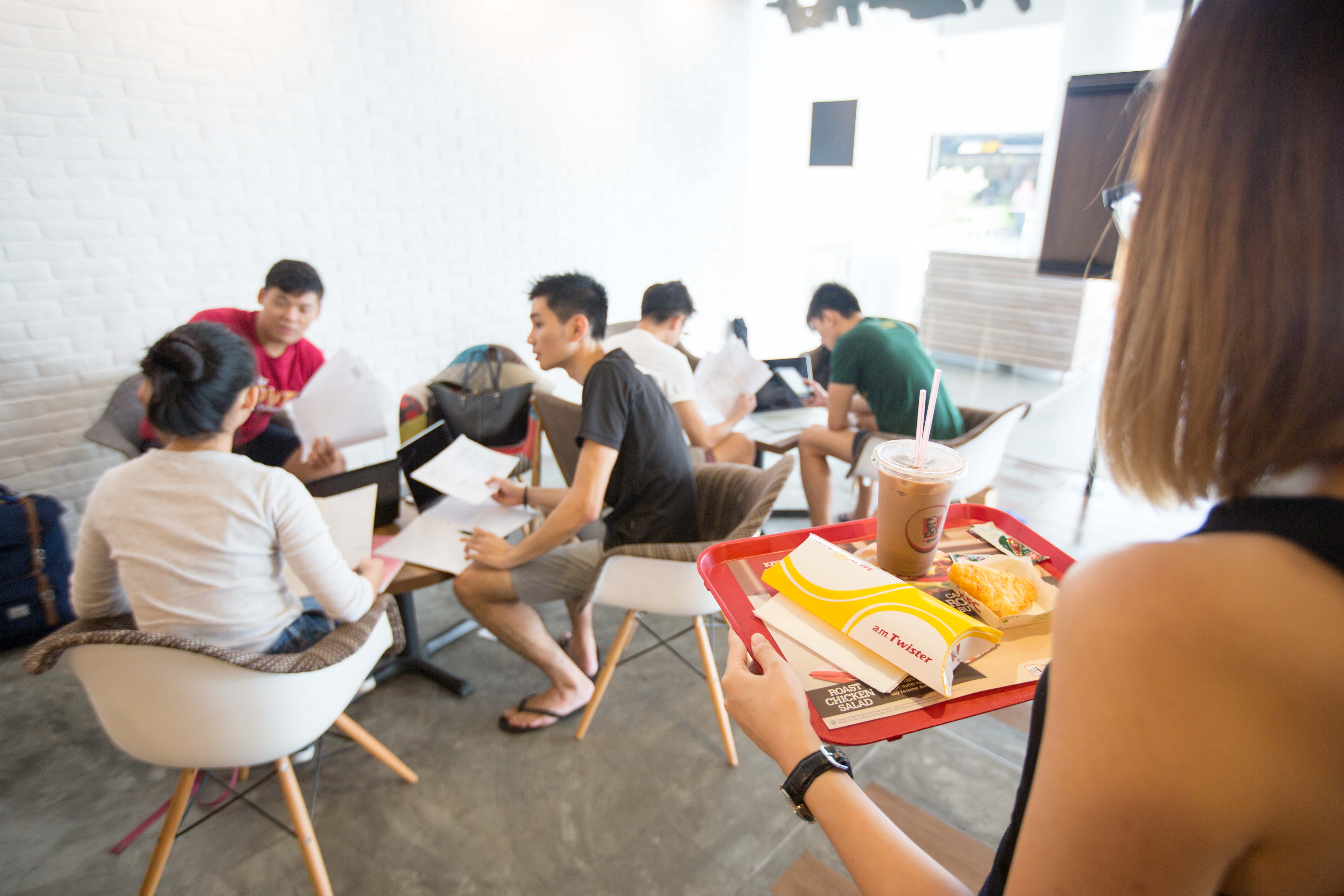
This composition was slightly better as we can see that she is holding a tray of food and is obviously looking for a seat. Also, all of the seats and tables are filled so that is good too. However, one small issue is that this could be any space in the world. There was no indication that this is a place meant for consumption of food. Hence, wasting eight people’s time, I quickly found another composition which worked out as my final one.

IMG_6991

This was taken further in in the KFC/pizza hut. This worked perfectly because I had the “pizza hut” sign in the background and the food and main lead was in full focus. All the tables that were in frame were filled up as well. Hence, I settled on this composition. As to why I needed my “cast”, the way I exaggerated this spread is by showing how all of the students are actually just studying and do not even have a drink or food on the table. But they were taking up so much space with their stuff that even if the main character was willing to share the seat, she wouldn’t have space to put her food down.

Front and back page

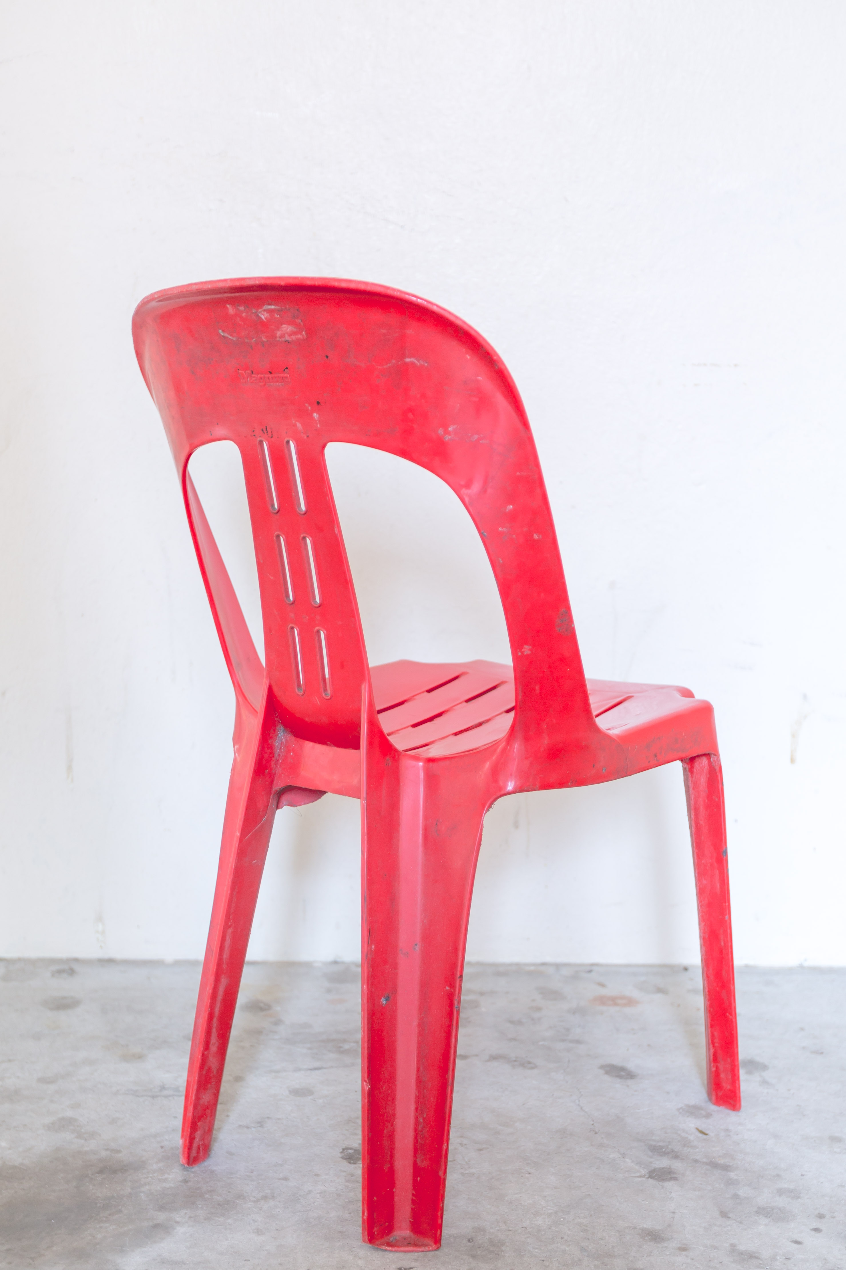
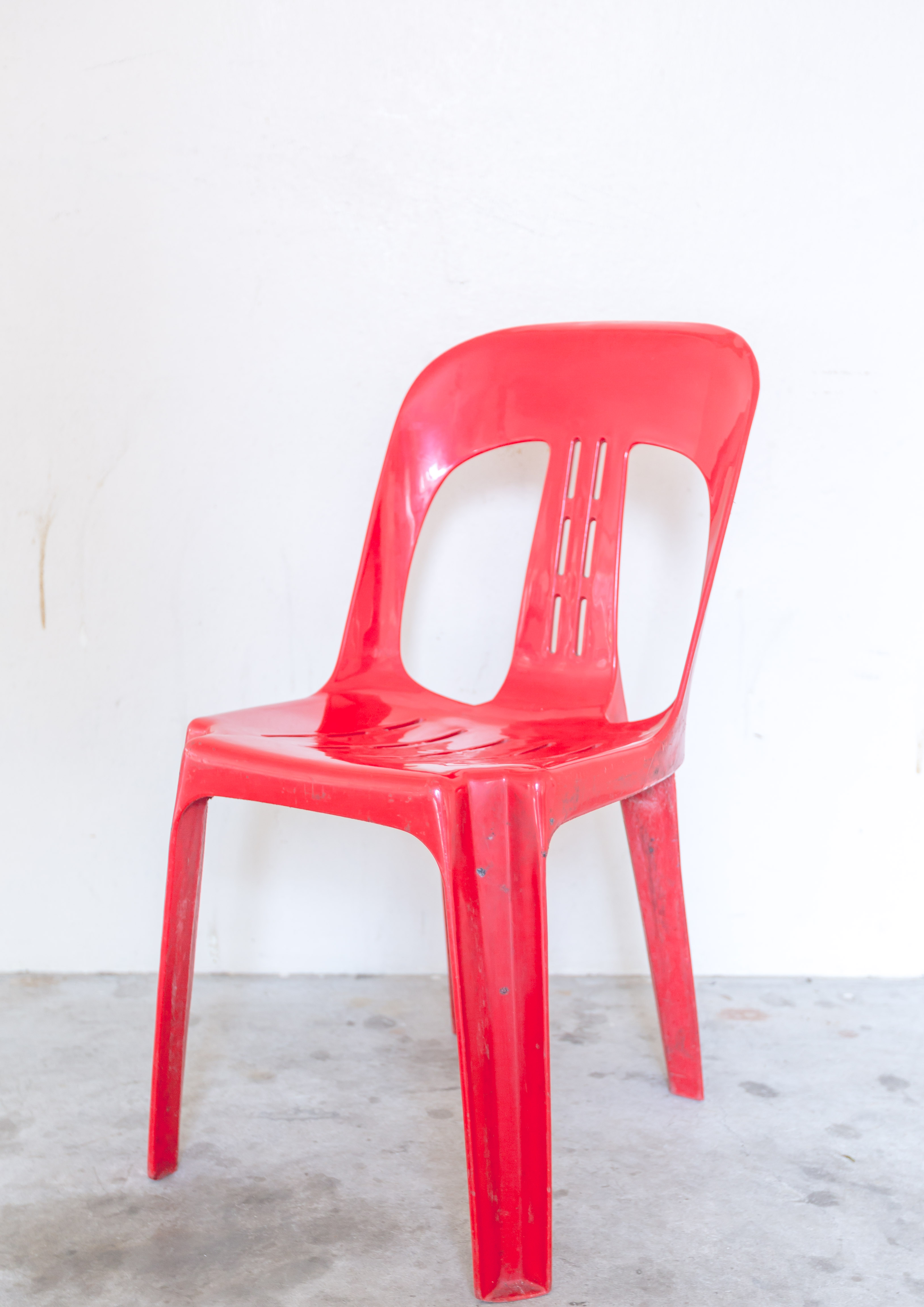
Last but not least, for my front and back page. This was relatively tough as well because I had to actually find a three legged broken chair. I was quite fixated on using the classic Singapore red plastic chair as I have not seen it anywhere else (thanks to Nat for pointing that out) so I went all around to find one. The chairs are actually quite prevalent everywhere but there were none that were broken. I had no choice but to come up with something else. So i thought, photo manipulations right? Why not break the chair in Photoshop and save the trouble and time. So that is what I did. I took a photo of the chair I found from a specific angle so it seems like a normal chair but from the back view, it will turn out to be a three legged one. Here are the two shots that I took.

IMG_7031 IMG_7033

Supposed-to-exist A2 spread

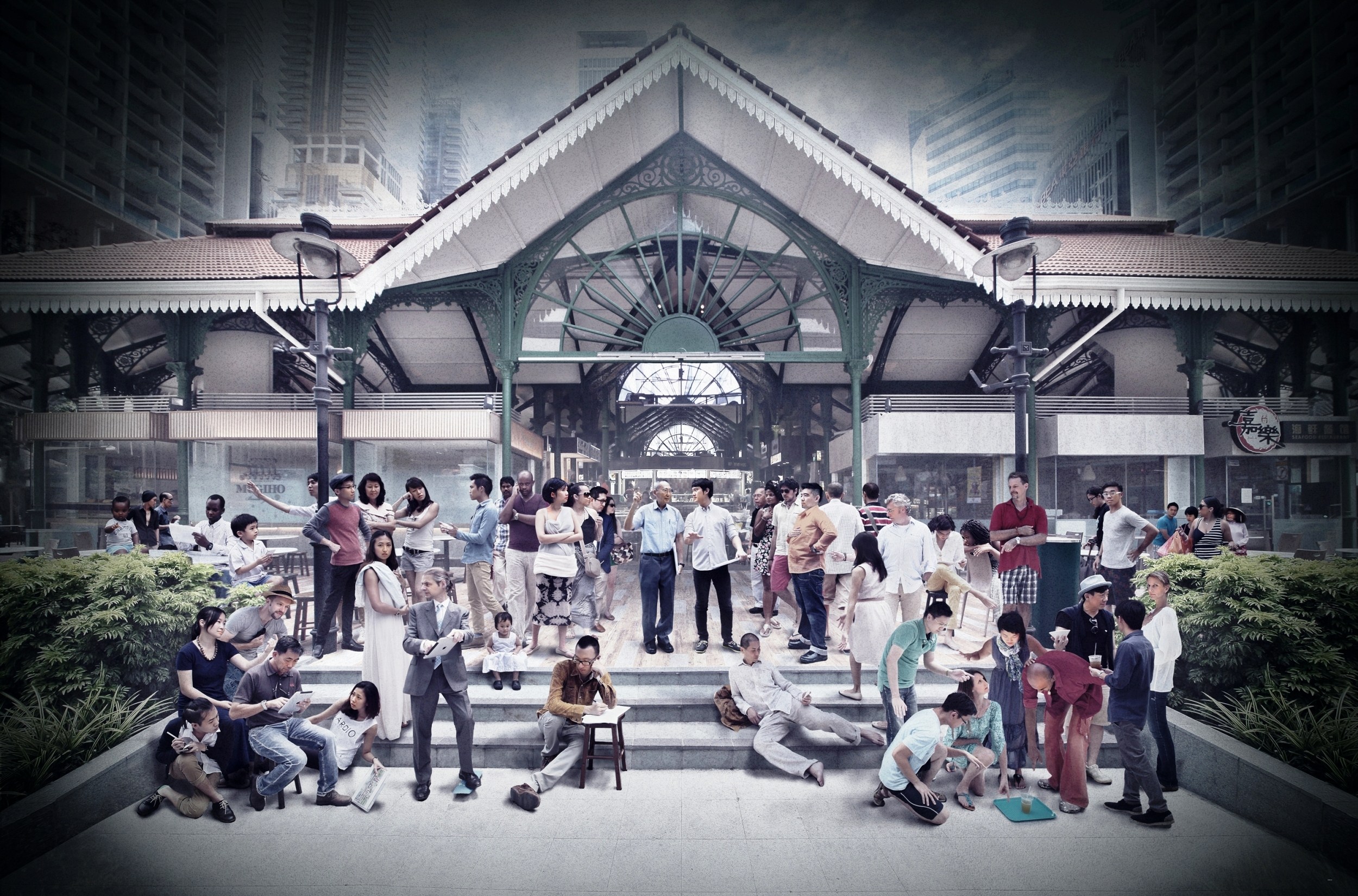
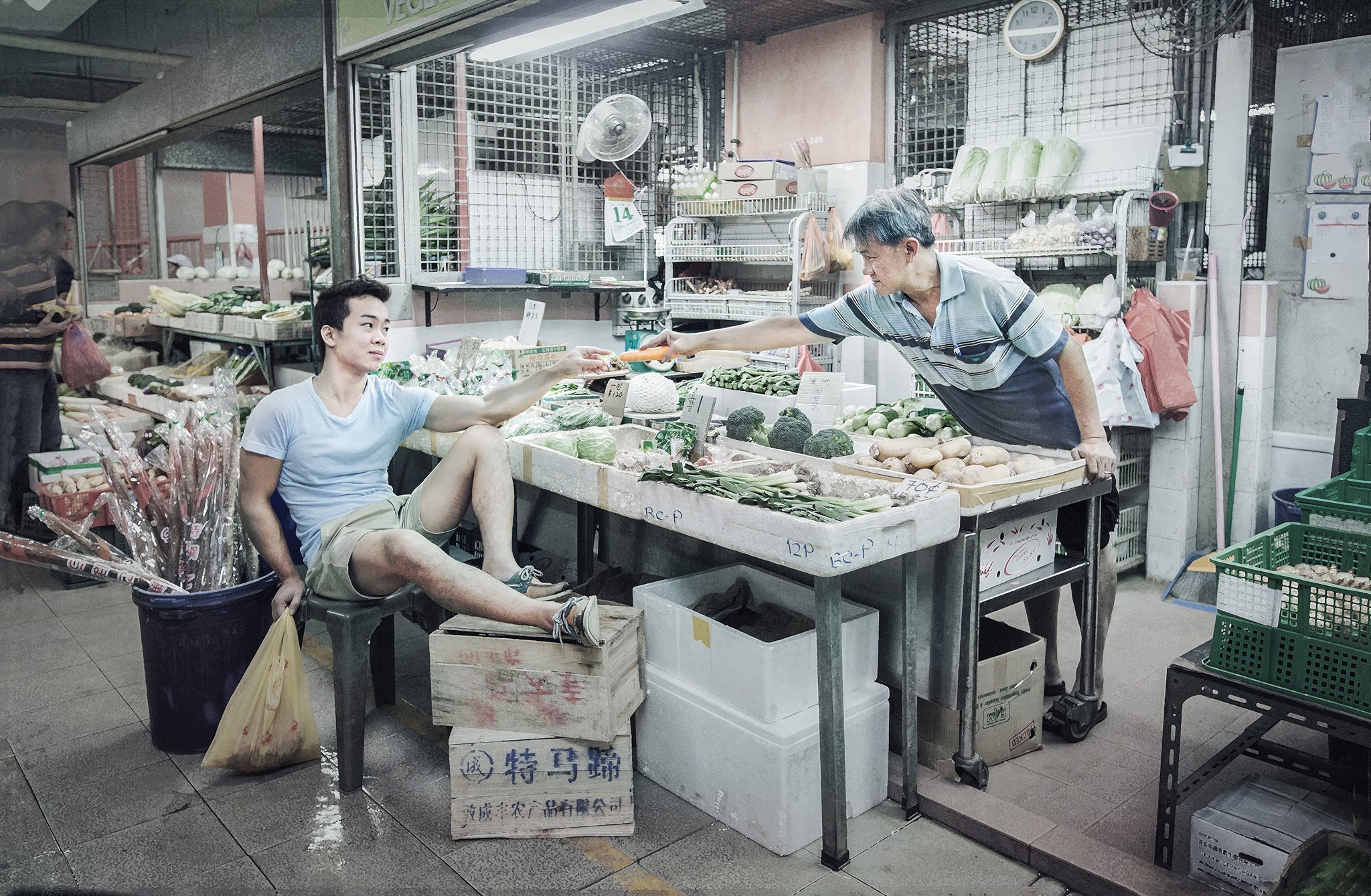
With my initial thought of using the eight page no staple zine, I had to have a picture for my final gigantic A2 spread. From my consultation with Prof Joy, she was telling me to make use of it properly and making sure it encompasses and holds my whole concept together. I wanted to portray how Singapore actually have the ability to make space for more seats for everyone but it is wasted so I thought the Marina platform will be the most apt location. Where else in Singapore will we have such a waste of space that is built with our hard earned money. I mean, we only use the space once a year for National day. ONCE a year with that amount of space taken up. What better way can you actually waste space in such a space constraint country?

So here are some of the shots I took

IMG_7042 IMG_7045 IMG_7047

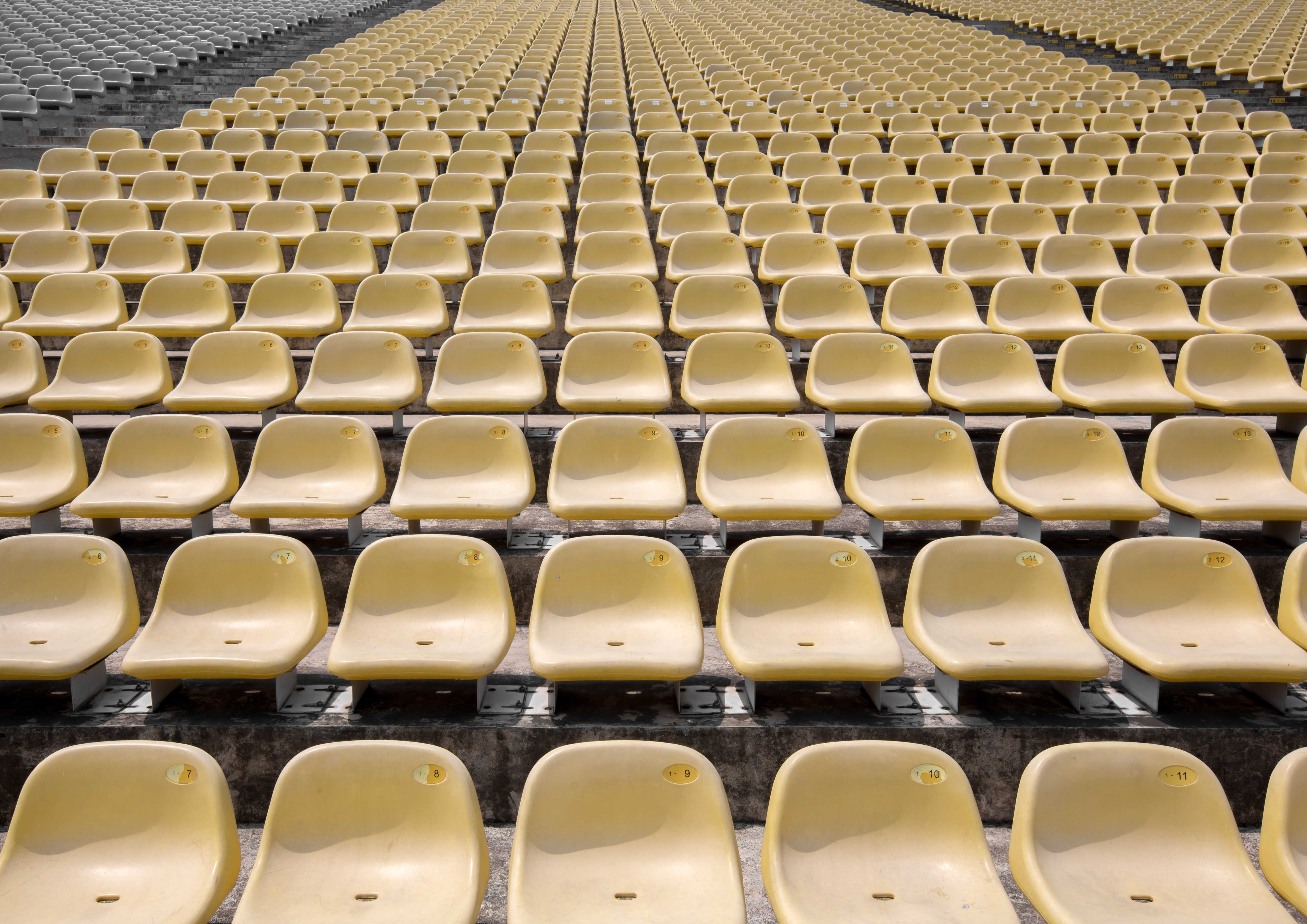
I mean, just look at the number of chairs man. This is not even half of what is present there. However, thinking further into it, I realised how my thought process for this and the point I want to bring out will not really surface in my viewers’ head if I weren’t there to explain it. And hence, I decided to go with the traditional folding pages and do without the no staple zine.


Process (editing and designing the spreads)

Now with all the photos taken, it was down to editing the pictures and adding necessary texts on them. I will keep this as short as possible and only mention the gist of my thought process. So here goes.

First and cover page

Paper 1 front

For this page, I made sure that both pages had a background that syncs with each other so it is more apparent that they are the same. In order to achieve this, I had to flip the background so the side with the same lighting will be in the middle.

Firstly, the most important point of these two pages is the fact that it is a three legged chair. In order to “break” the chair in photoshop, I went to search for pictures of broken plastic chair on google. It was really disappointing. I mean, I should have expected that. Who in the right mind would take a picture of a broken chair? So I had to do it myself. My process of making this was quite simple. I selected one leg of the chair after I cropped it out from the background and deselected some part of it to make it look jagged and broken. After which, I deleted that selected area and TADAH ! A broken chair from the back view.

For the overall aesthetics and layout, my initial picture had too much of the chair and too little of the background.

IMG_7033

I wanted more empty space for the front and back pages to look minimalistic and to have space for the title of my zine. In order to achieve this, I used a picture of the empty wall and scale it to become bigger before superimposing the cropped out chair on it. One small issue was that the chair had no shadow. I had to create a cast shadow for it on photoshop to let it look normal.

Front page

So that is it for the layout of the front and back page. As for the type on the front page, I wanted something short but something that can encapsulate the whole idea of the zine. So I came up with “Can I sit here”. Like how typical Singaporeans will ask for permission when they want. I arranged it in a way whereby they form a layout of a chair which will help with the overall concept of the zine.

As for the back page, I wanted to have something that will sum it all but bring across the point that there are some seats which you think or you see that you are able to sit on, but it actually isn’t. And hence, the sentence “no. not really” To answer the question on the first page and also to close off the entire zine.

Second and third page

Untitled-1

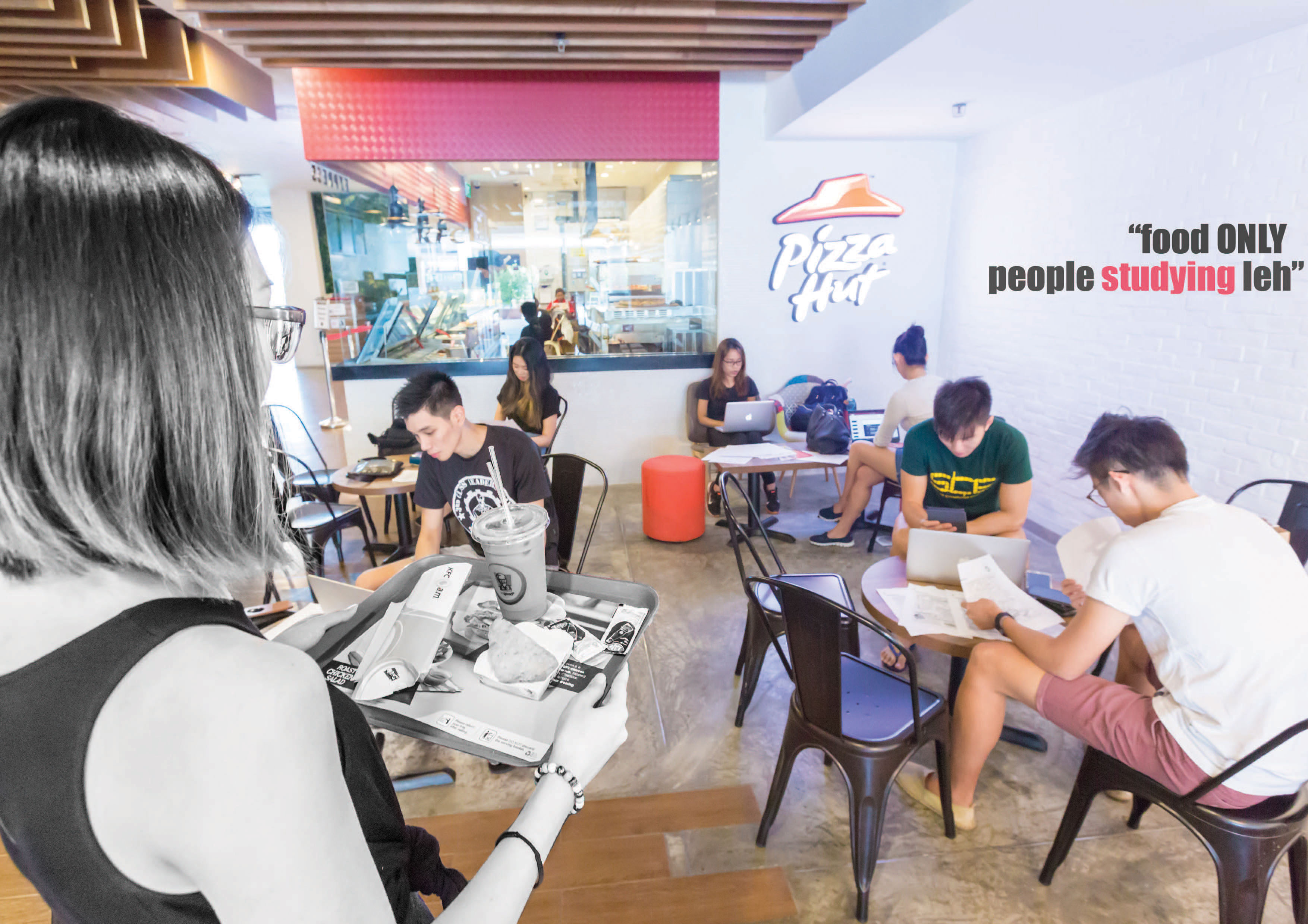
From this spread on, I had some parts of the composition that is made black and white and they are the protagonist of each spread. It is to signify that they are in a way, “disadvantaged” and rid of their entitlement to the seats. Like for this spread, the seats placed in Pizzahut/KFC is obviously meant for their customers who buys their food. But with the students hogging up the space to study, the customers are left with nowhere to sit.

For this spread’s words, it says “food ONLY. People studying leh”. Not only does it bring attention to my viewers that the antagonists are taking up the space wrongfully by studying, it is also meant to surface an underlying issue that Singaporeans, especially parents, focus too much on academic pursuit and sometimes, even neglect the basic need for food.

Fourth and fifth page

Paper 2 front

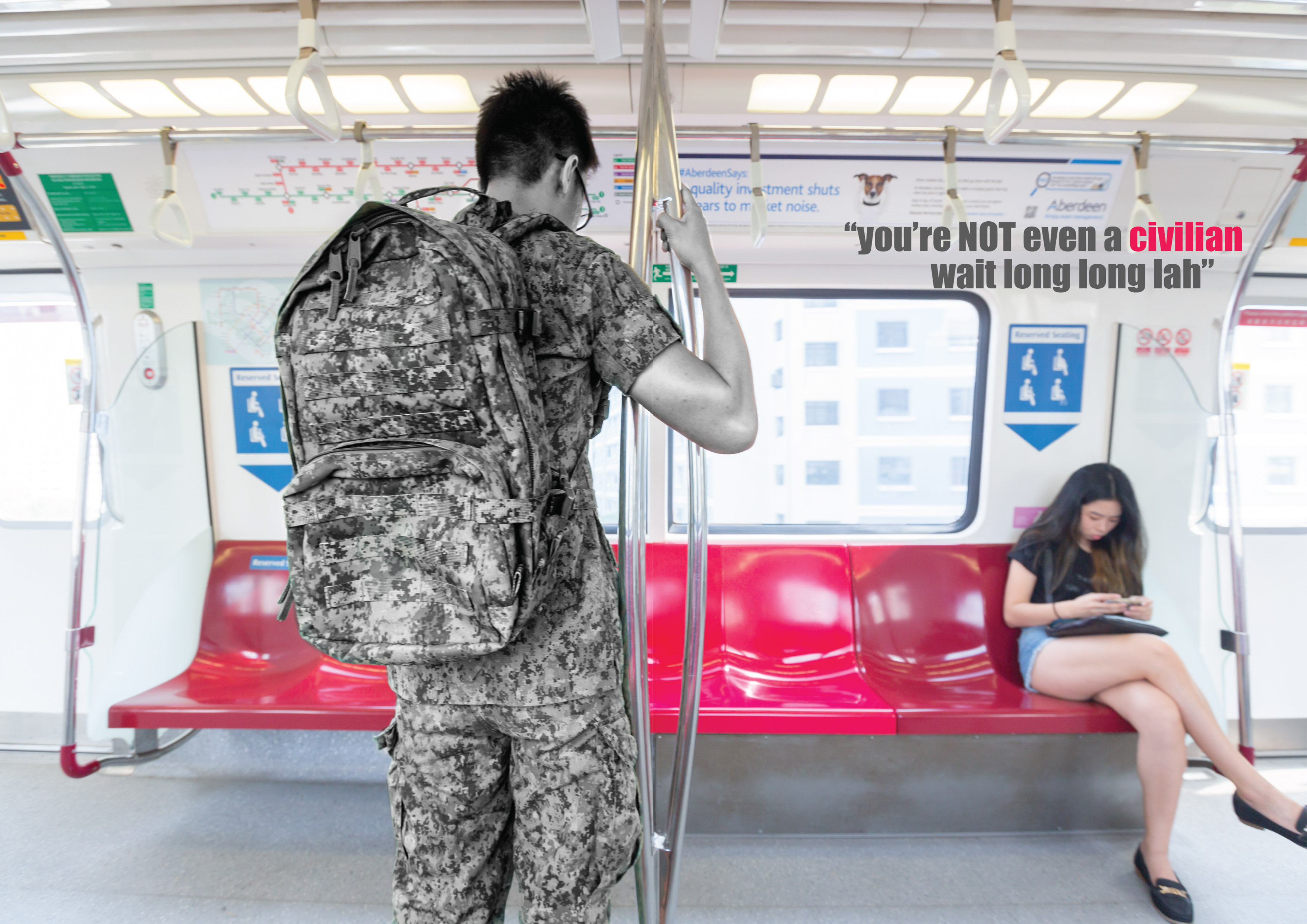
For this spread, the protagonist, which is the NSF, is black and white. Rightfully so because of the fact that he probably deserves the seat more than anyone else in the train for sacrificing two years of his life to serve the nation. However, just because of the social stigma, he dare not sit on the seat. If it was in the US or most other countries, he will be treated like a king and be offered a seat. I really feel that this aspect of Singaporean’s attitude has to change.

For the choice of words, I used “you’re NOT even a civilian. wait long long lah”. This is because, NSFs are always seen as one level below civilians because of how they are always seem to be expected of to serve the nation. And as the years go by, people just take them for granted and stop appreciating them any more. The phrase “wait long long lah” is a very Singaporean term when someone is trying to tell another person that he/she will never get what she wants. So i thought it was quite apt to include the quote here.

Sixth and seventh page

Untitled-1 copy

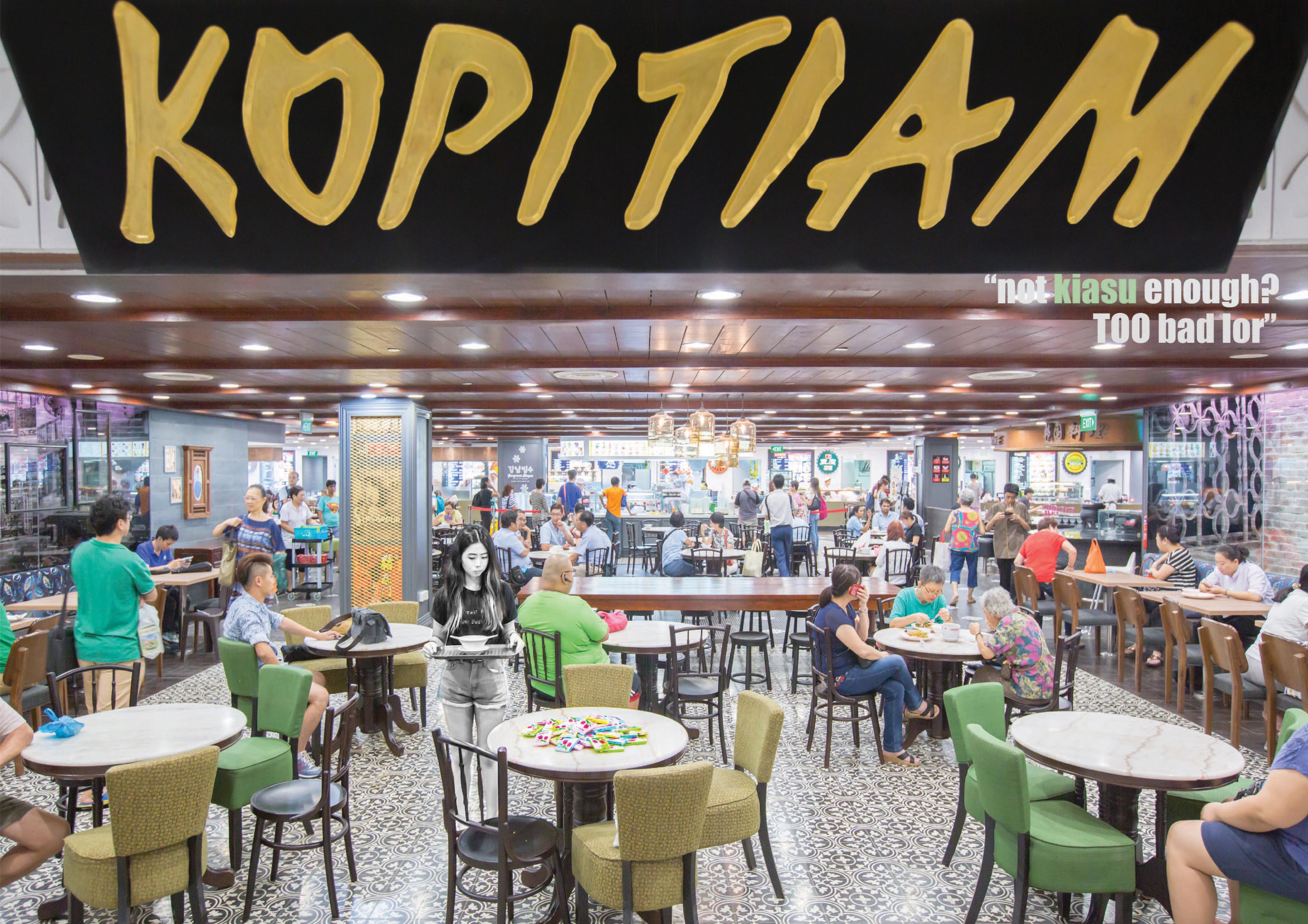
The last two pages of my zine that I will be discussing about is this page about using the tissue papers to reserve seats. For this particular spread, I did the same for the protagonist by making her black and white for her to stand out in the composition. What is different from this spread is that I actually increased the vibrance and clarity for the tissue paper packets to stand out more so it is more obvious.

As for the text, it says “not kiasu enough? TOO bad lor”. Kiasu is a term for Singaporeans who always want to be first in everything. This is to say that if you are not fast enough to make it apparent that you want the seat and actually doing something about it, then it is too bad for you that you cannot get a seat.

Choice of font and color for each of the spreads

For all of the spread, I wanted the picture to speak for itself as it is a photography zine and hence, I chose a relatively simple and clean font called “impact” as it is straightforward and clear with not much complications. I kept it standardised throughout so that they will look uniform and one. For the colors of the fonts, I chose specific words which were the “traits” of the antagonists which caused the protagonist to not have a seat they actually deserve. I picked the color from each of the spread so they will fit into the spread itself.

That is about it for my process of designing the zine.


Choice of paper and binding

Now that everything is done except making the zine physical, I will touch on briefly on my reason for choice of paper and the binding i chose.

For my choice of paper, I chose a 200GSM matte paper. I wanted something thick enough for my zine to feel like it is of quality but at the same time, not too thick that when I fold the pages, it will have ugly creases. Another reason as to why I chose this paper is that when I was looking through the papers that were available in the shop, I realised how the colorful inked parts of the paper were glossy while the rest were matte. I really liked that fact about it as it will help to emphasis the subjects and the focus of each of my spread.

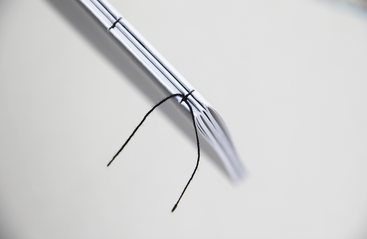
As for the binding, I wanted to sew it on initially so it will look more personal and like, more effort was put into making it. However, I realise that I need them to be tightly secured so that the pages will not show those at the back and destroy the look of each spread and sewing it will not be tight enough. Hence, I resorted to stapling it which worked really well and looked cleaner than expected.

Final deliverables

I have actually explained every concept and reasoning to each spread and the entire zine and hence, I merged both the process post and final into this. So, here are the pictures of the actual zines and there will be nothing to accompany it. Hope you all enjoyed reading my ultra long post of my thought and design process (prolly not) and thank you if you persevered till this point.

IMG_1565 IMG_1566 IMG_1568 IMG_1570 IMG_1571 IMG_1572

2D Project Three (Zine) Ideation & Research

Choosing one of the two and approach

For the first part of the final project, we had the choice between compiling all our previous works or building on previous projects and further exploring and developing them. I decided to choose the latter as I did not feel very much for last semester’s works and we only had two projects this semester. I really like both of the projects we had this semester but it was not difficult for me to choose between the two as my “Typographic Portrait” worked on having the video/interview element for the background. Hence, my zine was decided on further exploring the second project “Point of View”.

For my “Point of View” project, I used photo manipulations to exaggerate the situations my subjects are in, according to their respective facial expressions. I really like that I have the freedom to use photography to express what I want and hence, I thought, why not do something more exciting, but still within the medium of photography. And I came up with the idea of having mini installations/actors of my chosen topic and photograph it down for my zine. It is also linked to film like how I will be directing and setting up scenes to shoot in future for film.


Choice of topic 

I have had many many ideas for the content of my zine. For my initial concrete concept, I wanted to do something along the lines of showing what makes Singapore, Singapore. I wanted to have spreads which shows what food Singapore is known for.

Like make a spread on a classic coffee shop table with foods like chilli crab, char kuay teow, durians, laksa, ice kachang, bak kut teh etc etc.

Another spread on iconic places like esplanade, merlion, MBS, pasar malam, erp, ice cream carts, hbd flats, changi airport, singapore river, rocher colorful HDB, old hill street police station, shophouses in chinatown, sir stanford raffles, singapore flyer ,har pa villa, chinese and japanese garden etc. Like compile all of the photos into a photo montage on the A2 spread to showcase all of it. An example of a similar idea which was done for Berlin can be seen belowphotomanip berlin city

Credits: http://connormonkpca.blogspot.sg/

And having another spread on the words we say, like our singlish and the type of people (occupation) we can see only in Singapore- tissue peddlers, karang guni and ice cream man. 

However, I feel that it will be a little too much and too cliche. It was when I reached the brainstorming for activities that is unique to Singapore when I came up with parking coupons, queuing for stuff, chop-ing seats with tissues that I finally fixed on my choice of content.

I have always liked how my classmates can incorporate social issues into their work but all of my work till now have never really addressed any. And so I thought to make this final project count before I move on to my major in Film. For the reservation of seats using a packet of tissue paper, I realised if it was another country, people will just ignore the pack of tissue paper and go ahead and take the seat. Thus, it was only in Singaporean’s point of view that a pack of tissue paper on the table equates to the table being reserved.

And hence, my final choice of topic is about seats in the point of view of Singaporeans. About the issues with seats in Singapore which is unlikely to be seen elsewhere in the world.


Type and format of Zine

After deciding on my topic and also my medium which is photography, I had to decide what type of Zine I want to produce. I researched and looked through countless zines but photography zines still appealed most to me. I really like how aesthetically pleasing they look, especially with full spread pages and also, how they have an exaggerating lack of words as compared to other type of zines. So, it was easy for me to decide on the kind of zine I wanted to produce.

As for the format of zine, I am really into the eight page no staple zine as it will allow me to have an A2 spread of photo at the back of everything when the zine is unfolded. So that’s it for the type and format of my zine.


Research and inspiration

I looked up tens and hundreds of zines for inspiration on their format and how they arranged texts and pictures. I also looked out for interesting contents that I thought might be able to inspire me. So here are some of the zines I found.

https://pinthemall.net/pin/5583d1eeb4245/

Credits: https://pinthemall.net/pin/5583d1eeb4245/

This particular zine about nature was really aesthetically pleasing to me. All of their pages were full page pictures of fruits or plants with the facing page having either a minimal worded white space or a smaller picture with a nice composition.


195b7322718159.563173c173ce3 a5eab622718159.563173c1b7d97 edf0cc22718159.563173ca30f60

Credits: https://www.behance.net/gallery/22718159/Don-Quixote

This next zine is intriguing to me not because of its content but I like how minimal it looks. It forces the readers to focus their attentions on what is important and not go all over the pages. The thing that caught my attention most was it’s binding. The zine is sewn on very cleanly and I thought I might be able to use this method of binding if I were to use the traditional format for my zine.


afb15cde488a59cd703300b907a46bb7

Credits: https://www.pinterest.com/pin/296956169160603229/

This next zine that inspired me is a biography of a man. I like it because of its monochromatic theme. How it is devoid of colors and just black and white. Maybe I can do this for my zine? Or have some specific parts of my zine be black and white if it can emphasis a point. Apart from that, on the 5th spread from the top, it has a two paged spread which is something that I was looking for. I considered how A5 for each spread might be too small for my viewers to see the details of my pictures so I will most probably be using this format for each of my spread.


As for my approach to my topic, Proj Joy previously mentioned about “dude.sg” and the work he does. I went to see his works and they were really similar to what I imagined my work will be like. Some of his works that inspired me and I could relate more to, are shown below.

01-Food_For_Thought_Eugene_Soh_2014 The_Creation_of_Ahdam_2015_-_Eugene_Soh The_Last_Kopitiam_-_Eugene_Soh_2010

So with my approach and format of zine settled, now to move on to my process and my final deliverables.

2D Project Two (POV) Final

Adrenaline

So by now, everyone should know my underlying concept behind this particular choice of topic. For those who do not, I will try to summarise it here. For those who do, just skip this intro paragraph. I wanted to choose a subject that is intangible and after brainstorming for 1-2 weeks, I chanced upon a photo that inspired me while researching on “Adventure”. That is how my choice of topic came about. Upon further research on adrenaline, one article mentioned how adrenaline causes our senses to be escalated and makes us feel more than what we actually are. And hence, this entire project of “Point of View”, is based on that and specifically, how I interpret my subjects, as a photographer present at the scene, to be feeling at the moment I snapped the photograph of them.

So, without further ado, I will be introducing my final six panels and giving a short description on why I chose each of the particular manipulations for the original photos. The high resolution photos of each panels will be uploaded at the end of the post. Zoom in on their expressions if you all want. heh.

Disclaimer: No offence was intended for any of the manipulations. Please do not take any.


First and foremost, it is a photograph that I took during NTU CAC’s ball event. It was the moment when the pageant queen was crowned and her extremely elated expression made her look way more happy than I had expected her to be. Hence, my photo manipulation for this particular panel below, which will be explained in detail below the video.

For this panel, I banked on the level of happiness I think she was feeling at that point in time when the audiences passed her bouquets of flowers to congratulate her. Her expression is one of the happiest I have seen and this prompted me to exaggerate the scenario to show my interpretation of how I saw it. For this, I gave my subject a bigger crowd (which is represented by silhouettes of hands – cut off by the video here), a bigger crown (Miss Universe 2015’s crown) and a grander stage flooded with confetti. With these manipulations, I hoped to bring out the level of happiness I think she was feeling because of her adrenaline of being crowned.

The difficulty I faced with this panel was finding a suitable background and also, adjusting the color balance and lighting of both the pictures.


The original photo of my second panel was taken during an overseas trip to a kelong with my friends. It was the moment when one of my friend decided to jump into the sea from a platform, ONE metre off the sea level. Despite the fact that it was only one metre, her fear for the unknown sea gave her an adrenaline rush from fear and gave her a much more exaggerated expression.

For her exaggerated expression and body posture, I thought it was more fitting for her to be jumping off something way more significant and hence, I superimposed her jumping off a cliff that is super super high from the sea. Think the video speaks for itself.

The difficulties I faced for this manipulation was getting the lighting on my friend right to make it seem like it actually fits perfectly. Also, finding a photo with the scale of the background that fits the perspective of the original photo was quite a feat too. Glad this worked out rather well.


For my third panel, it was taken during a trip with my friends to another kelong. The subject, however, is not my friend but I sought her permission to photograph her (was working on my ADM Portfolio then). She was jumping off a 10 metre and her expression was totally epic. Look at it for yourself.

With an expression of such intensity and fear, I had to give her a much more exaggerated background to do her expression justice (hehe). And hence, I decided to superimpose her jumping off a stunt plane without any safety gears at all.

This panel was relatively easy to create as both of the shots were taken outdoors. The only thing I had to adjust was the warmth of the photos.


Moving on to my fourth panel, it is a shot that was taken during my client’s birthday shoot. It was a moment where a kid was chasing a man with a water balloon in her hands and the man played along and pretended (or actually was because he did not want to get wet) to be afraid and ran away from her. This is the only panel that has no expression shown but I thought his actions were exaggerated enough from the adrenaline he was experiencing. Hence, it was chosen.

I super imposed this shot on a situation like that of a fugitive who escaped via his vehicle but crashed and was forced to flee on foot. However, he was rounded up by the army and was forced to surrender.

For this shot, I had to edit three different photos in. Apart from cropping out the photos, I had to ensure that the colors and lightings/shadows fit the background. To make it more real, I added a cast shadow for the man running away and the soldier’s side shadows.


For my second last panel, the original photo was taken on yet another birthday party shoot. For this shot, my lady subject was afraid of getting wet from the water balloon her nephew mischievously placed on her head. Her expression showed so much fear that I felt bad for her.

With that level of fear on her face, I thought it was quite apt for me to superimpose this shot as a hostage situation. The lady’s nephew smile made him look slightly sinister and sadistic and hence, that inspired me to make him a super villainous man, holding the subject and threatening her with a parang.

I faced quite a few difficulties with this particular manipulation. Firstly, it was the choice of background. I wanted to choose a typical desert background which terrorist groups’ usually film their execution videos in but it looked a little too empty. And hence, after my first consultation, I chose a warehouse background instead. The other difficulty that I faced was to get the parang, my subjects and the warehouse to look like they are one photo. The lightings and temperature of each individual photos were too distinct and it took me quite a lot of time to get it right. Lastly, this was the first photo that I had my subject’s expression edited. I made the man look more vicious by editing his face to be more like an evil grin. His eyebrows were edited to converge more into the middle and his smile was made longer. I am quite pleased this turned out relatively well too.


Last but not least, for my last panel, the original photo was taken when my friends were having a balloon fight during a birthday surprise. My subject’s fear for balloons gave her an adrenaline rush rising from her fear for it and gave her a much more intensified expression.

With her squinted eyes and body posture that looks as though something big was coming towards her, I decided to superimpose her as shown above. It is a typical exaggerated movie scene with all kinds of different weaponry aimed and targetted at one single target.

The difficulty with this was getting the lighting right, really. Because of the background which is smoked and have a relatively well balanced outdoor lighting, it was really hard for me to edit my subject to get the same effect. I tried my best and the results was still not perfect. Still looks decent, i hope.


But yeah, I am really glad this project made me explore photoshop and photo manipulations in particular more. I am pretty sure these will be really useful for me in future, as a photographer and a videographer. Hope everyone had a good laugh looking at my presentation and photo manipulations.

Here are the high resolution photos!

Aish Claire gun JUMP kidnap MissU

Thank you

2D Project Two (POV) Progress

So, after consulting Prof Joy and hearing what other classmates had to say, I moved off entirely from my previous approach of wanting to actually get myself into exhilarating situations and getting a shot from my point of view when doing it. I personally felt that it would not have been so much of an effect as, after all, pictures are still pictures. I cannot really get others to feel what I felt. Maybe to a certain extent but definitely not the intensity I did when I am doing the particular activity.

Hence, I decided to go with my second ideation which was to base the project on enhancing photos. Building on the point where adrenaline elevate our senses and makes us feel more than what we usually will experience. However, I will not being using photos from my own point of view but rather, I decided to make use of my photo collections as a photographer. To search for photos that I have taken which shows exaggerated expressions on my subjects’ faces and subsequently, edit the photos’ backgrounds to suit what I, as the photographer, interpret my how my subjects were feeling at the point when I snapped the photograph.


Here are some of the photos that I considered but were not chosen for the final submission.

CAMERA

IMG_0209-2 IMG_0526-2 IMG_1611-2 IMG_1813-2 IMG_1937-2 IMG_2268-2 IMG_9609-2 IMG_9804-2-2 IMG_9820-2

These are 10 photos that did not make the cut for my final submission. Either because they have too many parts that were cut off by the people around/backgrounds, or their expressions cannot really be used in other situations. Looking through all these photos and my subjects’ expressions really brings me back to the moment I snapped them. Photographs are really amazing aren’t they. Allowing us to freeze moments for eternity and letting us relieve moments when we want to.


After all the filtering and brain storming about what pictures can be manipulated, I finally decided on the final six photos that I will be using for my panels and here they are. Below each photos are the reasons as to why they are chosen.

IMG_1848

First and foremost, I chose this photo which was taken during one of my client’s son’s birthday party. This particular moment is when everyone was engaged in water gun and balloon fight and one of the kids was chasing an adult with a water balloon in her hands. The man played along and pretended to be afraid of her and let her chase him with the balloon. Although in this photo, the expression of his cannot be seen, his actions do show exaggeration from possible adrenaline. This is an example of adrenaline caused by mostly fun.


DSC03076-2

The second photo that I have chosen was taken during my overseas trip with my friends. In this particular shot, my friend was jumping off a platform that is only one metre off the sea level. Although it seems (and actually is) quite a simple feat, the expression on her face showed otherwise. This is an example of adrenaline caused by mostly fear.


IMG_6374-2

The third photo that I have picked was snapped at my friend’s surprise birthday party. This particular moment was when she was having a balloon fight with another friend of ours. Although it was just balloons, her being extremely afraid of balloon caused her to have such an exaggerated expression. This is a good example of adrenaline caused by both fear (from the balloons bursting) and fun (from the friendly balloon fight).


IMG_6086-2

This fourth photo is one of my favourites. I met this lady during one of my trips with my friends and she gave me permission to take photos of her (I am not a pervert). For this shot, the lady was jumping off a 10 metre board walk and into the sea. If you can zoom in and look at her expression, you will see how frightened she actually was. This is a photo that shows adrenaline causing reactions and expressions that are caused by fear.


IMG_0522-2

For the fifth photo that I have chosen, it is an example of adrenaline arising from joy. This was snapped when NTU Cultural Activities’ Club pageant was crowned and she was receiving bouquets of flowers from the audience. Her expression shows that she is extremely elated and hence, this is also chosen as one of my final panels.


IMG_1843-3

Last but not least, it is this particular photo that was taken during another of my client’s birthday party. This was when a lady was threatened with a water balloon by her niece. Although it was all in the name of fun, the lady who really did not want to get wet, experienced adrenaline caused by fear. And hence, having such an exaggerated expression.


These are the six photos that I have chosen to manipulate for my final submission. With the selection of photos done, I moved on to finding pictures that can be superimposed on my photos to make them look more exaggerated and allow my viewers to see what I interpreted my subjects to be feeling.

Challenges faced

Honestly, I have always avoided photo manipulations and editing on photoshop because it is so complicated and I am really lazy. I am actually quite glad this project give me an official reason to do it and I “had no choice”. It turned out to be quite fun. Although the pictures seem to be quite easily manipulated, like just stack a picture there, stack another picture here, it is actually way more complicated than it is.

Firstly, I have to imagine what background/situations my subjects can be superimposed on. After which, I have to search through thousands of photos to find one that can be used. One that can fit the mood, one that has the right scale so my subjects do not look too big or small in it and one that has enough MP to not look grainy when printed. (Trust me, this took the longest time of all process)

After selecting the suitable images, I have to crop out whatever was not needed in my original photograph. This means that for all of my photos, I have to crop and cut my subjects to isolate them from their original backgrounds. I have to follow point by point around them to separate them from the original background. Other than that, for the photos that I want to use to superimpose on my images, I too, have to crop them.

After cropping all the photos and stacking the layers together, I had one last thing to do. As all the photos are of different environments, some are warmer, some are cooler, some are indoors, some are outdoors and have different cast shadows, I have to tweak every single minute details in order for the photos to look like they are one. Hence, the last step is necessary for the photos to not look out of place.

Here is an example of three photos that I am planning to merge together to form one of my panels. It is supposed to become a hostage situation in a warehouse.

IMG_1843-3warehouse My Parang 12 Inch Heavy-Duty Duku Chandong Parang Machete - 5160 Carbon Steel Model MYPCDGT12.1

As you can see, my original photo is outdoors and a whole lot more warm than the background image of a warehouse that I am going to super impose it on. Hence, apart from the warmth of the pictures, I have to also edit the lighting that is shone upon my subject. That is after I finish cropping my subject and the parang out of it’s background.

That is more or less it for my process post. Hopefully everything will turn out as I intend for it to and the print will be good!

2D Project Two (POV) Research

Research all on adrenaline.

Adrenaline: “The Energy Molecule” Adrenaline, technically known as epinephrine, plays a large role in the fight or flight mechanism. The release of epinephrine is exhilarating and creates a surge in energy. Adrenaline causes an increase in heart rate, blood pressure, and works by causing less important blood vessels to constrict and increasing blood flow to larger muscles. An “Epi-Pen” is a shot of epinephrine used in the treatment of acute allergic reactions.

An ‘adrenaline rush’ comes in times of distress or facing fearful situations. It can be triggered on demand by doing things that terrify you or being thrust into a situation that feels dangerous. You can also create an adrenaline rush by taking short rapid breathes and contracting muscles. This jolt can be healthy in small doses, especially when you need a pick me up.

A surge of adrenaline makes you feel very alive. It can be an antidote for boredom, malaise and stagnation. Taking risks, and doing scary things that force you out of your comfort zone is key to maximimzing your human potential. However, people often act recklessly to get an adrenaline rush. If you’re an ‘Adrenaline Junkie’ try to balance potentially harmful novelty-seeking by focusing on behaviors that will make you feel good by releasing other neurochemicals on this list. ”

Source-https://www.psychologytoday.com/blog/the-athletes-way/201211/the-neurochemicals-happiness


So yes, that is essentially what adrenaline is, when it gets released and what it can cause or help with. Sounds like lots of fun if you ask me. I decided to approach this project with photographic work as I feel that the ability to capture the hundredth of a second when adrenaline rush happens is really amazing. It freezes a moment you can never fully recreate and it allows others to experience what you did to a certain extent when they look at the photo.

Here are some of the photos I found when researching online which are similar in ideation to what I may be doing.

These two are taken by a 21 year old Ukraine daredevil turned photographer who climbs architectural building around the world and takes a shot from the top of it. A unique angle and act that no one has actually accomplished before.


mountainbike

MTI4OTkzODQzNTY2NjE5MjY3

Also from here, I found this picture of a mountain biker and a motorcyclist in action. This made me realise that the slight use of motion blurness while capturing the image can also aid in bringing the viewers into mood and helping them with getting the point of view of an ongoing action.

Apart from the cliche moments of adrenaline rush, I also found out that adrenaline is used to treat life threatening emergencies like a cardiac arrest or a severe allergic reaction. More information on those can be found here. This opened my eyes to the medical purposes of adrenaline which I never knew and I thought these might be an area I can approach to raise some awareness.

Last but not least, I chanced upon a website about the symptoms of adrenaline and I found the point about heightened senses really intriguing. We always experience adrenaline rushes but we do not actually realise that our senses are heightened when we are at that moment. But thinking about it, they do actually get heightened and we feel more for the moments, which probably makes us like adrenaline rushes more. Hence, I think I can approach this matter in a way to digitally enhance the photos to achieve better effects like how adrenaline does to our senses.


Some of the pointers I took away from the presentation in class were thinking about whether the situations that brings about adrenaline rushes are:

Controllable or not 

Arose because of danger or joy 

Different circumstances and places where the adrenaline rushes occurs

Different situations that causes it to arise like time limitations or limited objects 

Different point of view in the same situation from different people 

2D Project Two (POV) Initial Ideations

Topic chosen: Adrenaline

I was thinking about a tangible object that is black and white in color and I thought of a die and how it is adrenaline in the point of view of a board gamer. And being a person who loves taking risk, driving cars at 150km/hr, and doing crazy stuff made me think of and choose adrenaline instead. So here goes.


  1. Adrenaline from my point of view is driving a car at 150km/hr.
  2. Adrenaline from the point of view of a board gamer is seeing the die roll.
  3. Adrenaline from the point of view of a gambler is opening his last card that he just drew.
  4. Adrenaline from the point of view of a mountain biker is losing traction on a rock while going downhill.
  5. Adrenaline from the point of view of a 2 year old is being lifted up in the air.
  6. Adrenaline from the point of view of a 80 year old grandfather is seeing his grandchild for the first time.
  7. Adrenaline from the point of view of a mother is feeling her baby kick for the first time.
  8. Adrenaline from the point of view of a girlfriend is stealing a slap on the butt of her boyfriend in public.
  9. Adrenaline from the point of view of war soldier is narrowly escaping from an airstrike.
  10. Adrenaline from the point of view of a skydiver is jumping off the plane.
  11. Adrenaline from the point of view of a ghost is successfully scaring a grown up man.
  12. Adrenaline from the point of view of James Bond is hanging by a 80 storey building.
  13. Adrenaline from the point of view of Harry Potter is riding on a flying broom stick.
  14. Adrenaline from the point of view of thunder is seeing little children hide under the bed from its roar.
  15. Adrenaline from the point of view of a groom is lifting the veil of his bride.
  16. Adrenaline from the point of view of newly wed couple is having their doors knocked in the middle of the night.
  17. Adrenaline from the point of view of a marathon runner is seeing the finishing line.
  18. Adrenaline from the point of view of a boy is receiving a text from his crush.
  19. Adrenaline from the point of view of a person experiencing cardiac arrest is a saviour.
  20. Adrenaline from the point of view of a person having allergic reaction is relief.
  21. Adrenaline from the point of view of an ECG is an increase in erratic reading on the graph.
  22. Adrenaline from the point of view of a light sleeper is insomnia.
  23. Adrenaline from the point of view of a thief is stealing something.

Typographic Portrait Final Submission

Overlaying concept

I firmly believe that we cannot change what someone sees us as and we can only learn what they think of us and improve or become it

and no matter who or what we think we are and even though our own opinions matters most, we are still what others think we are.


Take for example, if we see ourselves as trustworthy people but if our friends never ever approach us when they need help, we know that we are not actually seen as someone who can be trusted or depended on.


Hence, for this project, I decided to collaborate with three of my closest friends to find out what they actually think of me and what attributes will they tag me with. I chose to use a 4D medium as I am going to major in film and used recorded interviews played in the background for all my panels. After I interview them, I had them design the type for me to carve out of the paper to allow the videos to penetrate through and play while I am presenting the respective panels while I discuss with them and design the backgrounds in accordance to what I think they meant.

To set expectations right, all the background are intentionally minimalistic and only in black and white so it does not take away the attention of the interview that is concurrently playing in the background during my presentation. Also, to explain why only part of their faces can be seen through the cut outs of the typeface, it is deliberately done as whatever others may say of us, we will unconsciously filter what they say of us and take in only what we want to. Hence, having the panels in the same way like how the view of the interview is “filtered” through the cut outs.


First Panel
Without further ado, let me present the very first panel by my first semester’s classmate, Toby. We worked on several projects together and we always stayed back together and even travelled together as a clique and hence I thought it was quite appropriate for him to be a candidate of mine. So here is the panel that both of us designed.

Intense

The attribute he gave me was that I am a very intense person. The typeface is designed so as to portray that I am intense in the sense that when I decide on the direction, I will go all the way dead set. Hence, the strokes of the letters are extended to the end of the panel. As for the background design, I decided to play with a slight optical illusion whereby I have arrows all converging into the middle of the picture. As if to imply that the focus is on me and as it gets closer and closer to me, it gets more packed and more intense to the point where all the points join each other.

I will let the interview that I played behind the typography do the rest of the explaining of the attribute.


Second Panel

The second candidate that I chose to interview is my Secondary school friend, Wen Qi. She has been my friend for close to ten years now and I would say she knows me better than most of my friends. Here is the panel we collaborated and designed.

Wenqi

The attribute she gave me was that I follow my heart in the things I do. She designed the typeface following how a heart beat will look like on an ECG monitor. As for the background, I dotted the grids of an ECG to make it more apparent. Hence, for this panel, it is my name following the pattern of a heart beat and it shows that I follow my heart.

As with Toby, I will leave the rest of the explaining of my attribute to her interview


Third Panel

Last but not least, the final person I chose to interview is my girlfriend, Nathalie. I do not think I need to explain why she was one of my chosen candidate so let us move on to the panel that we designed together.

Nathalie

The attribute for this panel is that I am observant. The type is designed in a way where the letters are in perspective and they are all looking at different directions. With G seemingly looking to the left, A down, R up, and Y to the right. For the background, I drew a landscape with mountains and seas to allow the type to seem like they are observing the nature all around them.

Here is the interview with Nathalie that I have conducted which will explain what she meant


And for the very last panel, it is designed solely by me and is meant to end off my entire presentation where by I will hold it up and end it with saying “I am Gary. And I am who you think I am”

DSC00178

The typeface is designed in a way where they all merge to form an outline of a camera. The details were added in with permanent marker to make it more evident. Camera as I am a photographer and most people know me as one. The medium used for this panel is reflective paper as it serves the purpose I needed; which is to reflect the face of whoever is looking at the type and allowing them to see themselves.

For presentation, I held this panel in front of my face and showed it to everyone in the class. Hence, while everyone is looking through the cut outs of the type, they are able to look at themselves in the reflective paper as well. It is to signify that no one can actually see all of me and there is always some part of me that will never be shown but whatever they see me as, through the cut outs, will be what I am to them.

Hence,

I am Gary

And I am who you think I am.

Typographic Portrait Final Process

So after receiving the designs of the type from my friends, I digitalised and compiled them altogether. I decided have the medium of my panels be thick black papers. Thick so that the video of the interview from the screen behind it will not shine through and distract the viewers from looking at the typography itself.

In order to do the cutting of the type, i decided to print out all 4 of the types and placing them on top of the black papers before cutting them out. Here are some of the pictures of the painful process.

CuttingZoomed in

It took me approximately 10 hours to cut all 4 panels as the paper was really thick and some of my friends were obviously out to kill me. The type had so many curves and it was so tough for me to control the penknife to avoid slipping and cutting excess.

I was relatively pleased with the end products as they only had one or two minor mistakes here and there and they were not obvious. So here goes, the panels before the back ground designs.

This is from Toby. The easiest one as it was all block letters and all straight lines. So all I had to do was to use a ruler and the penknife to follow the lines.

Toby

This second one is by Nathalie. Still relatively as it consists mostly of straight lines with only a few curves here and there.

Nathalie

This is from my secondary school friend, Wen Qi, and she was obviously out to kill me with the number of curves and the narrowness of the type.

Wenqi

Last by not least, the type created by myself. It is fairly simple as I do not have a death wish for myself.

Me

With the interview videos and the cutting of the type done, I am only left with the design of the backgrounds of my panels.

I made use of an old file which was transparent to draw on it and illustrate how the design could be. IMG_9660

Stay tuned for the final post for all the completed designs and what each of them represents!

Typographic Portrait Process

Firstly, I apologise for the delay in posting. Just got to check my email and NTUlearn and just got to know about the required posting so here goes.

After the past few weeks of interviewing and discussing with my friends and also, with the decrease from 6 to 4 panels, I decided to remove my first panel which was meant for the introduction. My introduction will hence be all spoken and not illustrated via a panel. The first three panels will each be an attribute given by my friends and the last will be something that will summarise and explains my underlying concept.

For them all, my friends will be designing the type and I will be completing it with designing the background.

So here goes. For my first friend, she created the type and here it is.

1

This one is done with playing of the perspectives of the letters for them to be looking at all four directions.

The second one is this

wq

It is one which shows my name in a font which is similar to an heartbeat on an ECG monitor.

And last but not least,

3

This is to show when I decide on the direction I go all the way deadset like how the letters of my name elongate and reach to the corners of the frame.

Last but not least, my own one.

Screen Shot 2016-02-13 at 2.14.33 pm

As cliche as it might be, it is just my name written to be in the form of a camera as I really appreciate and love what the camera does for us.

That is all. All for the presentation on Monday!

Typographic Portrait ideation

After presenting on my initial research on hand made typography and having Proj Joy see what I have presented on, she suggested that I should think of collaborating with others for this project. This is because I presented on having hand written types superimposed on photos and if a visual artists were to superimpose his type on a photographer’s photo, that will technically mean that he is collaborating with the photographer.

This set me thinking about collaboration and I came up with my overlaying concept which is that, we are actually, prominently what others think of us as. I mean, if we think that we are trustworthy people, but everyone around us who interacts with us do not see that we are, then we are technically not trustworthy. It is either we are doing what we are doing wrongly or we are just not doing the right thing enough. 

Hence, I decided to collaborate with four of the closest people in my life. Those who have spent the most time with me recently. My idea is to get them to think of an attribute that they can best tie me up with and then, we will collaborate and work something out together. As for the last two panels, they will be fully designed by myself and they will encompass and summarize the entire project. 

Some of the attributes that they have come up with were: Reliable, Intense, Appreciates that there is beauty in everything, genuine, honest, strong and I see the beauty in the mundane. Some of these initial ideas were really quite interesting attributes of myself which I have never really thought of myself. This actually proved my point about how our attributes are actually what others think of us, as some of these attributes were not even apparent to even myself.

Now to figure how this idea can actually work and maybe make them flow as one piece.

Throughout the week, I managed to meet up with all of the friends whom I am going to “interview” and managed to work a few things out. Here is one short clip of the interview I did with one of my friends! Just a little teaser! Stay tuned for the full clips during submission week