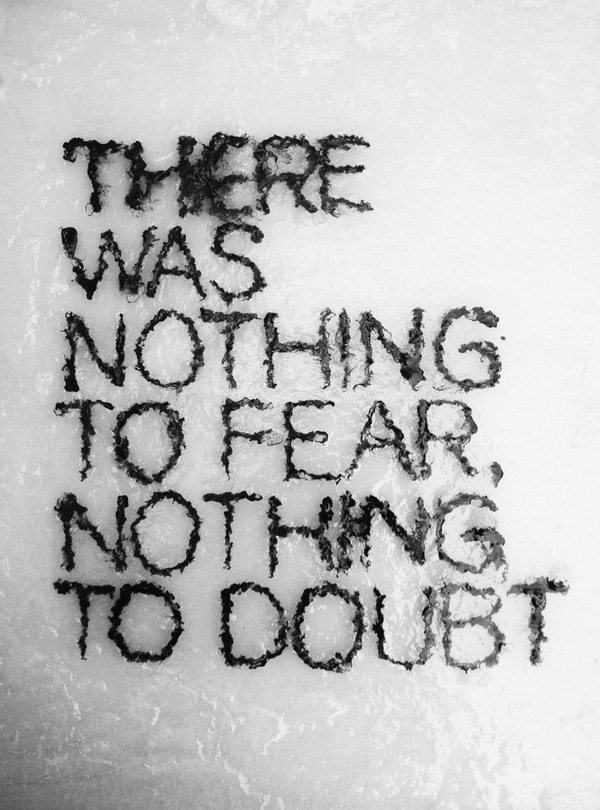
Typographic Portrait Final Submission

Overlaying concept

I firmly believe that we cannot change what someone sees us as and we can only learn what they think of us and improve or become it

and no matter who or what we think we are and even though our own opinions matters most, we are still what others think we are.


Take for example, if we see ourselves as trustworthy people but if our friends never ever approach us when they need help, we know that we are not actually seen as someone who can be trusted or depended on.


Hence, for this project, I decided to collaborate with three of my closest friends to find out what they actually think of me and what attributes will they tag me with. I chose to use a 4D medium as I am going to major in film and used recorded interviews played in the background for all my panels. After I interview them, I had them design the type for me to carve out of the paper to allow the videos to penetrate through and play while I am presenting the respective panels while I discuss with them and design the backgrounds in accordance to what I think they meant.

To set expectations right, all the background are intentionally minimalistic and only in black and white so it does not take away the attention of the interview that is concurrently playing in the background during my presentation. Also, to explain why only part of their faces can be seen through the cut outs of the typeface, it is deliberately done as whatever others may say of us, we will unconsciously filter what they say of us and take in only what we want to. Hence, having the panels in the same way like how the view of the interview is “filtered” through the cut outs.


First Panel
Without further ado, let me present the very first panel by my first semester’s classmate, Toby. We worked on several projects together and we always stayed back together and even travelled together as a clique and hence I thought it was quite appropriate for him to be a candidate of mine. So here is the panel that both of us designed.

Intense

The attribute he gave me was that I am a very intense person. The typeface is designed so as to portray that I am intense in the sense that when I decide on the direction, I will go all the way dead set. Hence, the strokes of the letters are extended to the end of the panel. As for the background design, I decided to play with a slight optical illusion whereby I have arrows all converging into the middle of the picture. As if to imply that the focus is on me and as it gets closer and closer to me, it gets more packed and more intense to the point where all the points join each other.

I will let the interview that I played behind the typography do the rest of the explaining of the attribute.


Second Panel

The second candidate that I chose to interview is my Secondary school friend, Wen Qi. She has been my friend for close to ten years now and I would say she knows me better than most of my friends. Here is the panel we collaborated and designed.

Wenqi

The attribute she gave me was that I follow my heart in the things I do. She designed the typeface following how a heart beat will look like on an ECG monitor. As for the background, I dotted the grids of an ECG to make it more apparent. Hence, for this panel, it is my name following the pattern of a heart beat and it shows that I follow my heart.

As with Toby, I will leave the rest of the explaining of my attribute to her interview


Third Panel

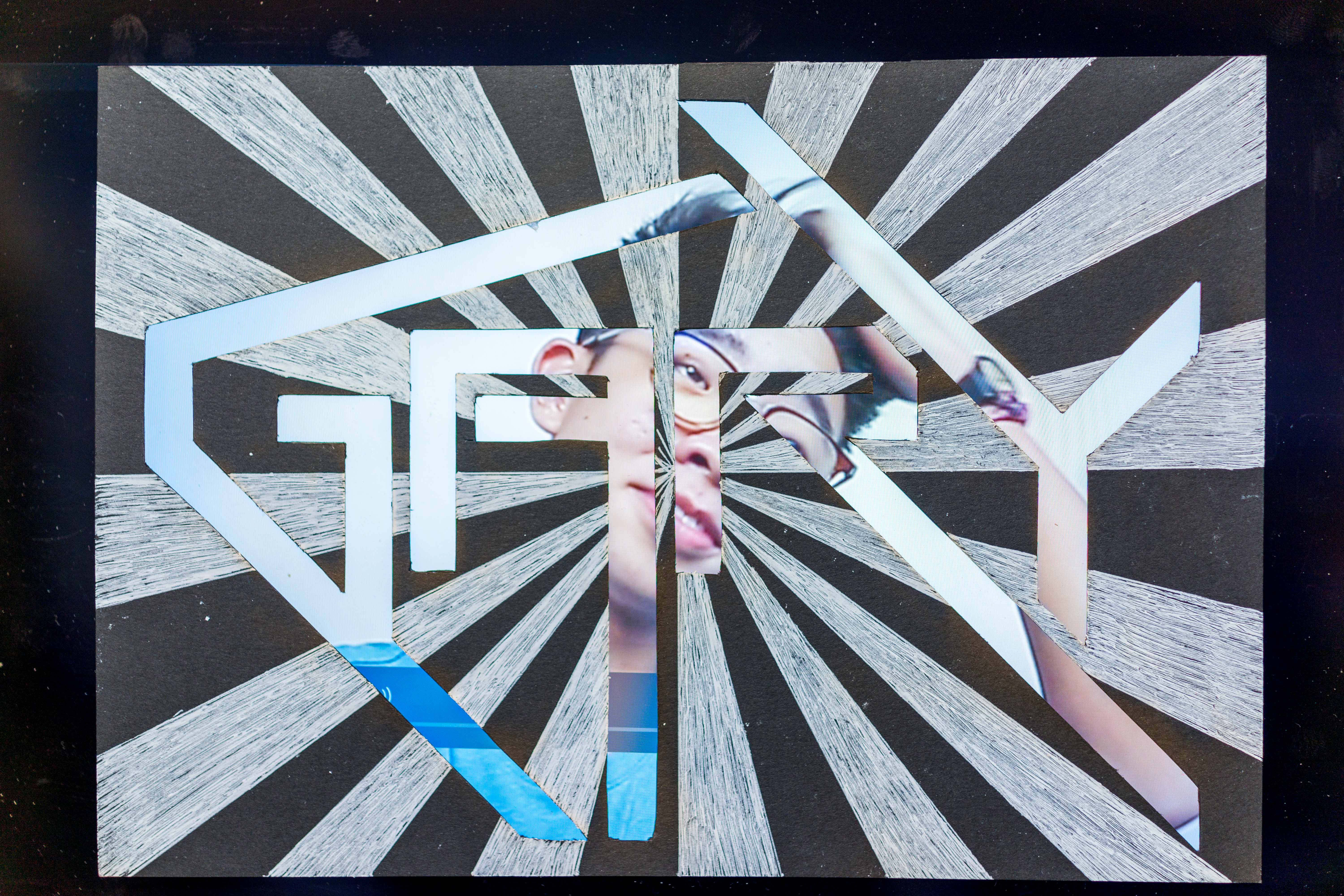
Last but not least, the final person I chose to interview is my girlfriend, Nathalie. I do not think I need to explain why she was one of my chosen candidate so let us move on to the panel that we designed together.

Nathalie

The attribute for this panel is that I am observant. The type is designed in a way where the letters are in perspective and they are all looking at different directions. With G seemingly looking to the left, A down, R up, and Y to the right. For the background, I drew a landscape with mountains and seas to allow the type to seem like they are observing the nature all around them.

Here is the interview with Nathalie that I have conducted which will explain what she meant


And for the very last panel, it is designed solely by me and is meant to end off my entire presentation where by I will hold it up and end it with saying “I am Gary. And I am who you think I am”

DSC00178

The typeface is designed in a way where they all merge to form an outline of a camera. The details were added in with permanent marker to make it more evident. Camera as I am a photographer and most people know me as one. The medium used for this panel is reflective paper as it serves the purpose I needed; which is to reflect the face of whoever is looking at the type and allowing them to see themselves.

For presentation, I held this panel in front of my face and showed it to everyone in the class. Hence, while everyone is looking through the cut outs of the type, they are able to look at themselves in the reflective paper as well. It is to signify that no one can actually see all of me and there is always some part of me that will never be shown but whatever they see me as, through the cut outs, will be what I am to them.

Hence,

I am Gary

And I am who you think I am.

Typographic Portrait Final Process

So after receiving the designs of the type from my friends, I digitalised and compiled them altogether. I decided have the medium of my panels be thick black papers. Thick so that the video of the interview from the screen behind it will not shine through and distract the viewers from looking at the typography itself.

In order to do the cutting of the type, i decided to print out all 4 of the types and placing them on top of the black papers before cutting them out. Here are some of the pictures of the painful process.

CuttingZoomed in

It took me approximately 10 hours to cut all 4 panels as the paper was really thick and some of my friends were obviously out to kill me. The type had so many curves and it was so tough for me to control the penknife to avoid slipping and cutting excess.

I was relatively pleased with the end products as they only had one or two minor mistakes here and there and they were not obvious. So here goes, the panels before the back ground designs.

This is from Toby. The easiest one as it was all block letters and all straight lines. So all I had to do was to use a ruler and the penknife to follow the lines.

Toby

This second one is by Nathalie. Still relatively as it consists mostly of straight lines with only a few curves here and there.

Nathalie

This is from my secondary school friend, Wen Qi, and she was obviously out to kill me with the number of curves and the narrowness of the type.

Wenqi

Last by not least, the type created by myself. It is fairly simple as I do not have a death wish for myself.

Me

With the interview videos and the cutting of the type done, I am only left with the design of the backgrounds of my panels.

I made use of an old file which was transparent to draw on it and illustrate how the design could be. IMG_9660

Stay tuned for the final post for all the completed designs and what each of them represents!

Typographic Portrait Process

Firstly, I apologise for the delay in posting. Just got to check my email and NTUlearn and just got to know about the required posting so here goes.

After the past few weeks of interviewing and discussing with my friends and also, with the decrease from 6 to 4 panels, I decided to remove my first panel which was meant for the introduction. My introduction will hence be all spoken and not illustrated via a panel. The first three panels will each be an attribute given by my friends and the last will be something that will summarise and explains my underlying concept.

For them all, my friends will be designing the type and I will be completing it with designing the background.

So here goes. For my first friend, she created the type and here it is.

1

This one is done with playing of the perspectives of the letters for them to be looking at all four directions.

The second one is this

wq

It is one which shows my name in a font which is similar to an heartbeat on an ECG monitor.

And last but not least,

3

This is to show when I decide on the direction I go all the way deadset like how the letters of my name elongate and reach to the corners of the frame.

Last but not least, my own one.

Screen Shot 2016-02-13 at 2.14.33 pm

As cliche as it might be, it is just my name written to be in the form of a camera as I really appreciate and love what the camera does for us.

That is all. All for the presentation on Monday!

Typographic Portrait ideation

After presenting on my initial research on hand made typography and having Proj Joy see what I have presented on, she suggested that I should think of collaborating with others for this project. This is because I presented on having hand written types superimposed on photos and if a visual artists were to superimpose his type on a photographer’s photo, that will technically mean that he is collaborating with the photographer.

This set me thinking about collaboration and I came up with my overlaying concept which is that, we are actually, prominently what others think of us as. I mean, if we think that we are trustworthy people, but everyone around us who interacts with us do not see that we are, then we are technically not trustworthy. It is either we are doing what we are doing wrongly or we are just not doing the right thing enough. 

Hence, I decided to collaborate with four of the closest people in my life. Those who have spent the most time with me recently. My idea is to get them to think of an attribute that they can best tie me up with and then, we will collaborate and work something out together. As for the last two panels, they will be fully designed by myself and they will encompass and summarize the entire project. 

Some of the attributes that they have come up with were: Reliable, Intense, Appreciates that there is beauty in everything, genuine, honest, strong and I see the beauty in the mundane. Some of these initial ideas were really quite interesting attributes of myself which I have never really thought of myself. This actually proved my point about how our attributes are actually what others think of us, as some of these attributes were not even apparent to even myself.

Now to figure how this idea can actually work and maybe make them flow as one piece.

Throughout the week, I managed to meet up with all of the friends whom I am going to “interview” and managed to work a few things out. Here is one short clip of the interview I did with one of my friends! Just a little teaser! Stay tuned for the full clips during submission week

Typography Research

My initial idea when I read “handmade typography” was literally hand made typography and so I went on to search for types that were made of 3D objects to seek for inspirations. There were countless examples of such types and I found these 3 to be the most eye catching and inspiring. They were created with one thing in mind, which was to have the material and medium used for the typography have a link to the typography itself.


The first one is by Dominic Le Hair as shown below.

Dominic Le Hair

This typography quoting “There was nothing to fear, nothing to doubt” made use of blocks of letter making out the quotes submerged in very shallow water. As though to suggest that there is literally nothing to fear or doubt because the water is so shallow and it is impossible for anyone to drown in it. Deeming it nearly harmless. Hence, by making use of the water as the medium around the type, it emphasises and allowed viewers to actually see the point the phrase was trying to make.


The second one is also by Dominic Le hair.

Dominic Le Hair

For this typography, Dominic made use of hollow block letters to allow light to shine through. To enhance the effect, he used fog in the foreground. He then strategically positioned lights to shine through the second half of the quote “will get called to the light” to illustrate what the quote was saying.


Lastly, for my research on “hand made typography”, I found what Tien-Min Liao did really intriguing. She literally used her hands for these types, creating every 26 letters of the alphabets.

Tien-Min Liao

As seen in the GIF above, the letters are all interchangeable from small to capital letters by changing just the gestures of her hands. I found this really creative as all she used were ink on her hands and for each transition, the ink on her hands were constant throughout.


While researching further, it hit me that hand made typography can be interpreted in other ways. One which was to be the cliche way whereby a type is superimposed on a pretty photo. I interpret it as hand made as, if the type is hand written, and the picture is taken by someone, it is technically hand made as both layers of the typography are created originally by the artists.


One of it which I found really aesthetically pleasing is by Kirill Richert, a Russian graphic designer.

Kirill Richert

I like how his type flows and having interesting elements such as the hat and the sneakers embedded into it. Also, he superimposed it on a picture of New York with a rainbow over it which gives his viewers an idea of how the city actually looks like.

I personally have tried doing something similar not too long ago. By writing my own inspired type and superimposing it on a photo I took so I thought I might work on it and use it for one or two of the final submission.

Screen Shot 2016-01-20 at 11.31.07 pm

However, I did come to realise that the picture I have used had no relation or whatsoever to the quote I have chosen as my viewers will not be able to relate to it. I could, as the picture was taken when I was on a trip with a group of friends and the quote was meant for them. From the lecture given by Prof Joy, I learnt that I should take into account the receiver’s possible confusion of the usage of my photo. This is because, no one but myself can relate to the context I have used except for my friends who were with me. Hence, one of the many take aways I have from the class was that I have to consider what my receiver will interpret my message or type as while creating my typography.


References

http://designinstruct.com/visual-inspiration/typography-inspiration/hand-made-typography-projects-that-will-inspire-you/

Tien-Min Liao’s handmade type

http://typostrate.tumblr.com/post/86682576760/enjoy-your- life