Typographic Portrait Final Process

So after receiving the designs of the type from my friends, I digitalised and compiled them altogether. I decided have the medium of my panels be thick black papers. Thick so that the video of the interview from the screen behind it will not shine through and distract the viewers from looking at the typography itself.

In order to do the cutting of the type, i decided to print out all 4 of the types and placing them on top of the black papers before cutting them out. Here are some of the pictures of the painful process.

CuttingZoomed in

It took me approximately 10 hours to cut all 4 panels as the paper was really thick and some of my friends were obviously out to kill me. The type had so many curves and it was so tough for me to control the penknife to avoid slipping and cutting excess.

I was relatively pleased with the end products as they only had one or two minor mistakes here and there and they were not obvious. So here goes, the panels before the back ground designs.

This is from Toby. The easiest one as it was all block letters and all straight lines. So all I had to do was to use a ruler and the penknife to follow the lines.

Toby

This second one is by Nathalie. Still relatively as it consists mostly of straight lines with only a few curves here and there.

Nathalie

This is from my secondary school friend, Wen Qi, and she was obviously out to kill me with the number of curves and the narrowness of the type.

Wenqi

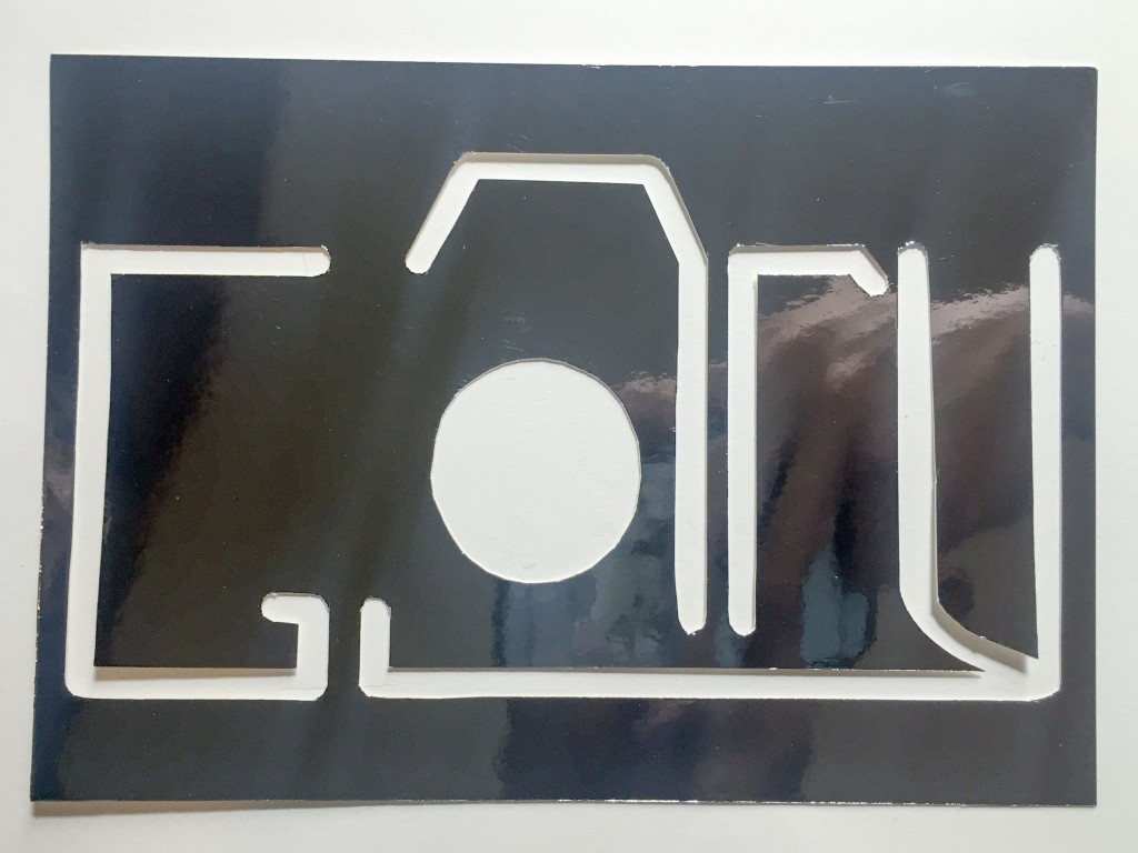
Last by not least, the type created by myself. It is fairly simple as I do not have a death wish for myself.

Me

With the interview videos and the cutting of the type done, I am only left with the design of the backgrounds of my panels.

I made use of an old file which was transparent to draw on it and illustrate how the design could be. IMG_9660

Stay tuned for the final post for all the completed designs and what each of them represents!

Typographic Portrait Process

Firstly, I apologise for the delay in posting. Just got to check my email and NTUlearn and just got to know about the required posting so here goes.

After the past few weeks of interviewing and discussing with my friends and also, with the decrease from 6 to 4 panels, I decided to remove my first panel which was meant for the introduction. My introduction will hence be all spoken and not illustrated via a panel. The first three panels will each be an attribute given by my friends and the last will be something that will summarise and explains my underlying concept.

For them all, my friends will be designing the type and I will be completing it with designing the background.

So here goes. For my first friend, she created the type and here it is.

1

This one is done with playing of the perspectives of the letters for them to be looking at all four directions.

The second one is this

wq

It is one which shows my name in a font which is similar to an heartbeat on an ECG monitor.

And last but not least,

3

This is to show when I decide on the direction I go all the way deadset like how the letters of my name elongate and reach to the corners of the frame.

Last but not least, my own one.

Screen Shot 2016-02-13 at 2.14.33 pm

As cliche as it might be, it is just my name written to be in the form of a camera as I really appreciate and love what the camera does for us.

That is all. All for the presentation on Monday!

Typographic Portrait ideation

After presenting on my initial research on hand made typography and having Proj Joy see what I have presented on, she suggested that I should think of collaborating with others for this project. This is because I presented on having hand written types superimposed on photos and if a visual artists were to superimpose his type on a photographer’s photo, that will technically mean that he is collaborating with the photographer.

This set me thinking about collaboration and I came up with my overlaying concept which is that, we are actually, prominently what others think of us as. I mean, if we think that we are trustworthy people, but everyone around us who interacts with us do not see that we are, then we are technically not trustworthy. It is either we are doing what we are doing wrongly or we are just not doing the right thing enough. 

Hence, I decided to collaborate with four of the closest people in my life. Those who have spent the most time with me recently. My idea is to get them to think of an attribute that they can best tie me up with and then, we will collaborate and work something out together. As for the last two panels, they will be fully designed by myself and they will encompass and summarize the entire project. 

Some of the attributes that they have come up with were: Reliable, Intense, Appreciates that there is beauty in everything, genuine, honest, strong and I see the beauty in the mundane. Some of these initial ideas were really quite interesting attributes of myself which I have never really thought of myself. This actually proved my point about how our attributes are actually what others think of us, as some of these attributes were not even apparent to even myself.

Now to figure how this idea can actually work and maybe make them flow as one piece.

Throughout the week, I managed to meet up with all of the friends whom I am going to “interview” and managed to work a few things out. Here is one short clip of the interview I did with one of my friends! Just a little teaser! Stay tuned for the full clips during submission week