
My initial idea when I read “handmade typography” was literally hand made typography and so I went on to search for types that were made of 3D objects to seek for inspirations. There were countless examples of such types and I found these 3 to be the most eye catching and inspiring. They were created with one thing in mind, which was to have the material and medium used for the typography have a link to the typography itself.
The first one is by Dominic Le Hair as shown below.
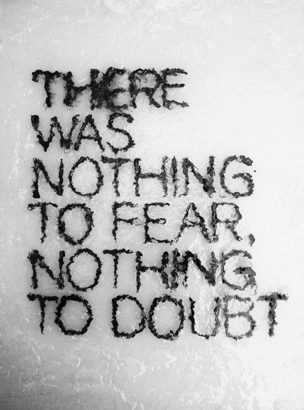
This typography quoting “There was nothing to fear, nothing to doubt” made use of blocks of letter making out the quotes submerged in very shallow water. As though to suggest that there is literally nothing to fear or doubt because the water is so shallow and it is impossible for anyone to drown in it. Deeming it nearly harmless. Hence, by making use of the water as the medium around the type, it emphasises and allowed viewers to actually see the point the phrase was trying to make.
The second one is also by Dominic Le hair.
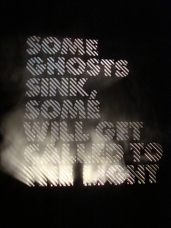
For this typography, Dominic made use of hollow block letters to allow light to shine through. To enhance the effect, he used fog in the foreground. He then strategically positioned lights to shine through the second half of the quote “will get called to the light” to illustrate what the quote was saying.
Lastly, for my research on “hand made typography”, I found what Tien-Min Liao did really intriguing. She literally used her hands for these types, creating every 26 letters of the alphabets.
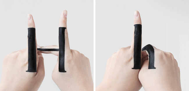
As seen in the GIF above, the letters are all interchangeable from small to capital letters by changing just the gestures of her hands. I found this really creative as all she used were ink on her hands and for each transition, the ink on her hands were constant throughout.
While researching further, it hit me that hand made typography can be interpreted in other ways. One which was to be the cliche way whereby a type is superimposed on a pretty photo. I interpret it as hand made as, if the type is hand written, and the picture is taken by someone, it is technically hand made as both layers of the typography are created originally by the artists.
One of it which I found really aesthetically pleasing is by Kirill Richert, a Russian graphic designer.
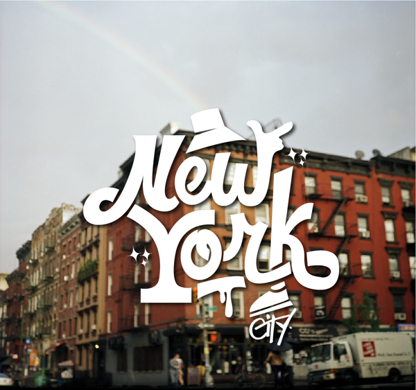
I like how his type flows and having interesting elements such as the hat and the sneakers embedded into it. Also, he superimposed it on a picture of New York with a rainbow over it which gives his viewers an idea of how the city actually looks like.
I personally have tried doing something similar not too long ago. By writing my own inspired type and superimposing it on a photo I took so I thought I might work on it and use it for one or two of the final submission.
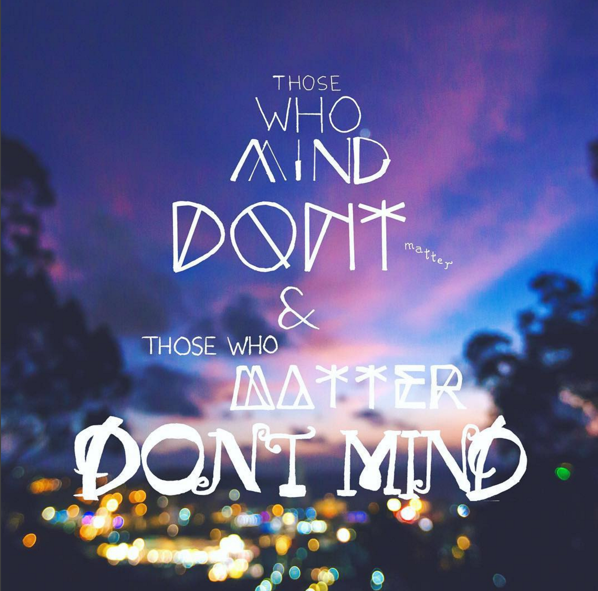
However, I did come to realise that the picture I have used had no relation or whatsoever to the quote I have chosen as my viewers will not be able to relate to it. I could, as the picture was taken when I was on a trip with a group of friends and the quote was meant for them. From the lecture given by Prof Joy, I learnt that I should take into account the receiver’s possible confusion of the usage of my photo. This is because, no one but myself can relate to the context I have used except for my friends who were with me. Hence, one of the many take aways I have from the class was that I have to consider what my receiver will interpret my message or type as while creating my typography.
References
http://designinstruct.com/visual-inspiration/typography-inspiration/hand-made-typography-projects-that-will-inspire-you/
http://typostrate.tumblr.com/post/86682576760/enjoy-your- life