Dream a little dream

I’ve heard that we don’t dream in color, but isn’t that just sad? I’ve always wanted to dream of a color that I’ve yet seen. Better yet, I want to invent a dream collector, plug it in my head when I sleep to collate all the wonderful things the subconscious creates.

This project is a little like my dream collector createds based on dreams I’ve dreamt and dreams that I want to dream. The saturation of colors are manipulated to represent the richness of the dreamscape, although it might come across as slightly gaudy, I wanted to bring across the feeling of exuberance and joy. The general theme going on would probably be whimsy and magic.

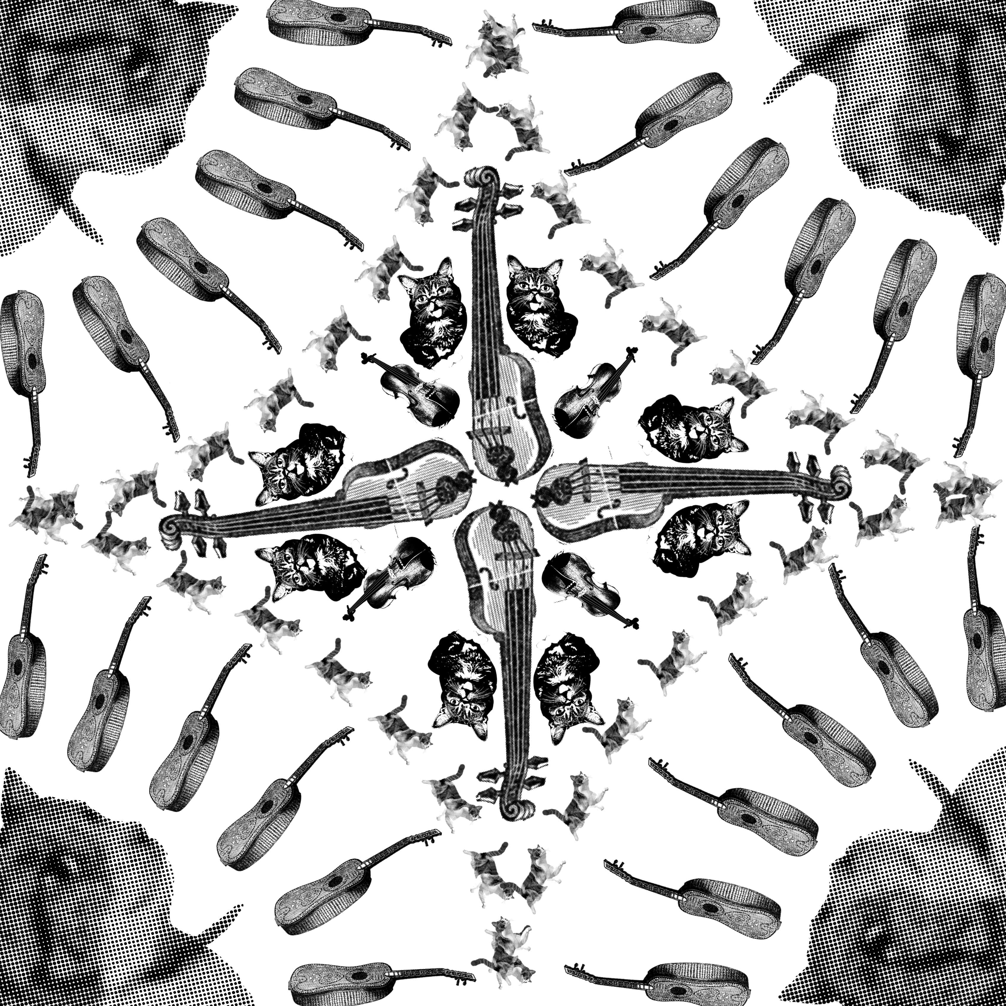
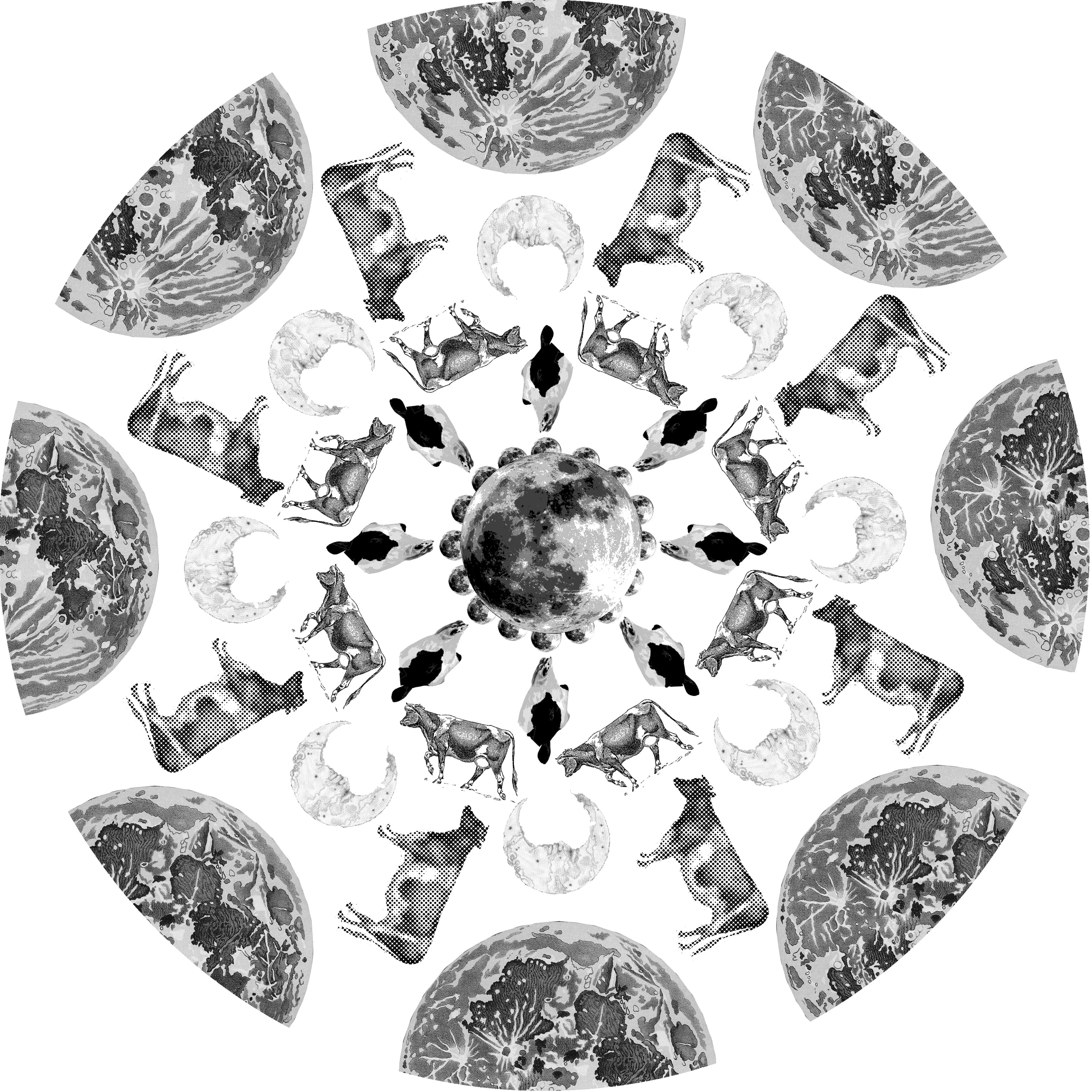
There are repetition of scenes as in dreams the concept of time is distorted, and events are hardly sequential. Also very often  I go back to similar recurring dreams and I wanted to capture that familiarity in the repetition.

The dream can be broken into 3 parts.
/A caricature of myself enters into my head, into the dream, almost like Alice in Wonderland falling into a strange place. The character then begins to explore this trippy, strange place with a slight hesitation but with curiosity. She wanders around, interacting with the landscape. Here I chose to repeat the sequence twice hoping to convey the character’s increasing comfort with the space as she has seen it all before, yet with a slight twist./

/I awake mid-dream, and carry on my morning preparation with half opened eyes before going back up the bus to fall asleep again (which I usually do)./

/This time as I go back to sleep, the dreamscape changes with a creepy undertone. Repeatedly I try to force myself awake thus explaining the black screens yet fail to do so. In this portion of the dream I keep trying to get out of this strange place laced with all of the things I do not like or fear (i.e: BIRDS, LIZARDS etc etc.) Yet I did not want to make it to completely creepy, reducing the fun factor of the entire series.  Finally I do manage to get out of my dream, lingering there till the brightness of the lights awaken me./

As this was my first foray into digital image creation & Photoshop, the quality of the editing skills aren’t top-notch. The general composition and editing was kind of flat? Whereby the entire background or setting would be shown in the frame. I did try to play around with some cropping and zoom-in images, and perhaps the next time around I could be more adventurous with the image composition. The character represents me, so this series of images are from a third person’s view point. I am quite pleased with the results and did enjoy creating this imaginary place. I’m so glad that there was a soundtrack that fitted the theme I was going for as it sets the mood for viewing. What I would have done better would be to plan my thoroughly to ensure that the message that I wanted to get across would be translated more clearly, especially during the presentation. Besides planning I felt that editing the overall concept is an important skill that I’ve yet grasped, at some point maybe it might have come across as “too much”

Lastly, before the presentation began I gave everyone little bags of meringue kisses- just as how a parent would kiss a child goodness and wish them sweet dreams.

So here’s a virtual bag of meringue kisses for you as you dream together with me!


Research & reference

Music: Golden- Szymon
Images:

Color study

color_schemes

1. Complementary colors
Colors that are opposite each other on the color wheel are considered to be complementary colors. The high contrast of complementary colors creates a vibrant look especially when used at full saturation. However this color scheme must be managed well so it would not be jarring.

Complementary colors are tricky to use in large doses, but work well when you want something to stand out.

Eg: Orange and blue
5740ea0a88c93dad03da747f4fbd609d

2. Analogous colors
Analogous color schemes use colors that are next to each other on the color wheel. They usually match well and create serene and comfortable designs. Analogous color schemes are often found in nature and are harmonious and pleasing to the eye.

Choose one color to dominate, a second to support. The third color is used (along with black, white or gray) as an accent.

Eg: Yellow, blue, Green

analogous color_4bc3e9d1dabb3_hires

3. Triadic colors
A triadic color scheme uses colors that are evenly spaced around the color wheel. Triadic color harmonies tend to be quite vibrant, even if you use pale or unsaturated versions of your hues. To use a triadic harmony successfully, the colors should be carefully balanced – let one color dominate and use the two others for accent.

Eg: Red, Blue, Yellow

13cb5dec1ebf5f726e210ed7402a9c2d

4. Split-complementary colors

The split-complementary color scheme is a variation of the complementary color scheme. In addition to the base color, it uses the two colors adjacent to its complement. This color scheme has the same strong visual contrast as the complementary color scheme, but has less tension. The split-complementary color scheme is often a good choice for beginners, because it is difficult to mess up.

Eg: Pink, Orange, Green
be22a723cf9172d7c81b3a565ca132af

5. Tetradic colors

The rectangle or tetradic color scheme uses four colors arranged into two complementary pairs. This rich color scheme offers plenty of possibilities for variation. The tetradic color scheme works best if you let one color be dominant. There should be a  balance between warm and cool colors in your design.

Eg: Pink, blue, orange, green

4214a65bd7e562e8b797038abab39637

6. Square colors 

The square color scheme is similar to the rectangle, but with all four colors spaced evenly around the color circle. The square color scheme works best if you let one color be dominant. You should also pay attention to the balance between warm and cool colors in your design.

Eg: Red, Yellow, Blue, Green

921591796

Color you color me

91+ENrl2SwL._SL1500_
/Red/
Courage, strength, warmth, energy, stimulation, masculinity, excitement, aggression, visual impact

A1ZDAW577VL._SL1500_

/Orange/
Physical comfort, warmth, security, sensuality, passion, abundance, fun, frustration

172036
/Pink/

Physical tranquillity, nurture, warmth, femininity, love

91QL8ar-XsL._SL1500_
/Yellow/
Optimism, confidence, extraversion, friendliness, creativity

91fYf6sLv6L._SL1500_
/Brown/
Seriousness, warmth, nature, earthiness, reliability, support, heaviness
164725
/Blue/

Intelligence, communication, trust, efficiency, serenity, coolness, reflection, calm, aloofness, unfriendliness

130117
/Green/
Harmony, balance, refreshment, rest, restoration, reassurance, equilibrium, peace

193748

/Purple/
luxury, authenticity, truth, quality, decadence180601
/Grey/
Neutral, dampness, depression,  lack of energy
190303

/Black/
Sophistication, glamour, security, oppression, coldness, menace, heaviness
114202
/White/
Hygiene, sterility, clarity, purity, cleanness, simplicity, sophistication, coldness, barriers, elitism

Reinterpreting rhymes

Project Brief:
Giving nursery rhymes a new facelift

For this project I decided to stick to one rhyme: Hey diddle diddle

Here’s how the rhyme goes

Hey diddle diddle, the cat & the fiddle
The cow jumped over the moon
The little dog laughed to see such a sport
& the dish ran away with the spoo

There are many ways to interpret this seemingly nonsensical rhyme, and countless analysis have been made to which what each item represents. However I’ve to take the rhyme at face value with its wonderful childish order and shake it up in terms of the arrangement rather than the meaning.

FINAL IMAGES

#1. Hey diddle diddle, the cat & the fiddle

CAT & FIDDLE -min

For this image, I took my inspiration from the traditional portuguese tiles.

16060359-Typical-portuguese-tiles-azulejos-with-pattern-Stock-Photo-azulejo

I love the symmetry and how replicating it would create new patterns. Using the different motifs creates textures to the otherwise flat image. The arrangement of objects creates new rhythms and lines which creates visual interest.

#2. The cow jumped over the moon

COW & MOON 2-min

My inspiration came from the rose windows frequently used in gothic cathedrals.

Rose_Window

The concentric nature of the image draws the eyes towards the image, having the motifs decrease in size from the outer rim to the middle also reinforces the effect.

In hindsight, I would have made the area outside the circle black, to create a greater contrast between the image and the background.

#3. The little dog laughed to see such a sport

LITTLE DOG LAUGHED1-min

For this image, I wanted to have a “pop art” feel, with the main motif as the foreground and a pattern for the background

pop_chaplin_by_colorium-d643gsw

Shirley commented that a mid-ground would make the picture more complete, therefore I used the bones to emulate laughter/sound lines.

#4. And the dish ran away with the spoon

PLATE AND SPOON1-min

I had no particular source of inspiration for this image, but the idea was to use shapes to create a landscape. The shapes used are actually facial features of a smiley face, introducing some expression to the otherwise faceless characters (dish + spoon). Perhaps the entire image read as a whole would look like the dish & spoon ran away rather gleefully rather than in fear.


RUNNER UPS

The other images that didn’t make the cut

cat fiddle 2-min
I didn’t fancy this as there was too much negative space. What I did try to do with this image was to use motifs that signified the characters rather than the picture of the actual characters (cat / fiddle)

Converted_file_5268a2e2
The contrast between the jumping figure and the heavily detailed images made the entire picture inharmonious and kind of distracting, as if they were two separated images merged together.

LITTLE DOG LAUGHED3-min
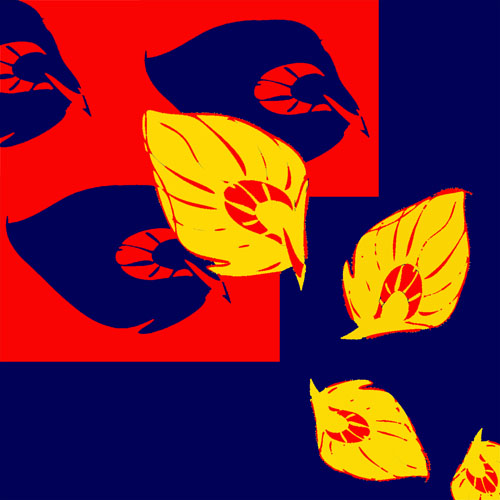
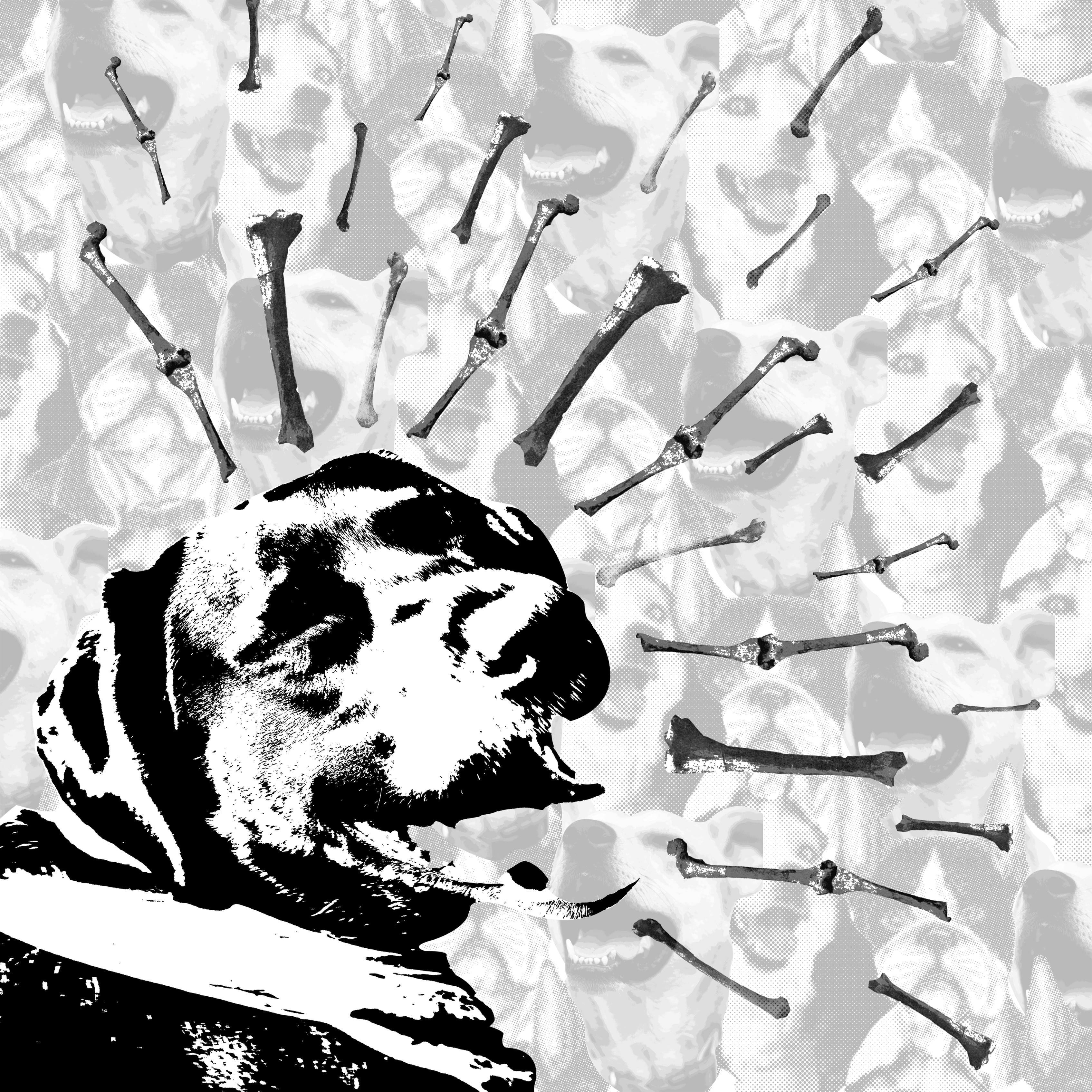
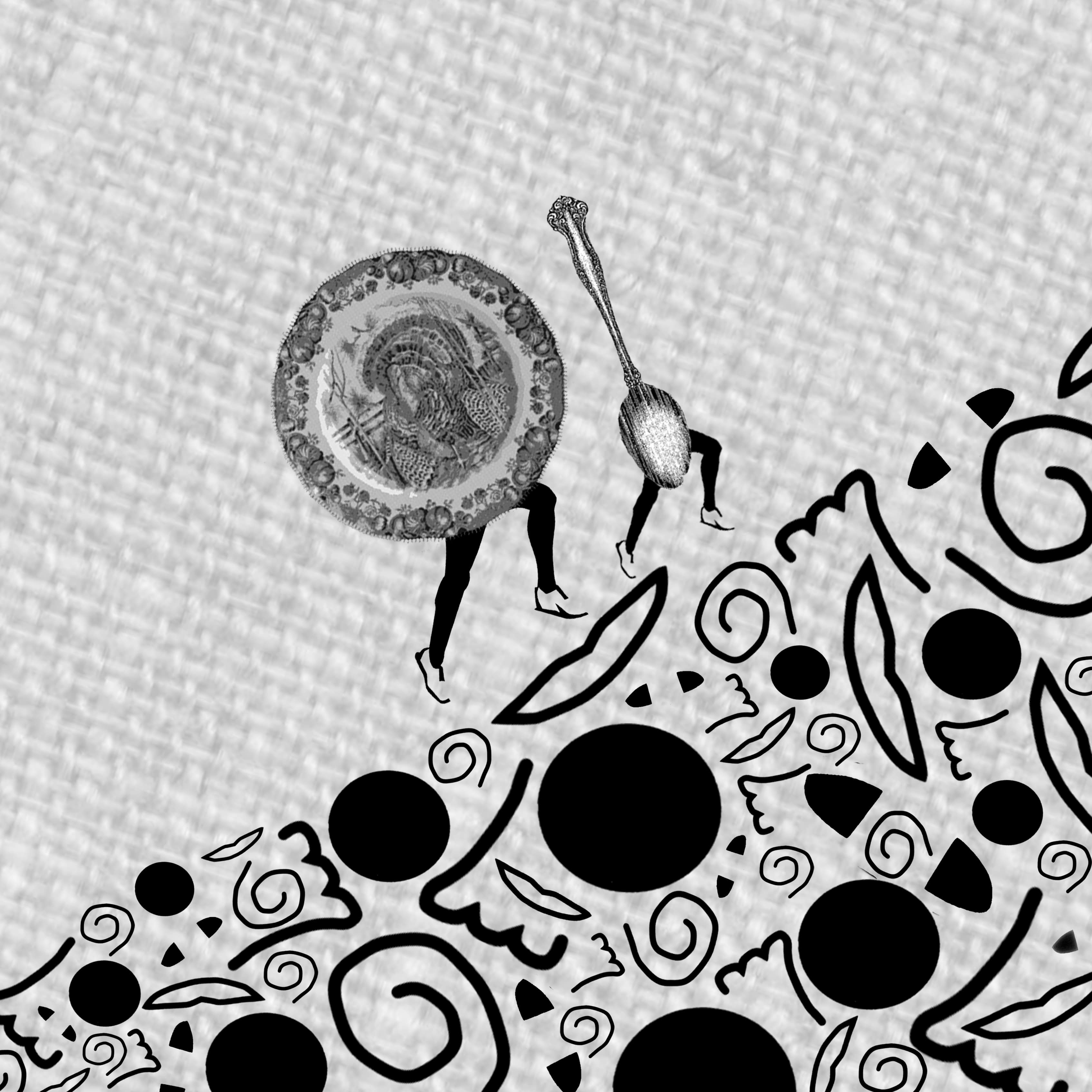
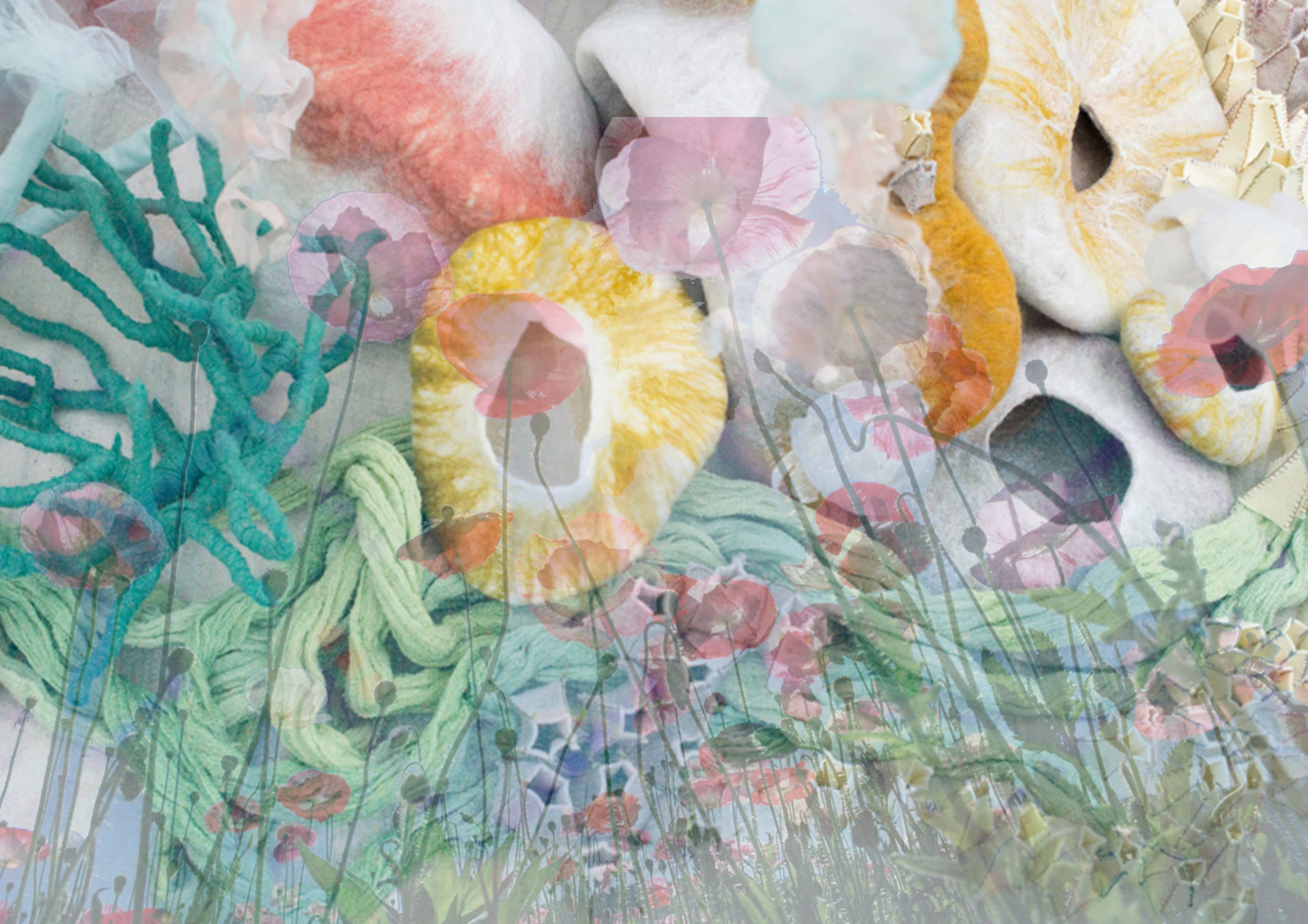
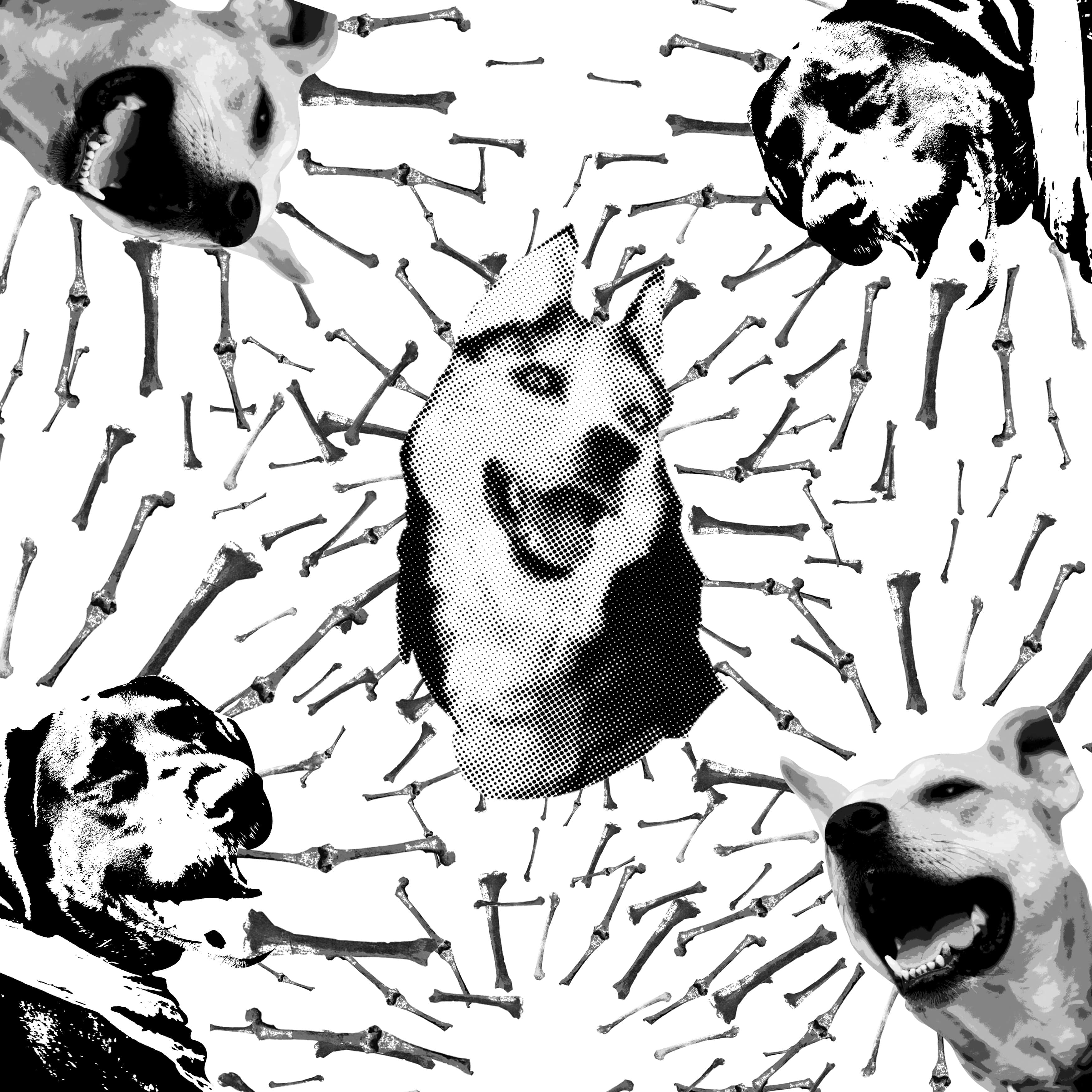
Similarly, I wanted the bones to be used as expressive lines, but this might have been too ambitious; the entire image looks too cluttered.

PLATE AND SPOON3-min
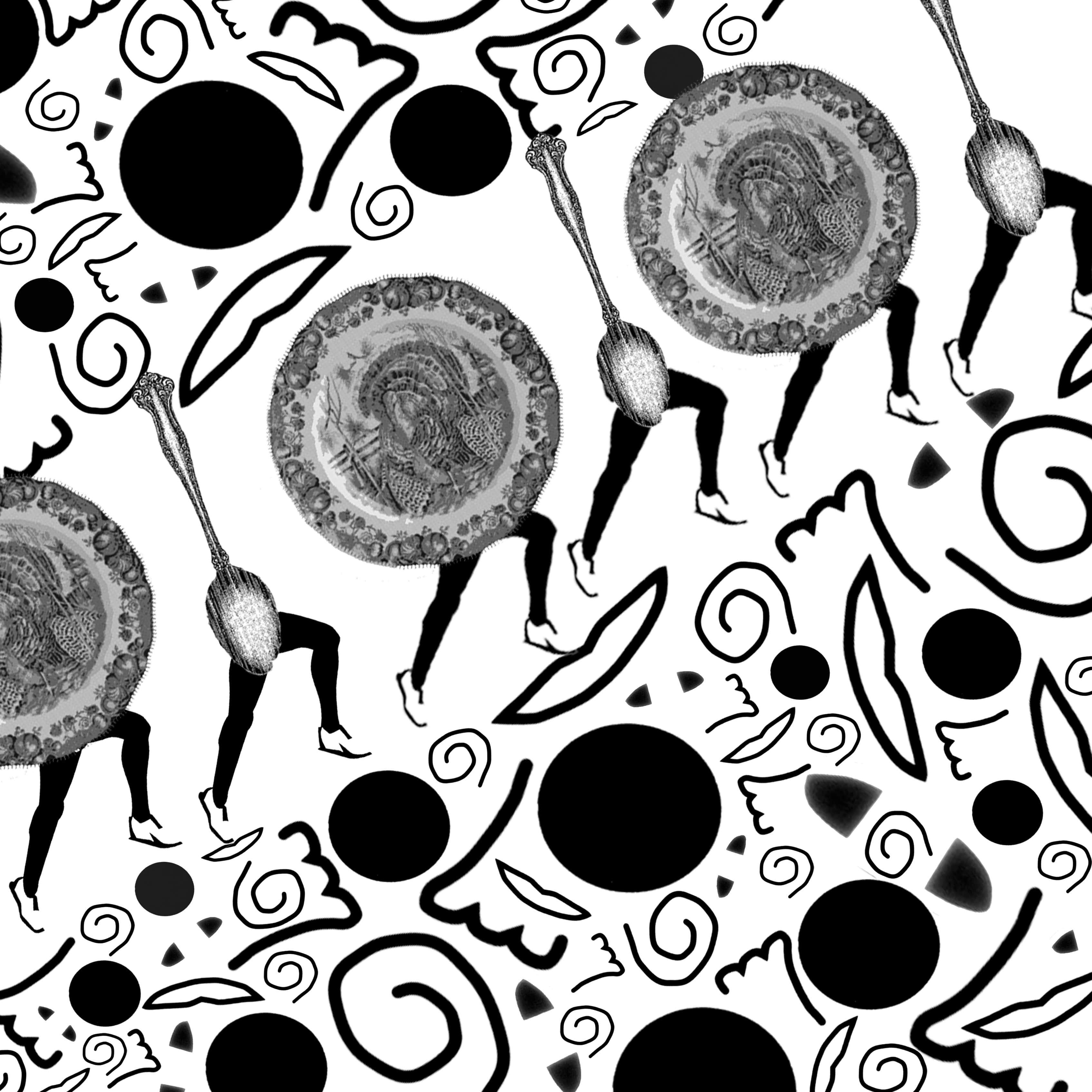
I really liked this image, but I decided to chose the image with the background as the hemp texture gave it a picnic-y feel. This image has less warmth in my opinion as the backdrop is white and stark.