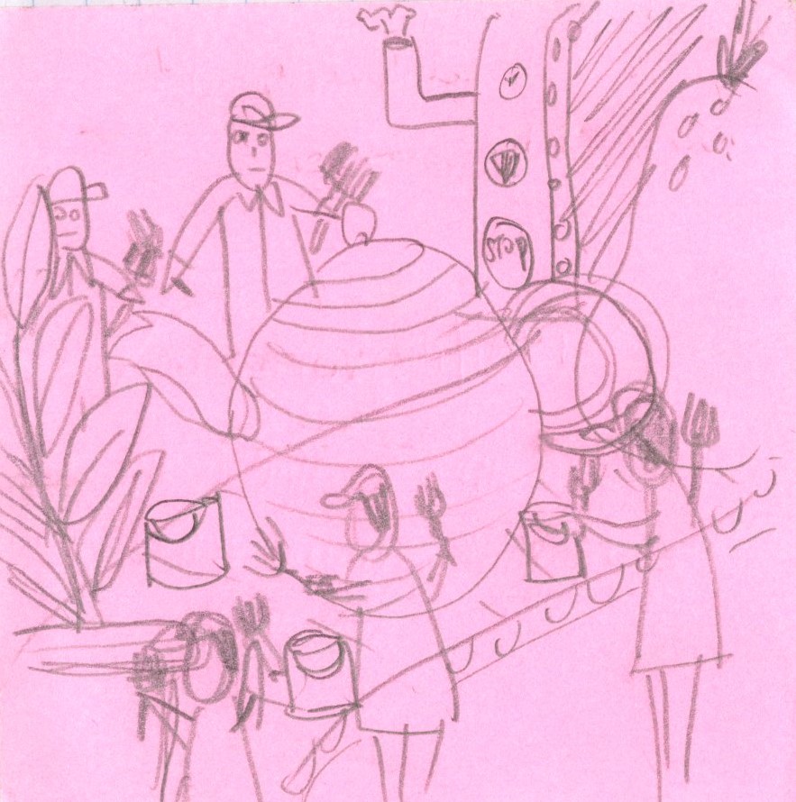
Continuing from my previous post on my idea of an almost obsessive emphasis on keeping in trends, I’m using the metaphor of production lines and disproportionately sized arbitrary objects to bring my point across. The uniformly dressed workers are totally emotionless as they paint all these objects the same shade of paint to keep them on trend yet rendering them similar and ultimately giving consumers boring products that are one and the same. These are my thumbnail sketches:
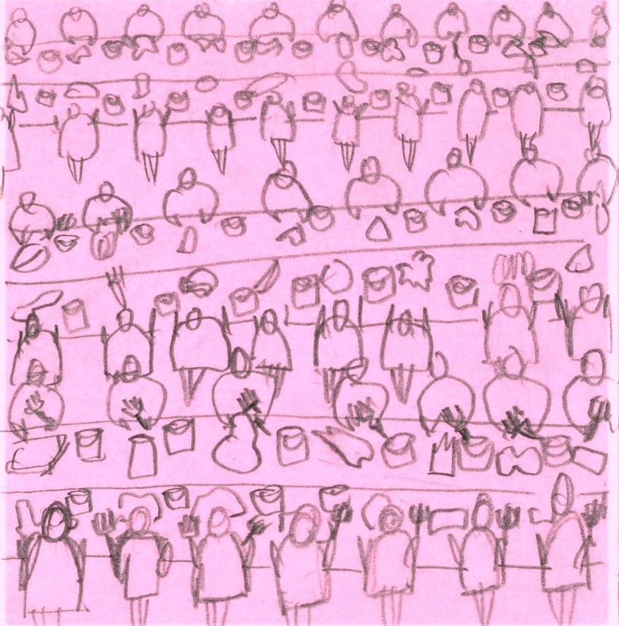
1&2
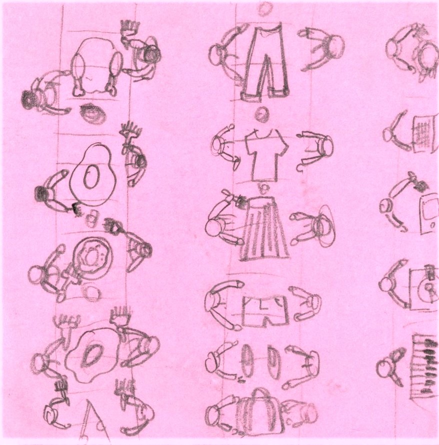

L: Vertical lines, orderly, top view.
R: Horizontal lines, frontal view.
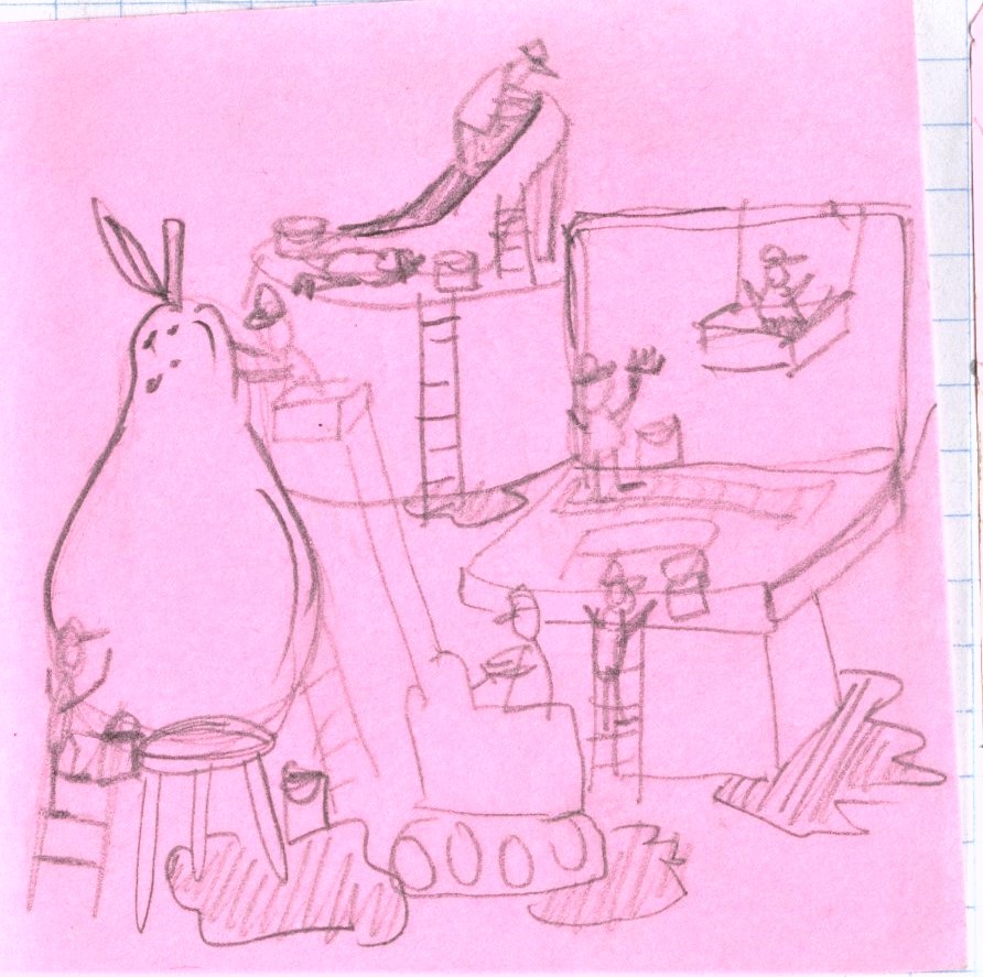
3&4
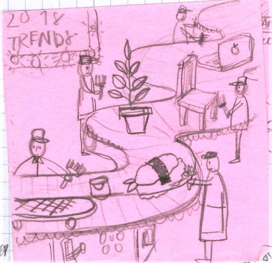
L: Deeper perspective, with an organic leading line. Extra bit of information from the trend board
R: Symmetrical side view with a pantone color board
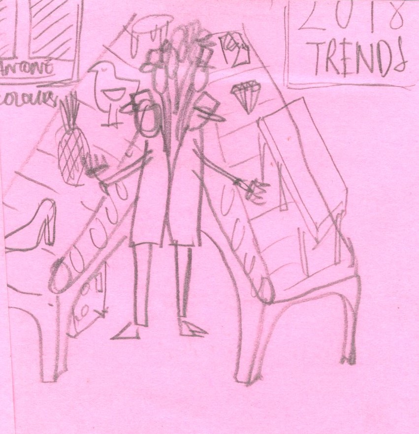
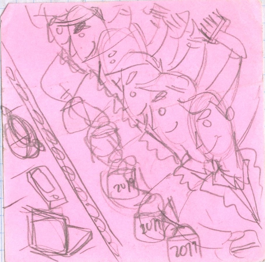
5&6
L: Close up on facial expressions with a triangle composition. A little bit more chaotic
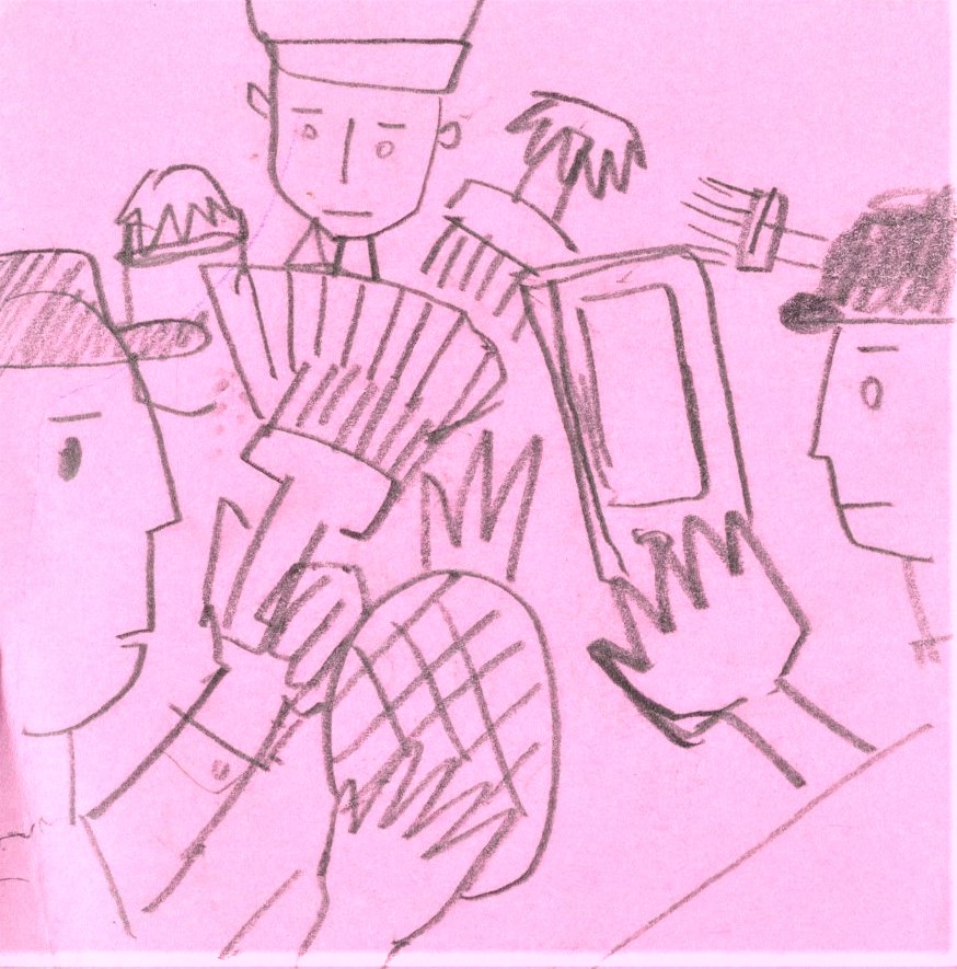
R: Faceless workers. almost pattern like. The repetition and distant view makes the image really cold, almost portraying an image of unethical employment.
7&8
L: Giant objects and tiny workers. Need to work on different compositions as well as being selective with the products featured.
R: Inspired by communist propaganda posters where the use of diagonal lines create dynamic movement. Not sure if this would work with my existing color palette/mood board.
9&10
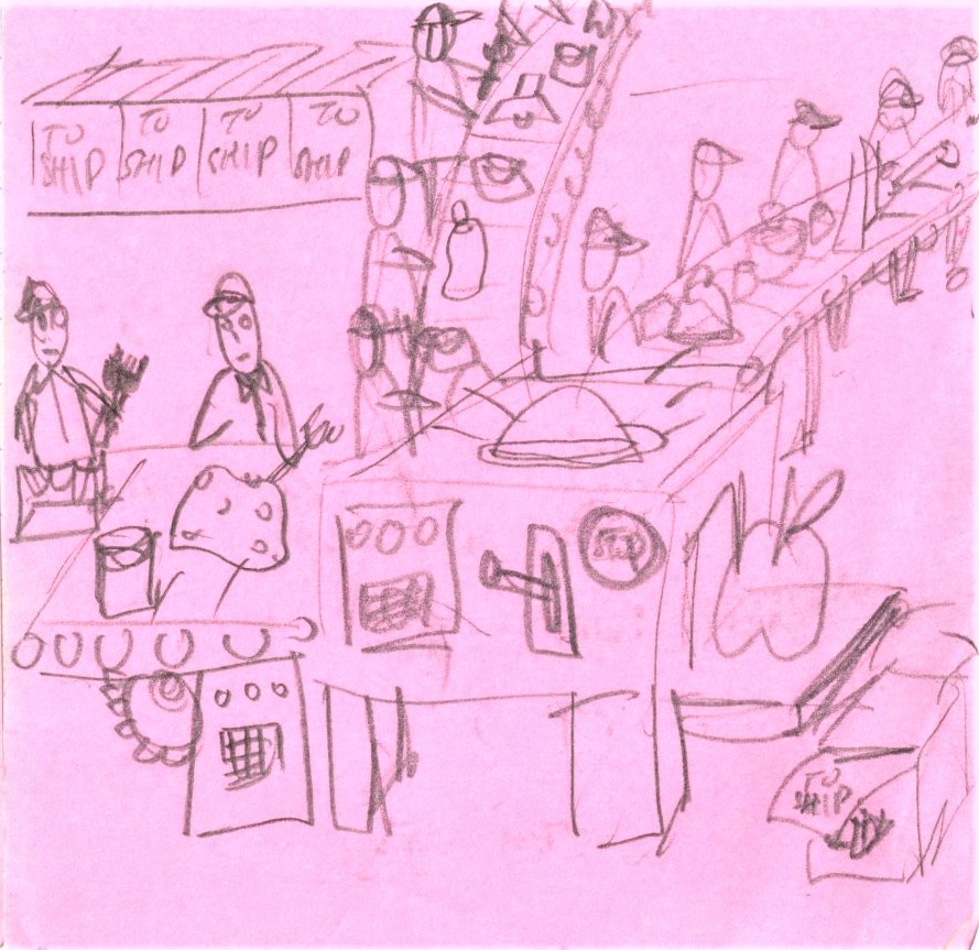
L: A more central image with breathing space on each side. Also giving faces to these objects to attribute an almost human character to them?
R:Include stop button as well as shipping boxes to suggest that this obsession can be stopped as well as drawing a link to consumers
11&12

L: Giant objects being pumped out by machines; workers painting with both hands
R: U shaped production line, focused on the faces of the workers
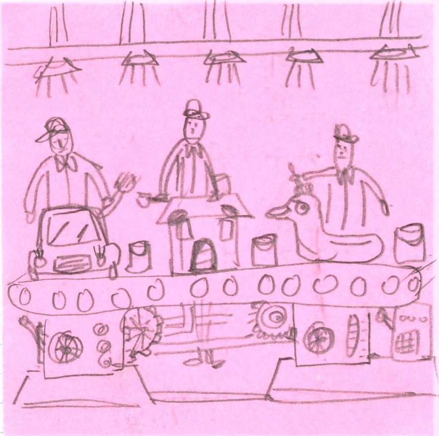
13&14


L: A background of boxes
R: Machines to resemble a ticking time bomb? With newly minted objects all dumped at the end of the production line
15
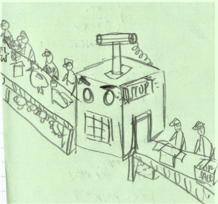
A cleaner look with a plunger dynamite box like machine
Artist reference/ style reference:
1.Rami Niemi

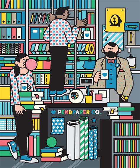
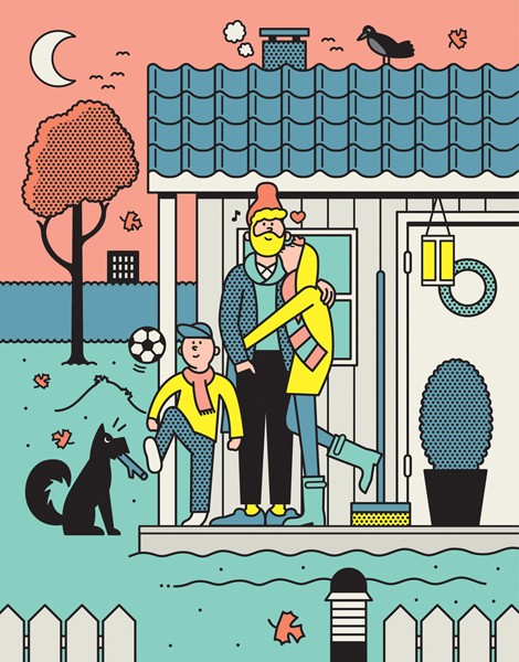
Clean, bold outlines to keep the patterns and colors contained. I like how simple it is yet how a depth is created through the layering of objects.
2.Isometric illustration
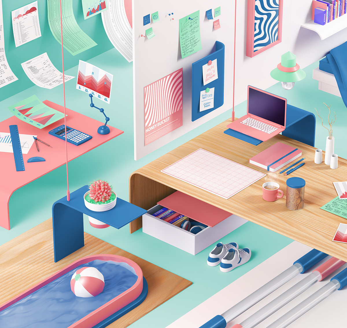
Nuria Madrid

Coen Pohl
This 3d style is the opposite of the first artist reference. Not sure which direction would be more suitable but I am keen to explore either for this project.