


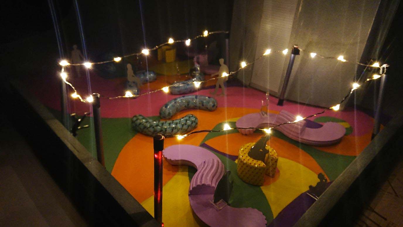
Night scene

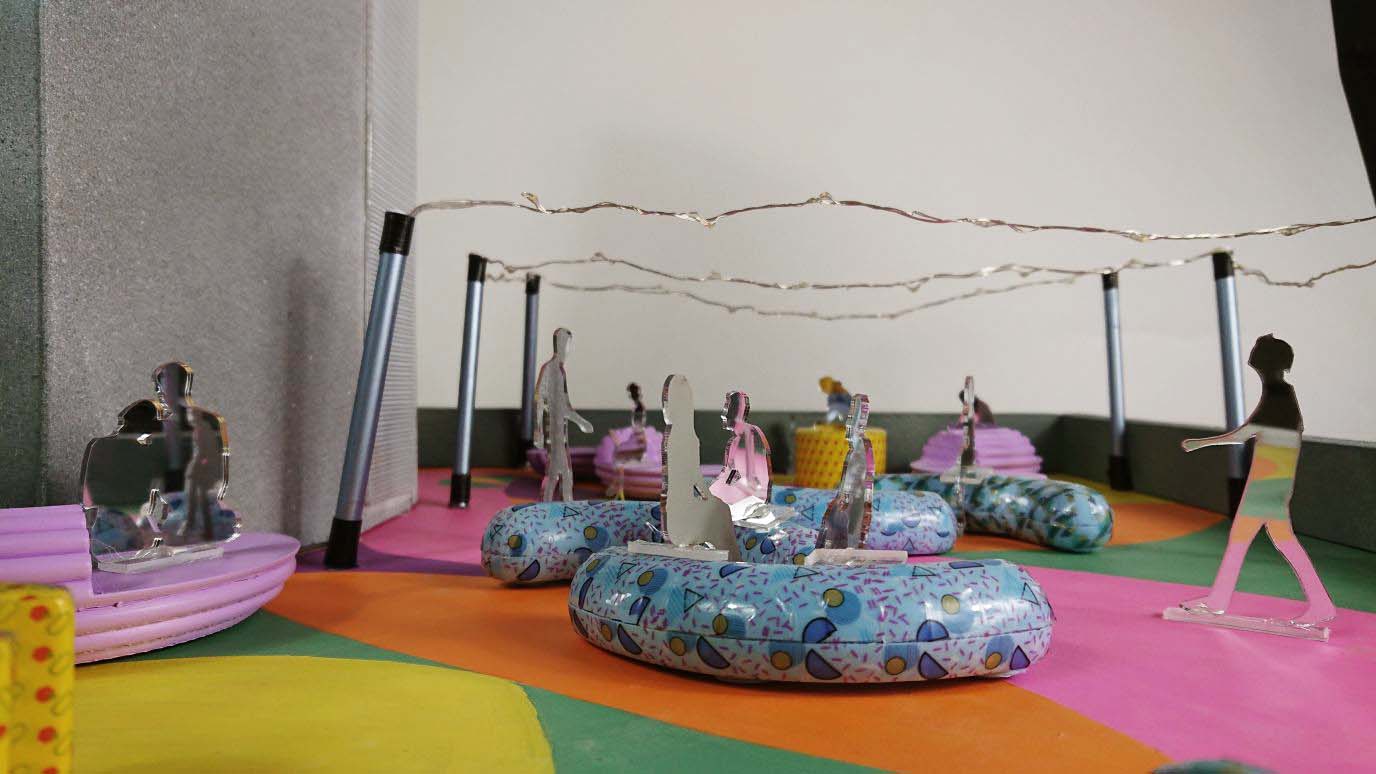
Day scene

Night scene
Day scene
It has been so much fun!!! I’ve learnt to be so much more on how to create illustrations digitally, admittedly so much more to experiment and learn but it has been a 13 weeks picking up new adobe skills. It has been a joy to be able to learn from some of the most talented people, seriously my mind is blown every critique session. Also, a big thank you to you Lisa for making this experience so wonderful! I have never once felt dread coming to school on a Monday for class and it has truly been so enjoyable listening to you teach animatedly:-) Every assignment has been equal parts challenging and satisfying. Other than the technical aspects, I’ve learnt to appreciate the function and beauty of mood boards, especially when I’m so easily swayed! Also the importance of knowing the target audience you’re designing for. Hopefully I’ll be able to go beyond designing for audiences I’m comfortable with and expand my body of illustrative works in time to come.
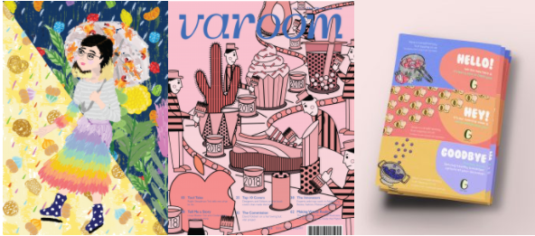
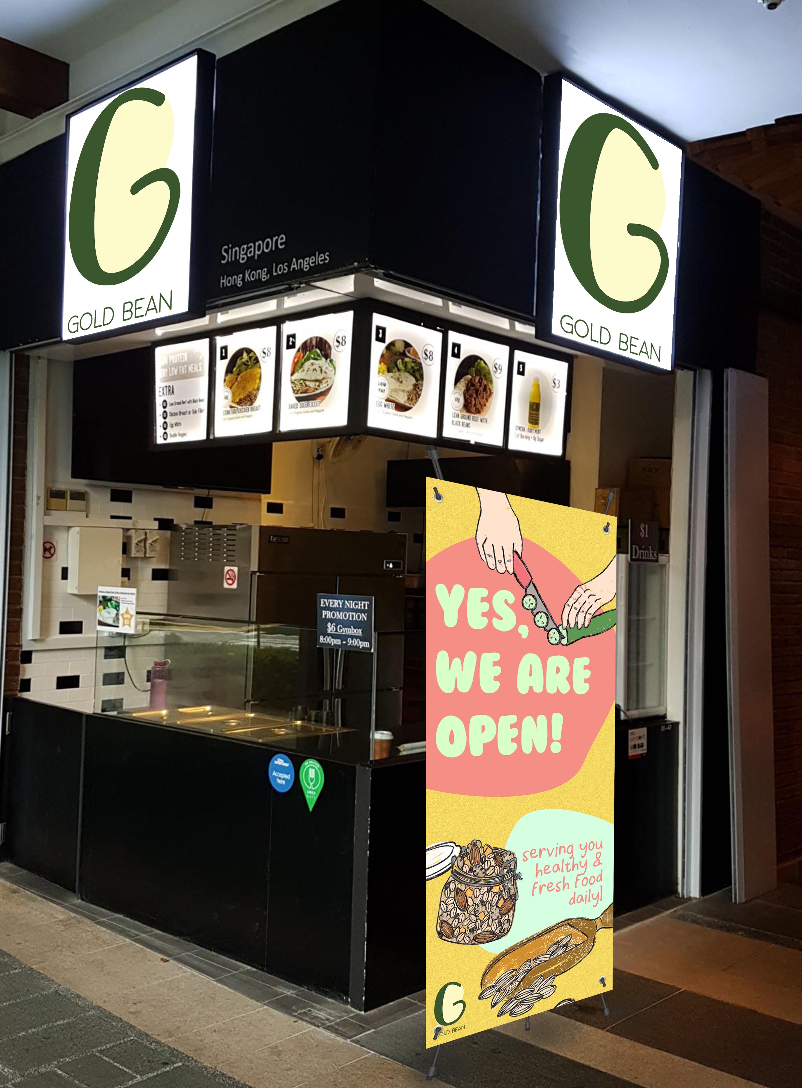
Here are my final mockups!
1. Dual cup holder
‘One for you, One for a friend.’ The idea behind this is a one-for one concept promotion happening through the opening week to get word out
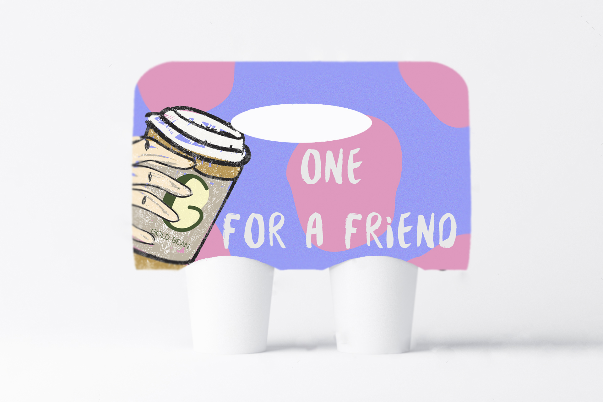
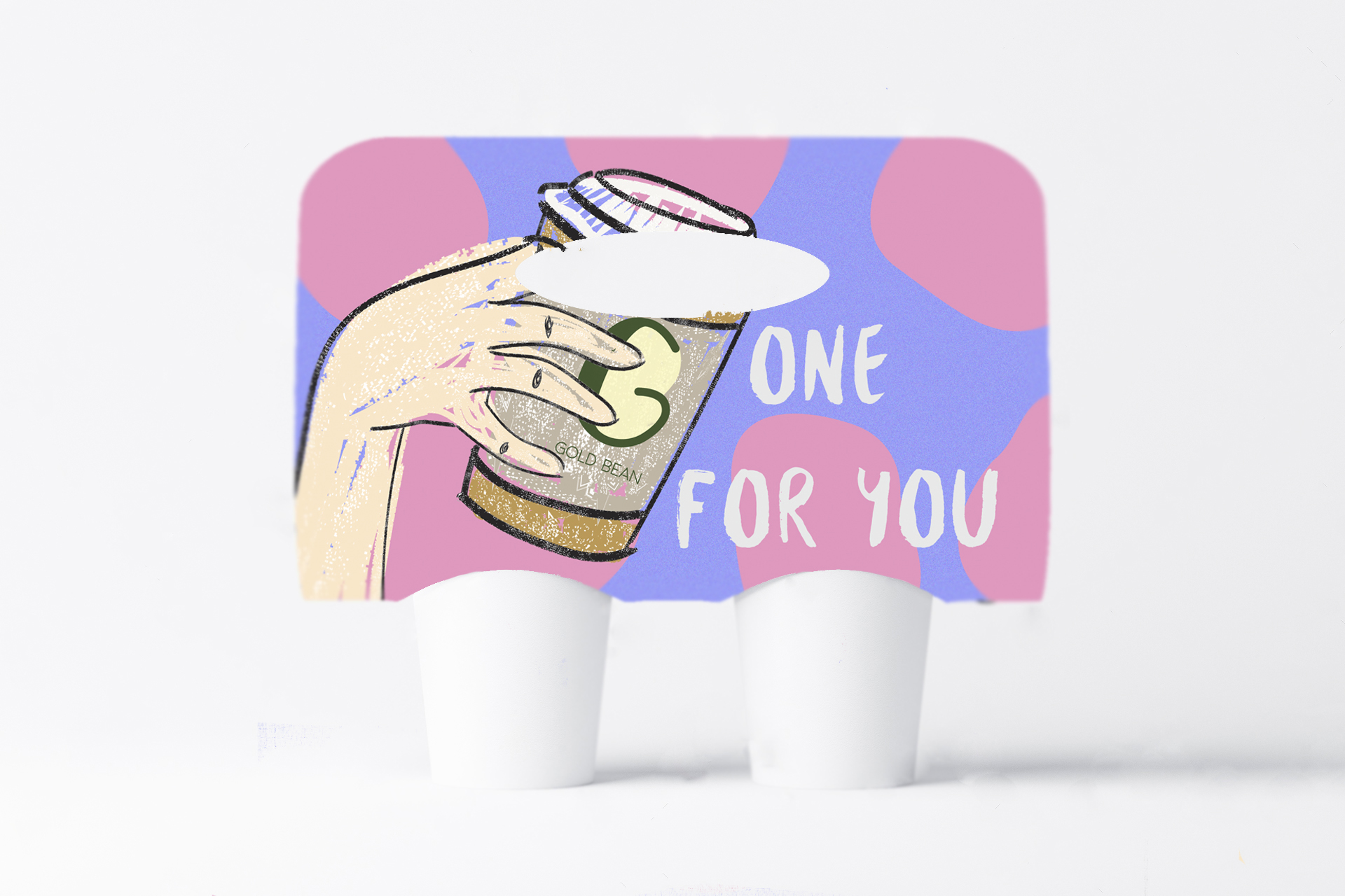
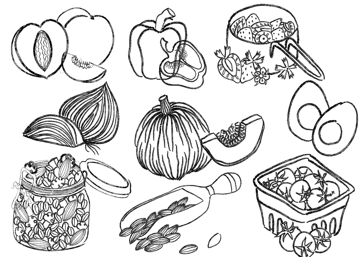
On the inside is a pattern created from the food illustrations

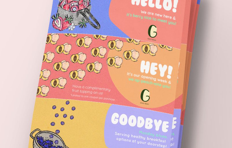
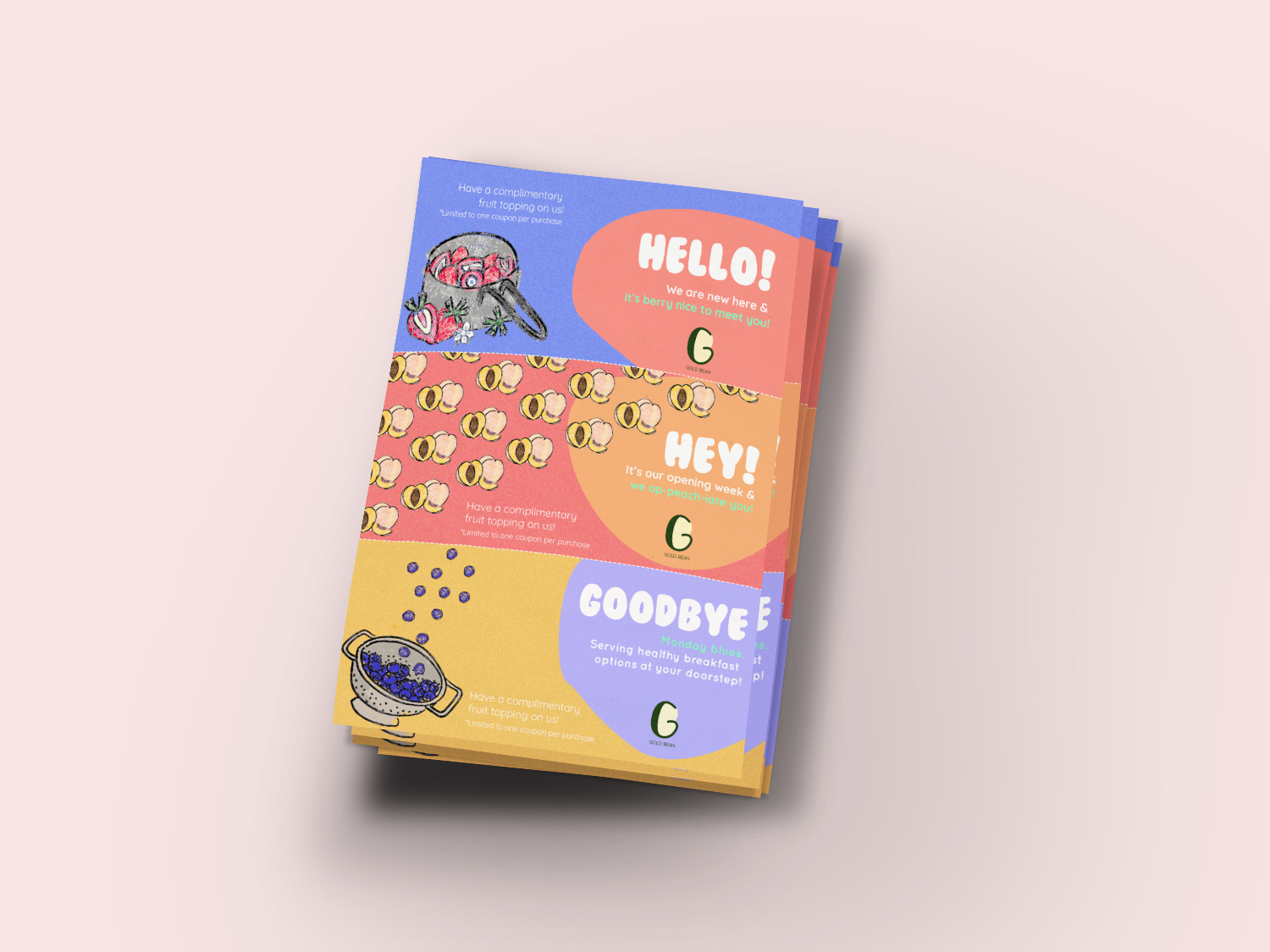
2. Free topping flyer
These are for the yogurt parfaits that the shop intends to sell
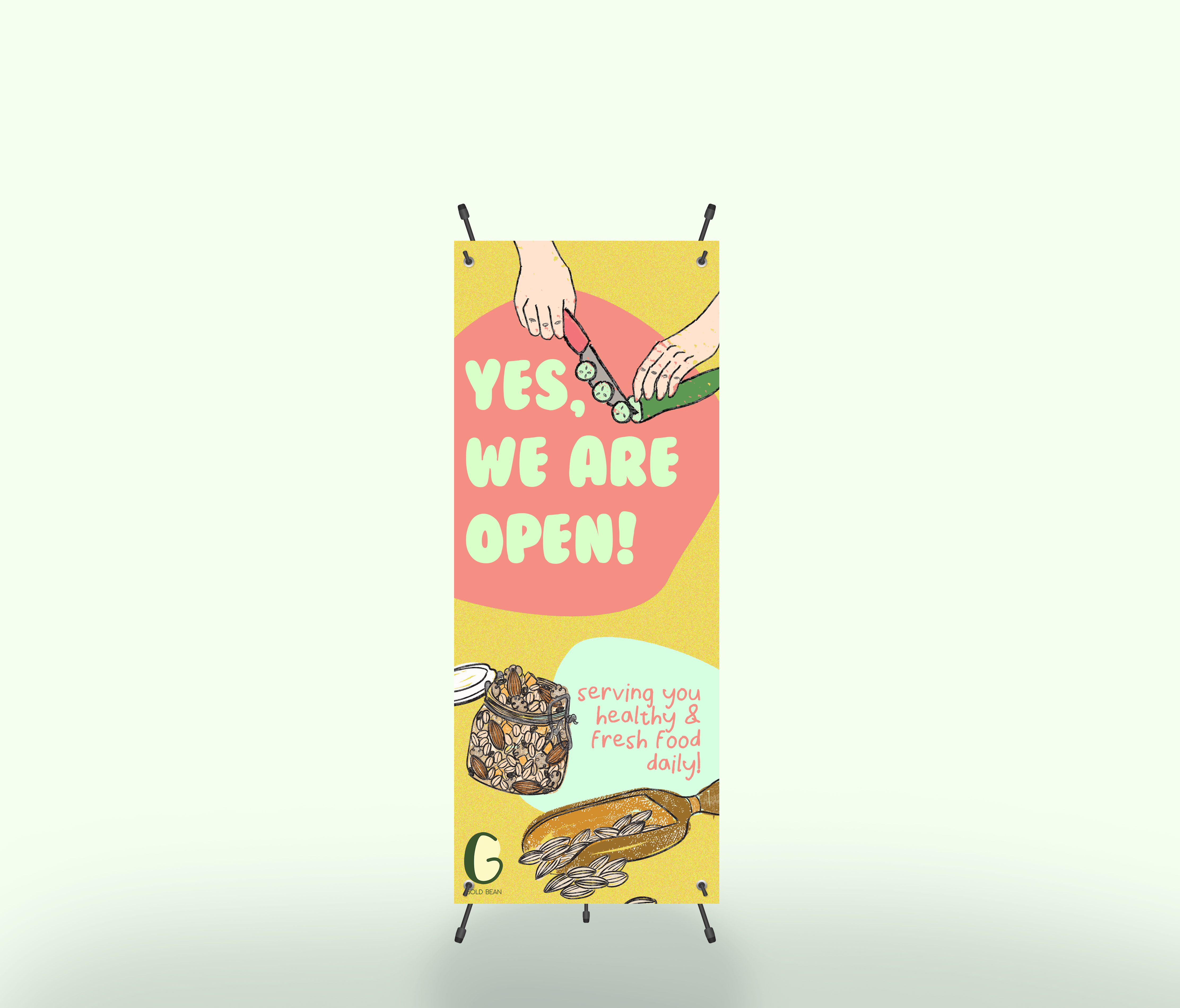
3. Pull up standee
Before critique: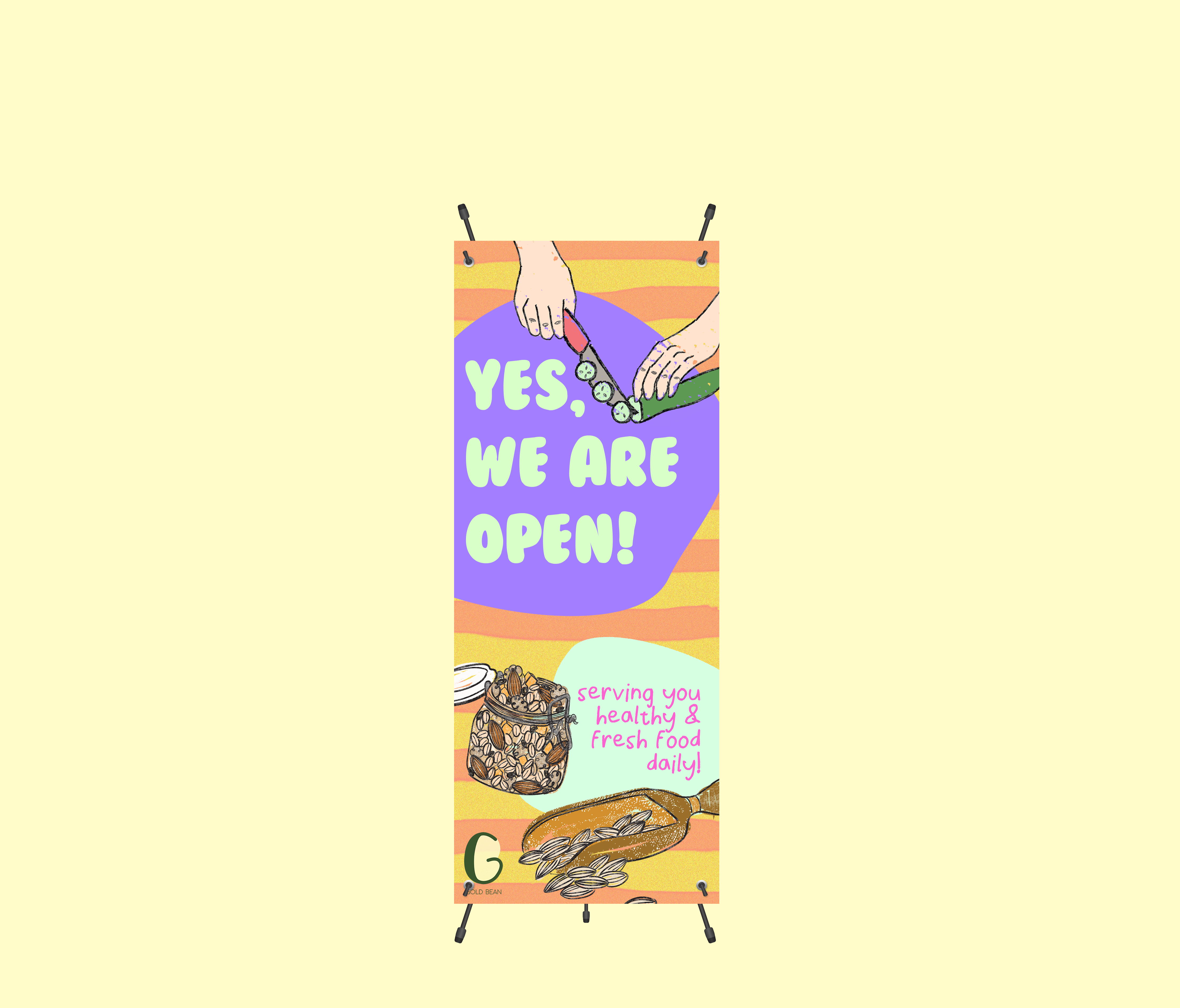
After critique:
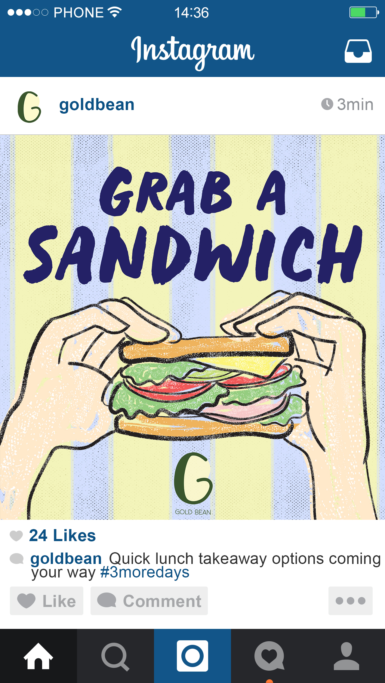
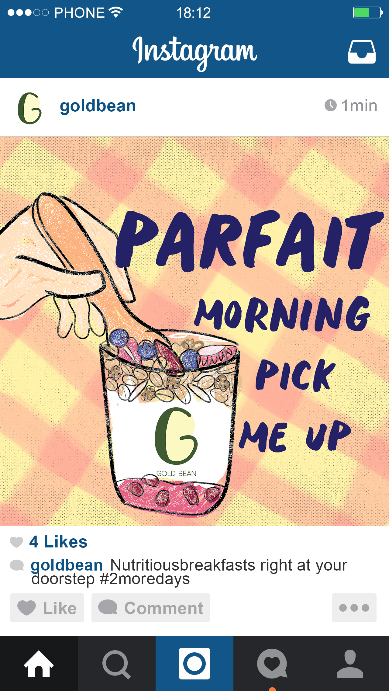
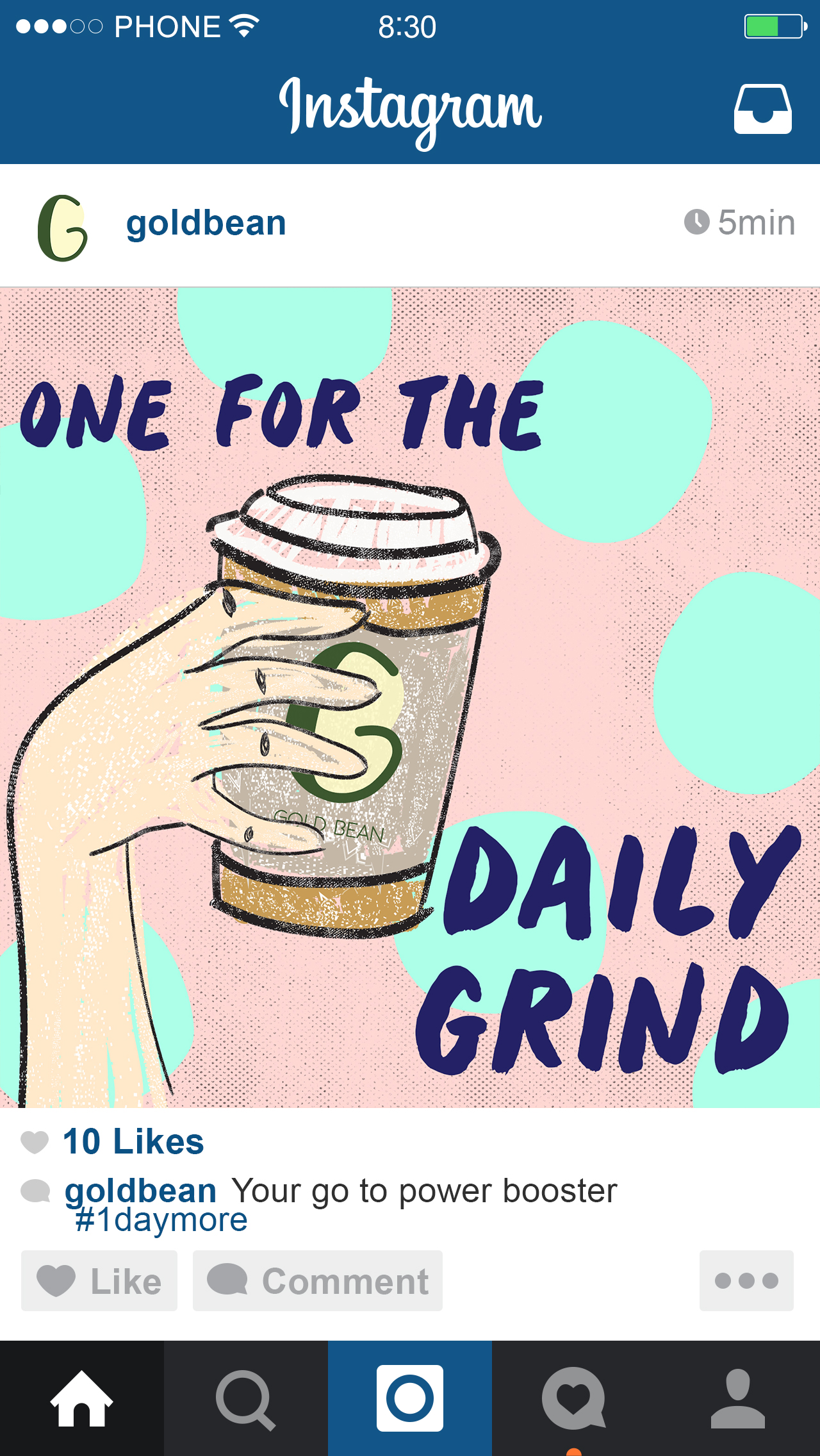
4. Instagram countdown posts
This is the first draft of our poster. Please let us know if we can edit in any way 🙂
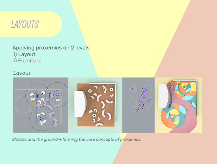
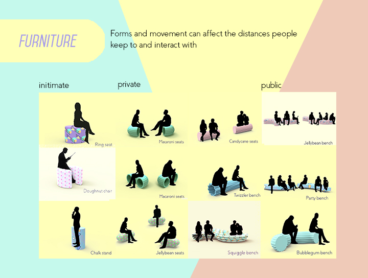
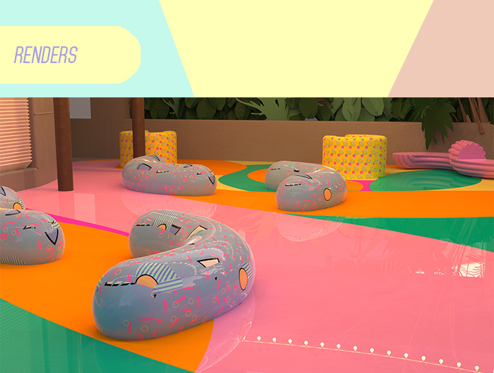
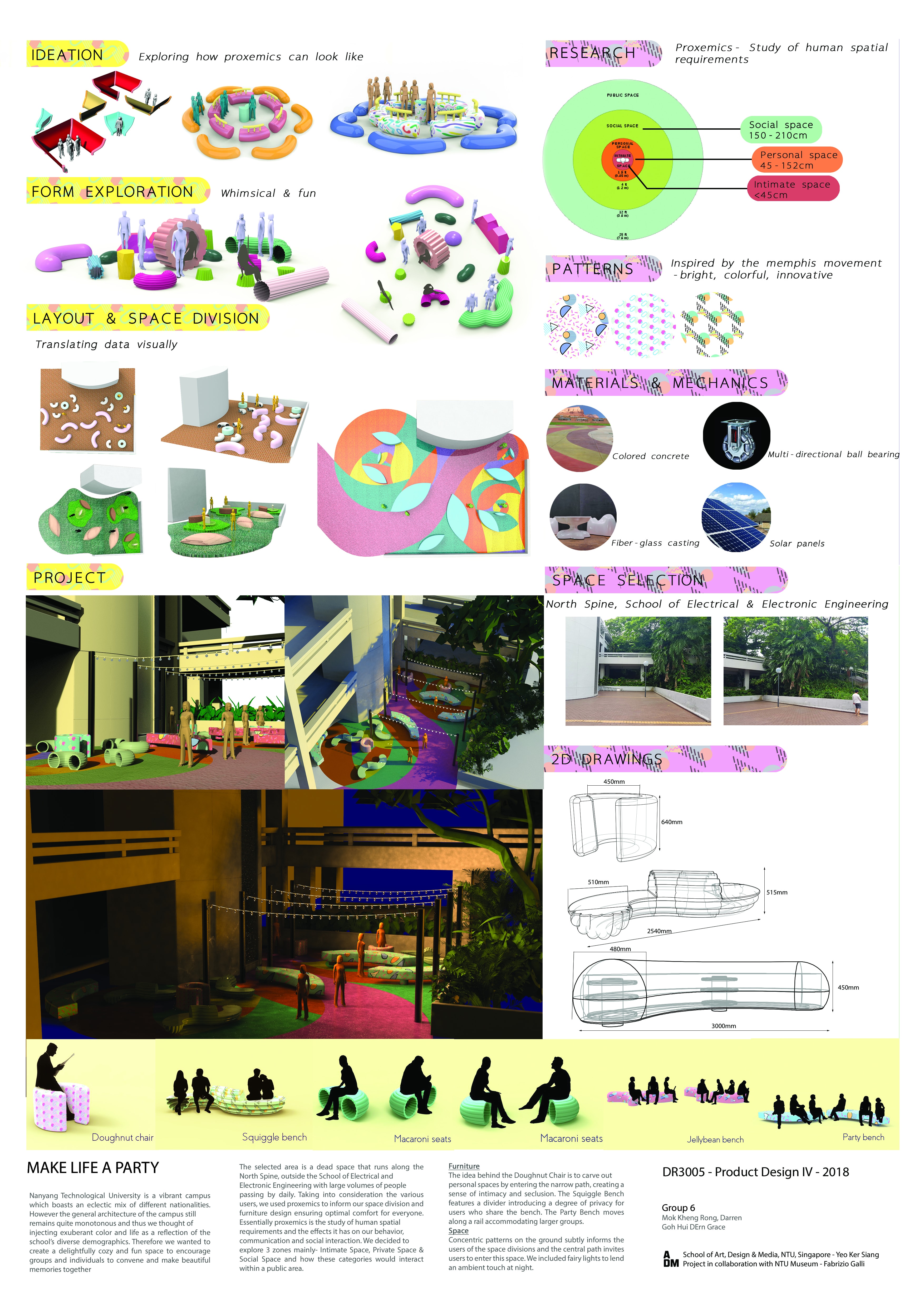
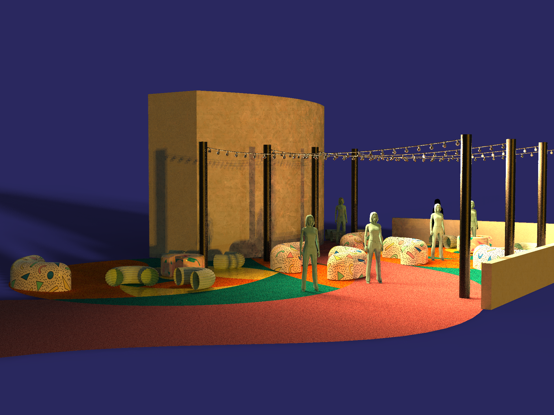
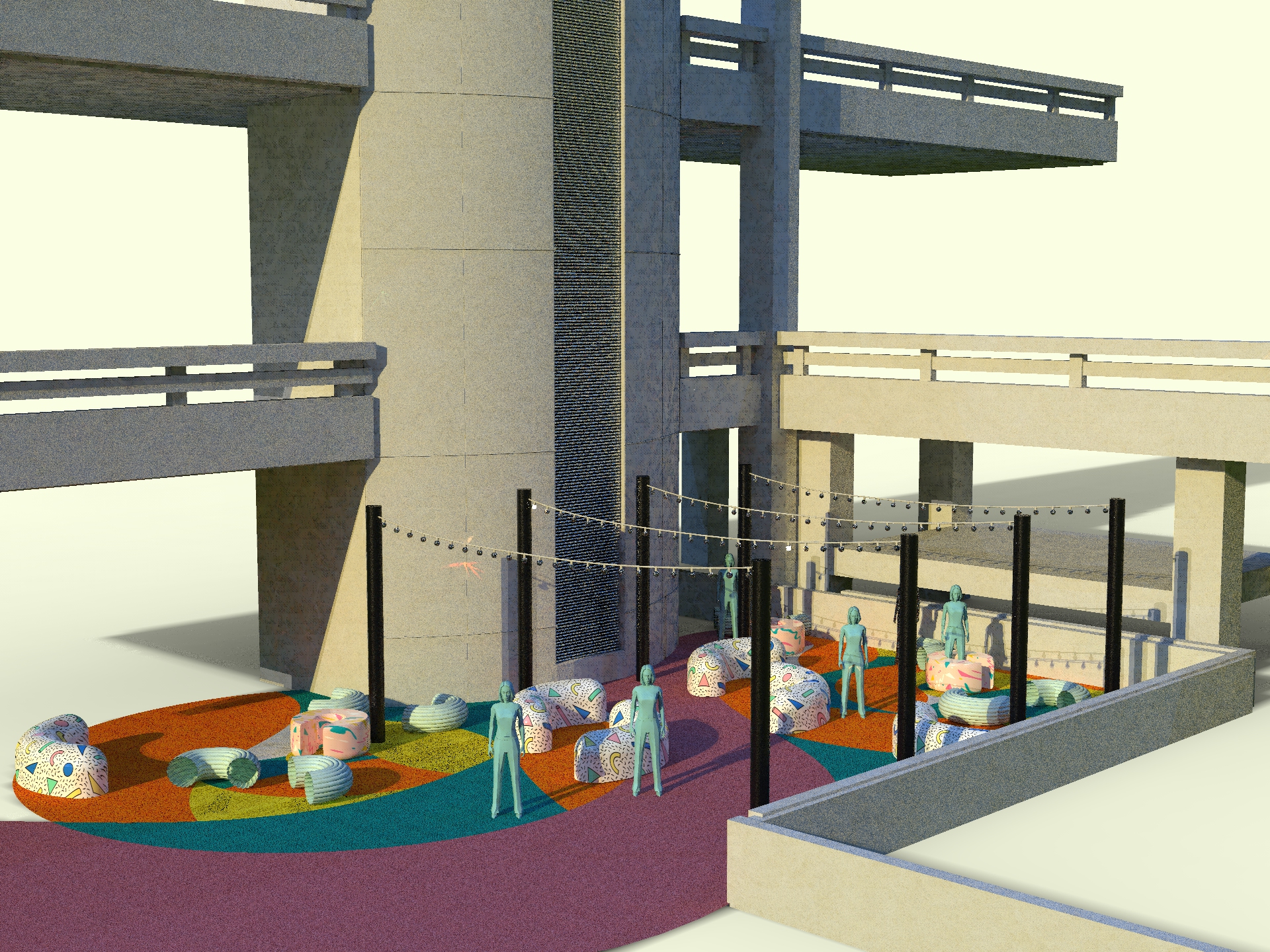
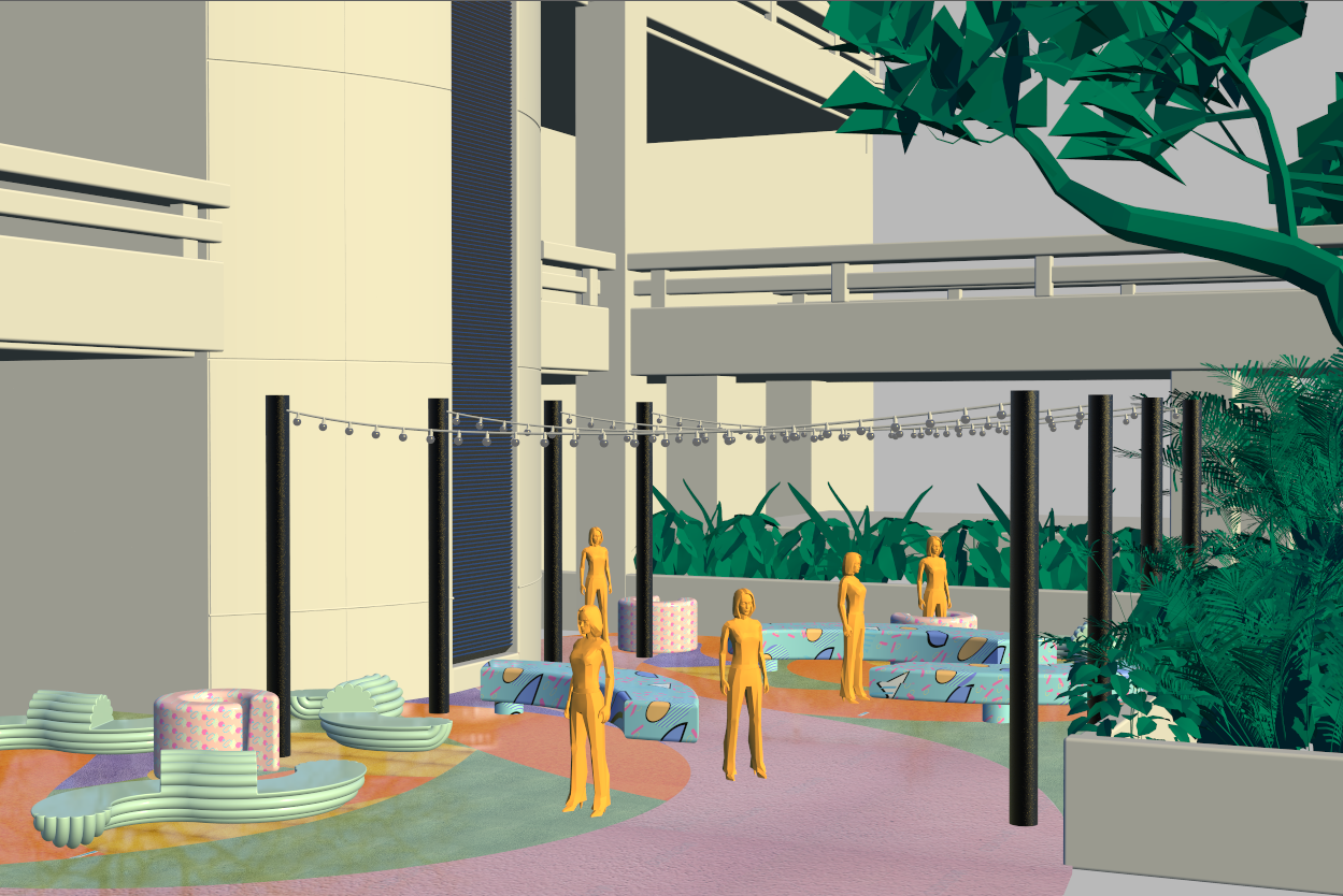
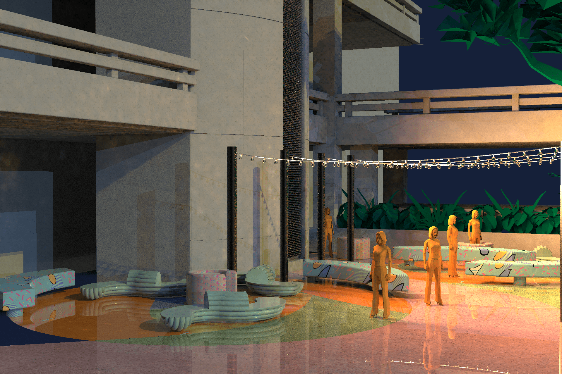
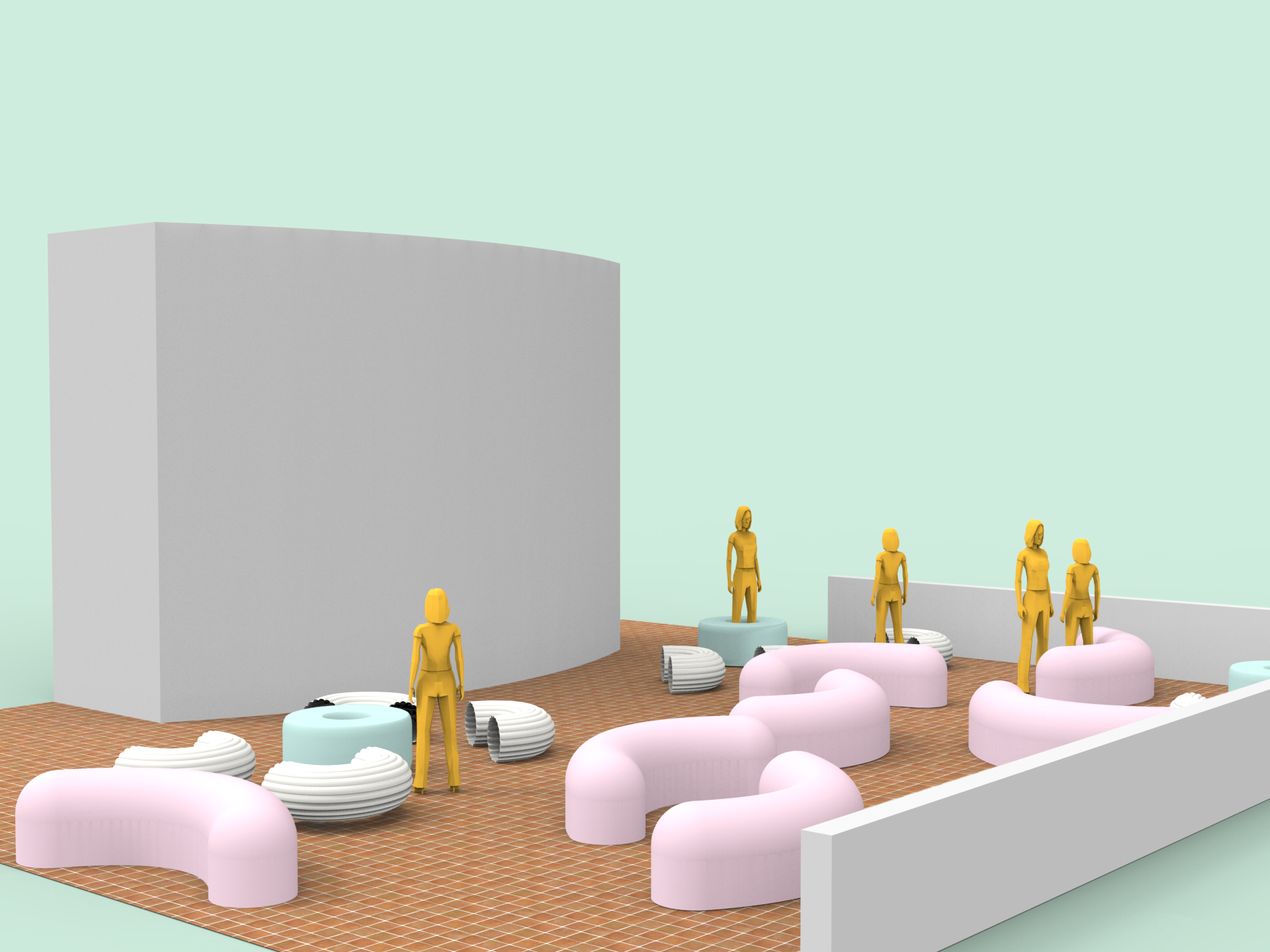
As we discussed last week during consultation, we have combined the candy furniture with the patterned rubber mulch flooring to create a fun and vibrant space for public gatherings. Additionally, this space and furniture is thoughtfully and deliberately designed according to the proxemics matrics to enhance the comfort level of the users who gather here, alone or in groups.
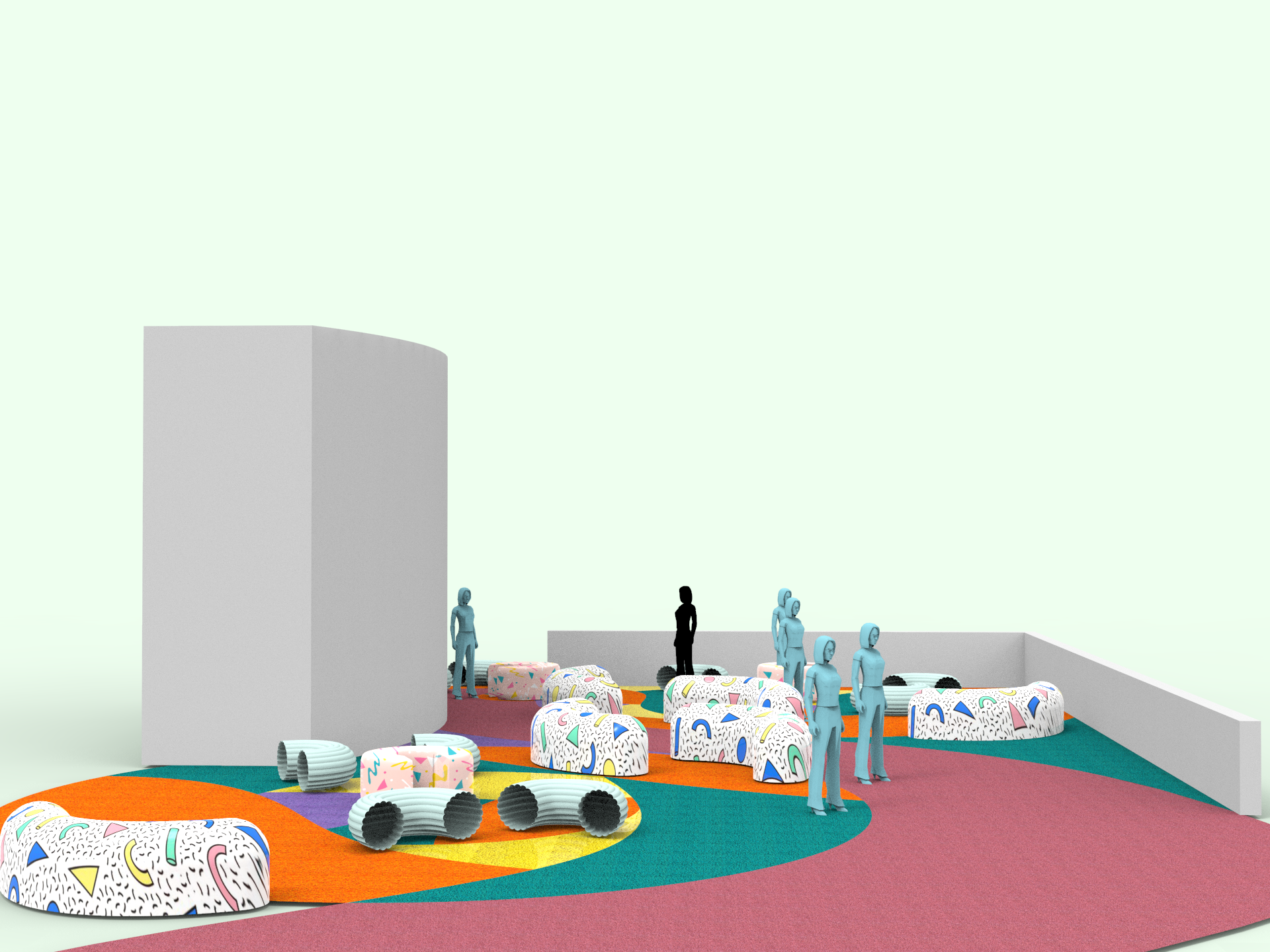

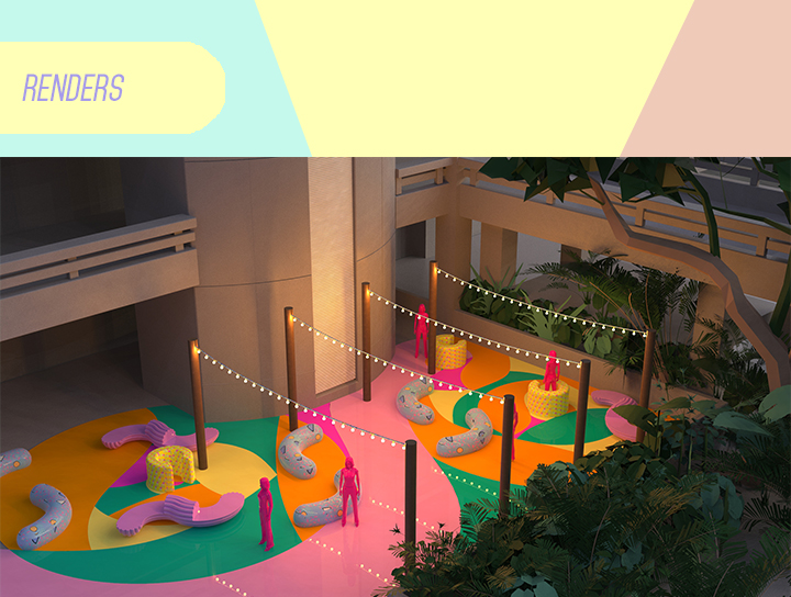
We felt like the space still needed another element to enhance the mood and tried adding fairy lights.

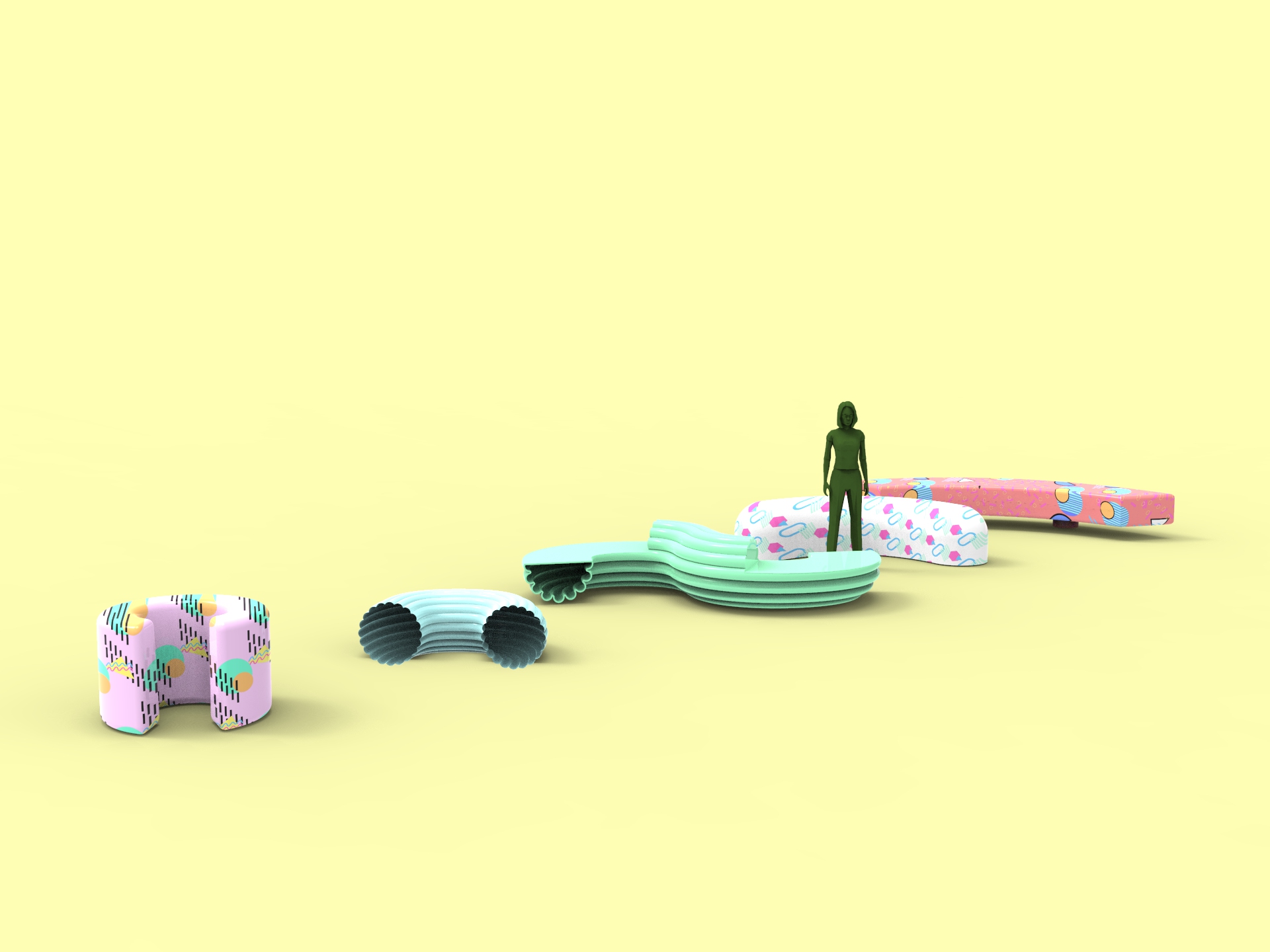
We also thought about how we can redesign some of the furniture. Here are the variations we came up with
Also after consulting, we changed the rubber mulch flooring to colored concrete to create a more sophisticated, laid back atmosphere.


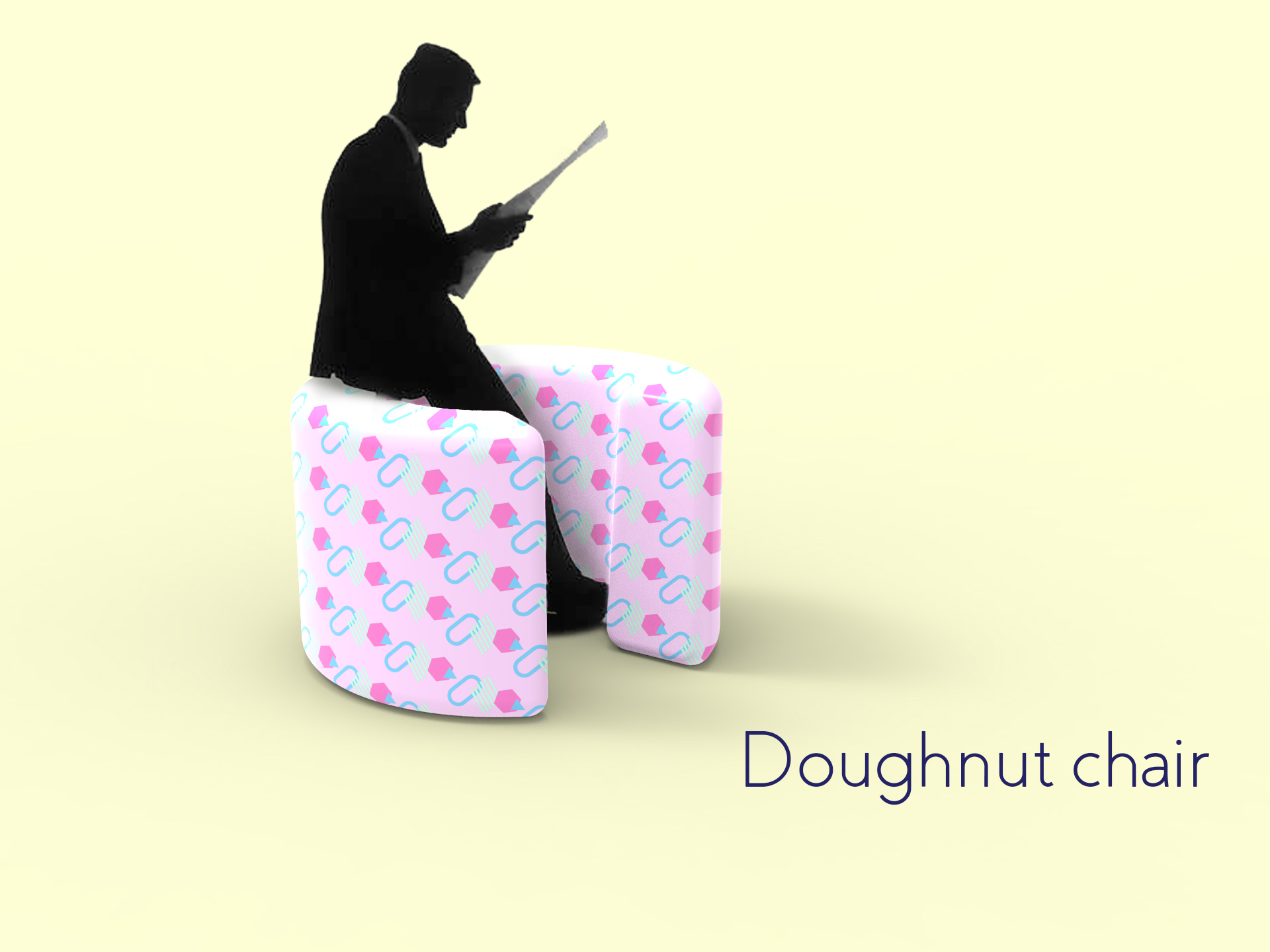
Doughnut chair
Indicative of intimate space. By entering through the narrow opening, the user creates a personal space within this shared area.
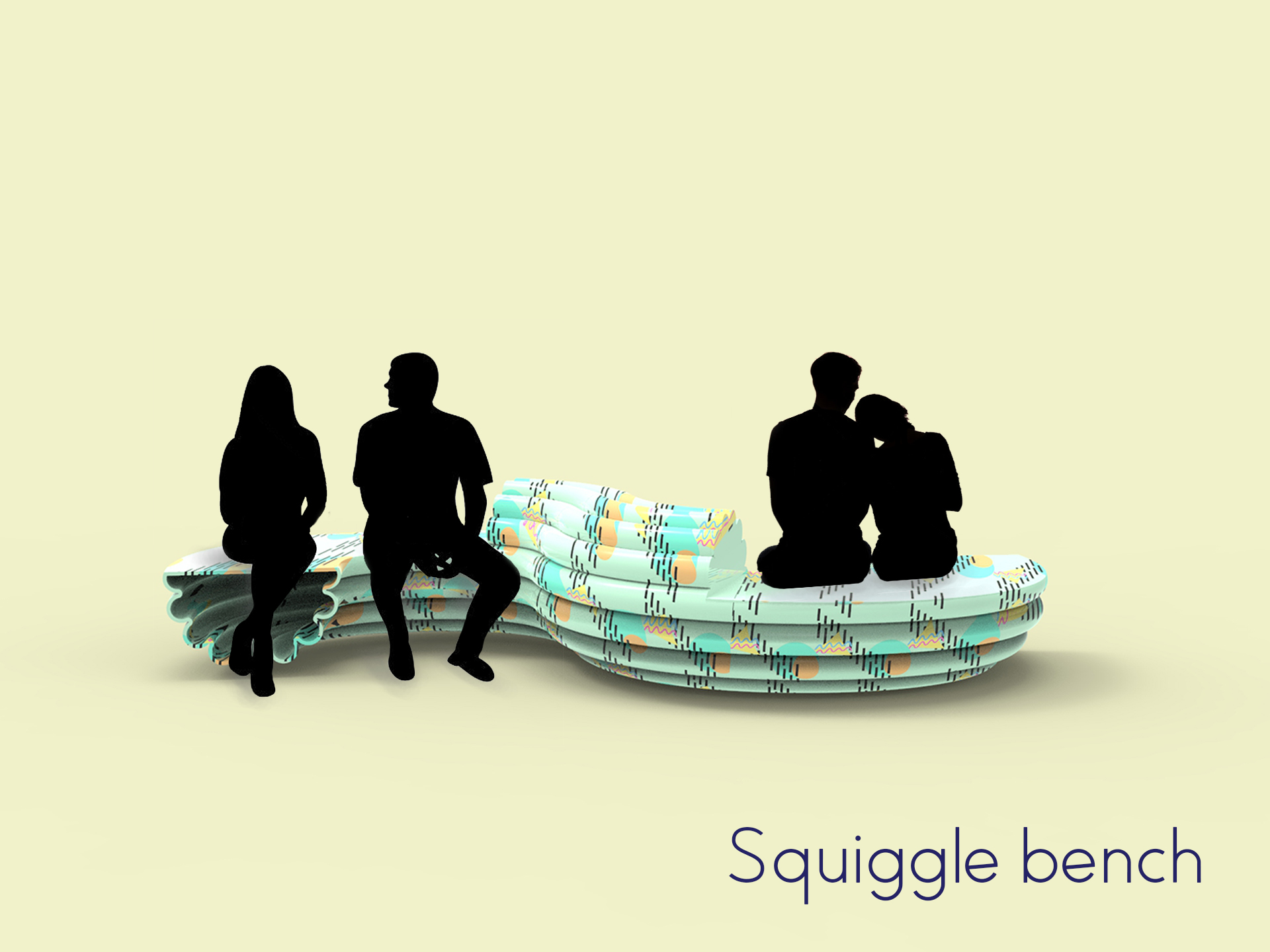

Squiggle bench
An s-shaped bench that features a divider in the middle creating some degree of privacy for users who share the bench.
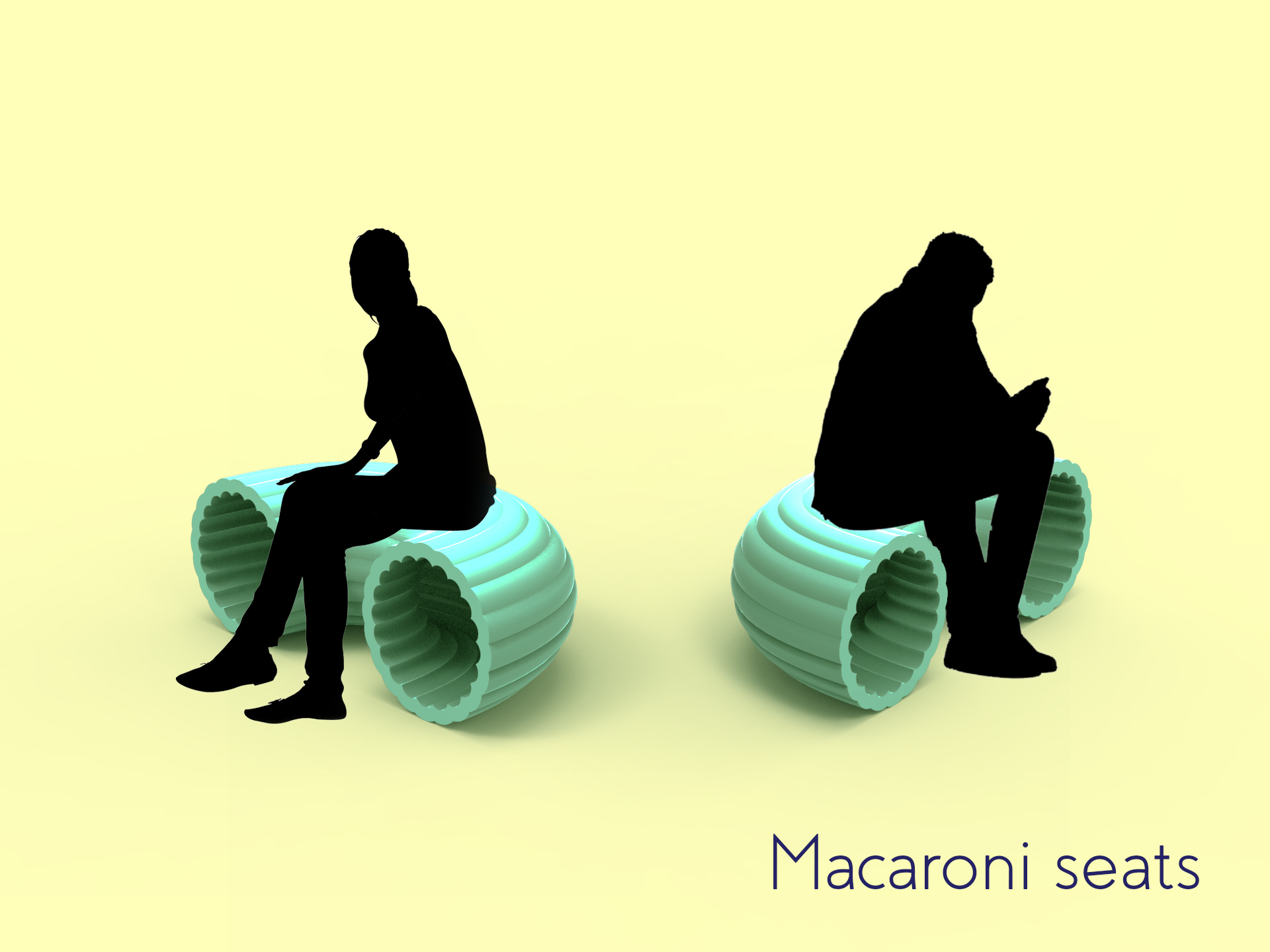
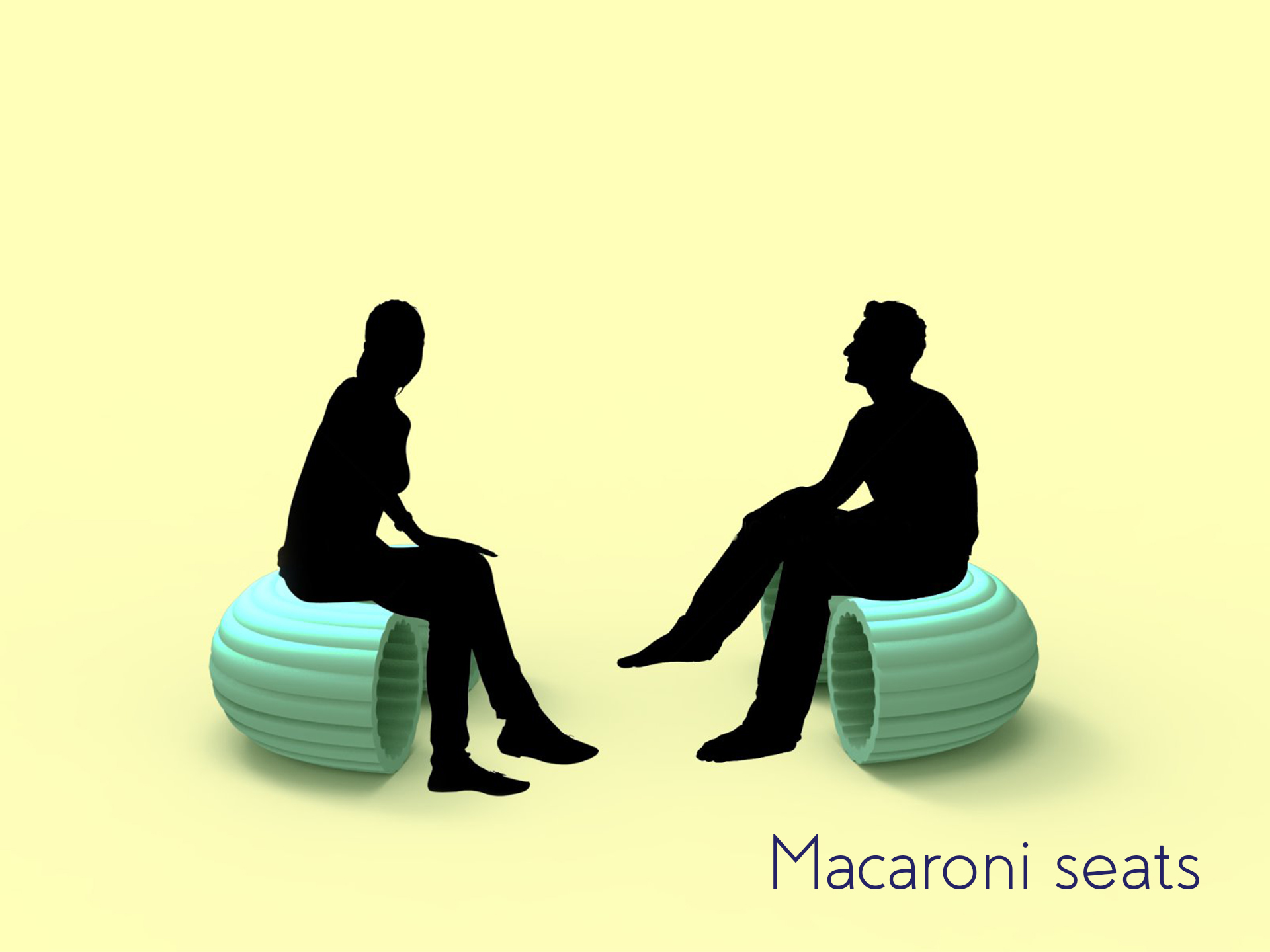
Macaroni Seats
These chairs are rotable on an axis to allow users to create private spaces for themselves or in pairs for conversations.
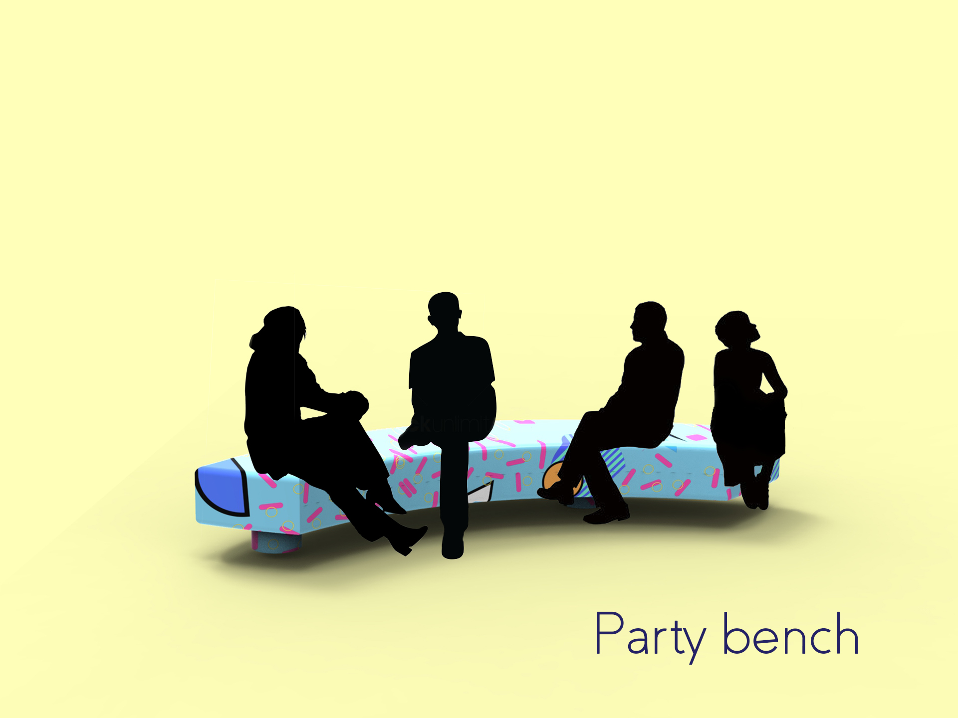
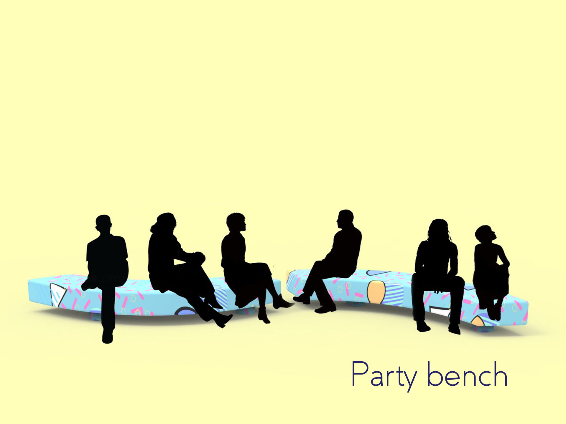
Party bench
Long benches for social gatherings/groups to convene and hang out together. These benches move along an rail to create longer benches accommodating larger groups.
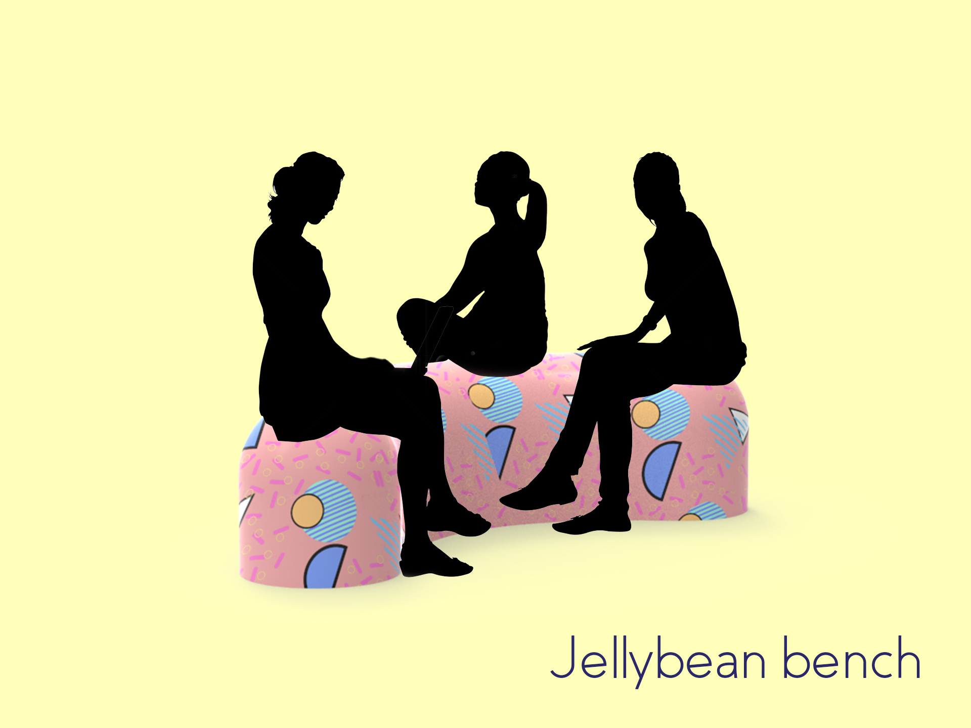
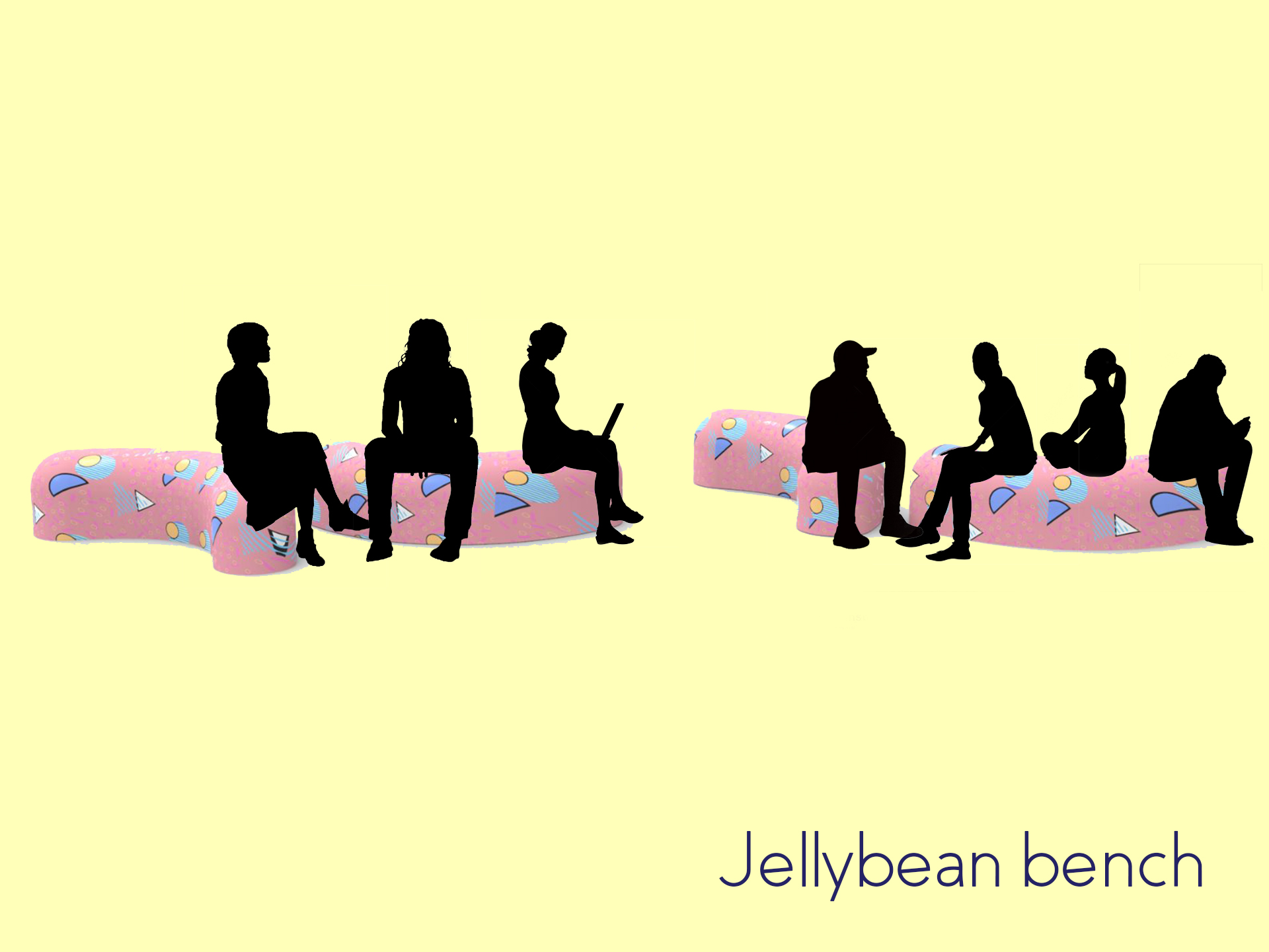
Jellybean bench
Similarly this bench moves along a rail to accommodate larger groups in the space.
The event I’ve chosen is the opening of my dad’s shop (haha, he’s opening a salad shop at Tanjong Pagar @Icon Village). To better inform the kind of items I should be designing I created an ideal user persona, Tina. Tina embodies the spirit of most office ladies I know both personally and on social media.
Because my dad is totally new in the F&B industry, and also because he’s a typical dad, the shop doesn’t have a strong branding. As such, I’ve decided to create a series of illustrations that are generic. One thing the shop hopes to be is a provider of fresh, healthy takeaway options.
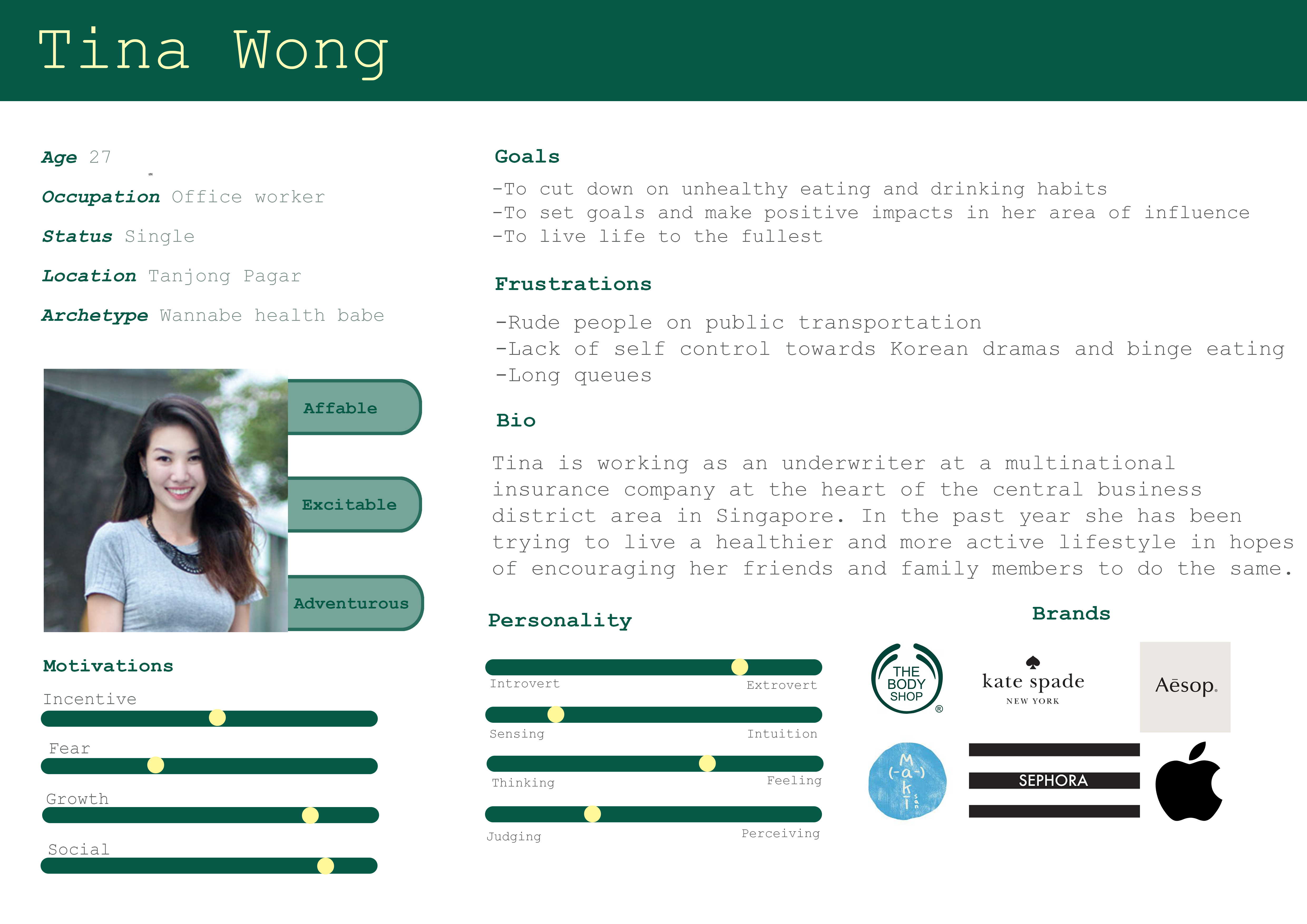
With Tina in mind, I decided on this moodboard to keep me on track as I design.
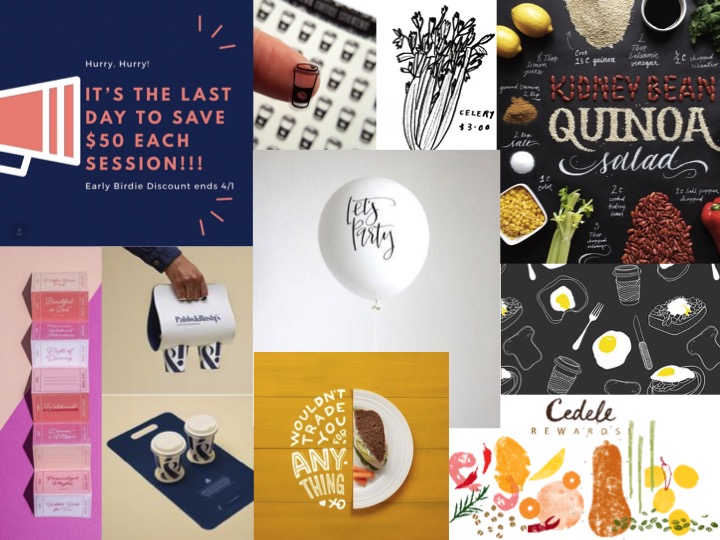
The items I’m designing for are:
1. Coffee holders
2. Promotion vouchers
3. Pull up banners
4. Instagram countdown images
(I really wanted to do printed balloons, but I guess office ladies like Tina wouldn’t really like balloons)
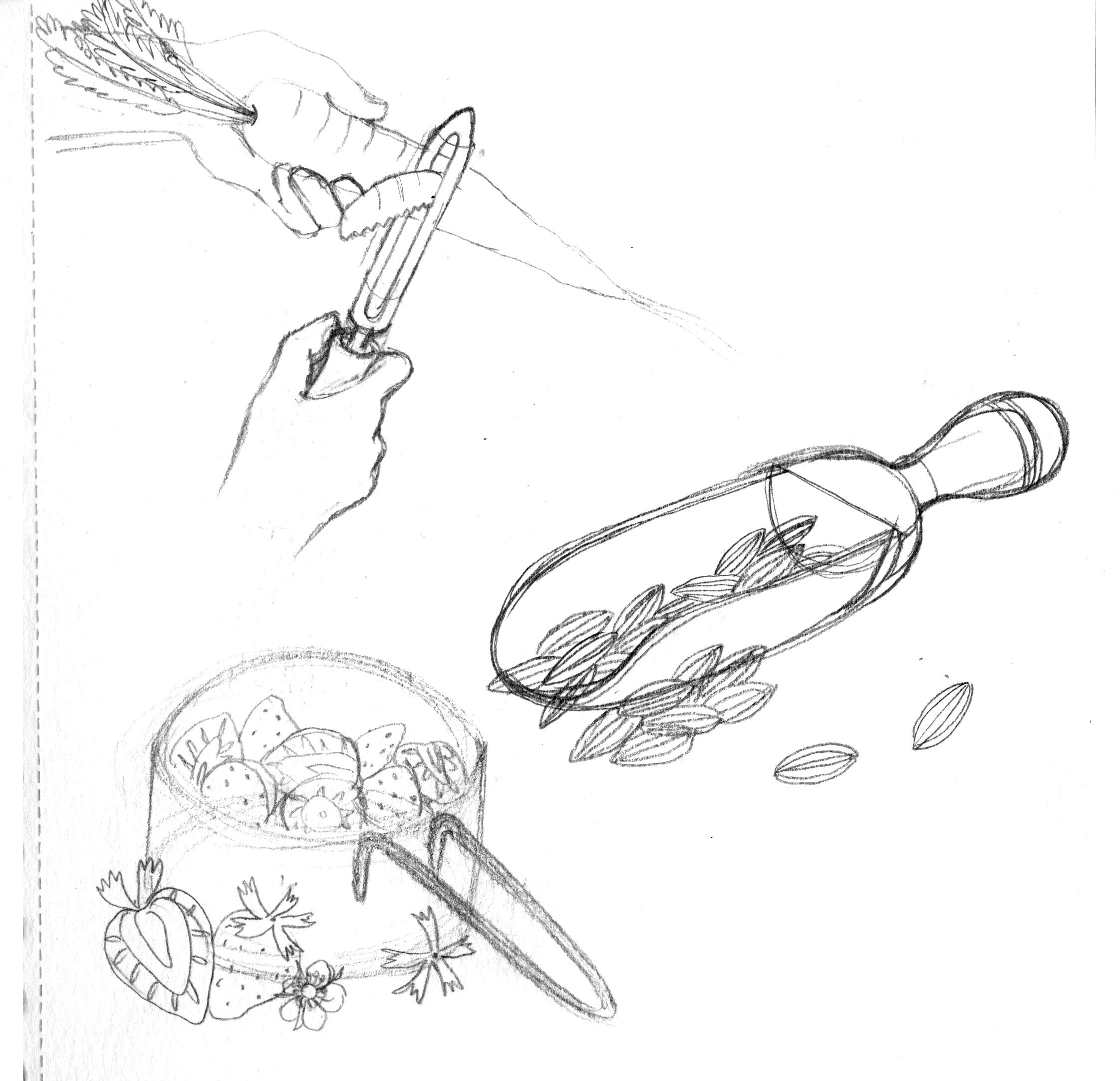
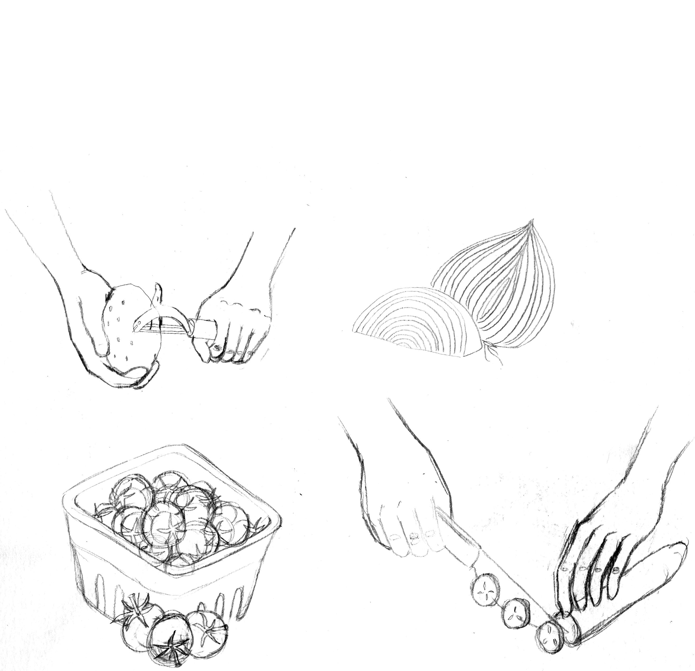
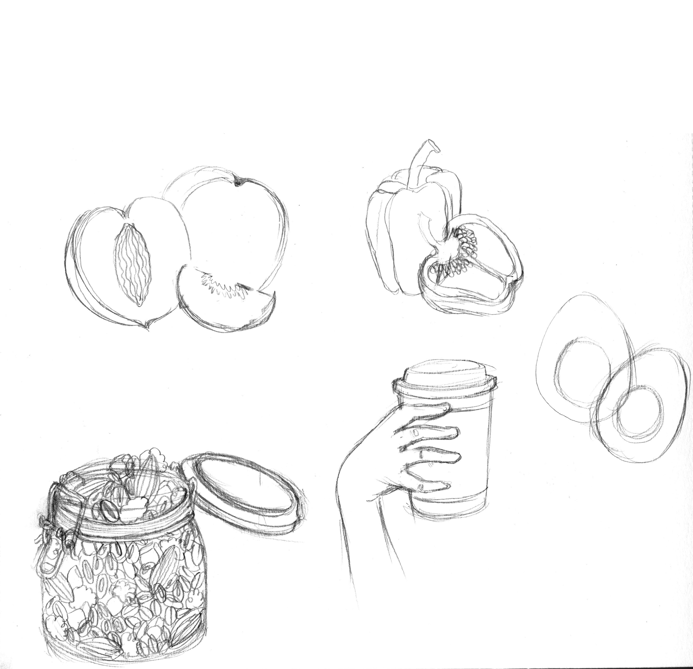
These are some of my pencil sketches, still on the fence if I should do a traditional ink+watercolor route or a digital stamp-textured style of illustration.

Maybe I’ll test out an alternative style over the weekend, though tempted to just do a digital version of watercolor with all the submission date lines.
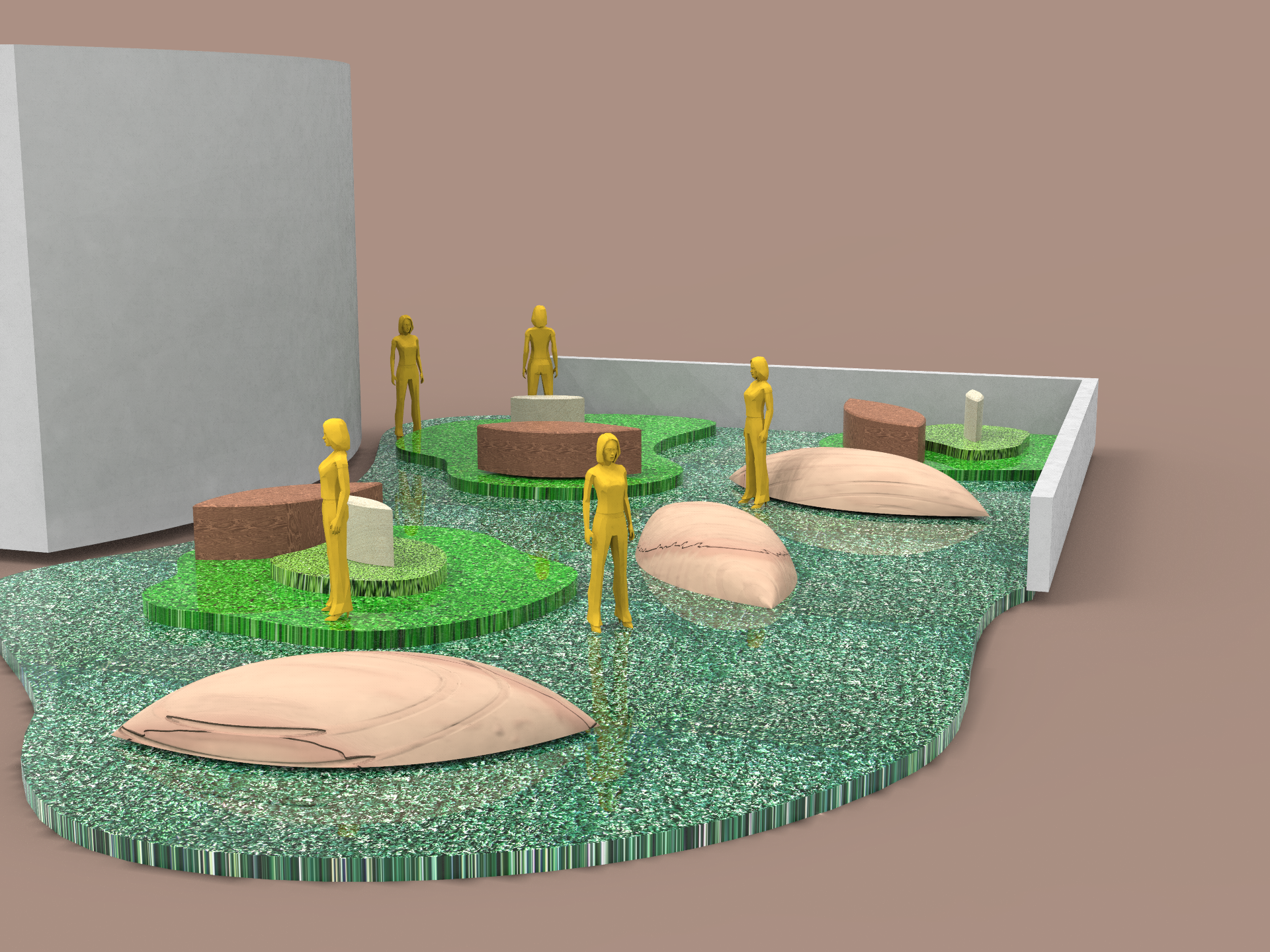
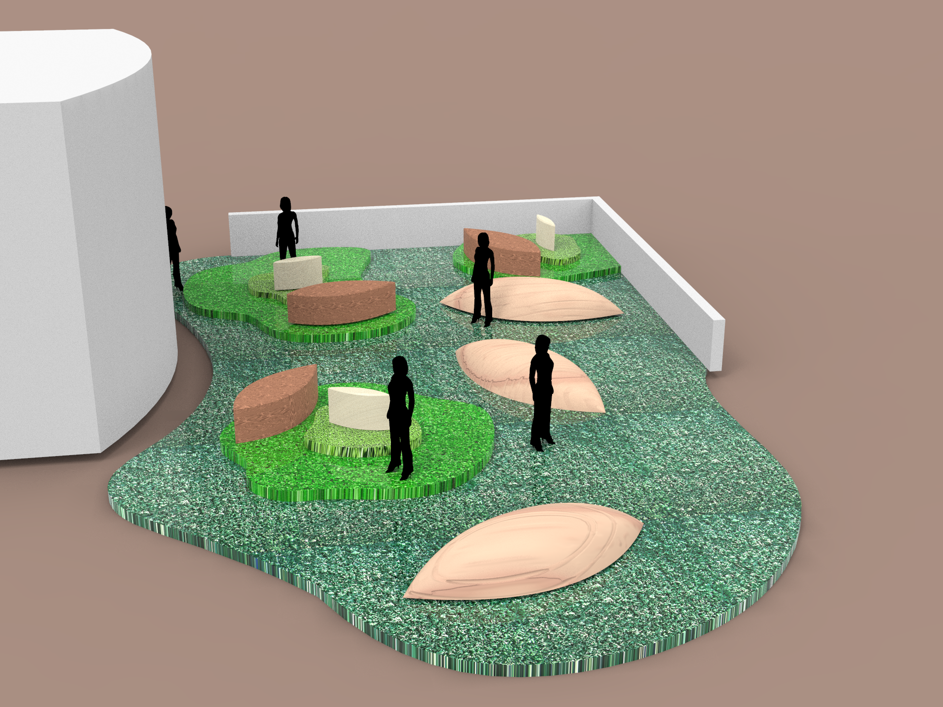
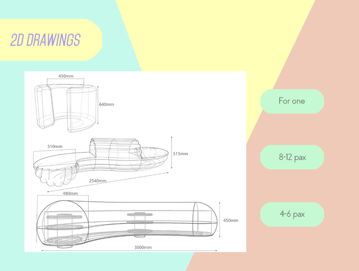
From last week’s consultation we started exploring how we could arrange the furniture so that they would make sense together and apart. We also thought of the location and how these sculptural furniture pieces could be contextualized in the space through the application of different materials

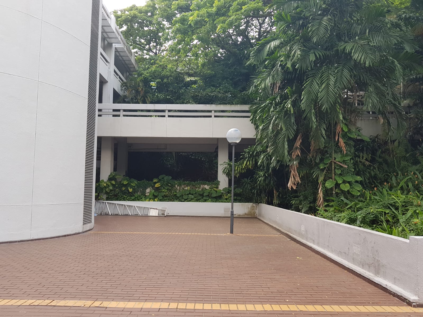

Our chosen location is this corner surrounded by lush foliage outside the School of Electrical and Electronic Engineering along the North Spine.
We went down to take some measurements and tried to place the furniture pieces in to imagine how they would fill the space.
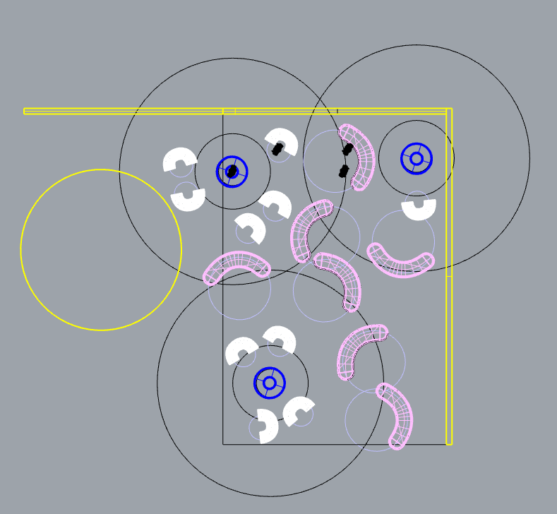
 The rings are used as a guide to inform the proxemics matrics.
Dark blue: Intimate space (45cm)
Shaped as such to show the space it creates if an individual uses it or even the slight discomfort of needing to share this space with another.
Previously the forms we used didn’t have an appropriate hierarchical representation and caused the user to stick out quite drastically. Hopefully this form expresses the matrics in a more suitable way.
White: Personal space (120cm)
We intend for these seats to be rotatable all around allowing users to define their own personal space even within a public setting.
Pink: Social space (370cm)
These longer benches are able to move along a rail installed at the bottom allowing different configurations as groups gather together.

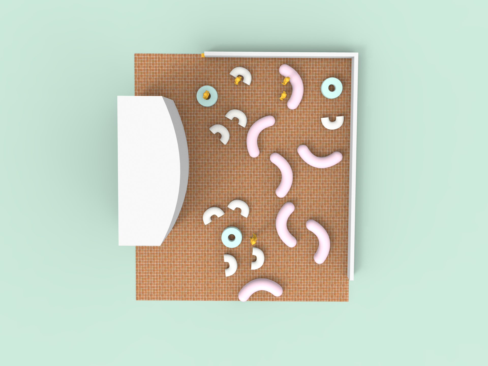
Next we thought of incorporating the proxemics matrics subtly into the design of the space by creating a motif on the surface of the ground. By using another material it also helps to separate this rest area from the bustling traffic around.

The pink route indicates a pathway to invite the public into the space.
Tried experimenting with a pebble pavement. This would affect how the furniture rotates though.

Another version using rubber mulch, similar to the sort used in playgrounds and communal exercise areas commonly found within HDB estates. 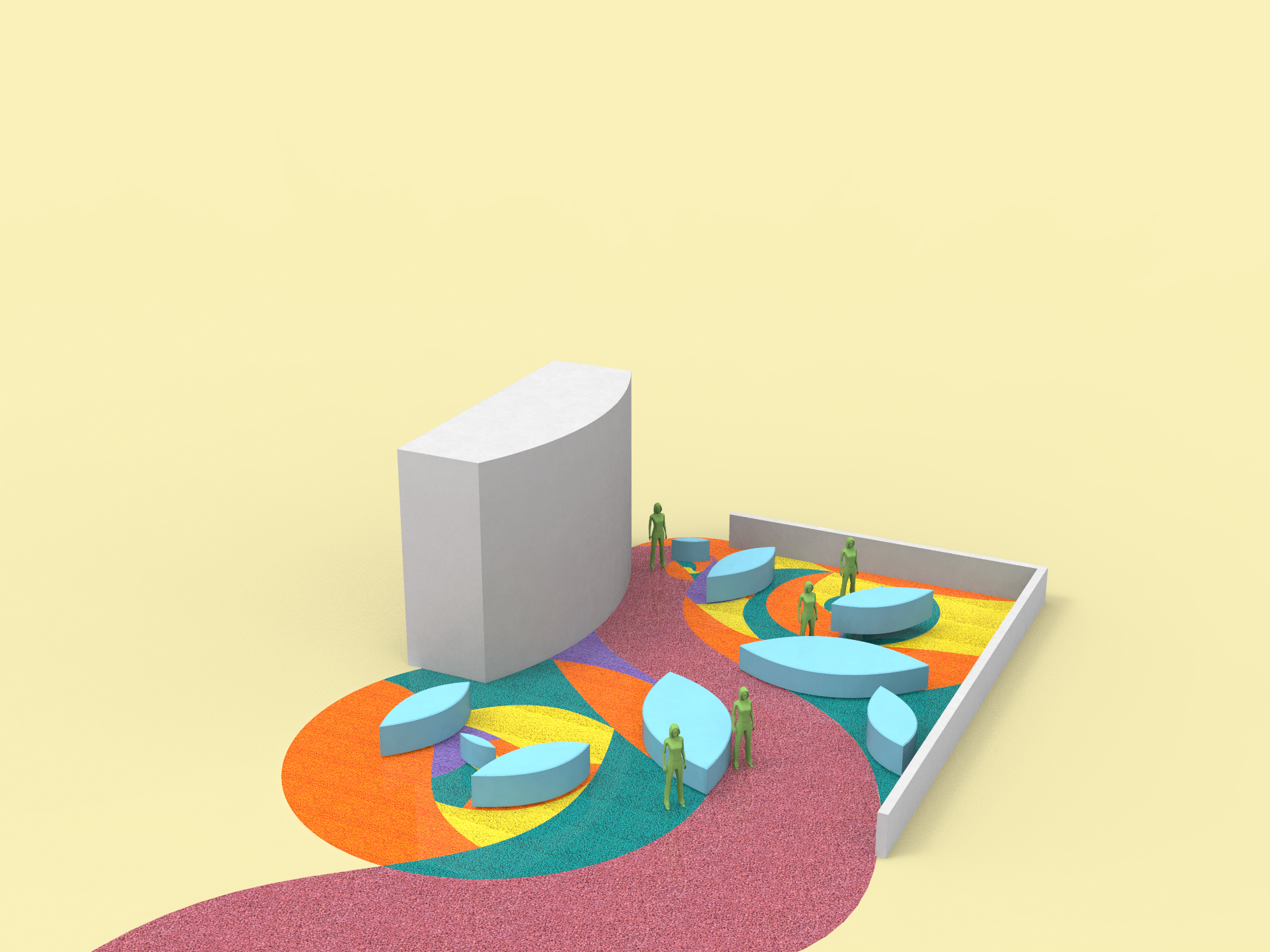

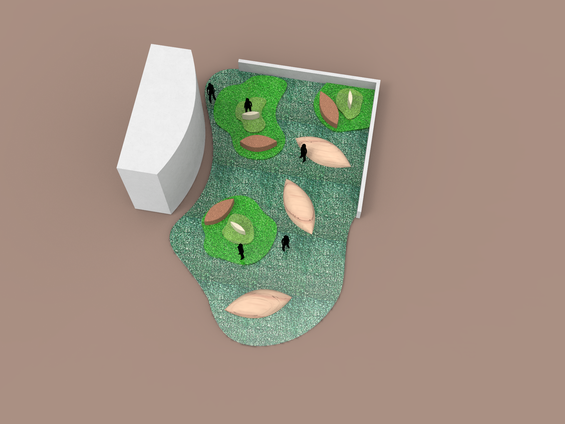
Top view of the layout. We also tried simplifying the forms to resemble flowers and leaves to harmonize with the foliage in the area.
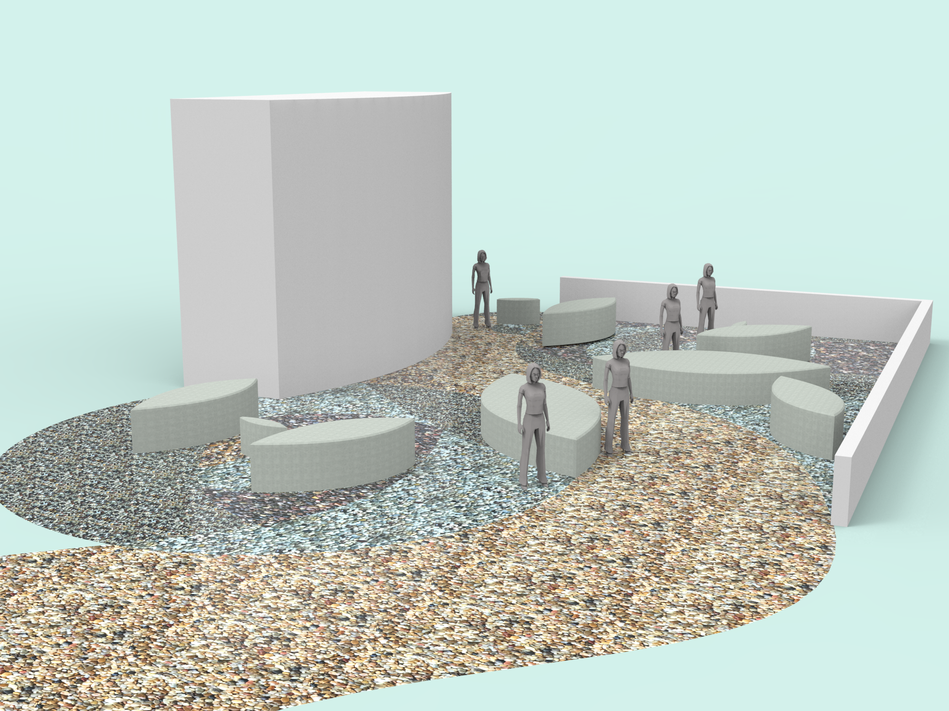
Lastly we tried using astroturf to create a different atmosphere (hopefully exuding a more chill vibe like a good place for picnics!) This time we also experimented with the height to represent the different zones and used wood as it plays well with the nature theme.