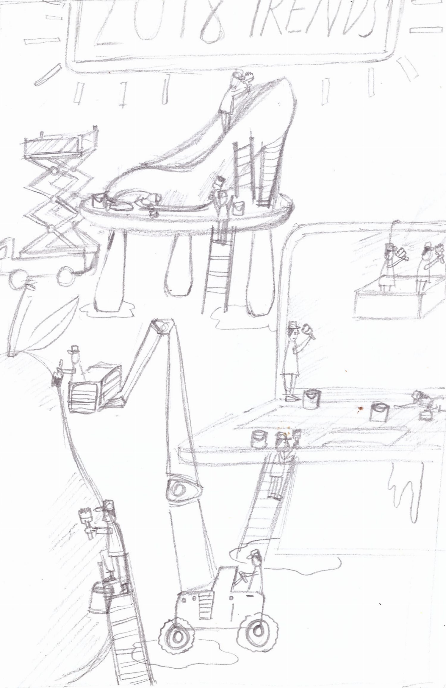
Idea 1: Conveyor belt
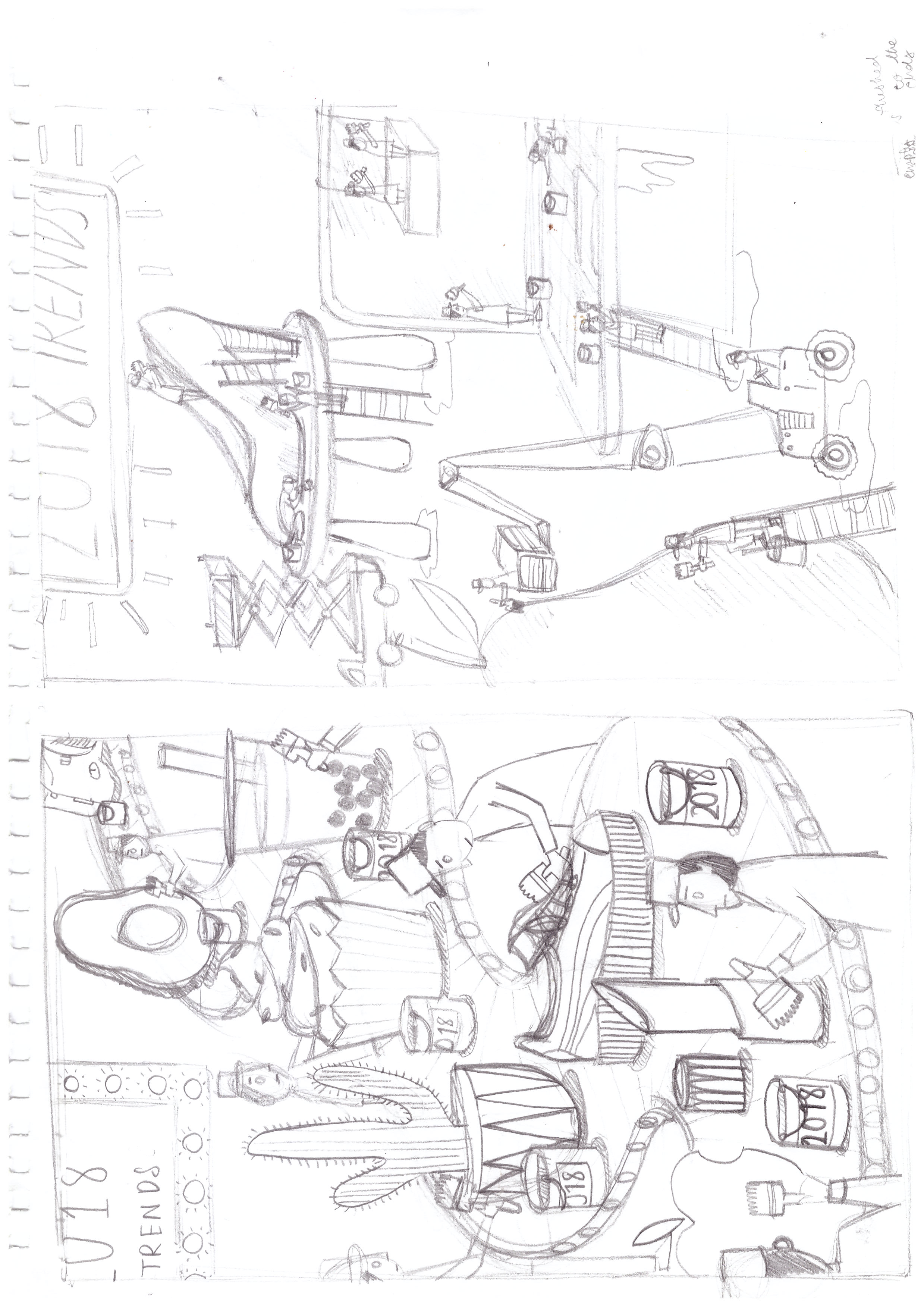
two versions, one with a clearer diagonal division.
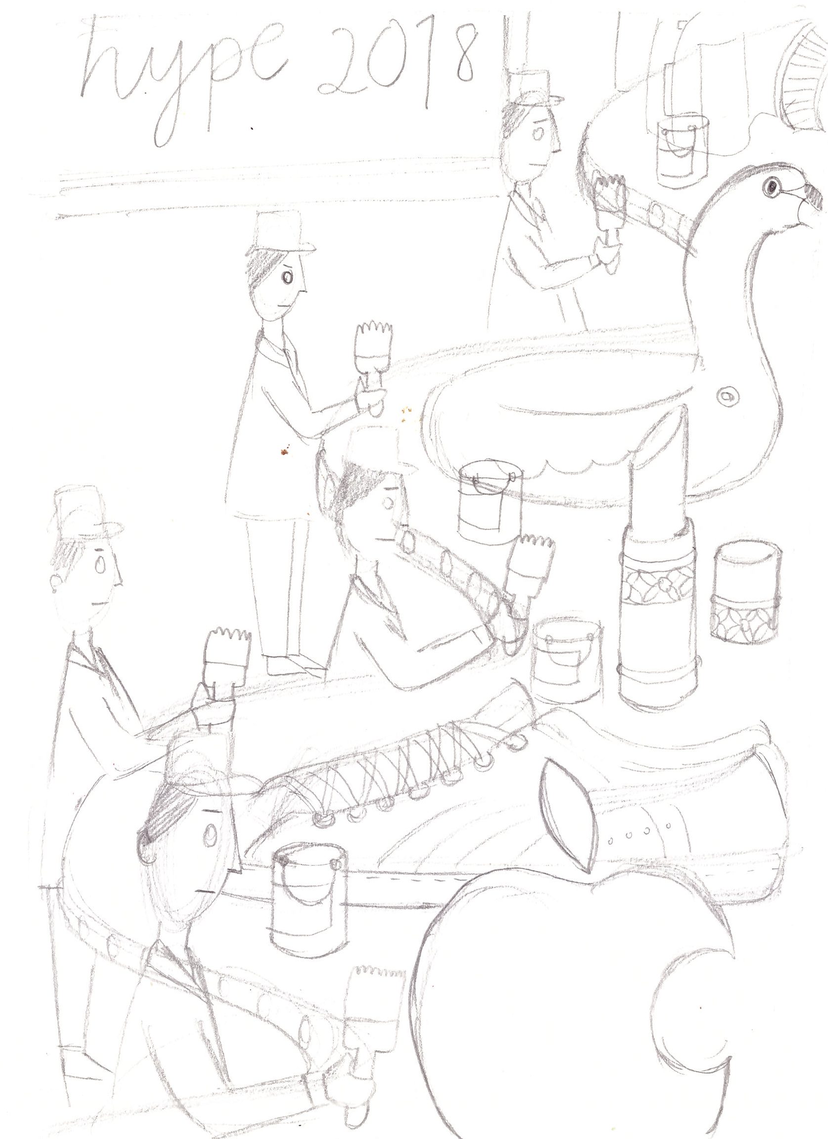
Idea 2: Tiny people.
I wanted to try an isometric illustrative style for this concept
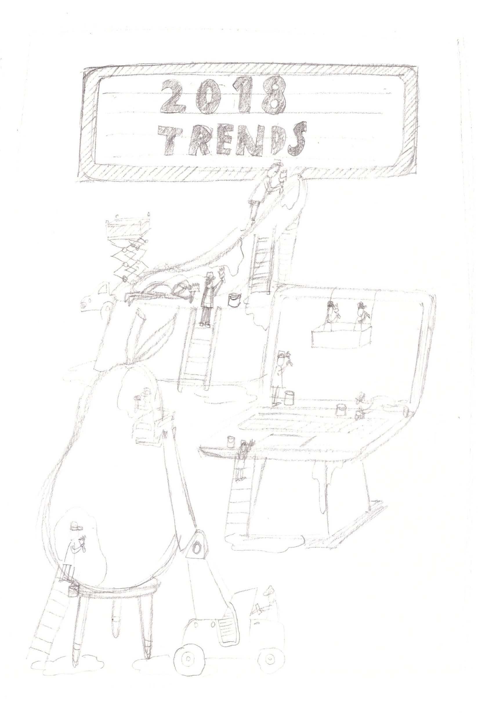
The second layout has more breathing space around it, keeping the graphics smaller .
Idea 1: Conveyor belt
two versions, one with a clearer diagonal division.
Idea 2: Tiny people.
I wanted to try an isometric illustrative style for this concept
The second layout has more breathing space around it, keeping the graphics smaller .
You must be logged in to post a comment.
Hi Grace
I love the idea of having tiny people and huge trending items! It’s fun but also quite (sadly) poignant of our time. I would avoid having the sign saying 2018 trends as I think your illustration needs to communicate this without words. Make the audience work a little! However having 2018 written on the paint buckets makes sense, giving the audience a clue rather than spelling it out for them 🙂
I’m looking forward to see your progressions next week. Have a good break
Lisa
Hi Grace!! 🙂
I am not sure which pencil comps post I am to reply to, but I chose this instead cause it seems like you are quite finalized with this concept ya? 😀
I really really LOVE the Idea 1 first version!! There is a strong visual hierarchy as to where the viewer’s eyes should look and the size difference really adds depth 😀
Perhaps instead of saying ‘2018’ in the case if this fab cover is used in ‘2060’, maybe you can consider Months or Seasons? Lets say Bubble tea trend bucket labels ‘ Summer Hit ( Then you illustrate a summer calendar image?), or maybe those price tags with the famous person on it like Yeezy shoes with a Kanye face on the tag? 😀
Just a suggestion!
Hi Grace!
My favorite of these compositions is the first one with the conveyor belt. I really like the visual depth and the diagonal direction. It really pulls your eye throughout the composition. I like the conveyor belt a lot more than the little people idea for this concept because I think it better conveys the idea of mass consumption of trends. Showing many little people working on one object makes it look like a lot of care and effort gets put into each product, which isn’t true nor is it what I think you’re trying to convey here. I agree with the others that you shouldn’t put the word “2018” in the actual piece. If you choose products that are very obviously 2018 trends, it wouldn’t be necessary to label the year, anyway.
I’m looking forward to seeing where this illustration goes! Especially to see a colorized version, I think it’ll really pop!
Audrey