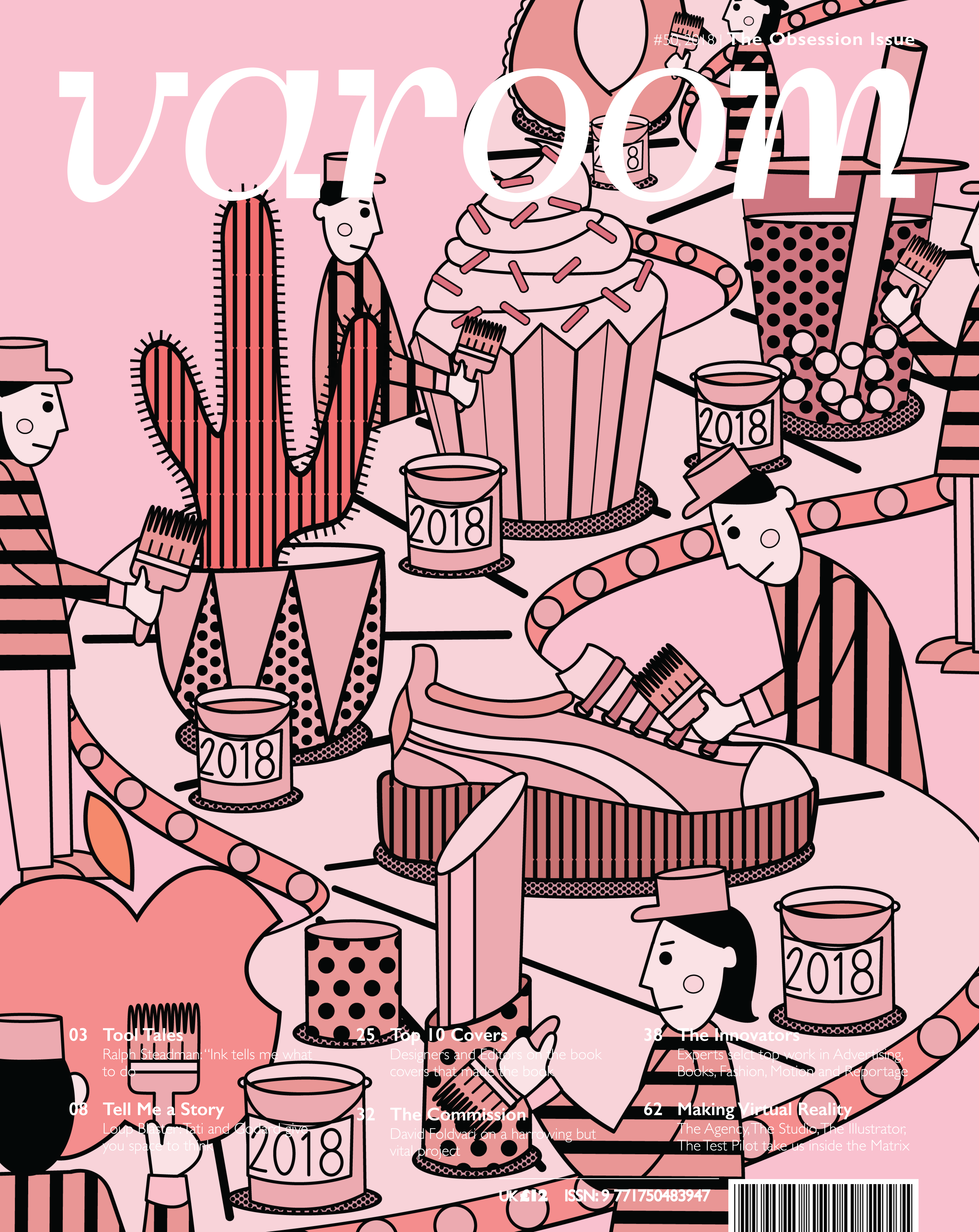
 V1: The bottom text was so unreadable, so we tried zooming out the illustration.
V2: Text still unreadable, didn’t really like the empty spaces and the new perspective. 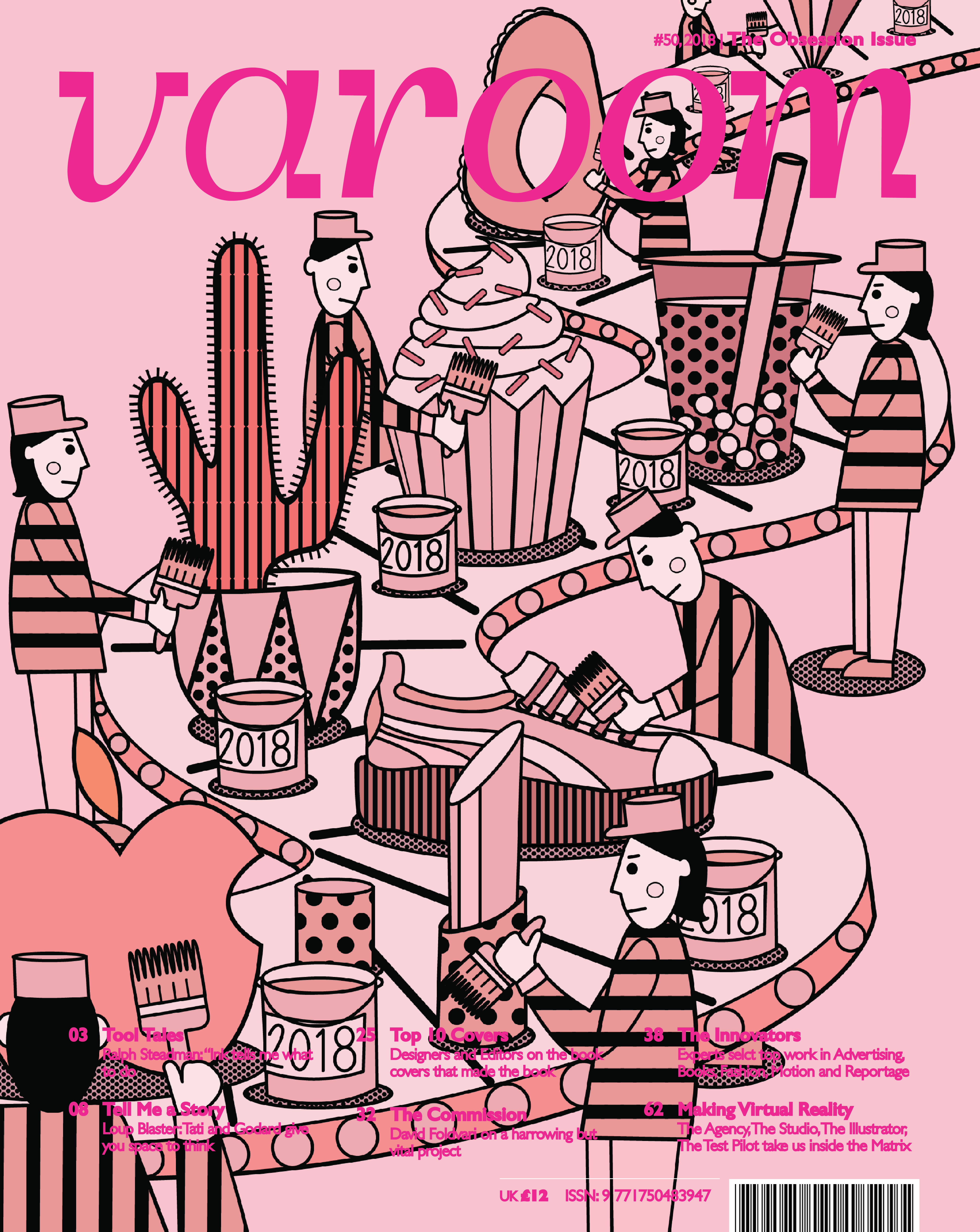
V3: Tried a different text color, adding to the text outline as well. Still unreadable.
V4: Tried making the text thinner, still unreadable.
 V5: Added a border, didn’t really like the way it truncated the design.

V6: Changed the text color and tried to use a gradient background to help make the text more readable without needing to edit the illustration. But it was ugly!!!
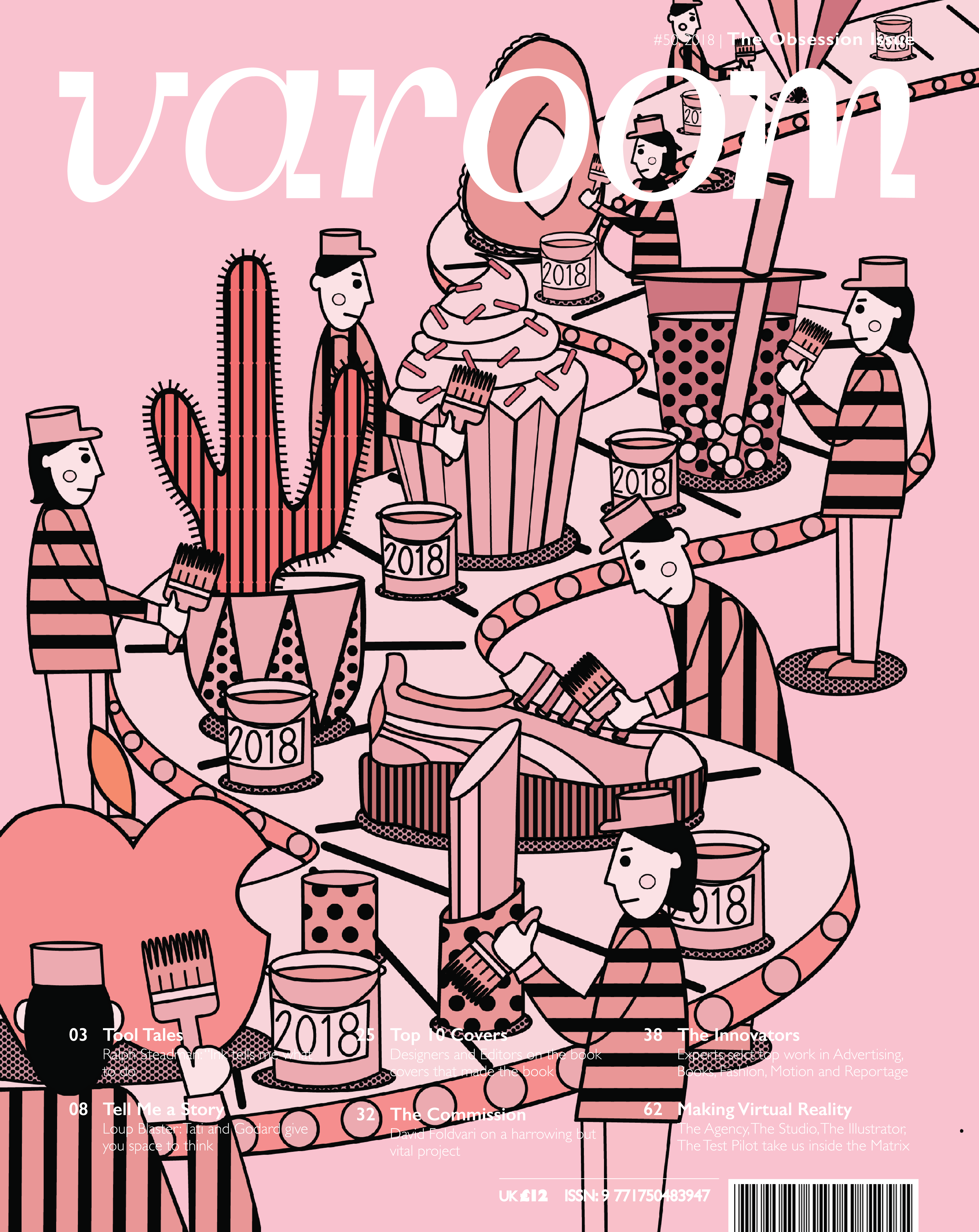
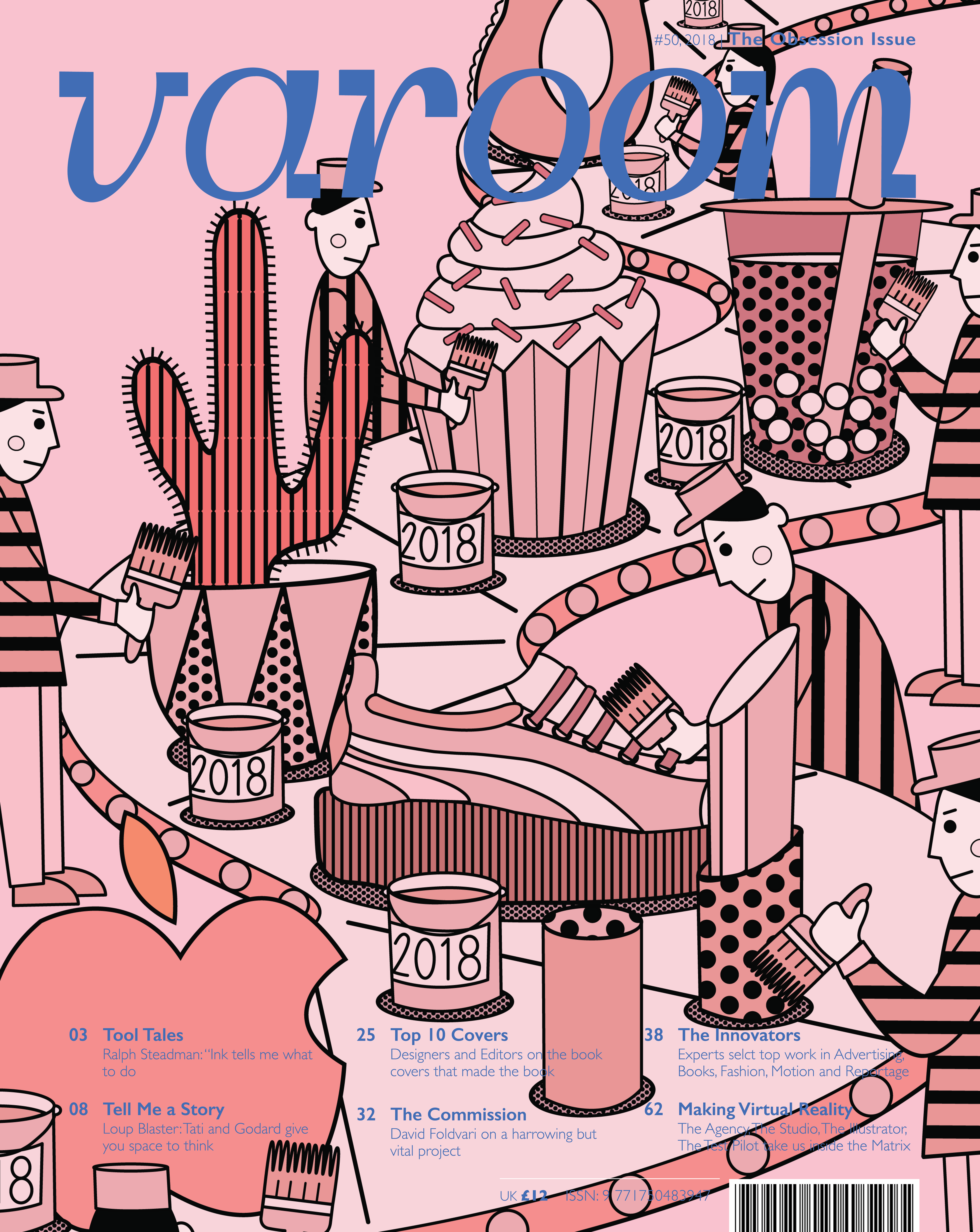 V7: Relented and moved the illustration. Better but a little messy at the top

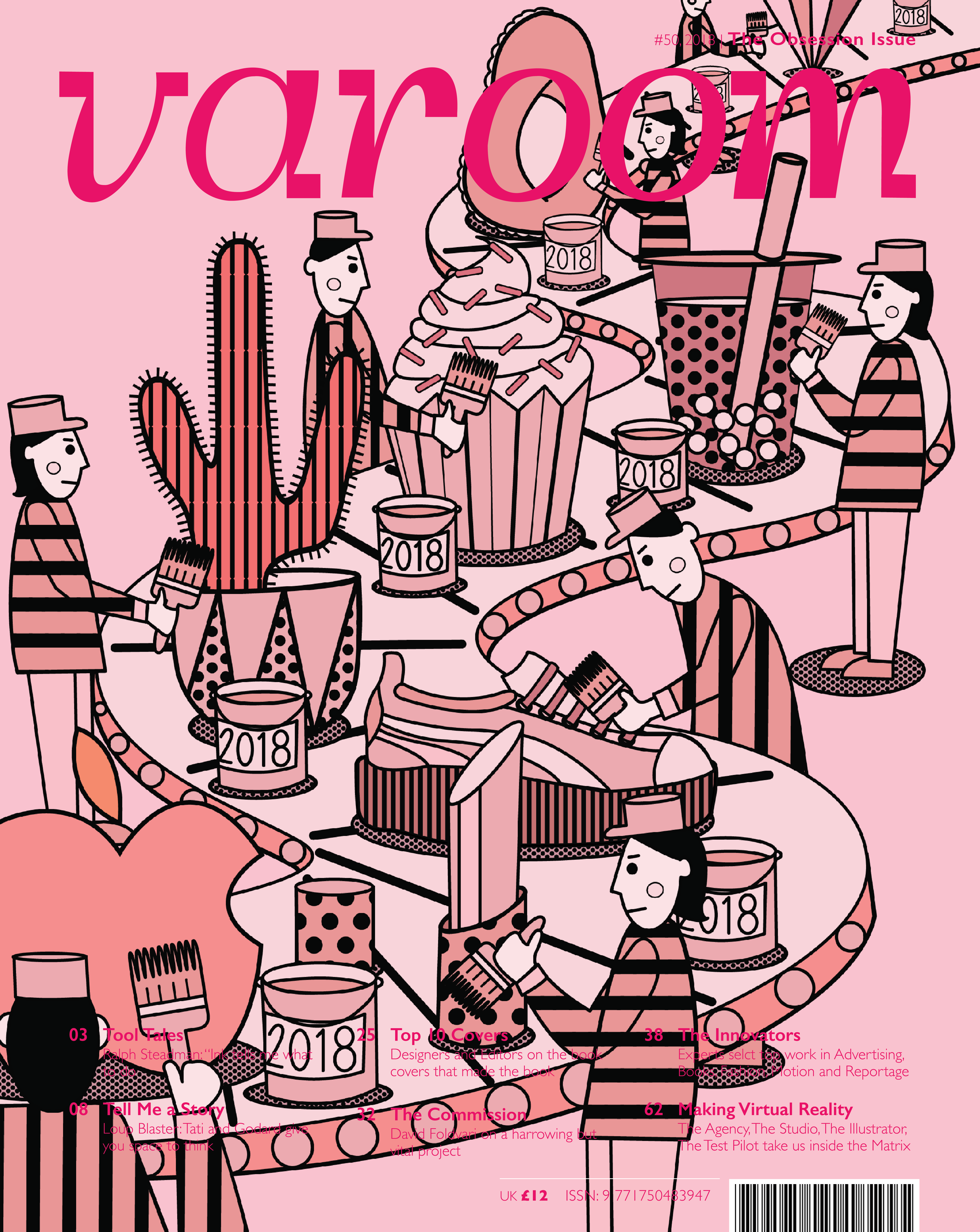
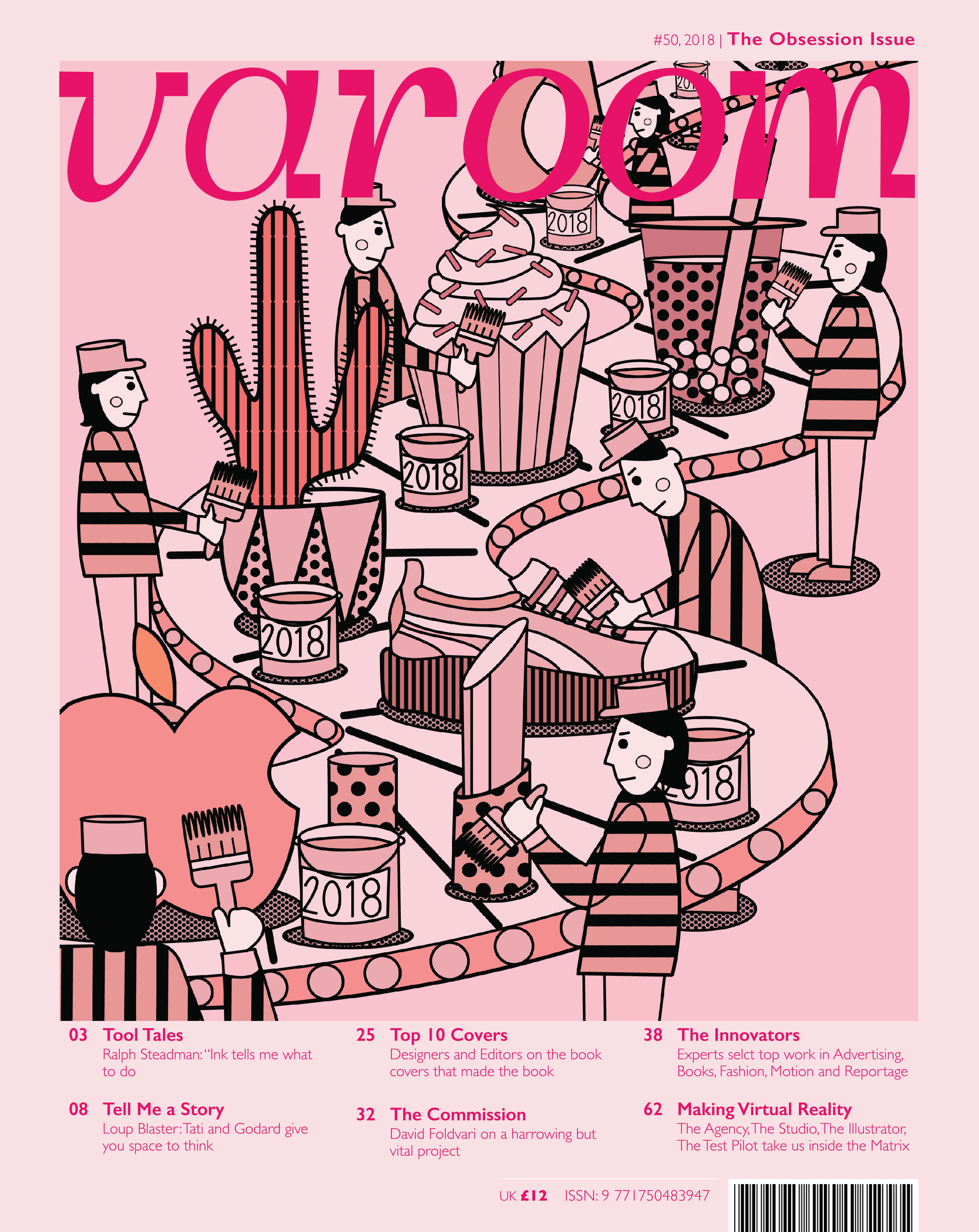
V8: Final version! Lesson learnt, work with the template when planning the illustration.