From last week’s consultation we started exploring how we could arrange the furniture so that they would make sense together and apart. We also thought of the location and how these sculptural furniture pieces could be contextualized in the space through the application of different materials

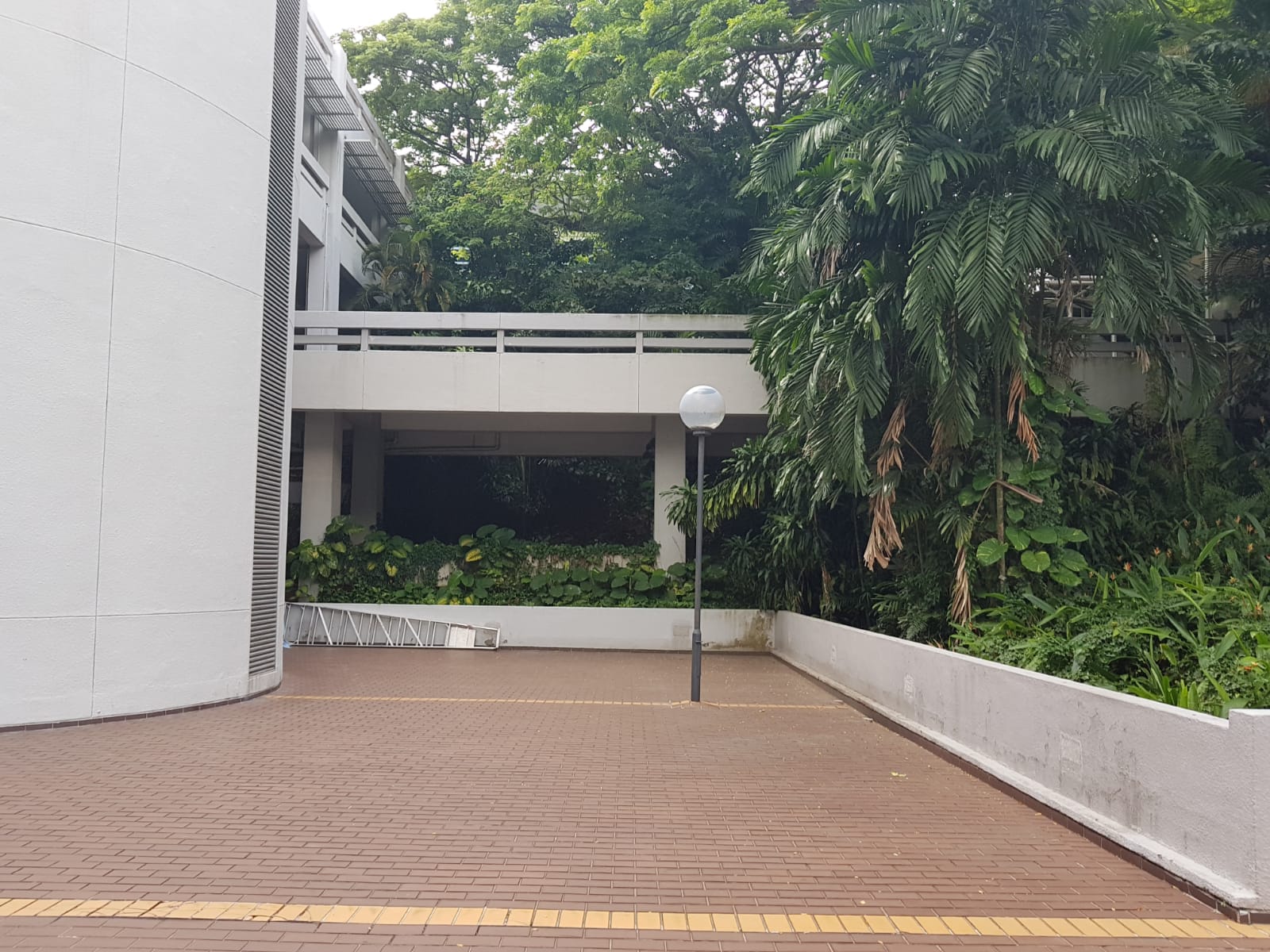

Our chosen location is this corner surrounded by lush foliage outside the School of Electrical and Electronic Engineering along the North Spine.
We went down to take some measurements and tried to place the furniture pieces in to imagine how they would fill the space.
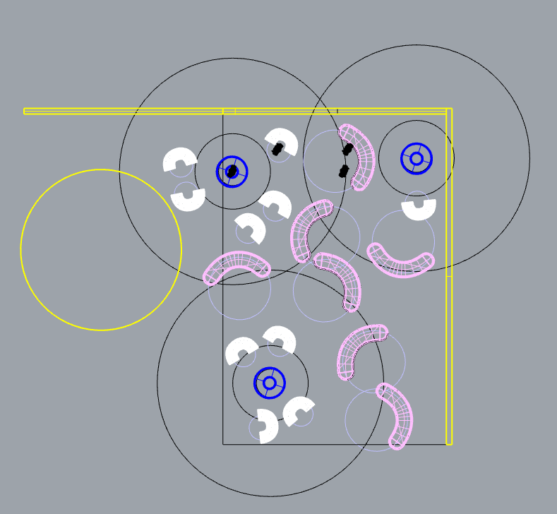
 The rings are used as a guide to inform the proxemics matrics.
Dark blue: Intimate space (45cm)
Shaped as such to show the space it creates if an individual uses it or even the slight discomfort of needing to share this space with another.
Previously the forms we used didn’t have an appropriate hierarchical representation and caused the user to stick out quite drastically. Hopefully this form expresses the matrics in a more suitable way.
White: Personal space (120cm)
We intend for these seats to be rotatable all around allowing users to define their own personal space even within a public setting.
Pink: Social space (370cm)
These longer benches are able to move along a rail installed at the bottom allowing different configurations as groups gather together.

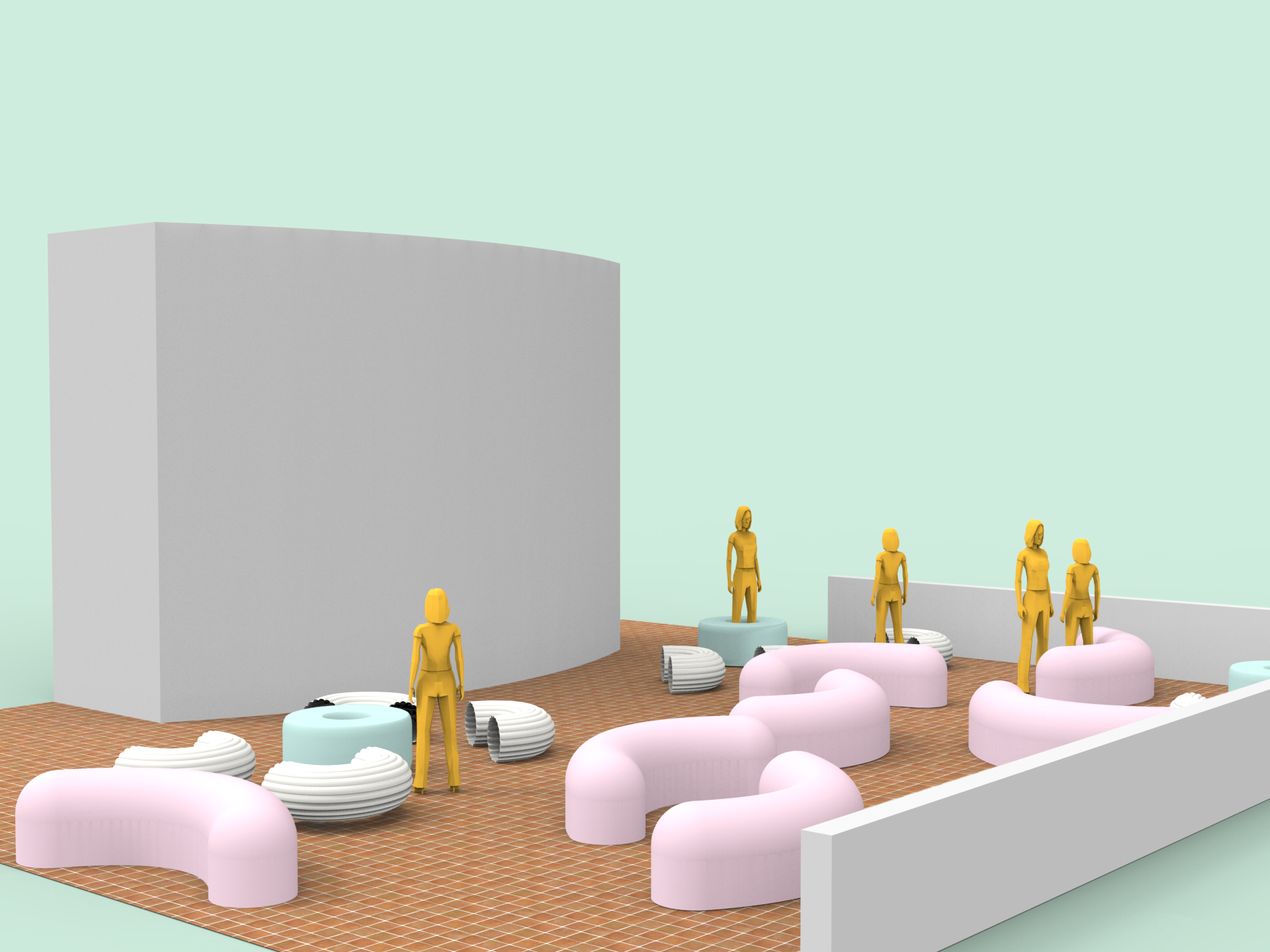
Next we thought of incorporating the proxemics matrics subtly into the design of the space by creating a motif on the surface of the ground. By using another material it also helps to separate this rest area from the bustling traffic around.

The pink route indicates a pathway to invite the public into the space.
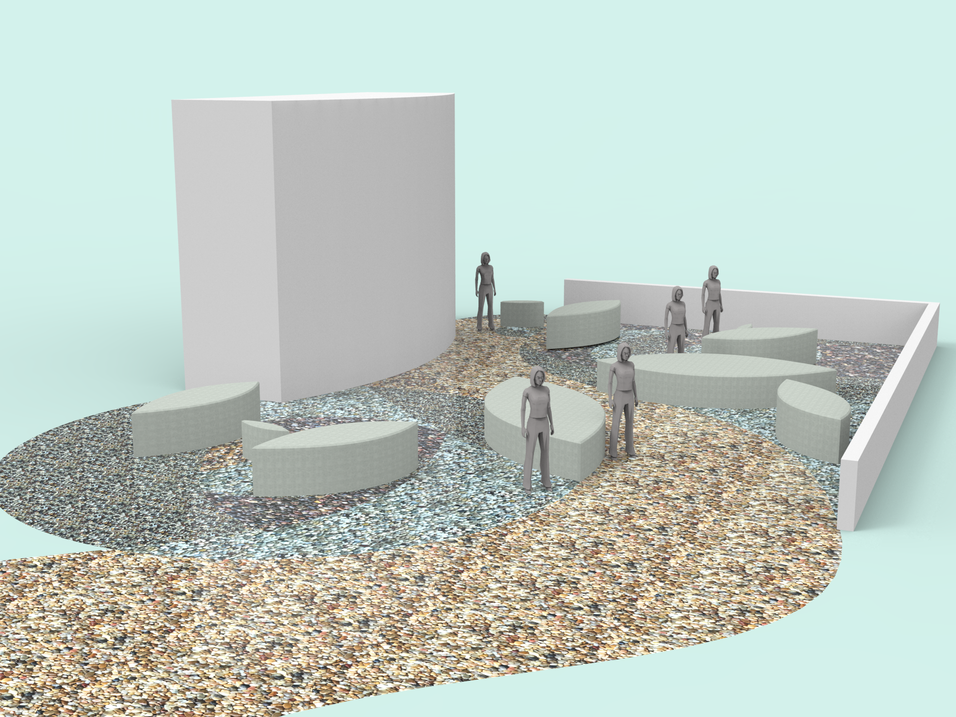
Tried experimenting with a pebble pavement. This would affect how the furniture rotates though.

Another version using rubber mulch, similar to the sort used in playgrounds and communal exercise areas commonly found within HDB estates. 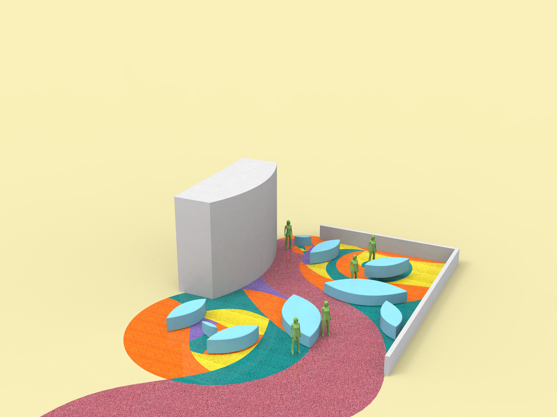

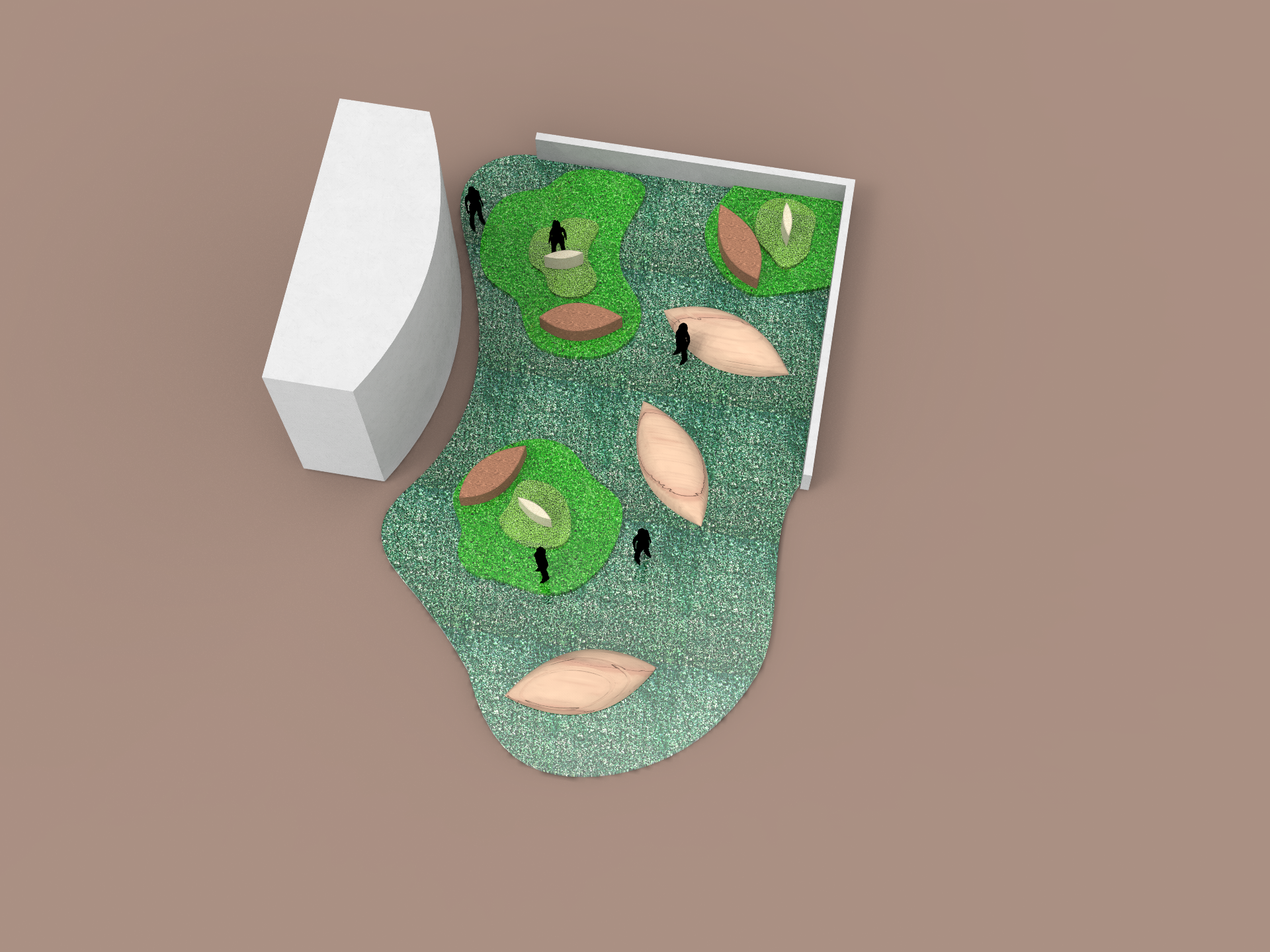
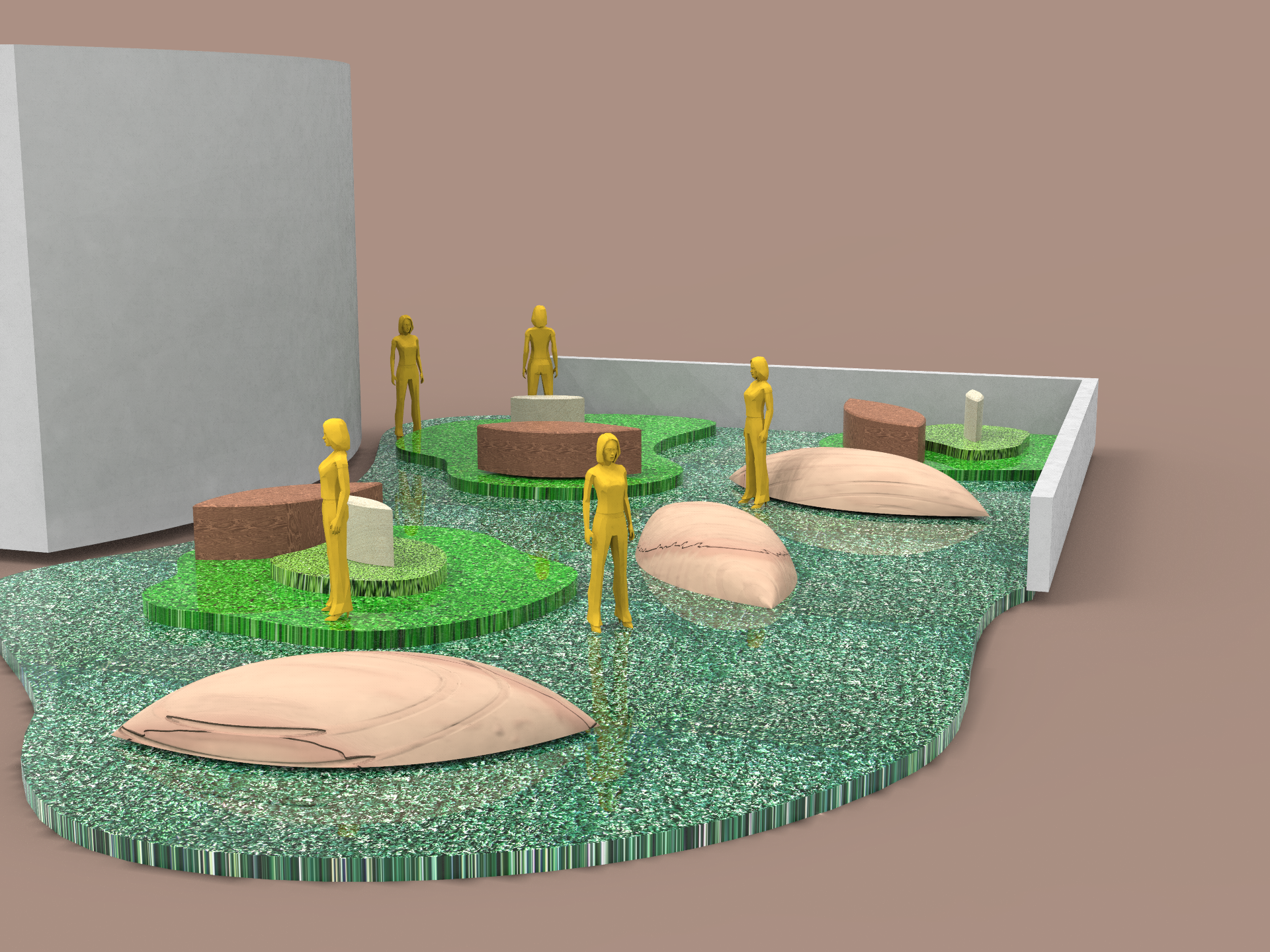
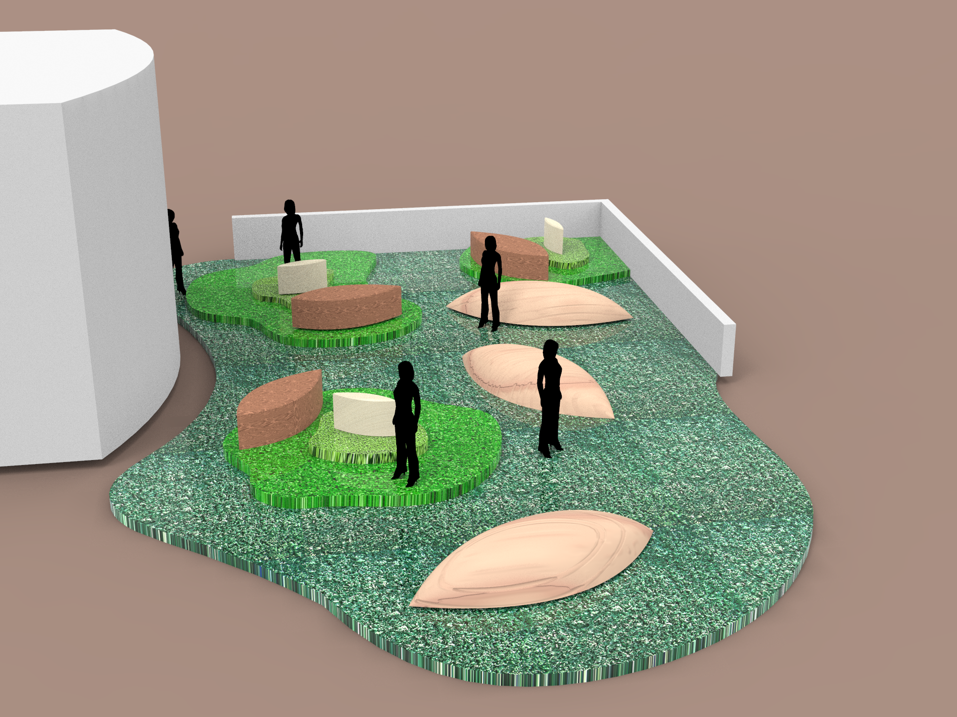
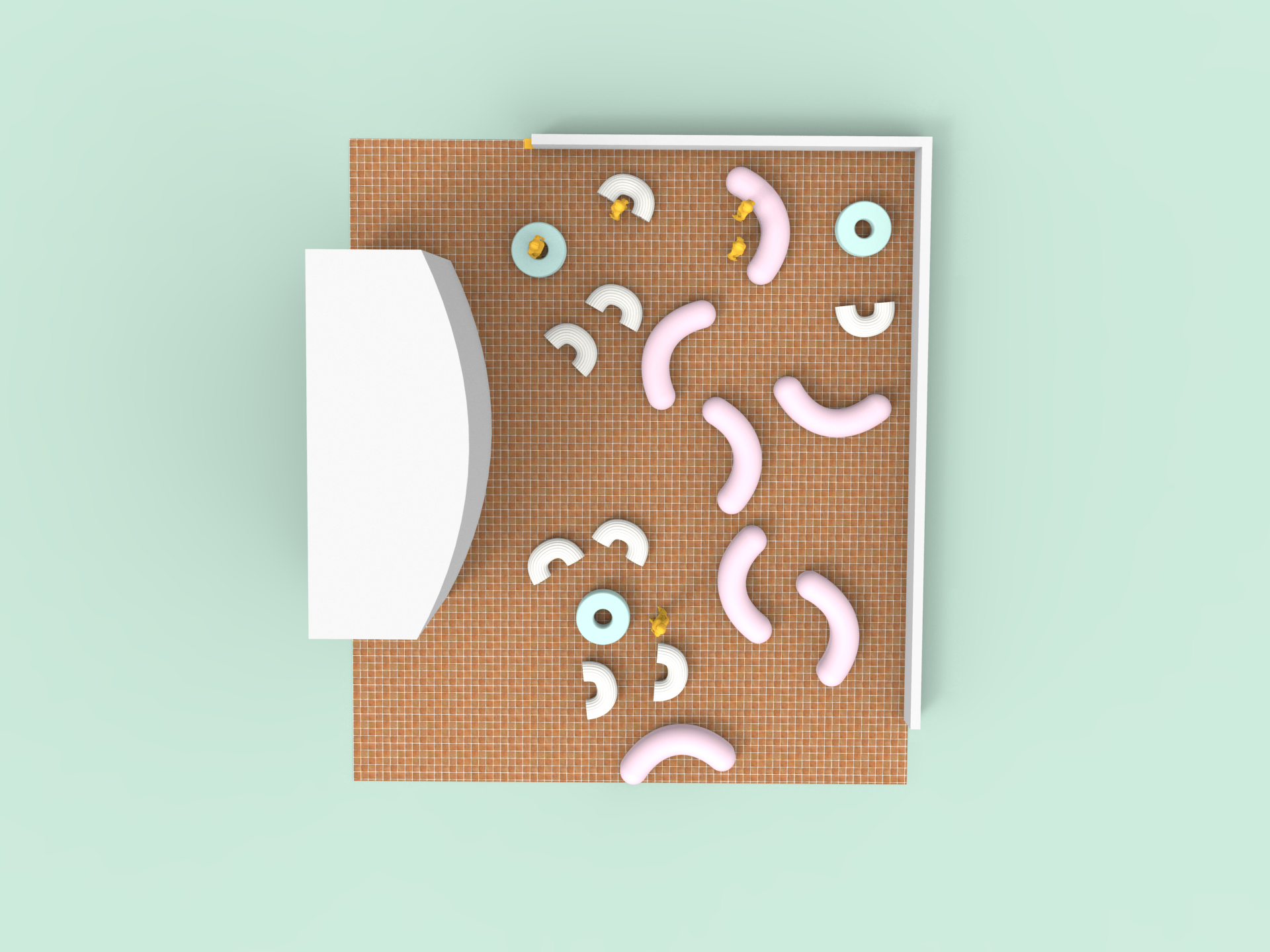
Top view of the layout. We also tried simplifying the forms to resemble flowers and leaves to harmonize with the foliage in the area.
Lastly we tried using astroturf to create a different atmosphere (hopefully exuding a more chill vibe like a good place for picnics!) This time we also experimented with the height to represent the different zones and used wood as it plays well with the nature theme.