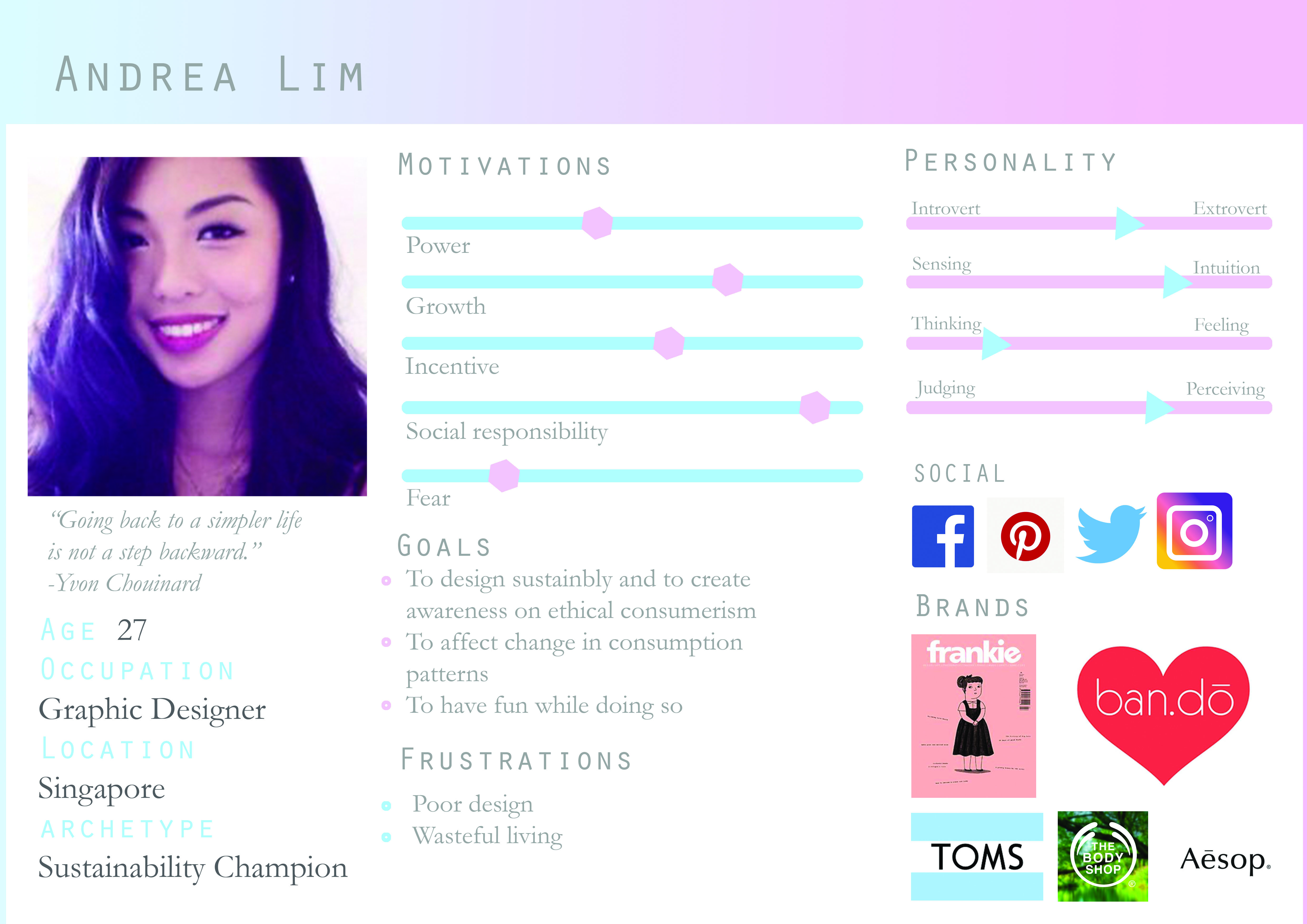
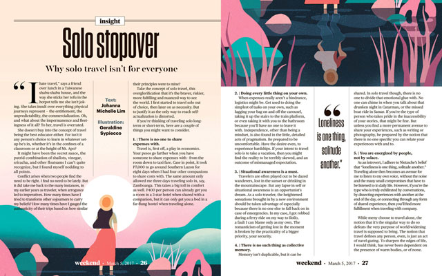
Ideal user persona for this project
Concept 1: Fickle obsessions
 The undergirding factor that pushes manufacturers to create products with planned obsolescence and encourages irresponsible consumerism.
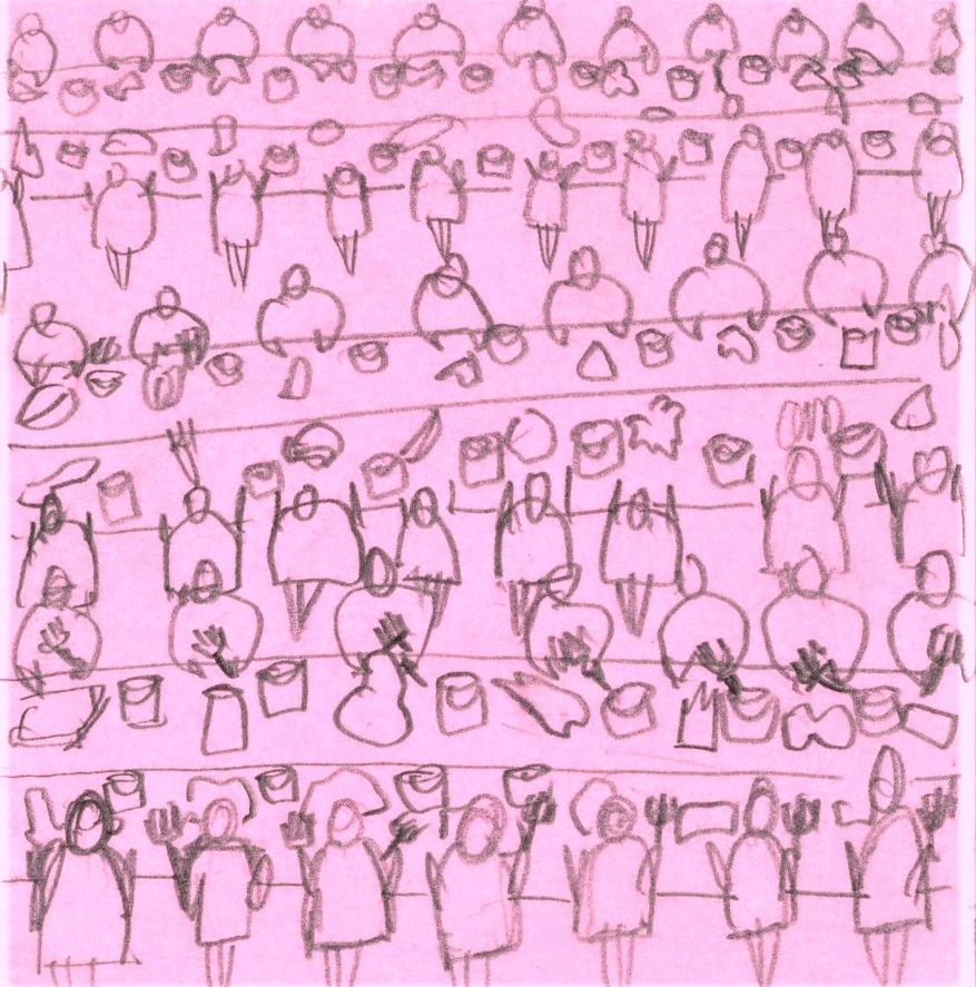
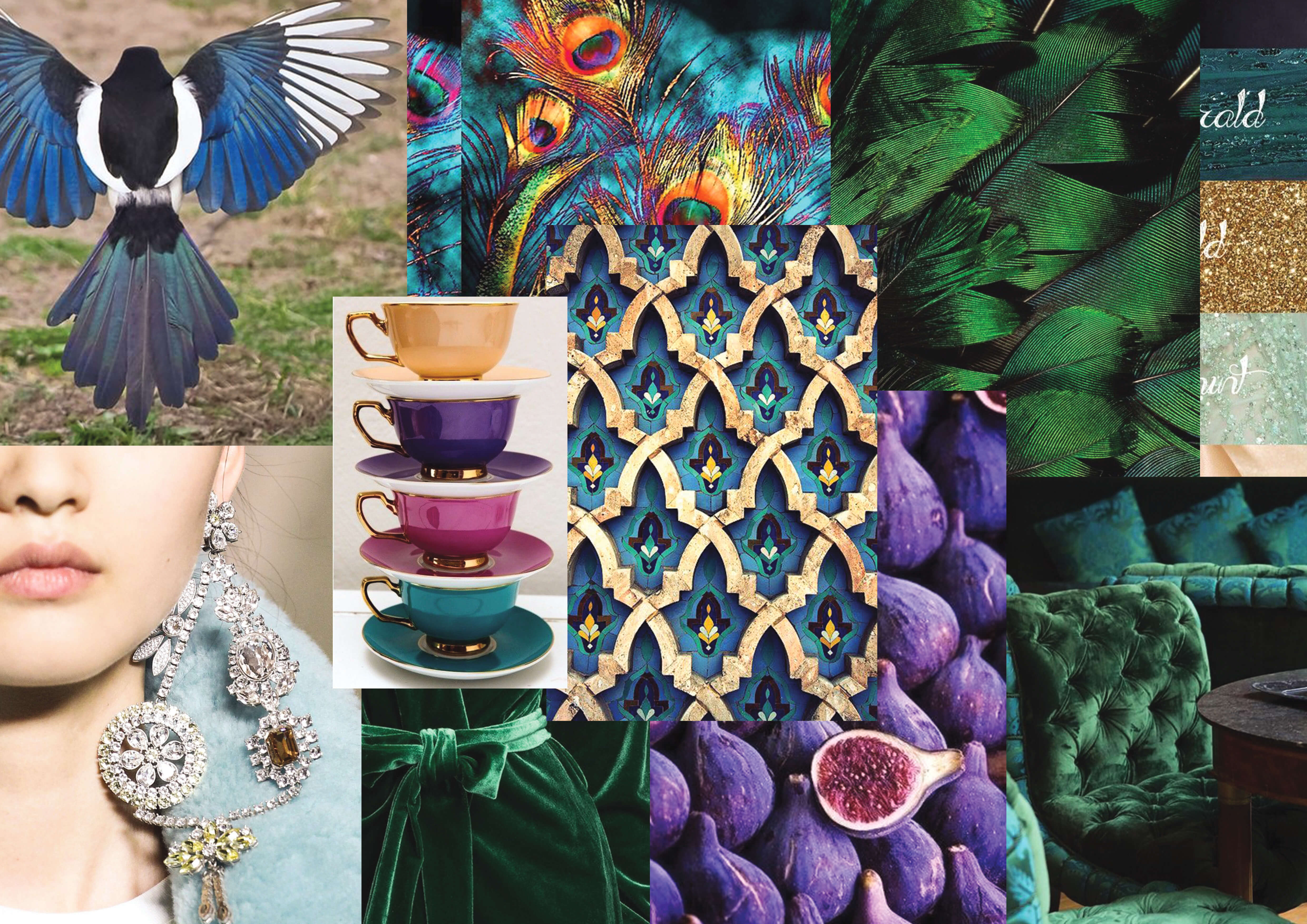
To use the magpie as a symbol as they are attracted to shiny things but very quickly grow bored and look for something new, building up a collection of glittery valuables but never satisfied, much like most consumers nowadays.
Keywords: Glitter, reflective, jewel tones, diamonds, opulent, detailed, ornate, magpie
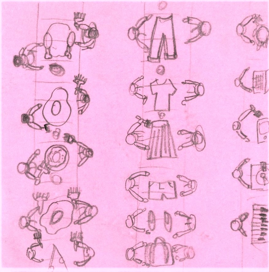
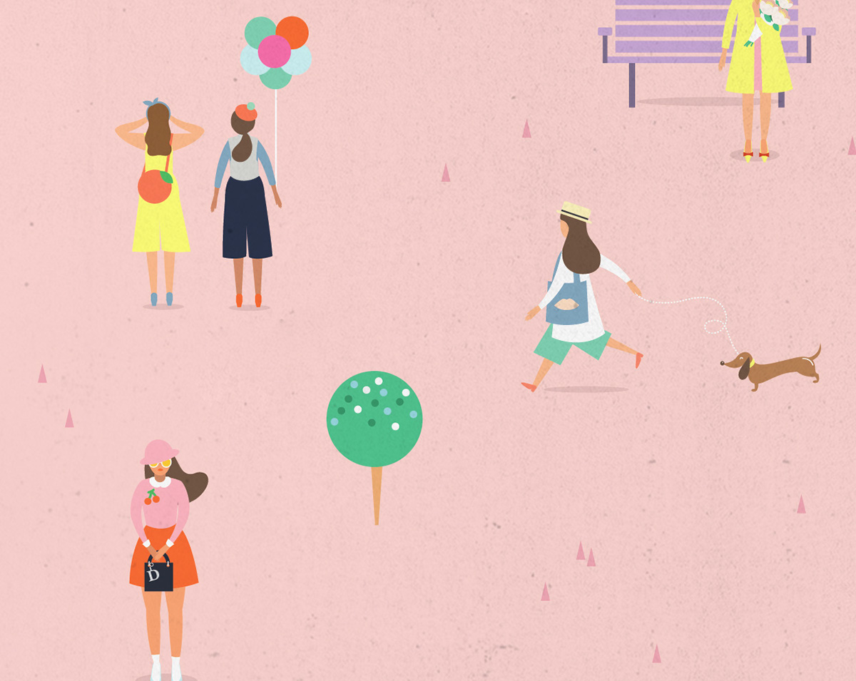
Concept 2: Obsession to pursue aesthetics
The idea of how popular culture shapes what is seen as the optimal aesthetic, which in turn influences consumer purchasing patterns.
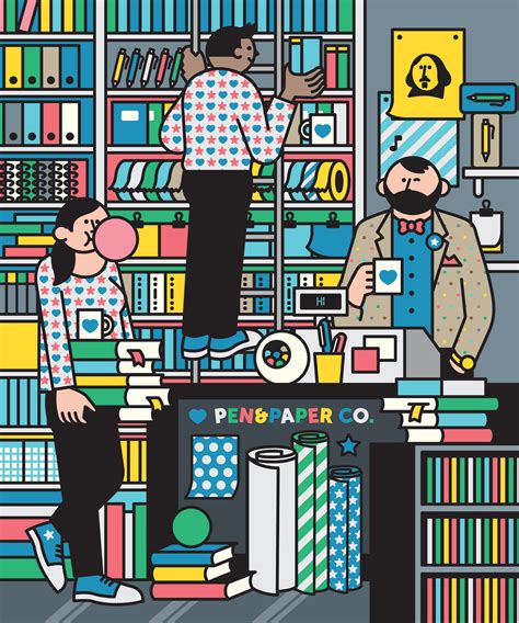
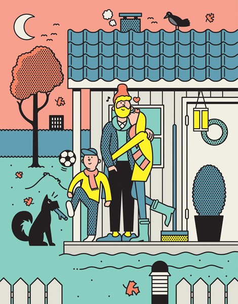
Style inspiration

Putri Febriana
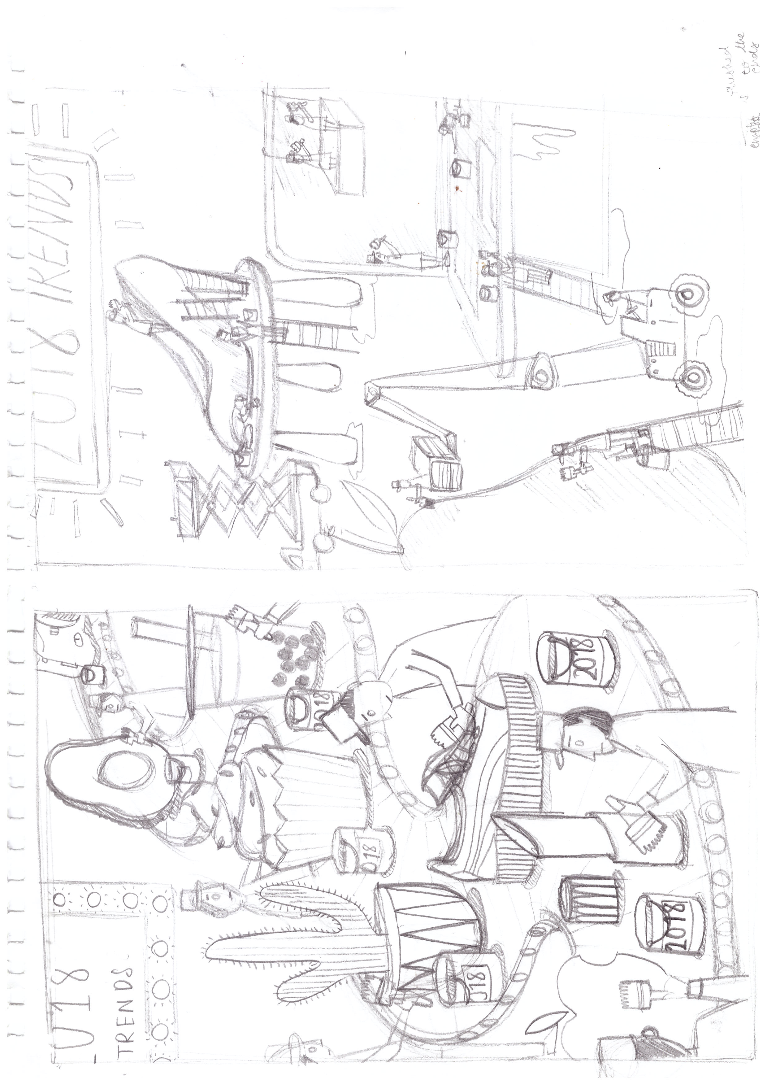
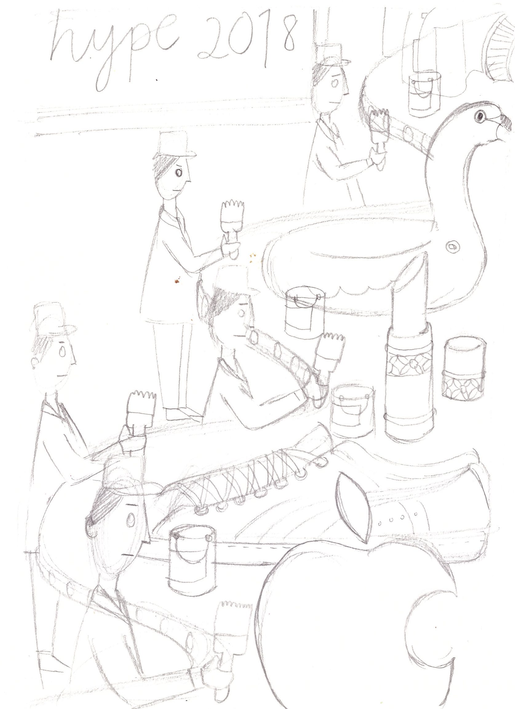
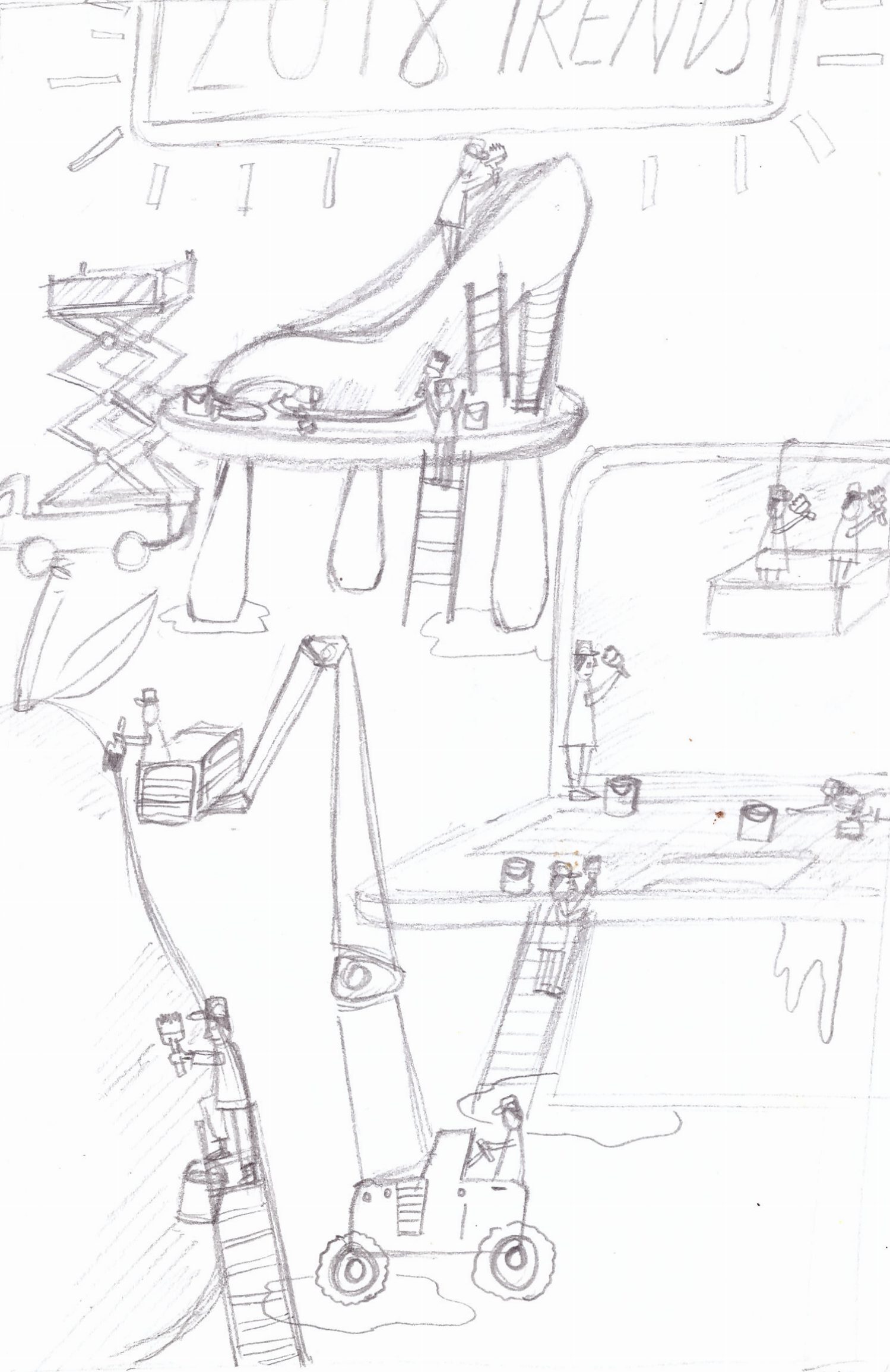
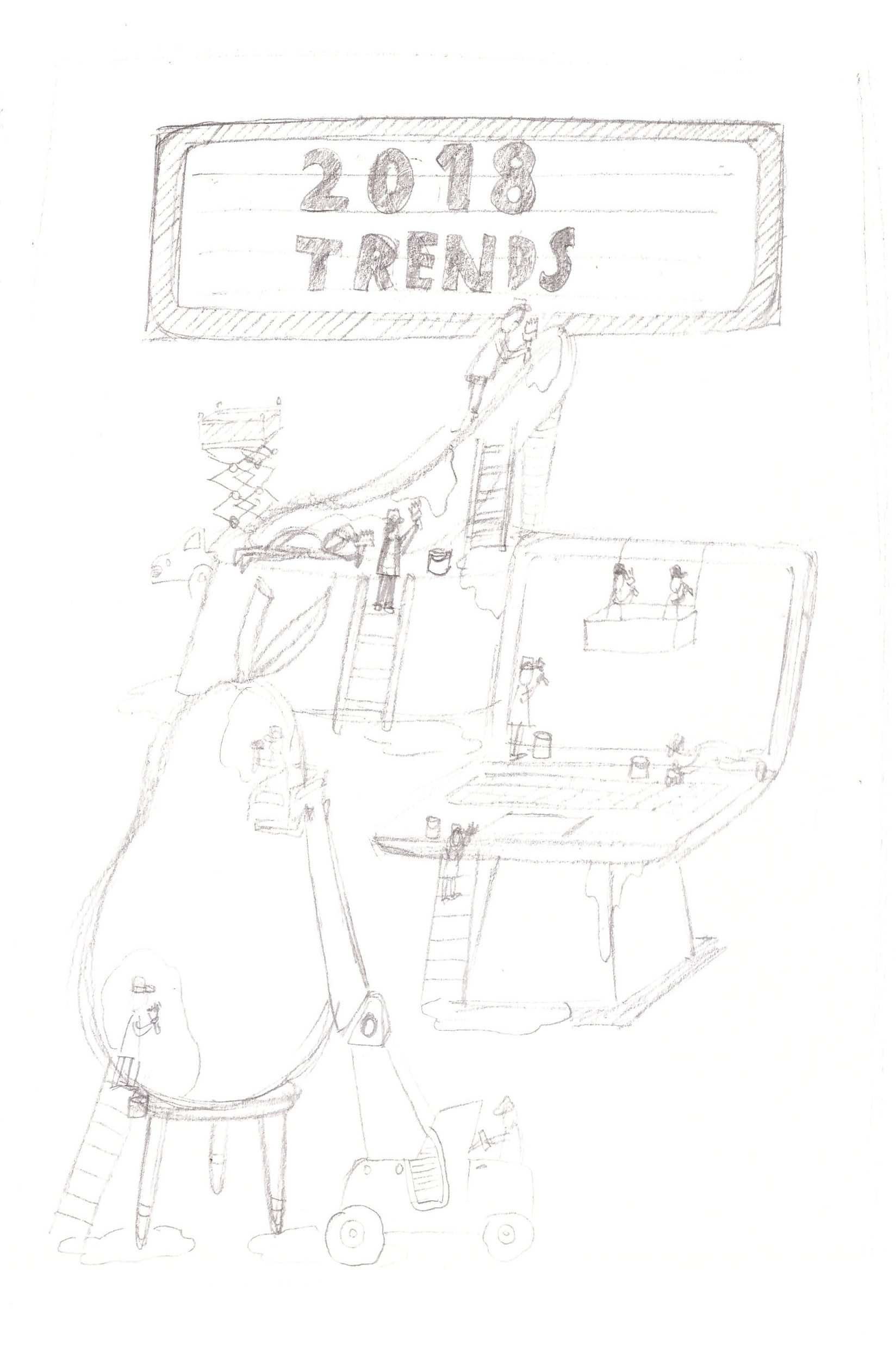
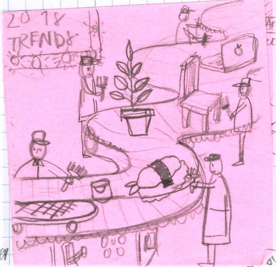
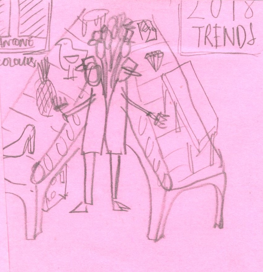
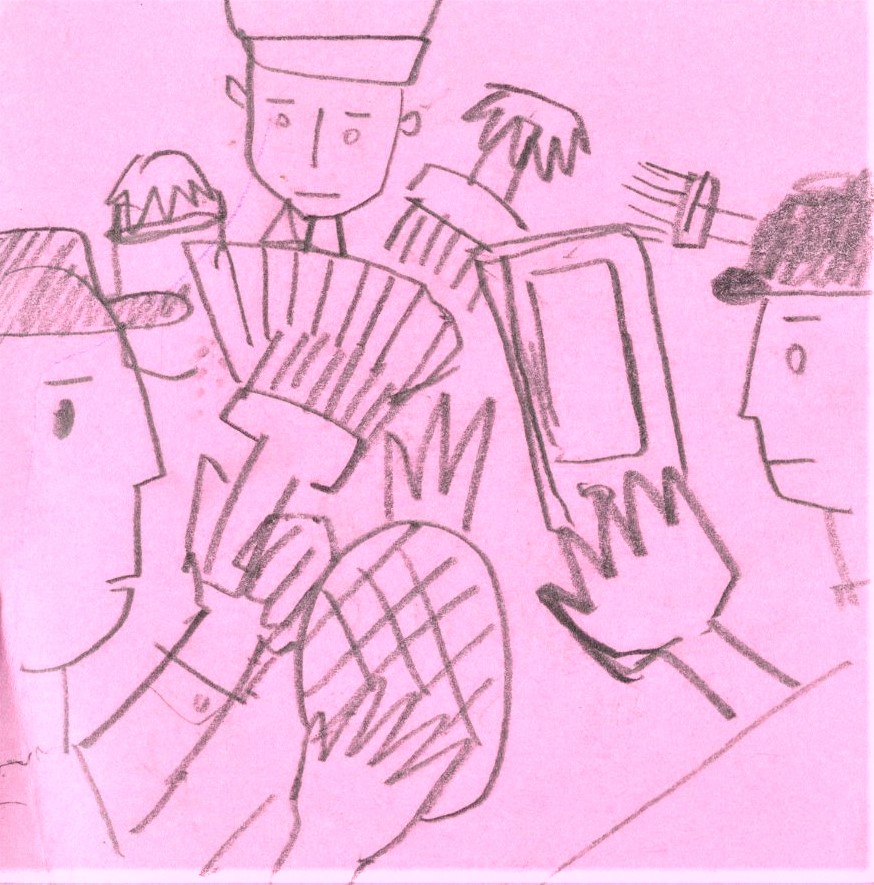
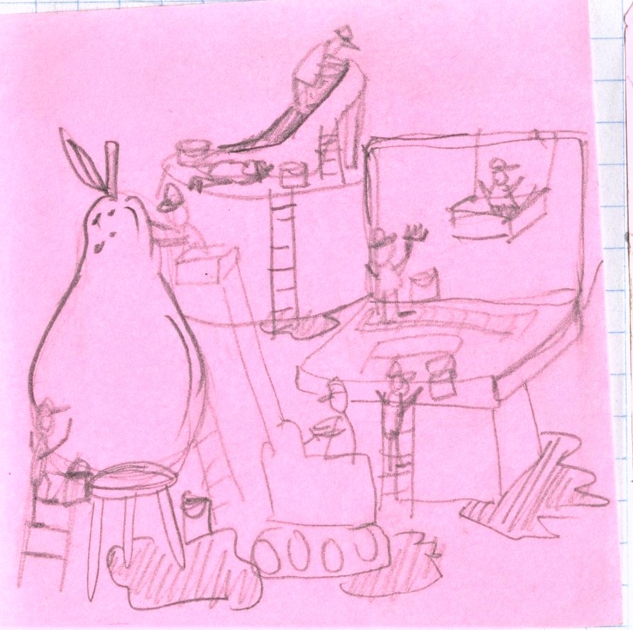
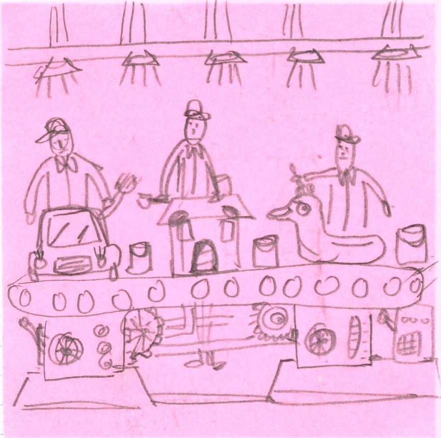
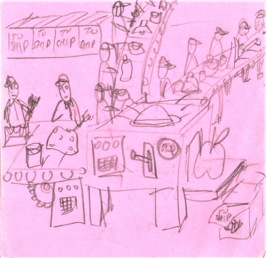
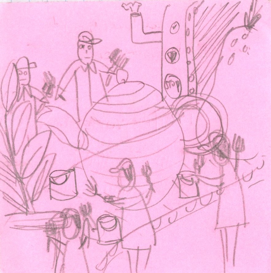
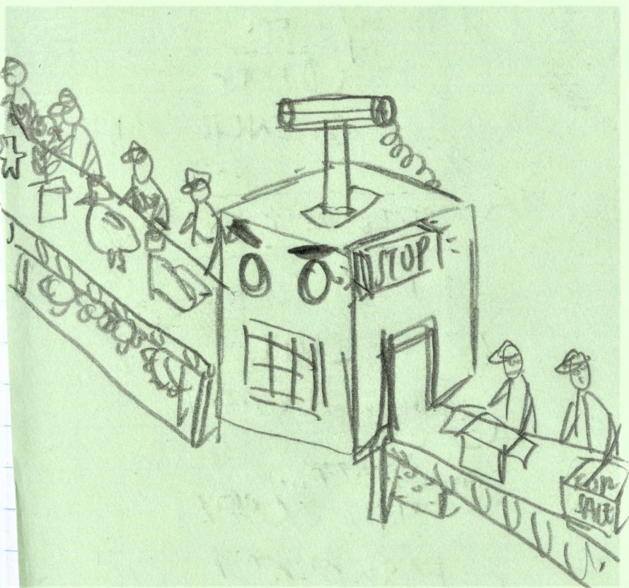
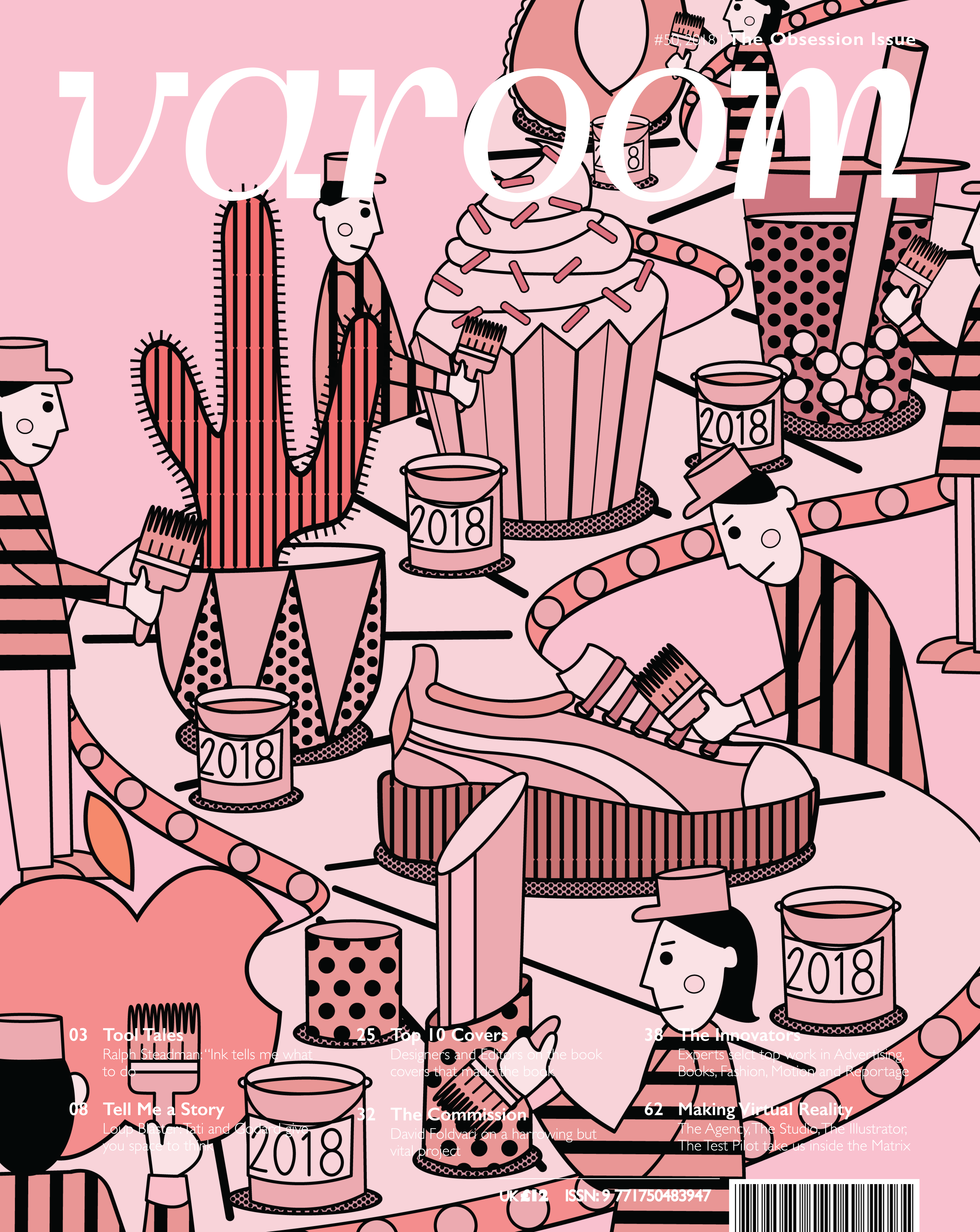
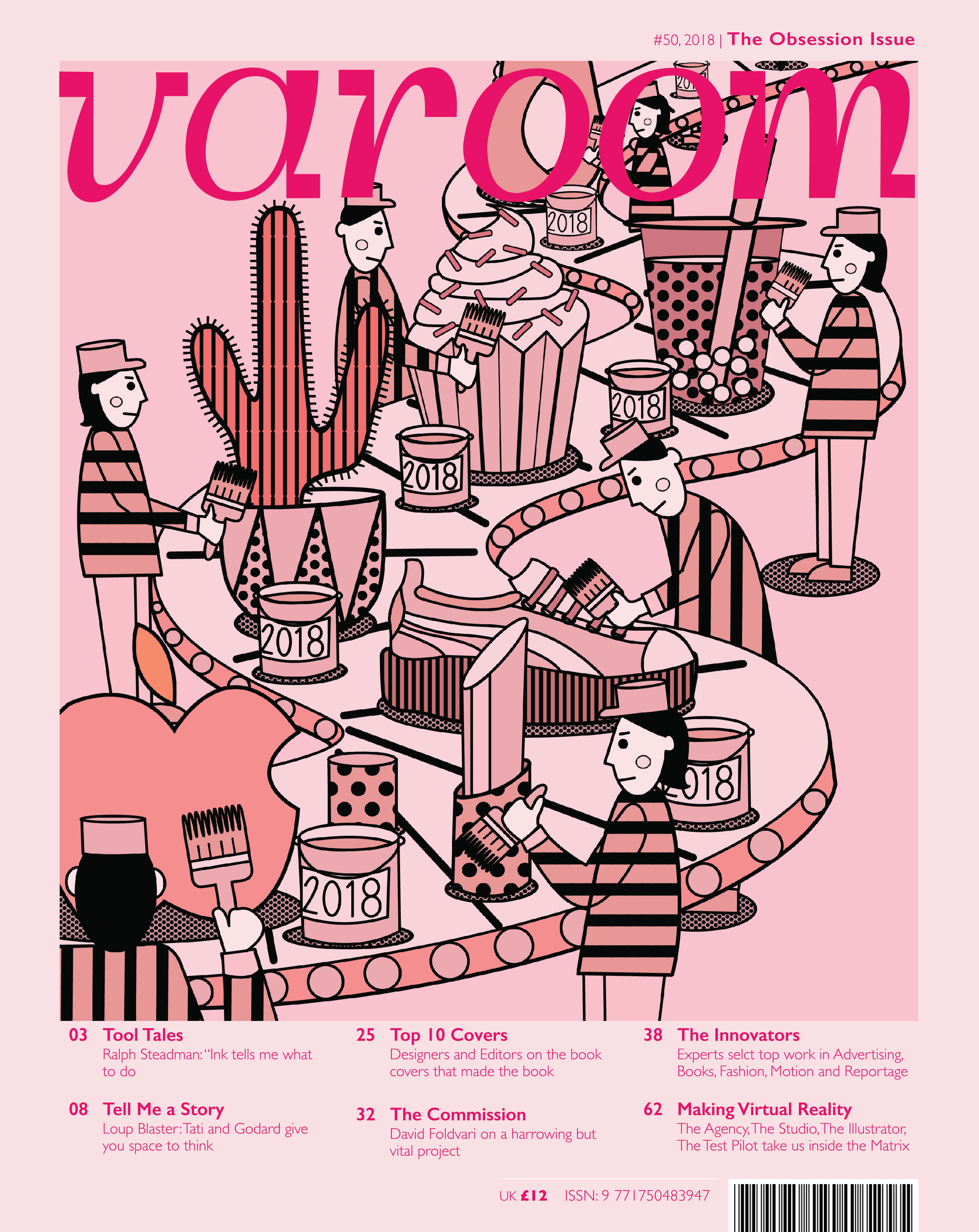
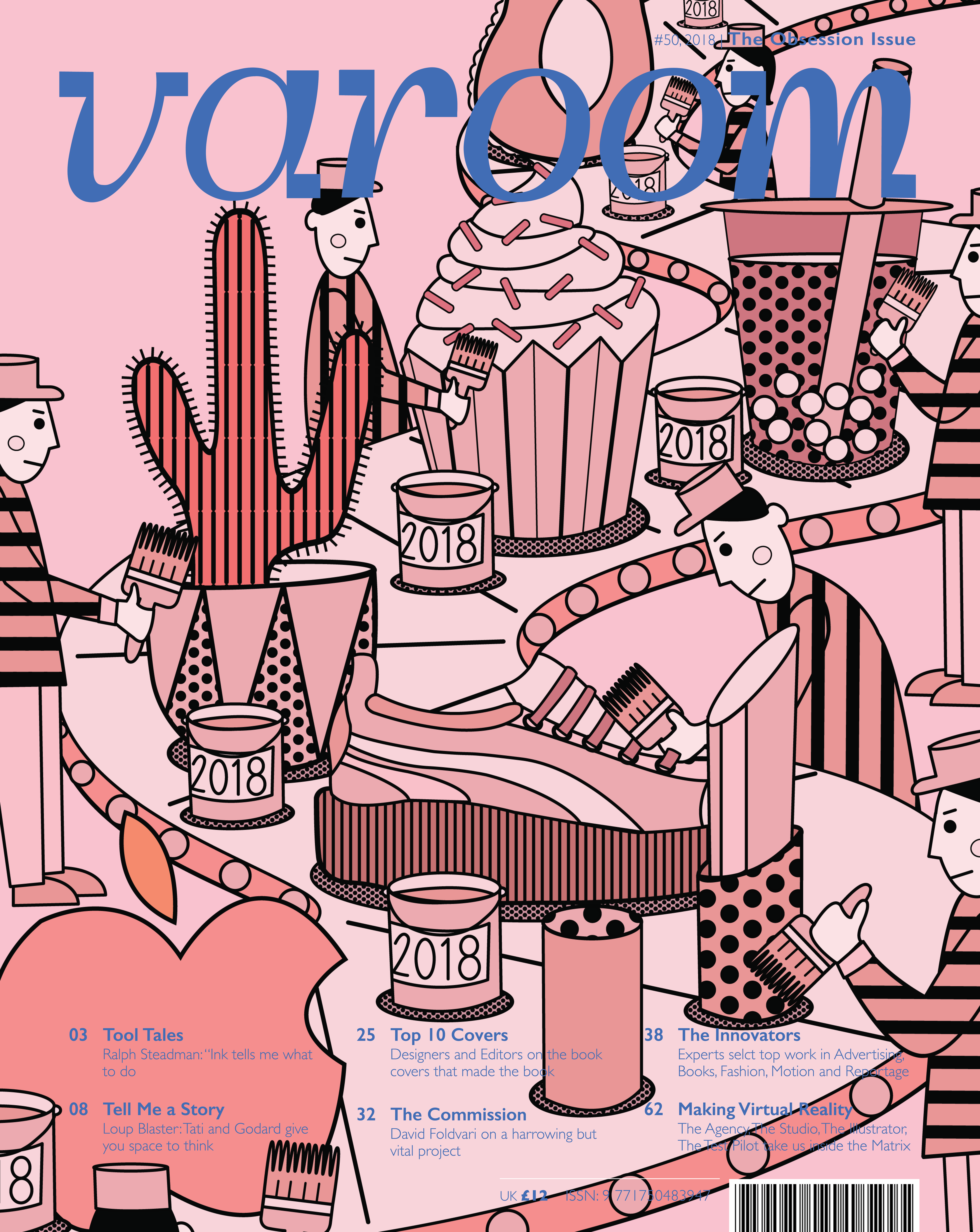
Thinking of using a production line as a metaphor, having workers painting arbitrary objects to keep it in trend
or
just playing with proportions, having the workers being really tiny and the objects being really large to emphasize how it overpowers everything.
or
a carnival like procession of objects that will come in trend having the audience clamouring for them.
The main idea being ordinary objects being elevated due to popular culture.
Keywords: Millennial, influencers, social media, trends, style
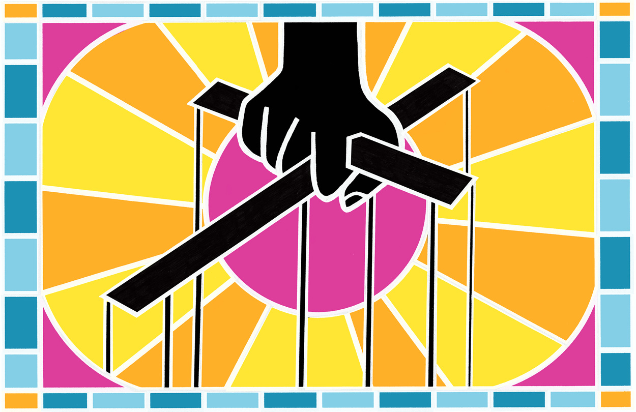
Concept 3: Positive obsessions
I came across this article while researching on positive obsessions and was quite moved by the new perspective provided by the author who pointed out that the behaviours that are absolutely vital for self-actualization is not very different than those of an unhealthy obsession. The main difference is the motivator of both, we are either propelled forward by what we love or what we fear. Healthy obsessions produces a joyful pursuit and unhealthy obsessions produces joyless striving.
I felt that many designers, artists and craftsmen can identify with this as we are our biggest critics. But how can we balance our critical eye whilst maintaining a healthy self esteem. How much till we’re pushed over to an unhealthy obsession with perfectionism?
Ideas/compositions:
For the illustration i was thinking of keeping the colors to a minimal, depicting the journey of two craftsmen, or even like two different cities?
Or
Taking off from the idea of a joyful pursuit vs fruitless striving was to draw the analogy of two farmers. The healthy obsession being a farmer which tills the ground and the other farmer which digs a pit for himself
Or
A speedboat race being propelled by joy or fear? So the boat which is propelled by fear has trouble starting the motor while the other boat speeds ahead.
After consulting with Lisa, we decided to expand on the second.
Positive Side Of Obsession
 V1: The bottom text was so unreadable, so we tried zooming out the illustration.
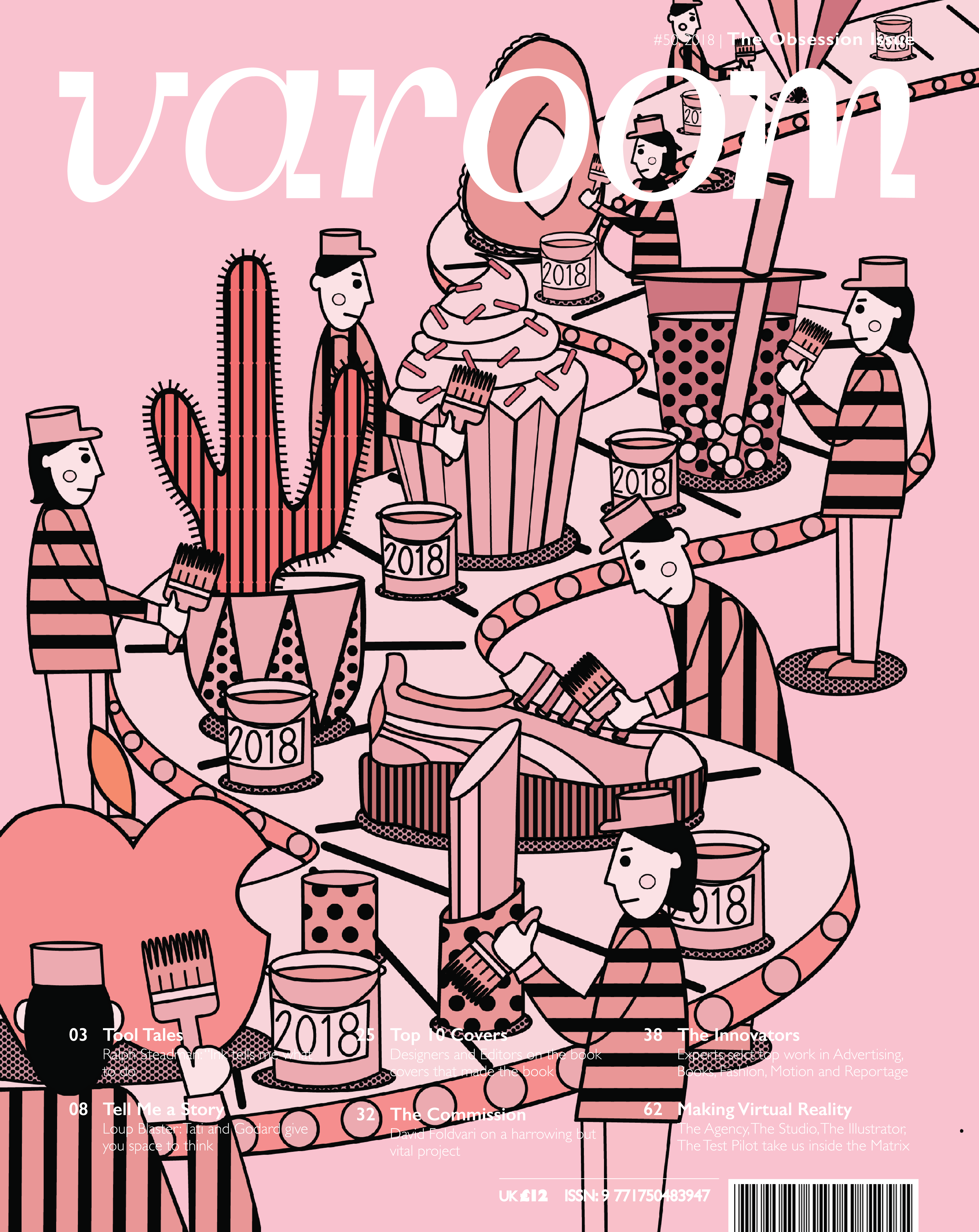
 V5: Added a border, didn’t really like the way it truncated the design.
 V7: Relented and moved the illustration. Better but a little messy at the top