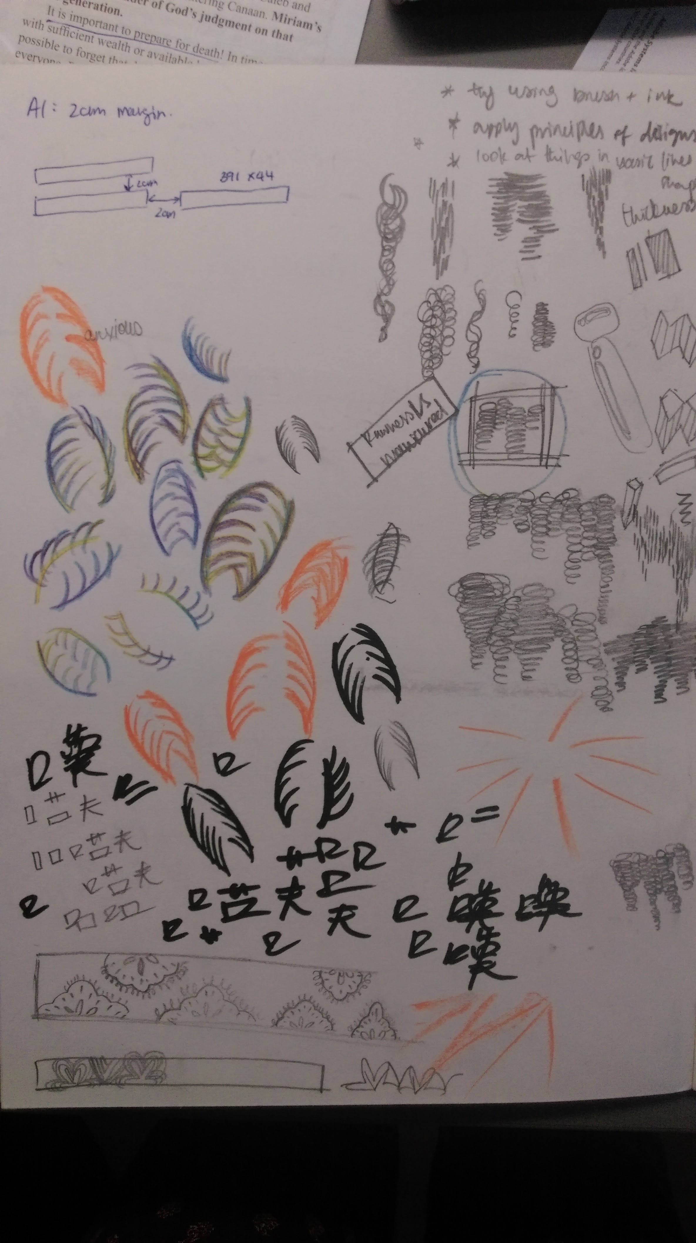
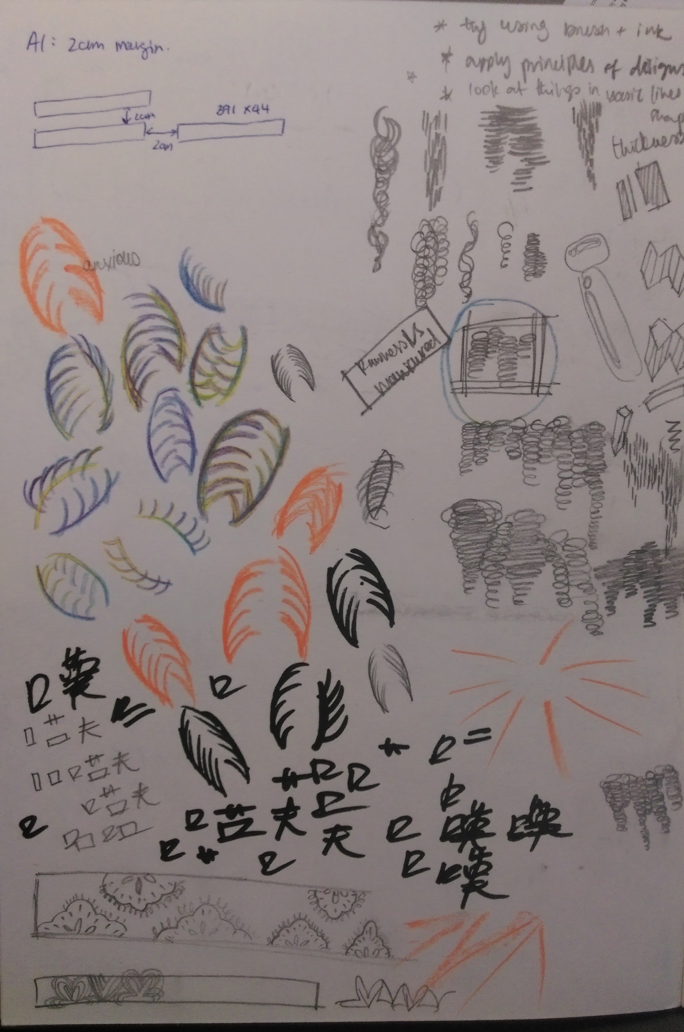
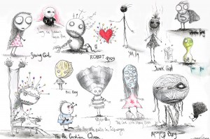
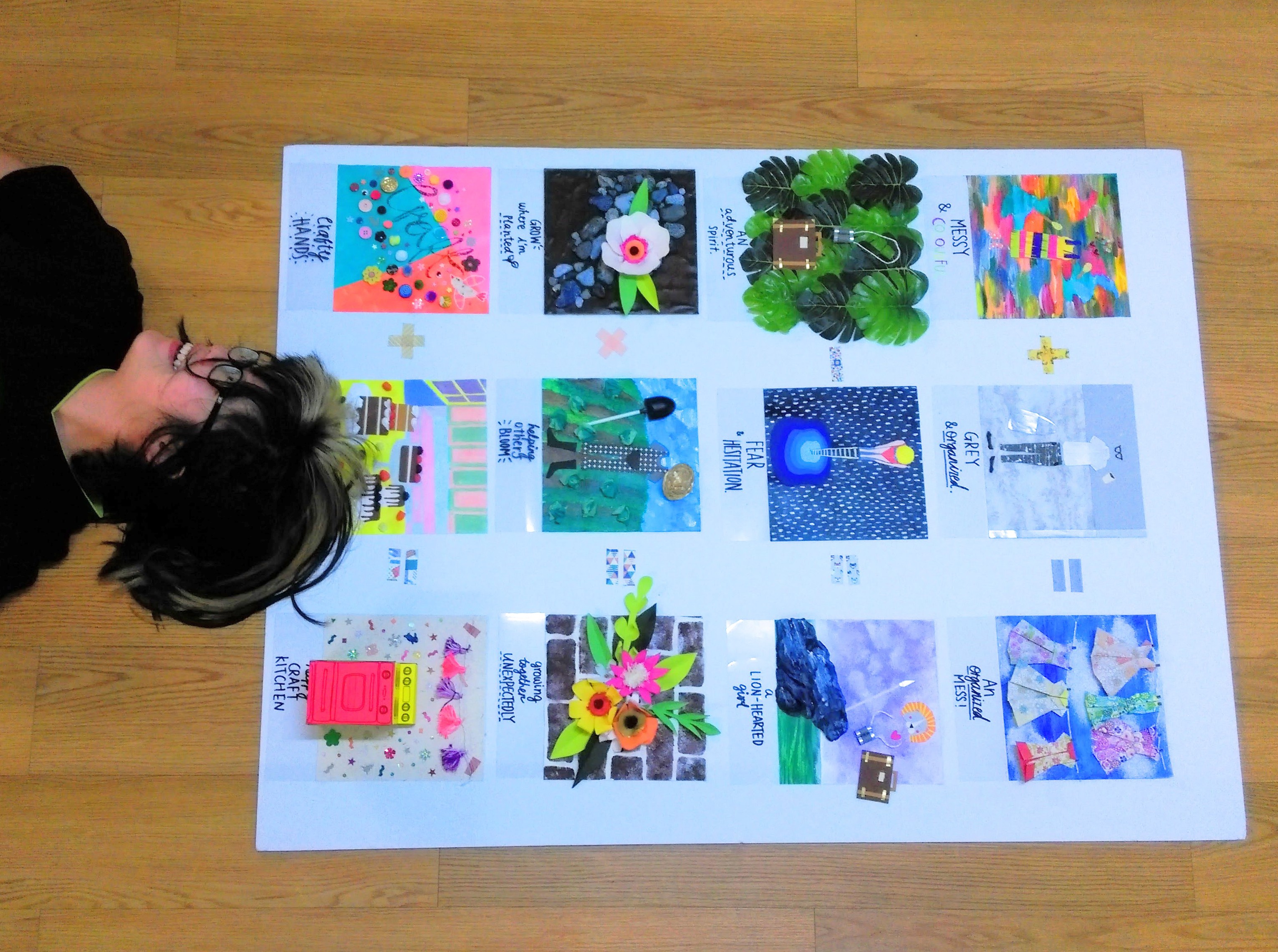
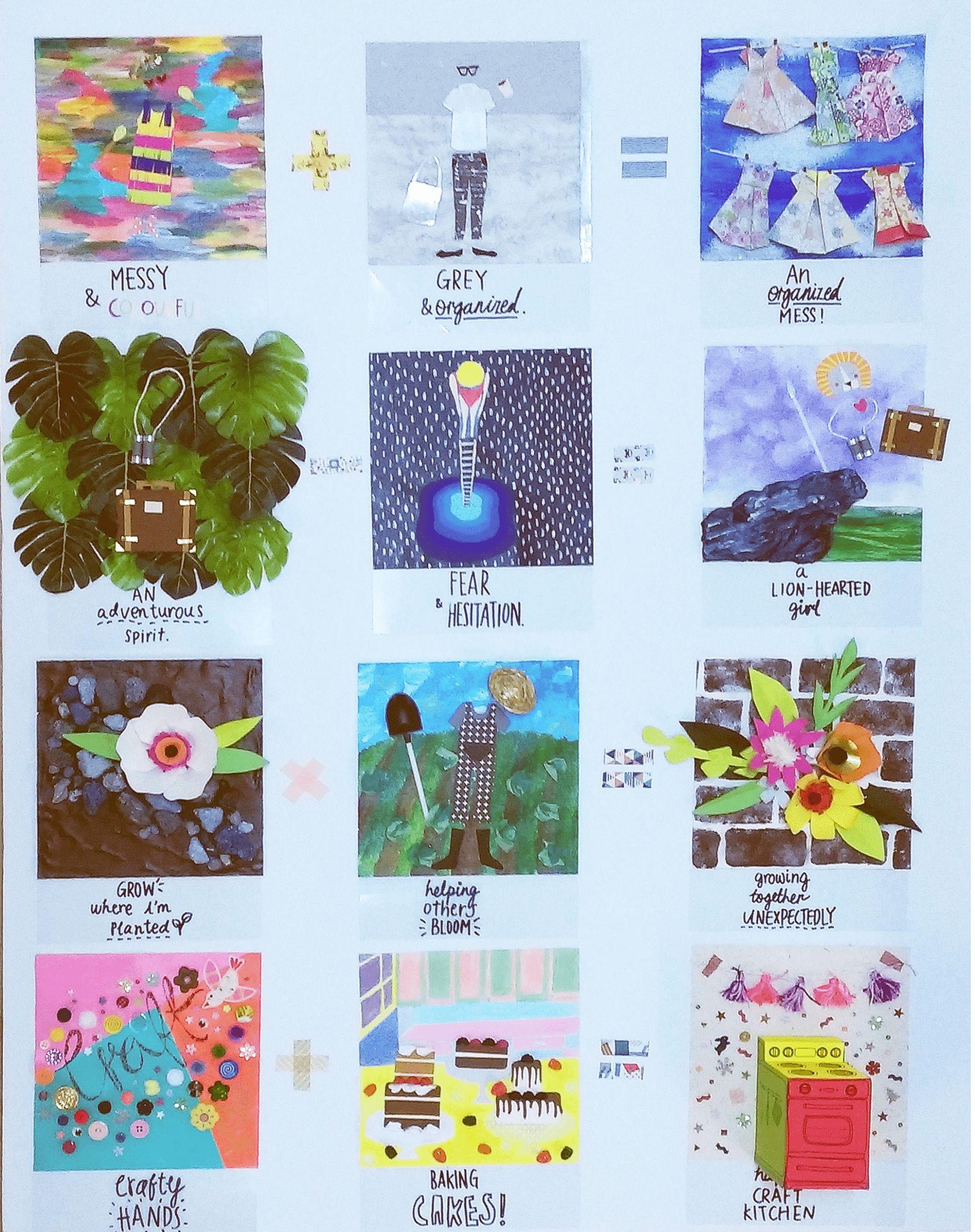
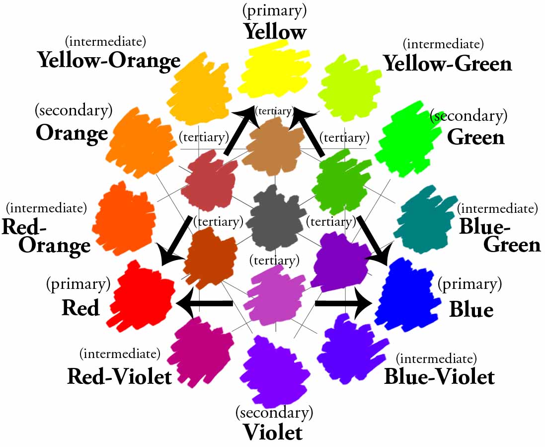
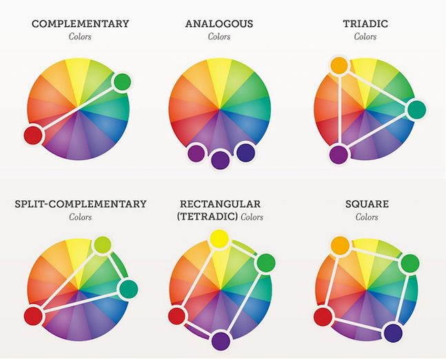
I began the ideating process by drawing out mind maps that included the meanings of the words, as well as certain experiences I associate with the word.
After accumulating various ideas, I proceeded to begin my experimentation process for each word. For this assignment I’ve stuck to acrylic paint.
Experimentation & Process


——–

^Initial ideas
Final work
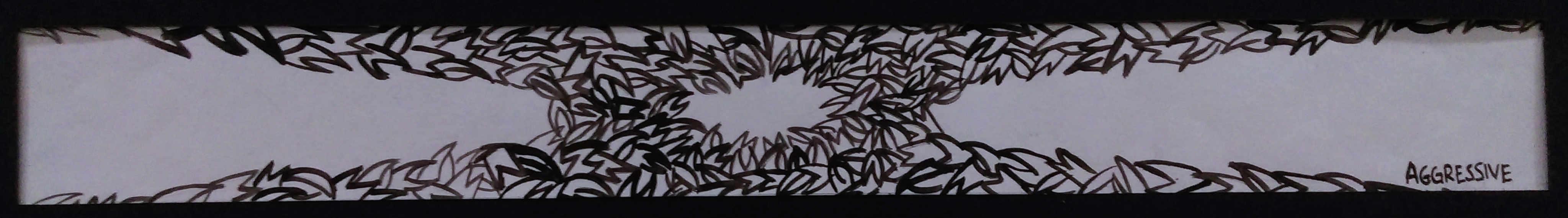
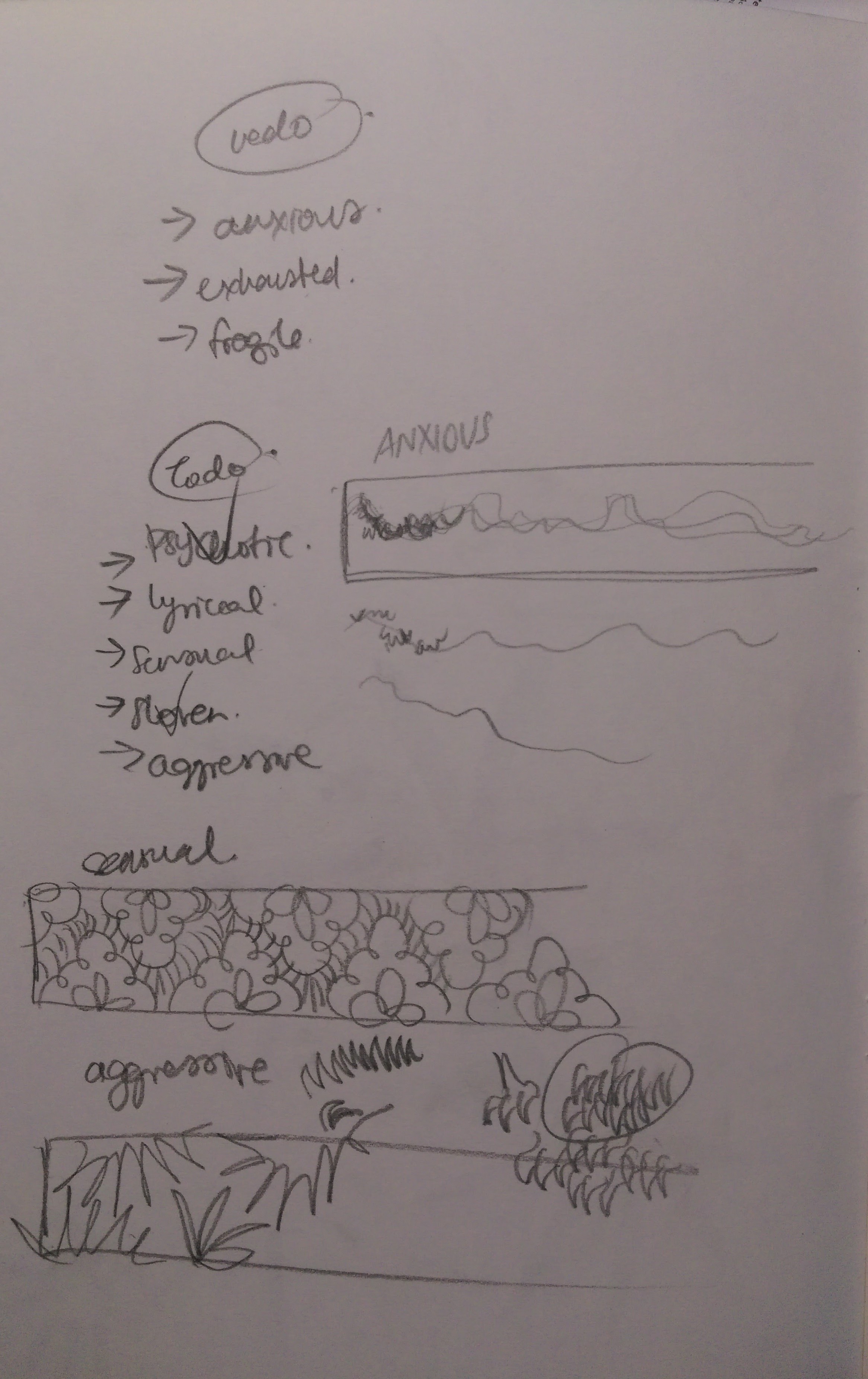
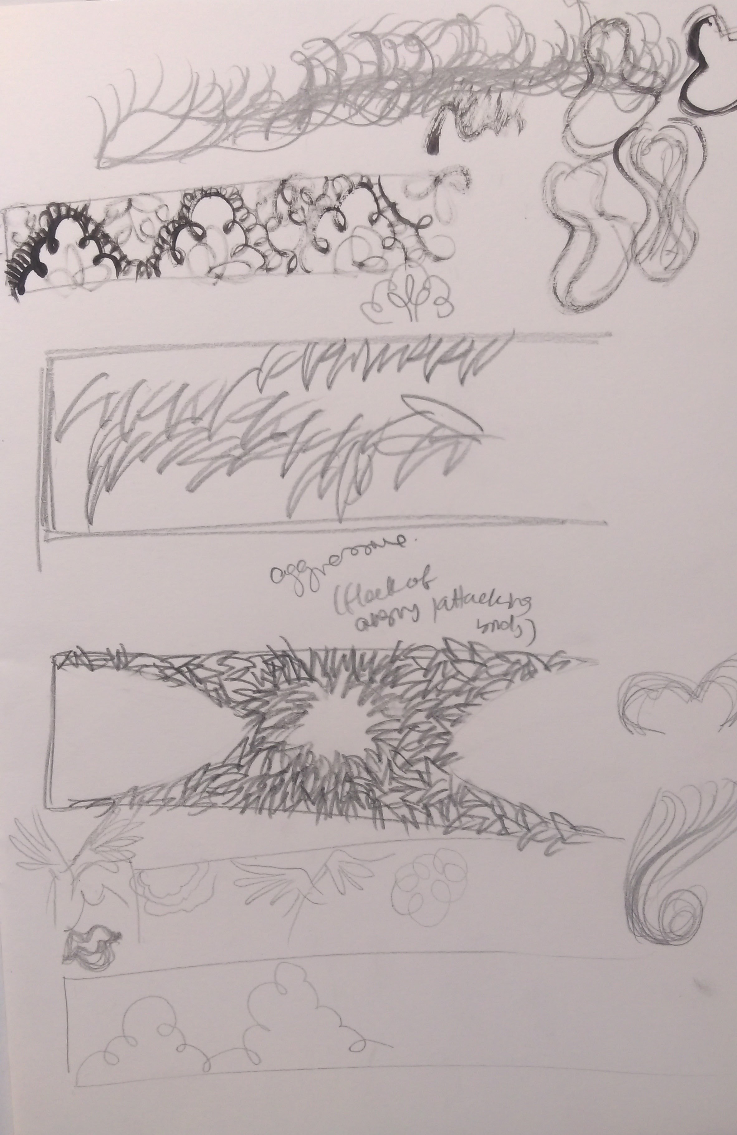
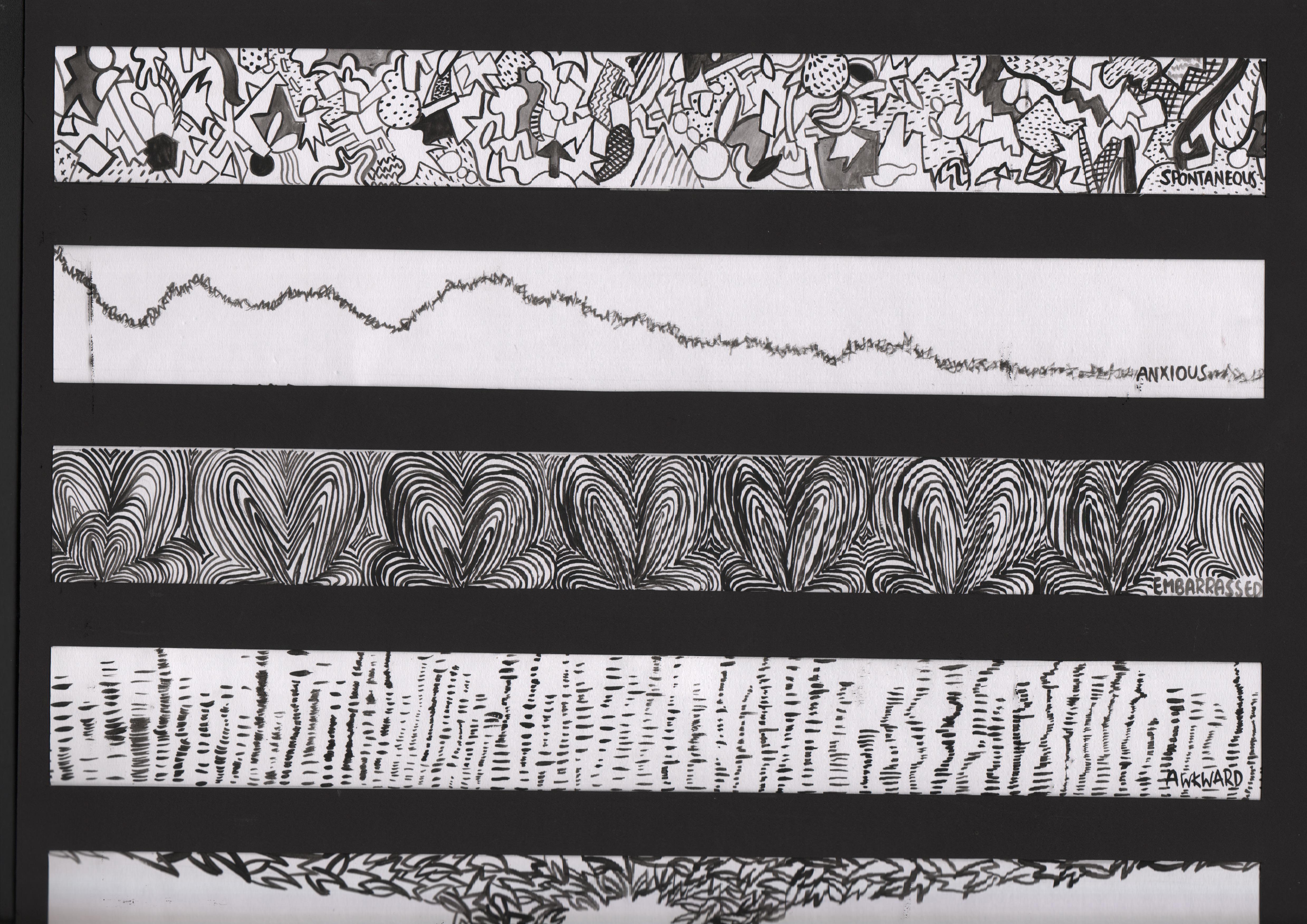
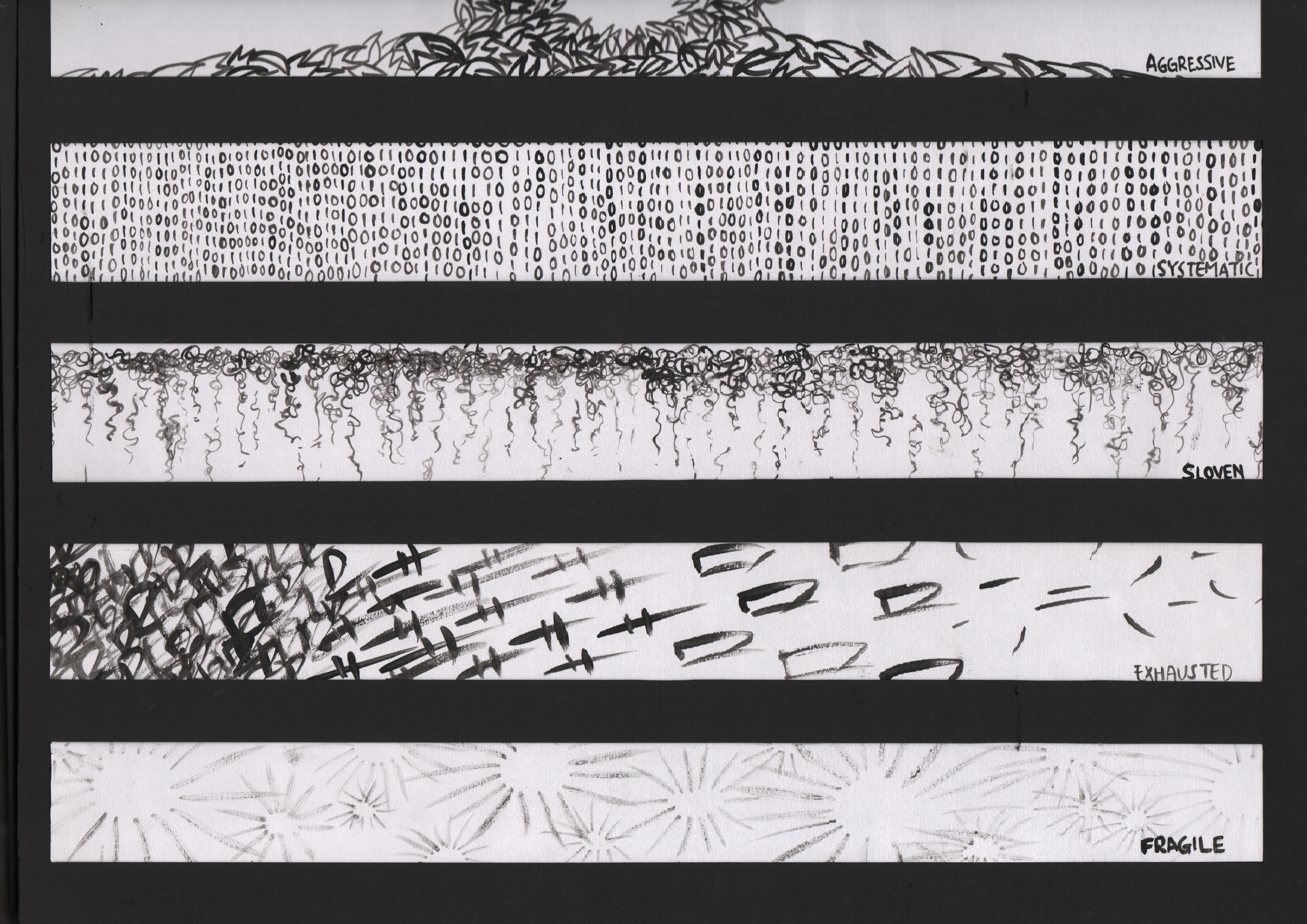
1.Aggressive
Definition/association
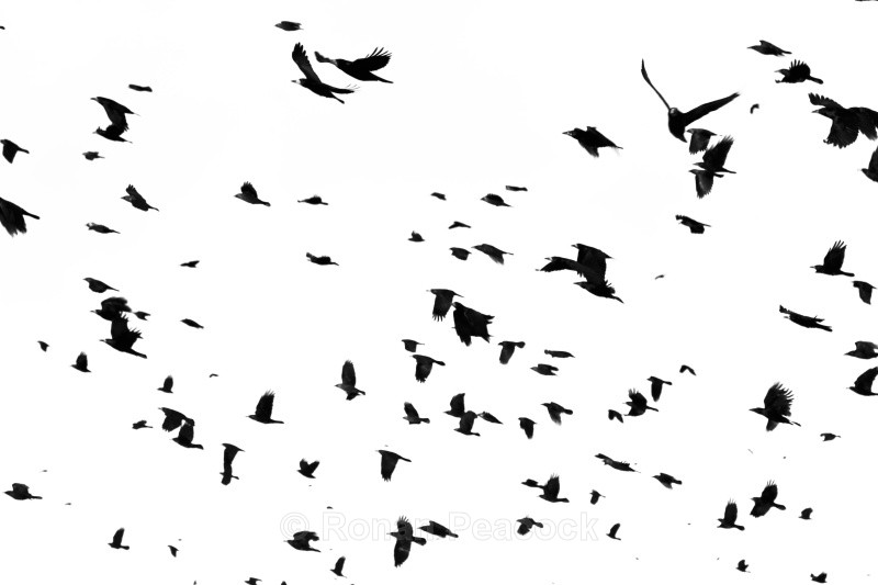
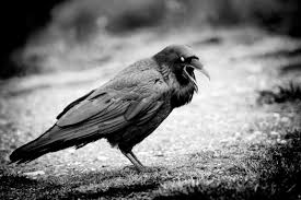
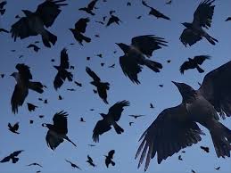
CROWS
Inspirations
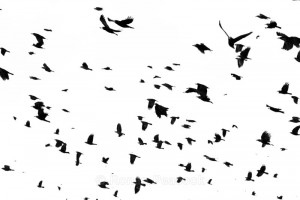
The Story
To me, crows are the very embodiment of the word ‘Aggressive’. I was attacked by a crow as a kid and had developed a fear of birds since then. The feeling of the the crow’s claws on my scalp is something I’ll never forget.
The most nightmarish situation for me, would be being caught in the middle on a whole pack of crows (or any crazy carnivorous birds…) and that is why my final interpretation shows vicious beaks from all four corners, congregating in the middle; expressing the same aggression of birds circling around their prey in the air, before swooping down to catch them.
Initially I tried experimenting with the claws of a venus fly trap, but it was rather difficult to translate the aggressiveness of the carnivorous plant into lines. After multiple attempts I decided to work on another idea and picked the crows instead.
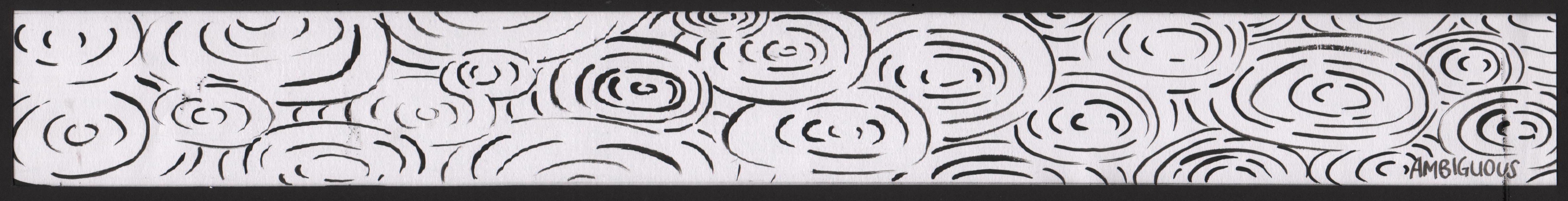
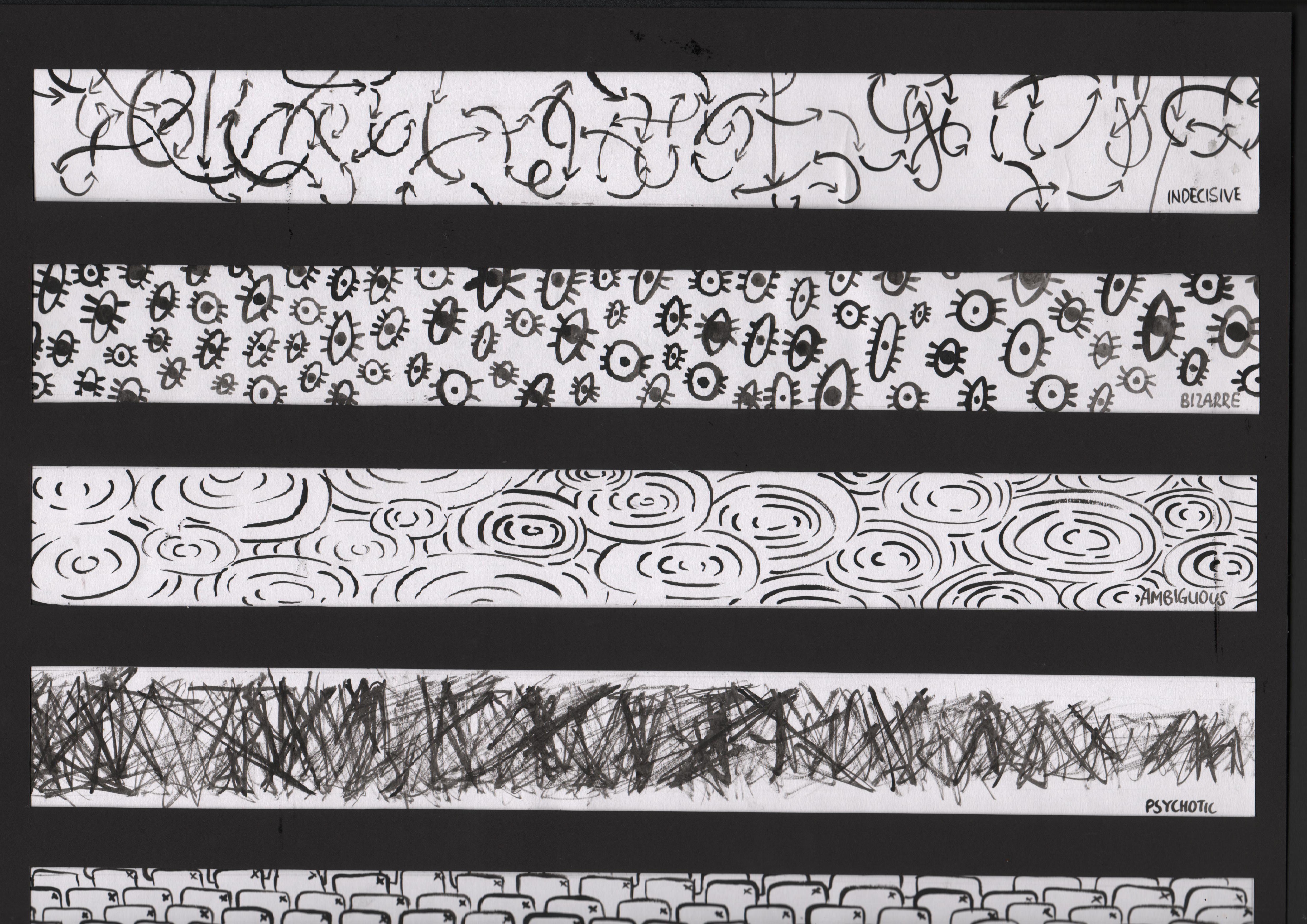
2.Ambiguous
Definition/association
Uncertainty, new beginnings
Inspirations

The story
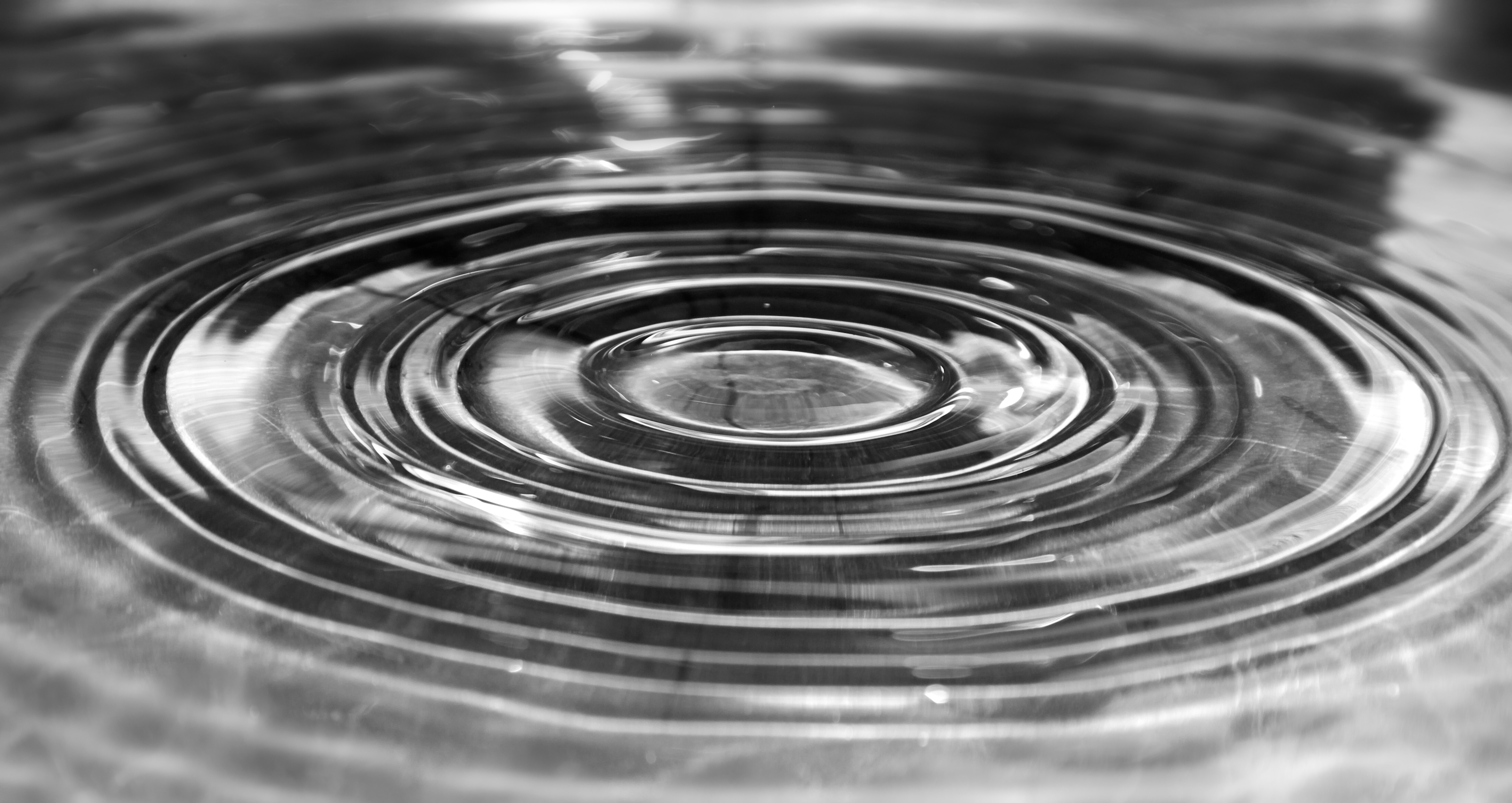
In times of ambiguity, new beginnings- such as a new season of life (SCHOOL), I tend to adopt a hesitant attitude towards things and people. Often I find myself being overly cautious, testing waters time and time again-a little like how the ripple effect never really stops, it just spreads.
Therefore I’ve chosen the ripple, caused by a literal testing of waters to represent this emotion. Funny how this piece looks surprisingly calm and peaceful, as if a picture of serenity when in reality, being ambiguous brings me no peace at all.
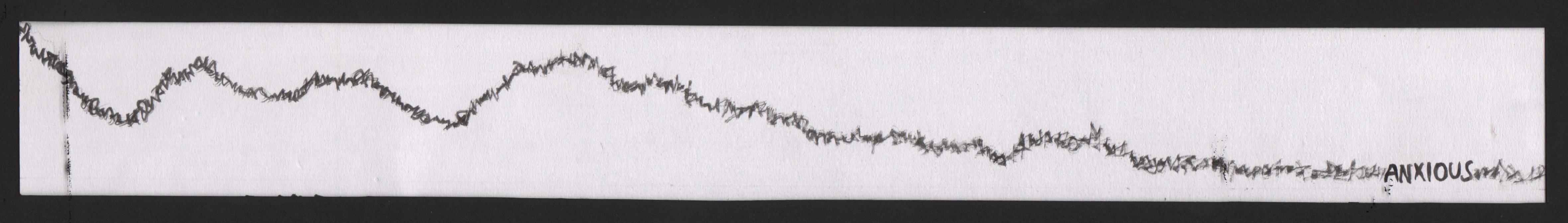
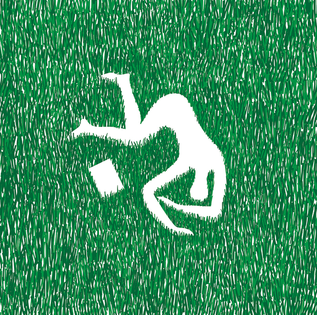
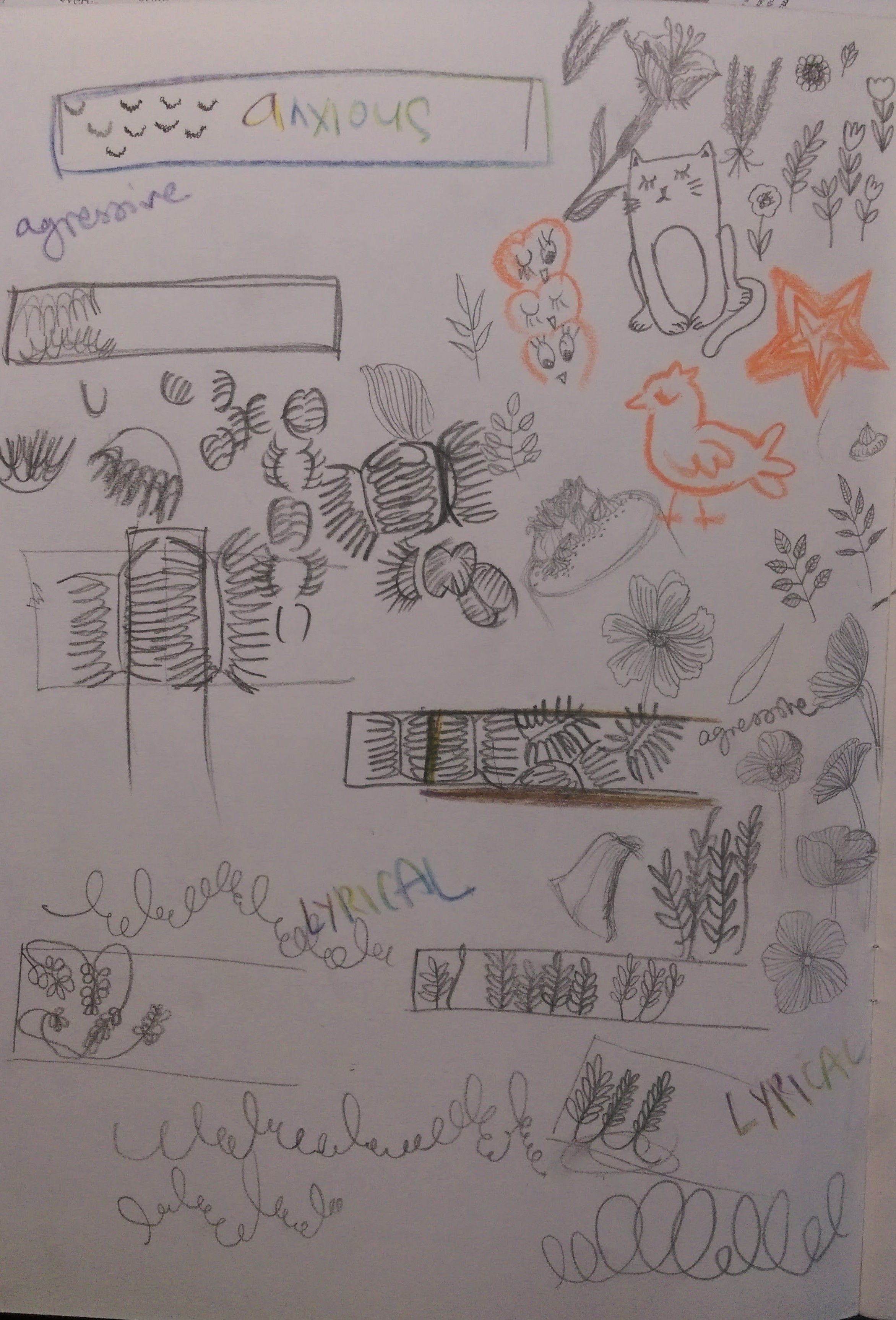
3.Anxious
Definition/association
Biting fingernails
The story
I was a very shy child, so incredibly shy was I that my teachers were irritated by my lack of participatory spirit in class. I’d get very anxious when I was called out in class, and thus developed a terrible habit of biting my nails.
Initially I had used the jagged moon-shape of badly bitten fingernails to depict ‘Anxious’ but after discussing with Shirley, I thought it better to translate it into a fluid line, slowly descending as my anxiety issues decreased overtime. Also, the previous idea looked like a wrapping paper print..
My very first idea was to draw a whole row of hands in the posture of prayer, for that is what I do when I am anxious. Instead of expressing anxiety, it looked like a peaceful line so that idea got scrapped!
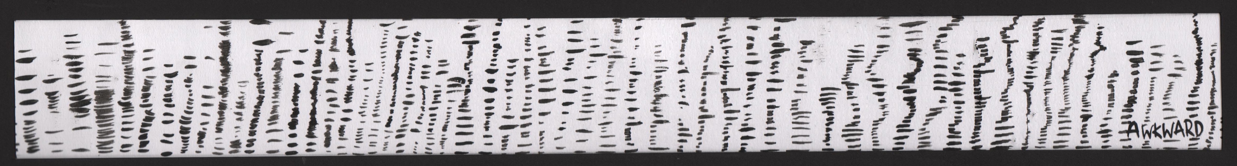
4.Awkward
Definition/association
Stuttering
Inspirations
The story
Awkward & Embarrassment are two emotions that are very closely linked, usually when I am in an awkward situation, I would very like embarrass myself-not a pretty sight.
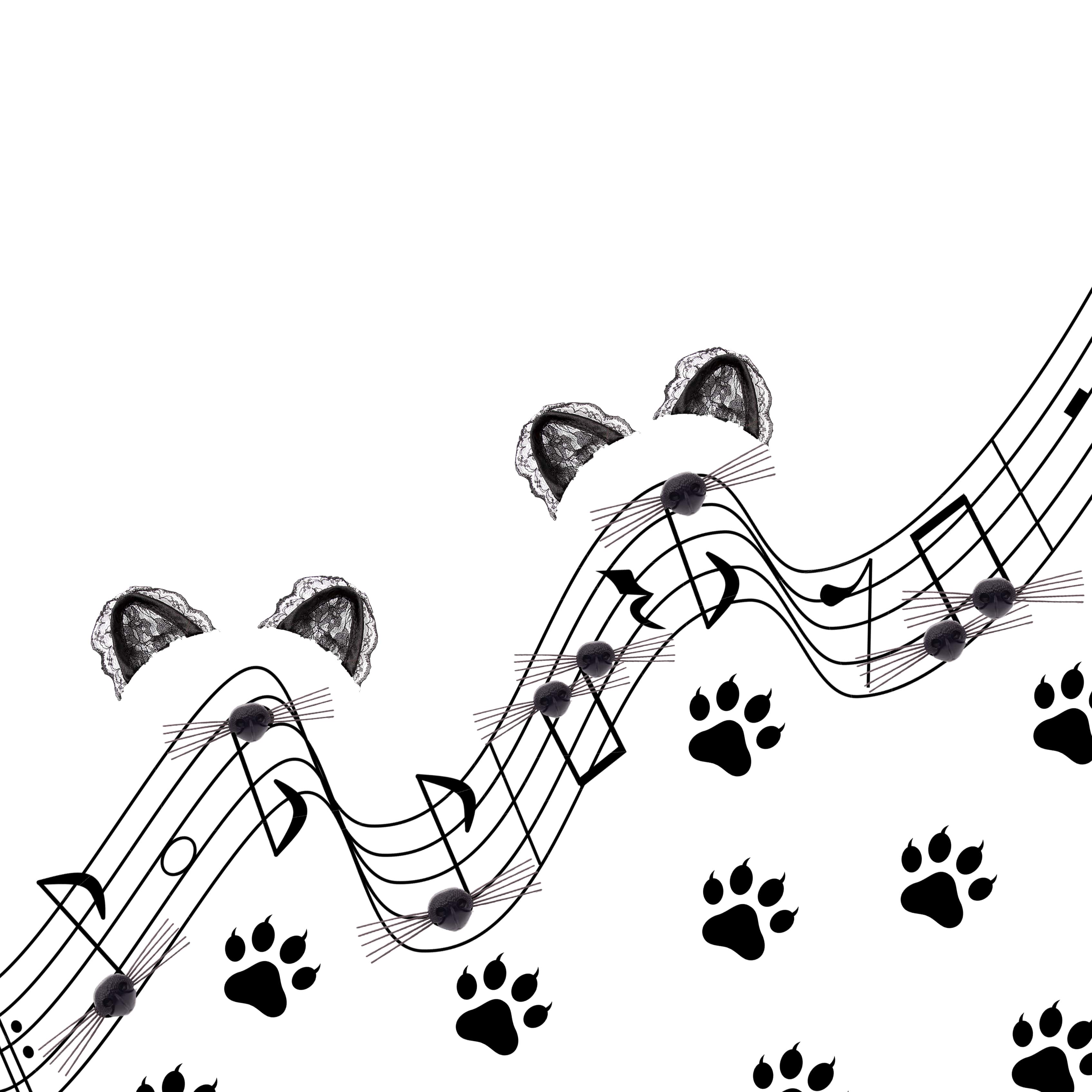
I wanted to capture the essence of awkwardness of a stutterer, and thought best to so as music beats. To ensure that my square mind would not create overly regular lines, I listened to videos of stutterers speaking and increased the number of strokes when they stuttered.
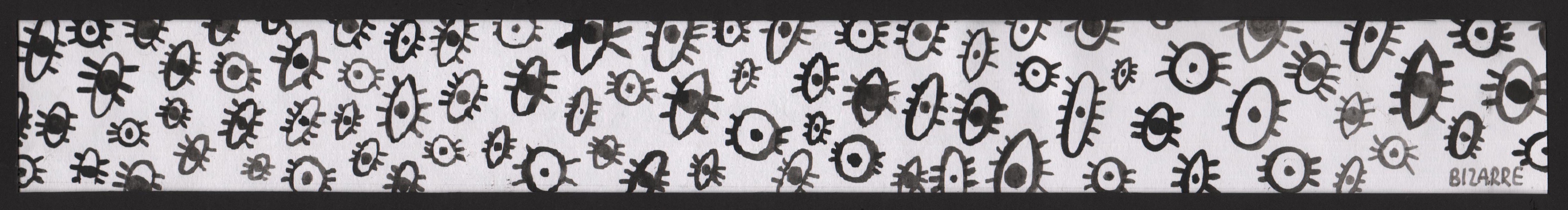
5.Bizarre
Definition/association
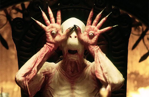
Tim Burton, Edward Gorey, Pan’s Labyrinth
Inspirations
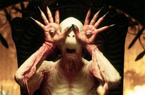
I love the illustrations of Tim Burton & Edward Gorey, they are to me bizarre and strangely intriguing. The word ‘Bizarre’ also reminded me of the film Pan’s Labyrinth which I caught on the plane, it was a little grotesque but I loved it. The most captivating character was the pale man, with his detachable eyeballs. I decided to use various eyeballs as motifs, tilting them at an angle that they may also resemble bugs- slightly bizarre but curiously captivating.
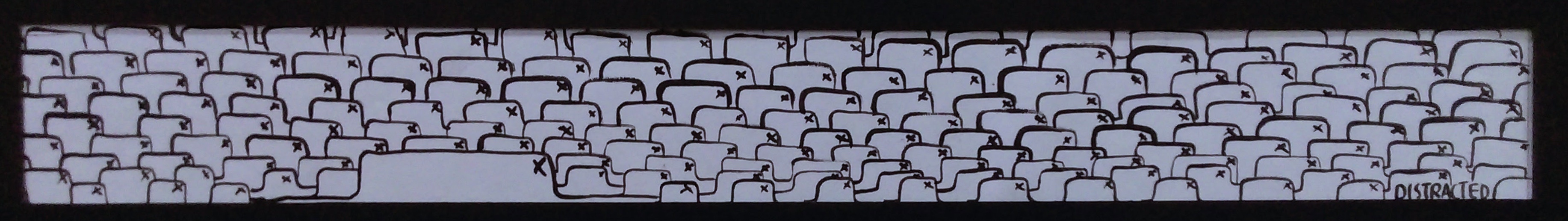
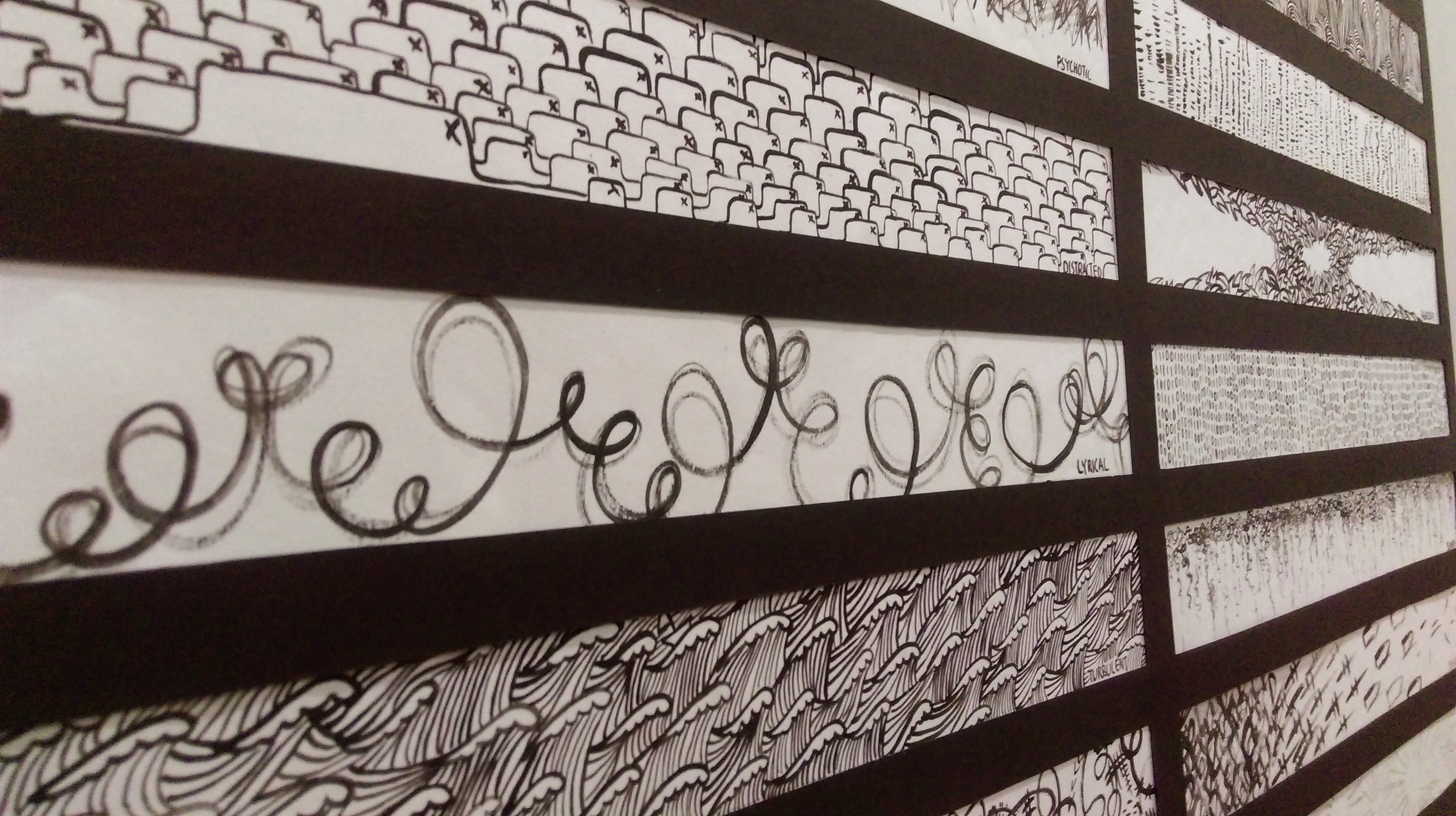
6.Distracted
Definition/association
Internet
The story
I am easily distracted, especially while getting work done on the net…just as I am typing this, there are 9 open taps, oh dear.
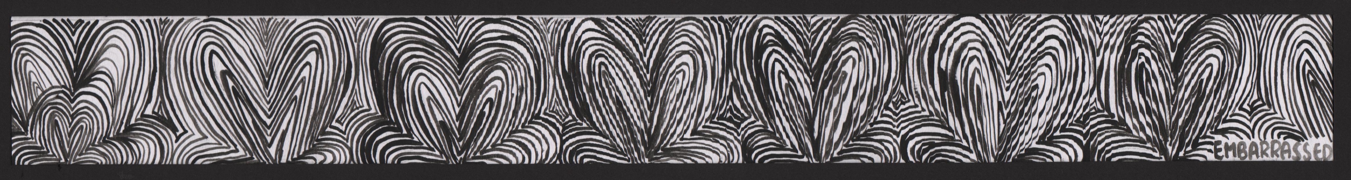
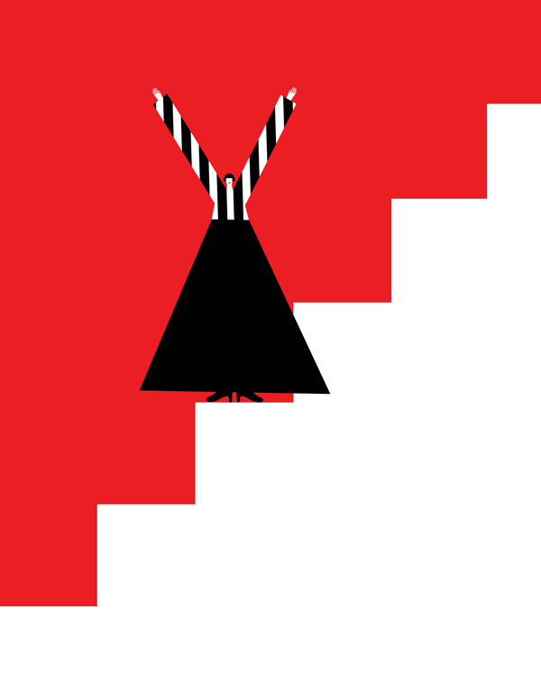
7.Embarrassed
Definition/association: Squatting
The story
Thinking back on my most embarrassing moment- it was when I had to do a public presentation in front of the school and had a blackout. Completely forgetting my lines and terribly embarrassed, I proceeded to squat down on stage, succeeding in embarrassing myself further as the crowd erupted in laughter. SO, I’ve decided to capture the motion of squatting to represent embarrassment
.
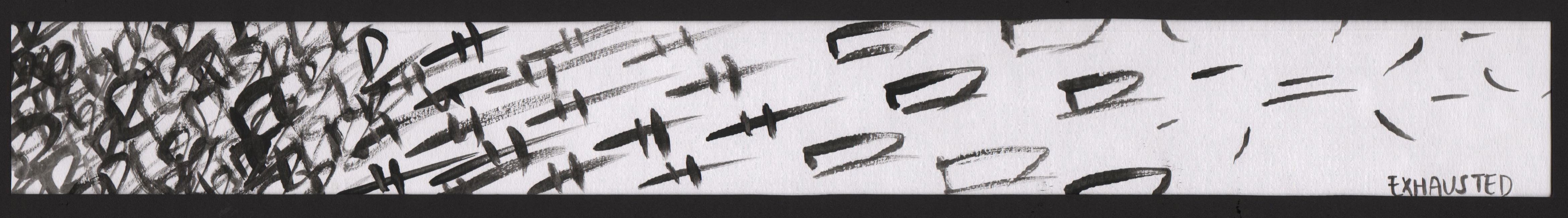
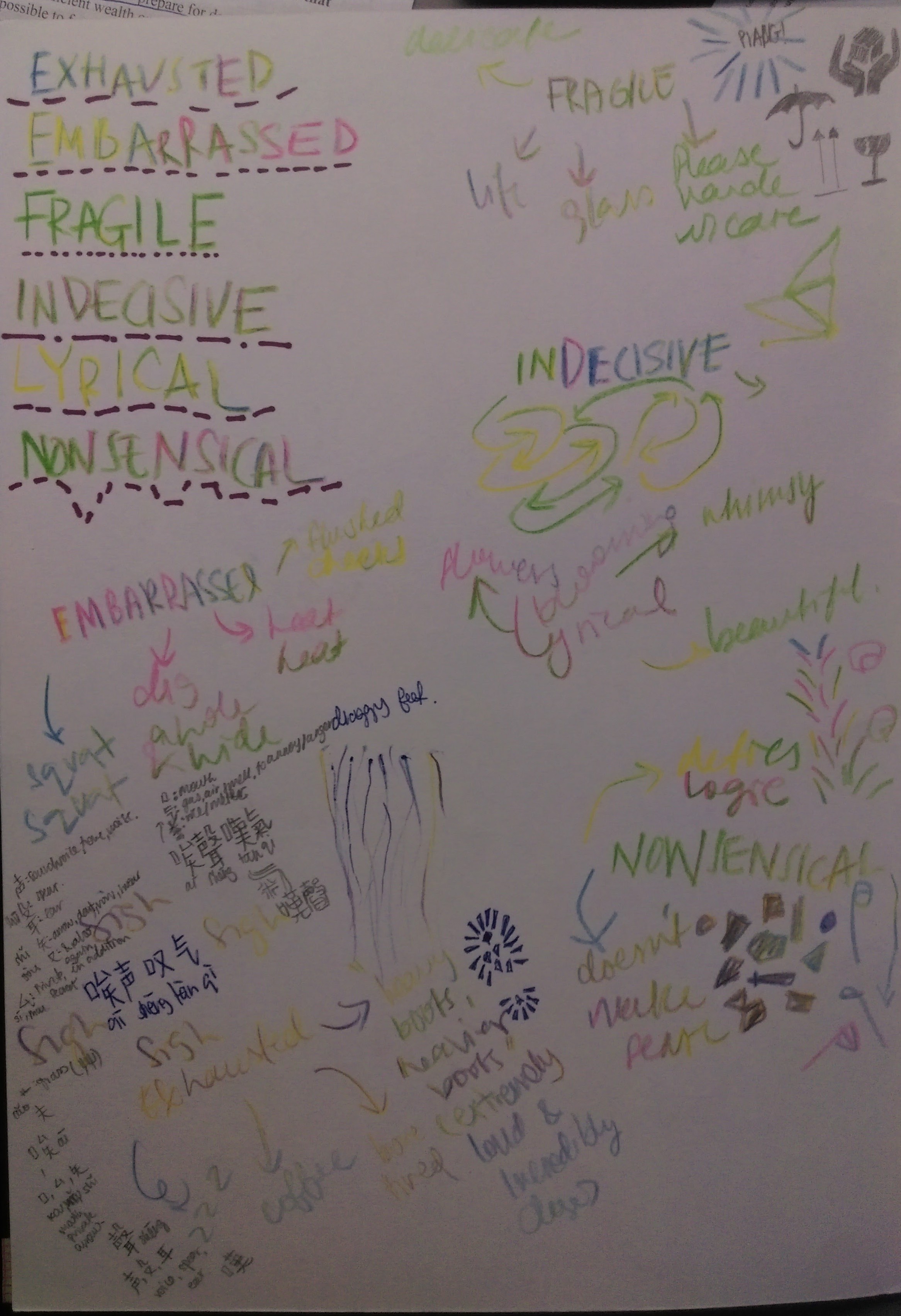
8.Exhausted
Definition/association
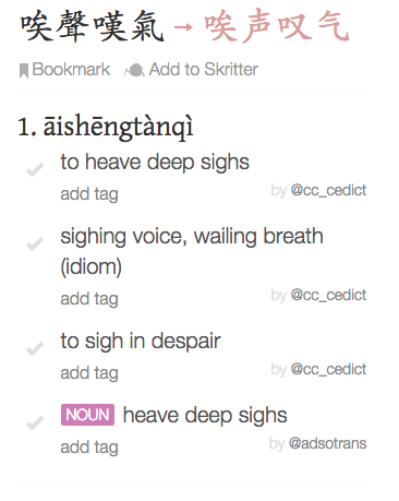
Chinese
Heavy sighs
Inspiration
The story
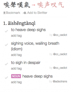
The most exhausting periods of my life were those moments struggling through Chinese exams. This language though beautiful had been the bane of most of my time in school. I picked the chinese phrase 唉聲嘆氣 as I did do that quite a bit, and still do in times of exhaustion. To create this piece, I deconstructed the word ‘嘆’ to its very basic elements, and deliberately made the front portion to be tighter than the back to simulate the release of a sigh.
Initially I had all the characters sprinkled about, but Shirley advised me to make the words unrecognizable, that it mayn’t be too “in your face”. I do like this improved version much more!
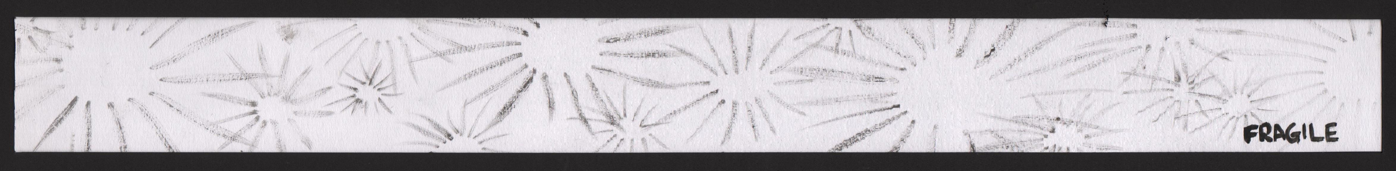
9.Fragile
Definition/association
*PIANG*
shattering of fragile items
The story
I wanted to create something that sounded like the sound of shattering glass *piang* Initially I chose to use harsh strokes, but realized the faint lines produced by dry brushing did a better job in bringing across the fragility of the sound.
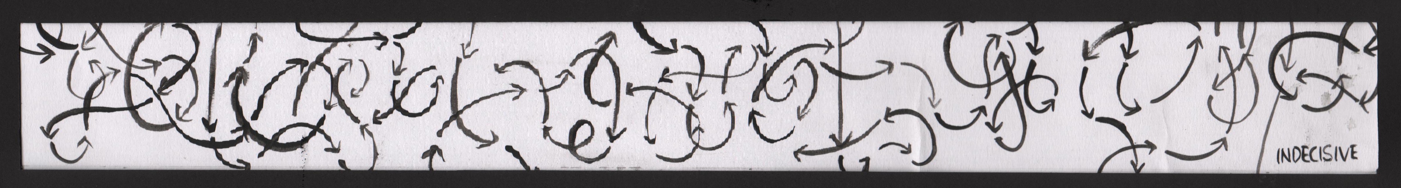
10.Indecisive
Definition/association
Going nowhere
The story
I used arrows as they represent a direction, indecisiveness has no direction at all, it just goes… nowhere.
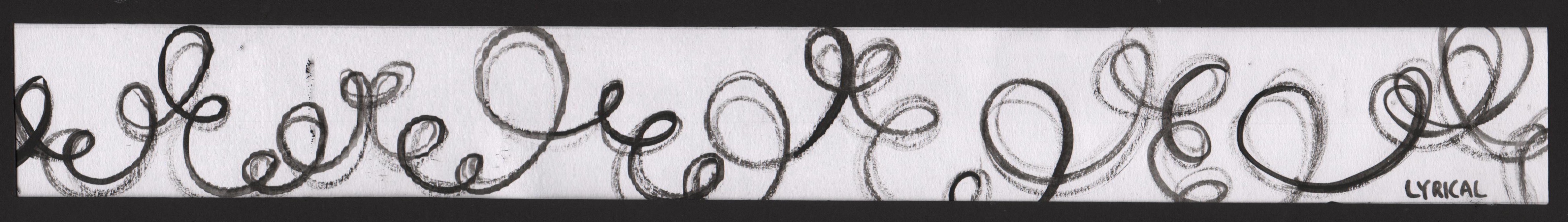
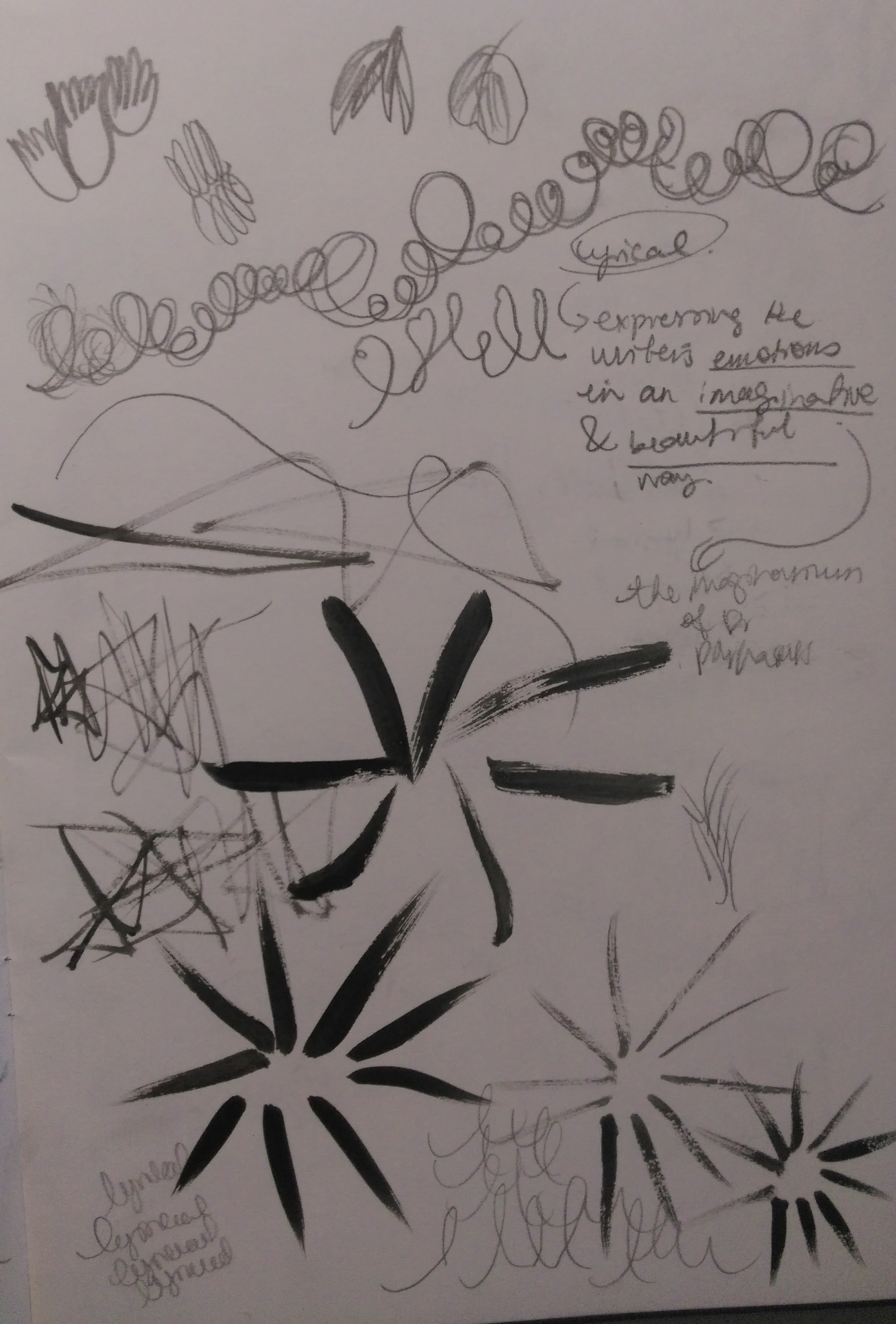
11.Lyrical
Definition/association
“(of literature, art, or music) expressing the writer’s emotions in an imaginative and beautiful way.”
Inspiration
Blooming flowers
The story
I watched a hyperlapse video of flowers blooming endlessly, and tried to capture that motion in swooping swirls.
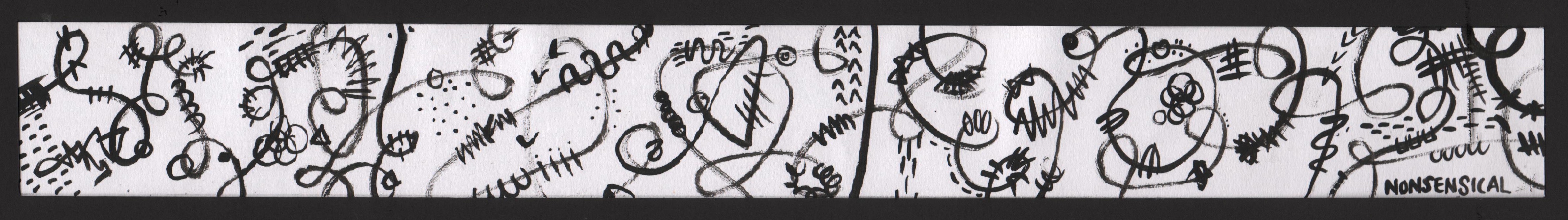
12.Nonsensical
Definition/association
“having no meaning; making no sense”
The story
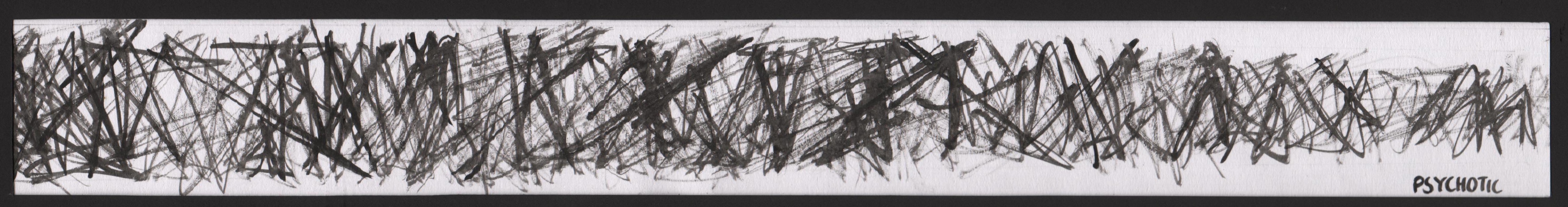
13.Psychotic
Definition/association
Uncontrollable person, actions, thoughts
The story
Being the unadventurous person I am, I could not allow my brush to go crazy and uncontrolled, I required a certain order to make sense of things. The lines are angry, pointed and well controlled within a white border. Shirley reminded me that Psychoticism did not necessarily mean going off the deep end, sometimes it could just be unrestraint motion within a fence.

14.Sensual
Definition/association
“of or arousing gratification of the senses and physical, especially sexual, pleasure.”
eg: “the production of the ballet is sensual and passionate”
The story
I was curious how something like a production or a music piece could be described as sensual, I’ve only seen it applied to people or objects (like lace!). After reading up on a couple of definitions & examples, I figured at the very root of it “sensual” must be something that is sensory. Perhaps a sensual piece of music could be the feeling of the melody touching your ears? Therefore I dipped my fingers in paint and rubbed over paper, almost similar to the action of caressing.
Initially I wanted to draw to use lace as the main motif, but I realized that the result turned out too literal an interpretation.

15.Sloven
Definition/association
“a person who is habitually untidy or careless.”
Inspiration
Unkempt facial hair
Unruly vines
The story
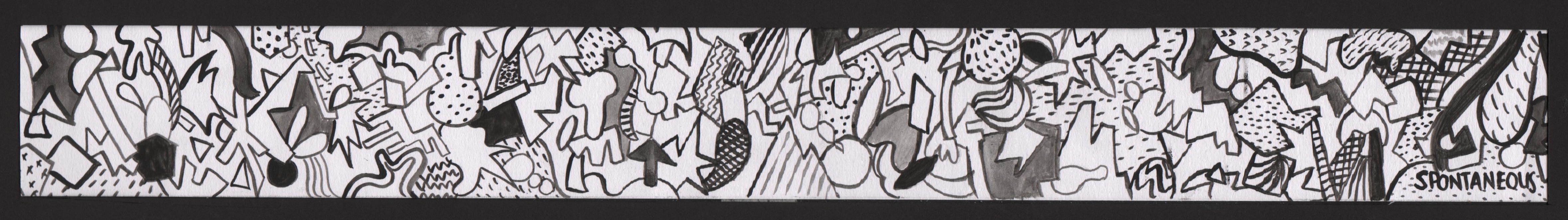
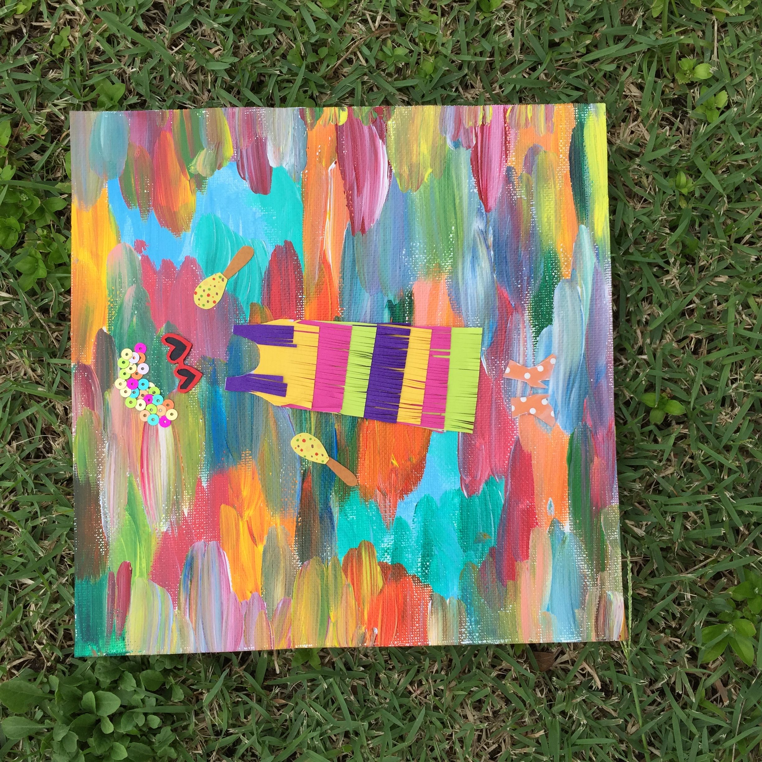
16.Spontaneous
Definition/association
Unplanned fun
Inspiration
kaleidoscope
The story
I love how unpredictable the kaleidoscope is, the mishmash of shapes & colors are so beautiful-and that’s how spontaneity is to me. I used various shapes and patterns to create something fun, bolding random pieces to create accents.
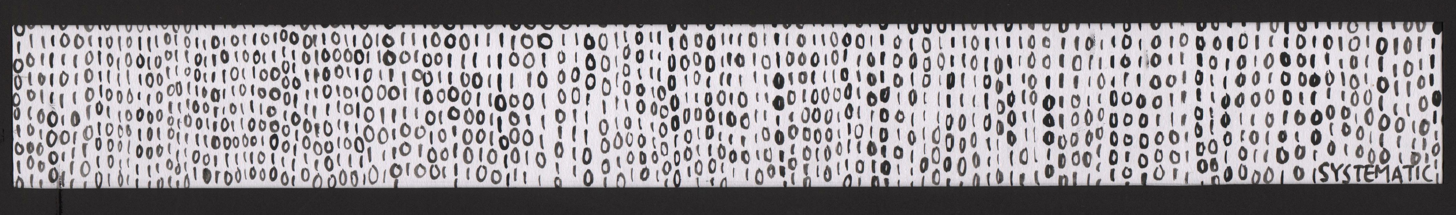
17.Systematic
Definition/association
In proper order
Inspiration
Binary
The story
I remember when I was still studying in Ngee Ann Polytechnic, we had to take a dreadful exam on coding. Being the tech idiot that I am, the only thing I gleaned from the entire module was that it is made up of many 1s and 0s. That just with these two numbers and careful arrangement, some spectacular results can be achieved.
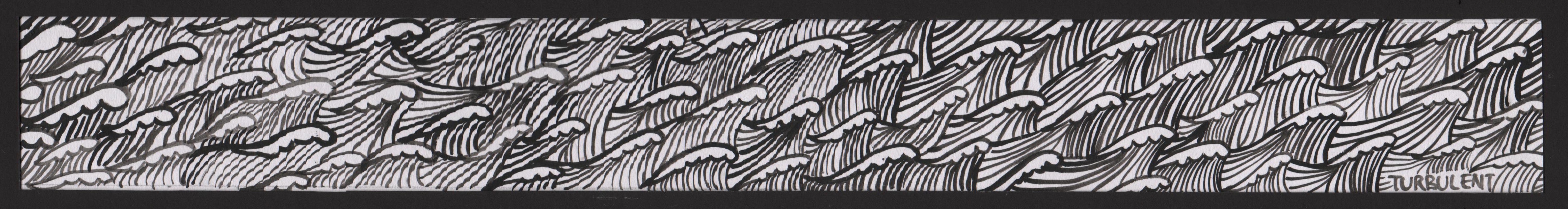
18.Turbulent
Definition/association
Stormy seas
The story
When things get tough, I like to imagine myself as a sailor navigating through choppy waves. Somehow picturing it like this helps me to remember that there will always be a way out once the storm stills. The style of this is a cartoon like illustration of “friendly” looking waves to mimic how I feel about turbulent times, the tiny boat overwhelmed by the waves is a representation of me. As the phrase says “this too shall pass” as with everything, so do the turbulent times.
*Tada* final work


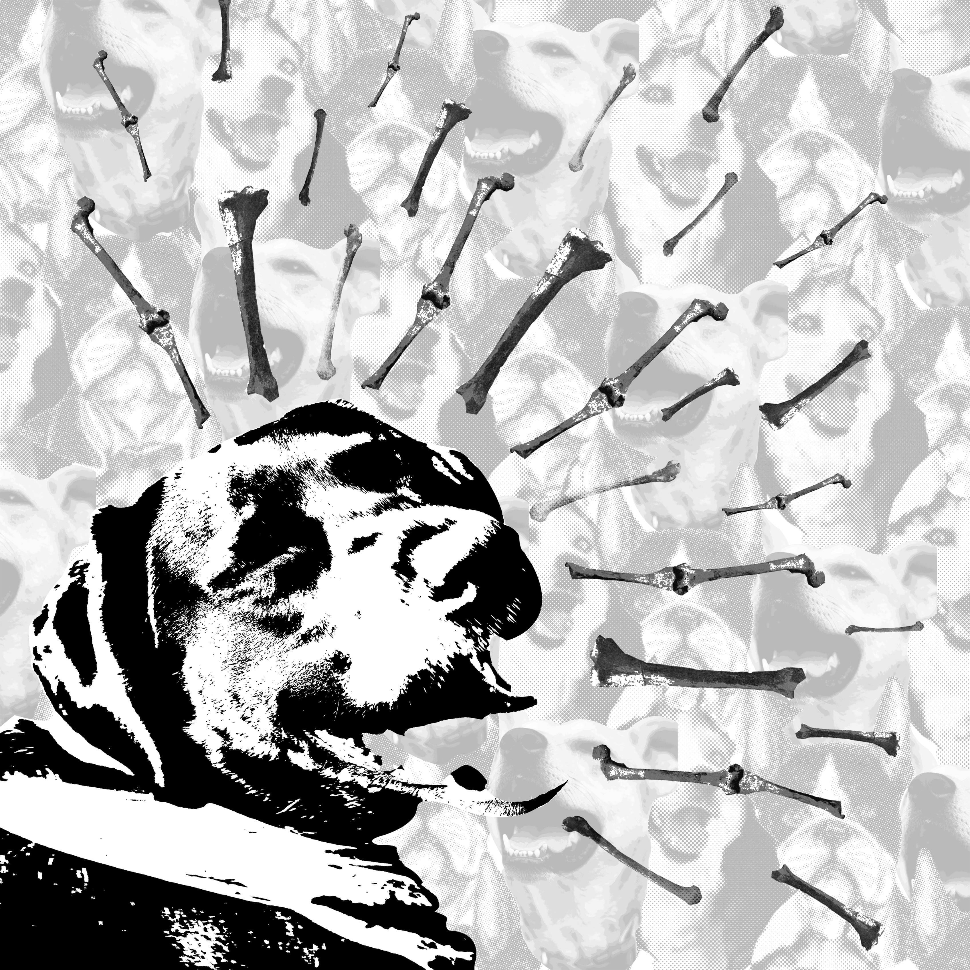
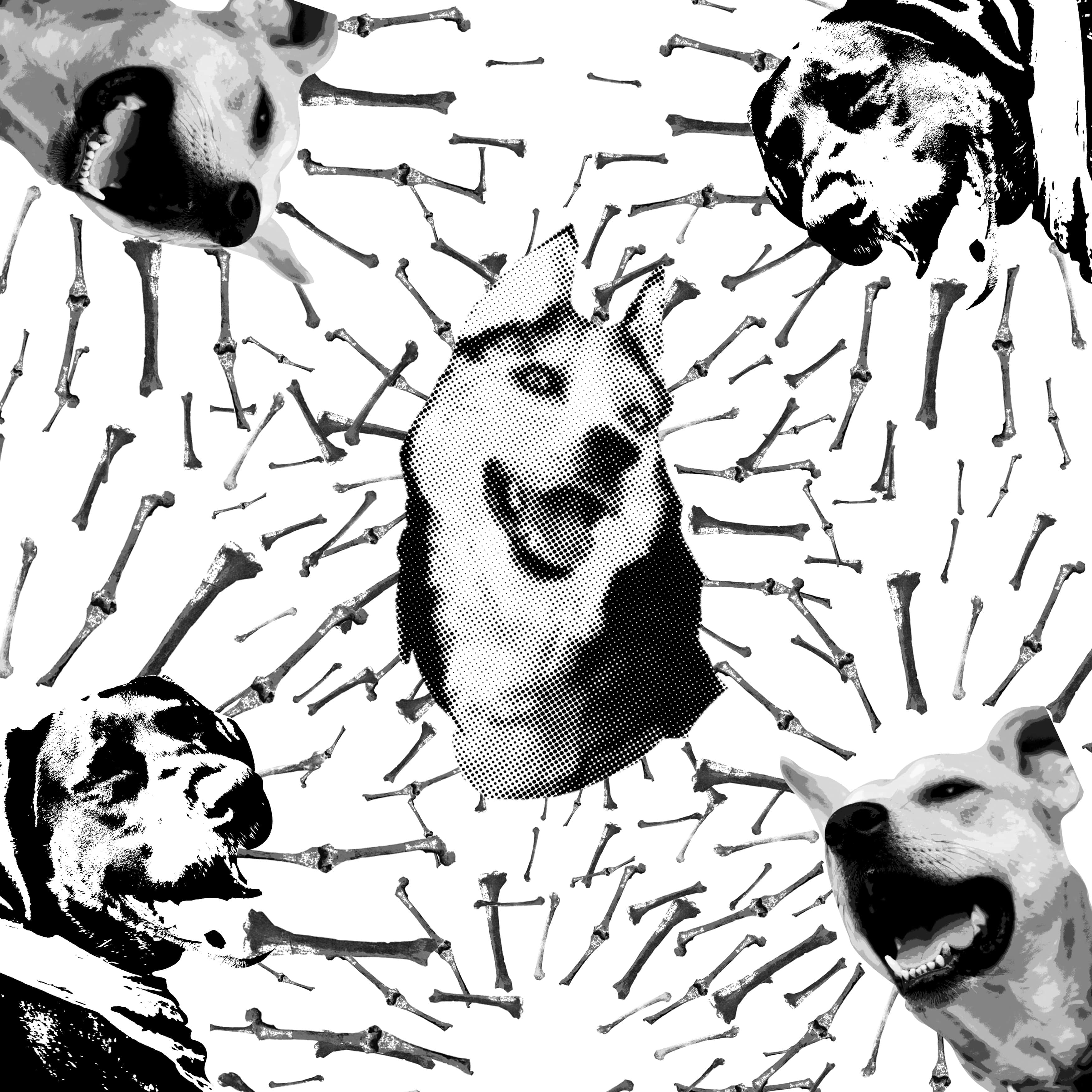 Similarly, I wanted the bones to be used as expressive lines, but this might have been too ambitious; the entire image looks too cluttered.
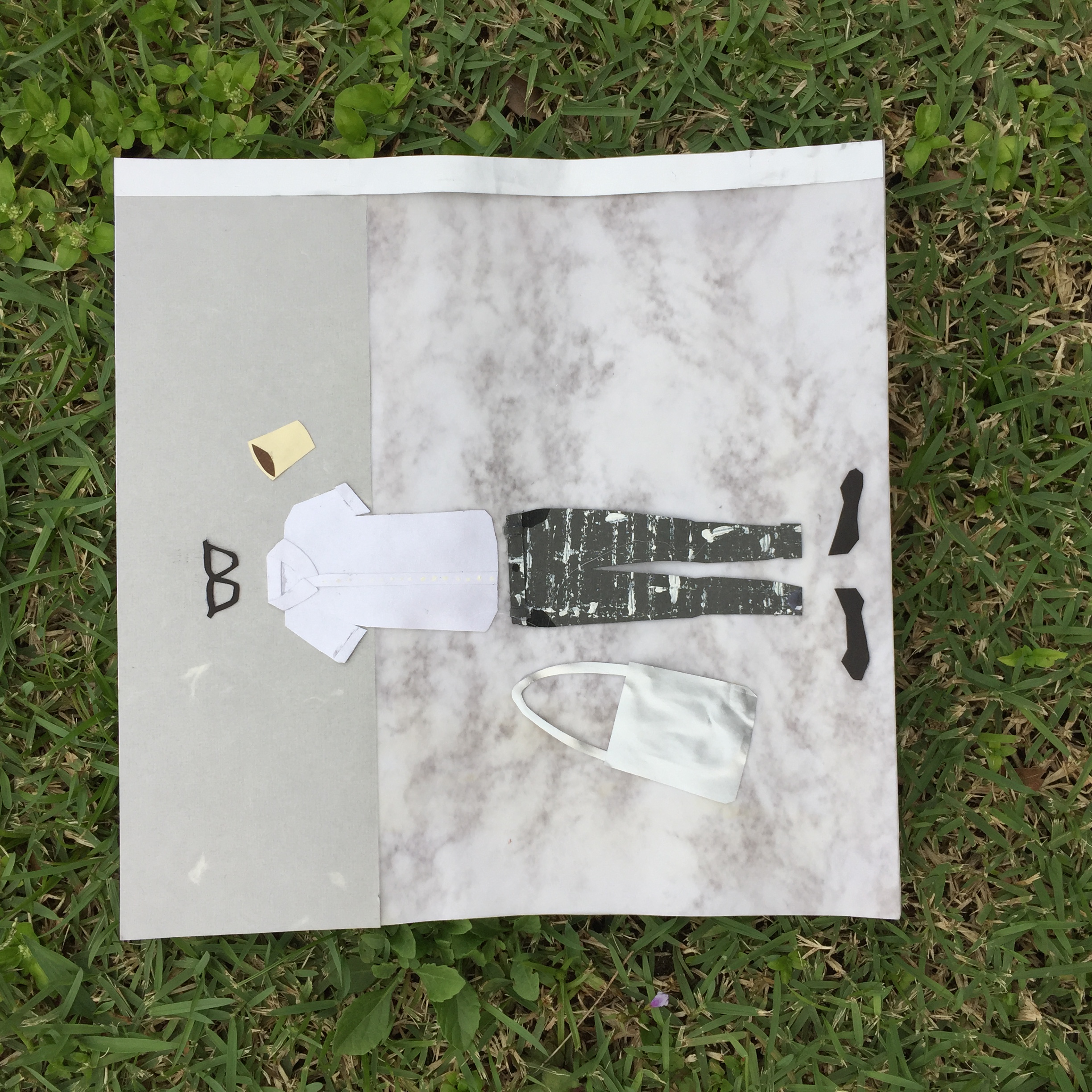
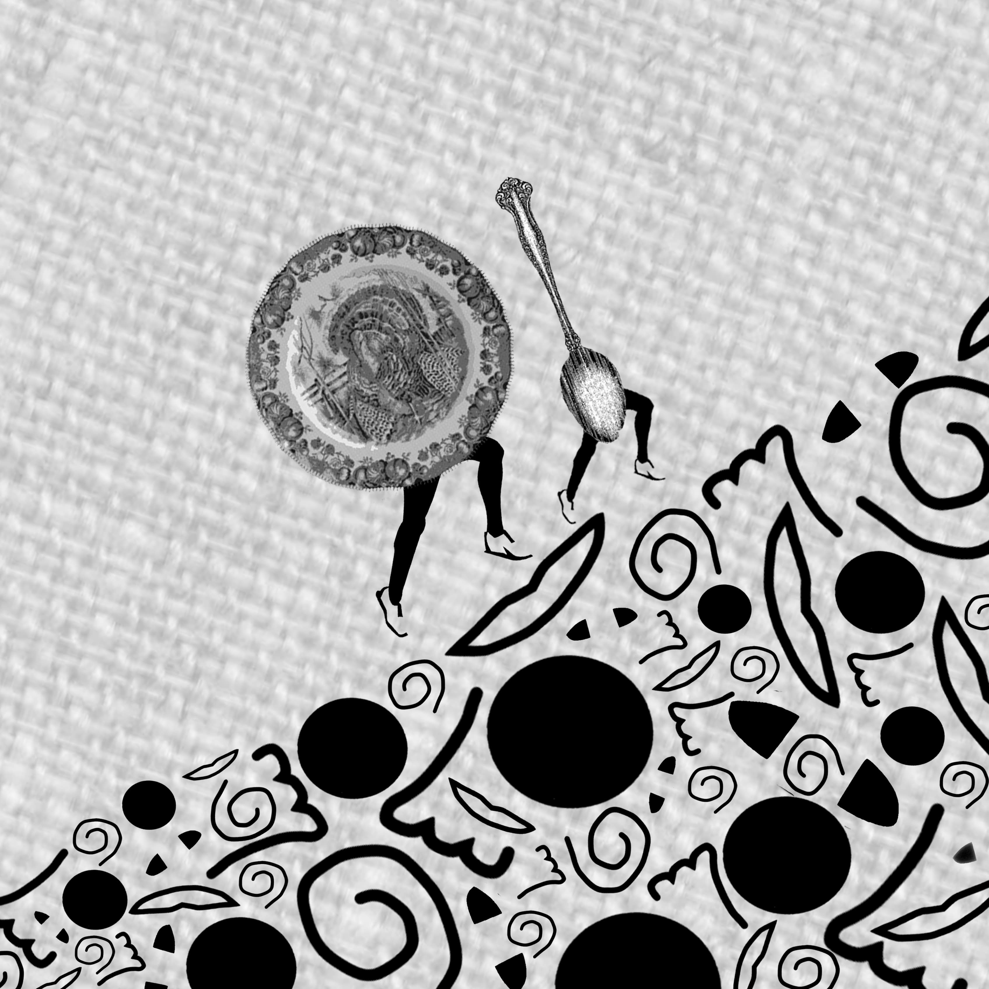
 I really liked this image, but I decided to chose the image with the background as the hemp texture gave it a picnic-y feel. This image has less warmth in my opinion as the backdrop is white and stark.