Production team: Debbie, Grace, Liying, Yiwen
Tracks :
David Jwoll- Cymbal Roll
Houses-Big Light
Novo Amor- Gold
Perfume Genius- Sister Song
Artist statement
We selected this children’s story to reinterpret as the message it conveyed is very relevant in our day and time. The puppets in the story were an apt metaphor of how we too are knowingly or unknowingly collecting and distributing labels, based on characteristics that are extrinsic. This phenomenon is greater amplified with our heavy dependence on social media, and how easy it now is to base our worth and image on how others deem fit.
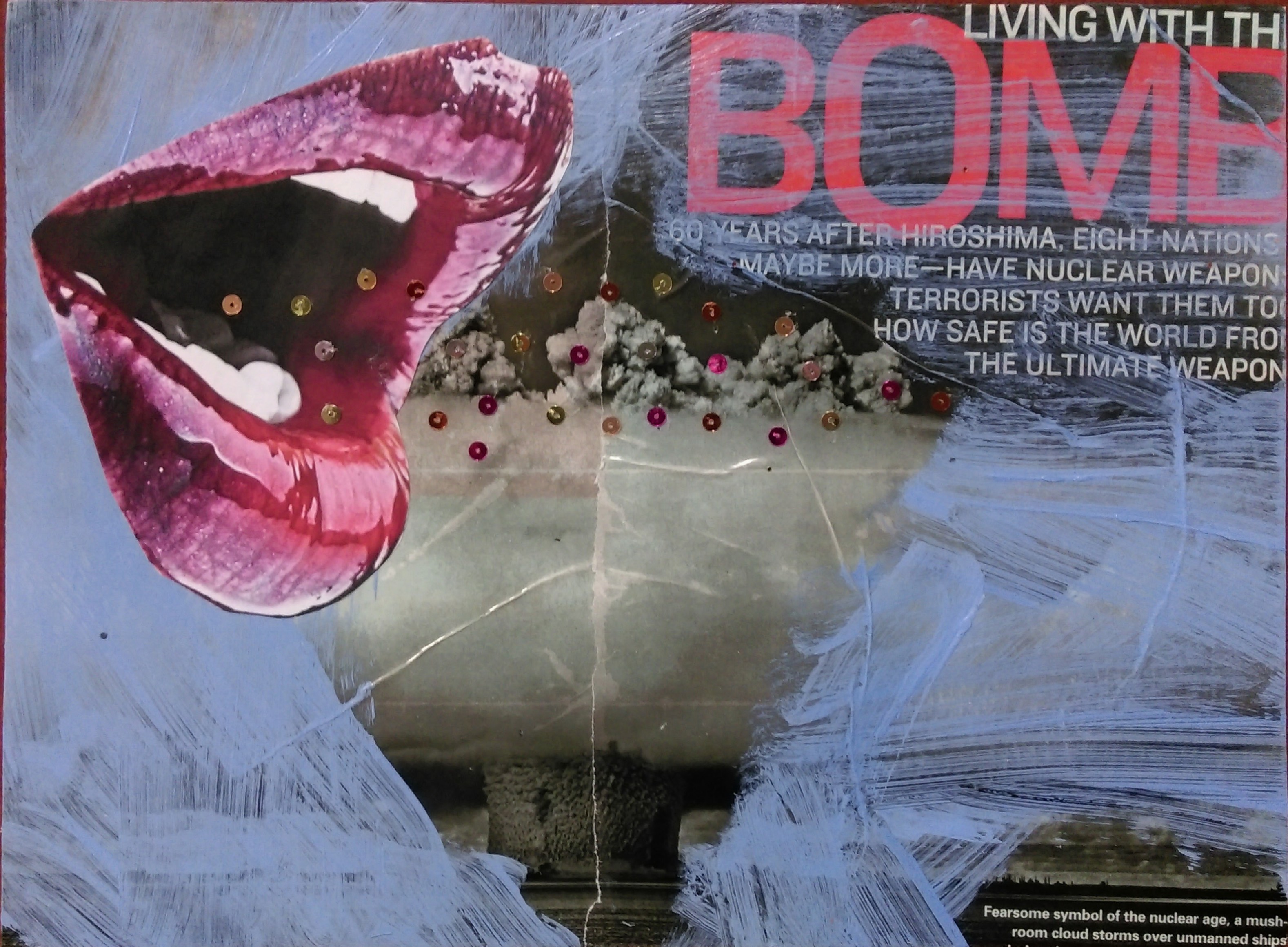
In this trailer, we challenge the idea of conventional beauty and how it should be measured. We also explore the connection of beauty with self-worth: are certain, idealised, physical features prerequisite for someone to be able to feel comfortable and confident in their own skin?
We approach this classic question through the eyes of a modern spectator by bringing in a modern twist – social media, increasingly prevalent not just as a tool for communication, but also as a quantifier of social standing.
Story
Original story: You are Special- Max Lucado
http://www.aikentdc.org/You_Are_Special.pdf
The nugget of treasure lies in the puppets’ daily exchange of spots and stars and how much importance was placed on this. Puchinello the protagonist in the story eventually learns that his importance shouldn’t be based on other’s opinions of him. The analogy is a simple and easy way to explain this truth to both children and adults alike- that we are all special in our own way.
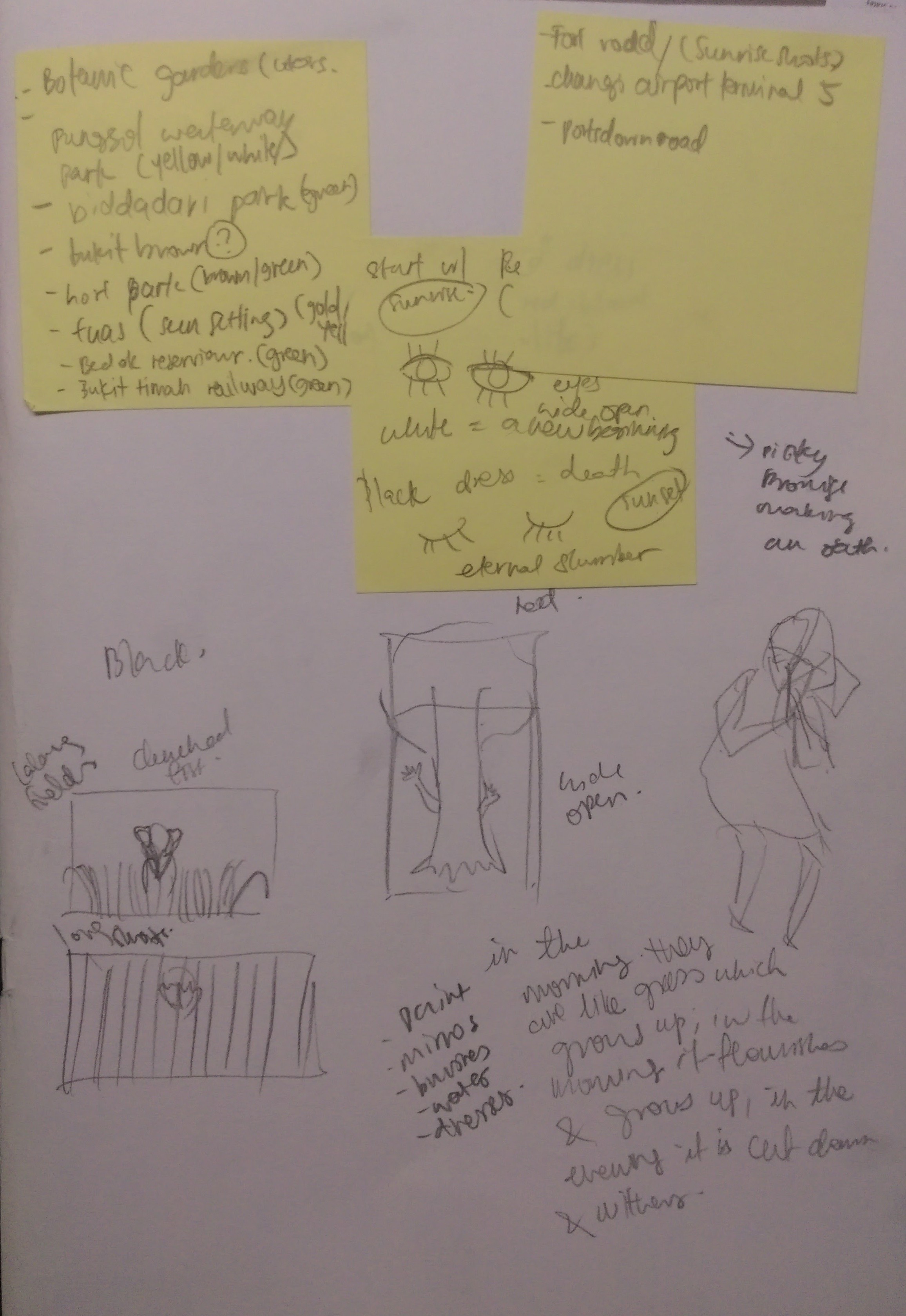
Symbolism
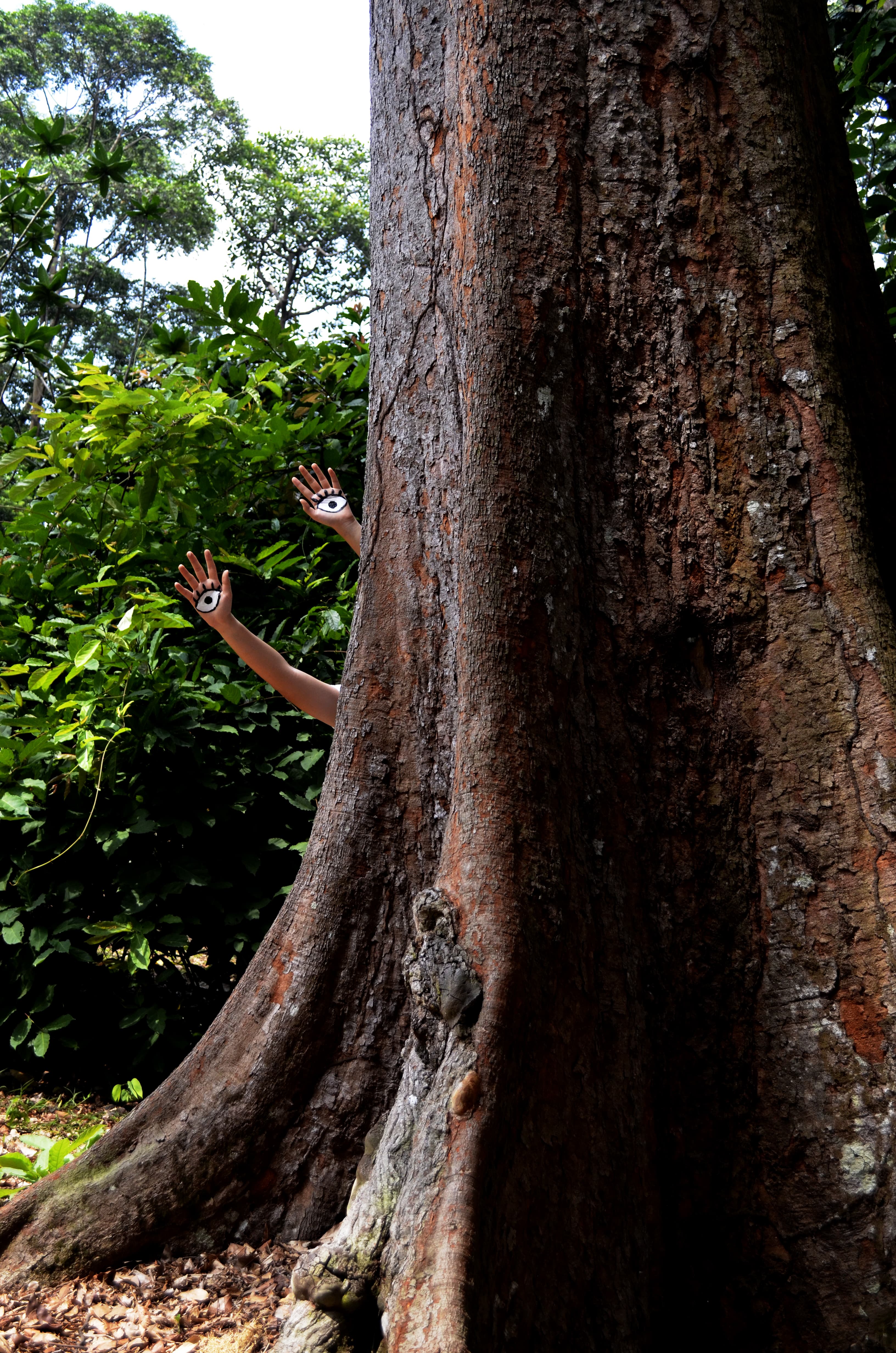
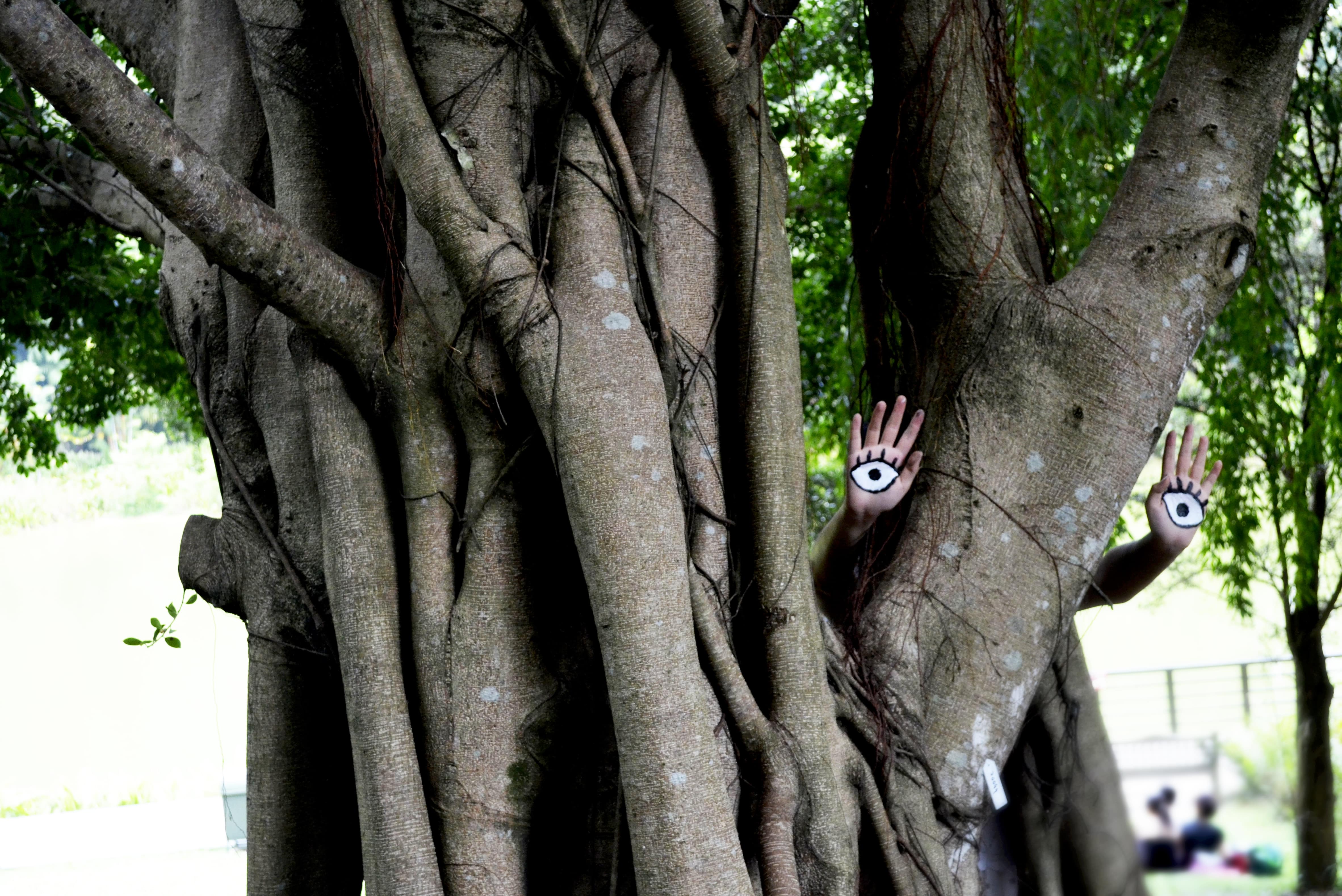
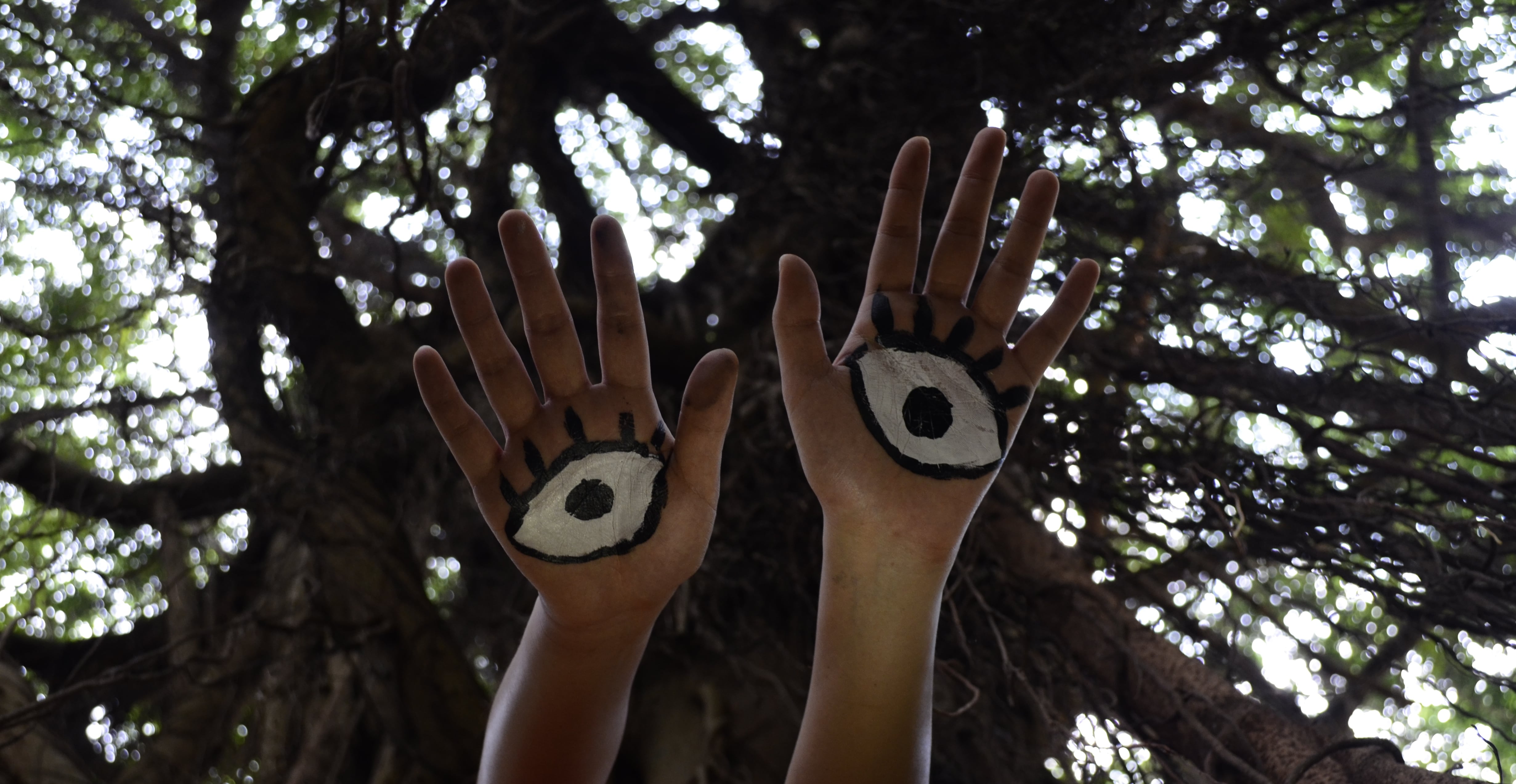
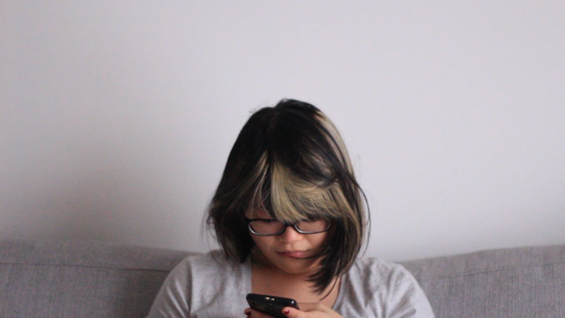
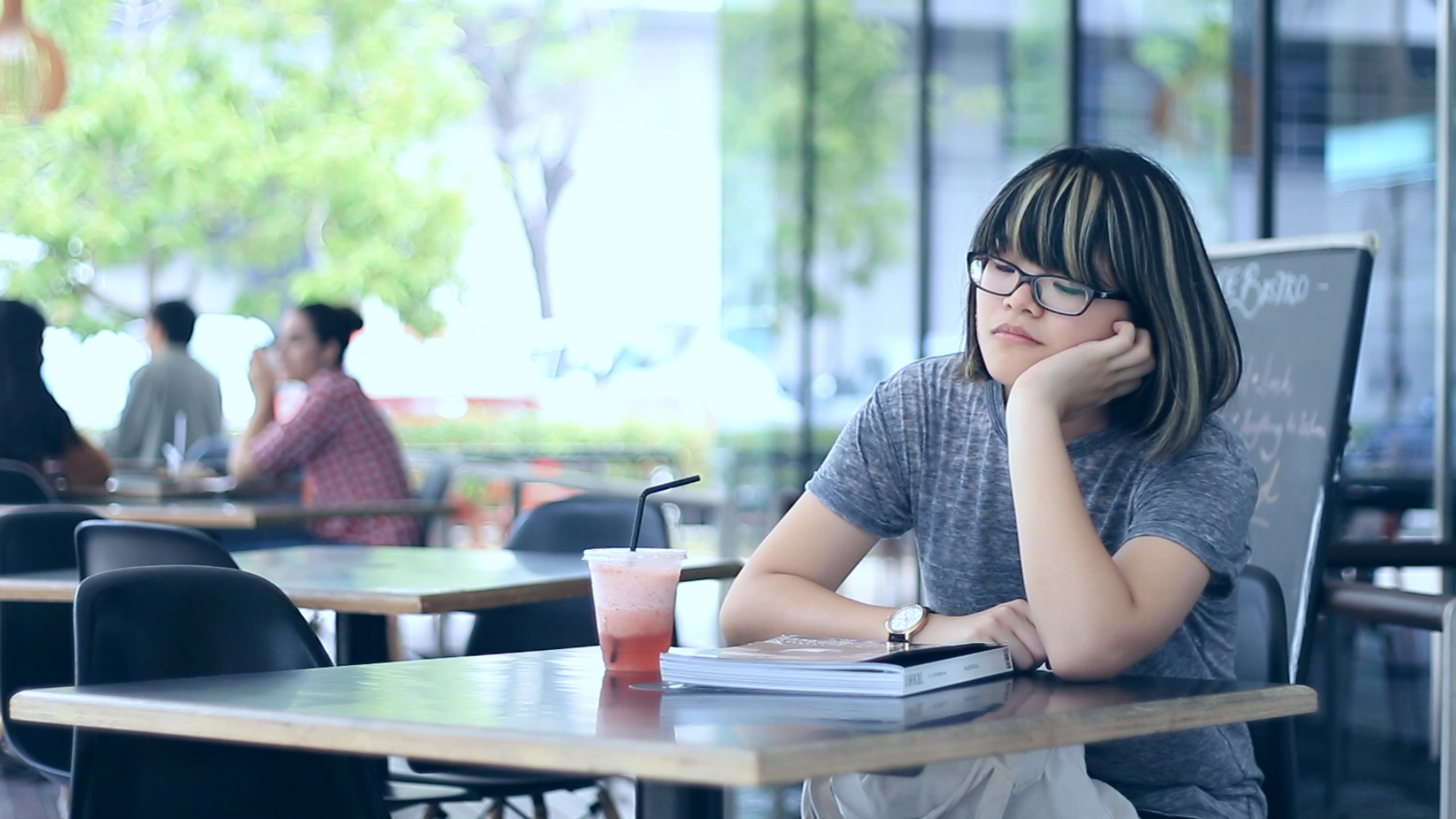
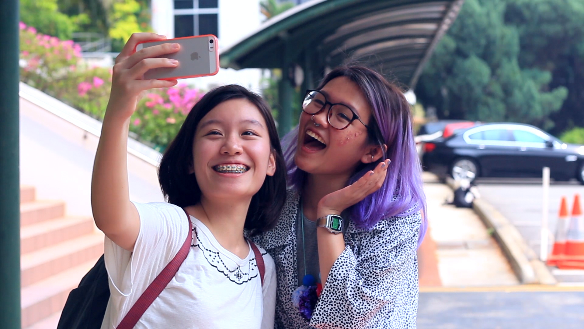
We needed to come up with a replacement for the signifiers in the story, namely the dots and stars. To make our story more realistic, we used scars as a visible, tangible ‘dot’ on the protagonist. We decided to use social media – Instagram in particular – as a system of validation, much like the stars.
Turning point
To recreate the climax in the story where Puchinello meets the stickerless puppet, we decided to create a character with a scar similar to that of our protagonist, but with a vastly different outlook on life. She befriends the protagonist, teaching her how to feel comfortable in her own skin, and that the opinions of others don’t- and shouldn’t- matter.
Title
bare
(bâr)adj. bar·er, bar·est
- 1. Lacking the usual or appropriate covering or clothing; naked
- 2. Exposed to view; undisguised
- 3. Lacking the usual furnishings, equipment, or decoration
- 4. Having no addition, adornment, or qualification
- 5. Just sufficient; mere
tr.v. bared, bar·ing, bares
- 1. To make bare; uncover or reveal
- 2. To expose
Process
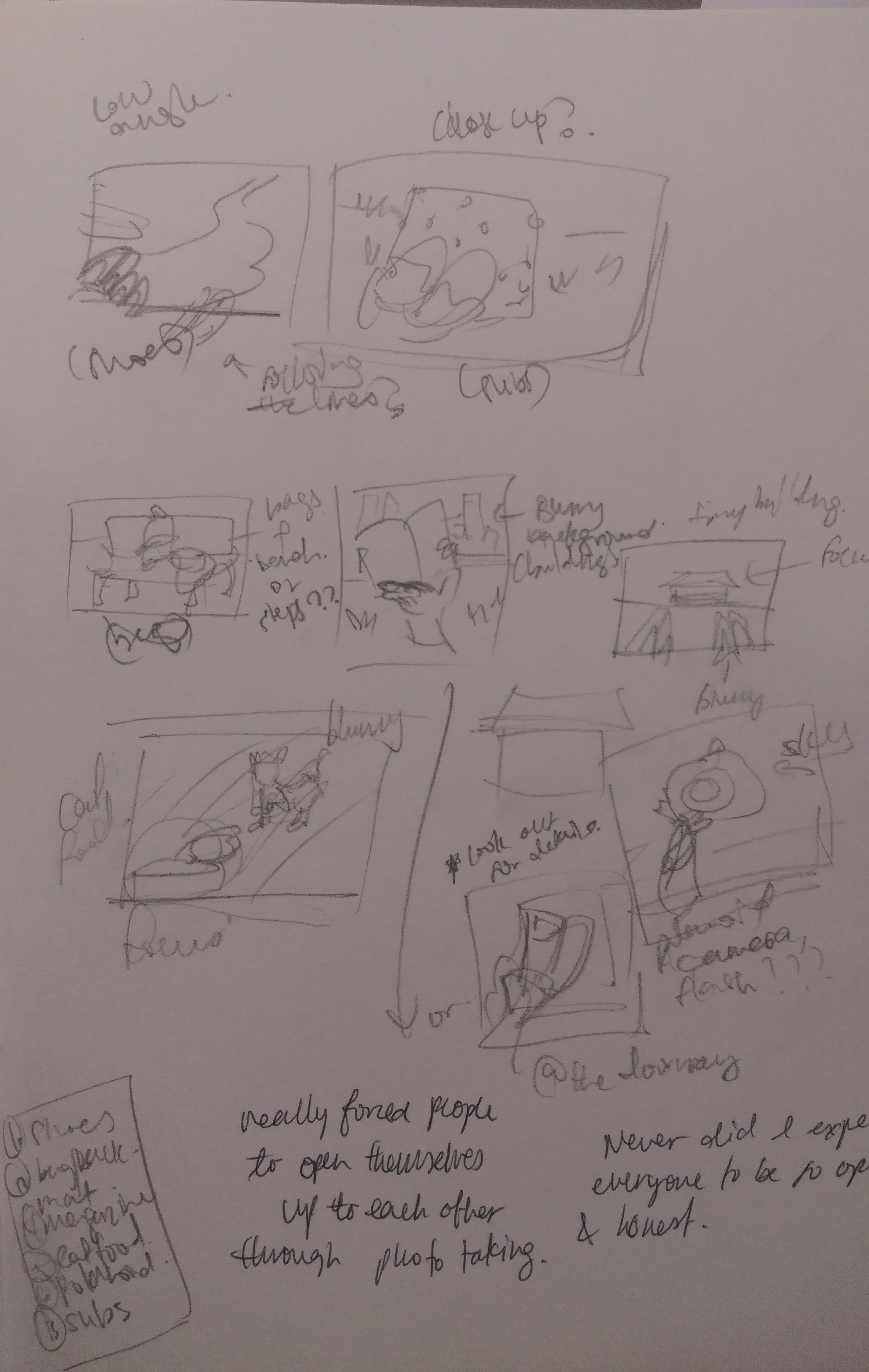
Storyboarding
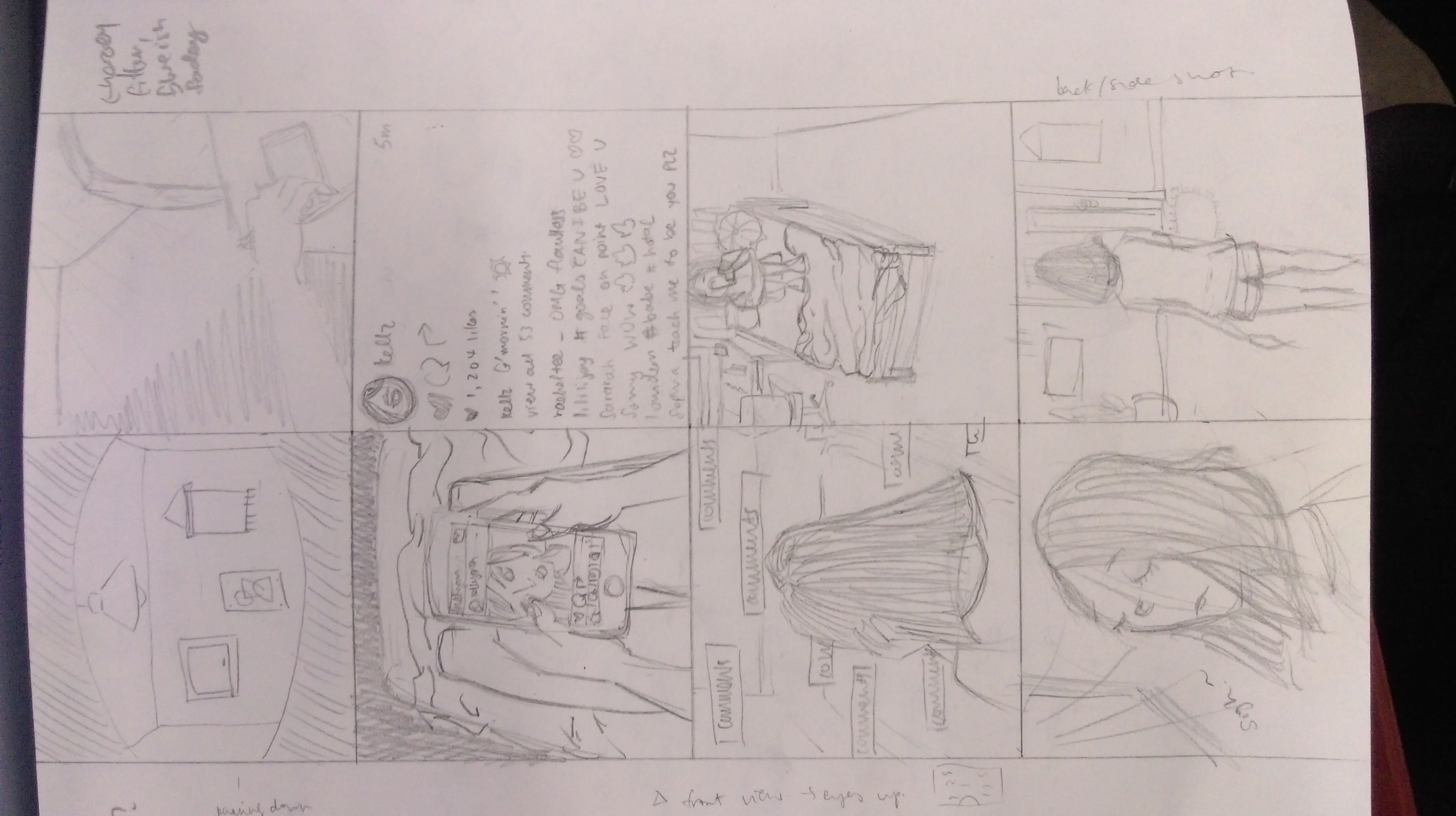
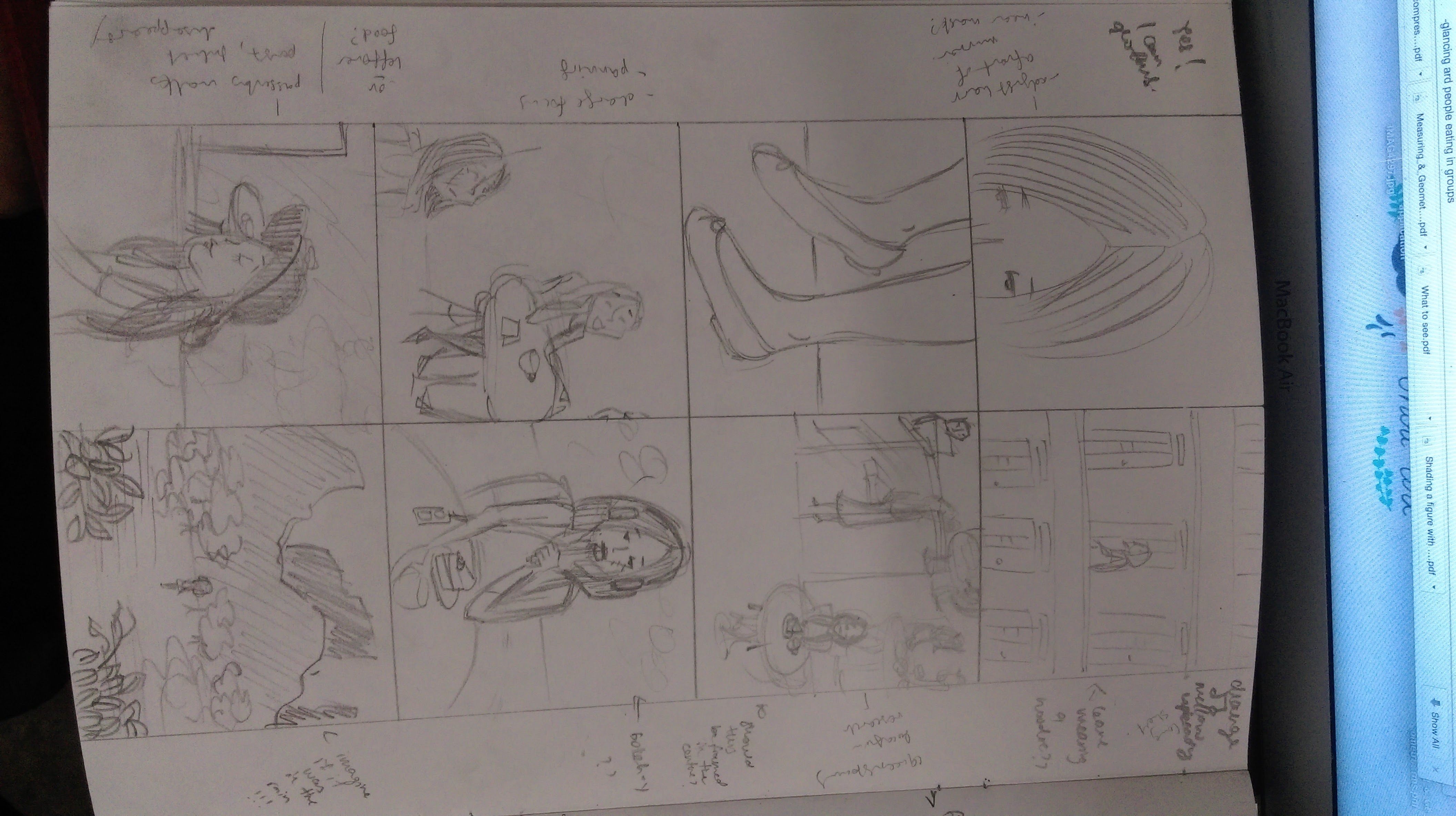


Even though we did not follow each frame exactly, it was immensely helpful to have the storyboard for reference and to keep the whole team on the same page. It was easier to visualize each shot better with the storyboard as well, totally not a waste of time!
Scriptwriting
We initially ran into problems trying to rewrite the fairytale in a plausible, modern context. One of the main concerns was how we could reinterpret the ‘dots’ in a visible, unoffensive manner that was still within our abilities to create. Another major complication we faced was how we could engineer the protagonists to meet, once again in a believable and workable manner.
We were limited by manpower and material resources – it was difficult to find other actors, and we did not have professional special effects make-up to create the scarring. As such, we had to constantly revisit and tweak the story to work around these complications.
Another issue we faced while writing the script was how to concisely tell a story within a limited time frame. This forced us to pare down the story sequences to the bare minimum that could effectively convey the essence of the story without leaving the viewer guessing.
Scene sequence
Next up was to do a rough breakdown of the various scenes into its respective locations to identify what we were going to achieve. Since it was a silent film, this served as a sort of script for the actors.
Location planning
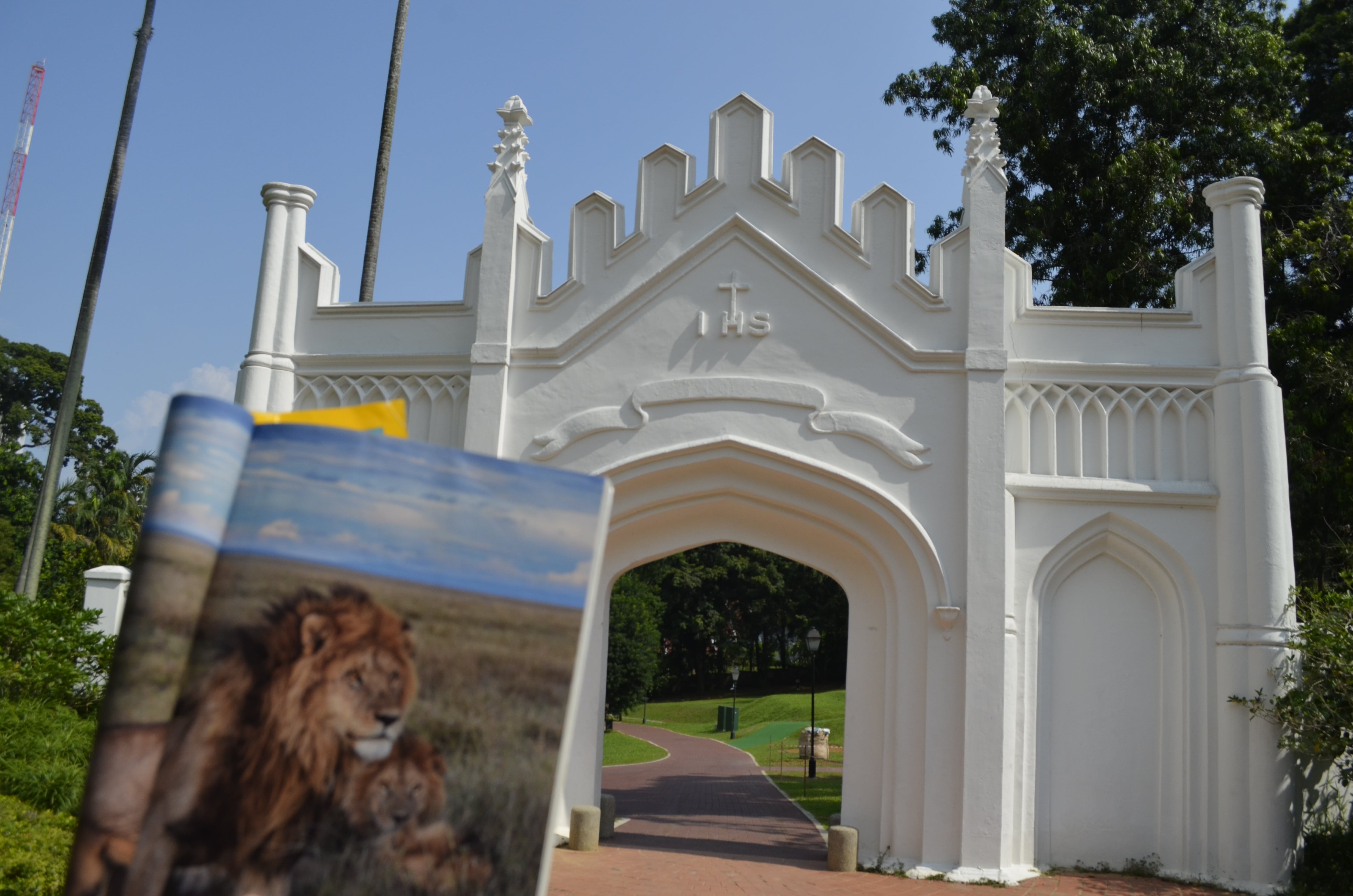
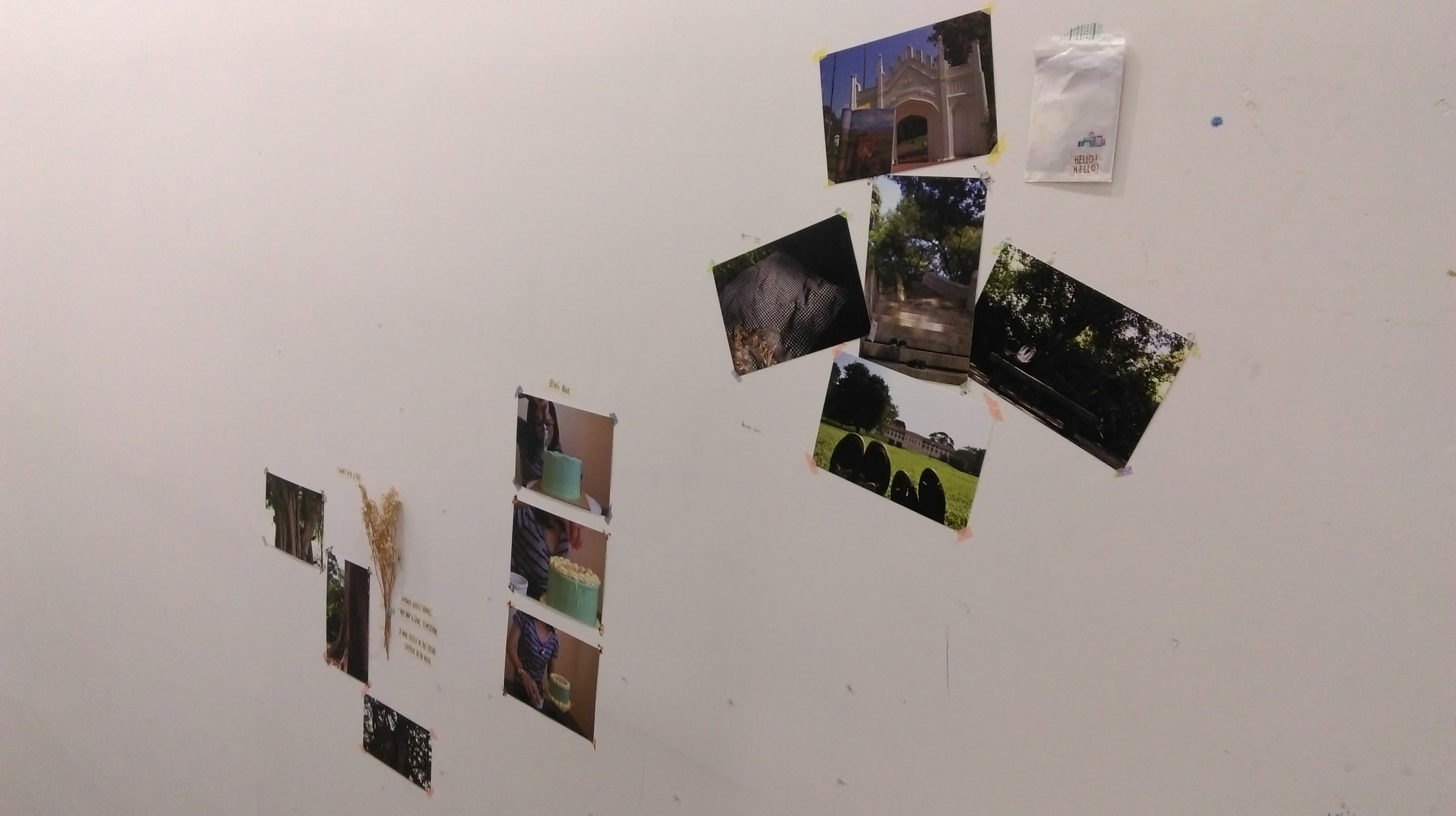
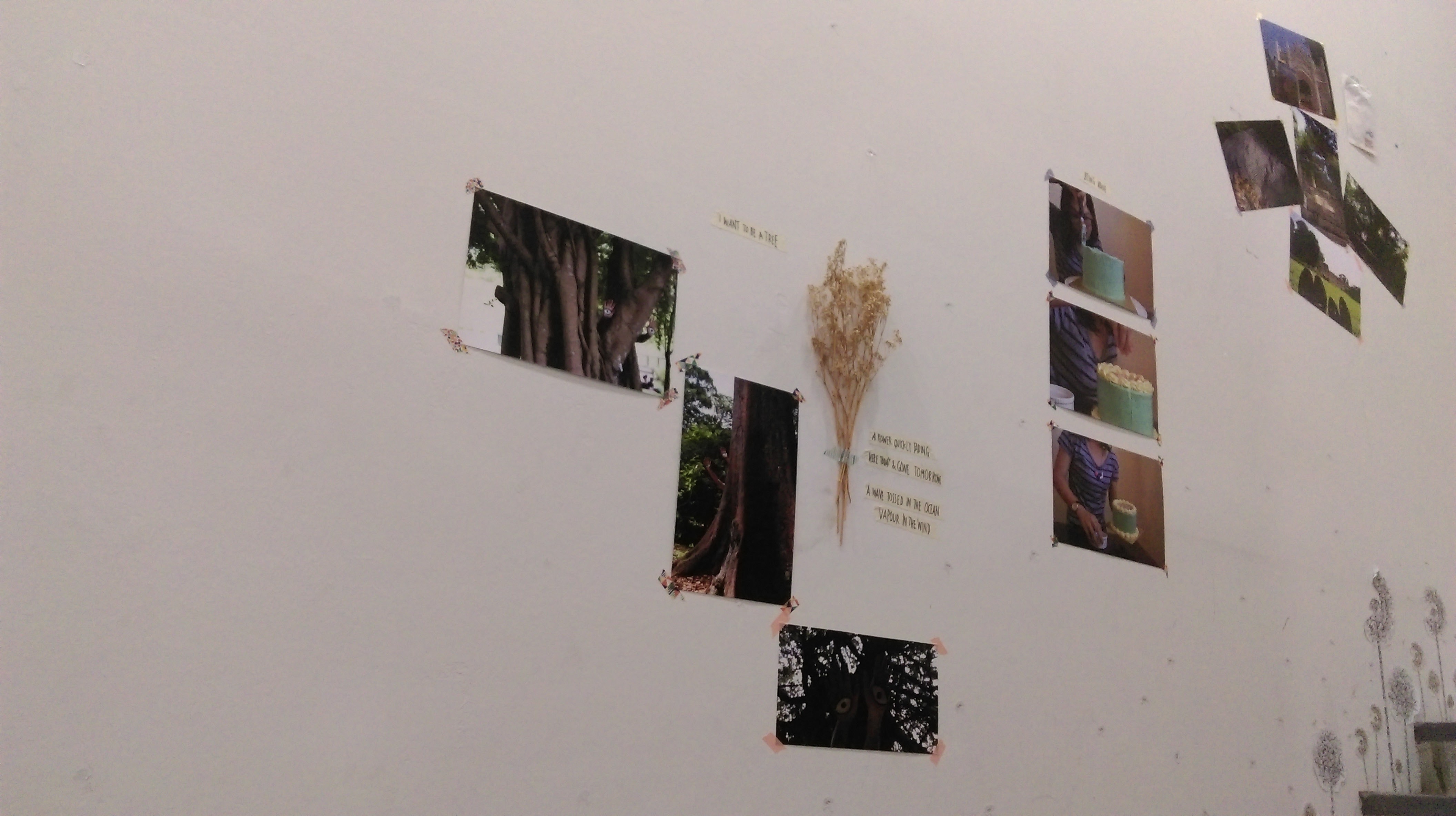
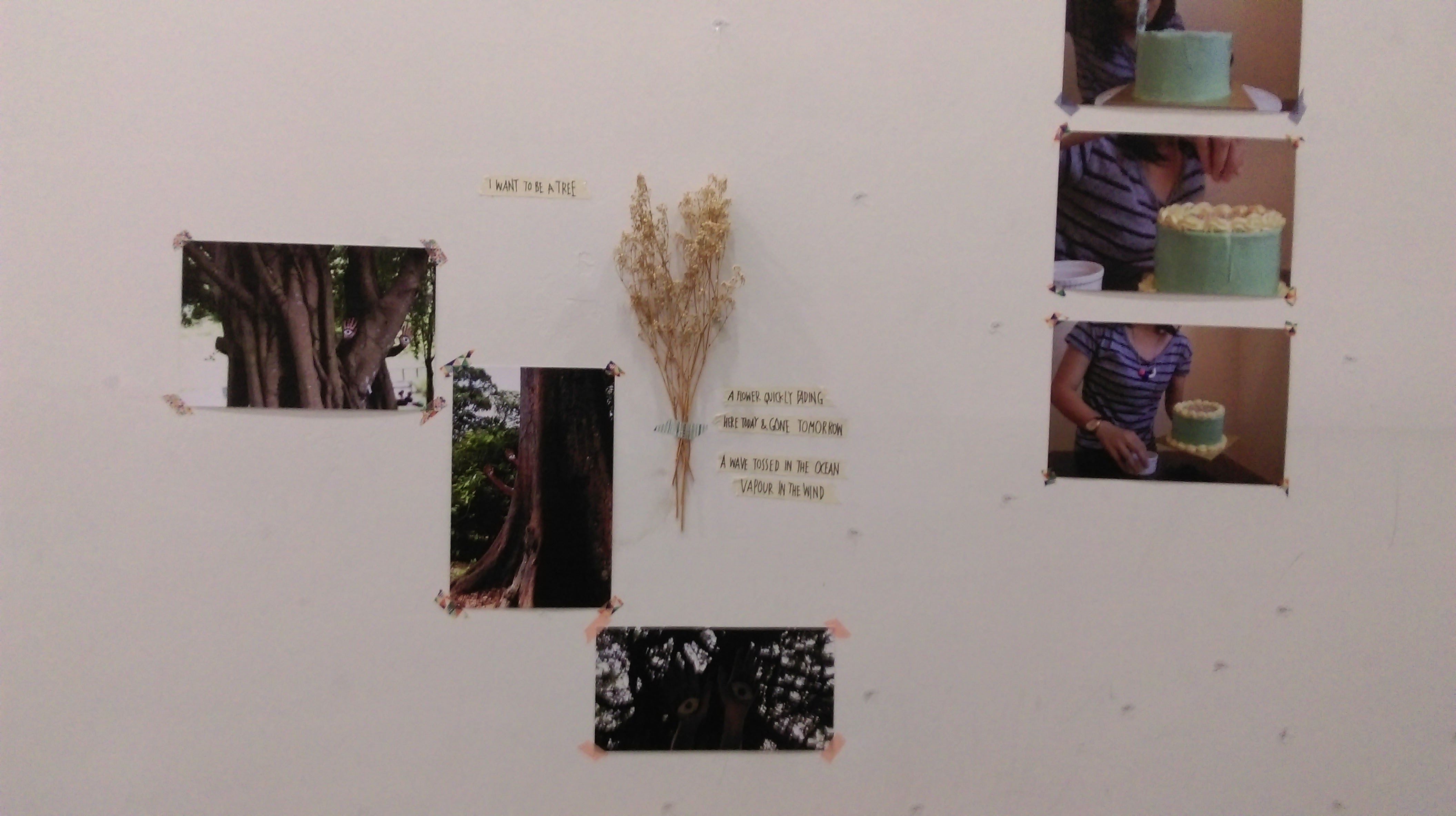
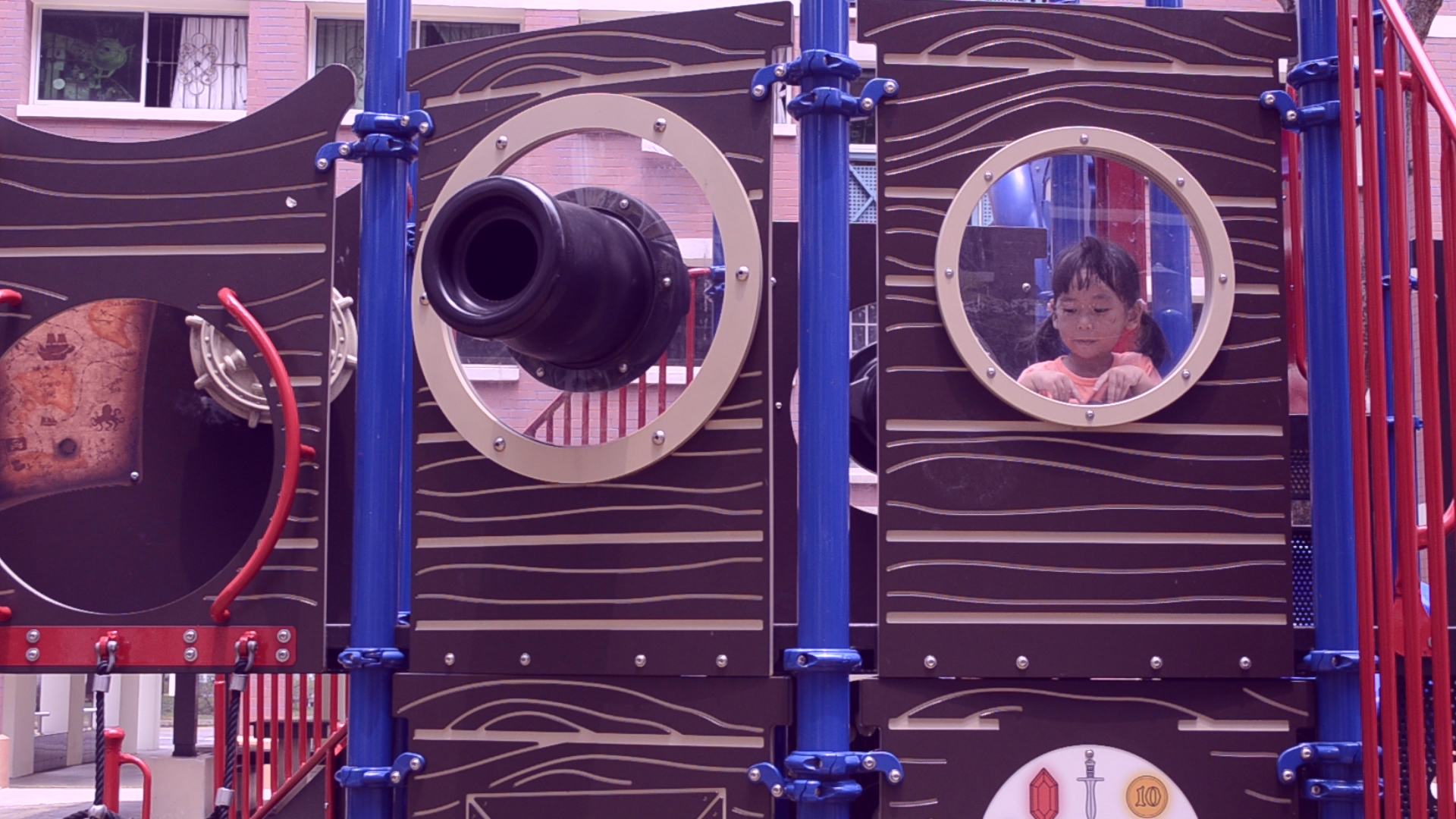
Initially we wanted to chose locations that were unique and could convey the mood we were going for. Light was one of the major factor we took into consideration as good lighting=good shots. However as the days rolled by, we decided to pick locations on campus for convenience sake.. Despite that adjustment, we managed to bring across the emotions with the locations we picked.

Inspiration
“Lalin”
We really appreciate the mood of this short film, with warm colour treatment and soft lighting. The message of the video is in line with our own theme, which has to do with letting go of labels and feeling comfortable in your own skin.
Kinfolk
We like the subtle text effects that helped bring out the mood of the video. Inspired by this, we attempted to play with simple text effects in our film.
Challenges
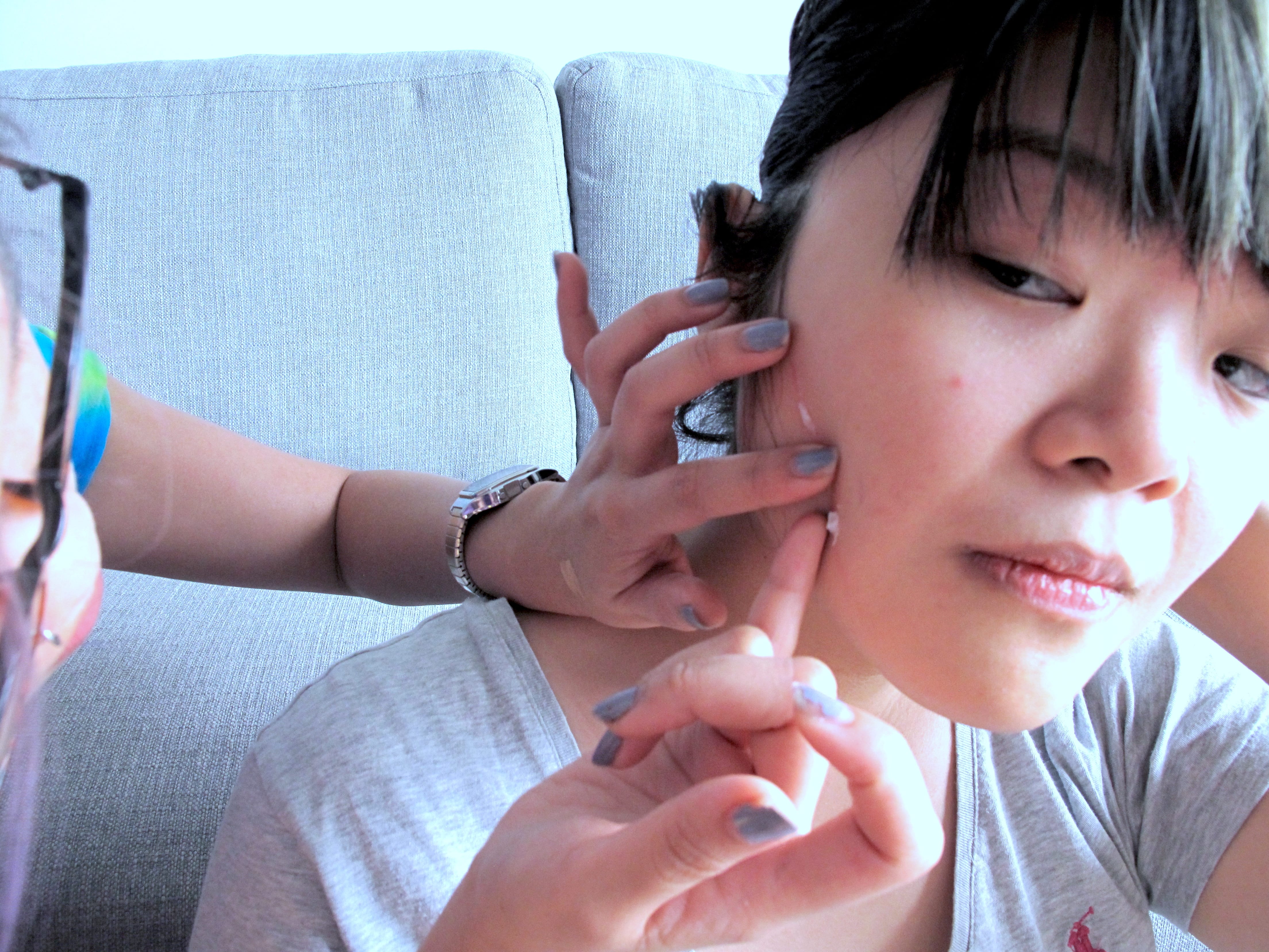
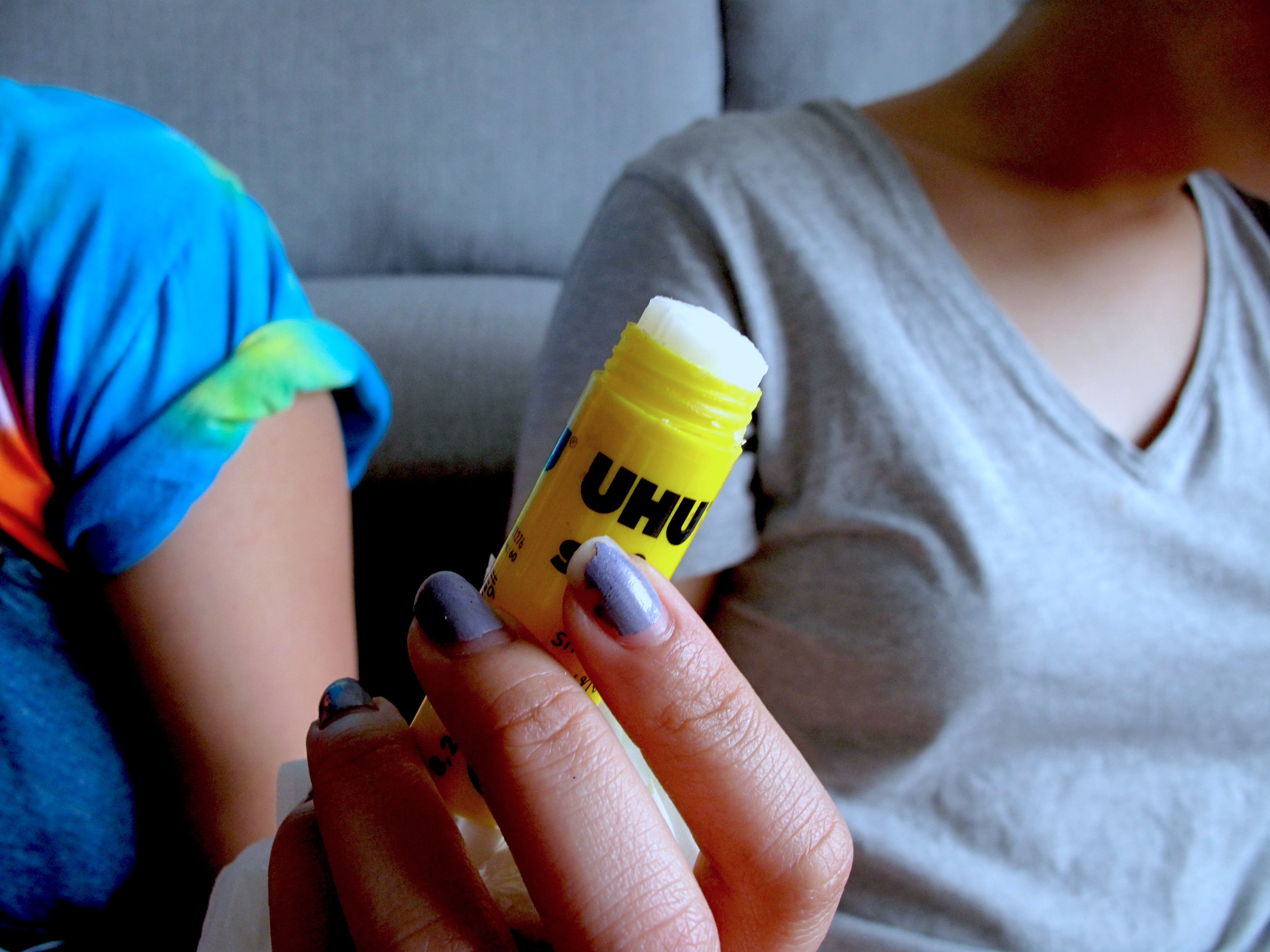
Scar:
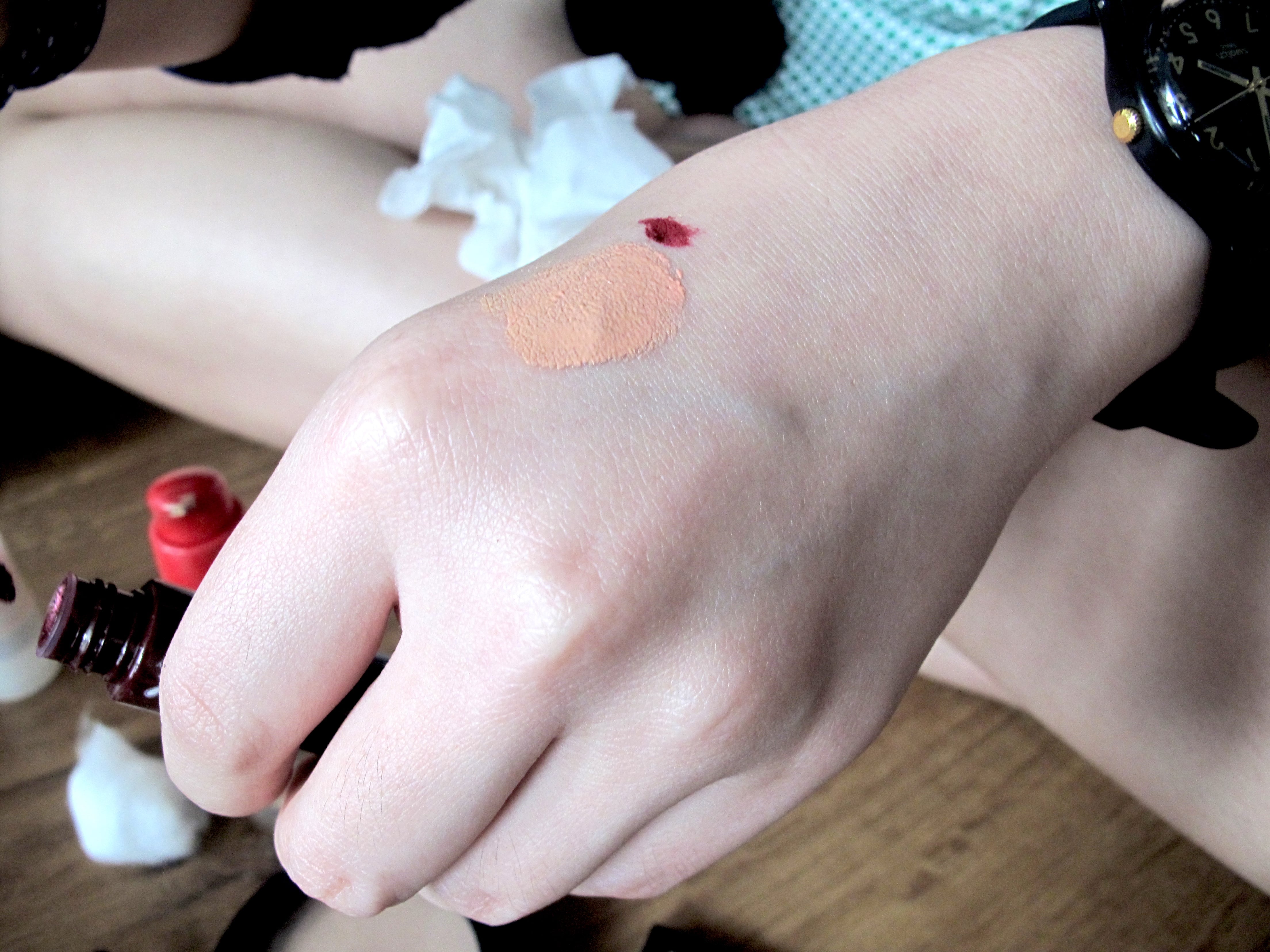
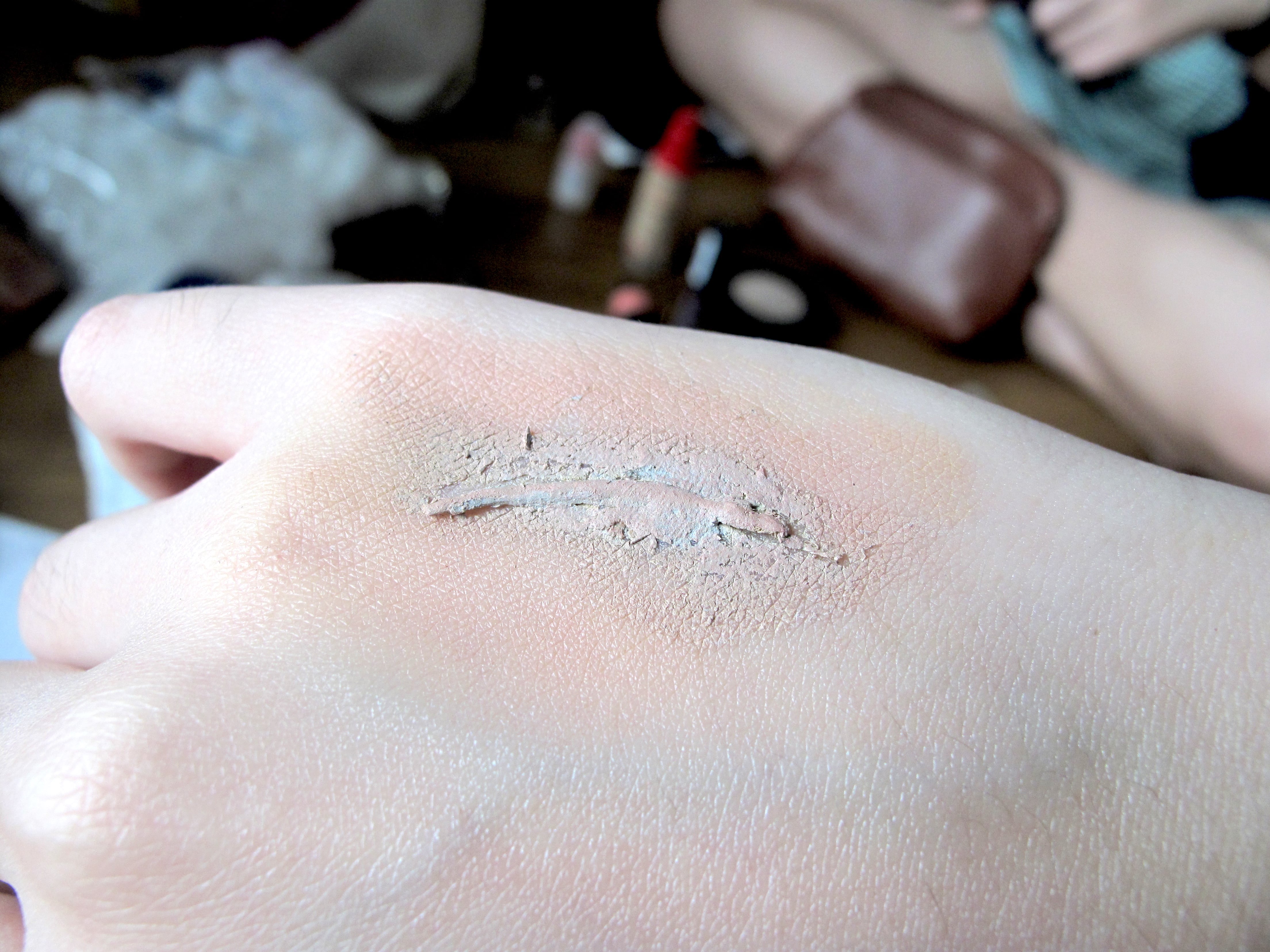
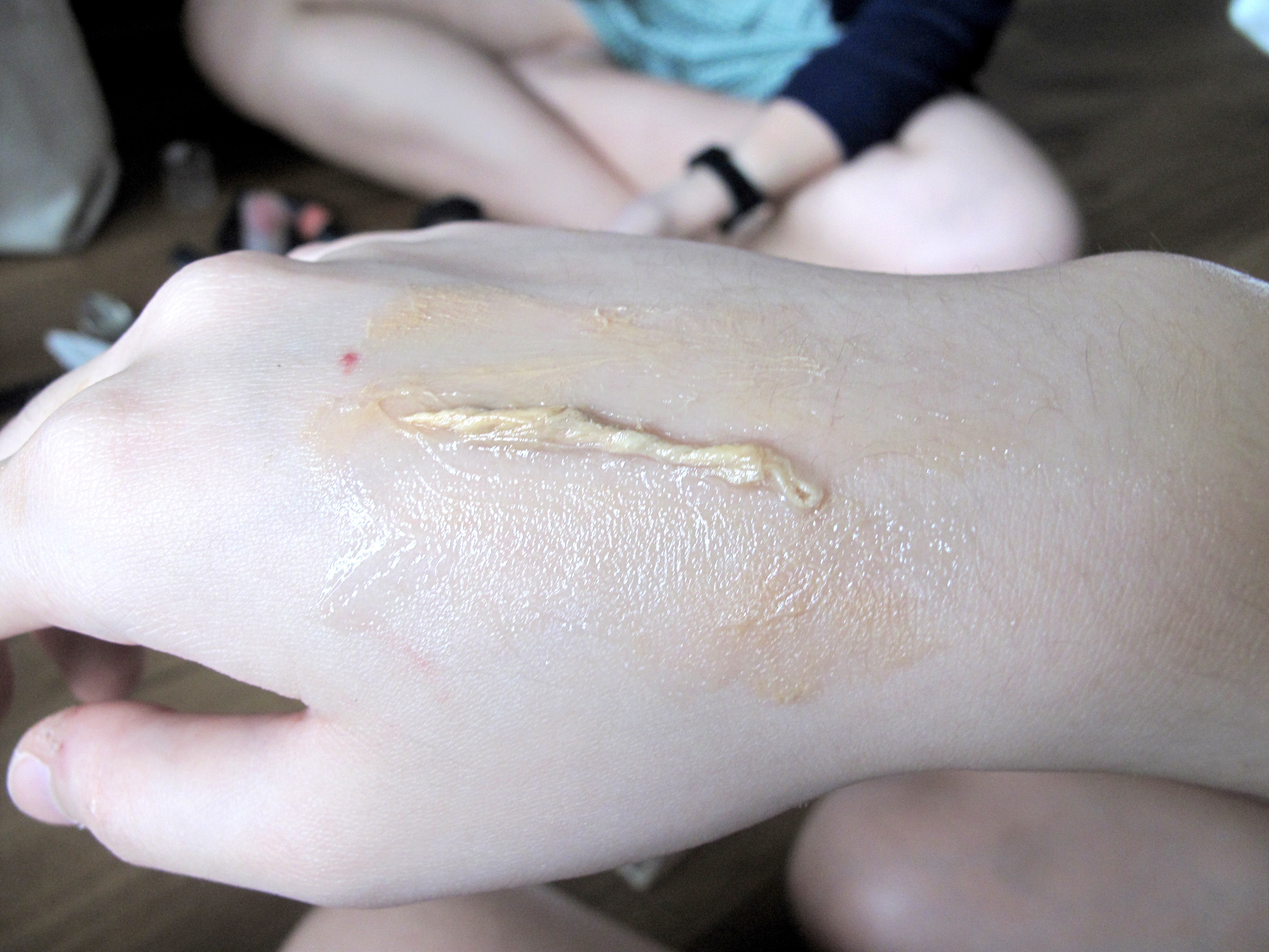
We spent quite a bit of time trying to figure this out. It looked rather straightforward on the tutorial but… lets just say that makeup artists really know their stuff. Eventually we made a rather passable scar with gluestick, BB cream and some lipstick.

Filming on the bus:
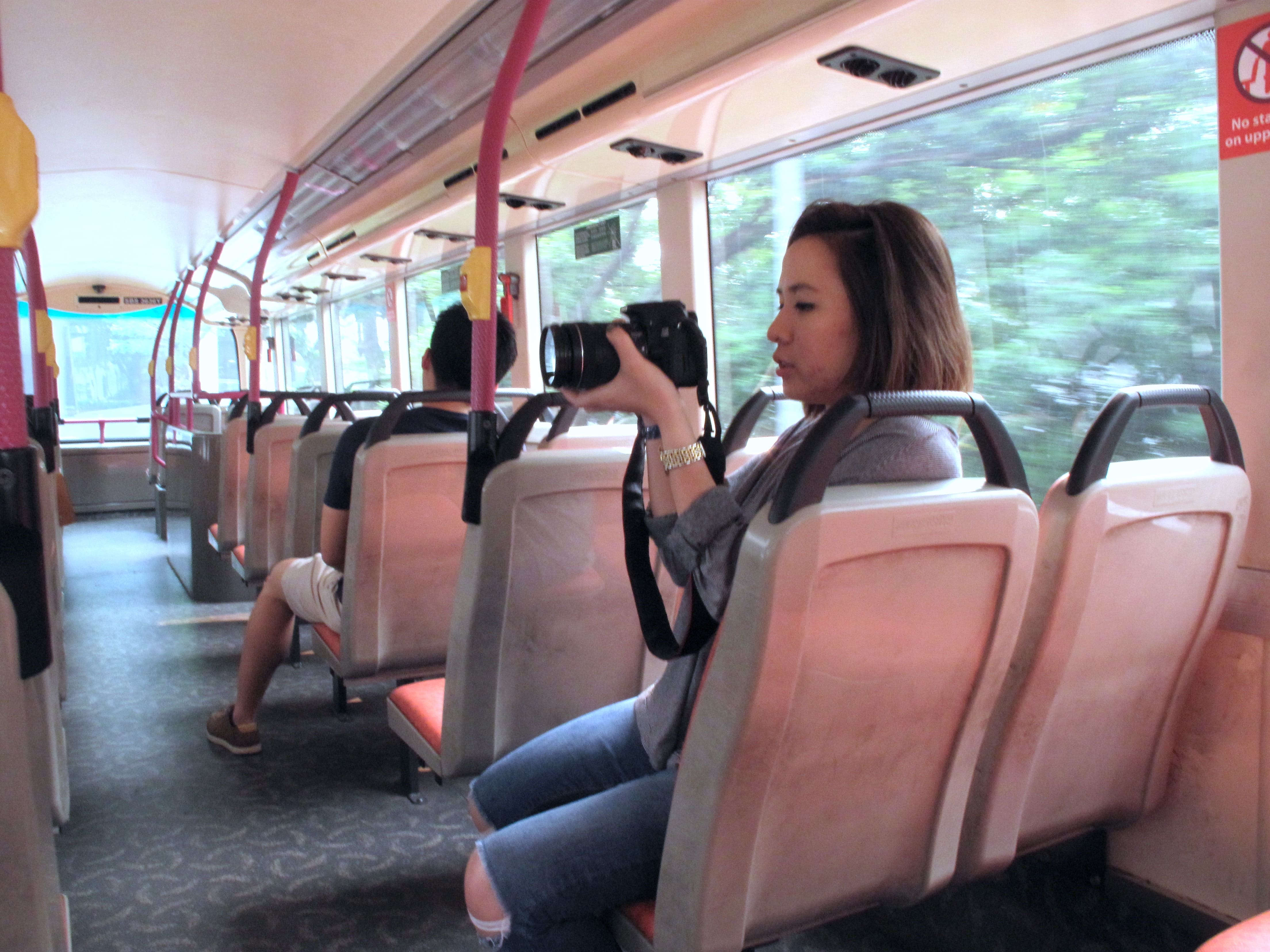

It was terribly shaky and we were trying to complete our shots before the bus driver spotted us.. apparently filming on buses is not allowed. Oh well.
Filming with children:
This was a lot tougher than we expected. The children we worked with didn’t really understand what we were doing as they were quite young. Halfway through there were some tantrums and unhappy faces but it all turned out well in the end.
Filming at the wholesale club:
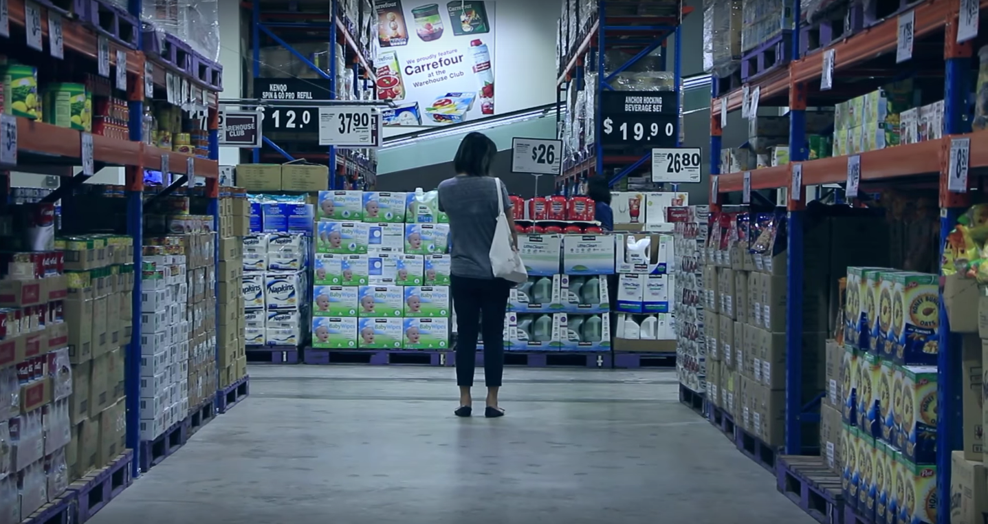
It isn’t really allowed to film at supermarkets soo…we had to be sneaky.
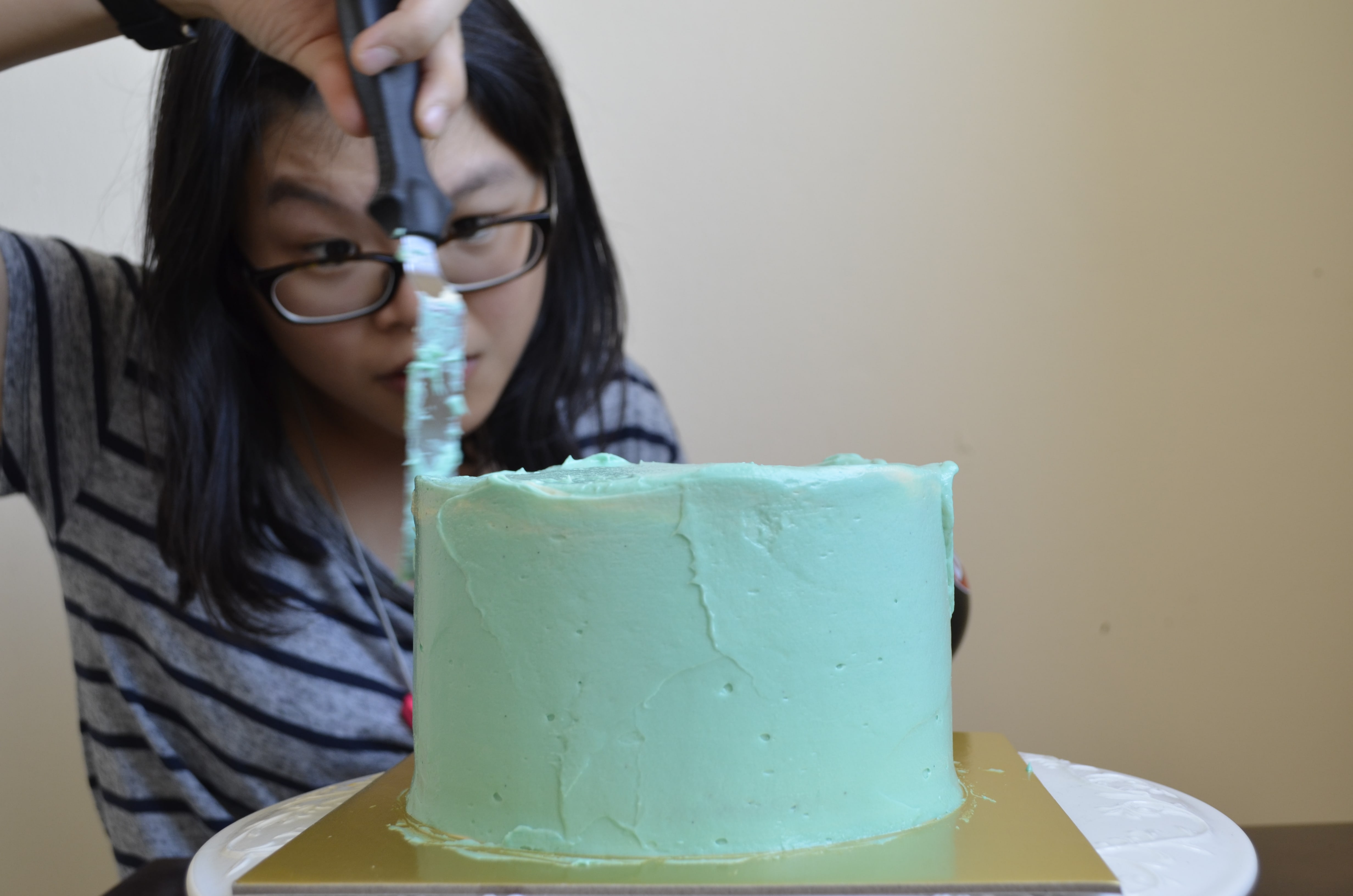
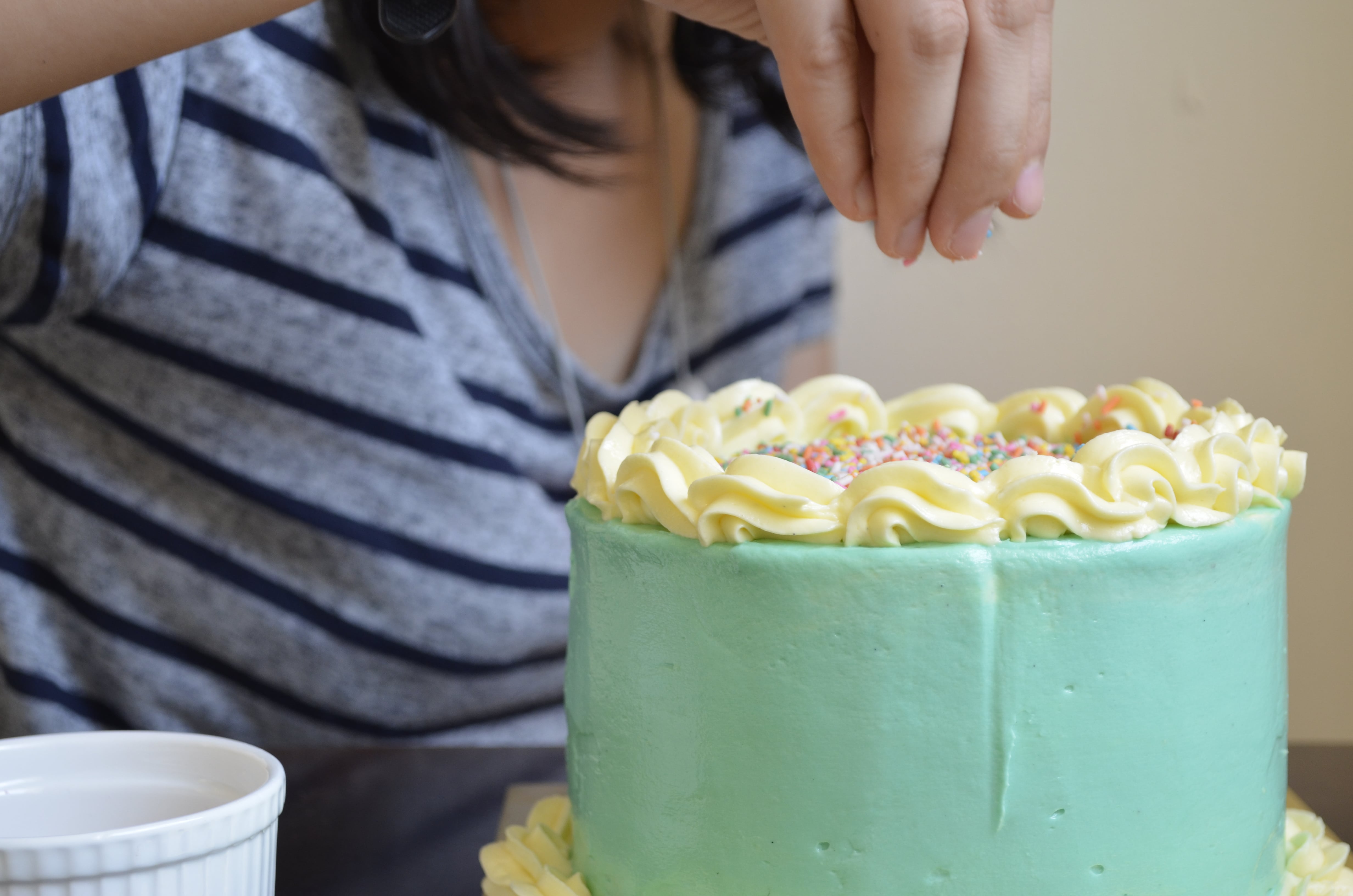
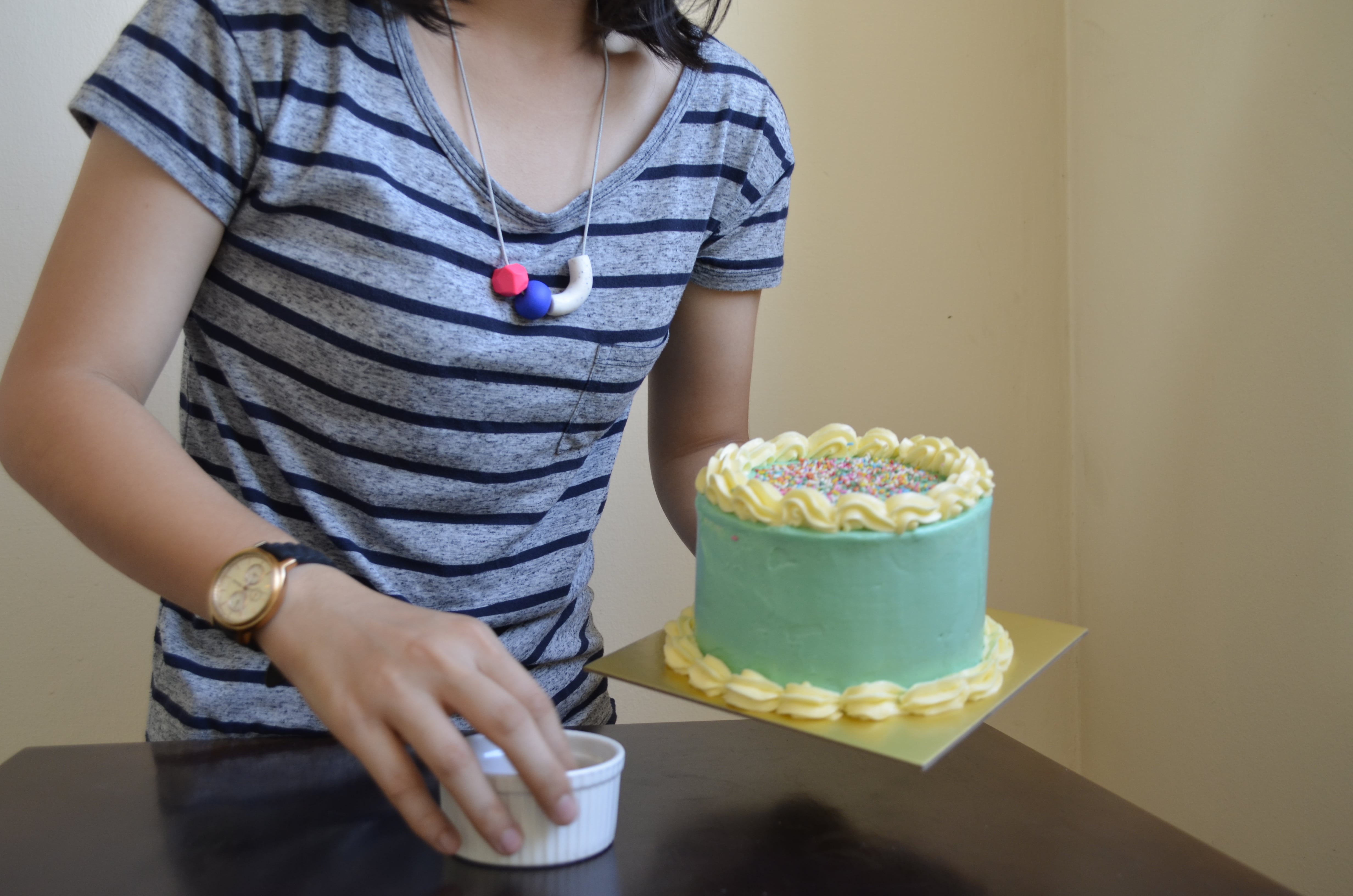
Post editing


The use of color treatment really enabled us to convey certain moods we wanted to achieve. Also it helped to ensure coherence throughout the entire film as the light conditions were not the same during all our filming sessions.
Reflection
Taking an old story and making a modern interpretation was an interesting experience. We identified a modern-day social issue that we can all relate to, and paired situations in the original story to match our current time. Exploring the use of different camera angles and overall moods took our film to the next level, and helped us convey a message.
On the whole, we all have gained a deeper appreciation of the work that goes behind putting a film together. Having a taste of it, this experience has truly been one that is meaningful and insightful but more importantly a whole lot of fun!