
History of Design Lecture 4 – Reflections: International Typographic Style
The International Typographic Style is a graphic design style that emerged in Russia, the Netherlands, and Germany in the 1920s and was further developed by designers in Switzerland during the 1950, and originally spread from Switzerland. It has had profound influence on graphic design as a part of the modernist movement, impacting many design-related fields including architecture and art. There is an emphasis on readability, cleanliness and objectivity.
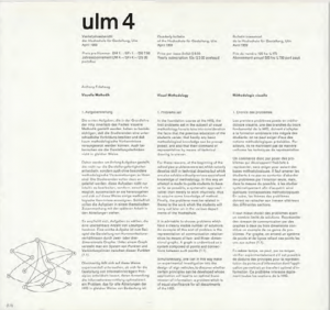
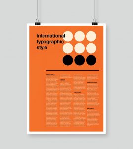
Objective photography, asymmetric arrangement of information and the use of sans-serif typefaces were common in this era. The style is also associated with a preference for photography in place of illustrations or drawings. This style focused on the organising of information into a very structured layout, and can be done commonly using an underlying typography grid, as shown below.
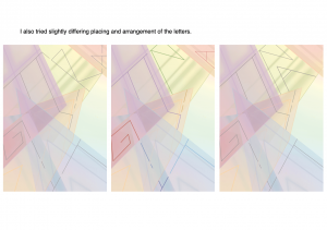
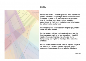
As I am currently taking Typography I and in progress of projects that make use of these grids to complete, I am particularly interested. Although the grids are restrictive in the sense that you can’t place text wherever you want (for example, in the middle of the grid), it acts as a guideline for designers to arrange text in a organised way, and allowing text to flush to either the right or the left, creating a paragraph with every line starting on the same line to allow easier reading. Below attached is an example of a poster designed with the help of the typography grids, as well as one of mine when I was exploring with the grids during one of my typography projects.
Through these 4 lectures, I’ve learnt more about the art movements in the History of VisComm and the art styles that has in a way or another influenced the art now. Desmond has been quite clear of the information he wanted to articulate and the bi-weekly quizzes have been helpful in the sense that it kept us on our toes and also did not result in too much stress due to the amount of content needed for each quiz. Thank you for the past 4 weeks! 🙂
History of Design Lecture 3 – Reflections: Constructivism

Constructivism was a rejection of the idea of autonomous art, with Vladimir Tatlin wanting to construct art. The movement was in favour of art as a practice for social purposes, and had a great effect on modern art movements of the 20th century, influencing major trends such as De Stijl movement, which I will briefly touch on later.
Constructivism encouraged the creation of art from scratch, with a mix and match of different materials. This movement mainly focused on geometric shapes and abstract forms, and works in this era were far from being objective and representational. There was also a focus in making useful and pragmatic items.
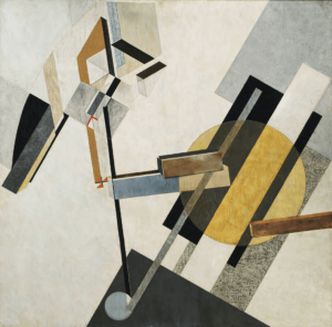
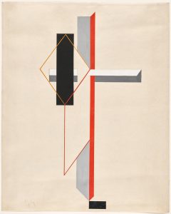
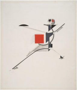
Below attached are artworks by El Lissitzky, an artist in the movement. His works heavily rely on the usage of geometric shapes, and are highly abstract.
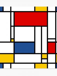
Constructivism influenced another art movement, De Stijl greatly. De Stijl focused on straight lines, geometric shapes (specifically squares and rectangles) and primary colour (red, blue, yellow) alongside black and white. Attached below is an artwork by Piet Mondrian, an artist that was largely influential in the De Stijl movement.
History of Design Lecture 2 – Reflections: Harper’s Weekly

Based on the second lecture, I’ve decided to research more on Harper’s Weekly and its contribution to the illustrative era in America which played a part that led to the decline in typography.
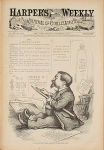
Harper’s Weekly, A Journal of Civilisation, was an American political magazine based in New York City. Published by Harper & Brothers from 1857 until 1916, it featured foreign and domestic news, fiction, essays on many subjects, and humour, all which were portrayed through illustrations. There were also many illustrations depicting the war. During its most influential period, it was the forum of the political cartoonist Thomas Nast. The magazine’s cover were all pure illustration, with minimal elements of typography. How the cover of every week’s magazine depended on the illustrators.
Harper’s Weekly was inspired by the successful example of The Illustrated London News. Illustrations were an important part of the Weekly’s content, and it developed a reputation for using some of the most renowned illustrators of the time, notably Winslow Homer, Granville Perkins and Livingston Hopkins. Another notable illustrator with recurring features was Thomas Nast, who was a feared caricaturist, and is often called the father of American political cartooning. Nast contributed a lot to the magazine, pushing the magazine towards being a magazine with significant political significance.
During this era, since there was a focus on illustrations, ornamented designs and the importance on how things looked visually, the use of typography in design started to decline. The decline of typography was further fuelled by the mechanisation of printing processes.
Harper’s Weekly was a showcase of the illustration heavy era in America, with all of their weekly publications illustrated and with the magazine gaining a lot of popularity for its illustrative covers among its political significance.