

Based on the second lecture, I’ve decided to research more on Harper’s Weekly and its contribution to the illustrative era in America which played a part that led to the decline in typography.
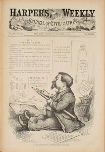
Harper’s Weekly, A Journal of Civilisation, was an American political magazine based in New York City. Published by Harper & Brothers from 1857 until 1916, it featured foreign and domestic news, fiction, essays on many subjects, and humour, all which were portrayed through illustrations. There were also many illustrations depicting the war. During its most influential period, it was the forum of the political cartoonist Thomas Nast. The magazine’s cover were all pure illustration, with minimal elements of typography. How the cover of every week’s magazine depended on the illustrators.
Harper’s Weekly was inspired by the successful example of The Illustrated London News. Illustrations were an important part of the Weekly’s content, and it developed a reputation for using some of the most renowned illustrators of the time, notably Winslow Homer, Granville Perkins and Livingston Hopkins. Another notable illustrator with recurring features was Thomas Nast, who was a feared caricaturist, and is often called the father of American political cartooning. Nast contributed a lot to the magazine, pushing the magazine towards being a magazine with significant political significance.
During this era, since there was a focus on illustrations, ornamented designs and the importance on how things looked visually, the use of typography in design started to decline. The decline of typography was further fuelled by the mechanisation of printing processes.
Harper’s Weekly was a showcase of the illustration heavy era in America, with all of their weekly publications illustrated and with the magazine gaining a lot of popularity for its illustrative covers among its political significance.