Roost prototype: https://invis.io/5PP1UCMNCQV 

Group Members:

Anam, Gladys, Joel, Song Yu, Youlmae


Define

To build on the accompanying app for our sustainable cafe, we developed personas based on user research we conducted. The personas can be seen in this post. To recap the goals of our personas, Jonathan wants to find cheap and healthy food in NTU, that is also accessible and convenient. Siti is more concerned with halal options and also, accessibility and convenience plays a bigger part to her. They are both afraid that quality of food might not be as fresh due to incorporation of blemished food, waiting times might not be ideal, and lack of certainty for menu.

Based on our personas and rough direction of possible app flow, we thought of possible features that our app could include and mapped this rough information architecture.


Rough Information Architecture


We then sketched some paper wireframes to get an idea how the possible flow could be like.
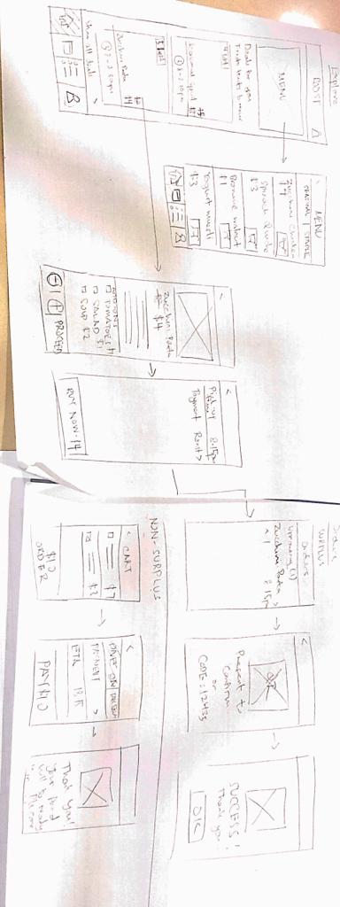
Paper wireframes


Prototype

Moving on, we created a lo-fi prototype that we can test with users, get feedback and iterate further before we make the hi-fi prototype.

Link to prototype: https://invis.io/5PP1UCMNCQV (Tip: Clicking on Home tab in Profile page will lead to the app view at 2pm)


Home

Roost view in peak hour, no surplus meal deals are available yet as compared to off-peak timings where unsold, surplus food will be advertised.

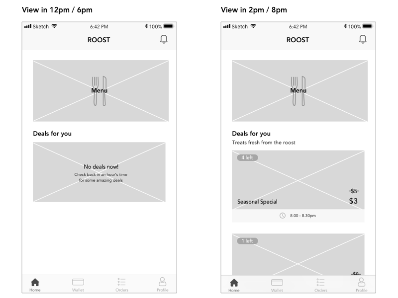
Home page of Roost at 12pm VS. Home page of Roost at 2pm


Menu and Ordering

Roost has two types of menus – Seasonal and Staple. Seasonal changes daily based on the produce we gather, while staple menu is the standard menu that does not change daily. The app allows people to access the items of the food available, to allow them to plan their meal in advance.

User can choose to order via the app to prevent wait times. Process of ordering is kept simple: Click on the item on the menu, Go to Item Description page and choose the add-ons before adding to cart. Users can select if they prefer dining-in or takeaway, then they set the collection time and pay using the app. At the end of a successful order placed, a screen will pop-up to thank the user for being part of the sustainable movement – affirming the user of their decision.
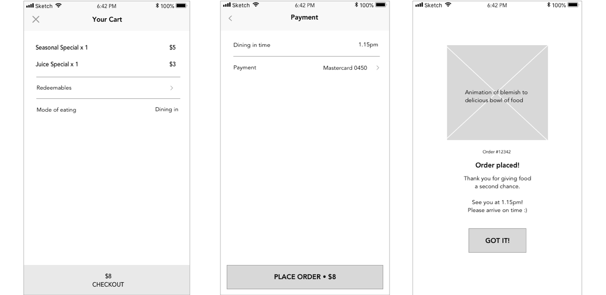
Ordering process


Orders

Once ordered, users can go to the order page. A pop-up will appear for first time users to inform them of the simple collection process – Upon collecting, present the QR Code in the order receipt to get their meal. At the end of the successful transaction, the user will gain rewards which can be used to redeem discounts in the future. The addition of gamification entices students to return to Roost for more perks and delicious food.

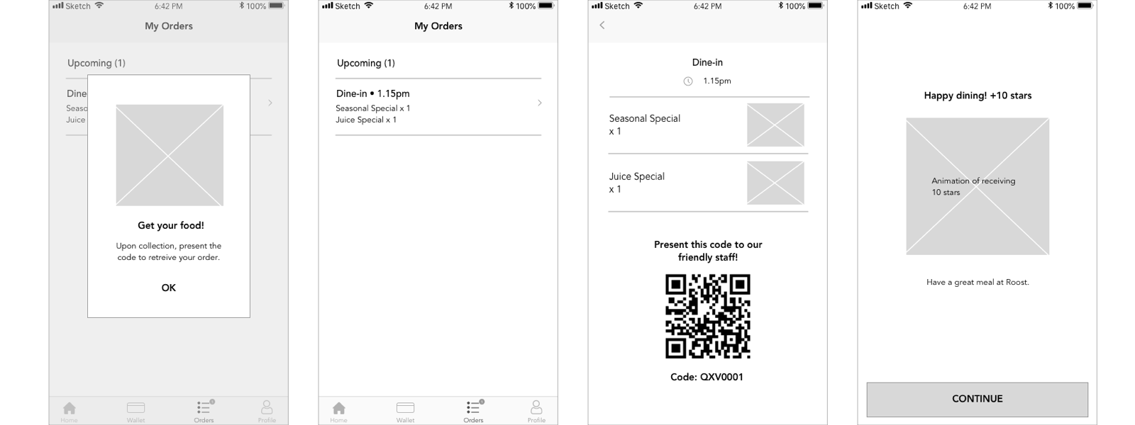
3 steps for retrieving one’s food in the Orders tab


Profile

Adding on to the point of gamification, it is prioritised in the profile page to motivate users to reach reward goals. Rankings are also given to the users to entice them to climb higher, visit Roost more often. In this case, Jonathan needs 25 more stars to gain a new 1-for-1 deal. The bar enabled him to track how near is he, to the next reward.

He also has a redeemable he can already claim, in which he can use the QR Code to present to the restaurant OR key-in the code typed below if ordering online via app.

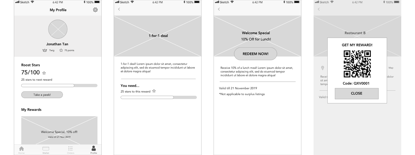
Use of gamification in the profile page – Rewards system to entice users


Wallet

In-built wallet system for easy transactions
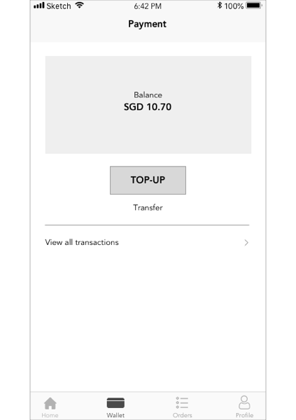
E-wallet


From here, we will conduct usability tests to see what we can improve on. With the updated visual language and logo, we will proceed on to create the high-fidelity prototype.

DAY WITH MOBILE [SINGAPORE]

Observing myself

WHEN: On the day I decided to monitor my usage of mobile device, I discovered that I use my phone the most in the morning when I am eating breakfast at home, during my commute to/from work or school, and lastly at night after my dinner.


WHAT: When I wake in the morning, I usually check for messages, emails as well as watch Youtube videos if there is additional time during my breakfast.

During my commute, as it takes a long time to get to my workplace or to school, I check my messages, social media apps and emails first. Listening to music is crucial in my commute, thus I open Spotify to play music. On the train/bus, I often read articles on Medium or basically surf Safari to get knowledge of things I find interesting. Sometimes, I listen to podcasts related to design as I find it is a make my commute productive. Occasionally, at transit points, I use my phone to check on apps that inform me of the bus/train timings.

At night, it is often for entertainment. I watch Youtube videos and contact my friends via social networking.


WHY: Social Networking – To keep in touch with my friends/kill boredom while travelling

Music – Spotify, Youtube, entertainment for my commute

E-mails – Stay relevant with work and school

Articles, podcasts, Safari – For long rides, to make my commute efficient and productive

Transport apps – Planning my journey


Observing others 

I observed others mainly when I was in the train or bus. Most people were glued to their phones. What I noticed was that most people would be on social media like Instagram, Facebook, messaging apps, or being involved in a form of entertainment via the phone. For example, watching drama on the phone and playing games. I rarely saw people reading news, nor educational articles.

Playing mobile games is something I found that was most common, seemed like 1 in 4 people in the train were playing mobile games.

Hence, most people use the mobile phone to kill time, keep themselves entertained.

In work, most people put away their phones and only occasionally picked them up if they had to respond to calls/texts that were of high importance.

My trip to France over recess week


DAY WITHOUT MOBILE [FRANCE]

I travelled to France over the week of recess, to visit someone. Here, I did not need to use my mobile as often because I had companion who had a phone. I moreover could not use my mobile effectively because, I did not purchase data. Thus, I thought it was an apt timing to try the experiment of leaving without the phone.

And it made me realized how my phone was my source of security. I felt handicapped without my phone, less secure. This also made me plan my day very thoroughly, during the night before. 

On the day that I did not use my mobile, I was alone in the morning when I arrived in the airport and then I would have to meet my friend at the city center. We sorted our plan the day before, where I would meet and what time etc. However, when I arrived at the airport, the airport firstly was huge and I needed to get the proper ticket to the city center via train. Without using a phone, this was quite a challenge before I had to rely mainly on signages, way-finding design and people. No GPS, Google Map, texting for directions. Not knowing the language well also posed a barrier, it made me not want to ask people for help. Plus, it did not help that the Paris metro ticketing machine was difficult to use if you were not familiar with it. After fiddling with the machine, I was able to get the ticket I want. Also, I was lucky that a girl was friendly and asked if I needed help. She directed me to the train station, which was where I needed to know. Not using my phone also meant not checking the time often because I do not have a watch – thus I had to rely on public clocks. Eventually I was able to get to the train station in the city center. Even though we had planned where in the station we would meet (the platform), I was constantly worrying over things like “Will I be late” “Will he be there” “What if we are waiting at the wrong place?” In the end, there was no problem with meeting, just over-worry that I had.

Hence, there is a general air of uncertainty when you do not get to use your mobile – the need to rely on public displays which are not present all the time like the phone, not gaining the information you need immediately, affirmation via texting. This also made me realise how the non-reliance on phone forces you to plan your day, and be meticulous about it. It made me weigh out possibilities that could happen, how I needed to tackle situations which I often relied on my phone for (e.g. Navigating), if I do not have a phone.

Moving on, I carried on the rest of the day with me relying on my friend for all of the mobile errands. At times, it felt it would be more productive if I could use my phone and search for directions too – it will be faster. Basically, I was relying on someone’s else mobile device. It sometimes made me feel like I wished I could do something.


THOUGHTS 

Not using my phone has enabled me to be more observant to my environment. I was much more wary for signages, timings and knowing the direction to head to. It also allowed me to observe people more detailedly since I was not glued to my usual habits of reading/texting on the phone. In Paris metro, I did not see a huge number of people playing games that often as compared to Singapore, and they were not as engrossed to the phones. People would use their phones to read, social network, listen to music, but they would also just listen to music and stare blankly. Since train rides were longer, it was evident that seats were also designed to cater for such context, more chairs facing each other for easy communication between groups of friends. This were interesting observations I gathered.

All in all, it was not overly difficult because we live in developed cities where way-finding and signages are well designed for people to find their way around. Occasionally, especially being in a foreign country speaking a different language, it is more confusing, but it is still doable. I felt that it was an interesting, eye-opening experience.

Yet, this also reminded me the importance of mobile devices being designed to make things so more efficient – for example, things like way-finding, navigating, planning on the go. It gives people certainty, as well. Of course, there is also the entertainment and networking factor – our mobile devices connect us to our friends and at times we feel lonely without that. However, this is brings me to a food-for-thought: Are we overly reliant on mobile devices to socialize with friends, so much that we compensate real-life communication? Perhaps actually mobile devices is making us lonely too?

In an increasingly artificial world where environments are mostly designed by humans, the prevalence of digital artifacts are crucial to our daily lives and hence the important of interaction design, as the design of digital artifacts is equivalent to designing lives.

Due to the ever-changing and evolving nature of digital artifacts, being increasingly complicated, this also results in interaction design being complex. It is a really insightful reading about how design is not focused on coming to a solution based on the given problem. It is contradictory and full of dilemmas, where a designer has to think of new ways to perceive people and their daily lives, yet at the same time understand and empathise with others’ views. Being an interaction designer is a reflective process – being aware and tending towards one’s own design ability, the designs one produces, and how to impact the world by design ideas and decisions. It is important for designers to self-reflect. With the importance of reflection as an interaction designer, this reading also posed a really important question:

What is good design? 

Examples of digital products that are disruptive to the industries


Good is relative to societal laws, regulations, agreements and contracts – plus considerations from democratic, cultural, and environmental ideals. It is hence a process we defining and redefining, based on reflection. While personal tastes might lead to differing opinions of good design or not – there are also practical signs that a designer can look at to gauge if a design is effective – e.g. a digital artifact that manages to truly disrupt industries, because it satisfies users’ needs.

Examples of thoughtful interaction design

Airbnb can be used as an example for thoughtful interaction design. It pioneered the way for new system where people could stay at apartment of a local, instead of the need to splurge on hotels. The designers had a goal of making users feel at home.

By designing a system that travellers could be matched to a home, neighbourhoods and experiences – this truly enabled people to feel more like they belonged to the country they were travelling in and hence gain an immersive experience. Their Design Language System (DLS) from the time of their humble beginnings of being a small company, compared to today, has been constantly evolving. This is a result of constant reflection to match the needs of upscaling to global needs, to changing trends and technology. According to Alex Schleifer, the vice president of Airbnb design, he mentioned:

It’s now owned by everyone that works on our product, which means it’s growing and changing every day. The way we look at it, we’ll never be done.

A design system needs to evolve at the pace of the company – or preferably even be slightly ahead, so it can support new projects.

Therefore, it is a constant process to match up to the growing complexities of systems – just like how thoughtful interaction design requires constant reflection.

It is worth mentioning how design is described as being so exciting as it can be driven by a will for change – changing how people live their lives and shaping their environment. Airbnb likewise was known to be disruptive to the travel industry, shifting people’s perception of accommodation – from hotels to wanting cheaper, immersive experiences which Airbnb offered – so disruptive that even countries had a ban Airbnbs to protect their hotel industry. It shows how powerful design thinking can be, especially when it is constantly evolving with reflective processes.

Food for thought

Back to the idea of ‘good design’, can a design be so good that it is then seen as good and bad in terms of its effects? For example, for Airbnb, it is effective to appeal to users. However, not so appealing to governments who want to protect a hotel industry. Its disruptive nature has caused much changes in the travel industry – does this also result in new systems to develop?

Overview

Future World is an exhibition that explores the relationship between art and science through immersive, interactive projects suitable for all ages. It allows people to have fun and play, but also probes an individual’s relationship with people, mother nature, and the universe. It has five themes – Nature, Town, Sanctuary, Park and Space – whereby these spaces are often transforming and different based on the interaction by guests.

TeamLab is a collective of people with highly various backgrounds ranging from art, programming, engineering to architects, where they unite to define artistic expression in the digital world, merging both art and science respectively. TeamLab is often interested in works that challenges the boundaries of the viewer and the space surrounding them. For example, their latest exhibition in Tokyo, Planets, is headlined “become bodily immersed in a massive art space with others”, allowing visitors have the ability to influence the work through their interaction and immersion, blurring the boundary between themselves and the artwork.

Future World – User experiences in Interactive spaces

In Future World, teamLab uses a range of interactive technologies to construct the immersive installations – ranging from projection, motion sensors, lights and participation from the users.

Immersive installations in Future World often allows users to participate in them and influence the artwork. In the Nature room, through the usage of motion detectors, the waterfall projection on the floor will bend around the viewer. Also, the walls have butterflies on them where people can hover their hand over the butterflies, as if touching them, and they “die”. Interactive element can be subtle, like the subtle water bending effect around the viewer, or deliberate where the viewer has to perform an action to see an desired outcome. Both combined together, creates an immersive space where the viewer has an influence in the space they are in and hence makes it highly engaging.

Universe of Water Particles, Transcending Boundaries

Apart from the participation aspect in the installation, the space design of the installation itself also contributes to creating an immersive environment. In the rooms like Nature exhibition, they often designed to seem boundless. The waterfall projection starts from wall and continues to the floor, till the end of the room. The surrounding walls have butterflies and forest elements, hence this makes the room feel like an actual nature space. This builds immersion as the artwork does not feel bounded to a canvas, but rather it surrounds and sometimes, almost engulfs the viewer.

Some works, like ‘Connecting! Block Town’ are highly reliant on participation, and does not rely so much on immersive space as compared to Nature exhibition and Crystal Universe where it is designed to seem boundless.

Connecting! Block Town

‘Connecting! Block Town’ allows viewers to determine the position of the blocks, and the Kinect above will detect the shape/colour of the block and hence determine the placement of an element of the town e.g. train, house, road and river. In these works, the artwork is mostly “created” by the viewers, the tools are the blocks and it is up to them to design their own town, using the table as a canvas. Participation is encouraged in form of play, which also promotes immersion in the installation.

In both cases, the installations are successful in immersion. The similarities lie in how viewers have an impact to the artwork which encourages them to participate, some more playful (activities) and some more subtle (just by including the viewer into the space). How the space is designed for immersion is where the installations vary, dependent on the purpose of the artwork.

That being said, some works depend greatly on people interacting with them and when they are not being interacted upon, for example the Hop Scotch and the Slide, these works cannot display its full potential (nothing seems to really happen). Hence, this might be a flaw to interactive art when it depends heavily on user’s activity. As such, these works might not be as successful as others, where it still feels very much alive even without people interacting with it like Nature exhibition.

All in all, something that I felt really interesting in Future World upon visiting for the second time, was that the artworks are never fully similar at any point of time as it is dependent to the how viewers interact with these works at the particular time. This creates immersion beyond the individual, and probes further into how the individual relates to others in an environment.

Art and commercial

Future World is an example of art work that teamLab produces. On the other hand, they done some commercial works like creating a Digital Light Canvas with ice skating rink.

Digital Light Canvas

The distinction between art and commercial industry work is more blurred in relation to TeamLab’s works, because they merge both well together. Often they are able to create immersive, beautiful spaces whereby they also determine their own creative direction, plus they gain commercial success for doing so. Hence they are producing artwork unique to them, even in their commercial works. In today’s world, the boundaries between art and commercial industry work can be challenged, for example artists like Jeff Koons merges both together. Likewise, I would say that teamLab is able to do so too.

In this chapter, Don Norman highlights what makes good design, and in particular – discoverability and understanding. Discoverability refers to knowing where to perform what, and how to perform them. Understanding is how the physical attributes link to the meaning of the design. Good design also tackles what users needs and it is so intuitive that often overlooked due to its effectiveness. Hence, as designers, it is important that our perspective in designing is focused on human-centric factors, meaning that design accommodates to human’s needs and not the other way round, which is common in problematic designs. A particular point that I found interesting how when a design is not working, most designers do not accommodate for that. overlook that aspect. His philosophy of human-centred design is essential for any designer, be it industrial or interaction designer, to be aware of.

The important takeaway from this reading for the components that highlights the discoverability in design – signifiers, mapping, constraints, affordances and feedback. These components need to work hand in hand for inituitive design, and I will highlight signifiers (and affordances) in my response.

Signifiers

Signifiers refers to mark or sound, basically an indicator that communicates appropriate behavior to a person. The clearest example would be the “PUSH” or “PULL” in doors to indicate what the user should do.

The lack of signifiers result to disastrous everyday problems. For example, when observing the wayfinding in ADM, the glass doors all around the school do not have indicators if they are PUSH or PULL.

ADM Norman doors

Till today, I struggle with this door because I do not see signifiers, and the handles are the same on both sides. Hence, signifiers are very important in such situations to give people a clue of the action expected from them.

Relationship to Affordances

Affordances refer to the relationship between the properties of an object that determine just how the object could possibly be used. When one looks at a door with handles, you know it can be pulled to open the door. However, one direction of the door is meant to be pushed and not pull – hence a gap in affordance and perceived affordance. Hence, at times Norman doors are often debated to be unideal in user experience – the presence of handles when a push action is expected from a user, because people are calibrated to pull handles when they see them. Hence this might be a conflict in a user’s mind, perceived affordance and affordance is not met and therefore there is a need for the signifiers.

However, the design itself should work in tandem with a signifier. It should be intuitive in a way that people understand the action needed from them too, hence like a perceived affordance. How can one improve the perceived affordance?

It is important to note that signifiers should always be designed together with the product, and not an afterthought to prevent people from doing what is not ideal. People should perceive the ideal action by looking at the product, (perceived affordances), with signifiers complementing and affirming their action. While signifiers closes the gap between what users perceive the object can do and what it actually does, how can signifiers be made more cohesive together with the perceived affordances?

Another question I have in mind is – How is affordance defined? For example, chair is meant to be sat on but it also has an affordance that is not communicated through its design – people also use a chair to stand on when reaching out for objects.

Overview

In this chapter, Chipchase highlighted our observing people’s behaviour with their belongings give a great insight into their everyday lives and how they relate to their surrounding environment. From this, we get a glimpse into a culture’s needs (from items they carry), perception of safety (how they carry it), these can translate into deeper insights like understanding a culture’s fears, beliefs, hopes and values.

How you carry – Range of distribution

Range of distribution was the term used to compare the distance that people were comfortable with in letting physical objects stray when in public spaces. Range of distribution differs greatly across different cultures – Shanghai having short range of distribution as compared to Singapore with a high range of distribution.

Meili from Shanghai (the example being used in the reading), was clutching her bag very tightly no matter what she was doing and was visibly upset when she let down her guard for a mere moment due to a phone call. This shows that people in Shanghai are very cautious in their belongings, generally suspicious of others, we can also infer that pickpockets and thefts are prevalent. This reflects the state that society is in – when the book was written (2013), China was emerging economy and more volatile as compared to today which is more stable and prosperous. Hence, thefts and pickpockets were certainly a visible issue then in 2013. Chinese people also tend to look out a lot for themselves first, due to immense competition in the society and small pockets of observation like this reveal such information to an observant eye. Once again it is important for a UX designer to take these into account to know what is needed in a culture – looking how how people live their lives shows how people relate to others around them, it also more deeply infers how the society is like, their values etc.

As compared to Singapore, there is definitely a high range of distribution because we are very comfortable with leaving our belongings a distance away from us. For example, when ordering food, people leave their bags on the chairs to reserve the table. People are also constantly using their smartphones while walking on the streets, whereby such behaviour is not common in place with short range of distribution like Shanghai because the likelihood of it being stolen is high. Hence, Singaporeans are more casual with their belongings, because pickpockets and theft are very rare. This reflects Singapore society as one that is extremely safe country, but also infer that people take things for granted. Carelessness is not rare, it is not unusual to find someone forgetting his/her belonging in a public space, only to be reminded by the staff or a friend – I myself included.

In conclusion, range of distribution gives an insight into the safety level of the country, how this is a reflection of the state of society (developing, volatile vs affluent, comfortable) and also more deeply, the values of a culture too.

A designer can design a bag that caters to differing range of distribution. For example, when I was travelling in Europe, I was aware of the possibilities of pickpocketing in regions with many tourists like Spain and Italy. My backpack was excellent for that because it had a compartment at surface of the bag, but it was at the back. Hence, I placed my valuables in that compartment because even if someone opened my bag sneakily, my valuables will not be found. Such a bag will be useful in a country with short range of distribution, without needing someone to resort to a frontpack which is not intuitive.

More food for thought

What Chipchase might not have mentioned as deeply, was that within the same culture there are many variations with how people carry their bags which reflects of their personality and values too – different personas that can create good UX problems to solve. In my culture, Singapore, I see differing habits of my friends. Some people like to carry backpacks because of the many components that help them organize things. Their items also always tend to be in the same places, a mark of someone more organised and meticulous. It is more efficient to find things and conduct a ‘Point of reflection’ (Chipchase defined as mental checklist of things brought).

Meanwhile, some just dump all their items in a large handbag/totebag but this often results in people rummaging their bag to find an essential item e.g. a wallet before tapping into MRT. This represents a person who tends to be more careless, and through this observation – it is evidently a problem when people cannot find their things in their own bag, making a point of reflection end harder to execute. It is not efficient and hence, this is something worthwhile for designer to look into, how can they improve the user experience of using bags? How do you prevent situations like this where one’s bag is a blackhole? It is simply including more compartments? But for people who do not like to take time to sort items into compartments, how can the placement of compartments be easy for someone like that to organize their things?

Messy bag


Backpacks are constantly being innovated to improve user experience of people used it. Now, there are also detachable backpacks that adapts to a person’s situation, they can use the whole bag when they need to bring many things. But in a situation where the user wants to travel light, he/she can detach the bag and simply use the smaller compartment. Just a digital design where it is important for designs to be responsive from desktop screen to mobile screen, a smart and well-designed physical object can apply the same principle.

Detachable bag


Beyond surface observation, it helps to also picture the journey of this person, how did these items end up in their respective places, why? What is the story of this person? With that, wow can a UX designer translate these findings into effective design that cater to different groups of people, not just vastly across cultures but also to different personalities in society?

What you carry

What you carry is also an important factor to observe. Across every culture and social strata, there are essentials that are constant – like wallet, keys and phone. However, even these essentials manifest in different forms across different cultures. For example, in Scandinavian countries it is not rare to see people carrying no cash at all. Their wallet simply comes in a form of a card case with a credit card inside, or via mobile apps, which reflects a heavily cashless society. In Singapore, people carry a range of payment methods – cards and cash, even mobile apps because there are many modes of payment available and different places require different modes of payment. Hawker centres mostly use cash, and restaurants now promote mobile apps for payment due to benefits of promotion and cashback.

Conclusion

In conclusion, it is important to combine the findings of both how you carry, and what you carry so that one’s design can cater to different personas in a society, and also across cultures. Point of reflection is an important factor that a designer can always keep in mind, how does one make it efficient? And beyond the individual, how can service design in public spaces be utilised to help people in conducting such mental checks (e.g. Tokyo vending machines to check card fare).

Overview

Cultural calibration is where one puts himself/herself in the local mindset of a new culture, ‘living’ in the shoes of their everyday lives and from there drawing key observations in comparison with other cultures in the world. This is especially important for a user experience designer – one has to be truly be well-versed with behavioural patterns in the particular culture first in order to design an effective human-centric product/service for that demographic. These can be done via a few techniques according to Chipchase, in which I will address the international language of Macdonalds and how this translates into calibrating culturally for UX.

Observations from Mcdonalds, global fast food chain

Culturally different food items

Chipchase has already mentioned how Mcdonalds mean differently in value to different countries. It can be seen as a place with air-con and free wifi in developed countries, places to sleep for the homeless even.

Ha Cheong Gai Burger in Singapore, by Mcdonalds


Mcdonalds has always been localizing their products to a specific culture. For example, Japan has Ebi flavoured (Japanese shrimps), and Singapore has Ha Cheong Gai burgers inspired by local flavours. These are often seasonal cultural products to  occasionally spice up the items on the menu, in order to spark interest. On the other hand, consistent items like fries are ubiquitous in all Mcdonalds across the world, in which allows it to be a global trademark item. Hence, a mix in both globally consistent items and items marked by cultural differences allows Mcdonalds to build a strong brand globally but is not totally identical which allows people to maintain interest in their food chain when travelling to different Mcdonalds throughout the world.

Customized image for different cultures

A more important observation that I witnessed is how Mcdonalds changed their logo colors to cater to different cultures. They have purposely customized their image to appeal to the public in a culture.

Paris Mcdonalds

When I was in France, I noticed that Mcdonalds logo was green and yellow. I was told by my French friend that this is because people are increasingly conscious about the environment and health, and thus Mcdonalds tries to improve their image with their change of colours – an eco-friendly and “healthy” food chain. In contrast, most places around the world still uses the same signature red and yellow logo, like Singapore.

Singapore Mcdonalds

Hence, different image appeals to different cultures, what is effective to a country might not be for another. This is worthy for designers to observe and apply to cultural optimisation of their designs.

Further translating cultural calibration

Linking observations to context – Utilising cultural calibration powerful design research

To fully utilise cultural calibration observations, this can be deepened with contextual knowledge of a particular culture. A model that I would refer to is Hofstede’s six cultural dimensions, which represents independent variables that different cultures tend to veer towards e.g. Power Distance Index (how less powerful members in society accept unequal power distribution), Individualism vs Collectivism (whether society values the self or the collective community mindset).

Here’s an illustration of how this could work. Using the Individualism vs Collectivism dimension, a culture which values Individualism (e.g. The Netherlands) might want to know how a product benefits them individually, whereas a country which values collectivism (e.g. Korea) might be more keen to know how the product benefits their community as a whole / how does it embody them into their society. With this context, one can link with observations from cultural calibration – in Korea city commute, people tend to group together a lot and they often have similar fashion and makeup. Trends are usually closely followed because people want to fit in to the community. Hence, this affirms Korea’s strong sense of collectivism, and a UX designer ought to design a product that benefits the “us” more than the “I”.

Therefore, linking observations from cultural calibration with contextual knowledge will largely empower the designer with ultimate tools for designing a culturally optimised product or service.


Further thoughts 

Striking a balance

It is important to strike a balance between how consumers live now (by observing the behaviours of people in a culture), and how they want to live. Observing Japan in peak hour allows us to know that people are constantly in a rush, and often tired in work. We hence see many products catered for convenience – e.g. prevalence of vending machines in subways and roads, full meals in convenience stores. But this does not tell us how do they want to live, and that is where research of their values and ideals come in. If they aspire to live the opposite of how they live now, how can one challenge that?

Food for thought – When designing a product, localizing for a culture – how far should one try to blend into the culture?


Project by Gladys Loh, Tan Siew Hua & Valerie Lay

This workspace is built for workaholics which need some convenience in their life. As a matter of irony, their laziness may not be rewarded when certain commands are mentioned. By simply putting the item you wish to partake into the holder, the robotic arms moves around and serves when you mention a command found in the list. Accompanied with the robot hand is a voice activated table lamp, which displays different colours according to your command.

Have fun watching our video below! 🙂

Demonstration and Documentation 


Smart Workstation 

Refresher on what our project is about- Adding on to the voice-operated drink holder, we decided to expand in terms of our devices, to create an entire smart workstation. We thought that a voice-operated light would be helpful in a smart workstation and thus we created/completed the LED Light.

Progress:

  • Completion of mini-arm and the code
  • Completion of LED light
  • Steps next to final: Assemble to proper sized drink holder and assemble the lamp

Mini-arm (Servo Prototype)

  • Currently the code works, it responds to commands but it is a little robotic
  • Thus we are going to modify the code to make it more human-like and cheeky

LED Light

  • We are done with the coding of the LED, it responds to voices well except when there are pronunciation errors
  • We just need to assemble it into the lamp and we will be completed with this