Chosen Rhyme: Wee Willie Winkle
Final designs
1 – Wee Willie Winkle runs through the town,

2 – Upstairs and downstairs in his nightgown,

3 – Tapping at the windows and crying through the locks,
4 – Are all the children in their beds, it’s past 8 o’clock.
Background
- Wee Willie Winkle is a Scottish rhyme based in the 1800s. Attempted to give a historic, vintage feel to the designs
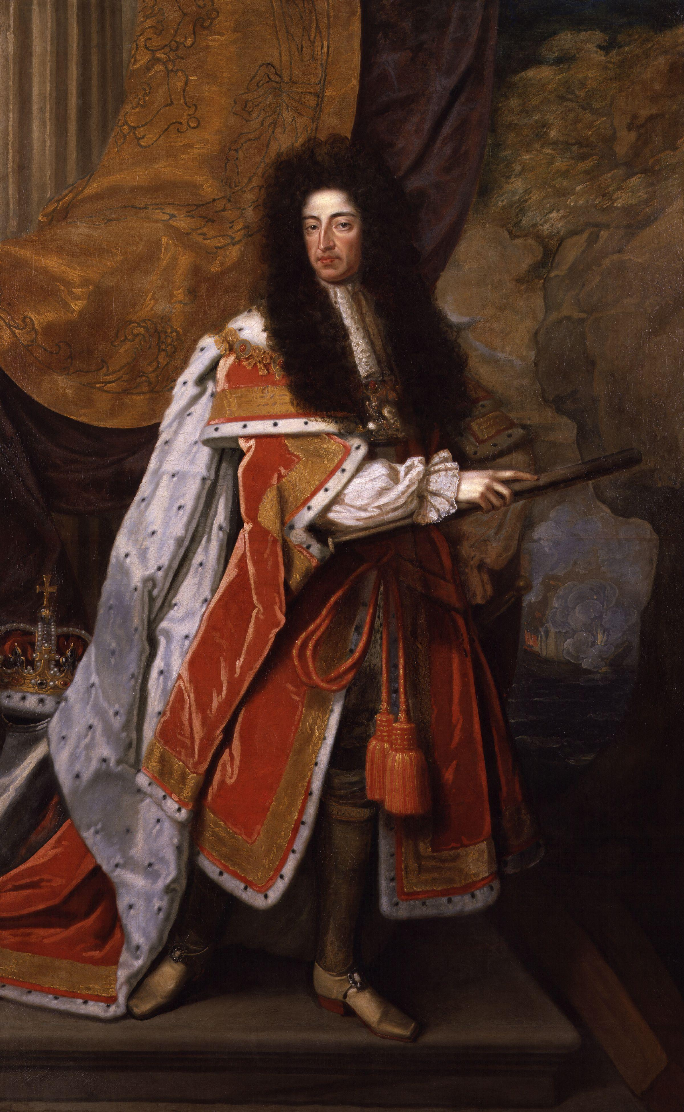
- Many possible speculations who ‘Wee Willie Winkle’ was, e.g. some believed he was Prince William III
Process
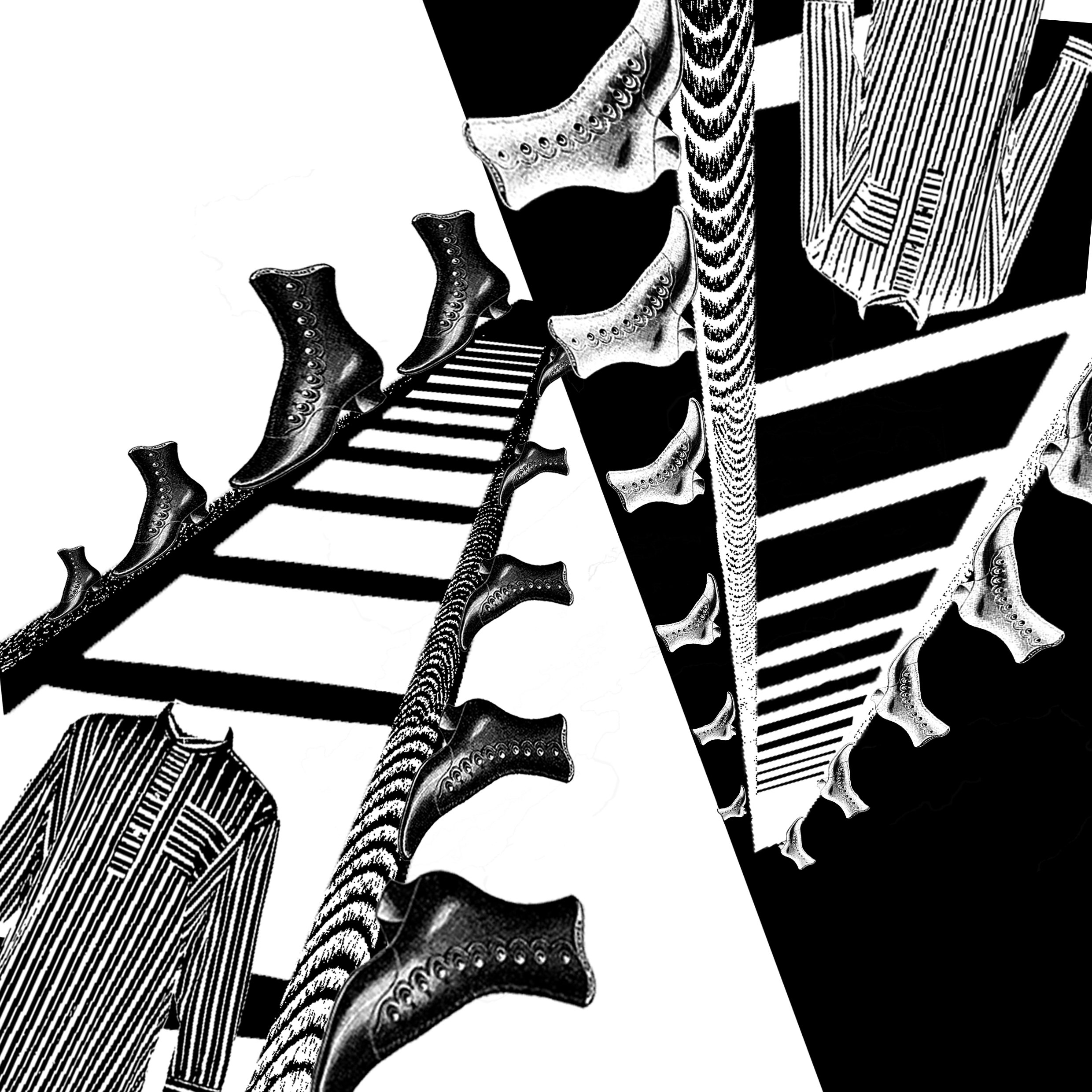
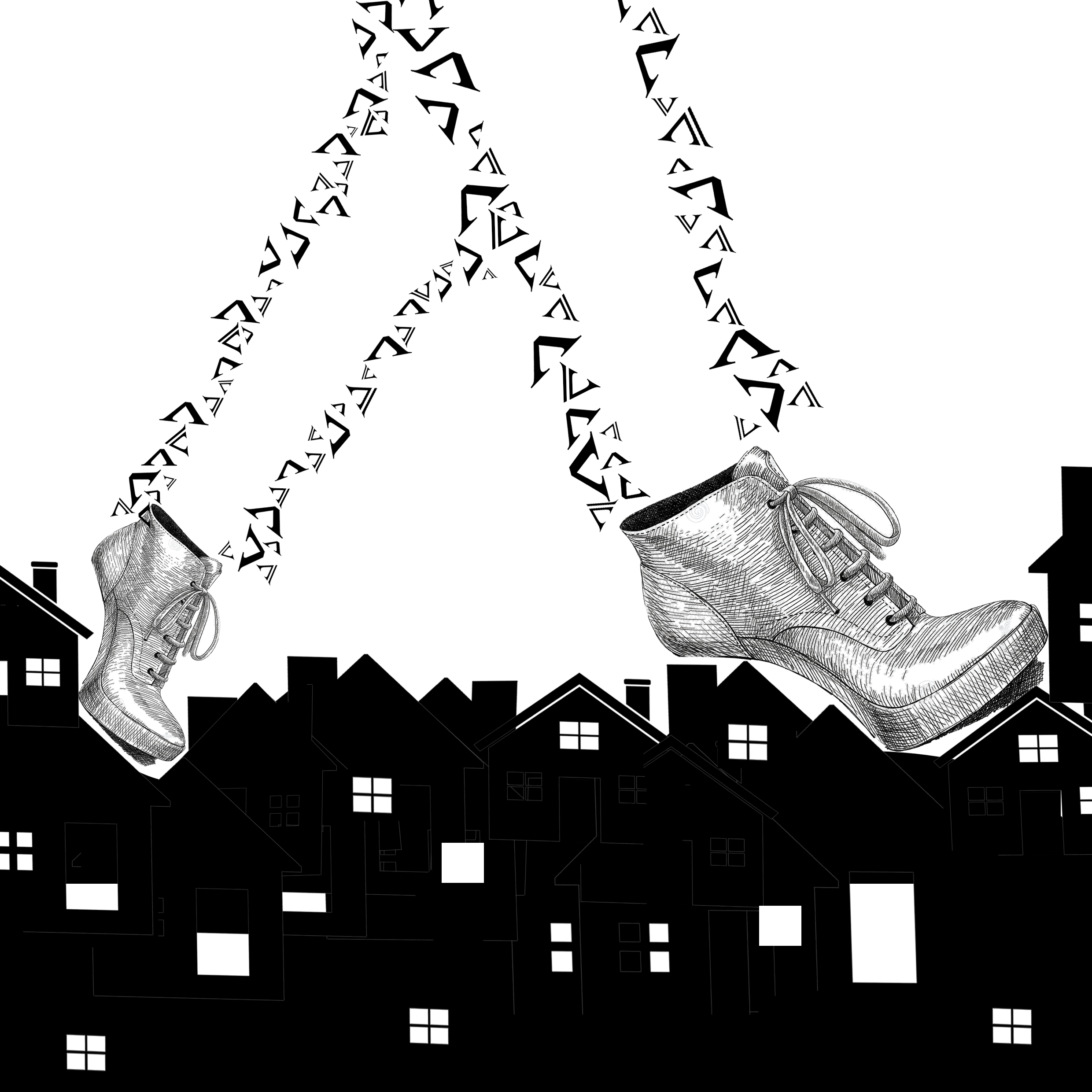
1 – Wee Willie Winkle runs through the town
Initial process:
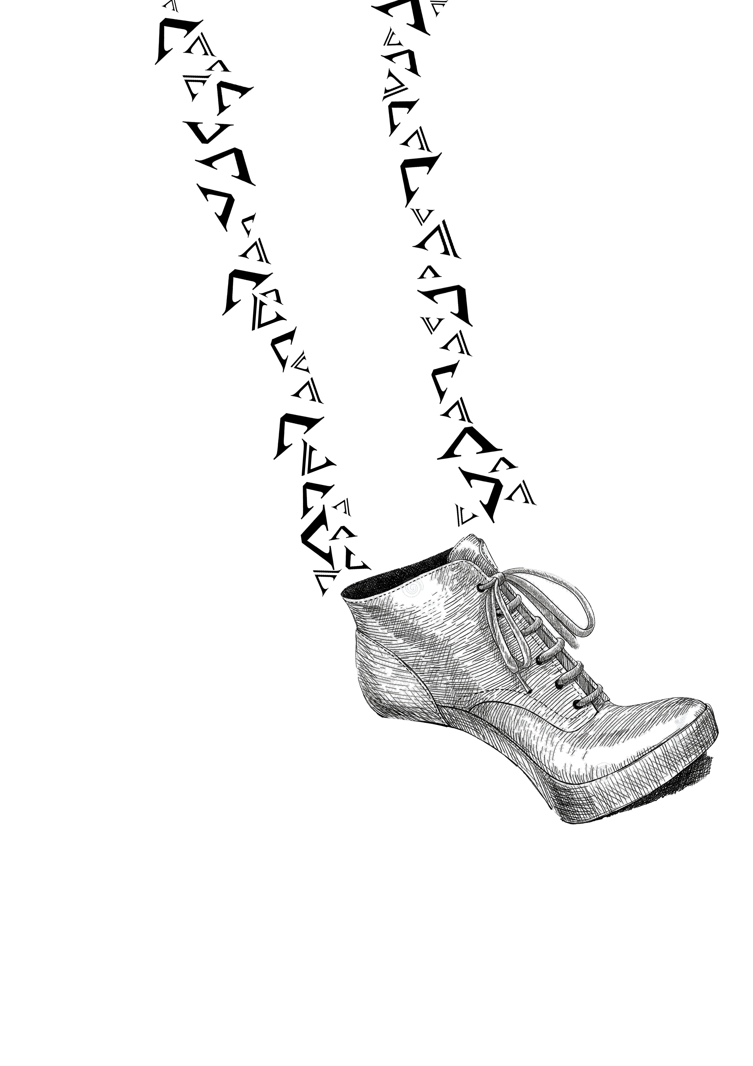
- ‘V’ font symbolizes houses (roofs)
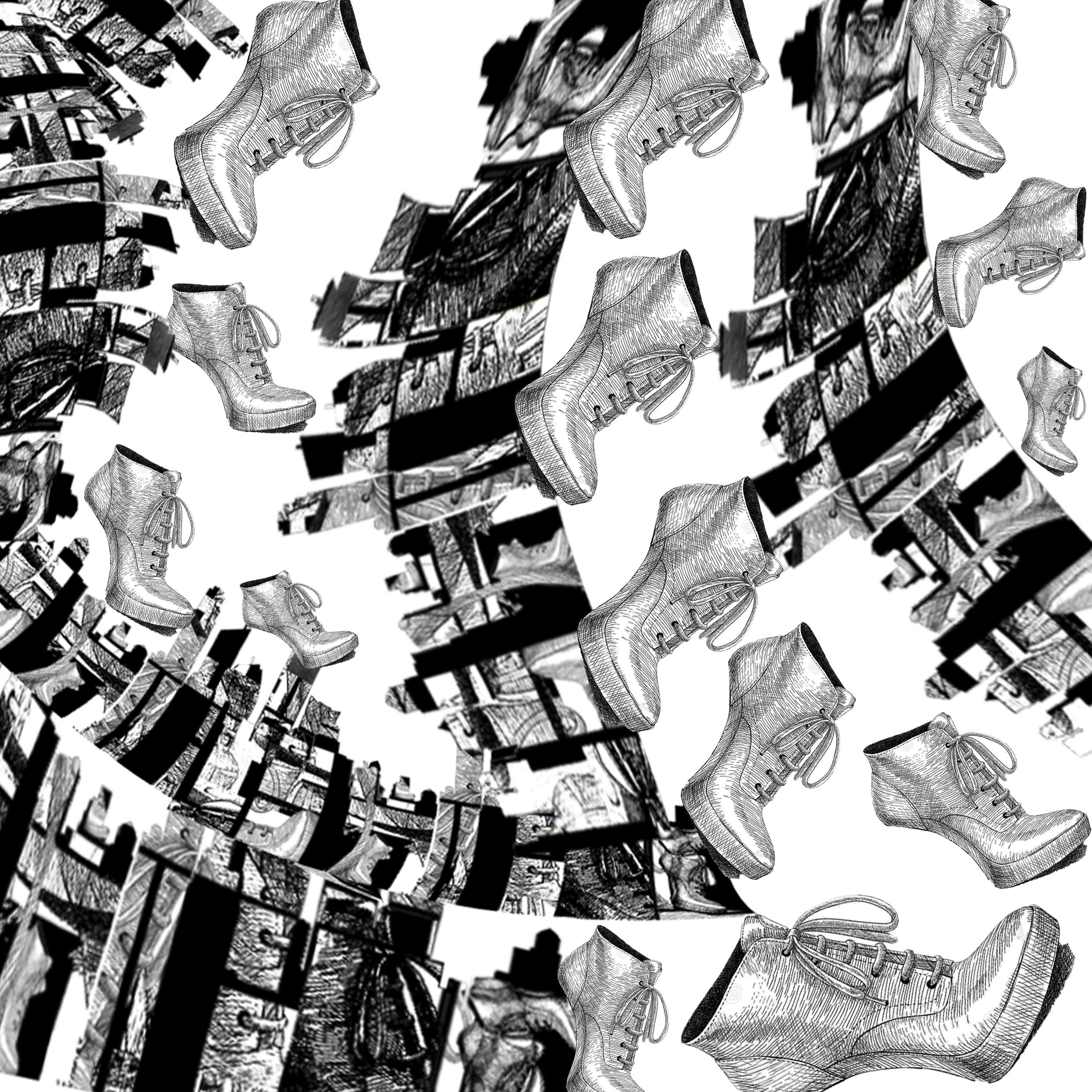
- Tip-toe shoe, give off motion of running
- Motion of flying away, as if blown by the wind (to give motion of running past houses)
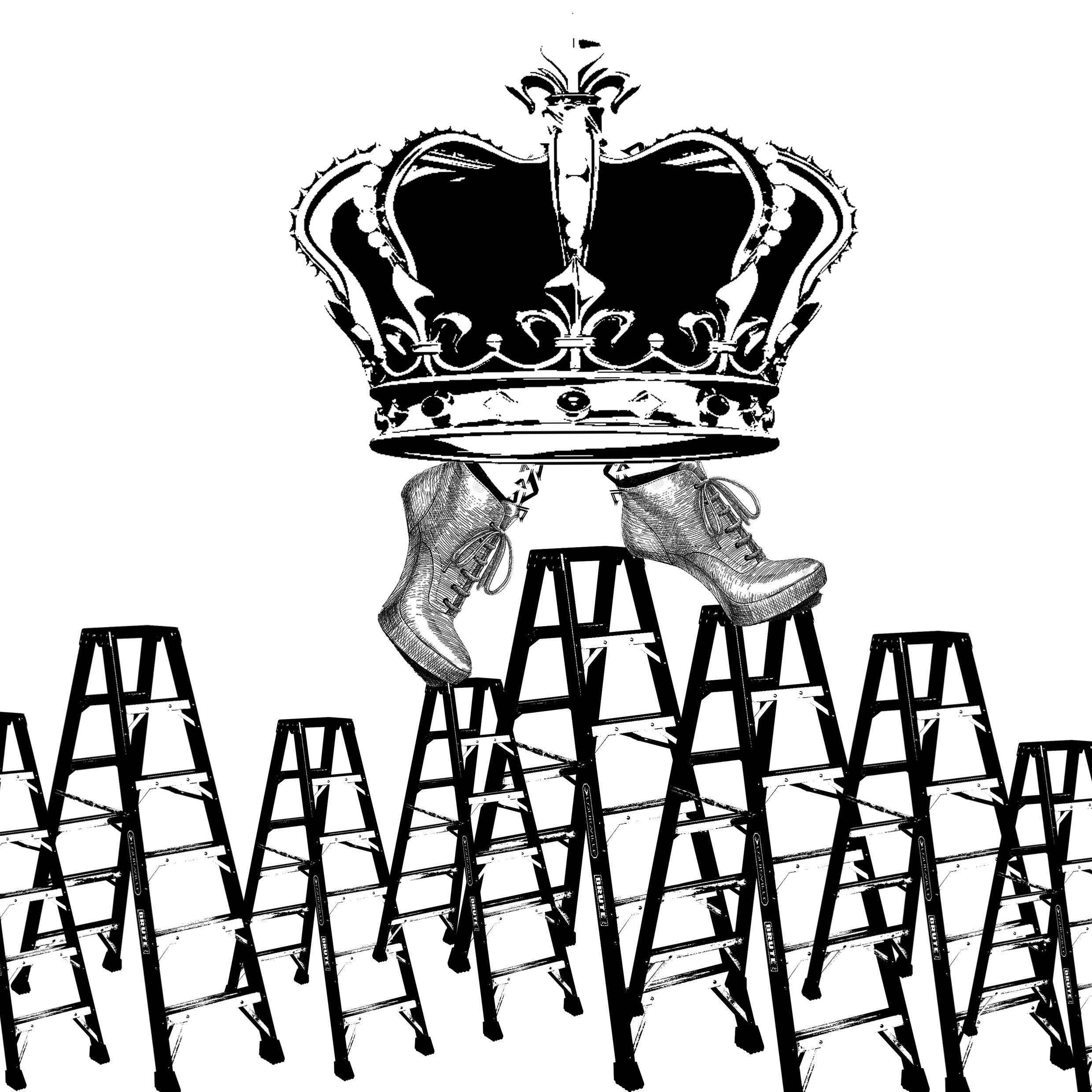
Crown
- Going by the interpretation that ‘Wee Willie Winkle” was possibly Prince William III
- Represent royalty
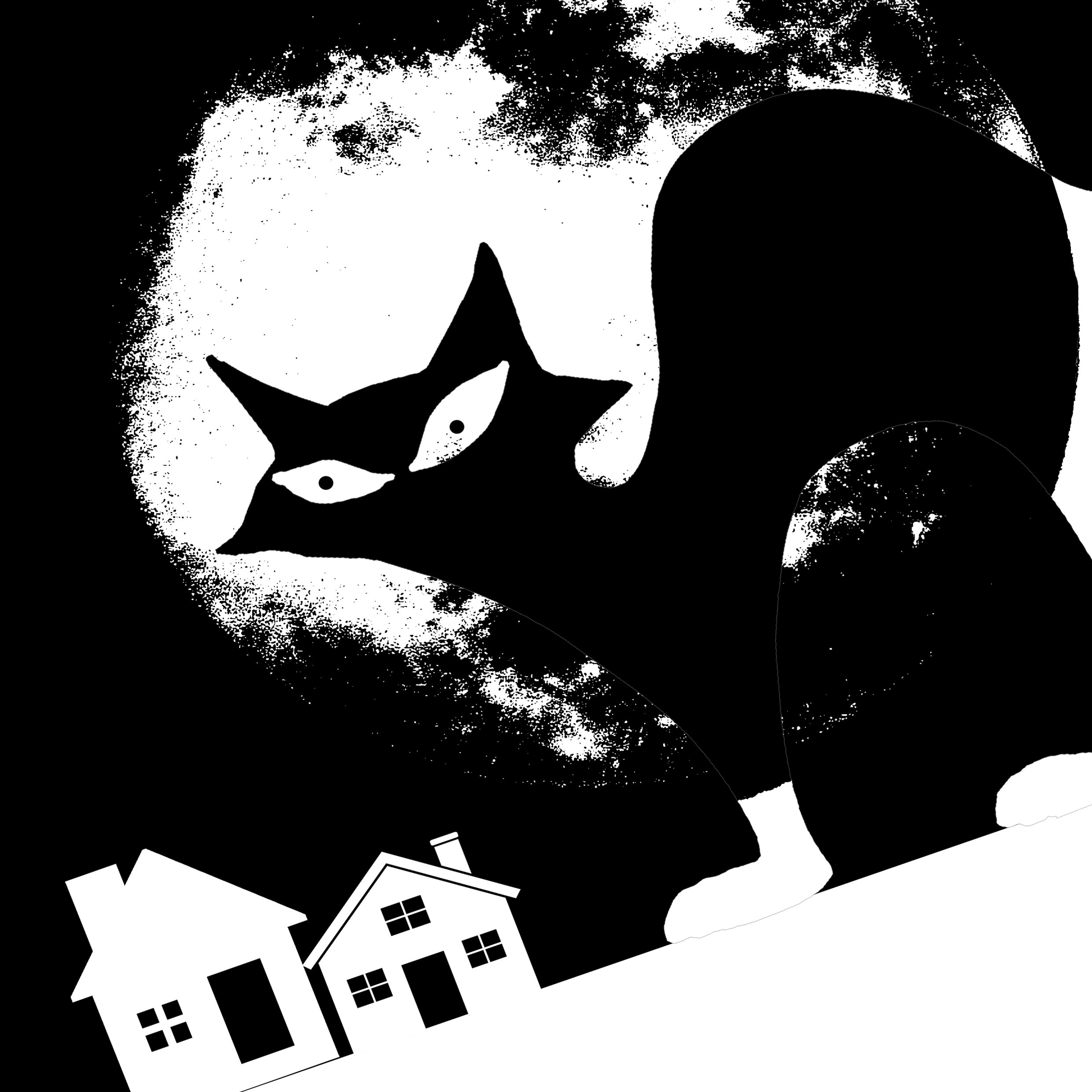
Animal – cat? wolf?
- Evoke the idea of a predator
- Representative of “Wee Willie Winkle” – he is stalking through the night and checking on all the children, seems a little intimidating
Early designs:
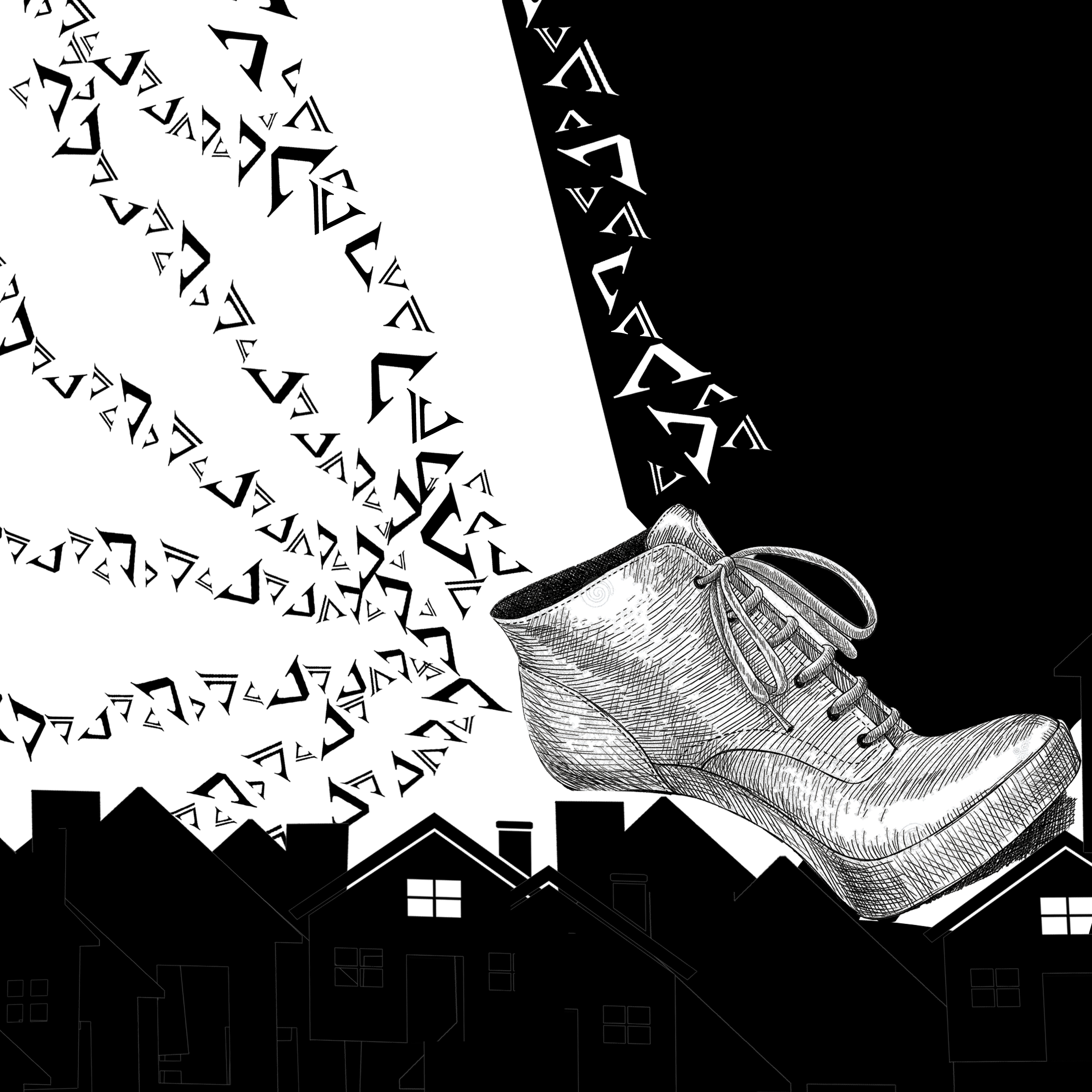
- Made use of the idea of ‘V’ as roofs
- Tried to play with positive and negative space, forming the shape of a running leg
- Silhouette of town to seem like running through the town
- Played with positive and negative space
- Represented “Wee Willie Winkle” with a cat – interpreted him as a intimidating figure that stalks through the night with hint of creepiness, thus the fierce cat
- However, cat looks stale and no motion is suggested. Do not convey “Running through the night”
- Warped the perspective of the town silhouette – overlaid town silhouette with shoes
- Shoes to add motion, give idea of running round and round
- However, the warp of perspective of the town silhouette + overlay of the shoes on the town silhouette: too messy, obscure and cannot tell that it is a town silhouette anymore
- Placement too random, not a successful design
- Used the early idea of ‘V’ as roofs, forming legs
- Idea of running through the town
- Idea is conveyed easily but maybe too literal
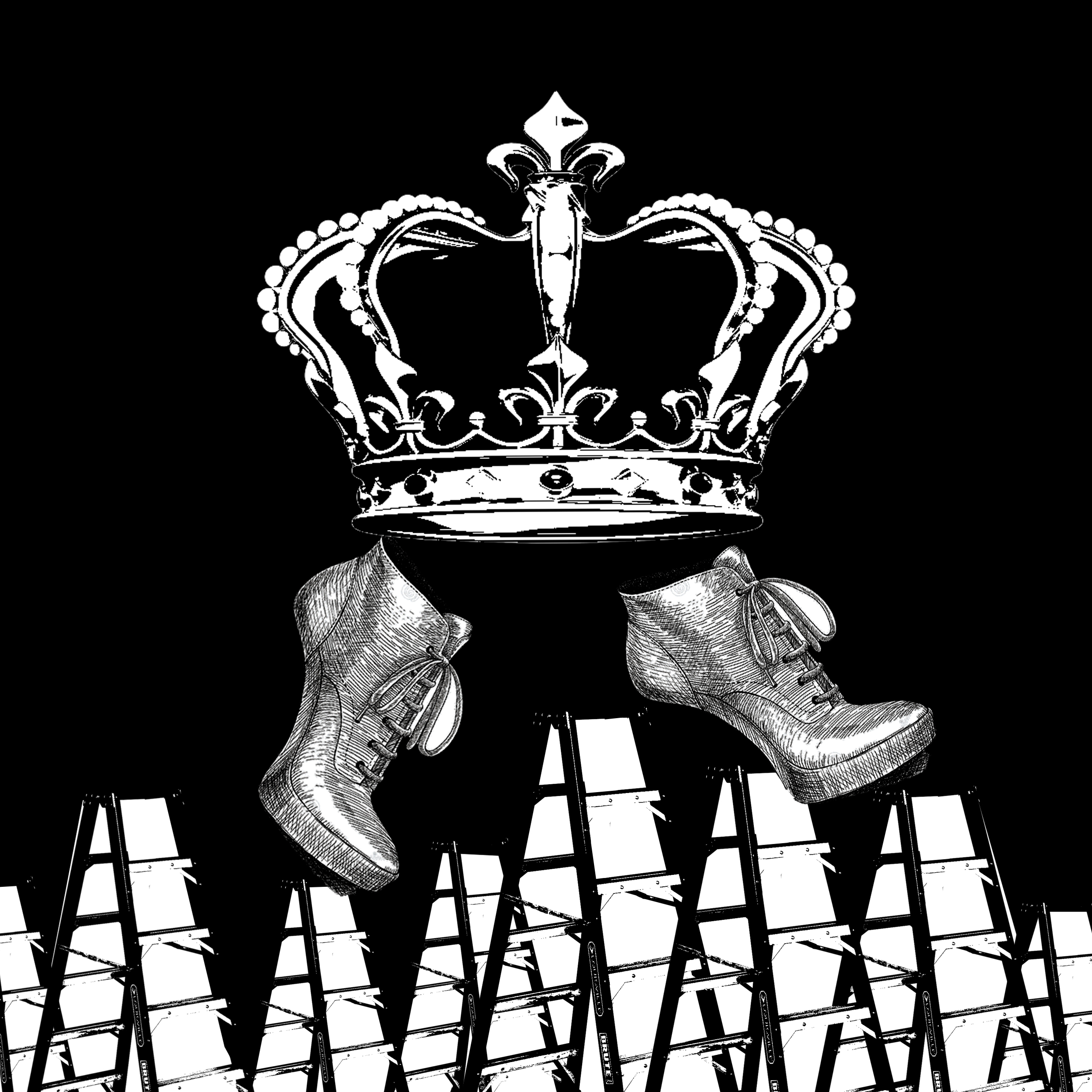
- Crown to represent “Wee Willie Winkle” as royalty, like suspected in his identity as prince
- Tried to be less literal, using ladders to symbolize rooftops – thought it to be more creative
- However, bottom of the ladders might give away the idea of ladders symbolizing roofs – might want to cut off the bottom of the ladders
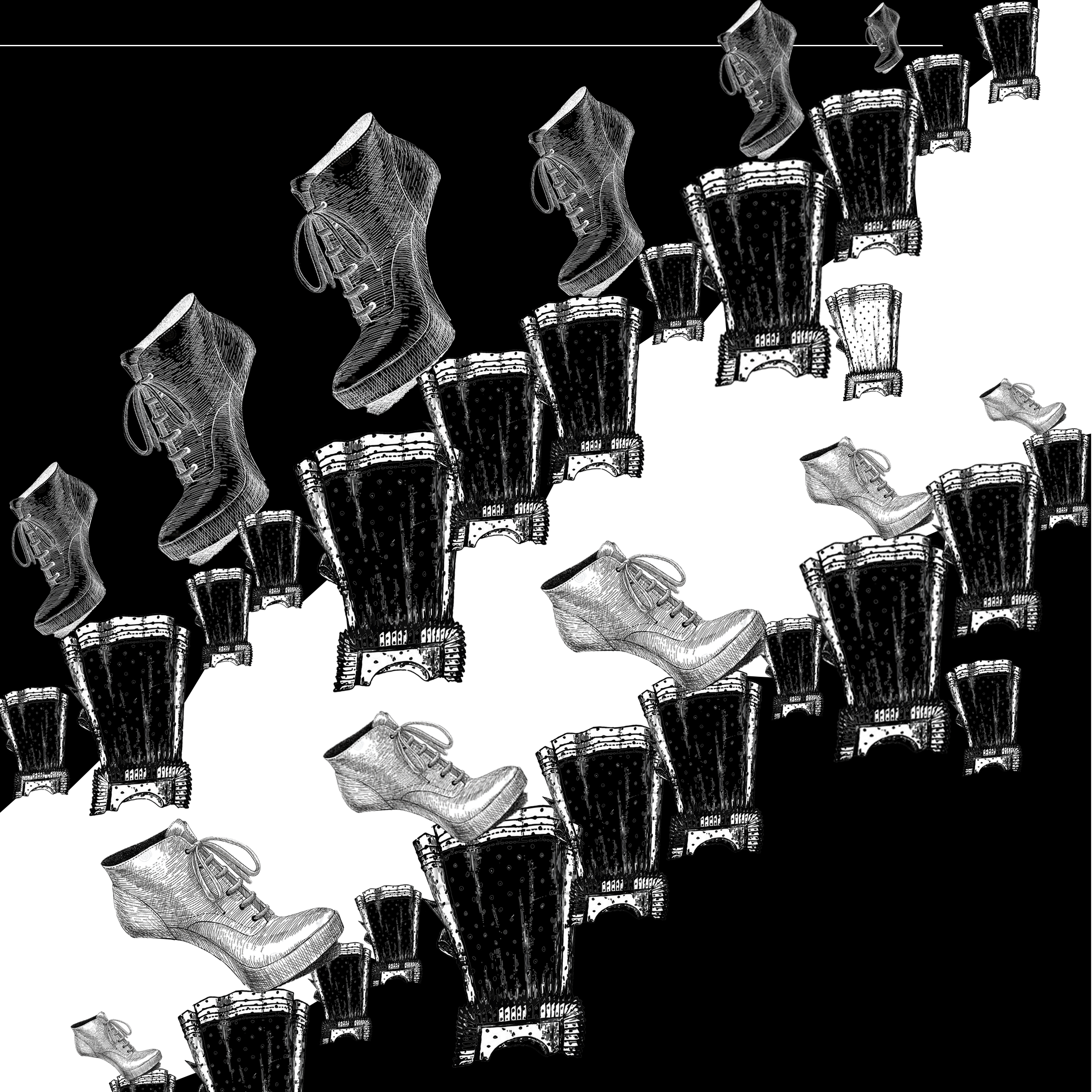
- Shortlisted design
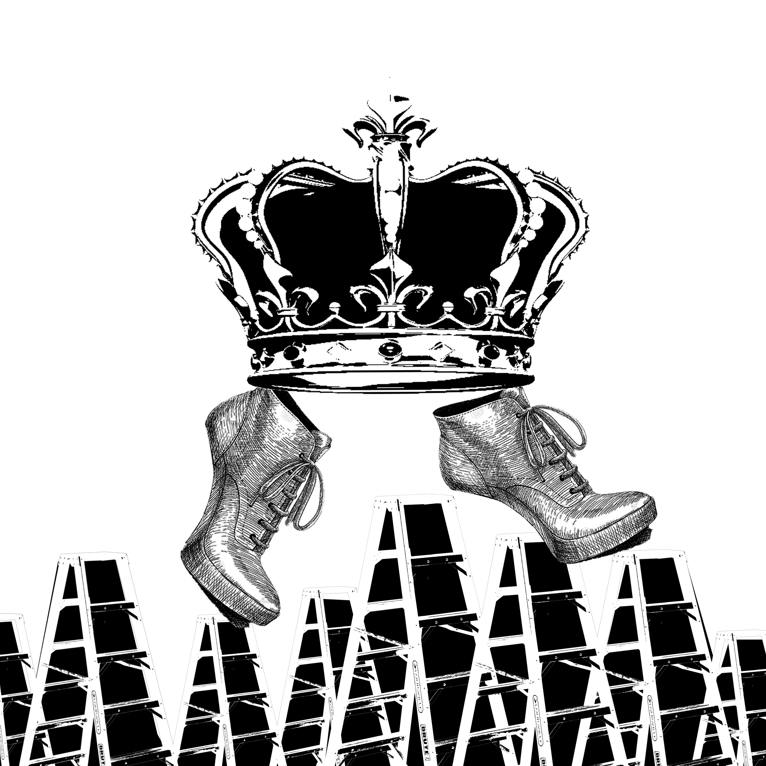
Using shortlisted design, various considerations
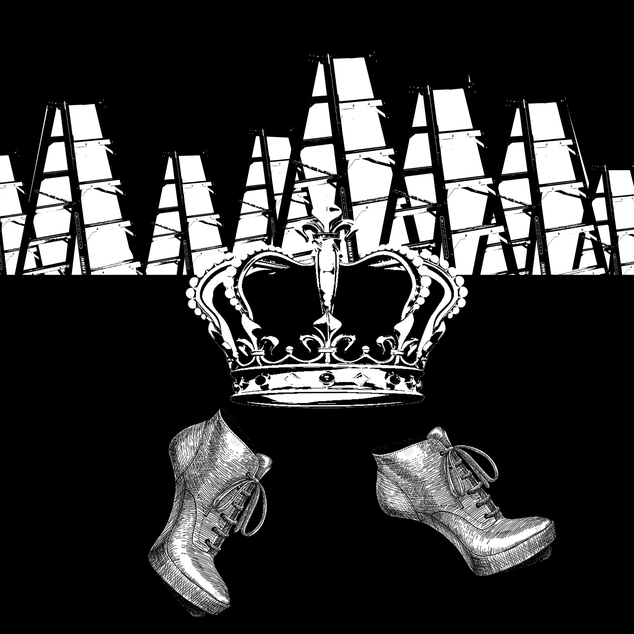
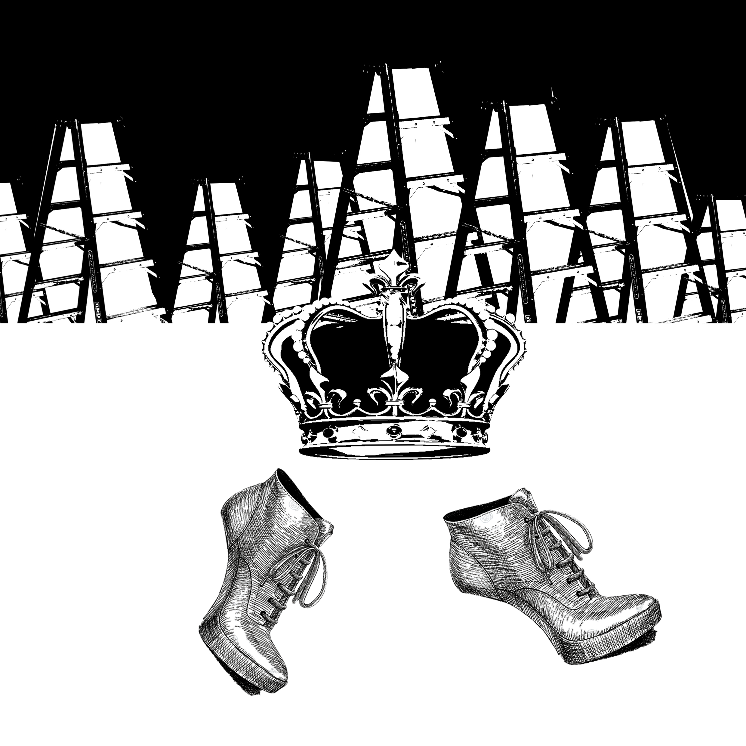
Final alternative
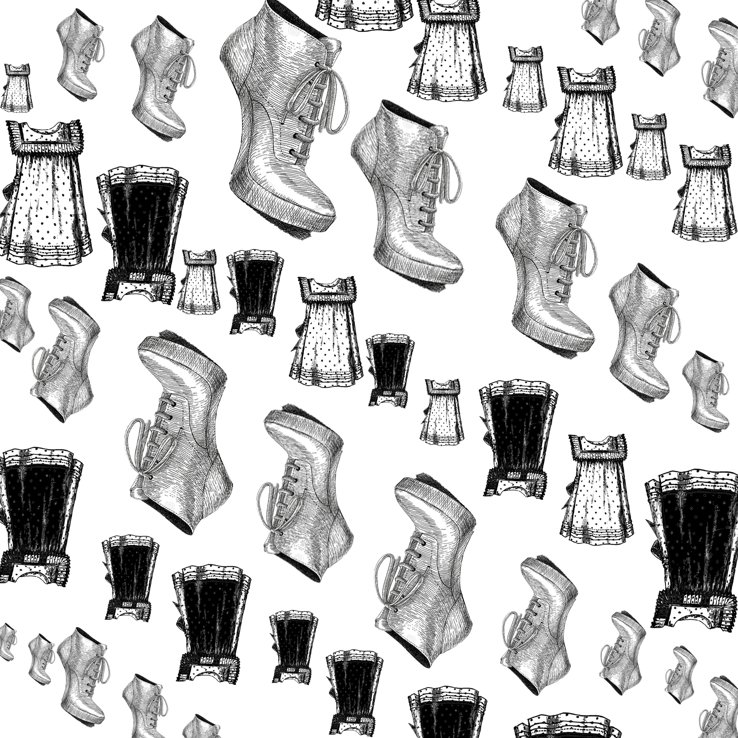
2 – Upstairs and downstairs in his nightgown
Initial process:
- Use nightgowns to form stairs (Different fill within nightgown – different stairs?)
- Once again trying to manipulative the positive and negative space
Early designs:
- Initial design
- Tried to be continuous, upstairs represented by upright gown and downstairs by upside down gown
- Result ended too flat, does not effectively convey idea too
- Looked more like a print
- The design uses girl’s nightgown, might be inappropriate in the context
- Shoe also looks awkward
- Nightgowns in black to achieve upward stairs, nightgowns in white to achieve downward stairs (white ones not obvious)
- Idea of going up and down the stairs
- Shoes look too random
- Once again nightgowns as stairs
- Positive and negative space to represent different tasks, to distinguish (Going down is portrayed in negative space, going up is portrayed in positive space)
- Still too flat
- Multiple nightgowns might not give the impression that it is only one person’s nightgown
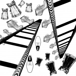
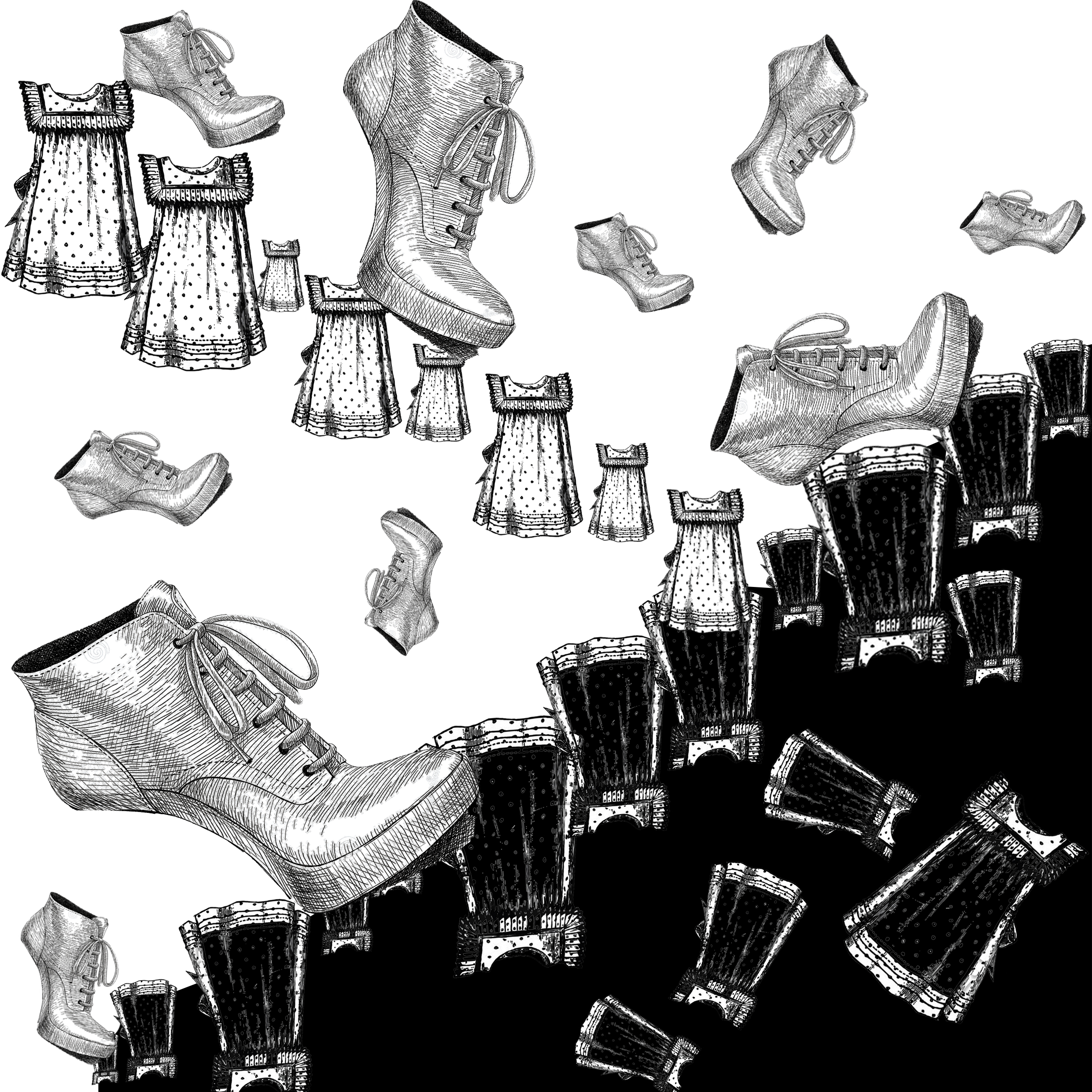
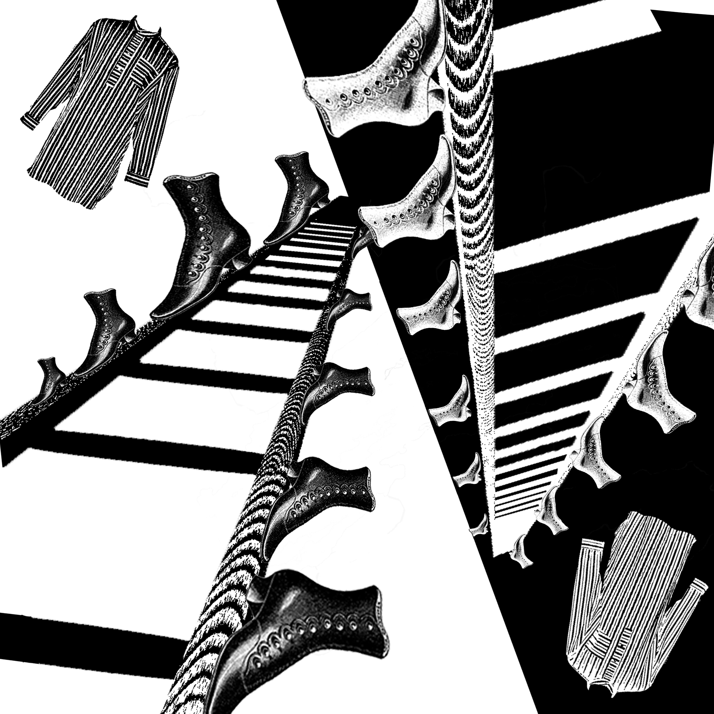
- Decided to break out of the idea of stairs and use the idea of ladders
- Incorporated ladder with perspectives
- Immediately draws more attention grabbing and interesting due to perspective
- Still looked too random in terms of placement – ought to be meticulous
- Changes: Delete the oxford shoes, add negative space, change shoes and nightgown
- Shortlisted design
Final Alternatives

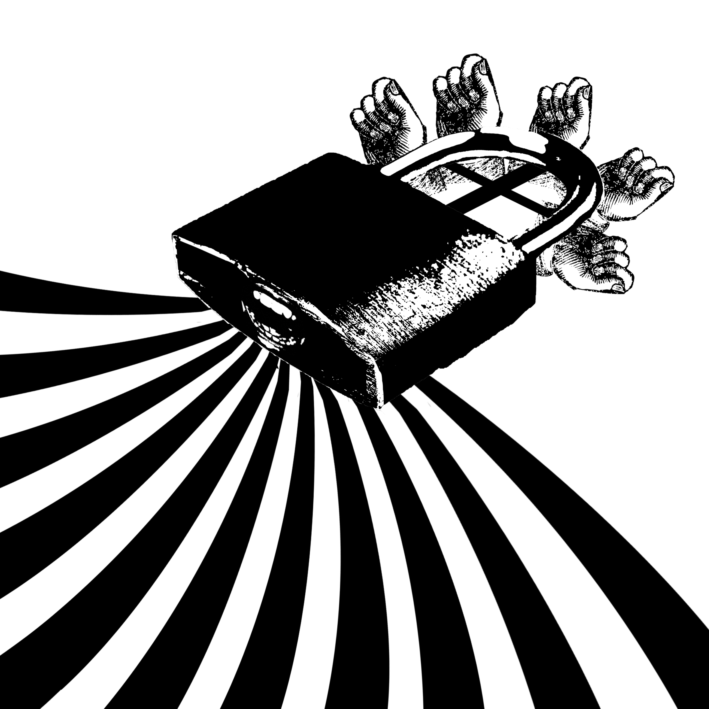
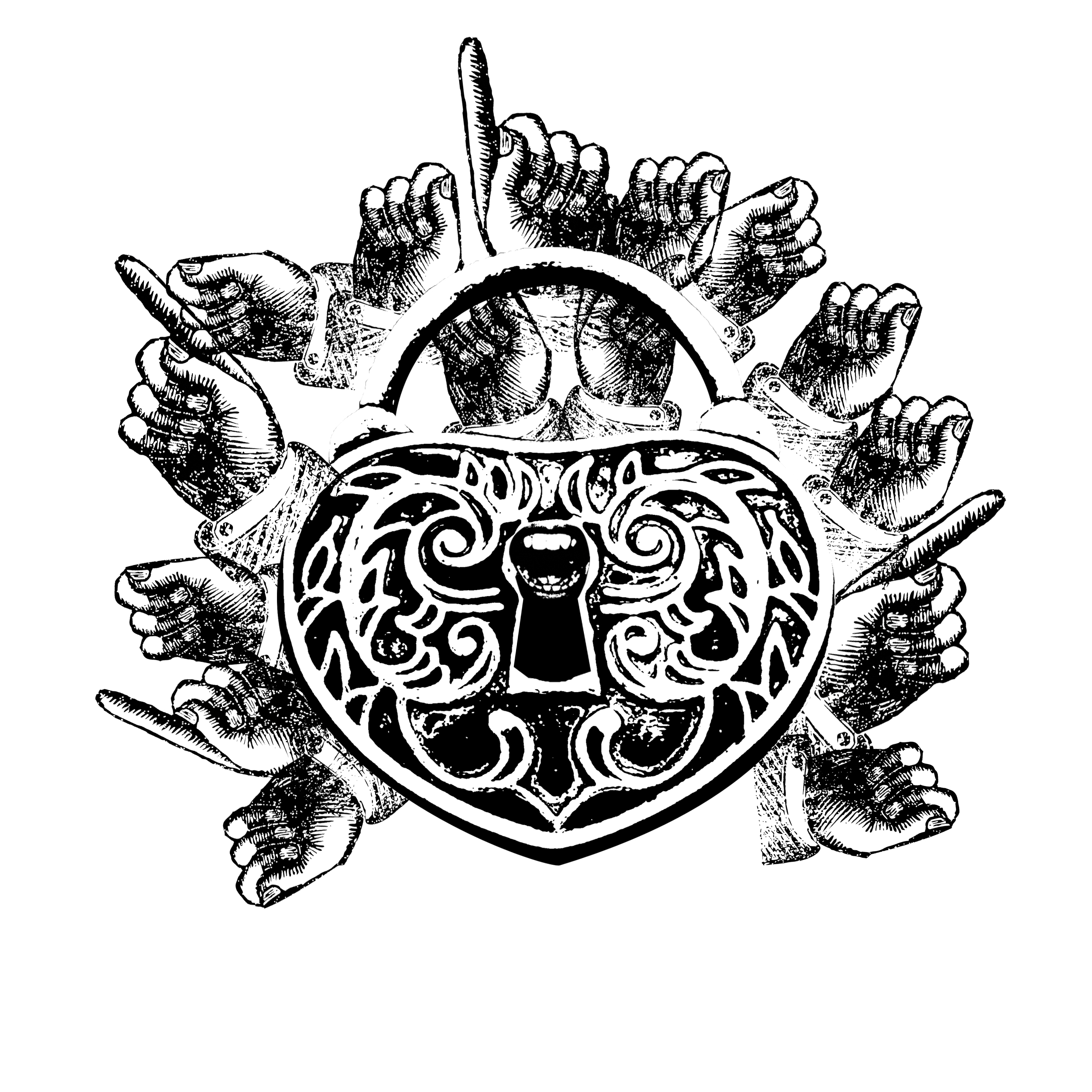
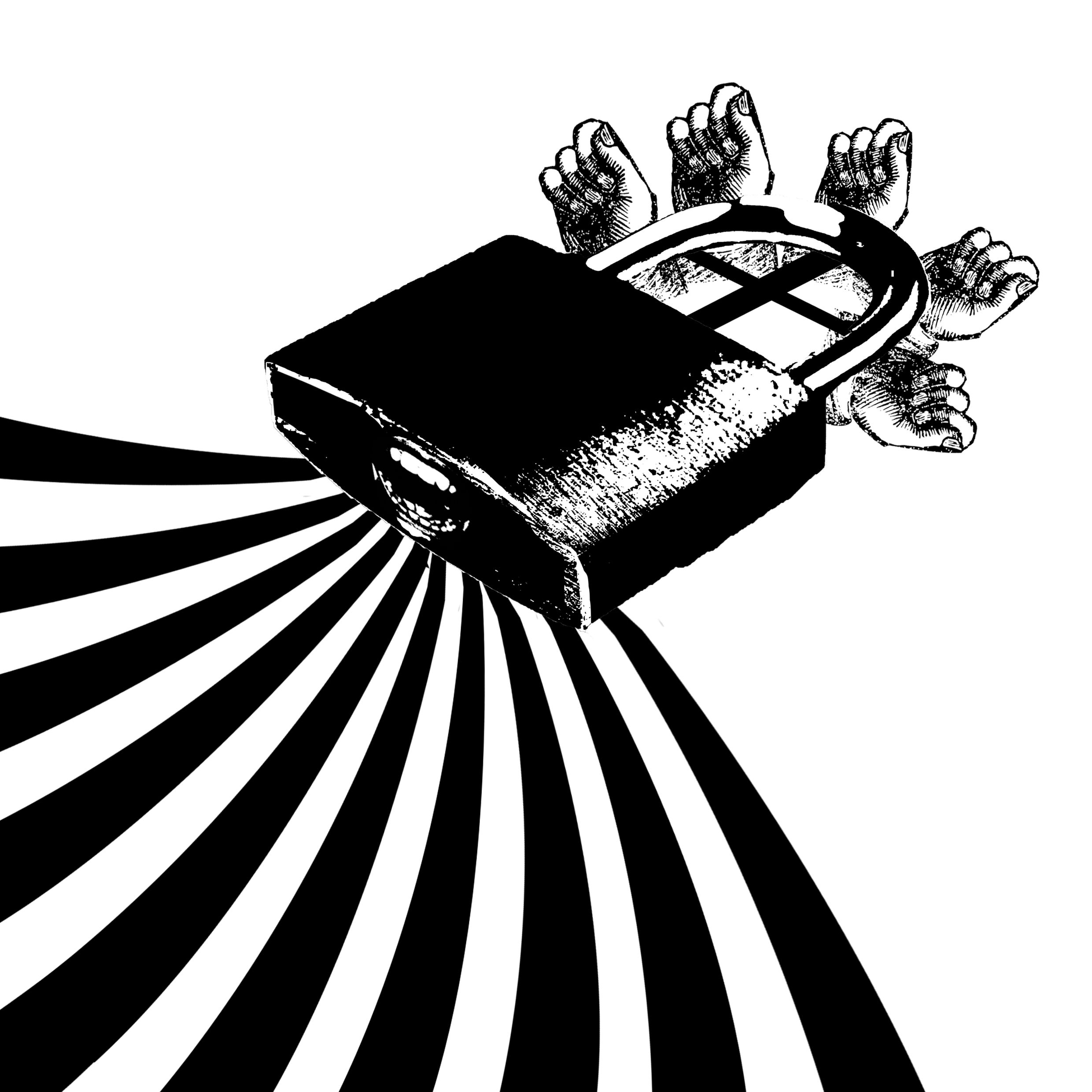
3- Tapping on the windows and crying through the locks
Initial process:
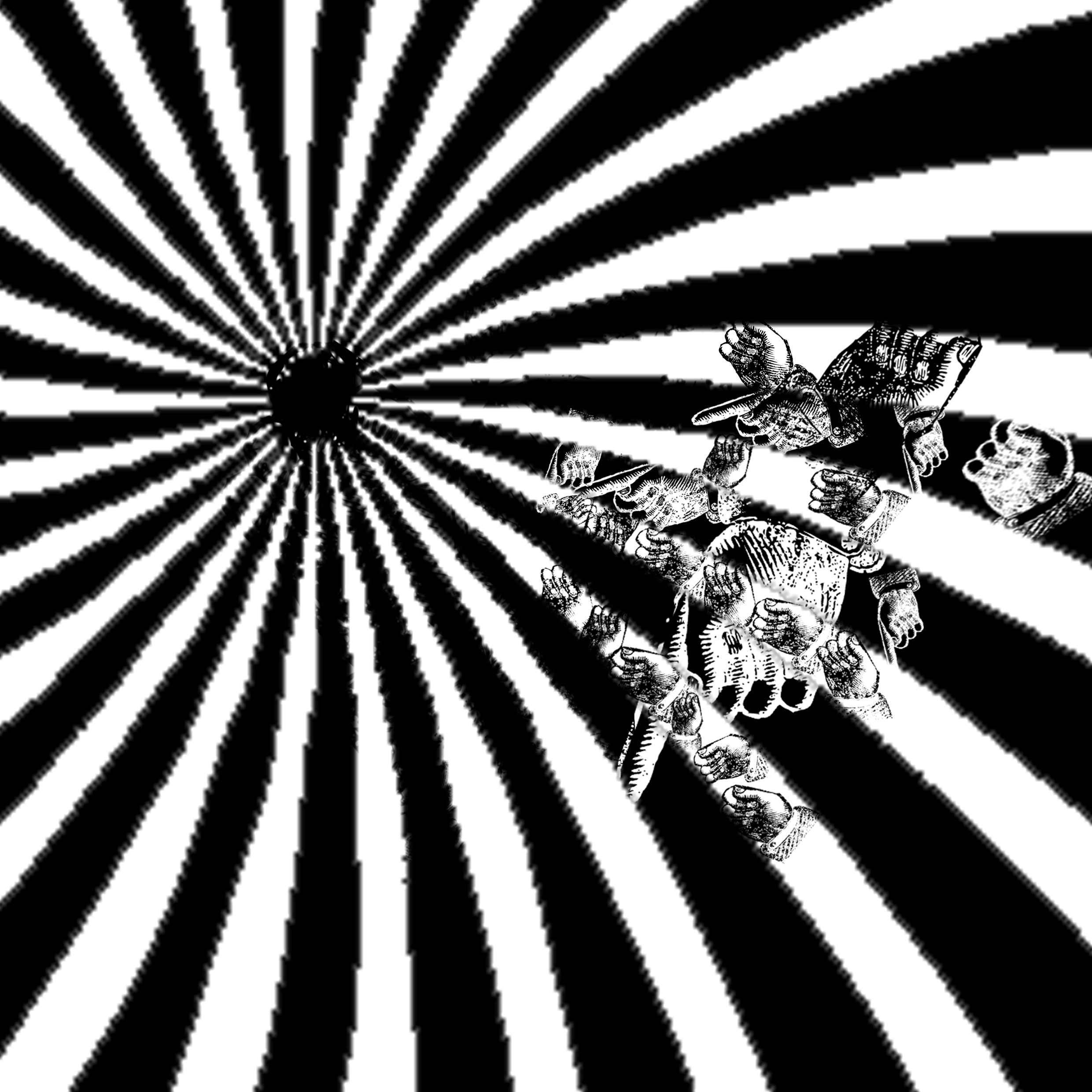
- Radial waves to suggest screaming effect (where the radial waves tapered in the centre – source of screaming, maybe can add a mouth)
- Overlay hands to symbolize the” tapping on the windows” line

- Tried to use pointy hands (“tapping on the windows”) to represent soundwaves (“crying through the locks”)
- Also looked like a mouth screaming
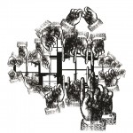
- Tried to insert windows on top of the hands to reinforce “tapping on the windowd”
- Mouth to form keyhole, literally “crying through the locks”
- Could add window grills

- Making use of musical lines coming out of the lock, depicts soundwaves travelling through locks (“crying through the locks”)
Early designs:

- Mouth at the lock, crying through the it
- Hands are formed round the lock (too much stacking however, looks messy)
- Windows to suggest the line “tapping at the windows”, however looks like a jail – message given out as if in a prison context
- Lock also too cartoon-ish, looks like hello kitty
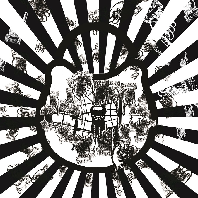
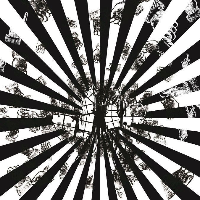
- Radial effect – screaming from mouth
- Hands to represent the knocking on windows
- Incorporated soundwaves plus the windows within the soundwaves
- Combination of all my idea looks like a mess, not a good design
- Lack a focal point and too much is going on (mixture of ALL my ideas)
Overall, nothing was shortlisted as I attempted to mix all my ideas into a single design – coming across as too cluttered, messy and lack of focus. I attempted to simplify my designs, try not to fit in ALL my ideas.
Final Alternative (after revision)
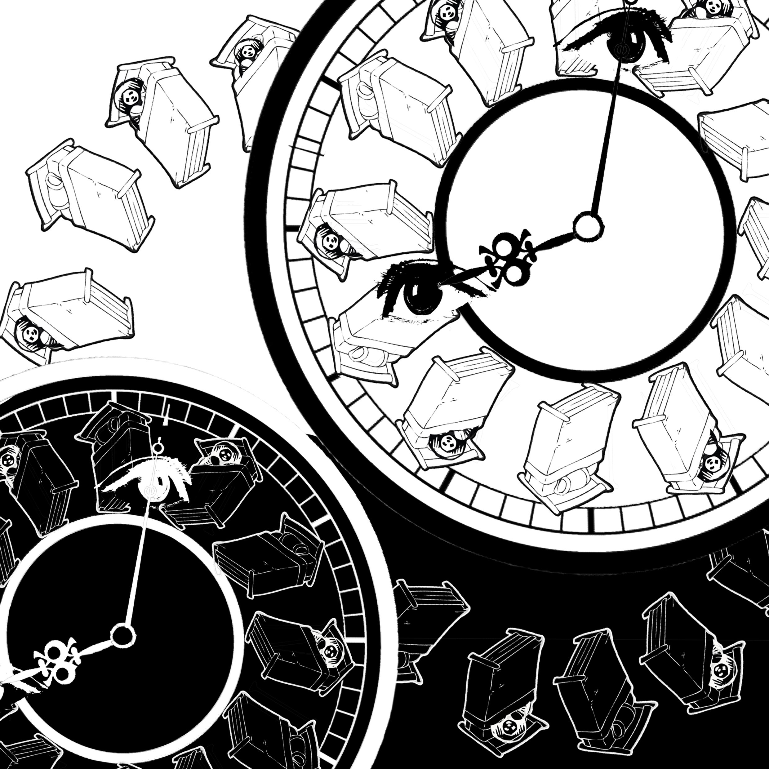
4 – Are the children asleep it’s past 8 o’clock
Initial Process:
- Clock as the idea of continuity (suggest to idea of clockwork gears)
Early designs:
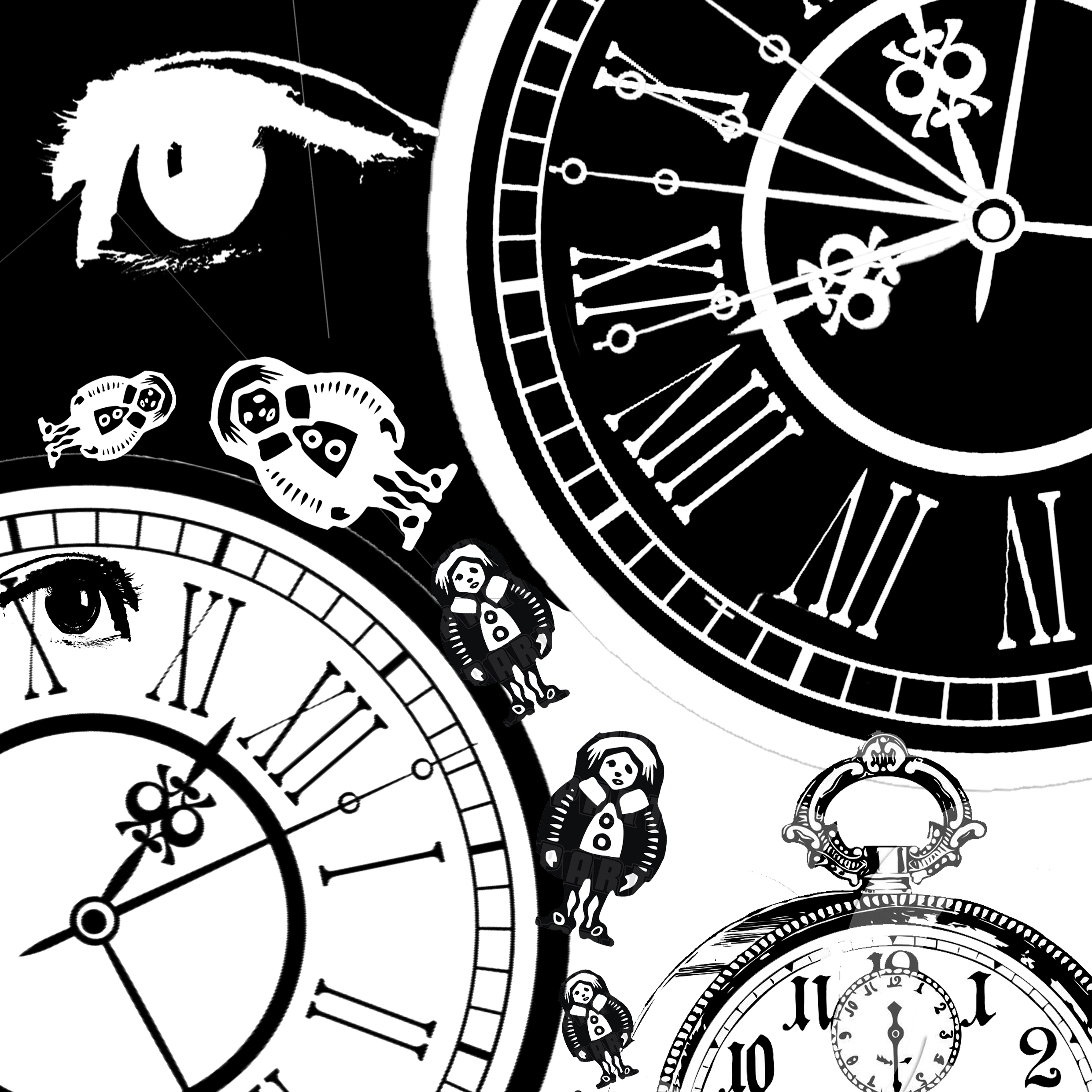
- Idea that clock is ticking, past 8 o’clock
- Tried to play with positive and negative space in one, and without in the other
- Eye to suggest Wee Willie Winkle eyeing on the children
- Eye looks out of place
- Message of “children in bed or not” not conveyed
- Children look too random, too many clock hands – messy
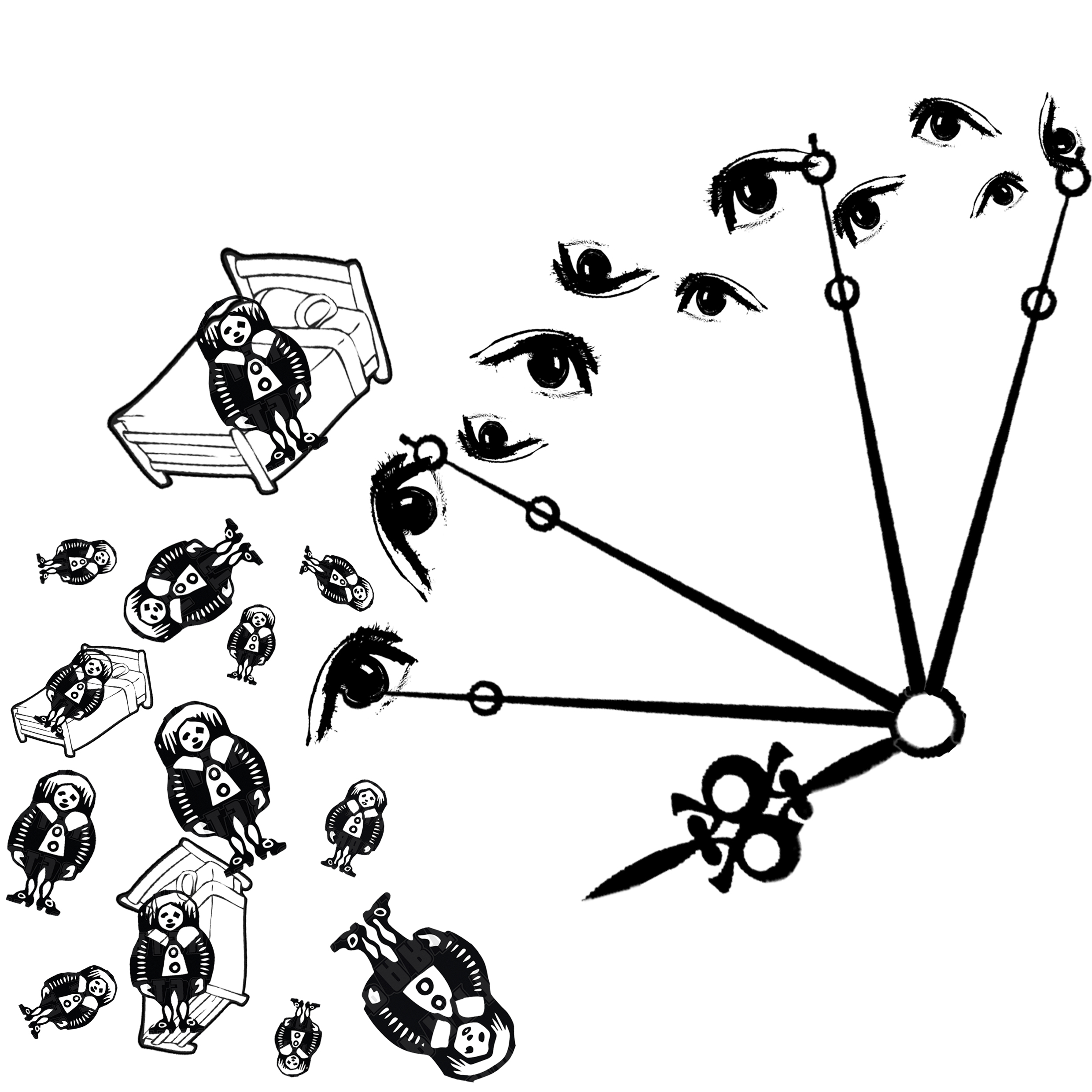
- Incorporated the idea of children on their beds to better convey message
- Clockhand is at 8 o’clock, ticking away
- Open eyes to show that children are awake – going by interpretation as researched, that Wee Willie Winkle was rudely awakened in his sleep due to noisy children at night
- Children look random

- Played with positive and negative space, contrast in mood (sinister vs innocent)
- The sinister eyes represent Wee Willie Winkle eyeing the children fiercely
- Mirrored position of the children for pattern, still looks too random
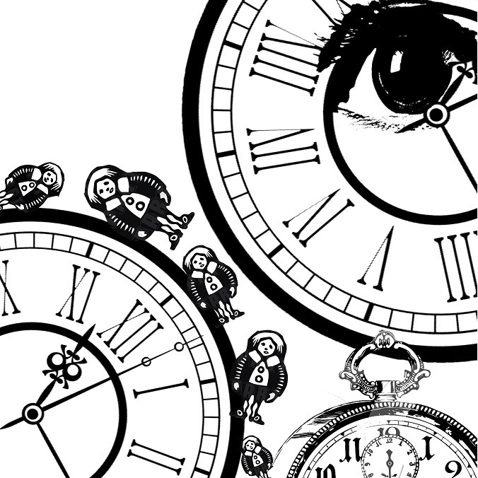
Final
Reflections
This assignment has helped me consider deeply what is literal and what is not literal, aiming that my designs are not too literal but at the same time understood by others. That aspect was challenging but it was fulfilling. Also, my first few designs had too much going on as I tried to fit in my different ideas. Along the way, I learnt to simplify the designs, take the essence of it.