In this chapter, Don Norman highlights what makes good design, and in particular – discoverability and understanding. Discoverability refers to knowing where to perform what, and how to perform them. Understanding is how the physical attributes link to the meaning of the design. Good design also tackles what users needs and it is so intuitive that often overlooked due to its effectiveness. Hence, as designers, it is important that our perspective in designing is focused on human-centric factors, meaning that design accommodates to human’s needs and not the other way round, which is common in problematic designs. A particular point that I found interesting how when a design is not working, most designers do not accommodate for that. overlook that aspect. His philosophy of human-centred design is essential for any designer, be it industrial or interaction designer, to be aware of.

The important takeaway from this reading for the components that highlights the discoverability in design – signifiers, mapping, constraints, affordances and feedback. These components need to work hand in hand for inituitive design, and I will highlight signifiers (and affordances) in my response.

Signifiers

Signifiers refers to mark or sound, basically an indicator that communicates appropriate behavior to a person. The clearest example would be the “PUSH” or “PULL” in doors to indicate what the user should do.

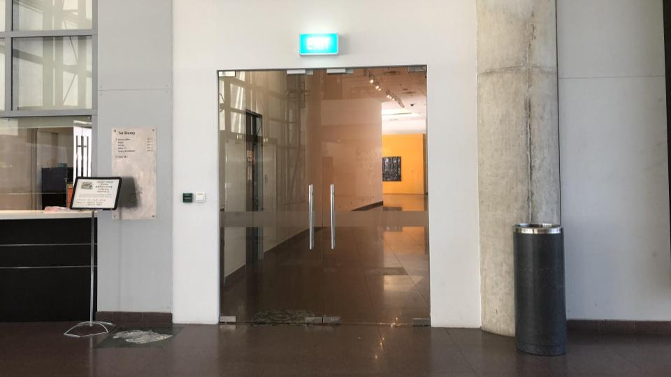
The lack of signifiers result to disastrous everyday problems. For example, when observing the wayfinding in ADM, the glass doors all around the school do not have indicators if they are PUSH or PULL.

ADM Norman doors

Till today, I struggle with this door because I do not see signifiers, and the handles are the same on both sides. Hence, signifiers are very important in such situations to give people a clue of the action expected from them.

Relationship to Affordances

Affordances refer to the relationship between the properties of an object that determine just how the object could possibly be used. When one looks at a door with handles, you know it can be pulled to open the door. However, one direction of the door is meant to be pushed and not pull – hence a gap in affordance and perceived affordance. Hence, at times Norman doors are often debated to be unideal in user experience – the presence of handles when a push action is expected from a user, because people are calibrated to pull handles when they see them. Hence this might be a conflict in a user’s mind, perceived affordance and affordance is not met and therefore there is a need for the signifiers.

However, the design itself should work in tandem with a signifier. It should be intuitive in a way that people understand the action needed from them too, hence like a perceived affordance. How can one improve the perceived affordance?

It is important to note that signifiers should always be designed together with the product, and not an afterthought to prevent people from doing what is not ideal. People should perceive the ideal action by looking at the product, (perceived affordances), with signifiers complementing and affirming their action. While signifiers closes the gap between what users perceive the object can do and what it actually does, how can signifiers be made more cohesive together with the perceived affordances?

Another question I have in mind is – How is affordance defined? For example, chair is meant to be sat on but it also has an affordance that is not communicated through its design – people also use a chair to stand on when reaching out for objects.

Overview

Cultural calibration is where one puts himself/herself in the local mindset of a new culture, ‘living’ in the shoes of their everyday lives and from there drawing key observations in comparison with other cultures in the world. This is especially important for a user experience designer – one has to be truly be well-versed with behavioural patterns in the particular culture first in order to design an effective human-centric product/service for that demographic. These can be done via a few techniques according to Chipchase, in which I will address the international language of Macdonalds and how this translates into calibrating culturally for UX.

Observations from Mcdonalds, global fast food chain

Culturally different food items

Chipchase has already mentioned how Mcdonalds mean differently in value to different countries. It can be seen as a place with air-con and free wifi in developed countries, places to sleep for the homeless even.

Ha Cheong Gai Burger in Singapore, by Mcdonalds


Mcdonalds has always been localizing their products to a specific culture. For example, Japan has Ebi flavoured (Japanese shrimps), and Singapore has Ha Cheong Gai burgers inspired by local flavours. These are often seasonal cultural products to  occasionally spice up the items on the menu, in order to spark interest. On the other hand, consistent items like fries are ubiquitous in all Mcdonalds across the world, in which allows it to be a global trademark item. Hence, a mix in both globally consistent items and items marked by cultural differences allows Mcdonalds to build a strong brand globally but is not totally identical which allows people to maintain interest in their food chain when travelling to different Mcdonalds throughout the world.

Customized image for different cultures

A more important observation that I witnessed is how Mcdonalds changed their logo colors to cater to different cultures. They have purposely customized their image to appeal to the public in a culture.

Paris Mcdonalds

When I was in France, I noticed that Mcdonalds logo was green and yellow. I was told by my French friend that this is because people are increasingly conscious about the environment and health, and thus Mcdonalds tries to improve their image with their change of colours – an eco-friendly and “healthy” food chain. In contrast, most places around the world still uses the same signature red and yellow logo, like Singapore.

Singapore Mcdonalds

Hence, different image appeals to different cultures, what is effective to a country might not be for another. This is worthy for designers to observe and apply to cultural optimisation of their designs.

Further translating cultural calibration

Linking observations to context – Utilising cultural calibration powerful design research

To fully utilise cultural calibration observations, this can be deepened with contextual knowledge of a particular culture. A model that I would refer to is Hofstede’s six cultural dimensions, which represents independent variables that different cultures tend to veer towards e.g. Power Distance Index (how less powerful members in society accept unequal power distribution), Individualism vs Collectivism (whether society values the self or the collective community mindset).

Here’s an illustration of how this could work. Using the Individualism vs Collectivism dimension, a culture which values Individualism (e.g. The Netherlands) might want to know how a product benefits them individually, whereas a country which values collectivism (e.g. Korea) might be more keen to know how the product benefits their community as a whole / how does it embody them into their society. With this context, one can link with observations from cultural calibration – in Korea city commute, people tend to group together a lot and they often have similar fashion and makeup. Trends are usually closely followed because people want to fit in to the community. Hence, this affirms Korea’s strong sense of collectivism, and a UX designer ought to design a product that benefits the “us” more than the “I”.

Therefore, linking observations from cultural calibration with contextual knowledge will largely empower the designer with ultimate tools for designing a culturally optimised product or service.


Further thoughts 

Striking a balance

It is important to strike a balance between how consumers live now (by observing the behaviours of people in a culture), and how they want to live. Observing Japan in peak hour allows us to know that people are constantly in a rush, and often tired in work. We hence see many products catered for convenience – e.g. prevalence of vending machines in subways and roads, full meals in convenience stores. But this does not tell us how do they want to live, and that is where research of their values and ideals come in. If they aspire to live the opposite of how they live now, how can one challenge that?

Food for thought – When designing a product, localizing for a culture – how far should one try to blend into the culture?