2D II-(Project 2-Part 1) “ ZINE: NEIGHBOURHOOD EXPLORER” (1) – EXPLORING

Heeloo!:)

Project 2 is gonna be a loooonggg project:) Honestly, I’m happy and also worried:( Happy because it is a new project, worry because if I didn’t do well on part 1 it might affect part 2:(

But anyway that aside, I got assign to PASIR RIS! Well actually not assign more of my “suay hands” pick. Why suay because I stay in Boon Lay. But this project is about EXPLORING so actually it’s ok!:) I believe it would be a great experience for me!:) 

Before I visit Pasir Ris, I did some research. First I ask my class mate Chia Te who lives in Pasir Ris if there is any interesting place I could go to because all I know is Downtown East and Wild Wild Wet. She answer ” PASIR RIS GOT NOTHING ONE SIA! “. ok, die liao lo.

Then I went google, type ” Explore Pasir Ris”, the first result I get was Pasir Ris park. Apparently there is alot of things to do in Pasir Ris Park. So, my main focus was to visit the park and also exploring the estate. 

When I reach Pasir Ris MRT, my friend and I have no idea how to go to Pasir Ris Park. So with google map, we got Pasir Ris Town Park. 

PASIR RIS TOWN PARK!

img_5473-min
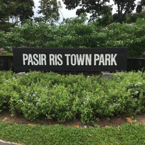
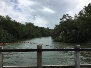
We didn’t know that we are heading towards the wrong park we thought Pasir Ris Town Park is Pasir Ris Park. Inside, there is a HUGE Pond? For fishing and prawning. There is also cafe, bars and kayak rental for people.

img_5475-minimg_5477-minimg_5478-min

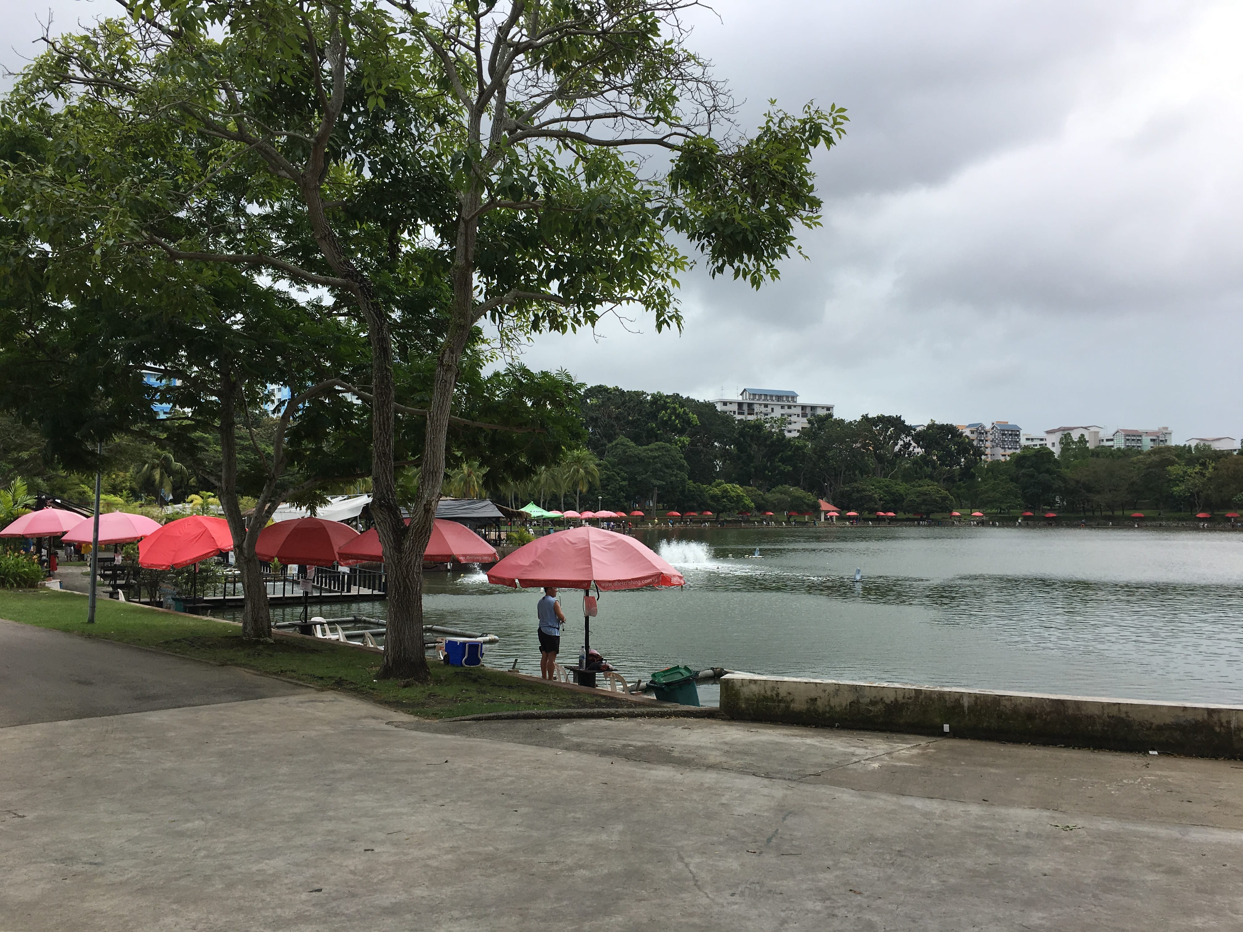
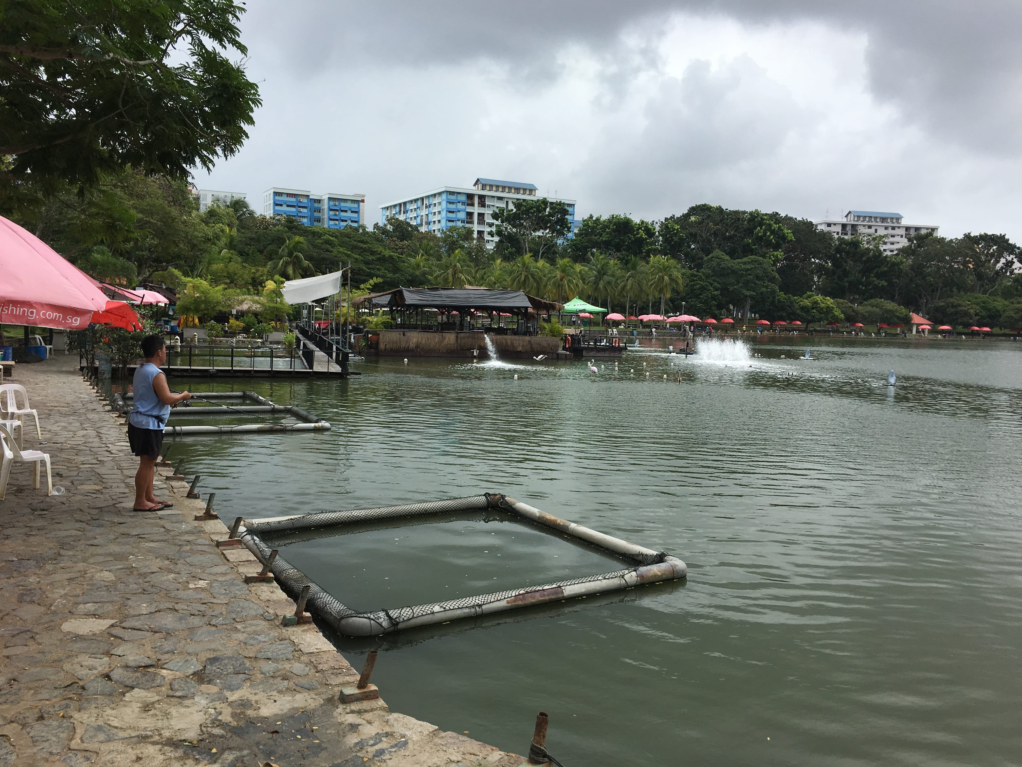
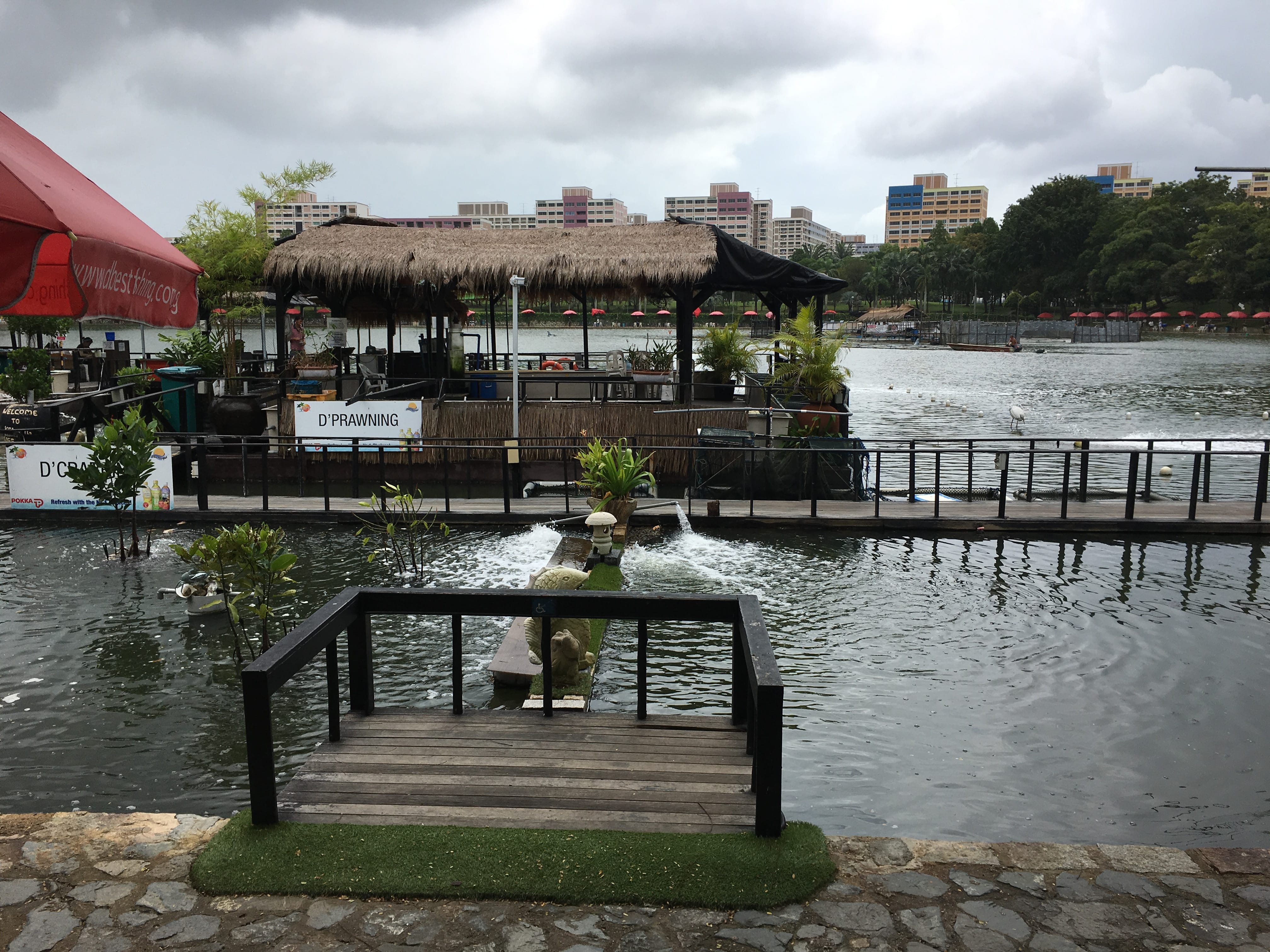
Well, it obvious we are on the wrong park. It is Impossible to have Maze, Mangrove Walk way Or even horse stable here. Finally….

PASIR RIS PARK!

img_5504-minimg_5505-minimg_5507-minimg_5502-minimg_5519-minimg_5513-min
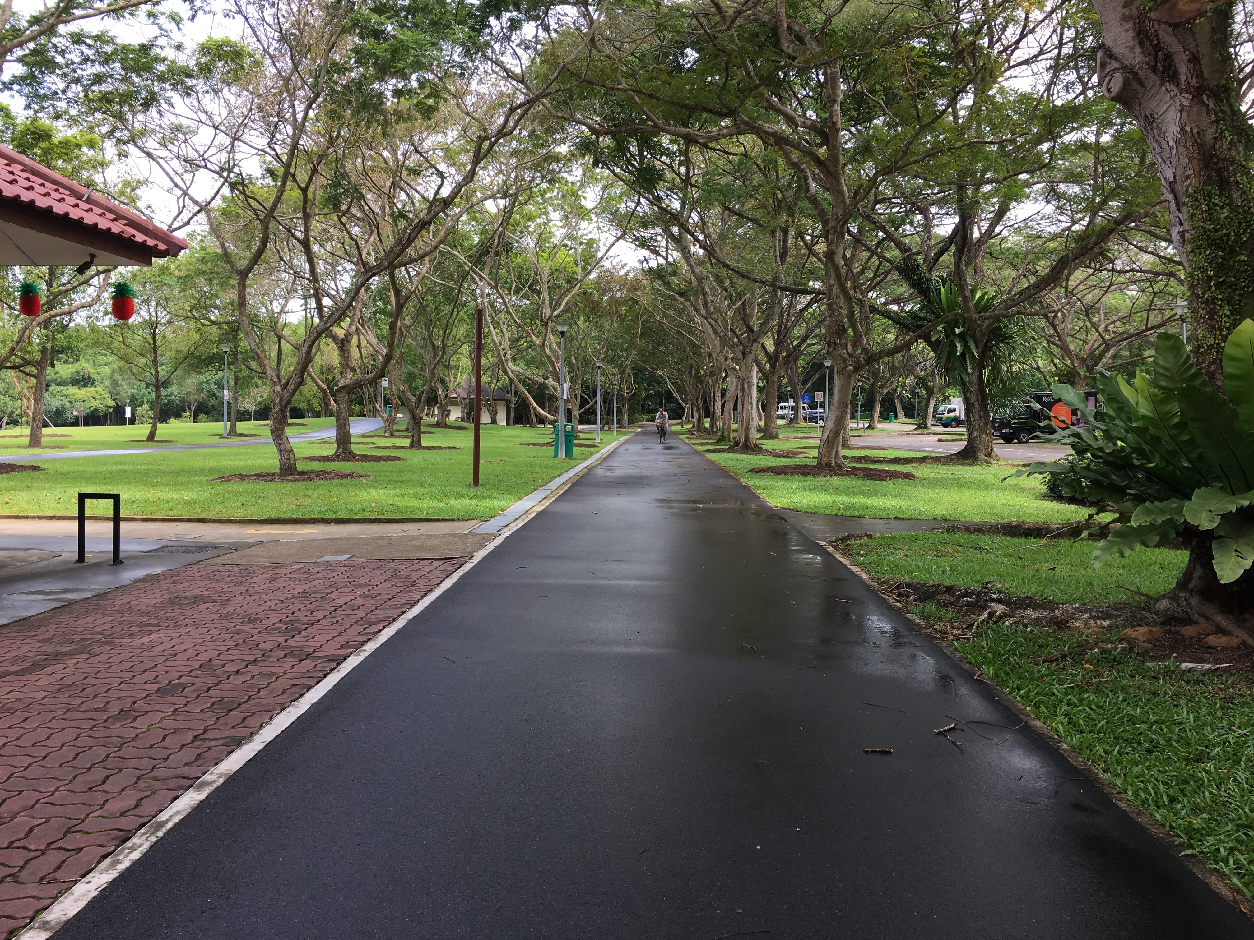
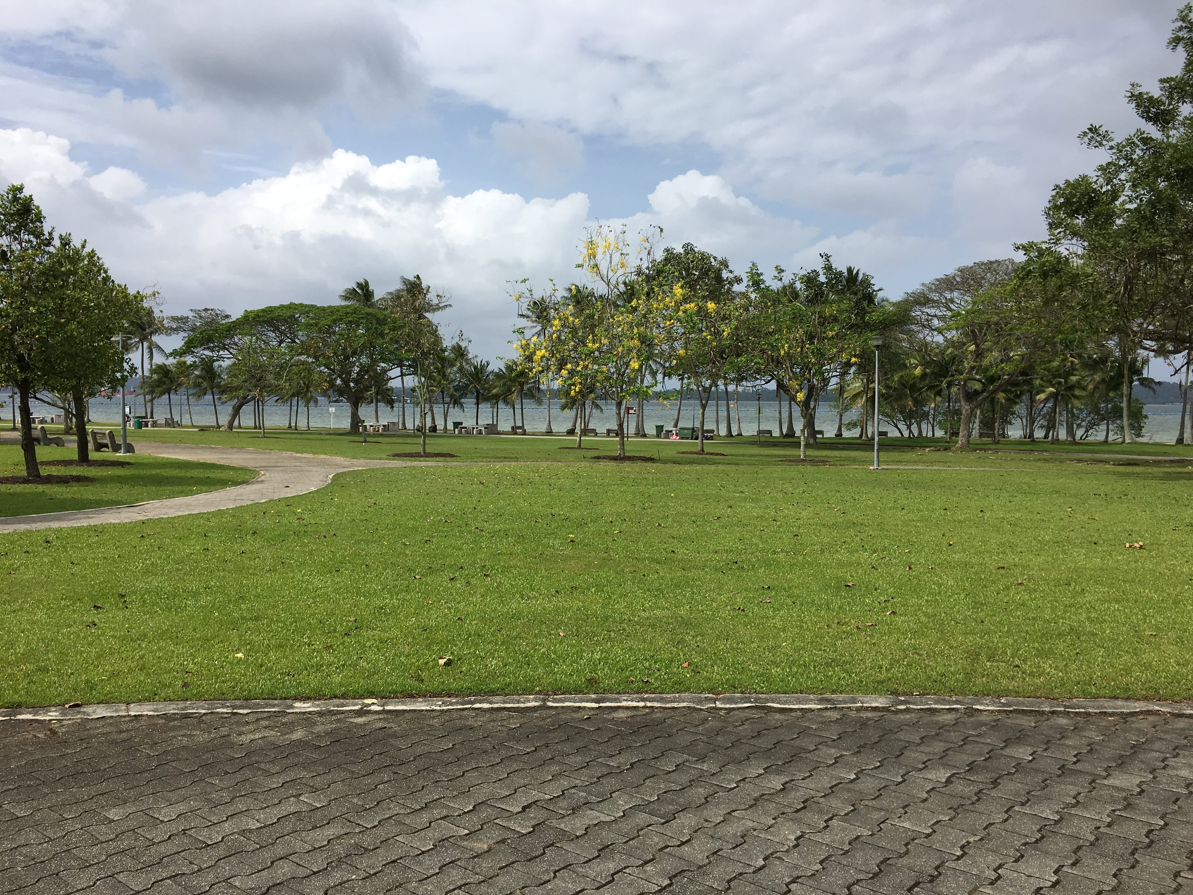
Pasir Ris Park is really a very nice place for family to chill and Relax during the weekend:) It got really great view and fresh Air. Beside, there is alot of nature entertainment for kids to enjoy like the mangrove walkway, bird viewing tower, kayak, bycicle, horse stable, spice kitchen etc. It is also a really good place to exercise! 

Kids’ Playground
img_5491-minimg_5496-minimg_5482-minimg_5483-min
img_5487-minimg_5492-minimg_5484-min

img_5494-min
You would have to climb up this mini robe maze to reach the tip of the slide.

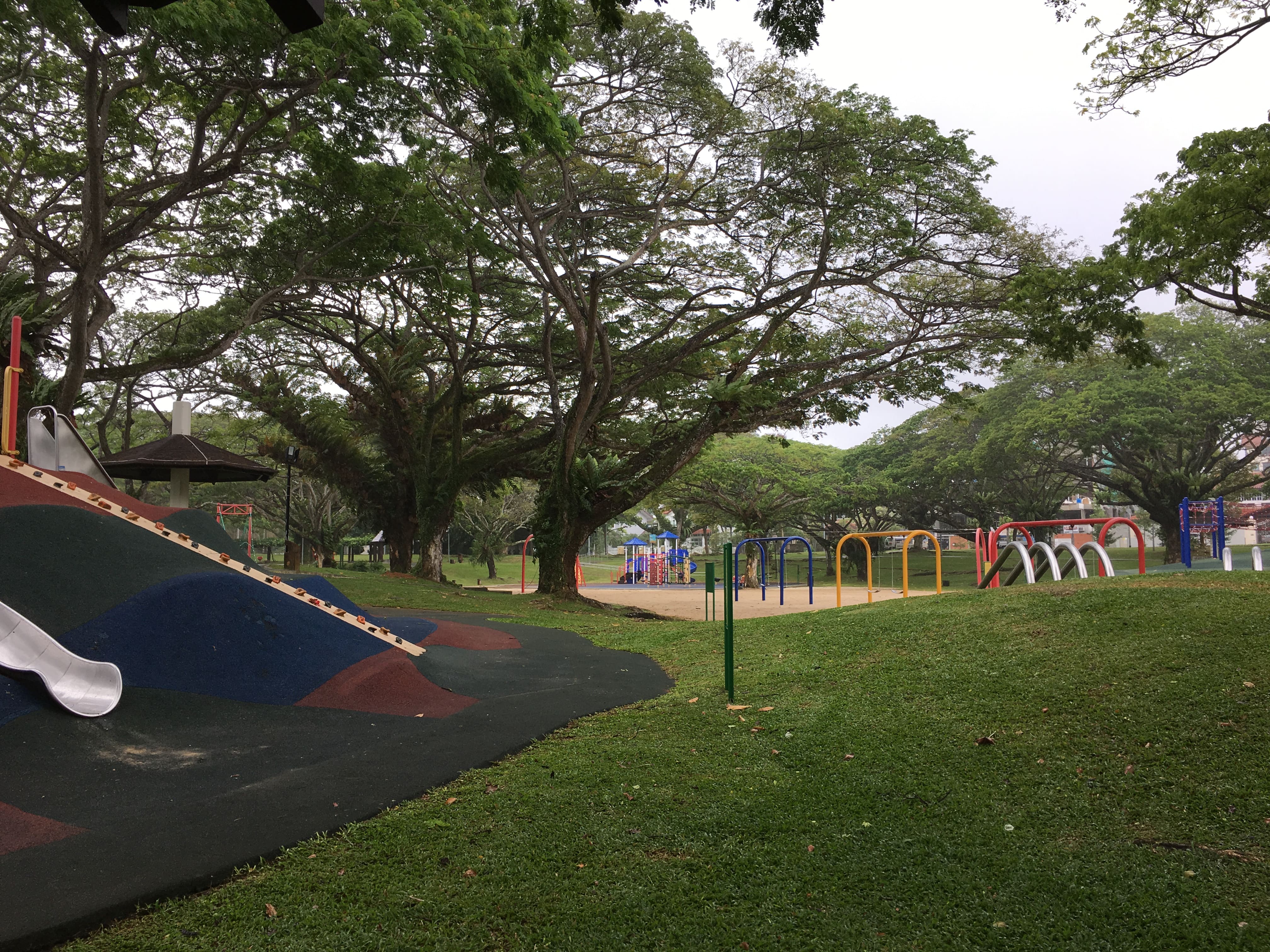
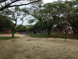
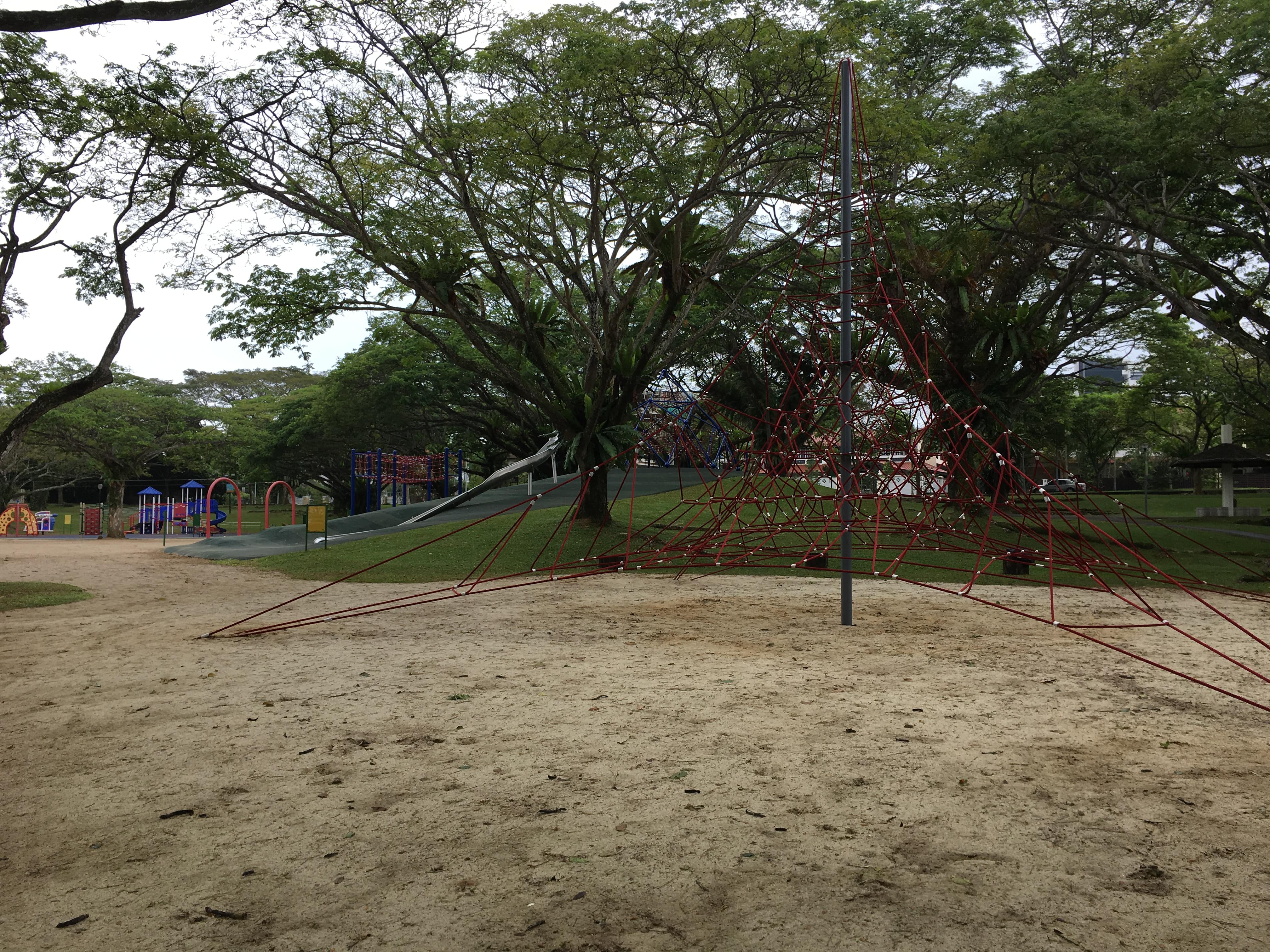
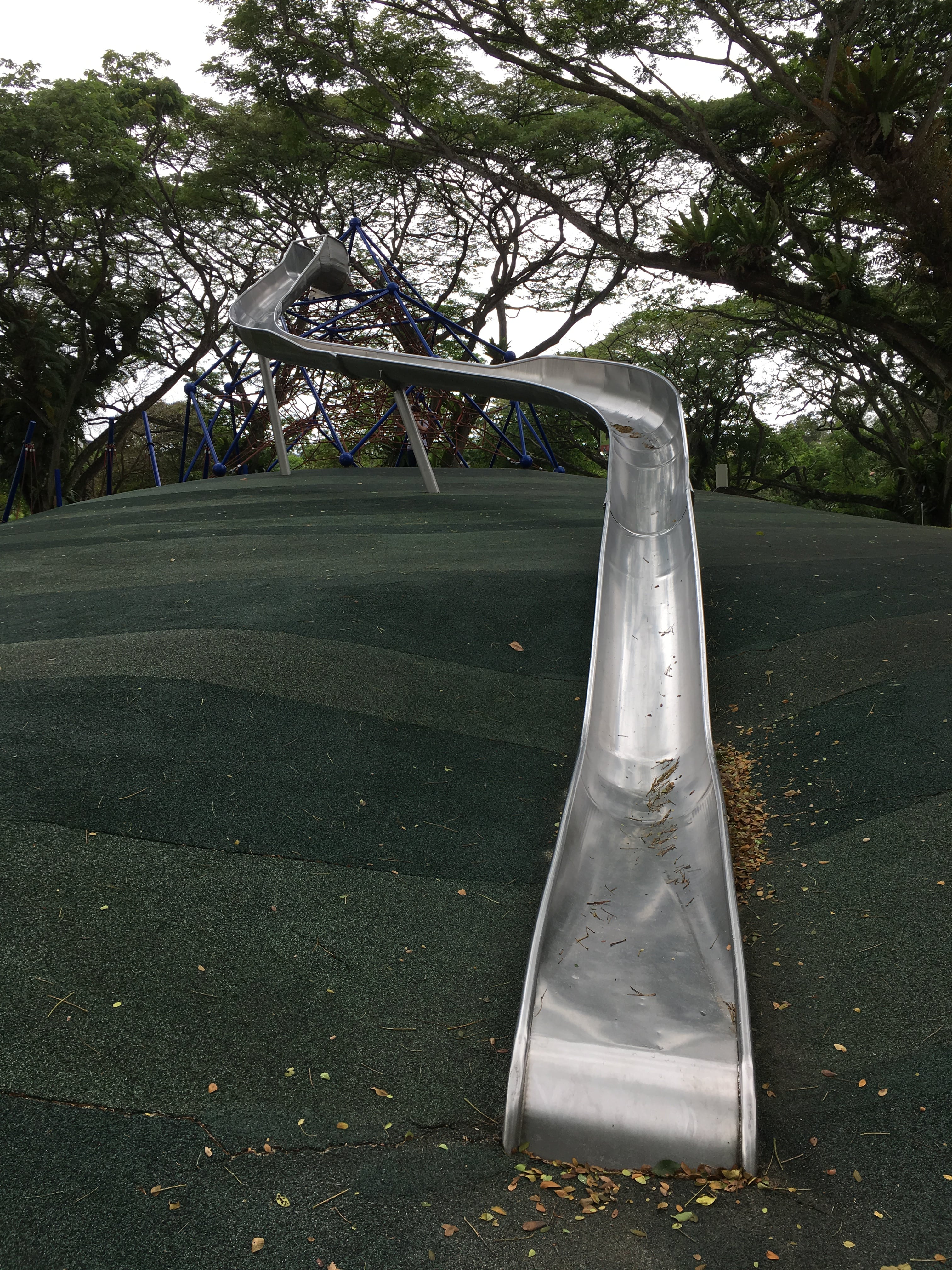
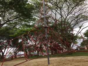
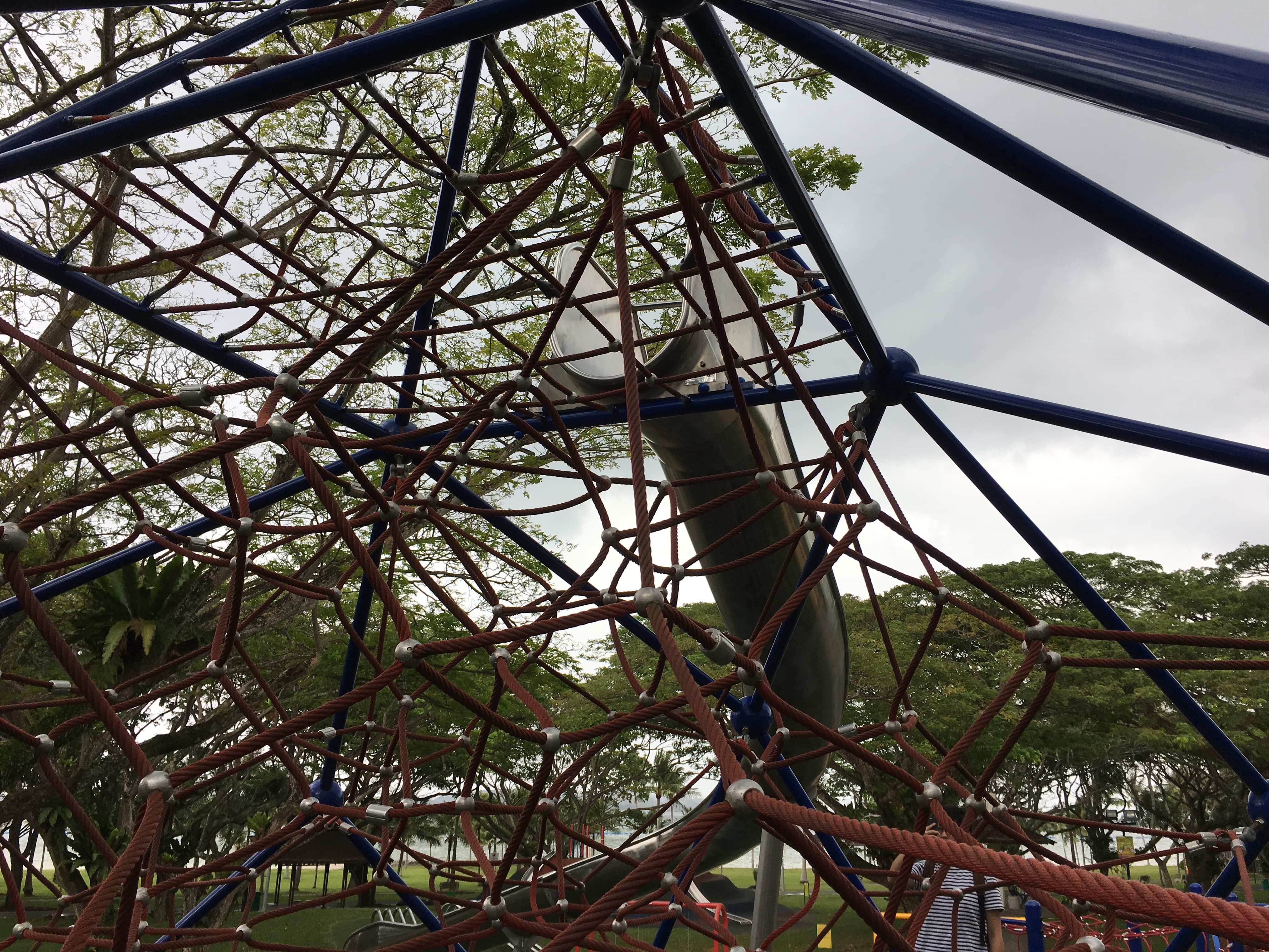
The first place that I saw when I reach the Park is the Kids’ Playground. It’s main attraction would be the red pyramid like rope maze for you to climb. The playground is really huge and not like the typical playground where you only have one main construction to play in the middle of the are. But this playground is split into alot of different section with many unique rides that you don’t really see in neighborhood playground. I wanted to slide down the long slide, then I realized in order to slide down, you would need to climb up the robe maze to reach the tip of the slide. Ok, Im too old for that, besides, I’ll probably stuck on the slide. 

Horse Stable

img_5511-minimg_5509-min img_5514-min
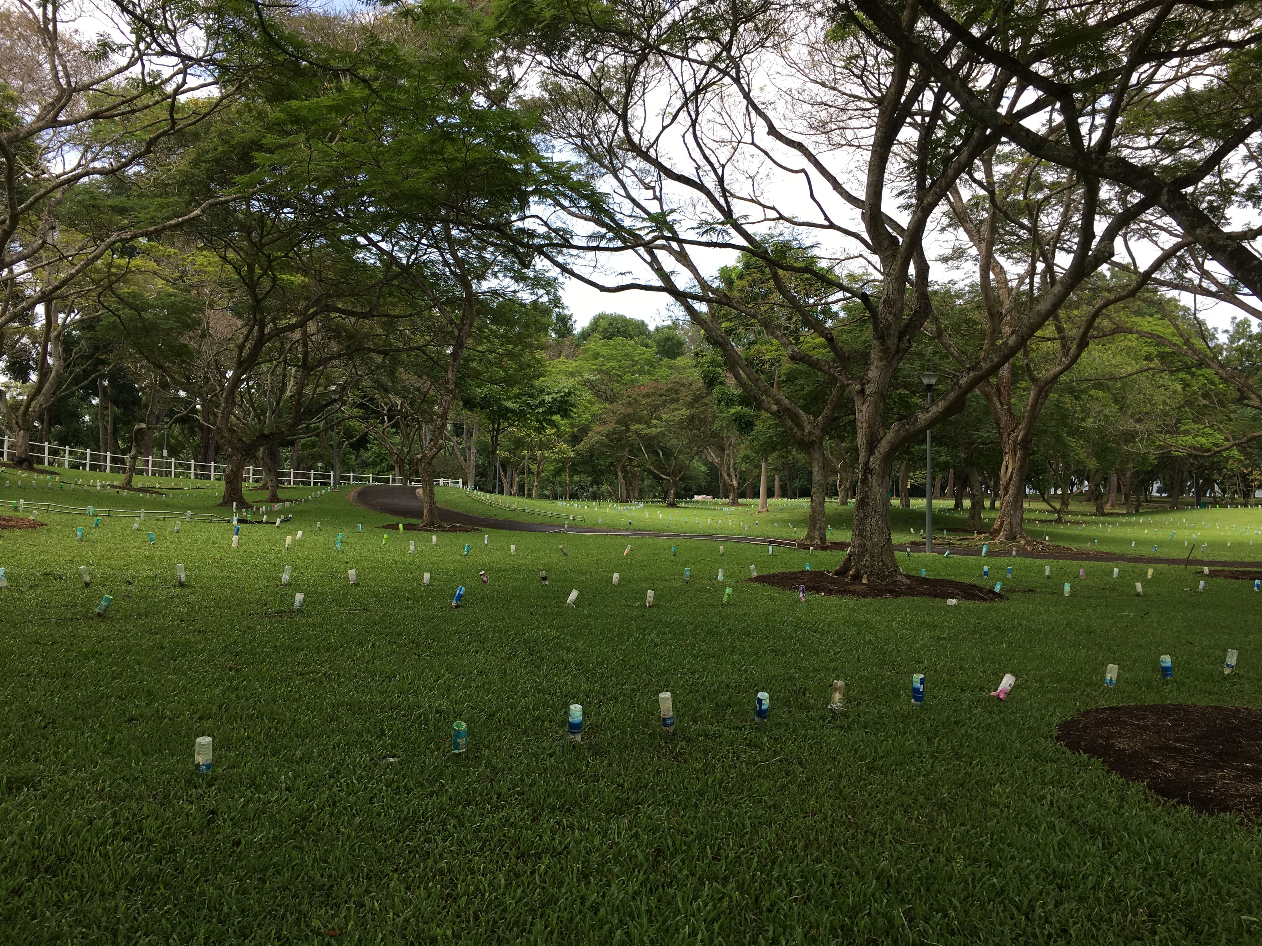
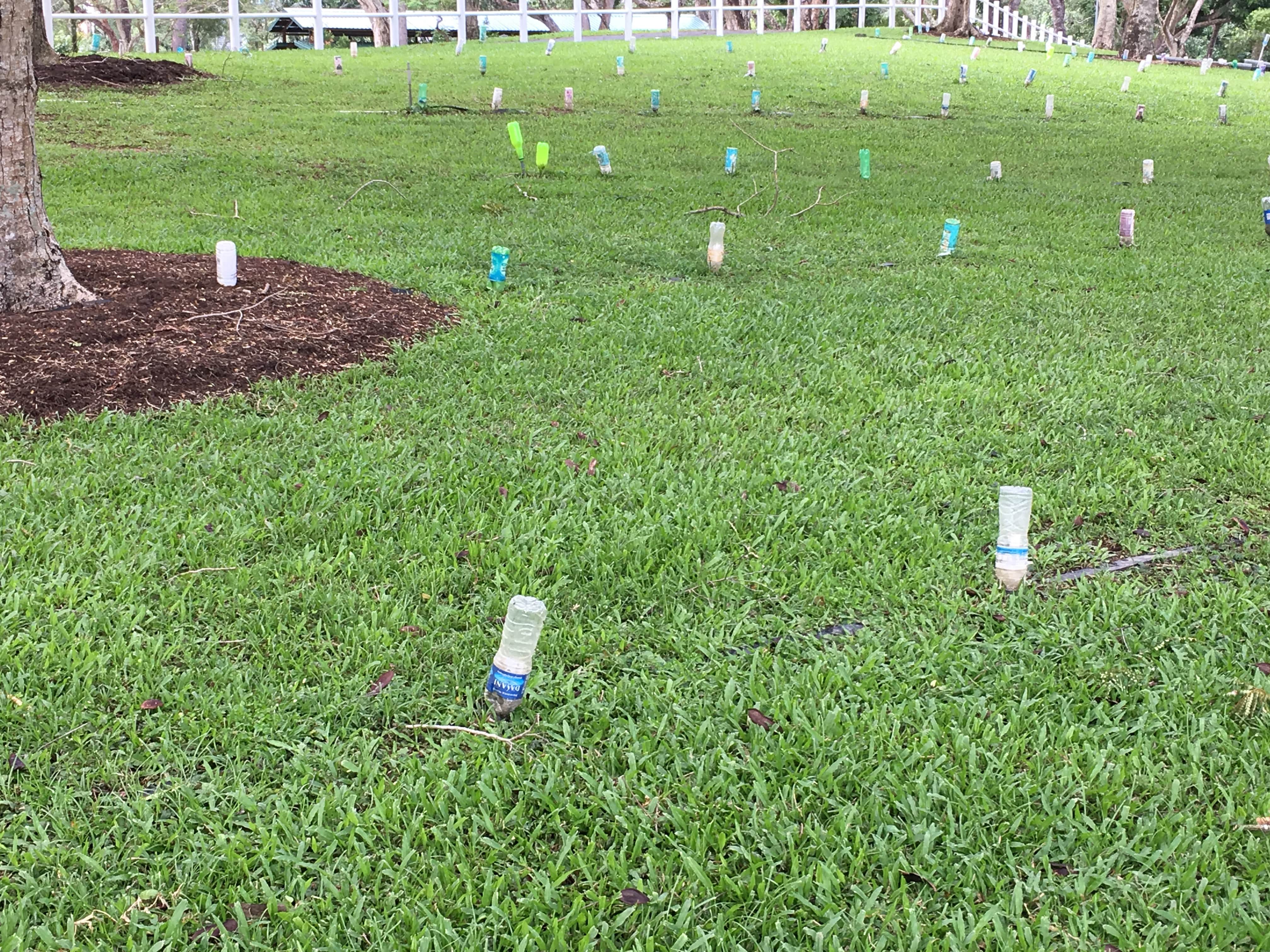
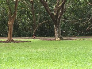
The horse stable it on a mini mountain like ground. And it is located pretty deep inside the park. Most probably if you want to visit the different area of the park a bike would be recommended:) It also have a walk way barrier that is most probably for the horse to guide them while visitor experience horse riding. And if we take a close look the barrier are actually made up of water bottle! SO RECYCLE! However, we were really disappointed because we didn’t have a chance to see any horse most probably because they are renovating. But instead, we saw CHICKEN! HAHAAHAHA!!!!!!

Bird Watching at the Bird Tower

img_5523-minimg_5527-min
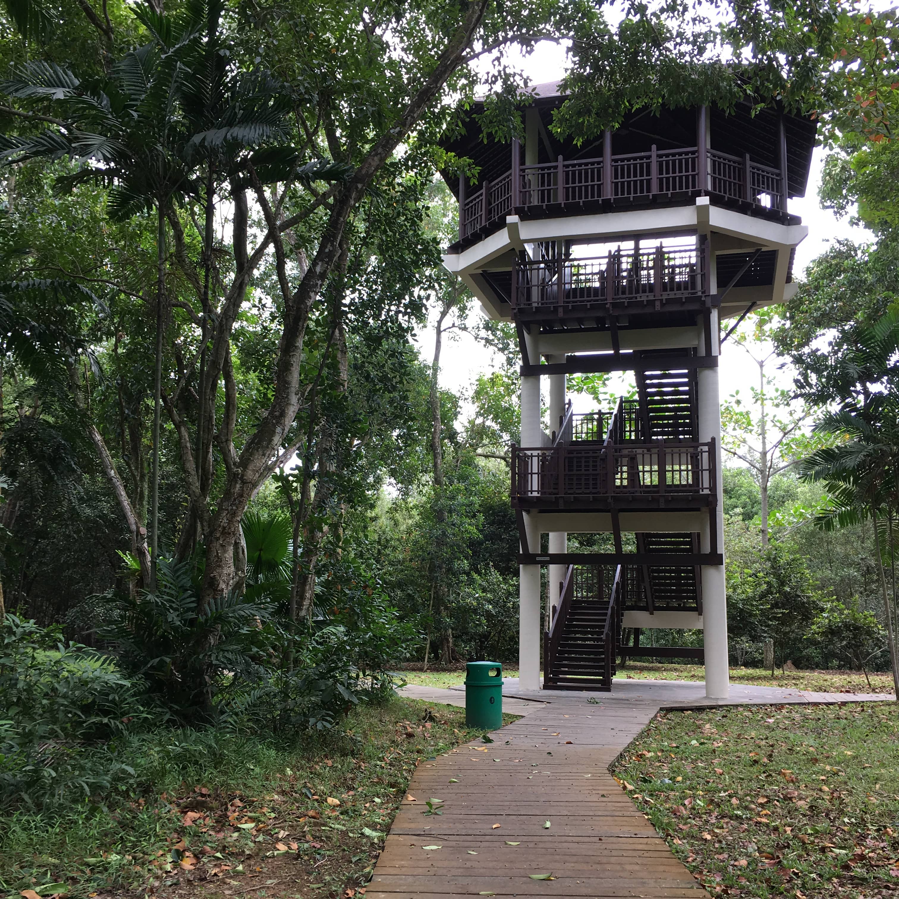
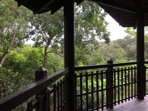
The bird eye tower is located a little infront of the horse stable, but still quite a distance. You can climb up the tower for birds watching. But honestly, I saw more bird on the ground level than climbing up. Professional bird lover also place their camera on the ground level. But we do spot couples up there though, Valentines Day mah:)

Mangrove Swamp

img_5540-minimg_5544-min15134004726_04ce2082df_bmonitor-lizardpasir-ris-mangrove-swamp-1315157034745_0fc1ec5e65_b
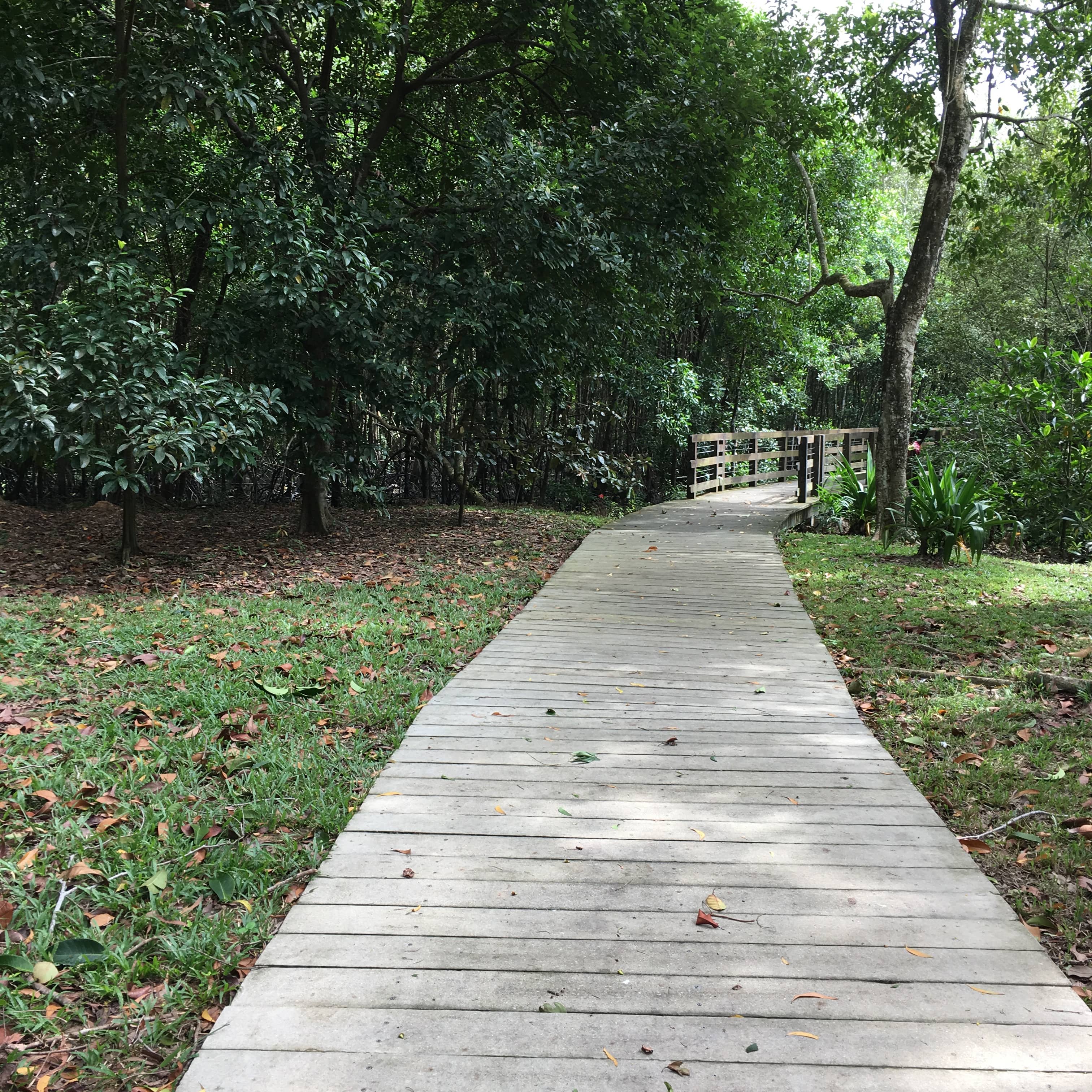
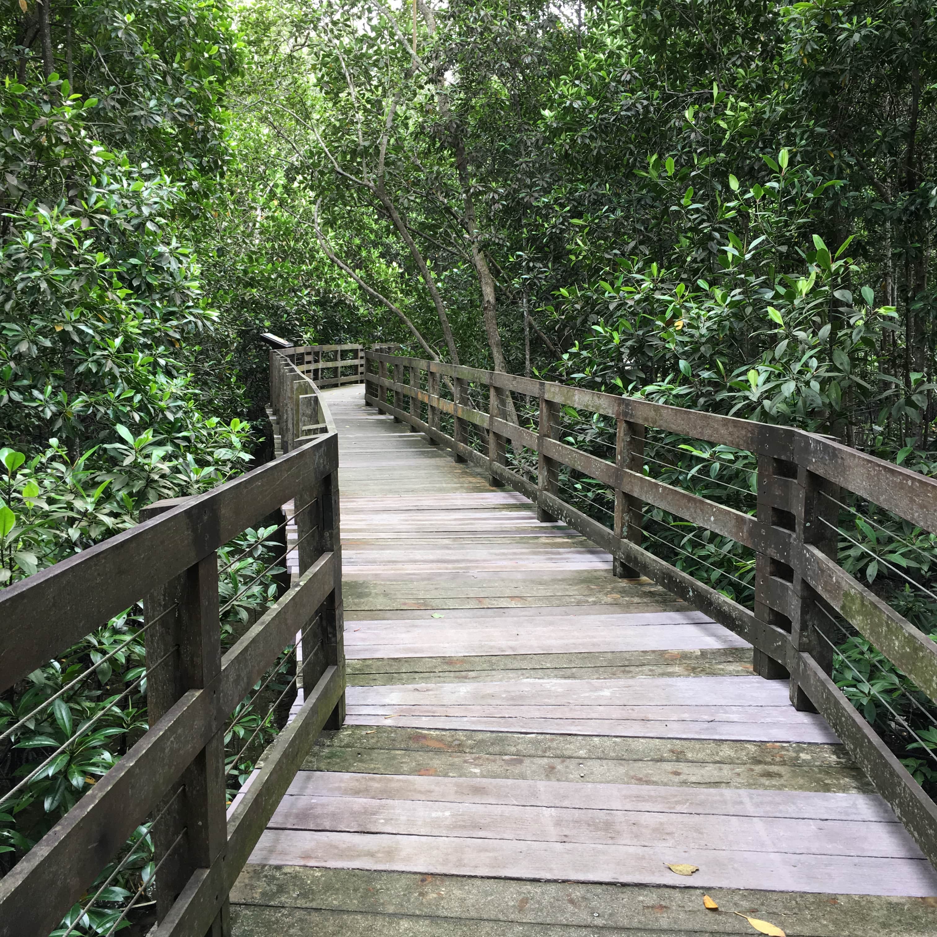
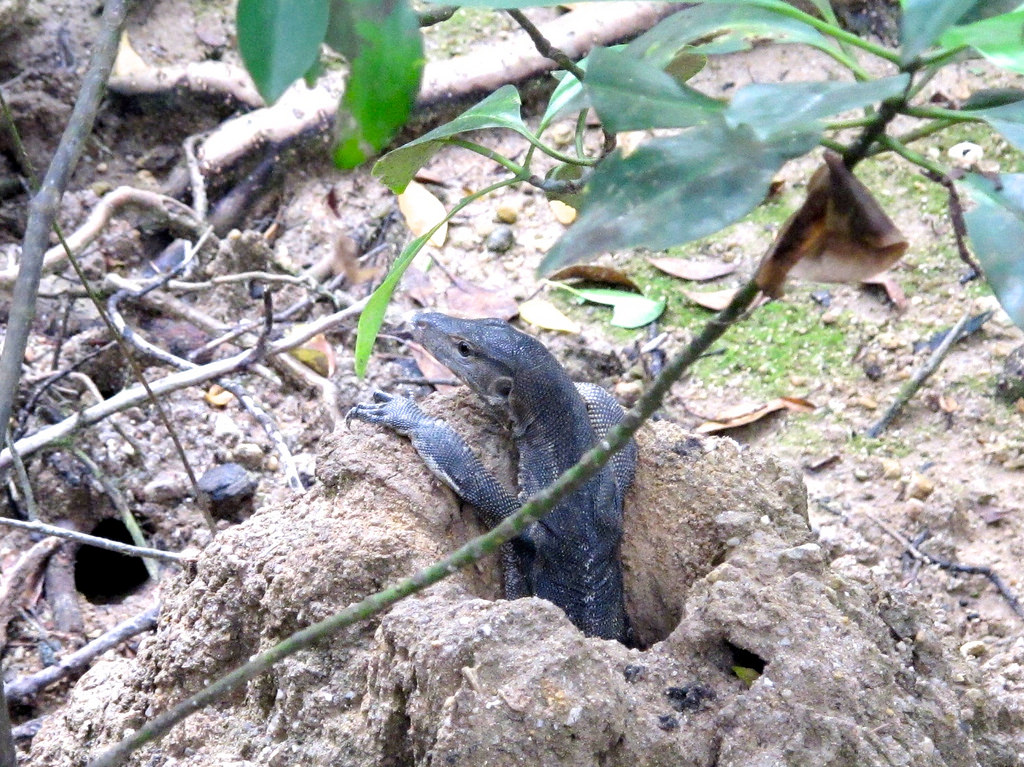
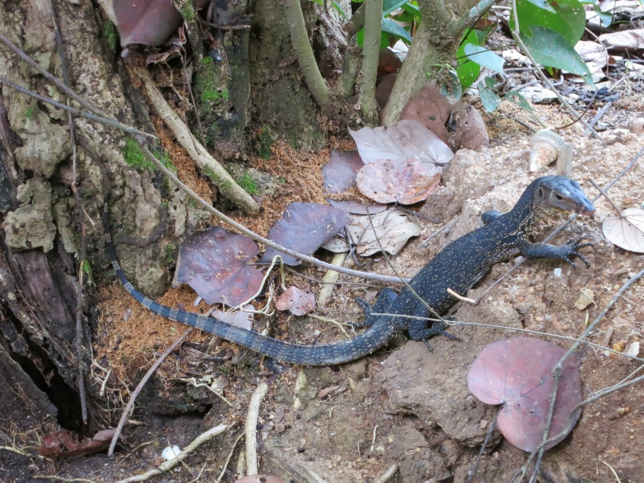
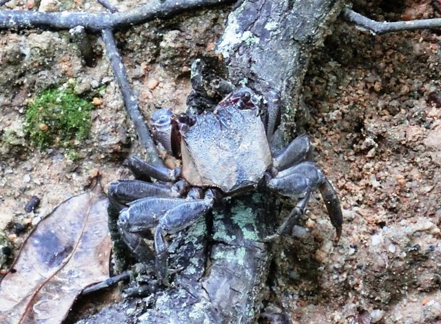
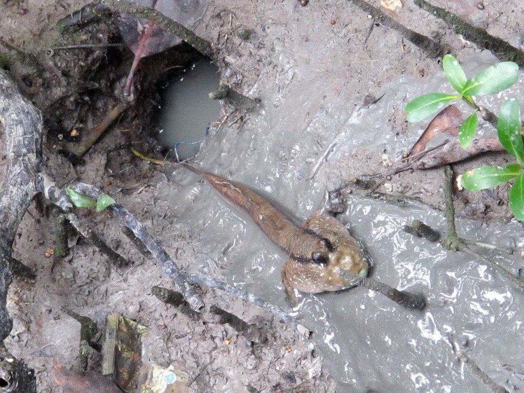
At the both side below the bird tower is the entrance to the mangrove Swamp. It is a long wooden bridge like walk way for people to look down and explore things like crab. To be honest it’s pretty silence and a little creepy because when you’re walking inside you have no idea what is going on outside. All you can see are tress and plant. Also also prepare mosquito repellent:)

Maze Garden

I was a little reluctant to go in atfirst because it just looks like there is alot of insect inside of something is gonna crawl out in any moment. Haha, but If you are here with kids I don’t know if it’s a good idea to go inside. The plants barrier are pretty high so is not a simple bonding maze for family haha!

ESTATE

img_5546-minimg_5549-minimg_5551-minimg_5576-minimg_5556-minimg_5555-minimg_5550-minimg_5547-minimg_5568img_5579-min
Based on my research, Pasir Ris to me is relatively a new estate. All the new project and facilities that the government have created for this town is all mostly to serve the purpose of family bonding unlike places like Ang Mo Kio, Redhill, Bedok, Bukit Timah. that have alot of history and the usually their main focus is to preserve. But I still believe there is a certain traditional features that you can find in every location of Singapore, and personally I really love the retro elements in HDB probably because I grew up with my grandma in Bukit Timah with alot of old auntie and uncle from their old kampong. Or maybe I am just searching for that warm I used to get from them. 

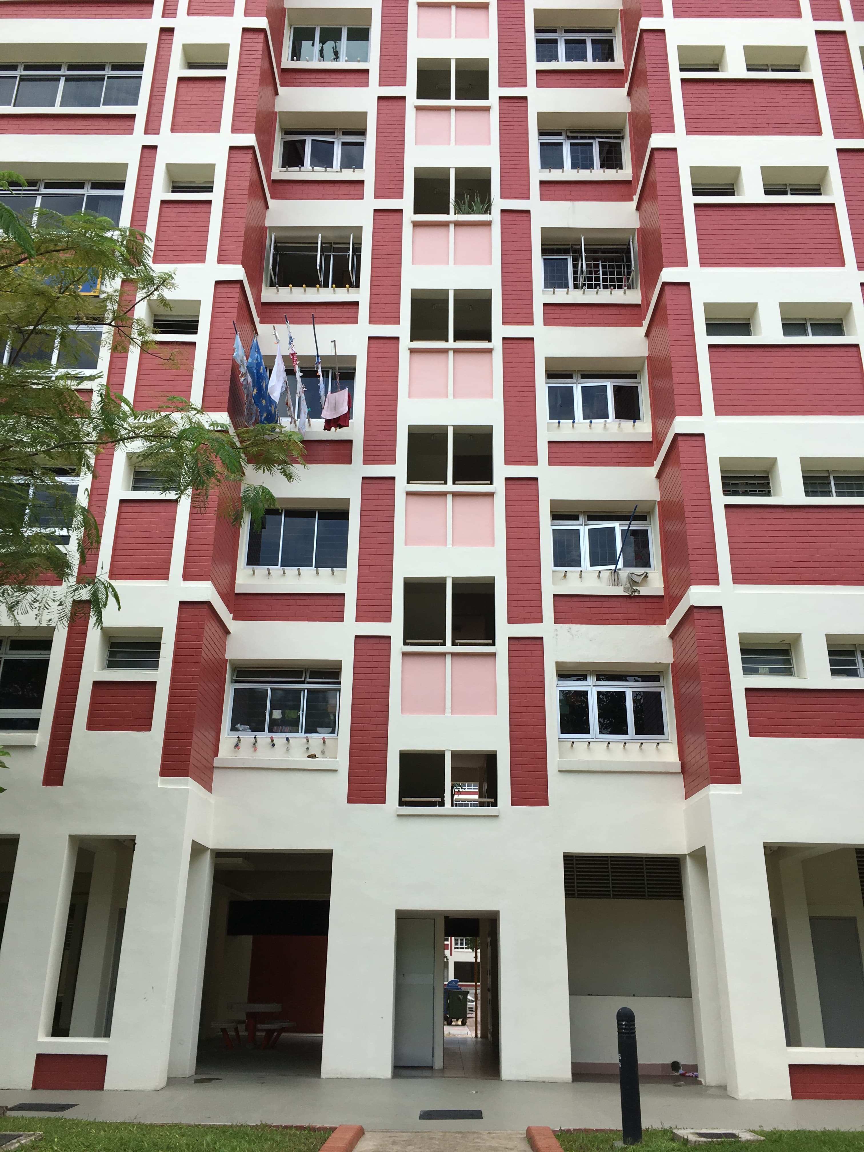
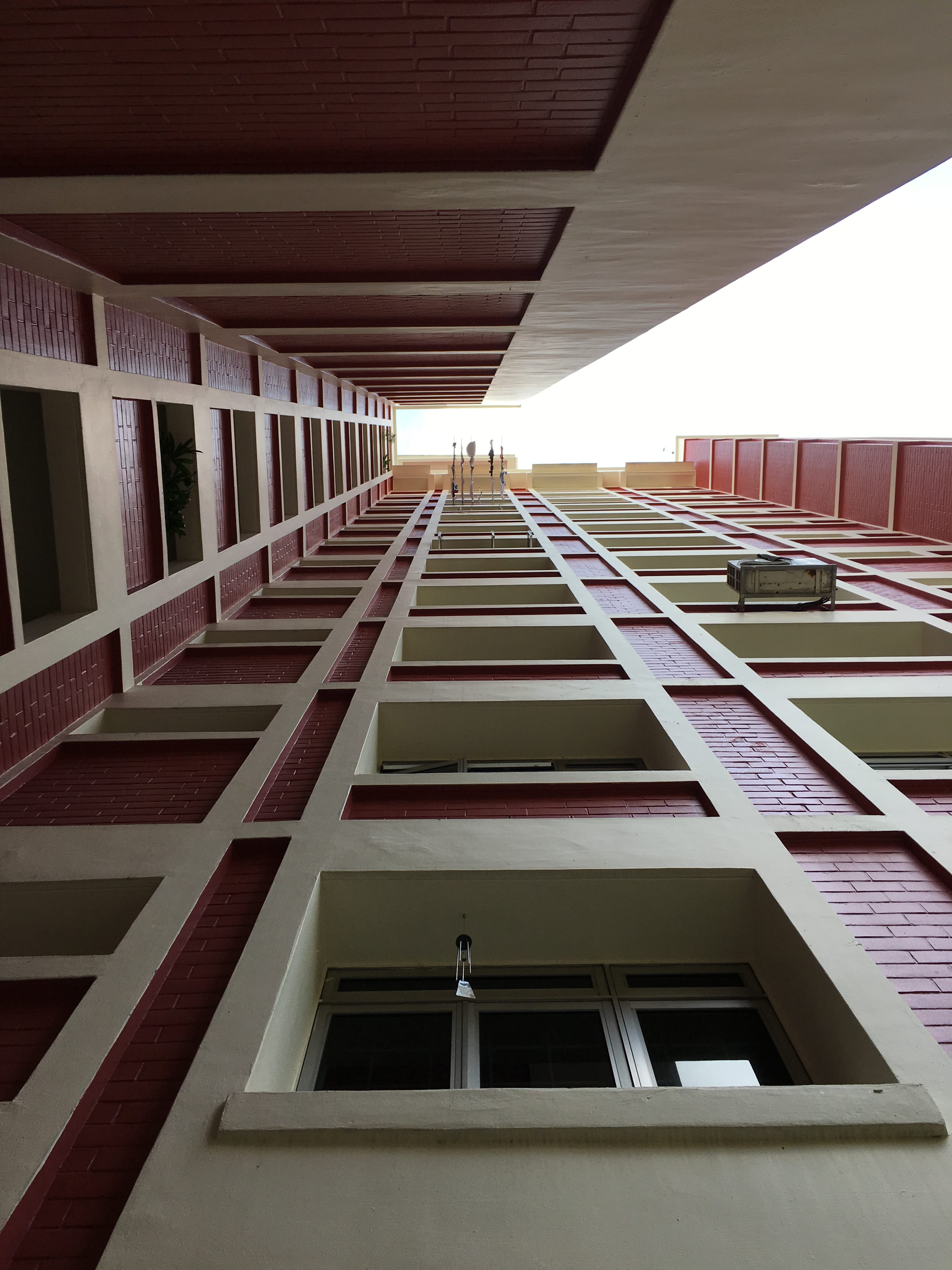
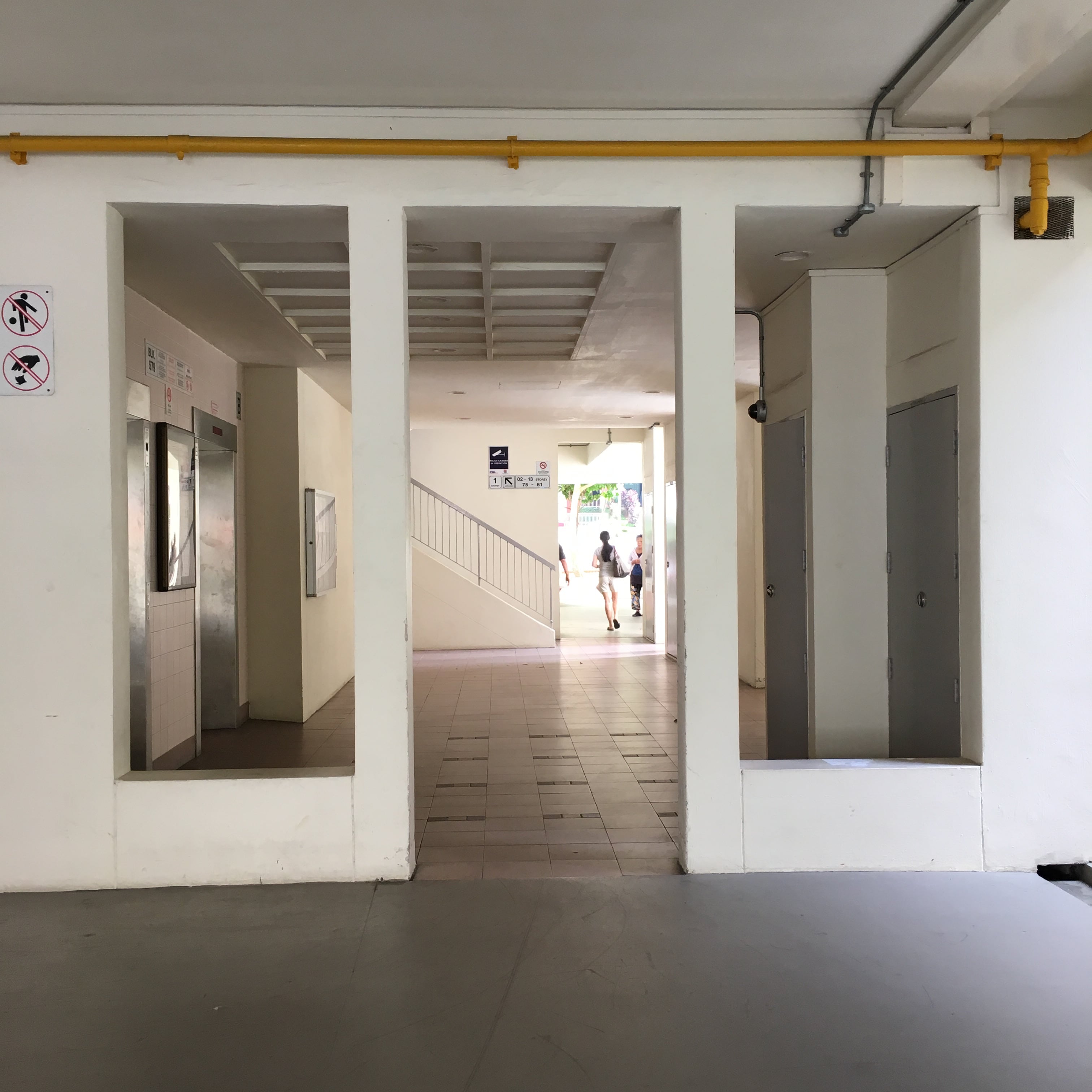
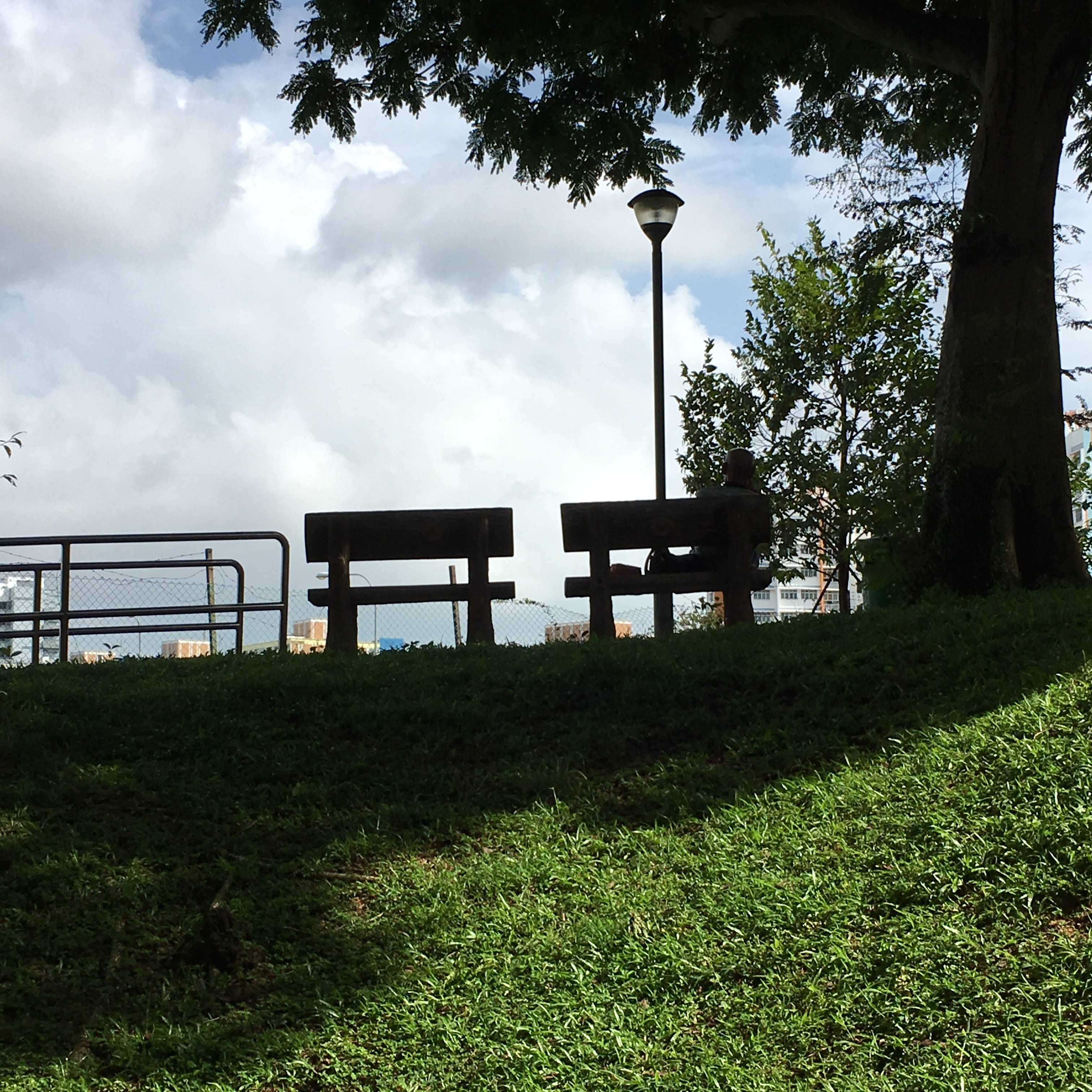
I went around the HDB trying to find these elements and I realized that is really really hard. In Bukit Timah you would see void deck full of ah gong and ah ma from your block gathering and chit chatting and it’s really really loud sometimes to the point noisy. But you would never feel alone or scare when you travel home, if you’re afraid of being home alone just stay at the void deck. But here in Pasir Ris, it is totally different, the void deck are so quiet and even if you see a family they are young couples. Not even little kids running around.

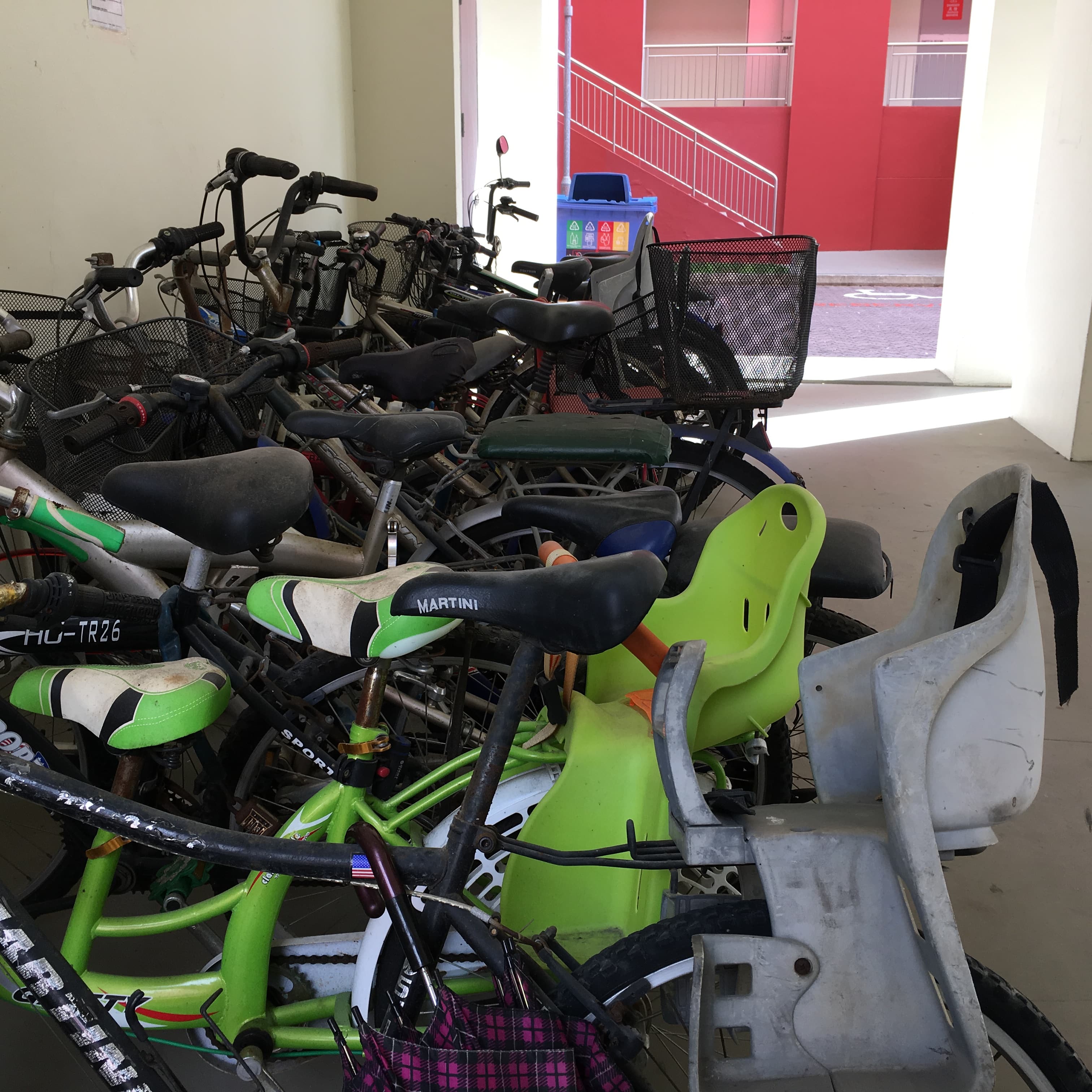
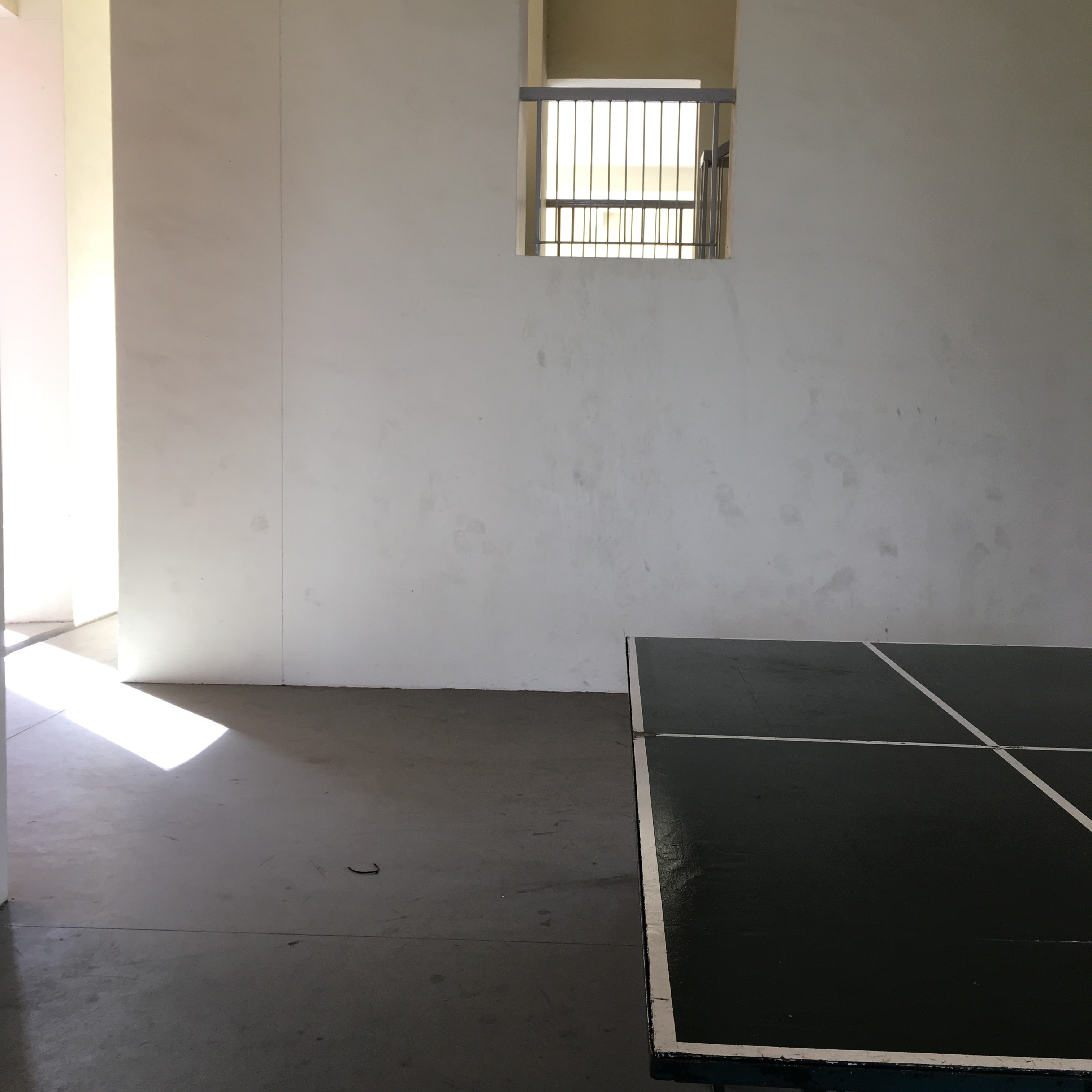
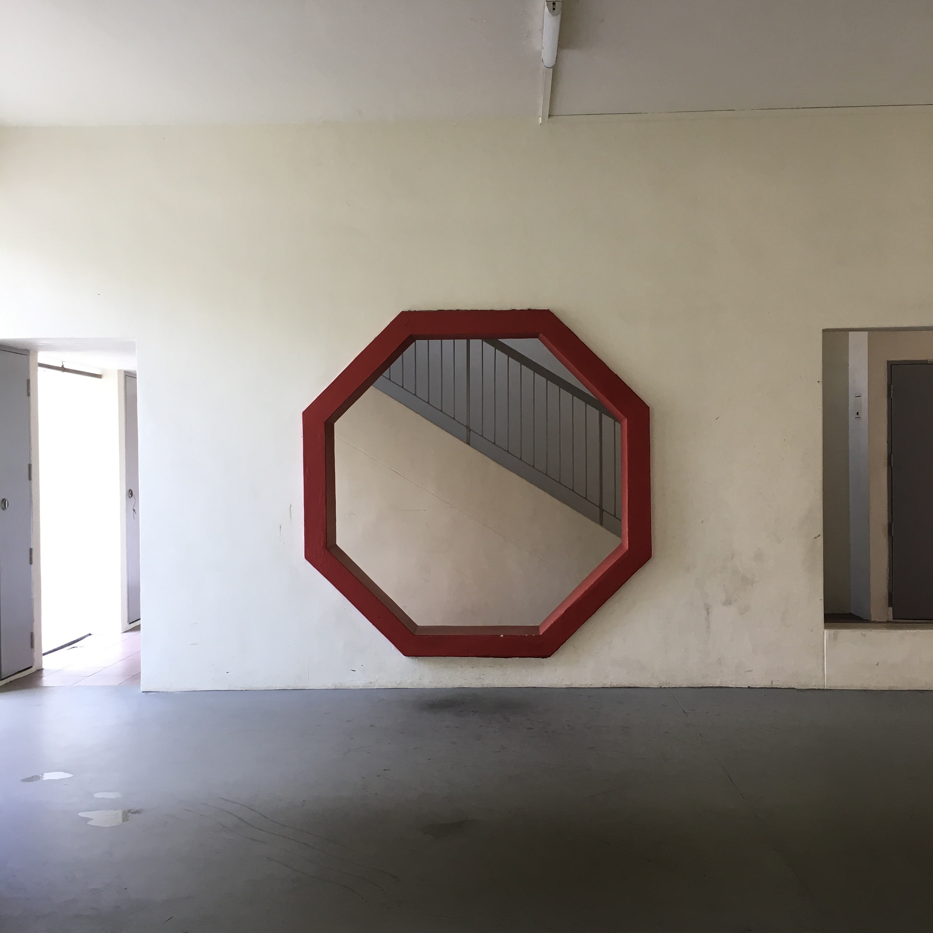
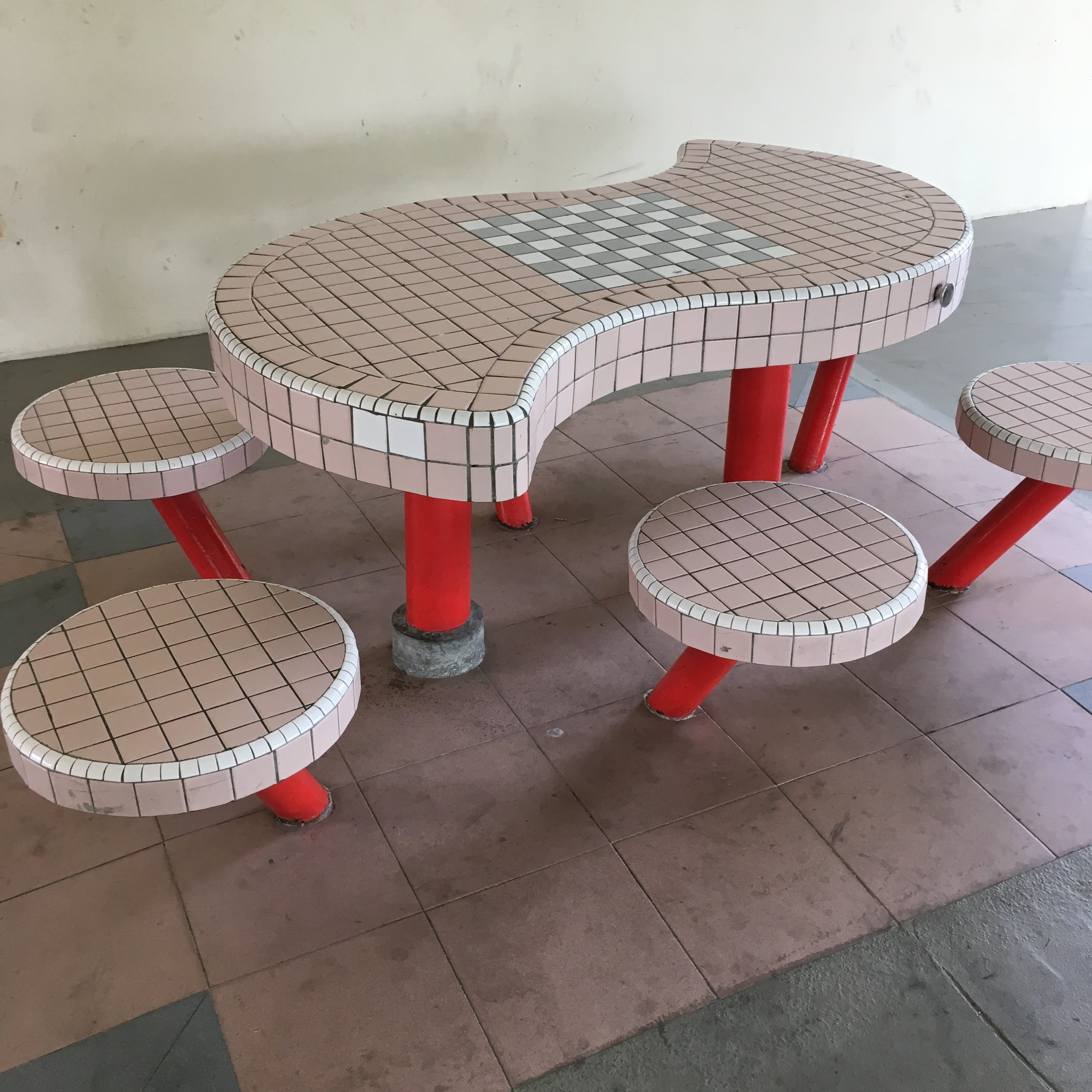
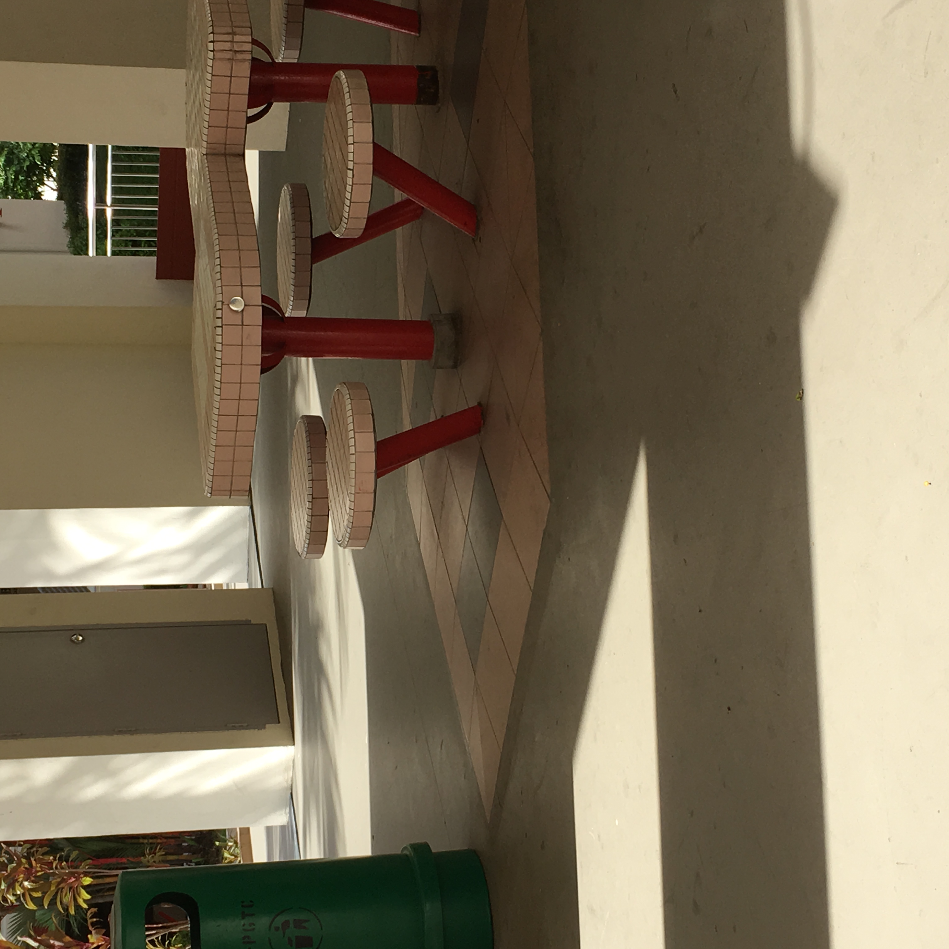
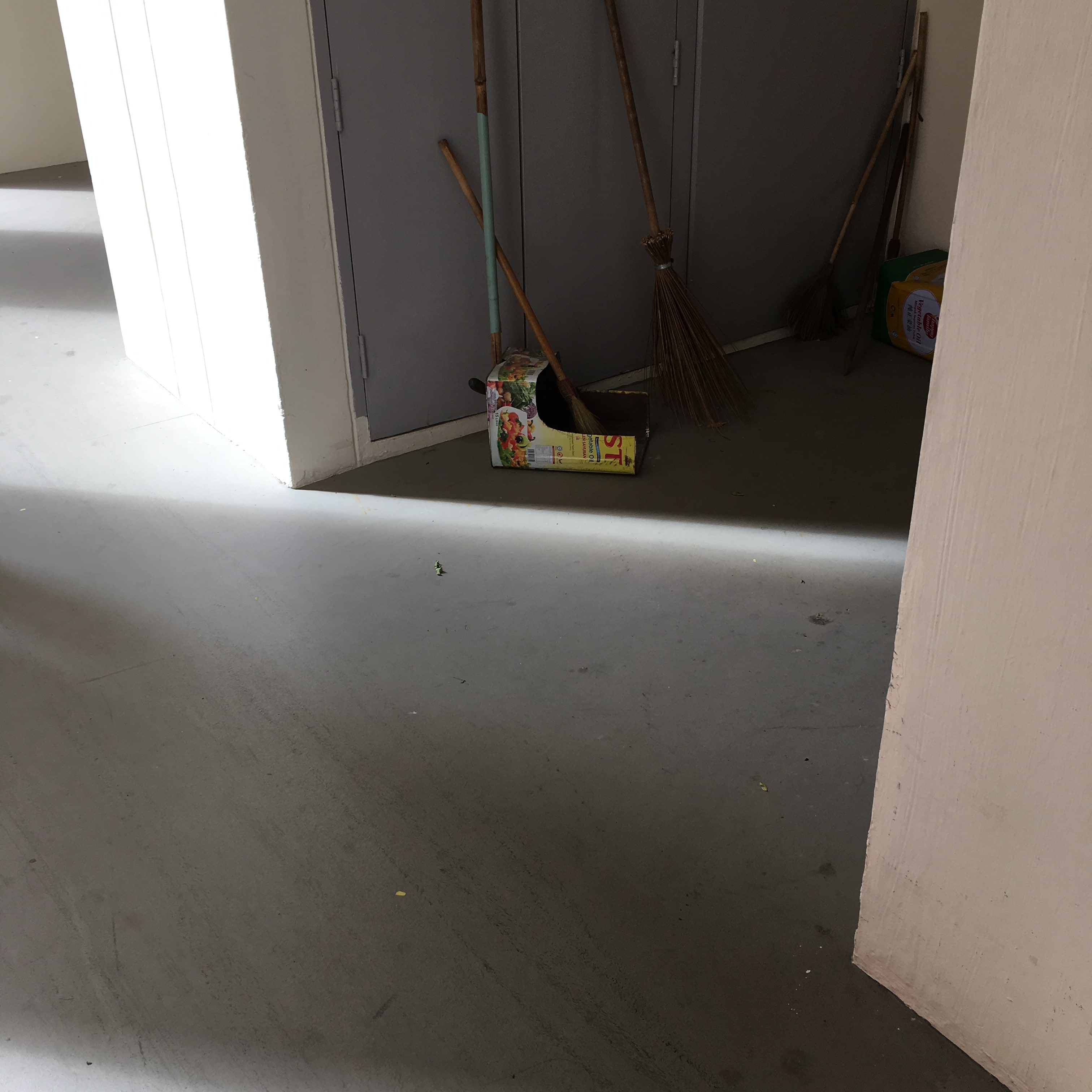
I manage to spot some traditional elements like the bycicle lock, new ones are two stroy high and some come with lock. Not all void deck have table tennis table for people to play and also the most iconic tiles table and stool. Or the hole in the pillars and also the metal tin dust pan. 

I feel I should probably visit the place where resident buys their groceries or kopitiam to further understand the life of resident there:)

BACK HOME,

Back home, I went to do more research and I find places like,

A very beautiful Public Library. It is a reopen library cater to the public and is design very modernly with many new technology. 

Then, I found a page about retro Playground in Singapore, I am very fond of retro and there isn’t much retro playground left in Singapore. So When I saw this I was extremely happy! But sadly I only found this on the internet after my visit so I didn’t have a chance to visit 🙁 

img_2953 kp1070073
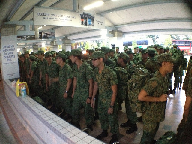
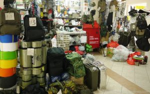
On consultation day, Hao Ran also old me that Pasir Ris is a place for army boys to gather when they book in for Tekong, and there are many shops there cater for them!!:)

slide_20130927ik7pcsc2fnsm_1
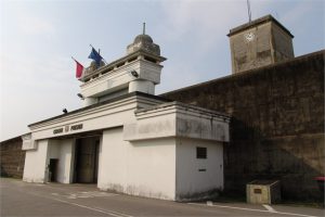
I didn’t know Changi Prison was near there, and there is a term call Changi Chalet?

On Pinterest I also link to places like:

b1daf66f5d234e85e3f992d42ae8e301
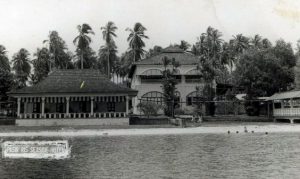
The Pasir Ris Hotel, circa 1962-64.
8bfb75a05fd08e3e2bf282ca31edd2ea
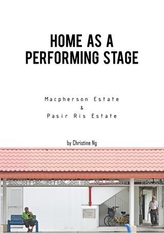
This book showcase activities happening in Singapore Housing Development Board (HDB) estates – Macpherson & Pasir Ris HDB estates
3c2f4284395d88a15a6f727a5387ab5c
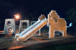
Elephant @ Pasir Ris – Old Singapore Playground

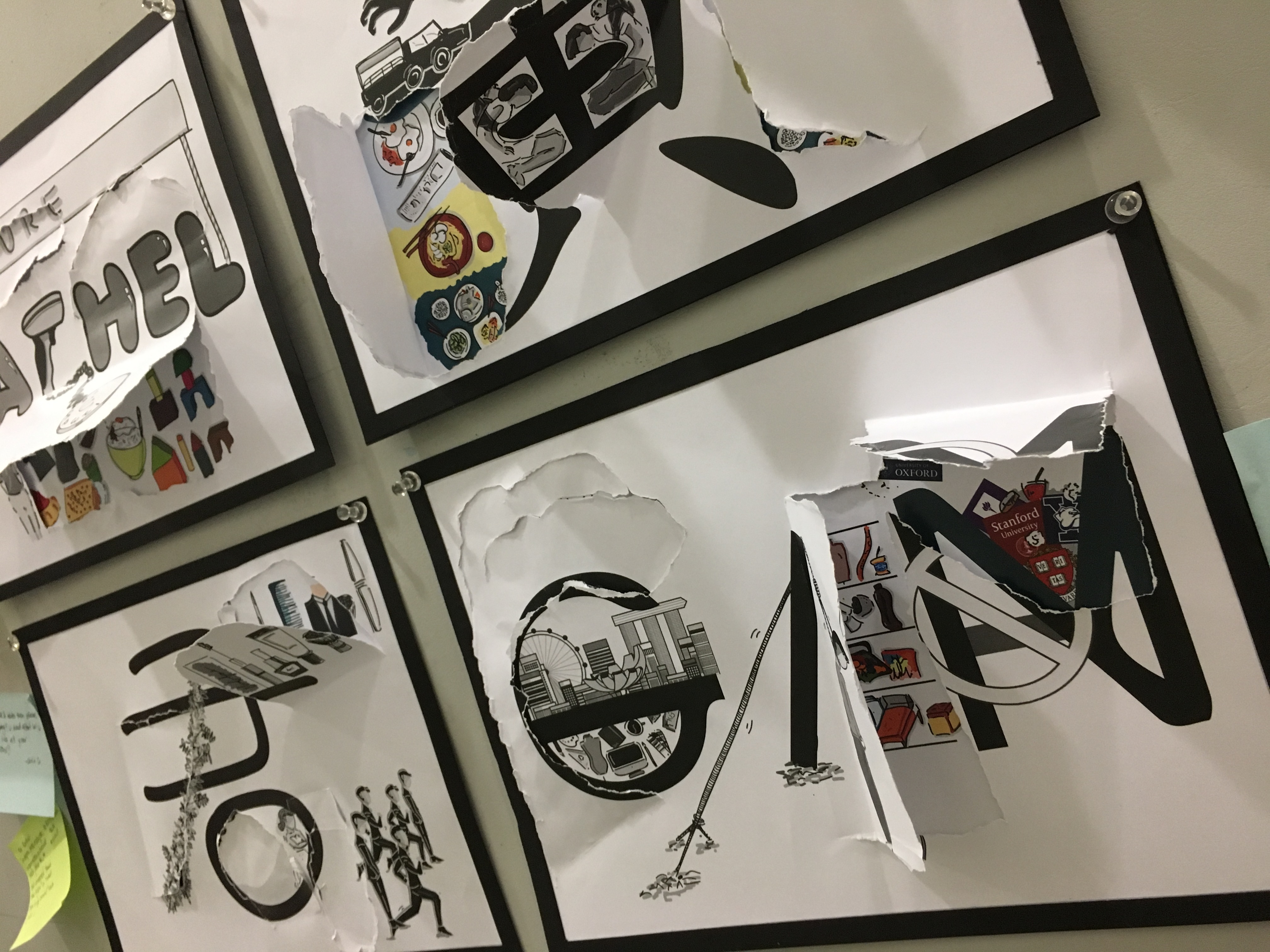
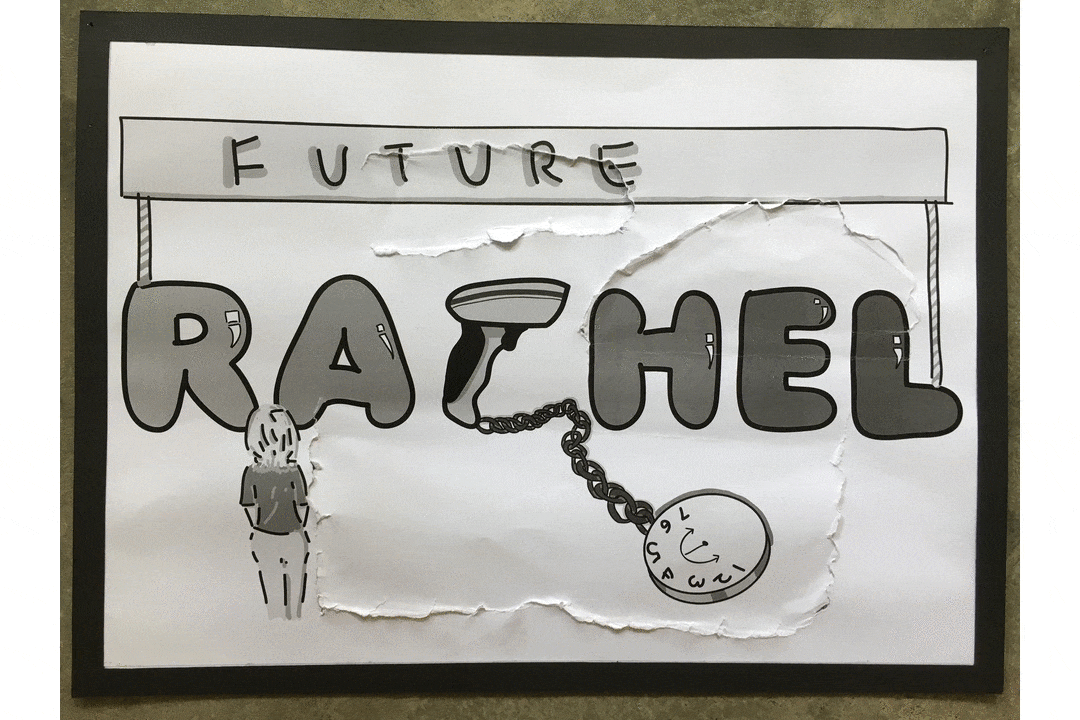
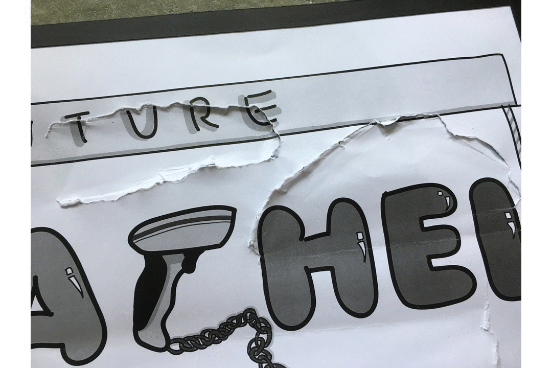
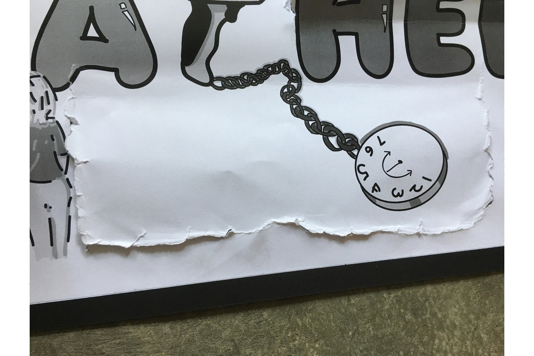
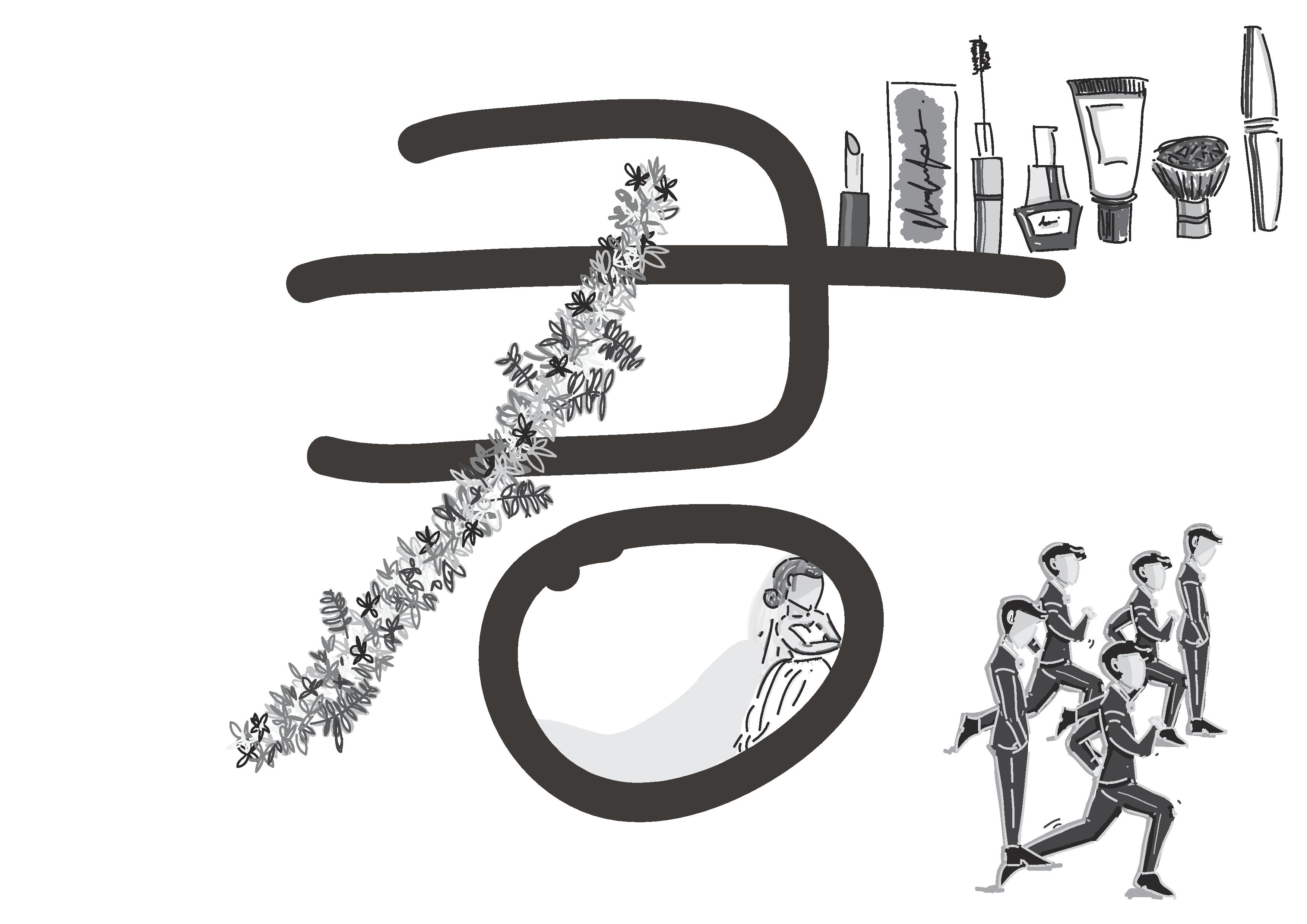
Consultation helps me to set my direction more clearly. Now I needed to gather all the elements I need for the info-graphic:)

BONUS: STUPID RAIN IN PASIR RIS!


3D II-(Project 1) – Gift (Process & Final)

Minty Mouse

After interviewing Sammi, I’ve decided to pick out some of her interest and work my gift around these area:) I’ve pick out interest like:

Girly Stuff
Not able to sleep on a regular timing (Sleeping at 4am waking up at 1pm)
Stress school life
Preferred usefulness in gift than ornament
Appreciate hand made and customized gift

After doing some research:

slide2

slide3

slide4

slide5

slide12

slide13

slide14

slide15

slide16

slide17

Then I came out with…..

img_5262

img_5253

Minty Mouse

It is a crochet Mouse (Sammi Zodiac is Mouse), it comes with two bottle of essential oil, Lavender and Eucalyptus. Sammi could drip the essential oil onto the mouse and she could place the mouse beside her bed. Kept with her or travel with her. The essential oil would help to ease her sleep as well as help her release stress. 

Behind the Scene:

Initially I wanted to create a human crochet doll, but Peter suggested that I could do something like a snake or just a head of the human or her  zodiac sign a wriggly mouse with thread coming out of it. But bringing back to the idea of her liking girly stuff. I decided to make the mouse cute so she could really use it, as she preferred gift with usefulness. 

Making

img_5105 img_5151

img_5076 img_5155img_5156

2D II-(Project 1) Que Sera Sera- Final ! (3)

img_5286

FINALLL

For the final presentation, I’ve created a front and back interactive work. The front which is in black symbolizes the stereotype thought I receive from people regarding the job I wanted and the back coloured composition symbolizes what I believe this job means to me. 

The four job I have since a child was:

Cashier
Lorry Driver
Mortuary Make Up Artist
Designer

My Name Is:

untitled-1-page-001untitled-1-page-002

And I Am A Cashier.

output_izggi6-iloveimg-compressed
Please click!:) its a gif

Type: Why I uses this font and why I selected this part of my name

Rachel = Rachel’s very first Job
(Font = bubble, the very first font I use at that young age to draw every thing)

Story behind each illustration:

output_m5syxe
Please click!:) its a gif

People always assume being a cashier means no future. On the front composition it shows a girl looking at the banner future and never be able to pass it. However, at that young age when I wanted to be a cashier people always tells you that your future is always bright and full of colours. Thinking back now I hope everyone could continue to have that positive mindset towards our future and be confident of what we want to be in our future career. 

output_v0hnq2
Please click!:) its a gif

Sometimes we couldn’t blame people to have that thought regarding cashier as a low pay job. I uses the bar code scanner as alphabet C and it is being chain to a clock with only time 1-7 and clock hands who only goes in a U shape meaning that people would forever think this job being tied to a part time life and low pay. However, we can convince people that doesn’t mean a low pay cashier means you would led a hard life. If we flip open it shows how leading a simple life with food like soda cracker with a cup of milo. a bowl of white rice with a fried egg drizzle with soy sauce. Basically if we are contented and led a simple life with the pay of being a cashier is more than enough. 

My Name Is:

untitled-2-page-001untitled-2-page-002

And I Am A Lorry Driver.

output_yrokwl-iloveimg-compressed
Please click!:) its a gif

Type: Why I uses this font and why I selected this part of my name

Huang 黄 = Composition inspire from my dad and I am proud of him/he’s and my surname
(Font = Chinese traditional font showing him as a traditional and stubborn person, not rigid)

Story behind each illustration:

output_paukoh
Please click!:) its a gif

When I first told people I wanted to be a Lorry Driver just like dad, people around me would say “why would want to do such a dirty job?” Assume it being low pay and definitely judge it as a low class job. The hand on the front page symbolize the black and dirty hand people thought this job is. But in actual fact people doesn’t see the amount of scars my dad have due to this job. And also to he’s driver colleague. They have constant back pain due to sitting on the driver seats for too long. And also pain in the wrist and cuts for moving goods up and down their lorry. 

output_olooek
Please click!:) its a gif

As a Lorry Driver people also assume it as a Low Pay Job. Similar to being a Cashier people would see drivers family living a tough life struggling with financial (shown in the front cover a couple with their kid squeeze in a small living  space) and that his job would be all about driving and nothing else, nothing meaningful. However, if you try digging into the life of a lorry drive you would realize their day are actually more pack than a office worker. My dad woke up everyday at 4.30am, after leaving home, he had to pick up the workers from their dorm than travel around Singapore to allocate them to various working location for the day. He also have to attend frequent safety lesson and pass various examination in order to carry on holding onto his driving license as well as always helping with the moving of goods up and down the Lorry. and lastly, lorry drivers family do led a happy life:) 

output_seo2k8
Please click!:) its a gif

Lastly the word 黄(huang) is form with a slanted horizontal line (横heng) and I make use of that to show how people categorize lorry driver as a low class (bottom of the heng) and branded car driver as the upper class(top of the heng). But the truth is if you open up the front cover, no matter you’re from a low class or a high class, we are all human. We all have to eat three meals to sustain our life. Doesn’t mean you’re in the upper class you only need two meals, we are all equal human being. 

output_q9eqae
Please click!:) its a gif

The second layer letter is also integrated in the first layer letterform. Showing the idea of lorry driver is join to this three meal and branded car driver is also join to this three meal.

My Name is:

untitled-3-page-001

untitled-3-page-002

And I Am A Mortuary Make Up Artist.

output_arfuzz-iloveimg-compressed
Please click!:) its a gif

Type: Why I uses this font and why I selected this part of my name

Jun 君 = Because the stereotype thought on this composition is due to traditional reason therefore Chinese name (Font = This is my dream job when I’m in secondary school, this is how I write jun in secondary school)

Story behind each illustration:

output_ph2tzu
Please click!:) its a gif

Wanting to be a mortuary make up artist would probably be a big NONONO to many adults. Especially to elderly, people would think this job being a “not clean” job because you have to deal with deceased people everyday. On my front composition I uses the flower to created the (撇pie) of my name because in taoism and buddism flower put inside a bucket of water is being used in funeral for people to wash their hands and face to so call “clean the dirty away” before they leave the place. This flower (撇pie) symbolizes this as a so call “dirty job”. but by talking to my mom friend (he is working in this field) he told me that he does not only stays inside the office doing the cleaning job but also he had to often visit different funeral location because you also need to be a funeral director and once during chinese new year eve while everyone is eating their reunion dinner, he was at mandai waiting for a deceased body.

output_ssxaop
Please click!:) its a gif

People also simply thought that this job the only requirement you need would be the skill to do make up. and make up and make up. (front composition) But the truth is, in order to work in this position you need to possess skill such as embalming, and also a funeral director as well as a cosmetologist (back composition)

output_kubi2u
Please click!:) its a gif

Lastly, many adults and elderly in the family despise this job because they believe this job would affect your marriage especially for girls. In my composition it shows that the husband all run away and the bride being kept inside this field. But after talking to my mother friend he told me that you just have to look for someone who is willing to step into your circle and accept you for who you are and your job. (back composition)

My Name is:

untitled-4-page-001

untitled-4-page-002

And I Am A Designer.

output_bxeumq-iloveimg-compressed
Please click!:) its a gif

Type: Why I uses this font and why I selected this part of my name

GIN = The name I use for design related work and given by my mom, she supported my design path
( Font = clean and more illustrated font)

Story behind each illustration:

output_p5idyb-iloveimg-compressed
Please click!:) its a gif

If you’re in the design field you’ll heard people saying design is such a small field. On my fort composition inside the letter G on the top is Singapore being kept within and at the bottom is the design industry being kept within Singapore. But if you tear open the area outside of G you would see that the world is huge, Design industry can venture out of Singapore into the outside world:)

output_opiibj
Please click!:) its a gif

死路一条, Something I heard many times from aunties and uncle around me. The guy committing suicide symbolizes this path as a designer would eventually come to an dead end. But open up this cover your would see that things around you, From furniture, commercial graphic, product, to fashion all require design. 

output_1bpzn8
Please click!:) its a gif

Lastly, people especially parents like to think that studying design means you didn’t score well enough to get into “proper” field like the business or science etc. ( symbolizes in the front cover of the letter A form inside letter N being stamp with a DO NOT sign. But people who study well or phd holders doesn’t mean they could do design. In my back composition you could see famous universities like Yale, Harvard, Oxford, NYU being thrown into a rubbish bin.

So Sorry for the LOOOONG post but this is all for my FINAL!!:)

2D II-(Project 1) Que Sera Sera- Visual / Presentation References (2)

com-1com-2

com_3com-4

After showing two composition in the last consultation I completed the rest of the draft before I started doing out the final in order to guide me on how I want to arrange my illustration as well as how I want my illustration to interact with the type. I also put in a careful thought on what typeface and which part of my name to use for different composition. 

Rachel = Rachel’s very first Job
(Font = bubble, the very first font I use at that young age to draw every time)

Huang 黄 = Composition inspire from my dad and I am proud of him/he’s and my surname
(Font = Chinese traditional font showing him as a traditional and stubborn person, not rigid)

Jun 君 = Because the stereotype thought on this composition is due to traditional reason therefore Chinese name (Font = This is my dream job when I’m in secondary school, this is how I write jun in secondary school)

GIN = The name I use for design related work and given by my mom, she supported my design path
( Font = clean and more illustrated font)

I also went on to research on artist reference and color reference:)

John Holcroft : http://www.johnholcroft.com/

Laura Berger : http://www.lauraberger.com/

Davide bonazzi http://www.davidebonazzi.com/

I selected these artist as my reference because through Davide bonazzi and John Holcroft illustration they created simple yet impactful composition, using symbols images and semiotics they created it contains hidden message they are actually pretty harsh in tone. The color tone they use is also pretty much of a warm tone and use no gradient included but mae uses of differenct solid colour in each drawing to create the value and shadow. I also selected Laura Berger because I love how simple her illustration are to create simple drawing without taking much consideration of proportion and realistic on whether the drawing make sense or somewhat whether is it correct in form. 

Other reference I took online would be:

niusnews: Modern Days – Les illustrations drôles et satiriques de Jean Jullien (image): 100 Awesome Graphic Design Work By Jean Jullien: The Mom by Jean Jullien: Cécile Dormeau: claire softley, kitchen, food, illustration, print, editorial, collage, design, colour, mark making: coffee simply #illustration SIMPLE PERO, NO SE PUEDE PRESCINDIR DEL ASA DE LA TAZA !: Rachael Cocker, eggs, food, drawing, design, print, pattern, cooking, illustration:

After deciding on style and Color I now start constructing my composition

capture

f
  Jelly Bean Colour Swatch

1

While creating my composition I also invented something called the ” JELLY BEAN COLOUR SWATCHES” nah, its actually just colour I pick out form the artist reference and adjust it to fit my composition and then I would pick colour from the jelly bean colour swatches to fit into different part of my composition. 

I also did test print on gloss paper just like Joy suggested. However, the gloss paper turns out rather yellowish and it doesn’t match my paper type colour on the back and so I decided to use thick normal paper printing which I think would makes the front and back composition more match.

img_5464

Final!!

2D II-(Project 1) Que Sera Sera- Concept Generation / Research (1)

Heelo:)

After receiving our project, The initial idea I had was to list down all the job I wanted to do since young:

I want to be a Doctor

I want to be a Cashier

I want to be a Teacher

I want to be a Lorry Driver

I want to be a Mortuary makeup artist

I want to be a Designer

I want to be a Hair Stylist

After listing them down I decided to create the composition using the material use in various job:)

So I went on to do some research:)

Hairstylist-Hair

605872294e67cd96e8f6735a101f83c61a7d829e962b277fd95c4a2bf12e9ef2 cd415e0664e016adfeaa91ab2d3558b1

Designer-Tools

112465807cb8c939349d211dbfd9e6ae

Lorry Driver-Diesel Oil

fb112b45c1c24c75678c1a6008a808c3industrial_steel_texture_by_miatari-d306qc0

Cashier-Coins

db779db85b5c8f442d3f10519d5ec610c340357a514cbe02e2763613d03af153

Mortuary Make Up Artist-Make Up

c70b6e6fad77f8c6d27d2c2abfe472e1bf0bded79bac81260e6610a2c6c76ee0cf8e76891ebced213323ba817fb5eb1ce2a7d628046ad2fab6c3268b6258e7bb

htb1ft0sjpxxxxcqxfxxq6xxfxxxn
I thought of using this Method to create my composition:)

Due to grandfather’s wake I missed out the first individual consultation, so after emailing Joy with my research. I receive feedback regarding the tone and message I’m trying to convey in order to avoid cliches in my work. and also how does these composition relates to me? For example, using tools for product designer doesn’t really tell what I think about the occupation, different types of tools will also be communicating a different message.

So I went on to brain storm on what these occupation means to me and what I wanted to tell people through these jobs. As we know Chinese new year is around the corner and  I just remember having to face those aunties and uncle who constantly ask me what you’re doing and what job you’re heading to and when you tell them, they judge you. And so I thought why not use this as my inspiration, I believe as we grow up we face many opinion from people regarding our future, especially towards the design industry. However, we as designer do not agree to that. I decided to use the term:

Stereotype VS My Perspective Towards The Job

When researching on how I could convey this message in my composition I came across:

3c7c0b37e282cbfd3330e1ea31796d503ecac1429792c71c2211f62cb68dfdc37f73536458c12ddb5f17f86707847f929d1254059c7a6b100bfb1c44bfe7867b9fcd1ef4ba3e96924fe2e968dee1db7d4518e45feca1e694dcb68f970e0cef037237fcfe3048d065fae9549c03595c0a87371f6f48a08b0061d97ea5ccfa67a2af62e08fce8c8df446a05e520171cf6ddcd882aa354249585bdb2a0b43aa26ab


why not go into this format for my composition the tore out part would be what this job actually is and what it actually means to me. Joy suggested that I could go and try tearing different types of paper and explore its effect. (which can be seen in my visual journal). I also wrote down in my journal the different stereotype people have towards the job and also the thoughts I have towards the job to help me manage what I want to include in my compositions. 

After exploring, I love how the thicker gsm paper gives a better and harsh effect due to the different layers in between. And also it would fit my message of being frustrated at how people think about my “dream” job.  I also tried pasting a colored design paper behind a white one with my name tore out to see the effect:

image3image1-1

I receive some feedbacks during consultation after I showed my draft composition regarding

-Instead of commercial font, create your own font ( using commercial font would bring in question like why I use this font? why I arrange it in this manner etc)

-From written font to more clean digital font (showing my job changes as i grow up)

-What I want my audience to see? (the link between the front and back (comparison)  

-The tore also bring out a certain emotion (mine is too clean doesn’t show frustration)

-Chinese font for traditional stereotype

-Gloss printing surface for top(superficial), Matt at the bottom

So for next step. It’s time for me to explore on

style of my typeface

style of my illustration

colours

Printing surface matt/gloss

and most important getting the composition out!