3D II-(Project 3-Final Project) – Zero Waste (Process & Final)

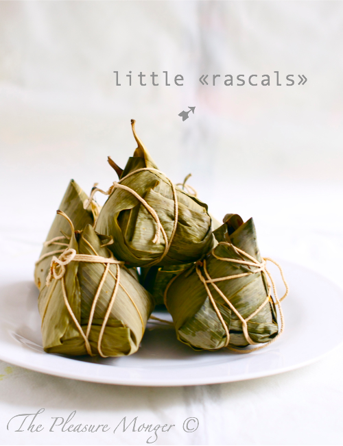
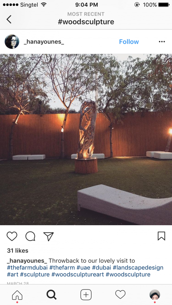
Our Final Project was to participate the CDL competition 2016, with the title “Towards A Zero Waste). We have to create a sculpture, placed on ground level and not taller than 2M. While brain storming, I was wondering what concept I could work into. Zero waste is a very general topic, very wide and also a concept that has been used by many artist. Therefore many sculpture had already been created with the idea of recycle, minimize plastic usage, categorization your waste. Looking through the website, I found these interesting images,


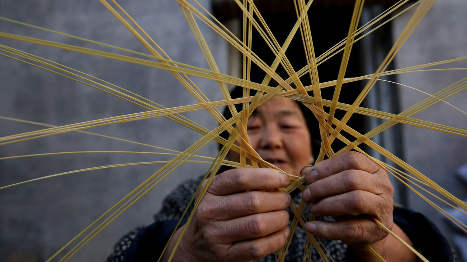
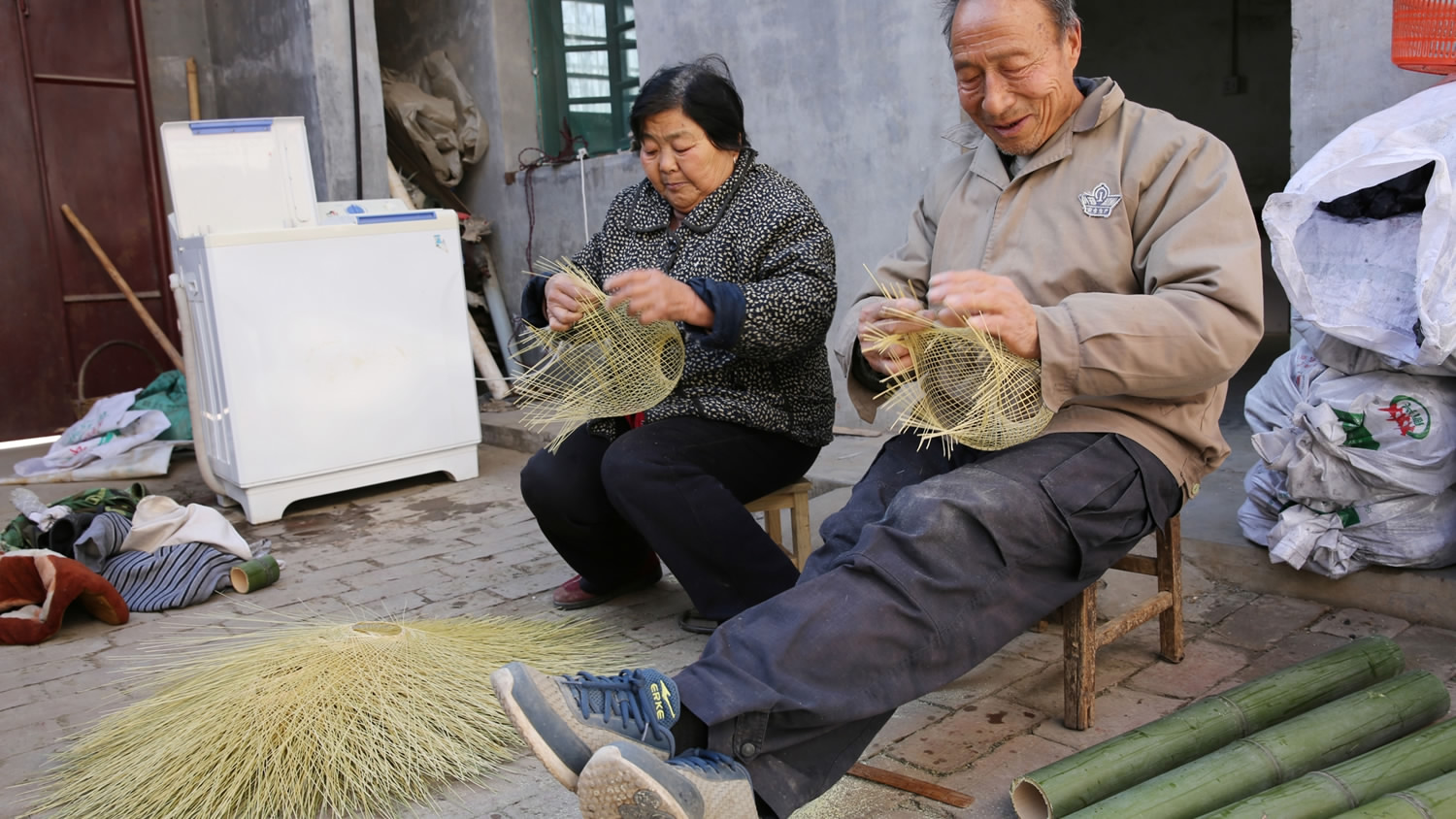
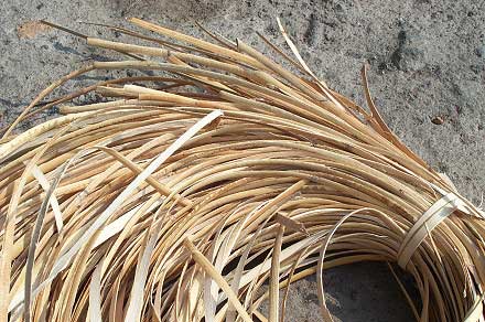
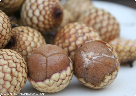
These are traditional craftsmanship like lantern weaving, ba zhang making, umbrella making, traditional rattan trap and rattan seeds. Looking at these images, it gave me an idea that these traditional craftsmanship are something that are precious and we should treasure them before extinct. And also because of the uprising factory mass production, these craftsmanship are slowly being rejected and remove. However, materials use in mass production like plastic, glass are actually creating more waste because they are none bio-degradable, instead using rattan basket for fishing than plastic pails are actually much more environment friendly. And if we don’t treasure these craftsmanship, one day because of the amount of waste created and we start searching for these craftsmanship we would be disappointed to find out that no one actually possess this useful crafts. 

After finalising my concept, I start searching for design inspiration, I want to create something that could represent industrail factory retricting the traditional crafts and also using patterns like lantern weaving, rattan seeds etc,
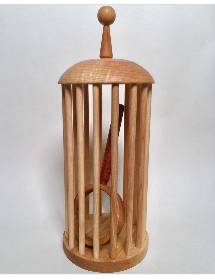
So I created:


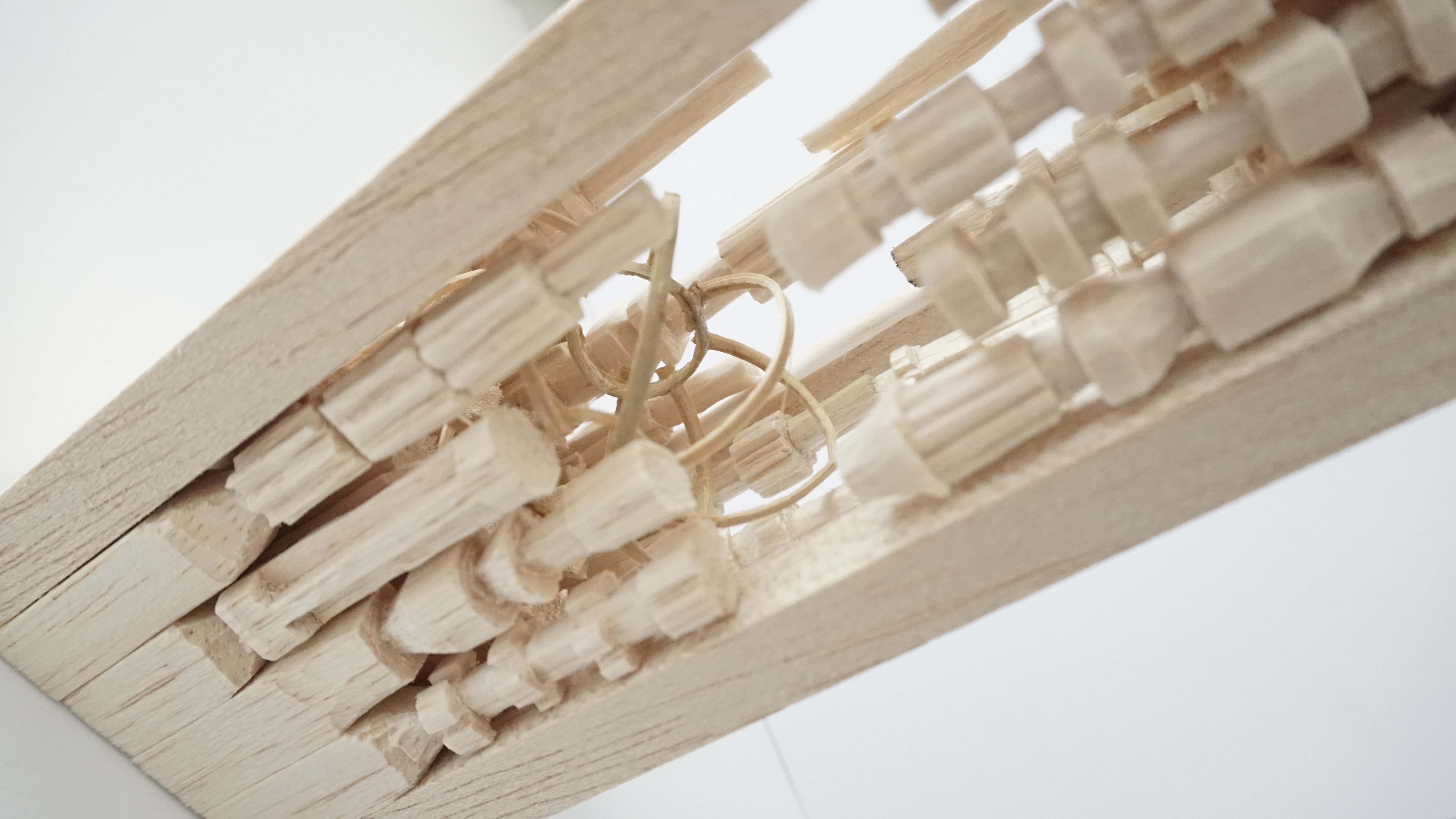
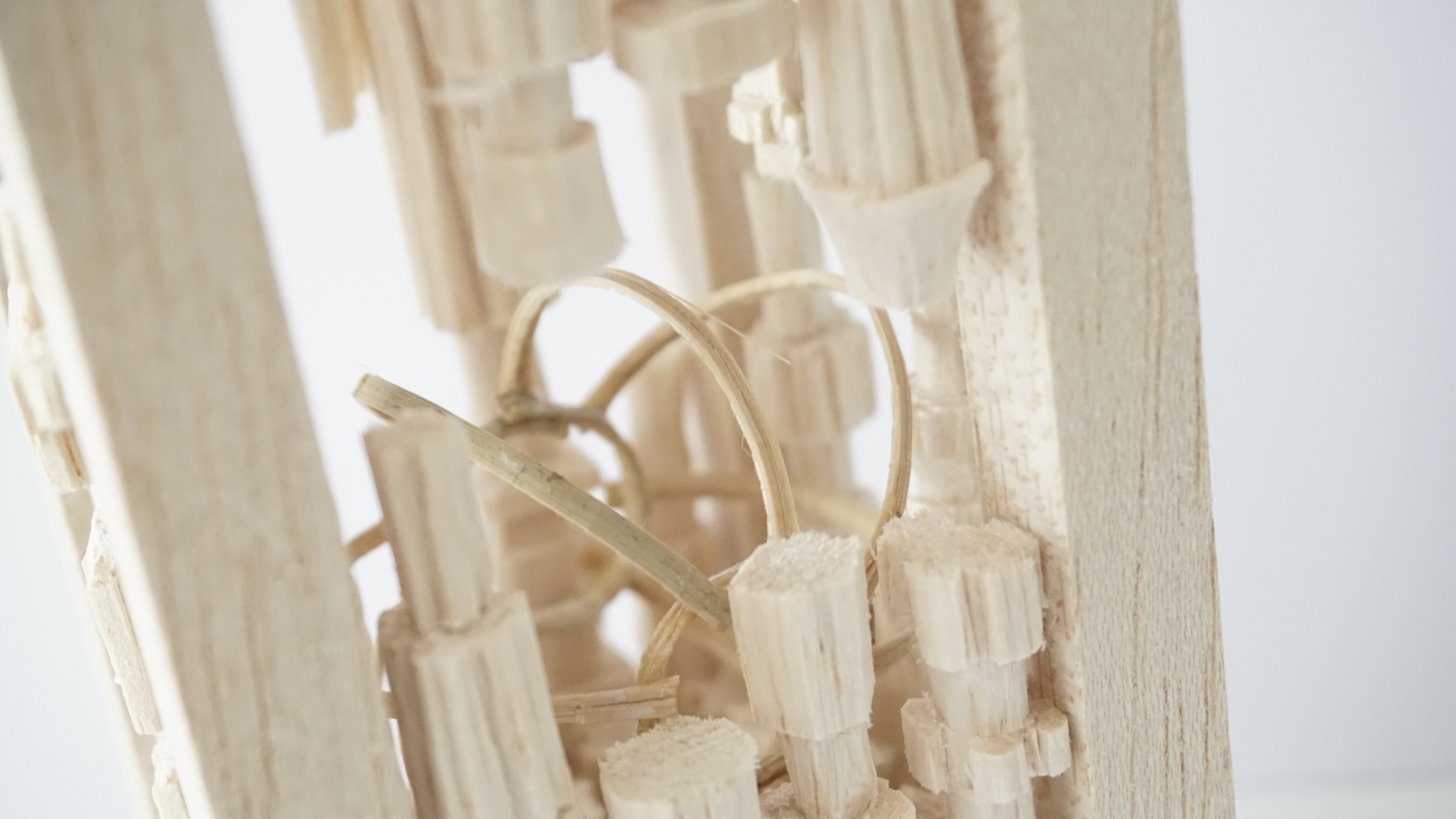
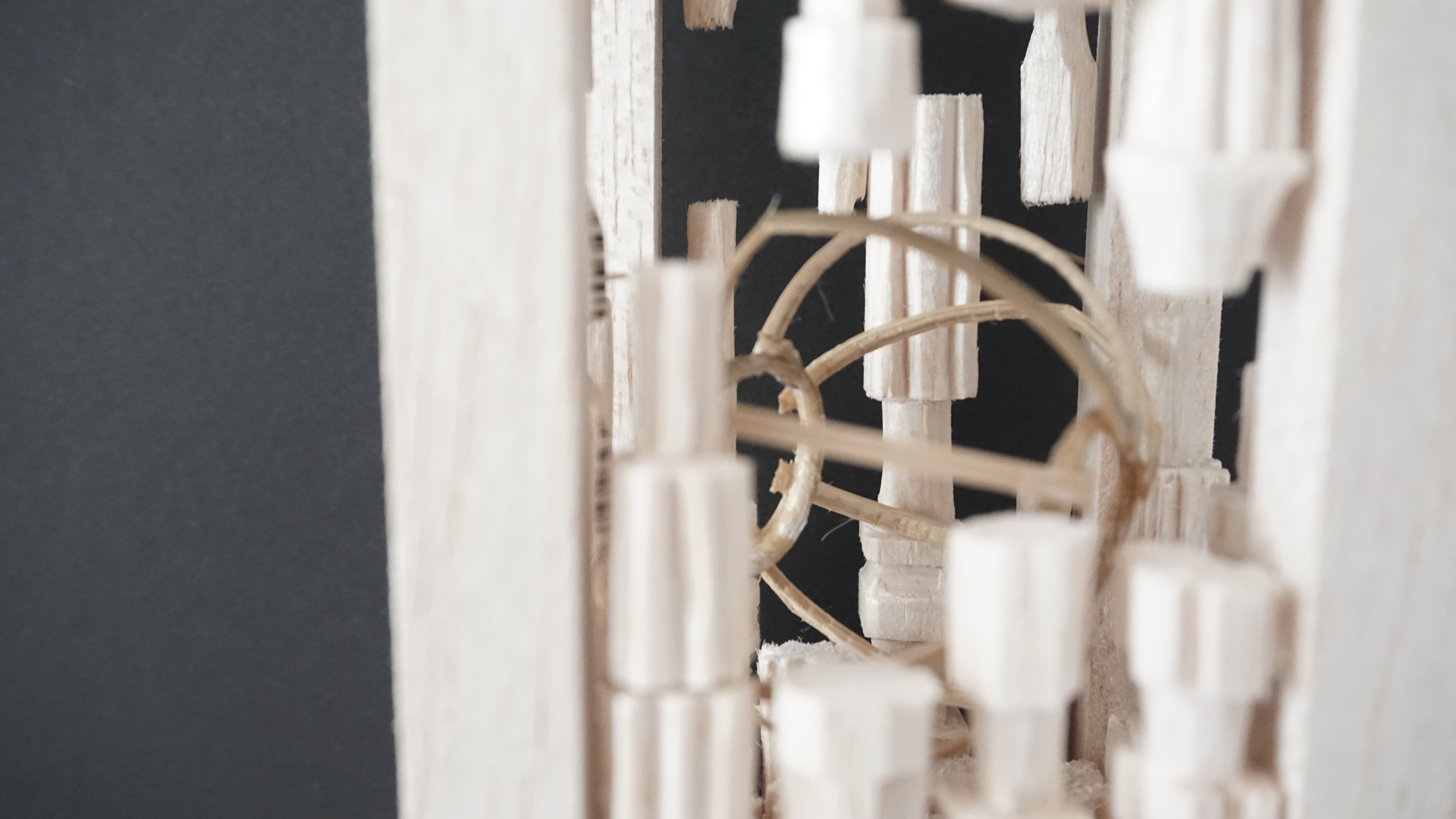
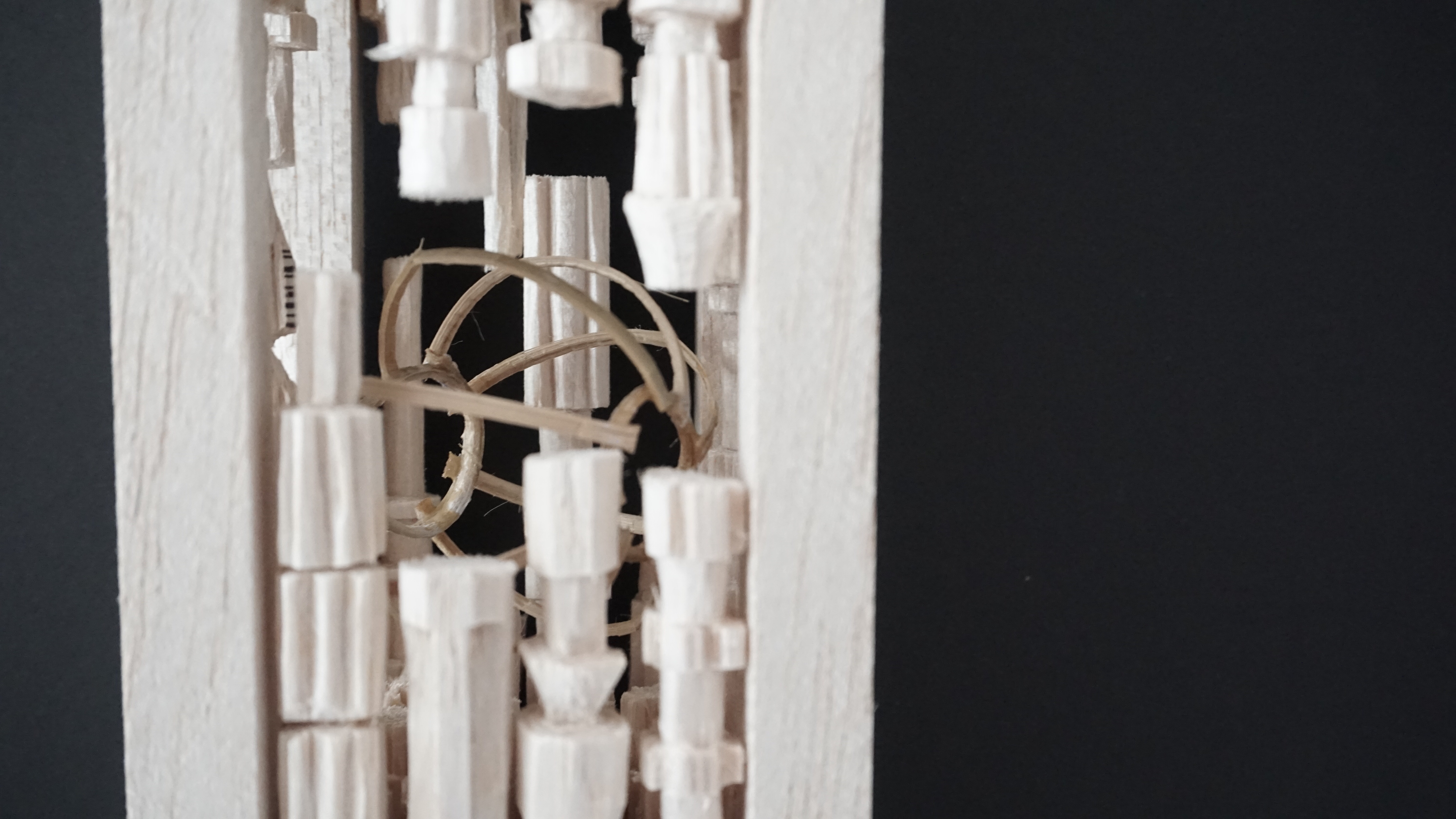
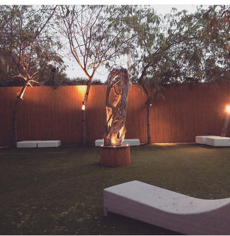
It is a upright sculpture with wood carve in patterns of industrial representative like spur gears, pipes, nuts and bolts. Surrounding and restricting the inside, is a rattan lantern weave ball that is being lock inside. It symbolizes traditional craftsmanship. One ball symbolizing the decreasing craftsmanship market and technique.
All four side of the sculpture have different pattern, so the audience could walk around the see the sculpture in all direction.

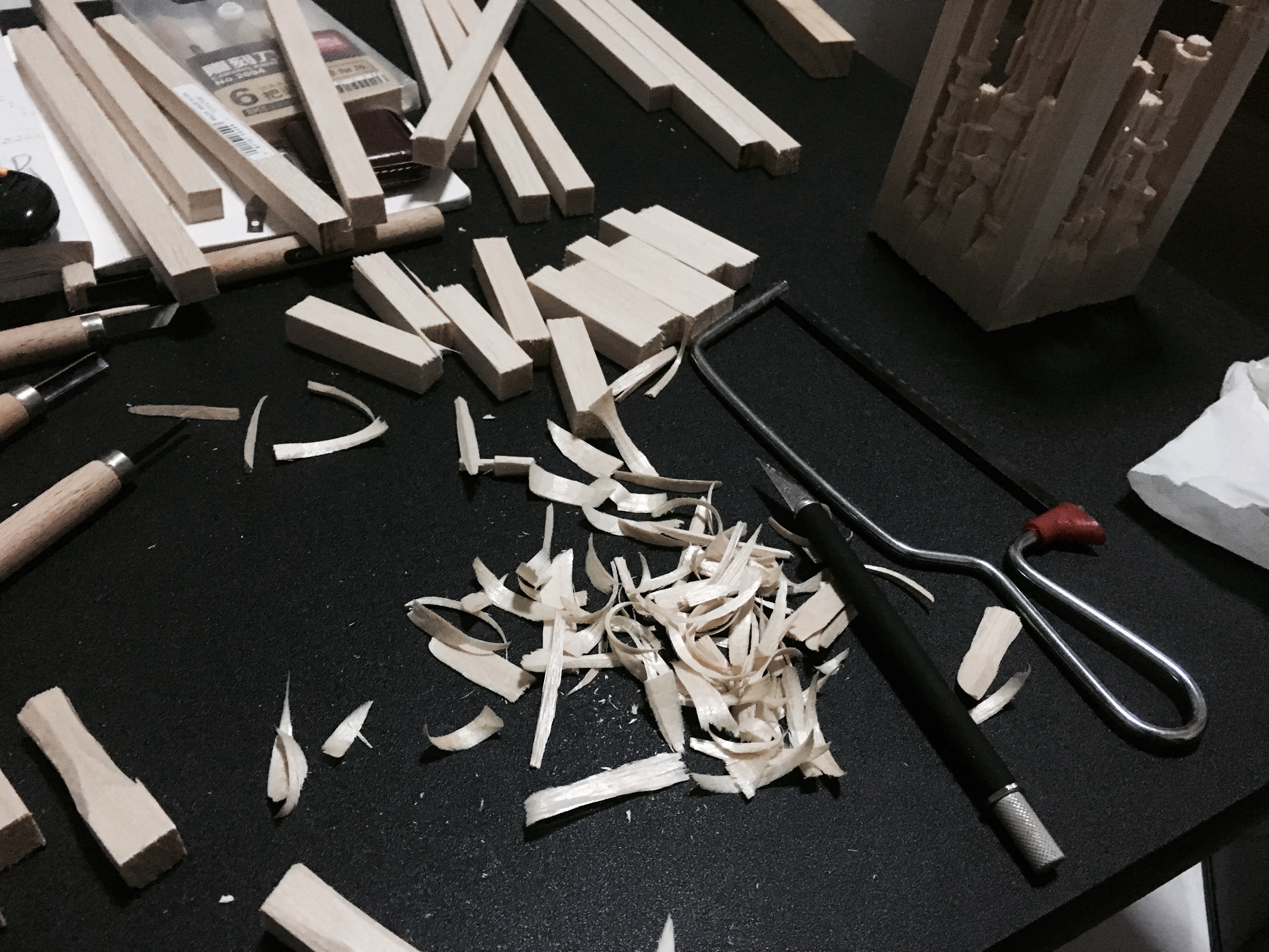
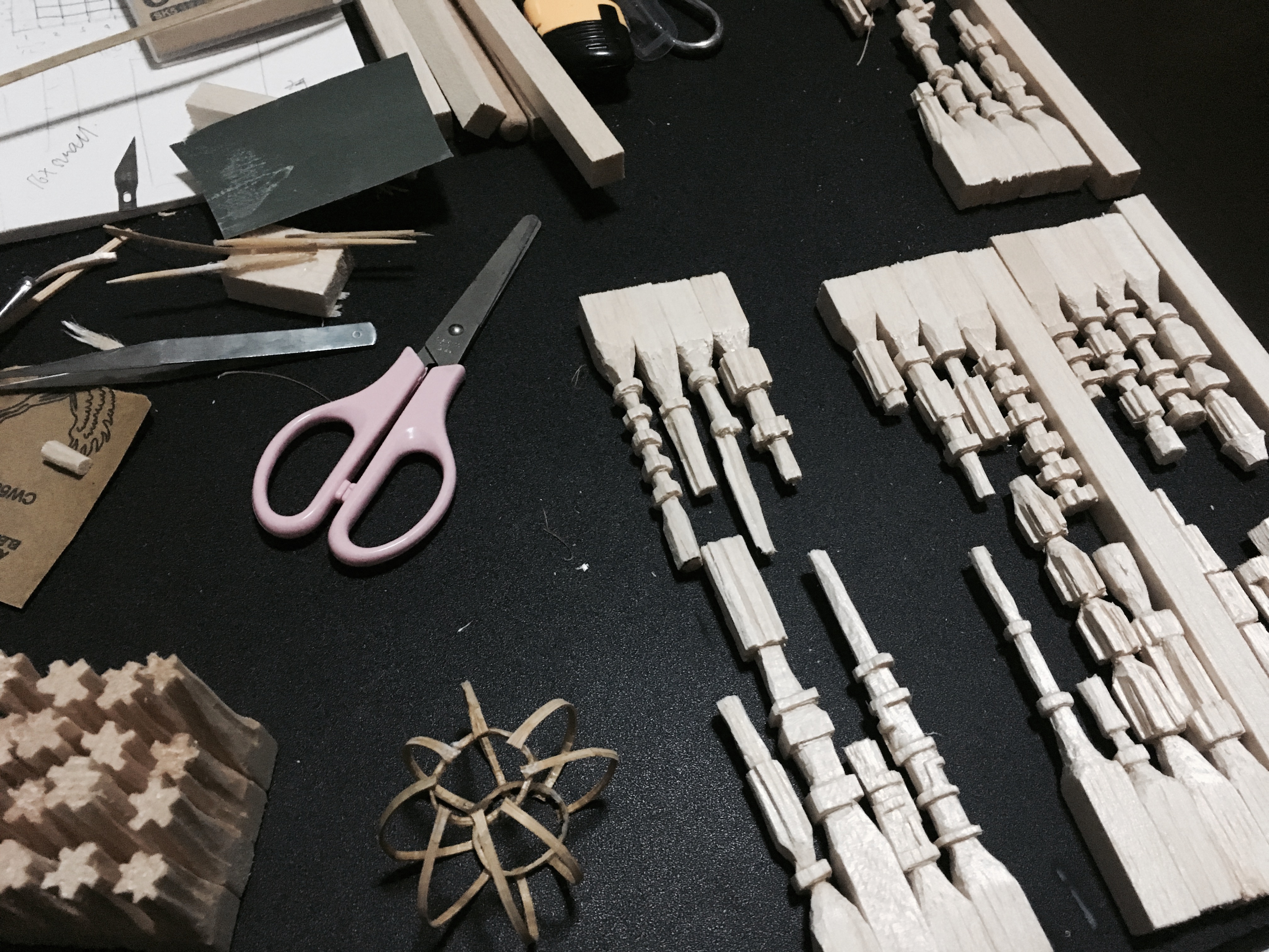
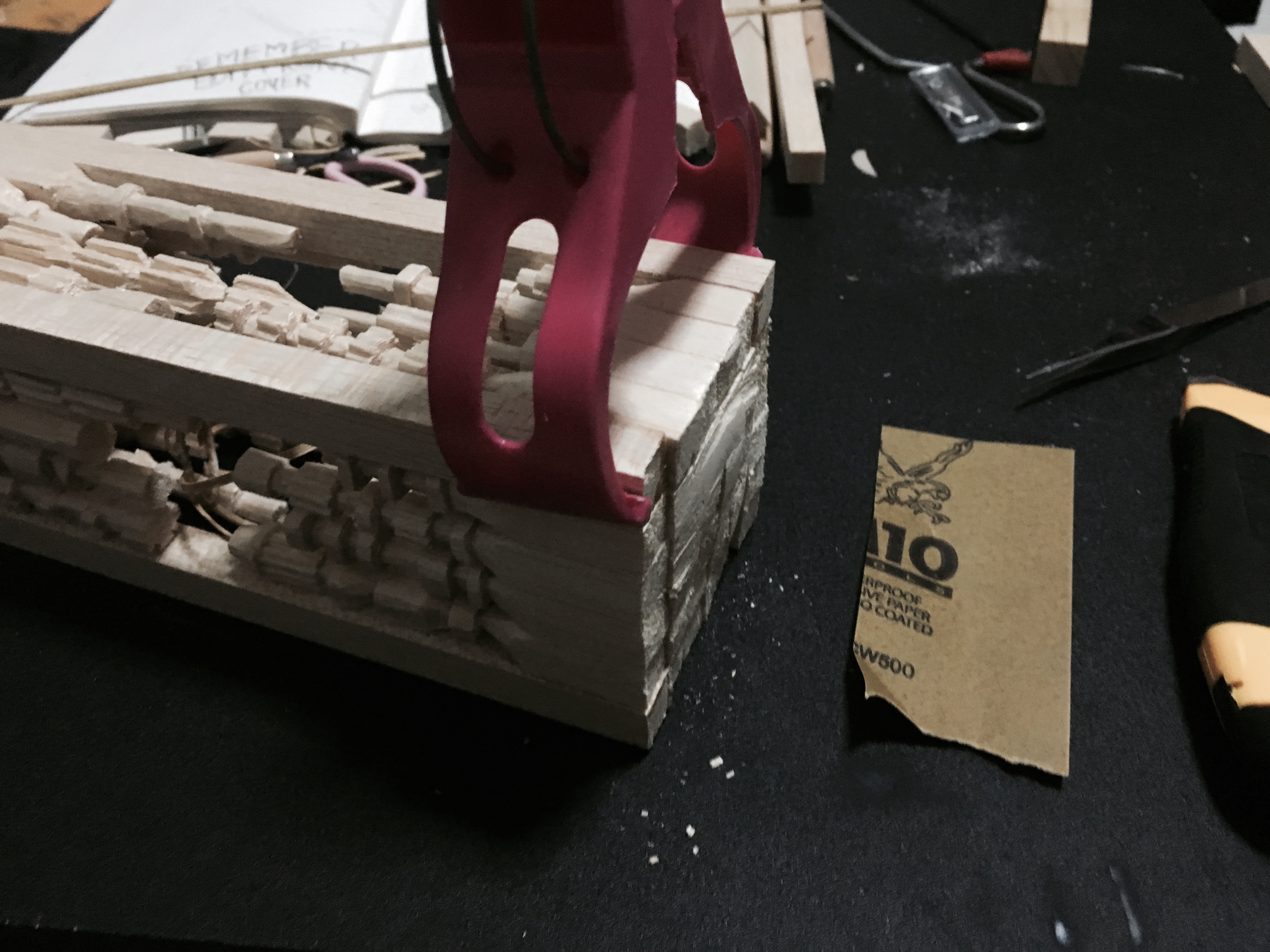
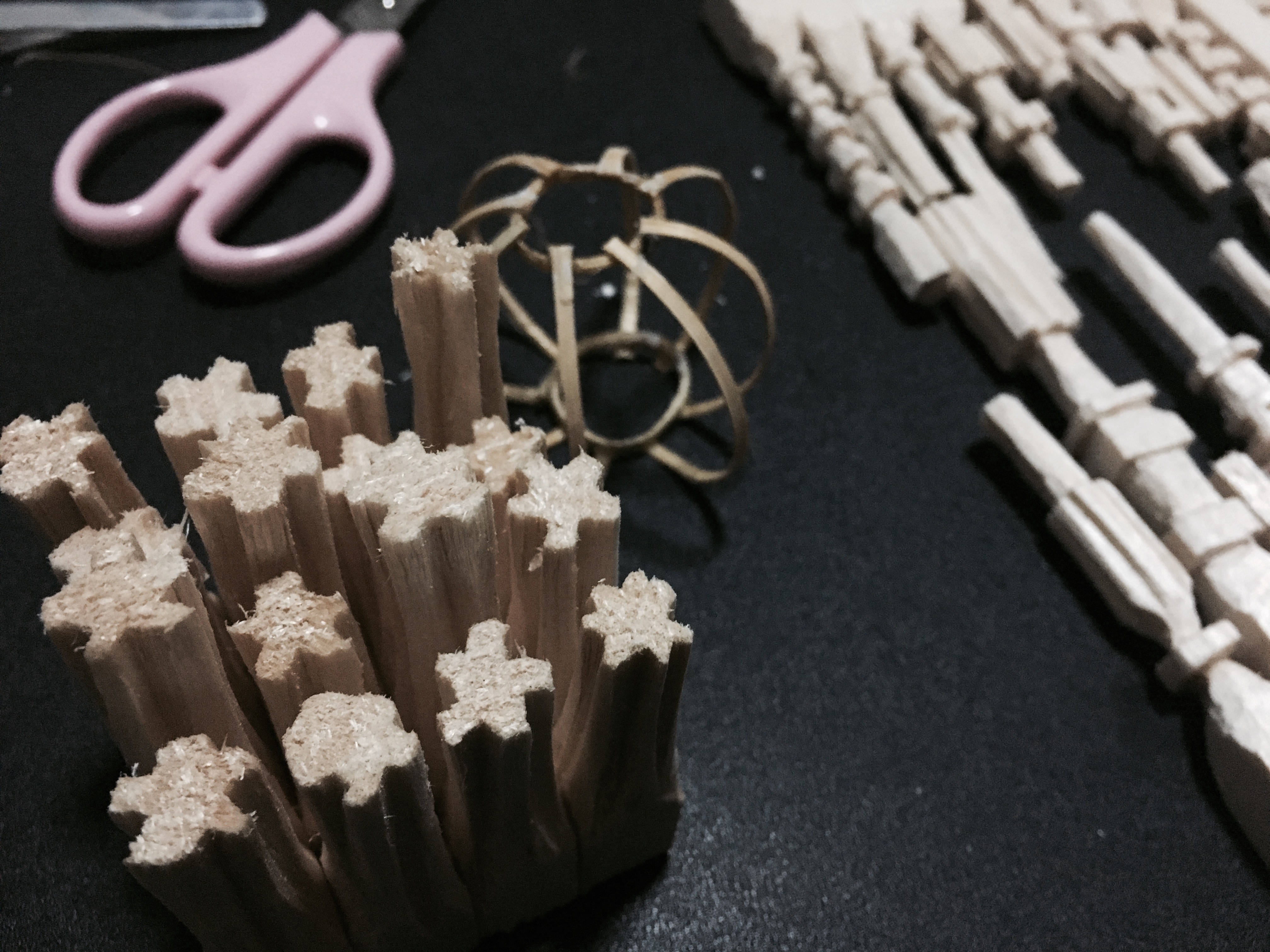
Model Making Process:


2D II-(Project 2-Part 2) “ ZINE ” (2) – FINAL


Front Cover
Khong Guan biscuit tin represent treasure/something precious to grandmother. Choosing this as my cover page symbolizes this zine as a little important diary my character grandmother(onion head) want to pass down to her future generation. Adding the two colored character give a connection between my cover page and my content inside.

P.s why I choose onion head is because that is my grandmother favorite food.

Spread 1
Linking back to my infographic of zhu ba jie, the onion head as a young child going to the famous food in pasir ris. ordering her favorite dishes every time she visited the market. As well as Tampines IKEA with their iconic dishes.
Since the onion head is still young she did sprout yet.
also the little character at the top corners are the characters at different stages of life. I had this idea because it was suggested during my group consultation that I could have something throughout the spreads that link them together and also telling the audience who the main focus character are.

Spread 2
Spread 2 as well as the middle spread. is the development of the two character relationship. Meeting her husband (my grandpa favorite food: Garlic) at downtown east chalet because they attended other people 21st birthday. And also them growing up in their relationship they have to face the two years of boys army life. Linking back to my infographic, tang seng who travel to the east for chalet and sun wu kong who travel to pasir ris for meeting point at the interchange to tekong.
Since this is a spread about them in their teenage years, on the left page the onion sprout first because people always say girls hit puberty earlier than guys and on the right both grew up and sprout. The top comer character also change from individual onion (she have boobs now cause is teenage puberty age) to them as a couple on the right top corner. I also receive very helpful feedbacks that I could use normal people instead of food character to make the main lead pop out as the focus! THANK YOU!

Spread 3
This last spread was inspire by my own grandparents story. Back in the days, Changi prison was also a drug rehabilitation center. In kampong time, many people take the drug-opium. Including my grandfather. When my mom was young my grandmother receive a call from the police saying my grandfather was caught as was lock inside. So my grandmother had to wake up 4am in the morning to cook breakfast and lunch for my mother and uncle before she head to work. Because now she is the only source of income. Also on the table is what they always eat. Simple meal such as porridge with salted egg and fried fish. On the left is a hand-written letter (I actually got my grandmother to help me write-old people Chinese word SUPER NICE!) that the onion head wrote in the zine to pass down, words she want to say to her future generation. The yellow sleeve onion is like her younger generation reading.
Now the onion have grew old and starting to dry up.


Back Cover
This back cover is the funeral table of the onion head symbolizing the end of her life. On the desk the zine was place there.
P.s my grandmother is still alive and healthy:)

My Infographic🙂


I had a really fun time doing this zine and also understand many fundamental that we need to take note when creating a zine and would definitely help us when we create brochure, magazine, book etc in the future. Most importantly, on the first day of foundation 2D II I said that my goal this time round was to improve my graphic. And I think I really did improve, I can do many more type of style compared and also I learn a new software. (I did learn Indesign in poly-but “you know~~ HAHA”) Also I am so grateful for this group of wonderful classmate. Always giving their best attention when someone is presenting and helping as much as they can during consultation. Also Thank You Joy for making my year 1 in 2D class fill with so much precious memories. From the post-it note that filled with so much encouragement, the consultations that you always put in so much effort in helping us despite so many students, the pizza! and also always saying “please feel free to email me if you have any problem:)”. I really appreciate your passion in trying to teach us as much as you can and always pushing us. THANK YOU THANK YOU!

2D II-(Project 2-Part 2) “ ZINE ” (1) – RESEARCH AND CONCEPT

When we were told to create a zine link to the same location from our previous project. I was a little worry because like before, there isn’t much I could extract from Pasir Ris apart from it having alot of parks. Looking back at my infographic, I find it a little too (老人ISH-too old people like). Firstly, it contains so many heavy informations and would usually fit the like of older adult or basically elderly. So, I was thinking if I should continue with the same concept but work with a different style. But something new that I want to incorporate into this zine would be the idea of “Kong Guan Biscuit Tin”. Why “Khong Guan Biscuit Tin” is because grandmother likes to wrap their money inside a handkerchief or towel and then place them inside the biscuit tin, so the biscuit tin became something really important and precious to them.

Image result for khong guan biscuit tin old

But the problem is I have no idea how to link them to Pasir Ris:( So thankful for the consultation with Joy, she gave me a wonderful suggestion that I could create a zine like a diary style. Inside containing all the different stage of her(grandmother) life. Linking back to my previous infographic, Food, Chalet, Army and Changi Prison. They could actually fits into a grandmothers different stages and age or her life. Before the consultation, I have also look into different style my zine could be. Like previously Chinese? minimal? newspaper? cartoon? vintage? Searching through Pinterest I cam acrosss some Japanese magazine. I really love the clean and simple line work Japanese illustration looks and personally I am also a fan or Taiwanese comic illustration artist (台湾插画), no actually I really like Taiwan, Korea and Malaysia comic illustration. There are similarities between some of these artist is that even though they are from diffrent coutry. There is definitely a group of them uses very simple lines to create stories about their daily life. Some example are Cheeming Boey from Malaysia & WanWan from Taiwan

JAPANESE STYLE:

public advertising,Japanmizushima-wakeari at nombre
12983463_1164841790201954_3599309578037349332_o.jpg (679×960)The Daileys - Rami NiemiSpody

Image; Japanese Food Packages. TRADEMARKED ™. Information; Andrew's inspiration came Japan. Whether it’s huge cityscapes, a bottle of ketchup or even a delicious biscuit, he is constantly striving to document these things in a bright and striking manner. COPYRIGHT ©Yama Kitchen - Okamura Yuta, Midori Hirota『はらへりあらたの京都めし』②魚田南祥伝社装丁=川名潤

『POP-EYE FASHION』Popeye No. 816 | ポパイ (POPEYE) マガジンワールドOn the Creative Market Blog - 50+ Awesome Resources to Create Visual Notes, Graphic Recordings

CHEEMING BOEY & WANWAN 彎彎


Confirming my style and concept I want, I went on to create a mini zine to help me understand how the booklet pages suppose to be print and also to draft out the layout of my zine. (As shown in my sketch book). After consulting with Joy and approving the layout design, Its time to draw, draw, draw…… (You may click on hem to view it larger:))


WATER COLOR

COLOR PENCIL


COLORS & CHARACTERS

FONTS & TEXT

COVER

I had to to create many drawings also making sure it doesn’t have any broken lines so I could fill in the color when i work with vector on illustrator. Appreciate sooo much that my grandma re-write the letter so many times for me because she keep insists old people handwriting messy:) HAHA. BUT AFTER ALL OF THIS I FINALLY HAD THE VERY FIRST ZINE I CREATED IN MY LIFE!!