Journey Week 1 -Selecting Move Quotes

Journey Week 2 -Individual Consultation
On week 2 of our project was our individual consultation, at this point of time, to be honest I was rather stuck and lost about the composition and how to link these quotes to the project. So after individual consultation with Joy I told her that the reason I love one of the quote is because it reflects my relationship with my mother and how my words always hurt her when we fight or quarrel. And joy gave me the idea that I could produce my composition based on the relationship I have with my family members:) and so Ok, Decided liao!:)
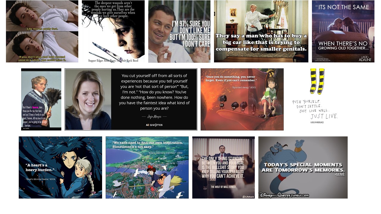
Quotes Selected:
- The deepest wounds aren’t the ones we get from other people hurting us,
They are the wound we give ourselves when we hurt other people–Edward Scissorhand, 1990
- Once you do something, you never forget. Even if you can’t remember-Spirited Away,2001
- You cut yourself off from all sorts of experiences because you tell yourself you are
‘not that sort of person”, But, I’m not. How do you know? You’ve done nothing, been nowhere.
How do you have the faintest idea what kind of person you are?-Me Before You, JoJo Moyes, 2016
- But if there’s love, dear…. those are the ties that bind, and you’ll have a family in your heart, forever.
All my love to you, poppet, you’re going to be alright…bye bye.-Mrs Doubtfire, 1993
Journey Week 3 -Recess Week
On Week 4 we would be having our silk screening session and so many of us uses our recess week to craft out our composition for the silk screening session next week.
So I choose the quote :
“The deepest wounds aren’t the ones we get from other people hurting us,
They are the wound we give ourselves when we hurt other people”
-Edward Scissorhand, 1990
cos got the most “feel” haha
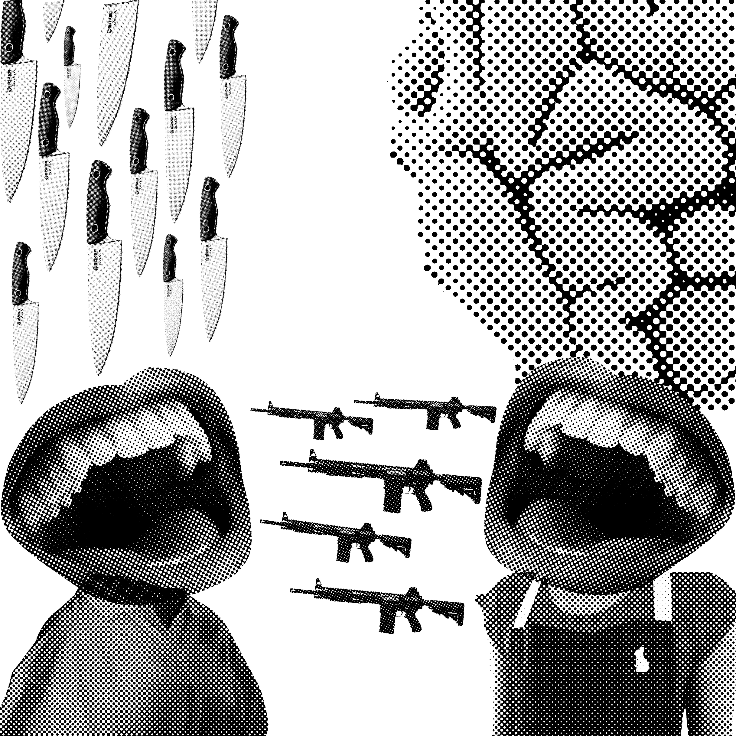
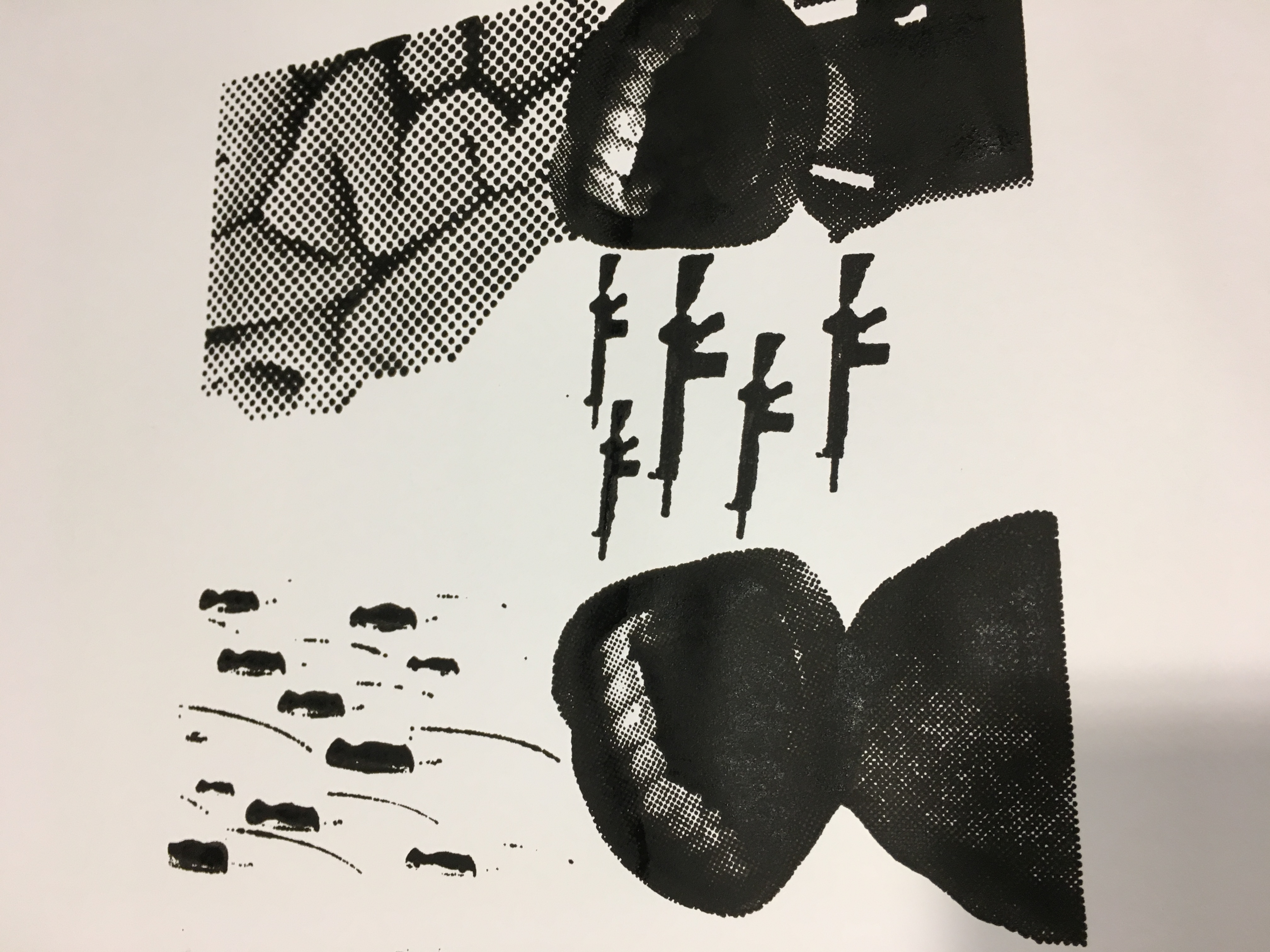
anyway, to me this quotes reflects to the relationship I have with my mom. Growing up I believe everyone been through many quarrels with their family members. If you say no, I don’t believe. haha,.. Anyway yes, I’ve quarrel with my mom countless time, when we quarrel, I always felt im the one being blame, being misunderstood and hurt by her and that I’m always wrong, But when I calm down, I always feel really sorry and guilty for the words I’ve said to her. Regretting each and every words I’ve said to hurt her. And this is where this composition comes about,
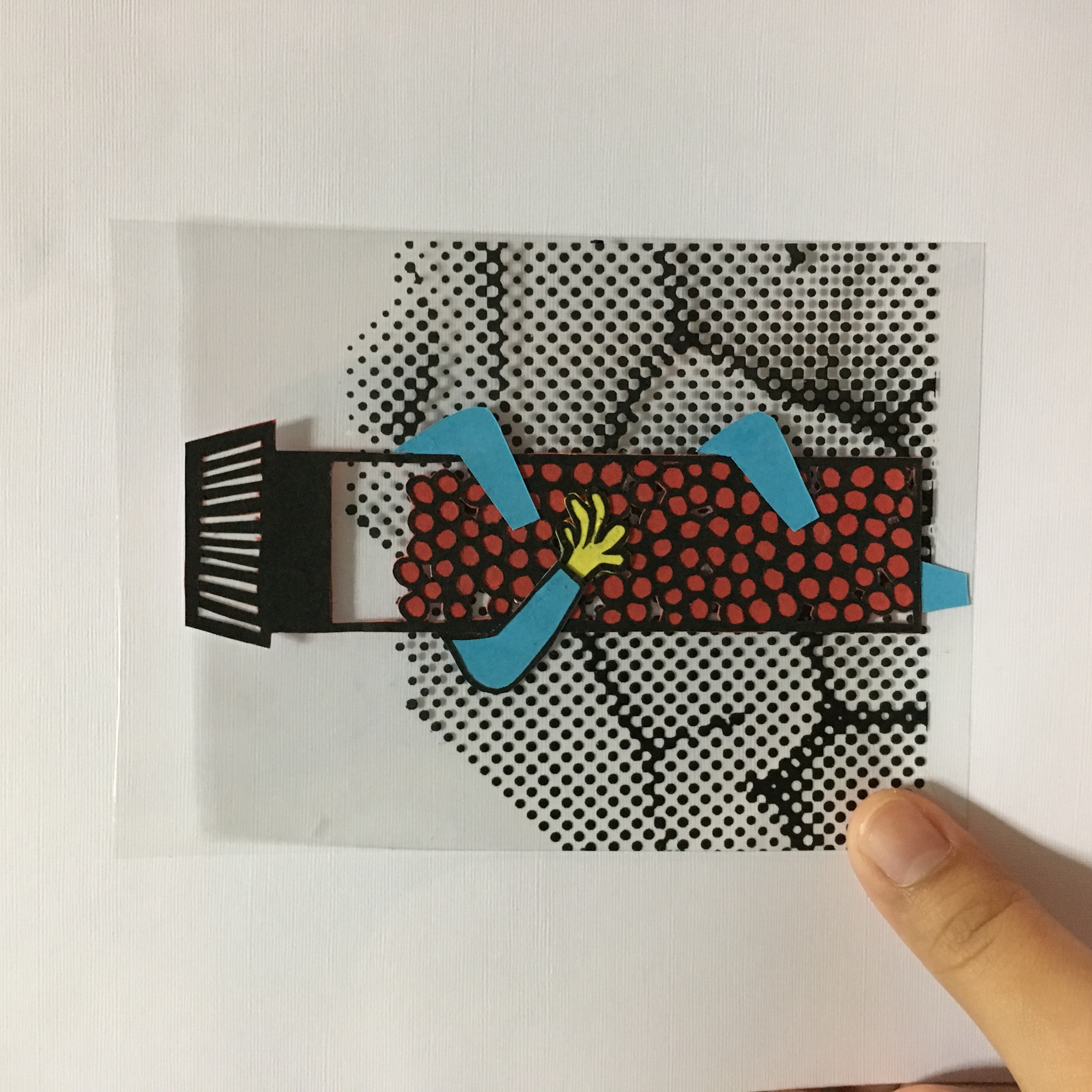
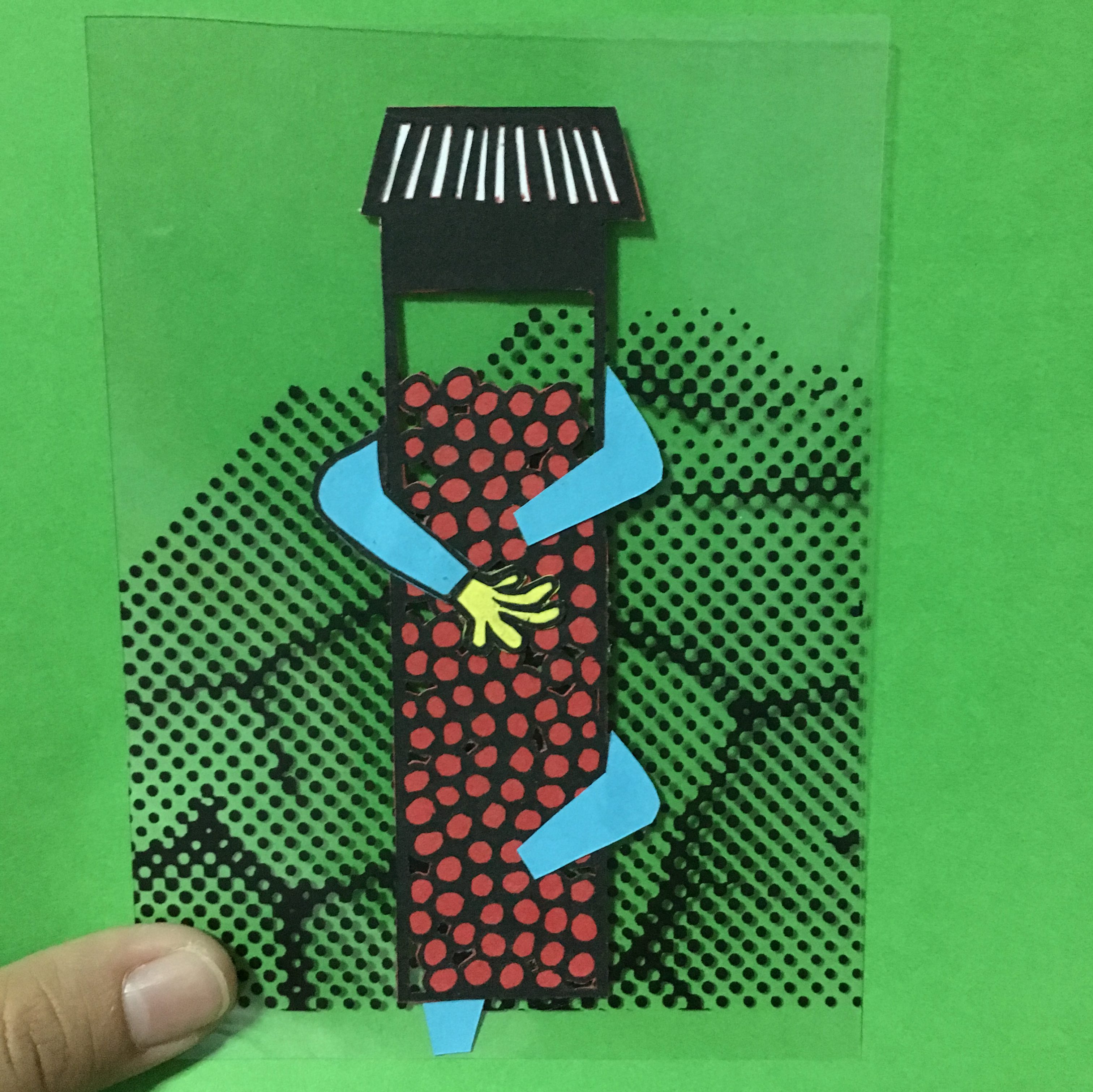
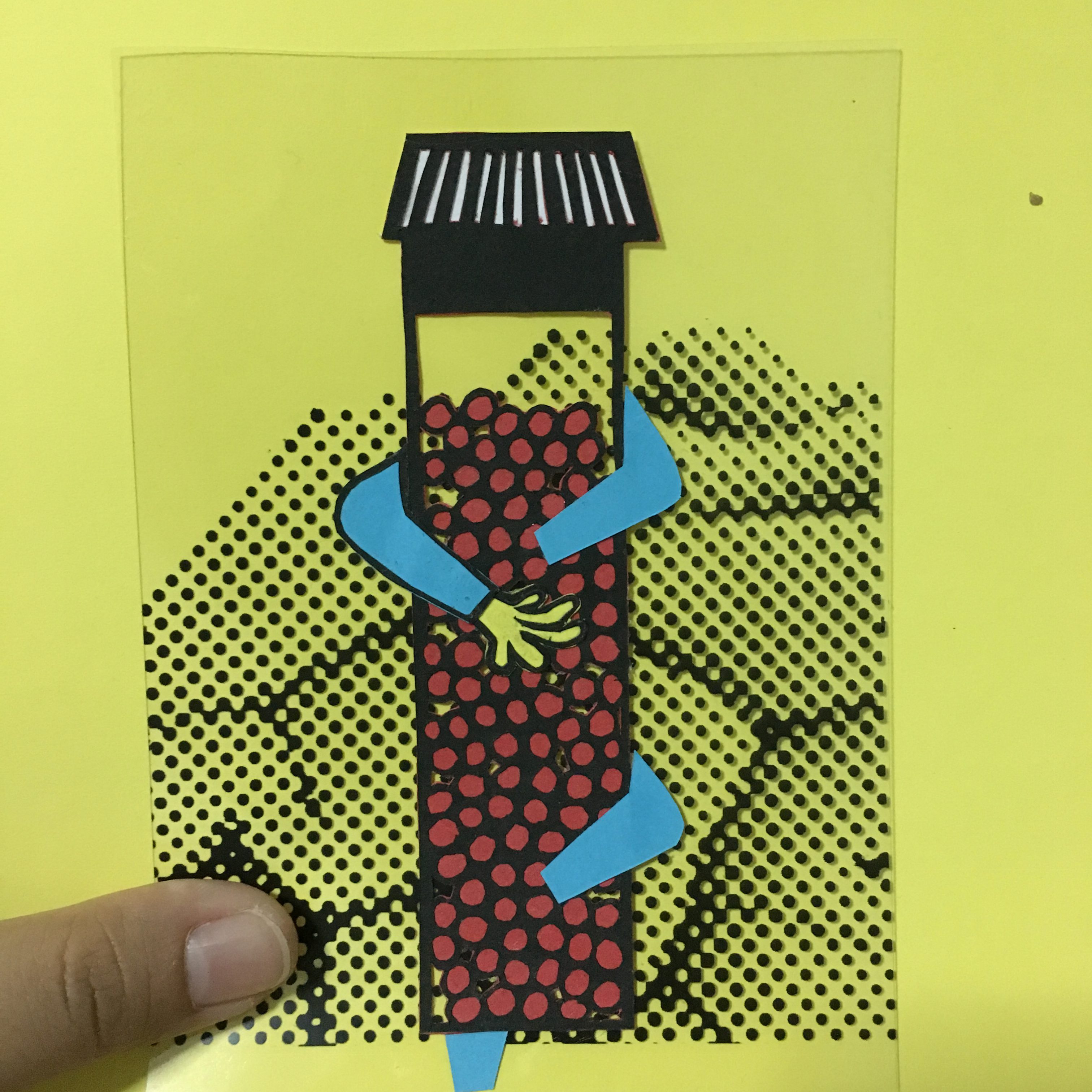
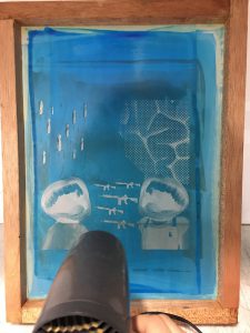
 The one on the left in white shirt is me and the one one the right with apron is my mother. The machine gun in the middle refers to the way I perceive her everytime we quarrel. I always thought of her as “机关枪” literally means machine gun, words just shoot shoot shoot out of her mouth nonstop. And the knife symbolizes the wounds I am gonna get when I quarrel with her. Like instead of her hurting me when we quarrel but it hurts more when I quarrel with her. The brain behind my mom actually means my mind, what am I thinking inside. Like on the inside I think of her as a machine gun. To be honest, I myself also does not like this concept very much as i felt it doesn’t really shows the message and meaning I was trying to convey. The whole composition looks pretty misleading. Honestly, I didn’t like it.
The technical aspect of it: Since the transparency was going to be for our silk screening lesson. I didn’t really bitmap it nicely and consistent, instead, I varies the bitmap size to test out the results I would get with different dot size.
Journey Week 4 -Individual Consultation, Silk Screening Session
I was given alot of feedbacks during group consultation and I REALLY APPRECIATE them!:) I receive comments that the composition have alot of meaning and story behind it but when looking at it, it doesn’t show. And also that the brain seems awkward and extra:) Mouth seems more happy than quarreling, Basically I can consider re-adjusting the whole composition:) SO Grateful for these comments it help me to know what other people interpret from the composition since I myself know the story and meaning already:) THANK YOU GIRLS!:)
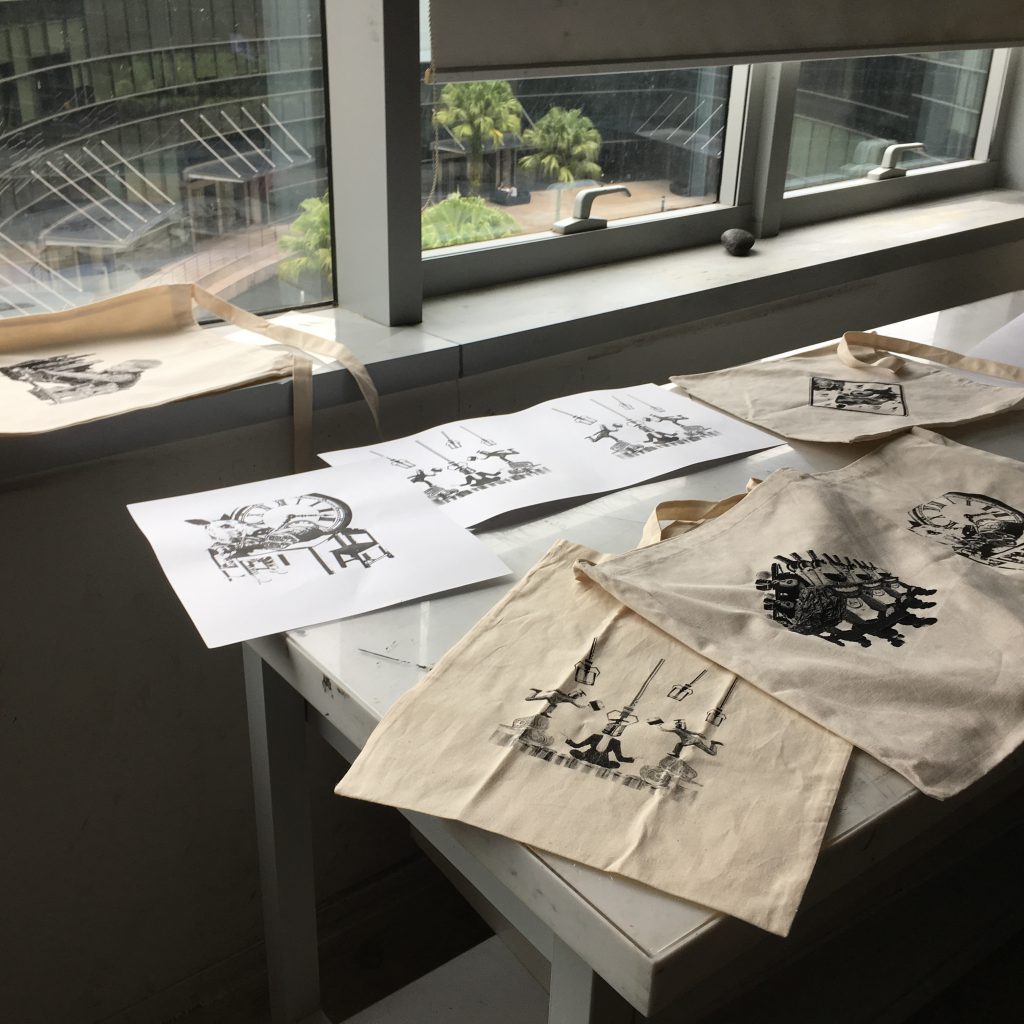
After our recess week was our first silk screening session, and was my official first silk screening session in my life. I didn’t really manage to take much picture because the dark room is very sensitive to light and the washing room was wayyyyyy to dark. So all I have was:
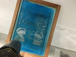
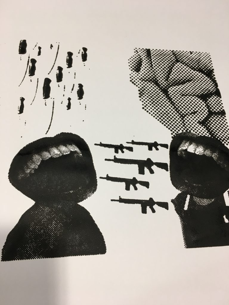
As you can see the bitmap for the knife was way too small so only the outline could be seen. But for me I think it’s alright as we can still recognized it as a knife. Both the mouth turn out pretty well, except the fact that I went twice and it was way too thick and it kind of smudged the ink a little, the bitmap dots were no where visible on the machine gun, however the overall shape of the machine gun were printed out with that I am pretty satisfied already. The only weird thing to me would be the brain. It seems too out of place and extra to be place there and also the bitmap being so huge and different. But anyway i purposely set the bitmap size to be so huge so i could see the effect and I guess after this class I got the rough idea of how the bitmap work and how to set my bitmap sizes:)
Before our group consultation and silk screening, we were given some time to think about our work and composition. I was looking at the quote from the movie Mrs Doubtfire”:
“But if there’s love, dear…. those are the ties that bind, and you’ll have a family in your heart, forever.
All my love to you, poppet, you’re going to be alright…bye bye.”
-Mrs Doubtfire, 1993
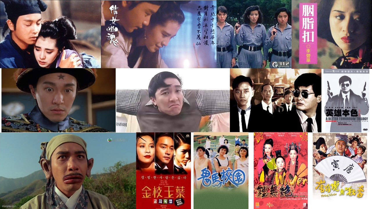
and I was thinking what thing actually binds my family together? I realized is these old chinese movies. Only on occasion when the tv give free channels and these movies air we would all put all electronic devices aside and just sit together as a family, have a laugh and watches these movies one after next. And this became my inspiration for quote number 2:)

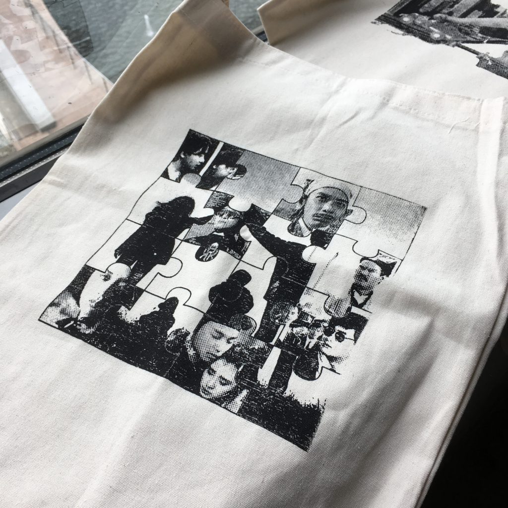
Journey Week 5 -Silk Screening of Tote Bag
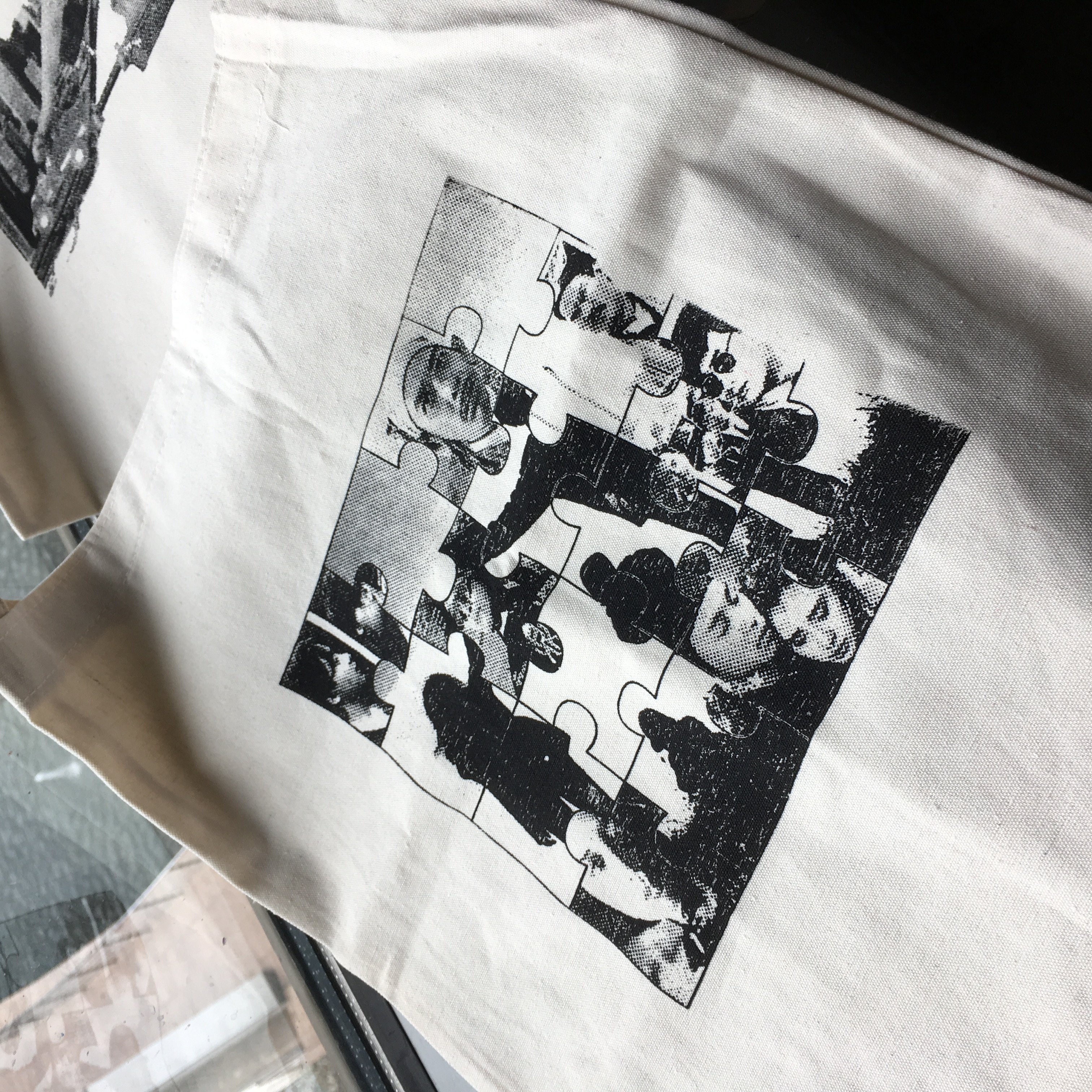
On week 5, Many of us spend our class time crafting out our new screen and tote bag. I felt like its four hours of washing washing washing and washing hahahahaha… But I enjoy the process:) I was really really worried the screen doesn’t turn out well as we are running out of time and only had one tote bag each. But with the help of Dawin and JiaZhen I AM SOOO SOOO GRATEFUL FOR THEM. they taught me how to correct take out the screen so I only tried once on paper and Jia Zhen was like just straight go tote bag, ok one, JUST DO IT!! And so…..
Next Week critique! Xiao Scary, No Actually very scary:(