Unconventional Materials: Felting and Applique
What is Felting?
Felt is a non-woven textile that is produces by matting, condensing and pressing fibres together. Felt can be made of natural fibres such as wool or synthetic fibres such as acrylic. There are many different types of felts for industrial, technical, designer and craft applications. While some types of felt are very soft, some are tough enough to form construction materials. Felt can vary in terms of fiber content, size, thickness, density and more factors depending on the user of the felt.
Types of Felting:
– Wet Felting
– Dry Felting (Needle Felt)
– Nuno Felting
Wet Felting
Felt is made by a process called wet felting where the natural wool fibres, stimulated by friction and lubricated by moisture (usually soapy water). move at a 90 degree angle towards the friction source and then away again, in effect making little “tacking ” stitches. While at any given moment only 5% of the fibres are active, the process is continual, so different ‘set’ of fibres becomes activated and then deactivated. thereby building up the cloth.
Materials Used:
– Wool
– Soap
– Hot Water
– Plastic sheets (protect working desk)
Experiment:
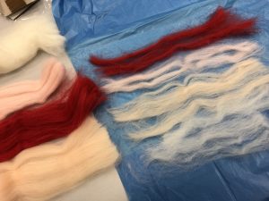
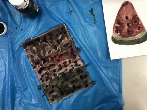
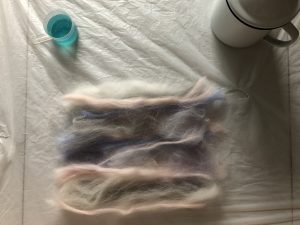
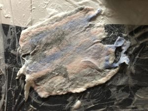
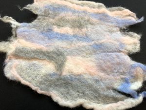
We start our wet felting by aligning the wool onto a plastic surface(protection) you can align the wool in any position to your liking. Can be in circle ball, strips or even lump. Do take note that once the wool are bind together it would become relatively thin so if we are looking to make a thick felt we have to put more layer or wool, but we could also add more along the way.

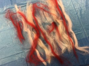
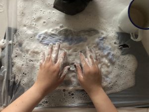
We can add drops of soap and also hot water. Hot water would increase the speed of the wool being bind together:) if we want it to bind a little slower we could add room temperature water. Cover you wool with a plastic layer and start rubbing the wool, the action of rubbing actually binds the wool together. We could also peel the plastic sheets up to check on our felt or also flip the felt over and rub the other side of the felt:)

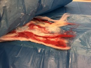
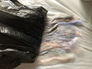
Once you have reach the desire “stiffness” and thickness you want just simple leave it to dry and you would have you felt:)
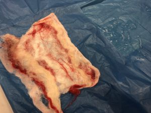
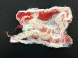
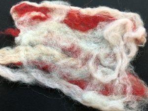
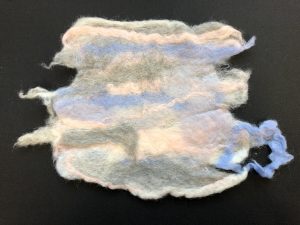
As the first experiment that I did in class my felt turn out to be very fragile and loose because I did not put enough wool. So I decided to experiment again at home with more wool:)
I think I accidentally put too much soap….
TADA!!
Dry Felting (Needle Felt)
Needle felting is popular fibre arts craft that creates felt without the use of water. Special needles that are used in industrial felting machines are used by the artist as a sculpting tool. While erroneously referred to as “barbed” needles, they in fact have notches along the shaft of the needle that grab the top layer of fibres and tangle them with the inner layers of fibres as the needle enters the wool. Since these nothes face down towards the tip of the neefle, they do not pull the fibres out as the needle exits the wool. Once tangles and compressed using the needle, the felt can be strong ans used for creating jewelry or sculpture. Using a single needle or a small group of needles (2-5) iri a hand-held tool, fine details can be achieved using this technique, and it is popular for 2D and 3D felted work.
Materials Used:
– Wool
– Felting Needle
– Sponge base
Experiment:
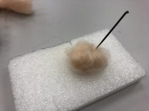
Dry felting is pretty simple and straight forward. Just use a sponge like material as base, hold your wool in the shape you want and.. poke.. poke… poke… poke… poke…
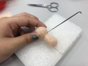
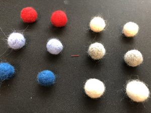
I want to create a little human so I started by rolling my wool into a ball and poke poke poke poke
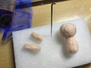
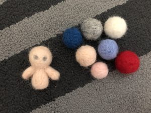
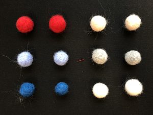
I am so sorry towards my little human the eye didn’t came our right. I find little felt ball so cute so I create different size of them:)
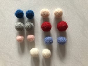
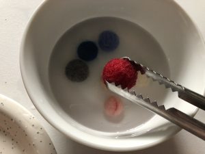
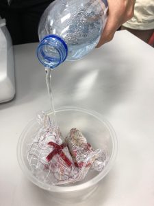
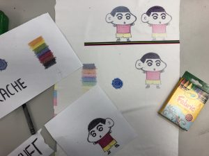
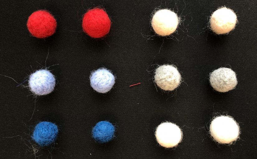
Since Professor Galina mention that wool would shrink in hot water. I thought why not duplicate another set of felt balls in same sizes and soak them in hot water:)
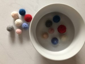
So I soak them in hot water for about 45 minutes and let it dry.
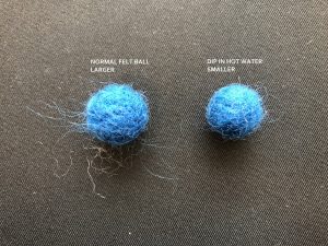
Even though the difference is a little. But if we take them out and look compare we can see that it did shrink. Maybe the reason for the small change would be that the water is not hot enough.
*Blue ball on left: Normal felted ball (larger)
*Blue ball on right: Dip in hot water (smaller)
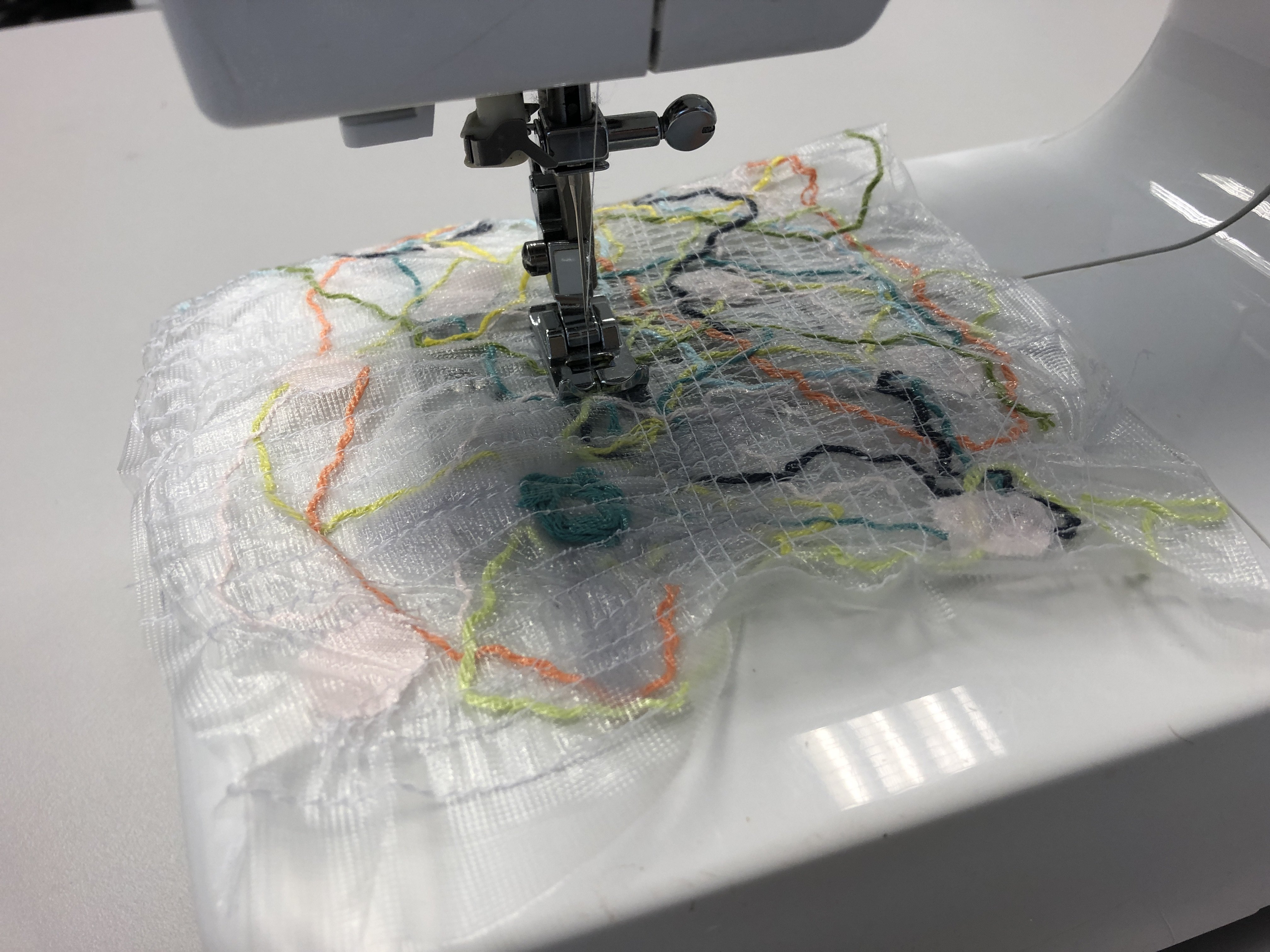
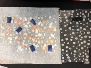
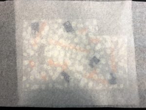
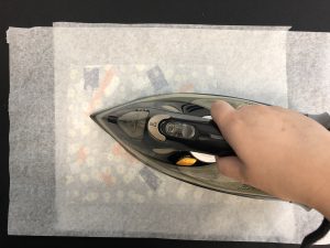
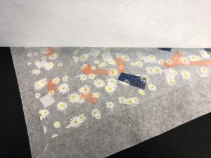
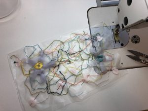
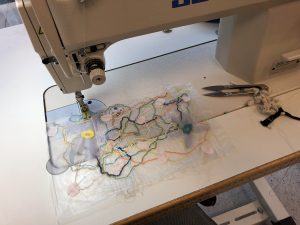
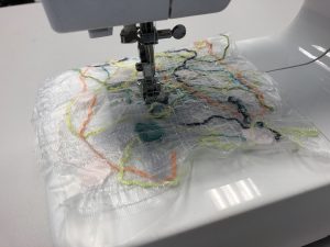
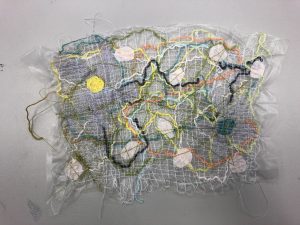
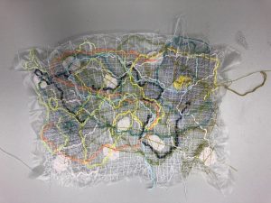
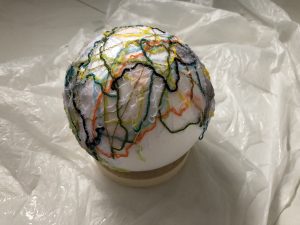
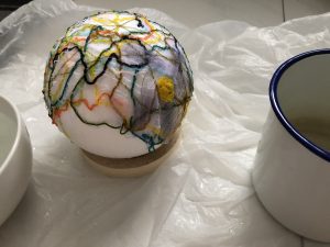
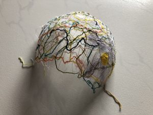
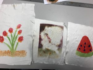
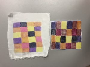
Nuno Felting
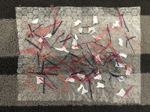
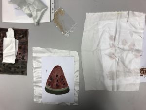
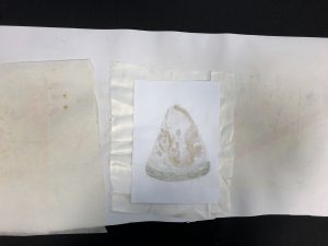
Nuno felting is a fabric felting technique developed by the Polly Stirling, a fibre artist from New South Wales, Australia, around 1992. The name is derived from the Japanese word “nuno” meaning cloth. The technique bonds loose fibre, usually wool, into sheer fabric such as silk gauze. creating a lightweight felt. The fibres can completely cover the background fabric, or they may be used as a decorative design that allowes the backing fabric to show. Nuno felting often incorporates several layers of loose fibres combined to build up colour, texture, and/or design elements in the finished fabric.
The nuno felting process is particularly suitable for creating lightweight fabrics used to make clothing. The use of silk or other stable fabric in the felt creates fabric that will not stretch out of shape. Fabrics such as nylon, muslin, or other open weaves can be used as the felting background, resulting in a wide range of textural effects and colours.
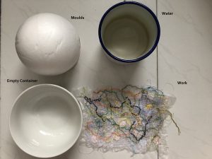
Materials Used:
– Wool
– Fabric (Silk etc.)
– Sponge
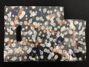
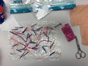
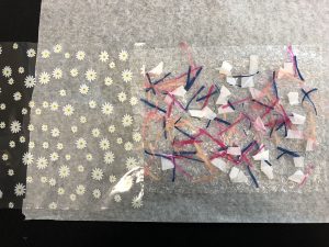
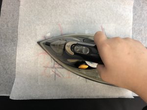
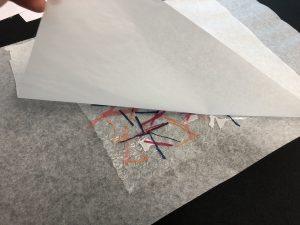
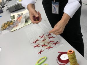
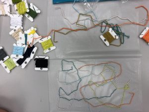
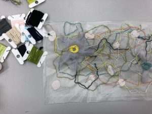
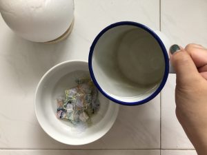
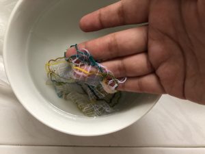
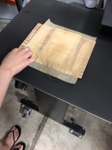
Experiment: