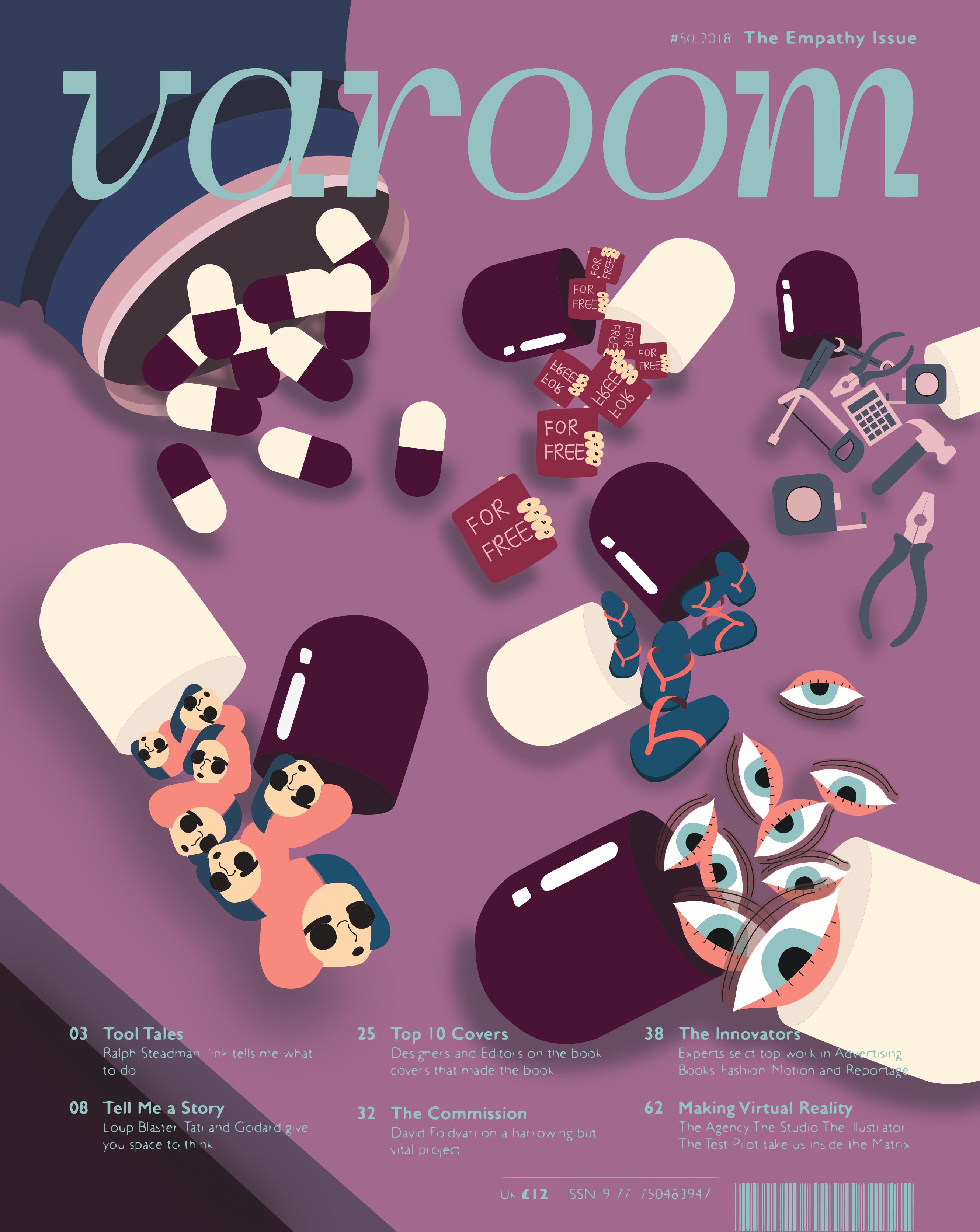
Illustration For Designer: Editorial (Final)

VAROOM MAGAZINE

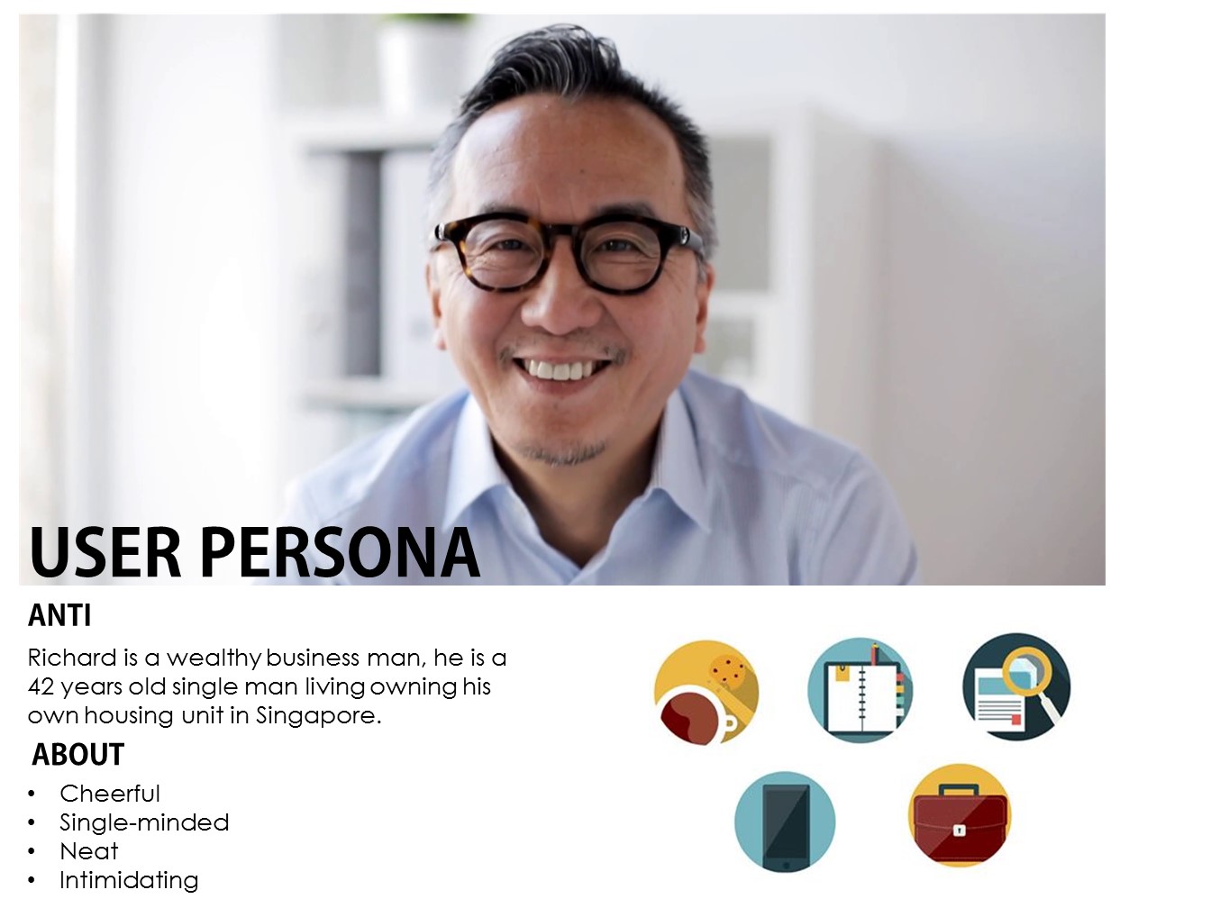
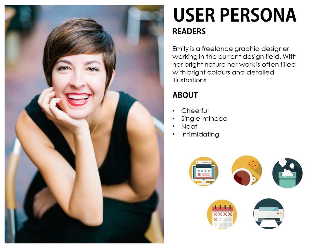
“Empathy For Designer”

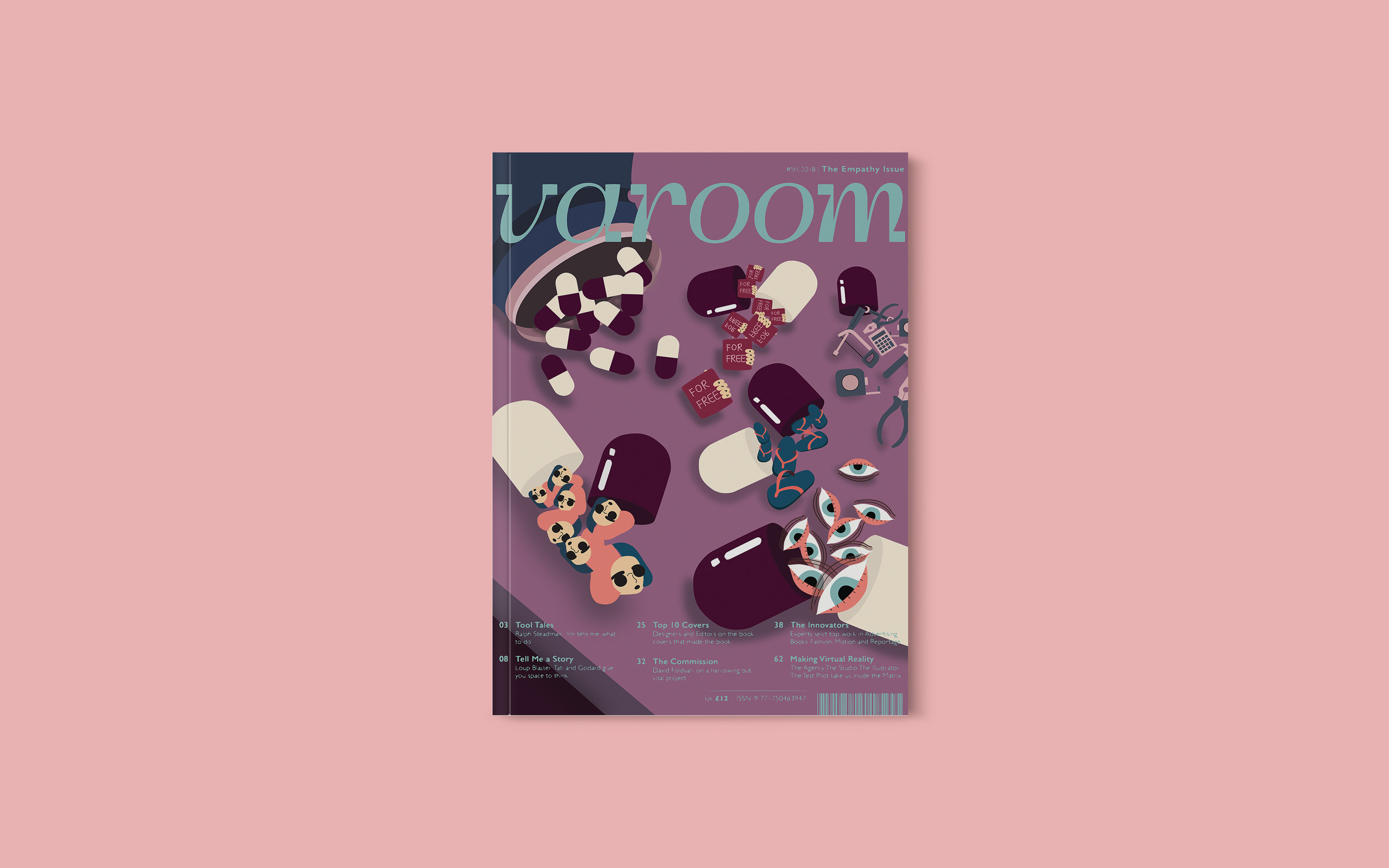
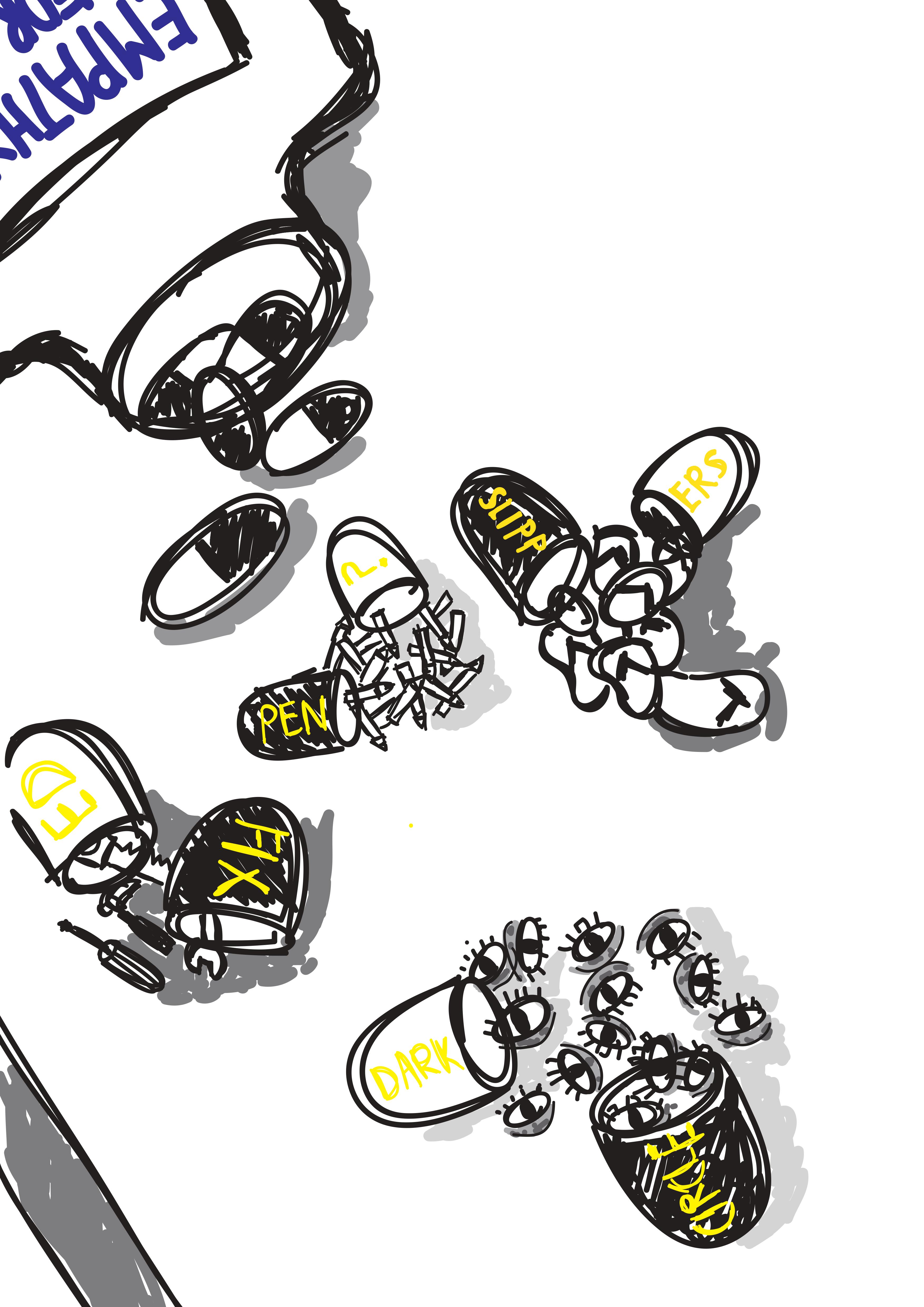
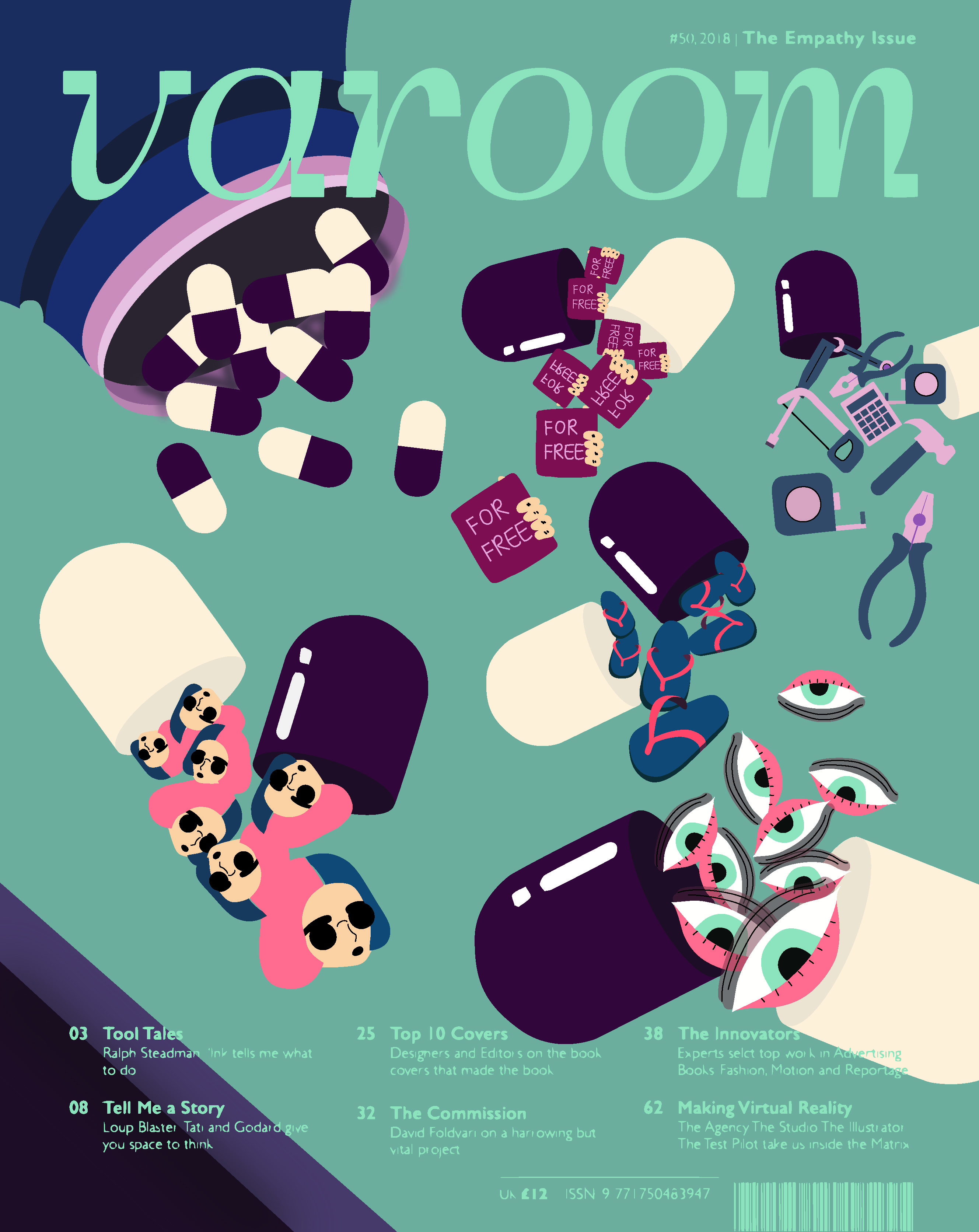
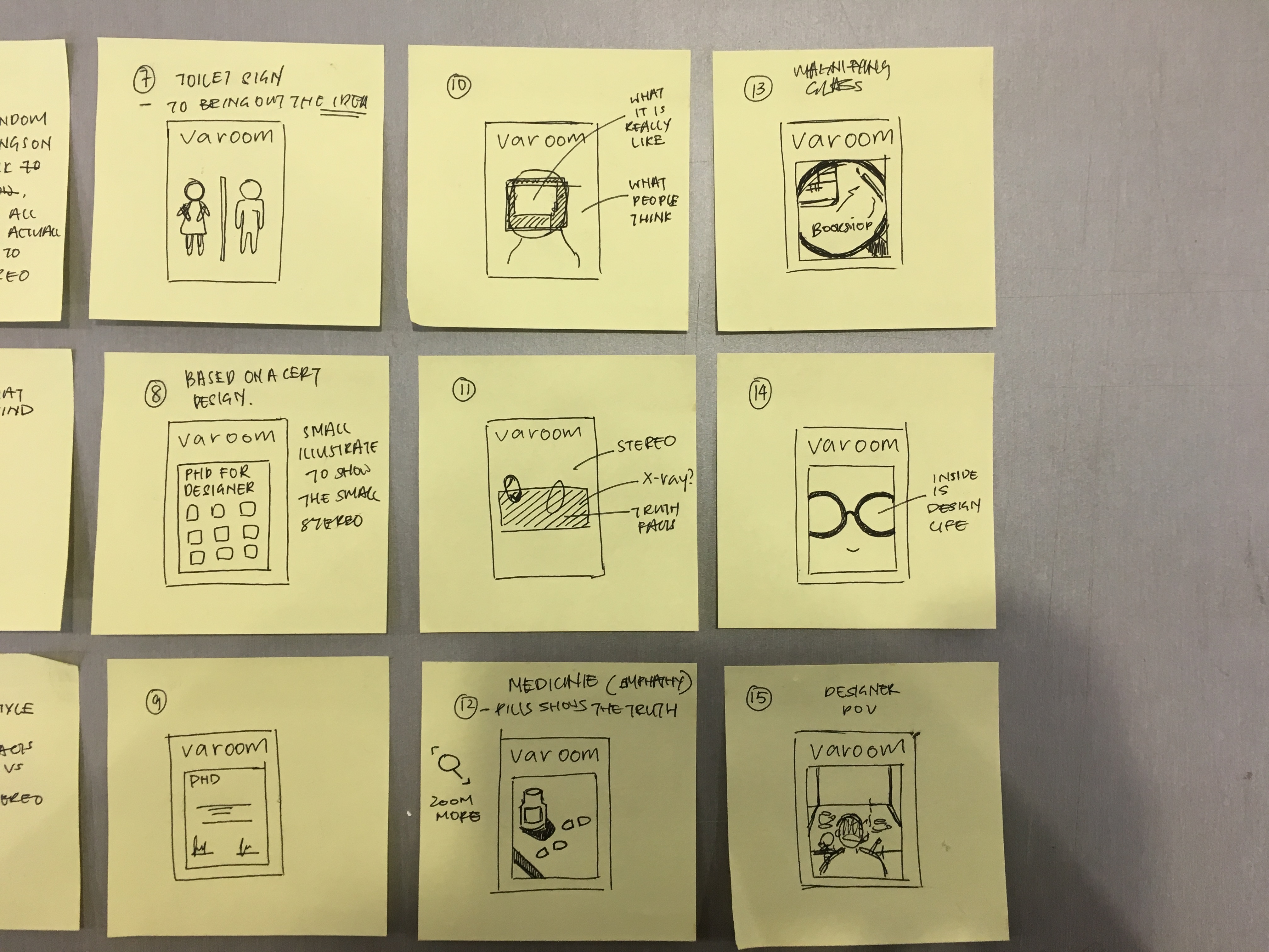
So after trying for many many many times, I decided that sticking to colors that are near match to the pills would be the best choice. My Concept is telling the audience to have a empathy on designer, to tell you the fact about designer. What stereotypes thoughts you have to the professional VS the actual facts of the people in this profession.Inside the pills (medicine designer eat) shows the truth of a designer life.

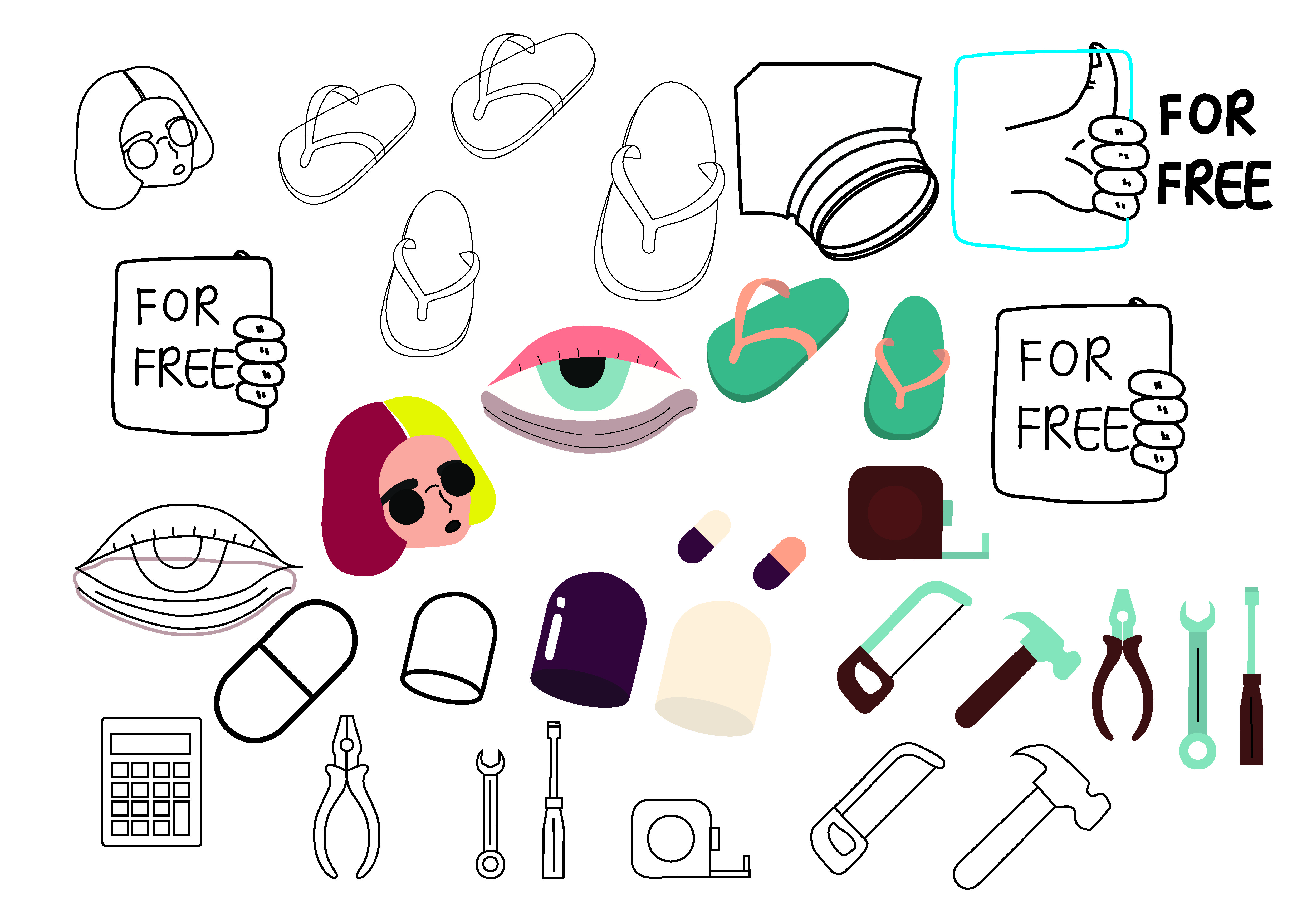
Assume we designer for free.
“It’s a simple job, make it nice, so do it at a low price or in fact for free.”

Assume we designer can fixed everything, light bulb, laptop, spectacles or even
“where to buy markers? Freaking popular lah!”

Assume we designer wear designer cloths and in fashion trend everyday, actual fact – Flip Flops.
“Come on! we work hours in front of our computers, let me be comfortable!”

Assume we designer have colored hair,
“I don’t even have time to cut my hair!”

Assume we designer have an easy job,
“Just come closer… Look at my dark eyes circle…!”

Illustration For Designer: Editorial (Research – 4) Finalizing Composition

Rough Sketch

Color Research
I look into some color concept that I could follow or have a guide because as I roughly created a background using the reference from my mood board I realized that the color are too down, it is too boring and gives a sad, moody feeling and I don’t want that as a magazine cover. Also it might not match my user persona, and having empathy for designer should have a color scheme that draws attention to convey the message but also a balance color that is not too cheerful nor too moody looking.
However, the color scheme that I chose does not match my design and artist reference that I choose, the color are too pop art and unrealistic looking, and the rest are too “normal” looking.

What I then decided to do since I could not foresee my composition would be to craft out the composition and then plan my color base on it. As there would be a lot of elements and items on the composition planning color ahead might not be the best solution to see the overall balance of the tones.

Drawing the Items

Adding Colors

Before Selecting colors I thought about designer working until morning, so I went over to colourlovers and search “morning” and I’ve selected two sets of colors


Unfortunately, this two sets of color is way too bright and too pop looking that it is not relevant to my theme and also it makes the whole composition slightly heavy and messy looking. 

What I decided to do since I am not really good with colors is that I went to simple search color palette and would be colors set that are group nicely together for me and i tried by placing it beside my composition and edit little at a time to find the fight balance and match

I came out with three “colors” that I am not fully convinced of so I am still trying to find the right color that balance the background as well as the items on the composition so that it does not attract the attention away.

Next Post (Illustration For Designer: Editorial (Final))

Illustration For Designer: Editorial (Research – 3) Composition Sketches

This is my Thumbnail Sketch on post-it for my composition:)


1-3, 5-7: I want to bring out the two side of of perspective in this composition, one side is the designer thoughts and another side is the stereotype thoughts people have towards designer.

4, This is one of my weakest composition i feel, personally I wanted to try out the style of my moodboard by putting random items on a desk but each items actually have a meaning to one stereotypes

8-9: So I have this idea of  making a PHD cert with small illustration to represent each stereotypes designer receives.

10-11, 13-14: This four composition is more of having a stereotypes as a whole composition, for example a designer on how he/she dress, But in the middle it have a Polaroid, x-ray or a magnifying glass to zoom in the and within the Polaroids, x-ray and magnifying glass are illustration of what the truth facts about designer.

12: This is a style that combines the idea of composition 4 and with a different meaning to the items place on. For example the medicine symbolizes the empathy for designer and each medicine pill represent the different stereotypes receives

15: This composition is using the point of view of the designer working as the whole layout, on the desk it would have items and truth about what a designer life is about and the things the could be seen (the actual fact) not stereotypes things like Starbucks, sunglasses etc. 

16: This is idea of the dollar twist ball game where each individual ball contains illustration that would represent the idea. But for this I felt that it would be a little weak and the twist ball might not be a good representative to show my concept.


Next Post (Illustration For Designer: Editorial (Research – 4) Finalizing Composition)

Illustration For Designer: Editorial (Research – 1) Theme & User Persona

BRAINSTORMING CONCEPT:)

I started this project by simply creating a blank page and write down the three topics:  Obsessions, Empathy and Style. Following, I wrote down events, situations that happen around me that are inspired by these three words. E.g, What people are obsess about (traditions, cheese, neatness),

Then I realized as i write, the is one common situation that occur on me personally and with the designer friends I have. Such situation seems to happen to us at least once, which is “Designer Stereotypes” .
“Designer Stereotypes” are situations or stereotypes designer receive that and being determine by others.

So i went and did a mini survey by asking my classmates and friends who are working in the current design field what are some stereotypes the receive:) Those highlighted one are the more common ones. So I decided to go with the concept “Having Empathy on us Designer”

USER PERSONA
Anti (People who might not be interested by the cover)

Reader (People who are interested by the cover)

Reader (People who are interested by the cover)

Next Post (Illustration For Designer: Editorial (Research – 2) Inspiration & Moodboard:)