Project 4 – Interactive Artwork – Research

The I-Ching Art Installation Involves 64 Chinese Phrases

Created by artist Huang Rui, the I-Ching art installation is hosted at the Opposite House hotel in Beijing, China. When the artist is presenting, guests are invited to hold one of the umbrellas and form a circle. Following the artist’s cue, the participating guests can then communicate with one another either aloud or in silence. From above, the umbrellas look like the yin-yang symbol.

Somehow, the usage of umbrella concept is pretty unique as we only uses umbrella when there’s rain but not in the indoor.


The light installation CLOUD

Cloud is an interactive sculpture created from 6,000 incandescent light bulbs by Canadian artists Caitlind r.c. Brown & Wayne Garrett. The piece utilizes pull chain switches and everyday domestic light bulbs, re-imagining their potential to catalyze collaborative moments and create an enveloping, experiential environment.

Project 3: Thinking Sequentially – Impossibilities of being

Inside A Box 

I got my inspiration while chance upon a quote, thinking outside a box. A guy in the box was affected by the movements he made previously. Any new movements to the box will eventually affect the current situation. By opening up the box also gives the character a new chance to redo what he did wrongly previously.

Project 2 – 2D – Forest Gump Process / Tote bag

Process of Silk screening

Totally enjoyed myself while doing our own silk screening from scratch. Below are the video of my process. I was quite lucky as it was my first time doing it and the outcome of it was fantastic on the paper.

In the video it might look easy but sometimes during your first try if you didn’t applied much pleasure on it some black inks won’t be able to spread properly and you might have to rewash your silkscreen to redo again.

Final outcome for Tote Bag


Project 2 – 2D – Forest Gump Final Outcome

#1 – “Im king of the world” – Titanic 

I felt that after a few drafts, I should really put the context of the movie in the design. So firstly, I featured a skull which representing death and as we know that there were not many people survive after the titanic sank.

The crown is to represent that he is a king and also a guy who seek for freedom as he was left in the deserted island after his boat malfunction. He was the only one left after the disaster. Due to the limited of supplies, he eventually died in the island. I was actually quite happy with my final design for the quote ‘I’m king of the world” from Titanic.

#2 – “I have nipples, Greg, could you milk me?” – Meet The Parents (2000)

This is one of my favourite outcome that I did. I decided to do it like a comic style which I got my reference from “Butcher Billy” that I research on. I decided to go for the comic style because the quote has a little sense of humour and also being sarcastic.

The action, the body and the facial expression with a cigar on given an impression that he’s a grumpy old man which the movie in the quote is all about. I painted the body textures to give a little more comic kind of look which the original photo doesn’t have it. The settings of the movie is in the dining hall so I designed the set with a wooden table with lamp and the milk in the foreground.

The window is at the background to represent that you’re in a house. I doesn’t want to put so much elements at the back which I wanted to keep things as clean and simple as possible.

#3 – “May The Force Be With You” – Star Wars (1977)

This is one of the quote that I did quite many drafts on it and I decided to stick with the artist reference “Noma Bar”. I wanted to try using the negative and positive space and I want to keep the design as simple as possible to understand the quote well. This design featured 2 friends, suits also representing they are presentable and there’s negotiate and conversation in between. Both are shaking their hands which representing “Good luck”. It is also the meaning of the quote.

In the middle, there are 2 guys who are fighting against each others. As in the movie “Star wars episode III”, Anakin Skywalker betrayed his master Obi wan and became Darth Vader at the end. So sometimes you may be best friends or brothers but when things happened, either one side or both sides will get hurt which the blood in the design represent.

#4 Roads? Where we’re going , we don’t need roads. – Back to Future – (1985)

When I first look at the quote, I decided to do something that is not related to the road. It can be either on sea, at the sky or even space. I felt that after created a few drafts, the subject in the space looks more eye pleasing to me.

I added the spiral effects and by overlaying it which gives like a milky way effects in space. The car is also the main object which relates to the movie.

Reflection / After Presentation

Overall, it was a good experience playing with photoshop using different kind of techniques like examples the threshold, half tone and posterize.

After I presented my 4 designs and hearing the feedbacks, I realised that a few of my designs can be improve and the meaning of the quotes can be further much more elaborate. I will try to improve on my next project! Totally looking forward to our final project “Ego”.

Project 2 – 2D – Forest Gump Process

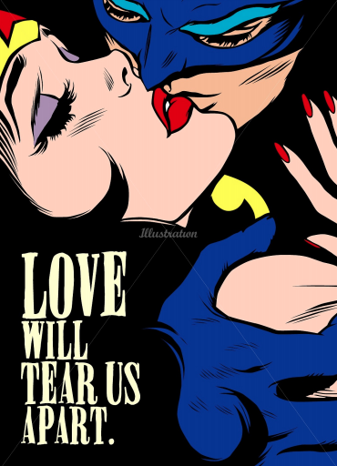
Movie quote: “I’m king of the world!” 

#1
This was my very first design idea, after the whole process I felt that I don’t really like the outcome. I literally puts everything that the quotes has like the ‘King’ and ‘World’ on a boat in the design. I felt that I have lost track little which I didn’t emphasize the quote properly.

#2

After exploring some ideas and also looking up at artist references, I did something like a comic kind of effects on my design. But I still felt that it missing something, it doesn’t bring out the content of the quote.

#3

I further explore more ideas and trying to think outside the quote, as “I’m king of the world” also representing freedom, why not I just put a space suits guy outside the world itself to representing his literally the king of the world? Overall, it doesn’t have the context of the movie which people can’t really relate to it.

Movie quote: “I Have Nipples, Greg. Could You Milk Me?”

#1


I wanted to design something that I research on which is to make into something like a comic kind of textures. I started out by putting a cow with nipples demanding people to milk in a farm, the image may look good but it doesn’t really suits the movie quote. After consultation it should be something in a sarcastic or sarcasm in a way.

After looking through the scene again the the movie “Meet the Parents”, Yes! It’s something related to sarcasm from the father-in-law in a dining scene setting.

#2

I did a replacement from a cow to a drunkard guy who is been sarcastic asking someone to milk him as he undress himself. But it still doesn’t fit the content of the quote and the movie which I will try to further improve on.

#3

For the 3rd design, I wanted to focus more on the father-in-law, what I really visualise is that, he’s fit in a way to represent he’s fierce and we can really see the focus of his nipples which relates to the quote above. But it still feels like it is lacking of some elements behind the design. I guess I would really have to re-watch the scene and again, try to explore more elements and artist references for ideas to further improve on the design.

Movie quote: Roads? Where we’re going, we don’t need roads. – Back to future (1985)

#1

This quote is from one of my famous childhood movie, “Back to future”. When I first started designing, the quote has given me a hint that the whole design won’t be at the road side, it should be either somewhere else other than road. My very first design was that, It shows a old guy pointing at the sea but after designing it I felt that the overall layout actually felt kind of plain.

#2

I was pretty happy with this design as I felt it somehow relates to the quotes but it still doesn’t have the context of the movie. I felt that after creating this, it’s just a space shuttle launch from earth to space and doesn’t seems to belong to the movie. After consultation, I was given an suggestions to replace the shuttle into the car instead so it will somehow link up with the quote above.

#3

I did this right after the consultation, I replaced the whole layout to somewhere around the empire state and the car from the movie. Somehow, I felt that the ideas is getting closer and closer. I believe the next one will be better.

Movie quote: “May The Force Be With you” – Star Wars (1977)

#1

This was the very first design that started out very literally by just emphasizing on the word “Force”. so I just edited in a way that looks like a few photographs smack right in the frame which kick start my brain of what is threshold all about.

#2

Right after some research and by looking at artist references, It has to have a vintage look like an pencil sketches look. My initial plan was to give a surreal look that somehow related to the Star wars. I uses the seesaw to show the word “Force”. Right after the consultation from my professor, she suggests that actually it should be another way right which is to show that the small guy is actually overpowered than the bigger guy.

#3

I did a swap on the images but it still doesn’t look appealing to me in a sense. I felt that something is either missing or I added too much stuffs in. It just doesn’t feel right to me. I decided to explore more and continue to work on my ideation of creating the layout for the quote.

#4

I designed this in less than 10 minutes, I just did a quick exploration of my ideas and wanted to try whether will it work or not. Sadly, it doesn’t fit or work properly in the design. it just a quick warm up for my brain and to execute the ideas out quickly. I felt that it deserved as a draft but will definitely helps me to think further.

#5

After focusing so much energy on trying to extract ideas from the word “Force”, why not just try to refocus a little and put the context of the movie in the artwork. So I decided to try out by putting the armour plate of Darth Vader in the design. It gives an idea of a guy trying to “force” start or restart a button. But after consultation, It seems like not many people recognize the piece of device. So it means that I have to drop the ideas and try to explore more.

#6

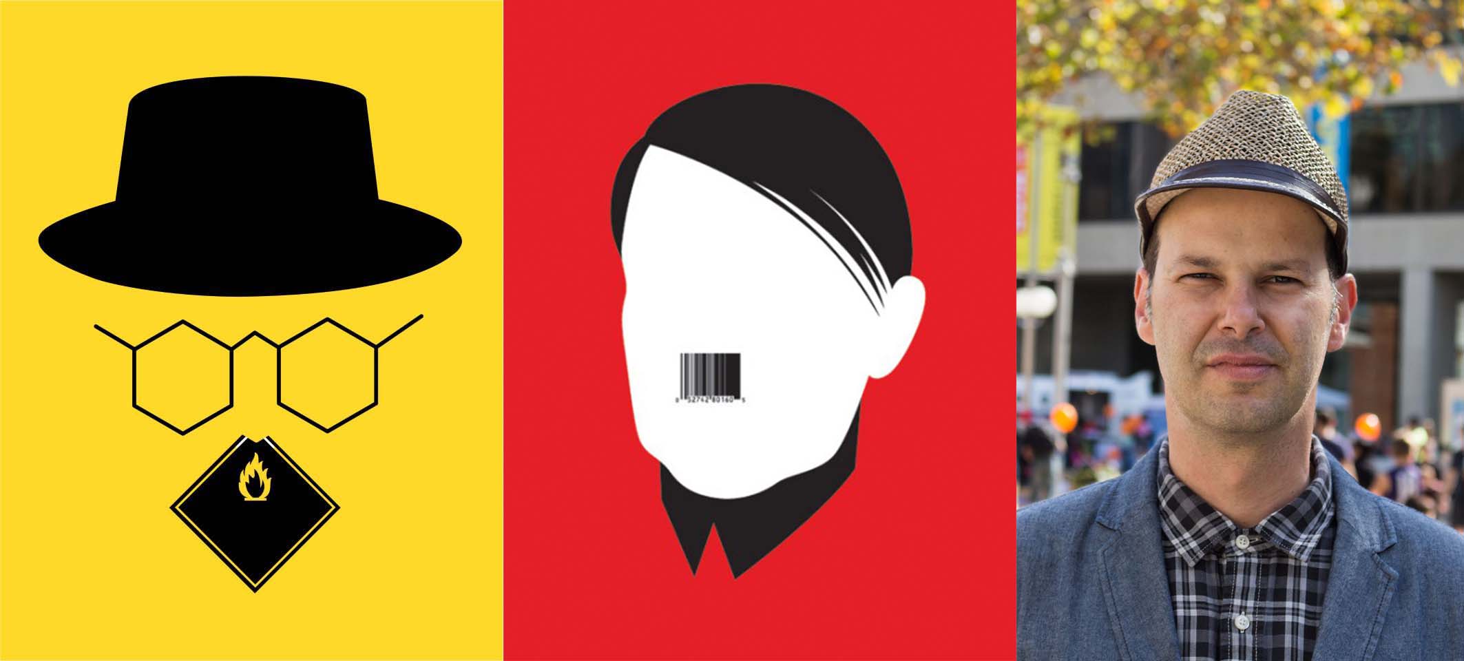
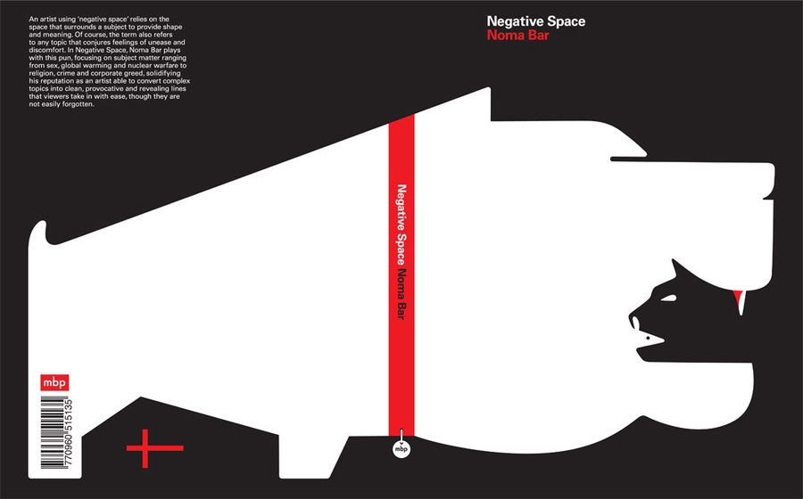
After doing some research on artist references, I decided to explore more into negative and positive space from the artist “Noma Bar”. I tried to keep things as simple as possible so that people can really focus more on the quotes. But I felt that it is still missing something else in the images.

#7

Again, I executed this design in less than like 10 to 15 mins, as the ideas of old weighting machine came  into my mind. But I had trouble finding and trying to fit things in the images. At the end I uses the 2 main characters in the old Star Wars movie which is Luke and his wife. I wanted to try something new which is to give a little sense of humour but it doesn’t seems to look good in the image. I decided to drop the idea and really focus back into the meaning of “May the force be with you” which representing “Good luck”. I realised I executed quite a lot in this quote which really helps develop my idea further.


3D – Assignment 2

Process

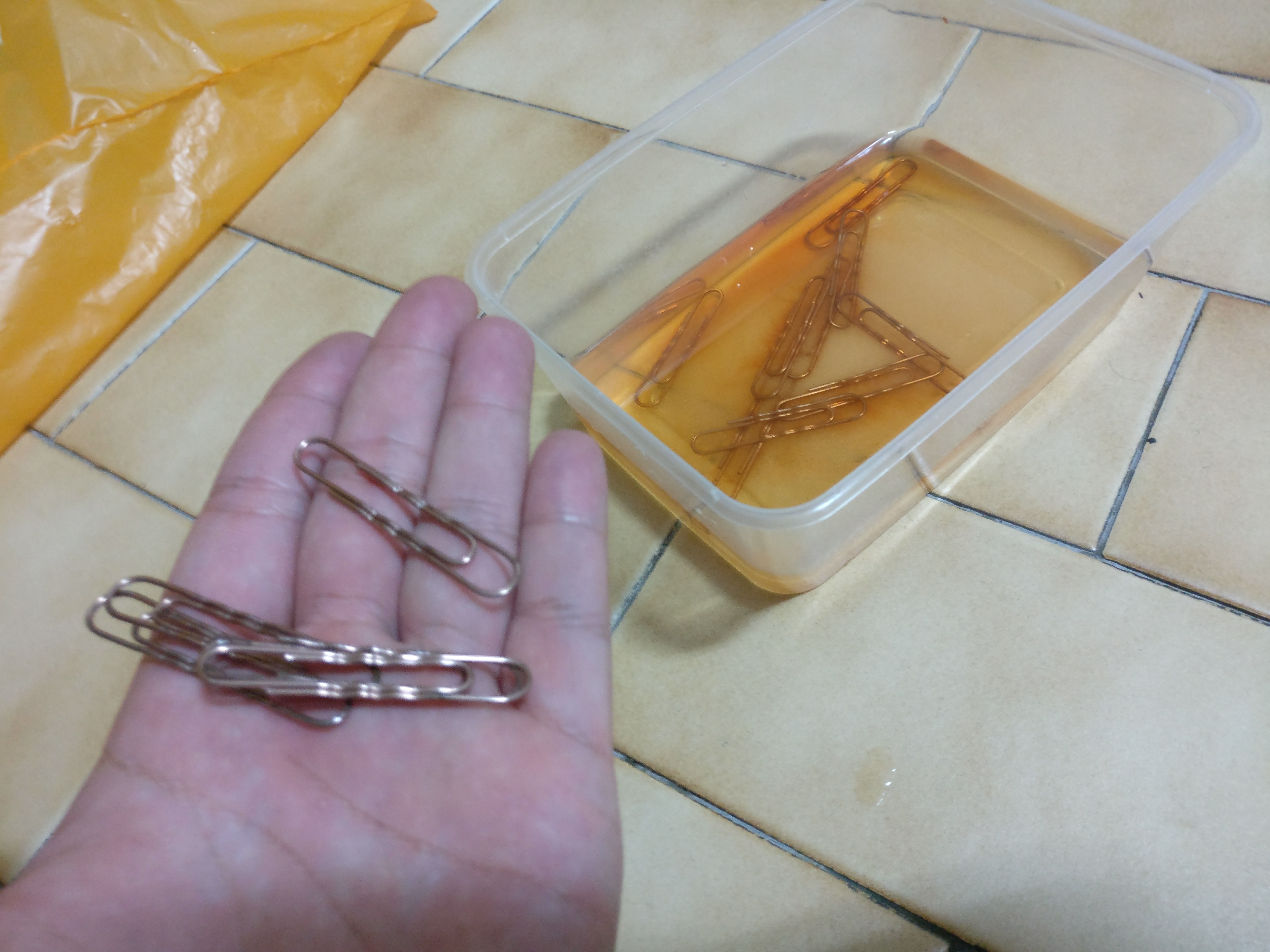
By using the same process as the study model, using salt, vinegar, bleach but the result didn’t turn up so well because I wanted to have the brownish effects on my model. So I was recommended by my classmate to put in as many copper clips as possible to soak them with the chemical. At the end of the process, I used a portable bunsen burner to burn some parts of the metal tin which gives little more detailed on the corrosion tins.

Final Model

The shape of the metal tins was inspired by a picture of lamp that I saw online, I felt that it gives a better form than my previous study model but after the consultation, the shape could be better if its constant like having the same shape.

Picture of my study model and the final form.

Some details to improve on and take note is that I have to keep things consistency for the next project. I used the wrong glue to stick the supports on my model which resulted ugliness on my model because the yellowish glue is too distracting. There’s something I need to focus and improve on!

Project 2 – 2D – Forest Gump / Artist Reference

Noma Bar

I was looking through pinterest and I  came across a artist that uses negative space on his design which inspired me a lot. I felt that by using the negative space it creates a surreal atheistically pleasing piece of artwork.

Simplicity is also one of my main focuses to design the whole layout for my 4 pieces of designs for the movie quotes.

Noma Bar’s Art work

His name is Noma Bar, he is an Israel-born graphic designer, illustrator and artist. His work appears in newspapers, magazines, book covers, ad campaigns and in his own books.

Noma Bar’s Book Cover

This is one of his book titled “Negative Space” written by him, originally published back in 2009. I managed to find a video of the book which shows us the designs and the used of negative spaces. 

This is by far one of the most interesting piece of work that I ever seen.

From Pinterest, I moved to youtube to search up  more of his artwork. There were tons of video references about Noma Bar in youtube, his artwork then expanded from illustrations into animation which deliver the message even further through motions.

Another one of his recent work in 2017 for the Mercedes-Benz.

ButcherBilly

http://www.illustrationweb.com/sg/artists/ButcherBilly/view

Butcher Billy is a Brazilian illustrator with a fresh approach, who loves to slice up ideas and imagery in popular culture and reassemble them in unique ways. Juxtaposing everything from Wonder Woman and the Watchmen to Morrissey and Breaking Bad, his work is ironic, humorous and very postmodern. His subtle questioning of pop culture using pop art as his medium is a juxtaposition in itself, yet in their own unique way all his images seem to make sense.
When I first saw this post, I was attracted by it. In terms of the colors , the textures also given a surreal kind of effects. I would love to try out this kind of approach on my 2D project!
Here are some of the work done by illustrator done by Butcher Billy. I really like the strokes on their skin tones which representing the shadow of the textures, would love to give this kind of textures on my work.

Jürgen Willbarth

One of the little number of artists who has done a classic education and learned all the different techniques from scratch. Jürgen Willbarth works like the old masters and creates his work by hand. Tradition lives on it its best form- timeless. Classic pen drawings, water colored paints, animals and landscapes, as well as detailed architectural images are his specialties.
Here are some work from Jürgen Willbarth, It was done using technical pen instead of computer. He strongly believed by using traditional way of doing work still has the sentimental value in it. Would love to explore more on this kind of technique in my illustration.

Dourone

http://dourone.com

Dourone is the pseudonym of Spanish artist Fabio Lopez. He’s a self-confessed creative nomad who loves to travel between different European countries and the United States, but grew up in Madrid. As he travels, he loves to paint – it’s as simple as that.

A self-taught illustrator, Dourone’s career developed out of painting shop fronts and interiors in his home city. Some of his favourite works have been huge wall murals in Los Angeles and as he’s progressed he’s added computer skills to the mix and will do his best to work in whatever medium a client requests.

Main influences include MC Escher, Moebius, Giovanni Battista Piranesi and Philippe Mohiltz, and he’s inspired by all the places he’s been to and interesting people he’s met. He also enjoys a fine wine.

I really love the half tone effects and he uses multiple images to form into a composition. I’m in love with the overall image and love to explore on this technique.

Project 2 – Forest Gump Movie Quotes Research

Research 

Our brief was to look up for movie quotes in the internet and design it into an image using photoshop. Firstly, I gathered quite a lot of movie quotes from the net and narrow down to the 4 main quotes that I want.

For some examples

“Bond. James Bond.” Dr. No, 1962

“My precious.” The Lord of the Rings: Two Towers, 2002

“Don’t ever change. For anybody.” – All about steve 2009

“Mrs. O’Brien: There are two ways through life; the way of nature, and the way of Grace. You have to choose which one you’ll follow.” Tree of Life (2011)

“i’m in a glass case of emotion.” – The Legend of Ron Burgundy (2004).

“You Taste Like A Burger. I Don’t Like You Anymore.”Wet Hot American Summer (2001)

The Chosen One

“I Have Nipples, Greg. Could You Milk Me?” – Meet the Parents (2000)

The above quotes is from the movie “Meet The Parents”,  it is a 2000 American comedy film written by Jim Herzfeld and John Hamburg and directed by Jay Roach. Starring Robert De Niro and Ben Stiller, the film chronicles a series of unfortunate events that befall a good-hearted but hapless man while visiting his girlfriend’s parents. Teri Polo, Blythe Danner, and Owen Wilson also star.

I chose this quote because when I first look at it, I felt that it is somehow related to an animal instead of a human. We should think it in a humour perspective way instead of sexuality or discrimination against women. But after re-watching the scene, the father-in-law is trying to be sarcastic in a way so the whole design should be something related to sarcasm.

Roads? “Where we’re going we don’t need roads”. – Back to the future. (1985)

Back to the Future is a 1985 American science-fiction adventure comedy film directed by Robert Zemeckis and written by Zemeckis and Bob Gale. It stars Michael J. Fox as teenager Marty McFly, who is sent back in time to 1955, where he meets his future parents in high school and accidentally becomes his mother’s romantic interest. Christopher Lloyd portrays the eccentric scientist Dr. Emmett “Doc” Brown, Marty’s friend who helps him repair the damage to history by helping Marty cause his parents to fall in love. Marty and Doc must also find a way to return Marty to 1985.

This is one of my favourite childhood movie and it is one of the best scene which they travelled back to the past. I chose this quote because it can be anywhere instead of the roads, It allows us to develop our ideas further. Instead of traveling on road, It can be either on the sea, in the air or even in space.

“I’m king of the world!” Titanic, 1997

Next up is Titanic, produced back in 1997 American epic romance-disaster film directed, written, co-produced and co-edited by James Cameron. A fictionalized account of the sinking of the RMS Titanic, it stars Leonardo DiCaprio and Kate Winslet as members of different social classes who fall in love aboard the ship during its ill-fated maiden voyage.

I felt that the quote is pretty much summarise a person who wants freedom or it may be something related to a higher authority with an evil plans.

“May the force be with you” – Star wars 1977

This is one of the famous quotes in the movie “Star wars”.
“May the Force be with you” was a phrase used to wish an individual or group good luck or good will, one that expressed the speaker’s wish that the Force work in favor of the addressee. The phrase was often used as individuals parted ways or in the face of an impending challenge.

I will be more likely to emphasis on the word “Force” strongly and also focus more on the word “Good luck” to create the artwork!


Project 2: (Image, Sound and Memory) – Goodbye, Emily

Scroll all the way down for research and development. 

BEST WITH EARPIECE ON! 


Ending

Summaries of Goodbye, Emily

Emily is a girl who suffered from depression, by using the tape recorder to record her sorrows in every places she visited. Which helps her to keep things on track but she decided to end her life at the very end.

This is a recording of her whenever she felt that she isn’t herself (Depression thoughts). I skipped some days in the middle part if you did hear carefully in the recording to represent she’s alright and a sense of fighting against her depression, but she still decided to give up and live on with her depression.

I wrote it in a point of view story-telling method, it allows the viewers to listen and understand that they are actually the one who played and rewind the tape recorder at the very end.

Inspiration

I got my inspiration of writing something regarding about depression through a video that I saw on my Facebook feed. It was actually a video of 36 hours before the death of  “Chester Bennington” the lead singer from the famous band “Linking Park”.

As we can’t really judge by seeing someone’s emotion and someone who suffered from depression will always protrayed a side of their happiness but we did not know actually they are dying inside. That concludes the story that I wrote.

RIP Chester Bennington.