Movie quote: “I’m king of the world!”
#1
 This was my very first design idea, after the whole process I felt that I don’t really like the outcome. I literally puts everything that the quotes has like the ‘King’ and ‘World’ on a boat in the design. I felt that I have lost track little which I didn’t emphasize the quote properly.
#2

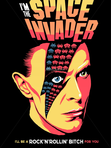
After exploring some ideas and also looking up at artist references, I did something like a comic kind of effects on my design. But I still felt that it missing something, it doesn’t bring out the content of the quote.
#3

I further explore more ideas and trying to think outside the quote, as “I’m king of the world” also representing freedom, why not I just put a space suits guy outside the world itself to representing his literally the king of the world? Overall, it doesn’t have the context of the movie which people can’t really relate to it.
Movie quote: “I Have Nipples, Greg. Could You Milk Me?”
#1

I wanted to design something that I research on which is to make into something like a comic kind of textures. I started out by putting a cow with nipples demanding people to milk in a farm, the image may look good but it doesn’t really suits the movie quote. After consultation it should be something in a sarcastic or sarcasm in a way.
After looking through the scene again the the movie “Meet the Parents”, Yes! It’s something related to sarcasm from the father-in-law in a dining scene setting.
#2

I did a replacement from a cow to a drunkard guy who is been sarcastic asking someone to milk him as he undress himself. But it still doesn’t fit the content of the quote and the movie which I will try to further improve on.
#3

For the 3rd design, I wanted to focus more on the father-in-law, what I really visualise is that, he’s fit in a way to represent he’s fierce and we can really see the focus of his nipples which relates to the quote above. But it still feels like it is lacking of some elements behind the design. I guess I would really have to re-watch the scene and again, try to explore more elements and artist references for ideas to further improve on the design.
Movie quote: Roads? Where we’re going, we don’t need roads. – Back to future (1985)
#1

This quote is from one of my famous childhood movie, “Back to future”. When I first started designing, the quote has given me a hint that the whole design won’t be at the road side, it should be either somewhere else other than road. My very first design was that, It shows a old guy pointing at the sea but after designing it I felt that the overall layout actually felt kind of plain.
#2

I was pretty happy with this design as I felt it somehow relates to the quotes but it still doesn’t have the context of the movie. I felt that after creating this, it’s just a space shuttle launch from earth to space and doesn’t seems to belong to the movie. After consultation, I was given an suggestions to replace the shuttle into the car instead so it will somehow link up with the quote above.
#3

I did this right after the consultation, I replaced the whole layout to somewhere around the empire state and the car from the movie. Somehow, I felt that the ideas is getting closer and closer. I believe the next one will be better.
Movie quote: “May The Force Be With you” – Star Wars (1977)
#1

This was the very first design that started out very literally by just emphasizing on the word “Force”. so I just edited in a way that looks like a few photographs smack right in the frame which kick start my brain of what is threshold all about.
#2

Right after some research and by looking at artist references, It has to have a vintage look like an pencil sketches look. My initial plan was to give a surreal look that somehow related to the Star wars. I uses the seesaw to show the word “Force”. Right after the consultation from my professor, she suggests that actually it should be another way right which is to show that the small guy is actually overpowered than the bigger guy.
#3

I did a swap on the images but it still doesn’t look appealing to me in a sense. I felt that something is either missing or I added too much stuffs in. It just doesn’t feel right to me. I decided to explore more and continue to work on my ideation of creating the layout for the quote.
#4

I designed this in less than 10 minutes, I just did a quick exploration of my ideas and wanted to try whether will it work or not. Sadly, it doesn’t fit or work properly in the design. it just a quick warm up for my brain and to execute the ideas out quickly. I felt that it deserved as a draft but will definitely helps me to think further.
#5

After focusing so much energy on trying to extract ideas from the word “Force”, why not just try to refocus a little and put the context of the movie in the artwork. So I decided to try out by putting the armour plate of Darth Vader in the design. It gives an idea of a guy trying to “force” start or restart a button. But after consultation, It seems like not many people recognize the piece of device. So it means that I have to drop the ideas and try to explore more.
#6

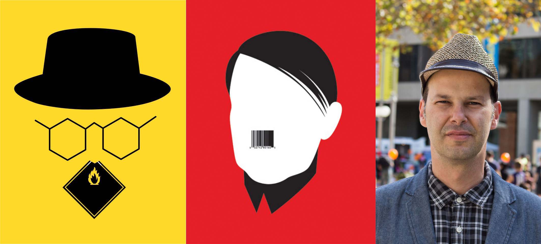
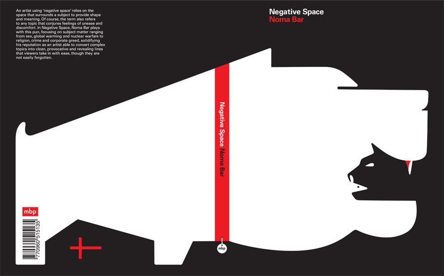
After doing some research on artist references, I decided to explore more into negative and positive space from the artist “Noma Bar”. I tried to keep things as simple as possible so that people can really focus more on the quotes. But I felt that it is still missing something else in the images.
#7

Again, I executed this design in less than like 10 to 15 mins, as the ideas of old weighting machine came into my mind. But I had trouble finding and trying to fit things in the images. At the end I uses the 2 main characters in the old Star Wars movie which is Luke and his wife. I wanted to try something new which is to give a little sense of humour but it doesn’t seems to look good in the image. I decided to drop the idea and really focus back into the meaning of “May the force be with you” which representing “Good luck”. I realised I executed quite a lot in this quote which really helps develop my idea further.

