Tag Archives: Art

Project 2 – 2D – Forest Gump Final Outcome

#1 – “Im king of the world” – Titanic 

I felt that after a few drafts, I should really put the context of the movie in the design. So firstly, I featured a skull which representing death and as we know that there were not many people survive after the titanic sank.

The crown is to represent that he is a king and also a guy who seek for freedom as he was left in the deserted island after his boat malfunction. He was the only one left after the disaster. Due to the limited of supplies, he eventually died in the island. I was actually quite happy with my final design for the quote ‘I’m king of the world” from Titanic.

#2 – “I have nipples, Greg, could you milk me?” – Meet The Parents (2000)

This is one of my favourite outcome that I did. I decided to do it like a comic style which I got my reference from “Butcher Billy” that I research on. I decided to go for the comic style because the quote has a little sense of humour and also being sarcastic.

The action, the body and the facial expression with a cigar on given an impression that he’s a grumpy old man which the movie in the quote is all about. I painted the body textures to give a little more comic kind of look which the original photo doesn’t have it. The settings of the movie is in the dining hall so I designed the set with a wooden table with lamp and the milk in the foreground.

The window is at the background to represent that you’re in a house. I doesn’t want to put so much elements at the back which I wanted to keep things as clean and simple as possible.

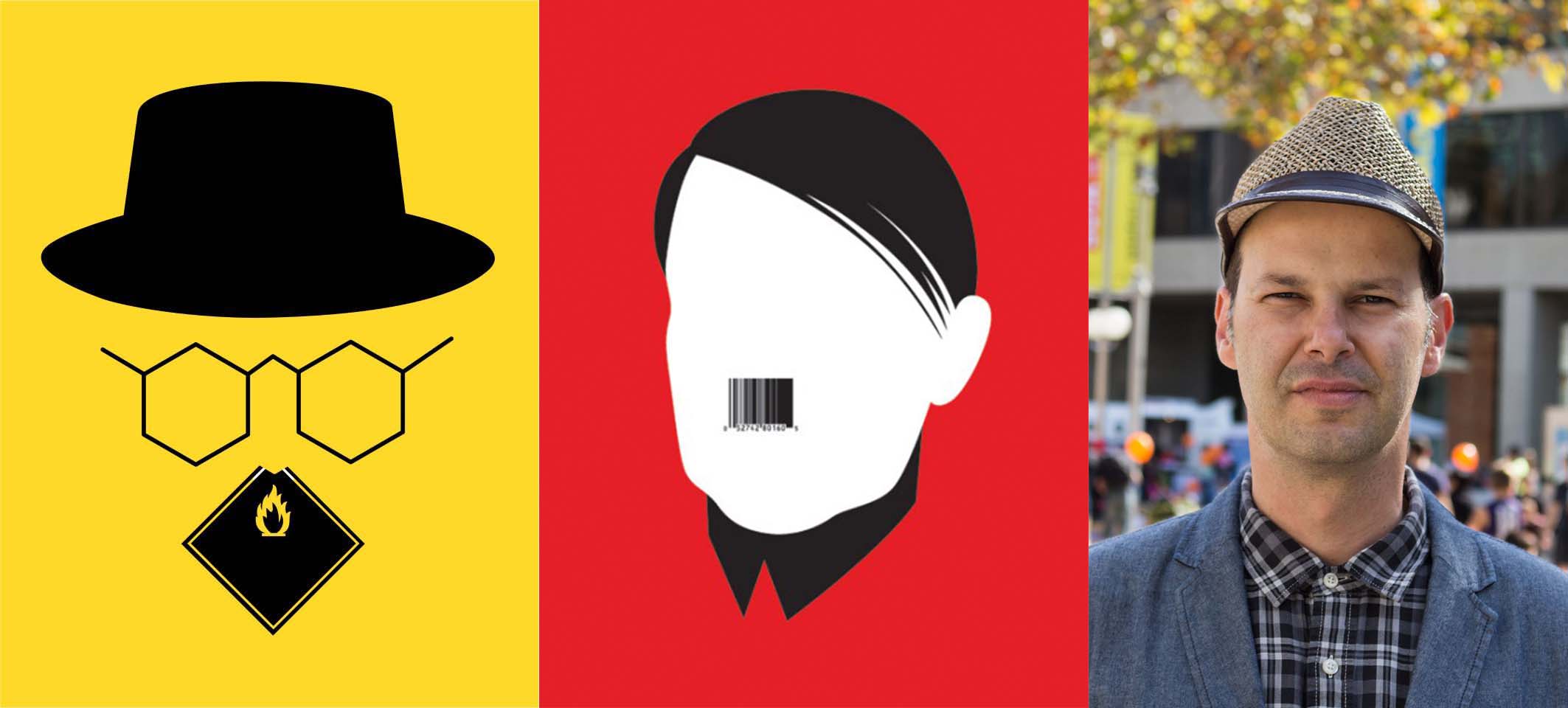
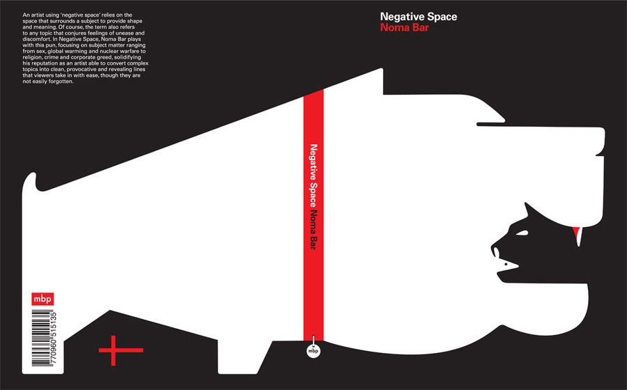
#3 – “May The Force Be With You” – Star Wars (1977)

This is one of the quote that I did quite many drafts on it and I decided to stick with the artist reference “Noma Bar”. I wanted to try using the negative and positive space and I want to keep the design as simple as possible to understand the quote well. This design featured 2 friends, suits also representing they are presentable and there’s negotiate and conversation in between. Both are shaking their hands which representing “Good luck”. It is also the meaning of the quote.

In the middle, there are 2 guys who are fighting against each others. As in the movie “Star wars episode III”, Anakin Skywalker betrayed his master Obi wan and became Darth Vader at the end. So sometimes you may be best friends or brothers but when things happened, either one side or both sides will get hurt which the blood in the design represent.

#4 Roads? Where we’re going , we don’t need roads. – Back to Future – (1985)

When I first look at the quote, I decided to do something that is not related to the road. It can be either on sea, at the sky or even space. I felt that after created a few drafts, the subject in the space looks more eye pleasing to me.

I added the spiral effects and by overlaying it which gives like a milky way effects in space. The car is also the main object which relates to the movie.

Reflection / After Presentation

Overall, it was a good experience playing with photoshop using different kind of techniques like examples the threshold, half tone and posterize.

After I presented my 4 designs and hearing the feedbacks, I realised that a few of my designs can be improve and the meaning of the quotes can be further much more elaborate. I will try to improve on my next project! Totally looking forward to our final project “Ego”.

Project 2 – 2D – Forest Gump / Artist Reference

Noma Bar

I was looking through pinterest and I  came across a artist that uses negative space on his design which inspired me a lot. I felt that by using the negative space it creates a surreal atheistically pleasing piece of artwork.

Simplicity is also one of my main focuses to design the whole layout for my 4 pieces of designs for the movie quotes.

Noma Bar’s Art work

His name is Noma Bar, he is an Israel-born graphic designer, illustrator and artist. His work appears in newspapers, magazines, book covers, ad campaigns and in his own books.

Noma Bar’s Book Cover

This is one of his book titled “Negative Space” written by him, originally published back in 2009. I managed to find a video of the book which shows us the designs and the used of negative spaces. 

This is by far one of the most interesting piece of work that I ever seen.

From Pinterest, I moved to youtube to search up  more of his artwork. There were tons of video references about Noma Bar in youtube, his artwork then expanded from illustrations into animation which deliver the message even further through motions.

Another one of his recent work in 2017 for the Mercedes-Benz.

ButcherBilly

http://www.illustrationweb.com/sg/artists/ButcherBilly/view

Butcher Billy is a Brazilian illustrator with a fresh approach, who loves to slice up ideas and imagery in popular culture and reassemble them in unique ways. Juxtaposing everything from Wonder Woman and the Watchmen to Morrissey and Breaking Bad, his work is ironic, humorous and very postmodern. His subtle questioning of pop culture using pop art as his medium is a juxtaposition in itself, yet in their own unique way all his images seem to make sense.
When I first saw this post, I was attracted by it. In terms of the colors , the textures also given a surreal kind of effects. I would love to try out this kind of approach on my 2D project!
Here are some of the work done by illustrator done by Butcher Billy. I really like the strokes on their skin tones which representing the shadow of the textures, would love to give this kind of textures on my work.

Jürgen Willbarth

One of the little number of artists who has done a classic education and learned all the different techniques from scratch. Jürgen Willbarth works like the old masters and creates his work by hand. Tradition lives on it its best form- timeless. Classic pen drawings, water colored paints, animals and landscapes, as well as detailed architectural images are his specialties.
Here are some work from Jürgen Willbarth, It was done using technical pen instead of computer. He strongly believed by using traditional way of doing work still has the sentimental value in it. Would love to explore more on this kind of technique in my illustration.

Dourone

http://dourone.com

Dourone is the pseudonym of Spanish artist Fabio Lopez. He’s a self-confessed creative nomad who loves to travel between different European countries and the United States, but grew up in Madrid. As he travels, he loves to paint – it’s as simple as that.

A self-taught illustrator, Dourone’s career developed out of painting shop fronts and interiors in his home city. Some of his favourite works have been huge wall murals in Los Angeles and as he’s progressed he’s added computer skills to the mix and will do his best to work in whatever medium a client requests.

Main influences include MC Escher, Moebius, Giovanni Battista Piranesi and Philippe Mohiltz, and he’s inspired by all the places he’s been to and interesting people he’s met. He also enjoys a fine wine.

I really love the half tone effects and he uses multiple images to form into a composition. I’m in love with the overall image and love to explore on this technique.

Project 2: (Image, Sound and Memory) – Goodbye, Emily

Scroll all the way down for research and development. 

BEST WITH EARPIECE ON! 


Ending

Summaries of Goodbye, Emily

Emily is a girl who suffered from depression, by using the tape recorder to record her sorrows in every places she visited. Which helps her to keep things on track but she decided to end her life at the very end.

This is a recording of her whenever she felt that she isn’t herself (Depression thoughts). I skipped some days in the middle part if you did hear carefully in the recording to represent she’s alright and a sense of fighting against her depression, but she still decided to give up and live on with her depression.

I wrote it in a point of view story-telling method, it allows the viewers to listen and understand that they are actually the one who played and rewind the tape recorder at the very end.

Inspiration

I got my inspiration of writing something regarding about depression through a video that I saw on my Facebook feed. It was actually a video of 36 hours before the death of  “Chester Bennington” the lead singer from the famous band “Linking Park”.

As we can’t really judge by seeing someone’s emotion and someone who suffered from depression will always protrayed a side of their happiness but we did not know actually they are dying inside. That concludes the story that I wrote.

RIP Chester Bennington.

Project 1 – 2D – Research and Development – (After Consultation / Part 3)

Research on Tate & Wabi-Sabi Style

(Links from Tate.org.uk & Wabi-Sabi style)

During after the consultation of our 18 outcomes of the emotions, we were given some feedbacks, ideas, styles and website for us to explore and research on, for our final artwork. One of it is Tate.org.uk, where we can find inspirations and by looking on the ways of techniques that the artists express on their artwork. Another style that we was told to research on after the consultation is "Wabi-Sabi" its one of the most interesting concepts because there is beauty in simplicity. This is one of the styles that I am moving into after some research on the net. 


Quotes 


Finding the quotes for simplicity to keep myself motivated.


Project 2: Image, Text and Final Artwork

Project 2: Create an advertisement with the non-perishable food item that you have received from the exchange. consider the various concepts introduced by Roland Barthes in his analysis of an advertisement and the layer of meanings created through the interplay of linguistic message, Image & Meaning, Dennoted messaged, connoted Message.
Brain Storming & Sketch

Baked beans was one of the most interesting product that I got in class during the exchanging for our new 4D assignment Project 2: “Image & Text”. In the above as we can see a rough sketch of my initial idea which by placing the product in the middle filled with jelly beans around. As we know baked bean doesn’t really have any unique flavor in it.

(Foreground)

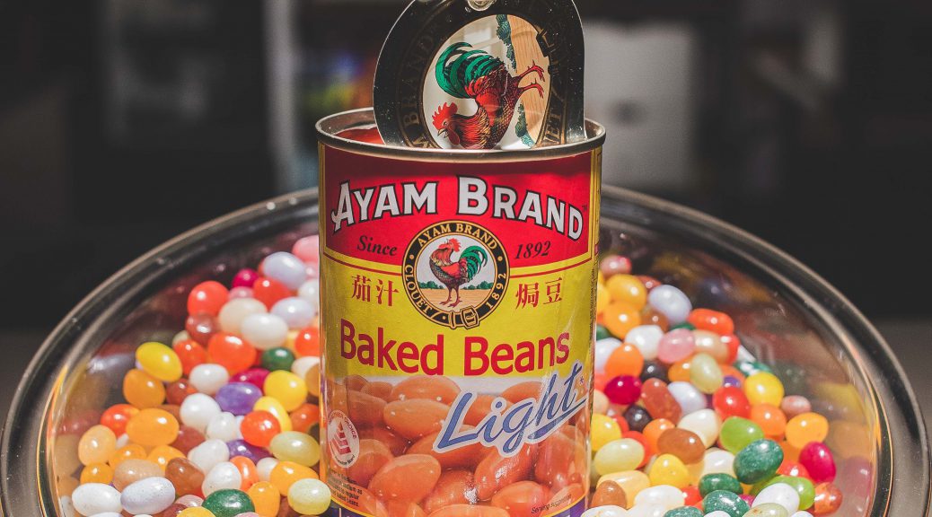
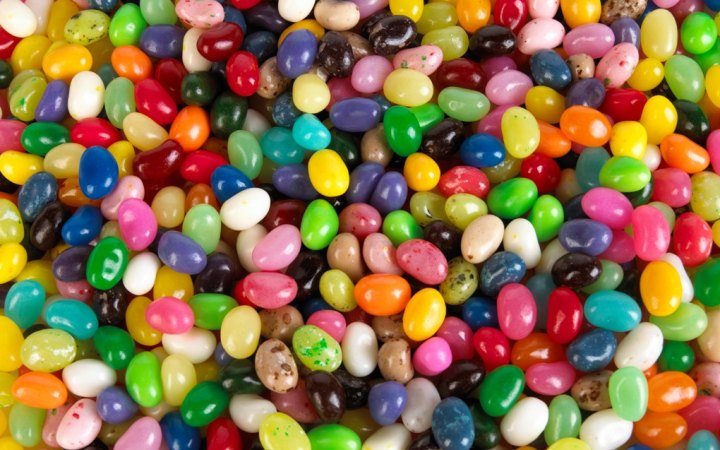
Jelly beans has lots of different unique taste and in colors, By replacing the baked beans into jelly beans it gave a sense to the viewers a whole new experience of eating baked beans. Which linked to my slogan “New Experience in Every Taste”

(Mid Ground)

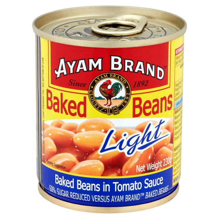
As the actual Baked beans can that I got doesn’t really look appealing so I decided to use this brand for my main subject.

(Background)

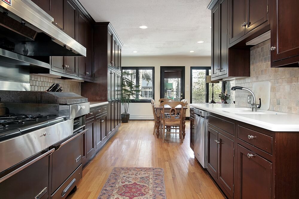
By putting kitchen as a background, it shows that where the product is belongs to. As whenever we see a kitchen it reminds us like our mother’s cooking. It brings a warm feelings to the viewers as a connoted message. This will be a challenge because I wont be shooting the images in a real kitchen set. It will be like a office setting but by putting familiar objects, it will look exactly like a kitchen. Stay tune for the image!

Final Artwork

This is the final layout of the artwork that I created using the ideas that I sketched out previously.

Challenges 

I felt that there’s always room for improvement in the artwork, like example the art directions can be improve and of course the ideas behind this advertisement poster can be more clear cut and more in-depth. I will definitely do more research and improve my artwork in the near future.

Project 1 – 2D – Research and Experimenting (Part 2)

Experimenting  Part 2

It was fun experimenting using objects that can be found in the natural or in supermarket.

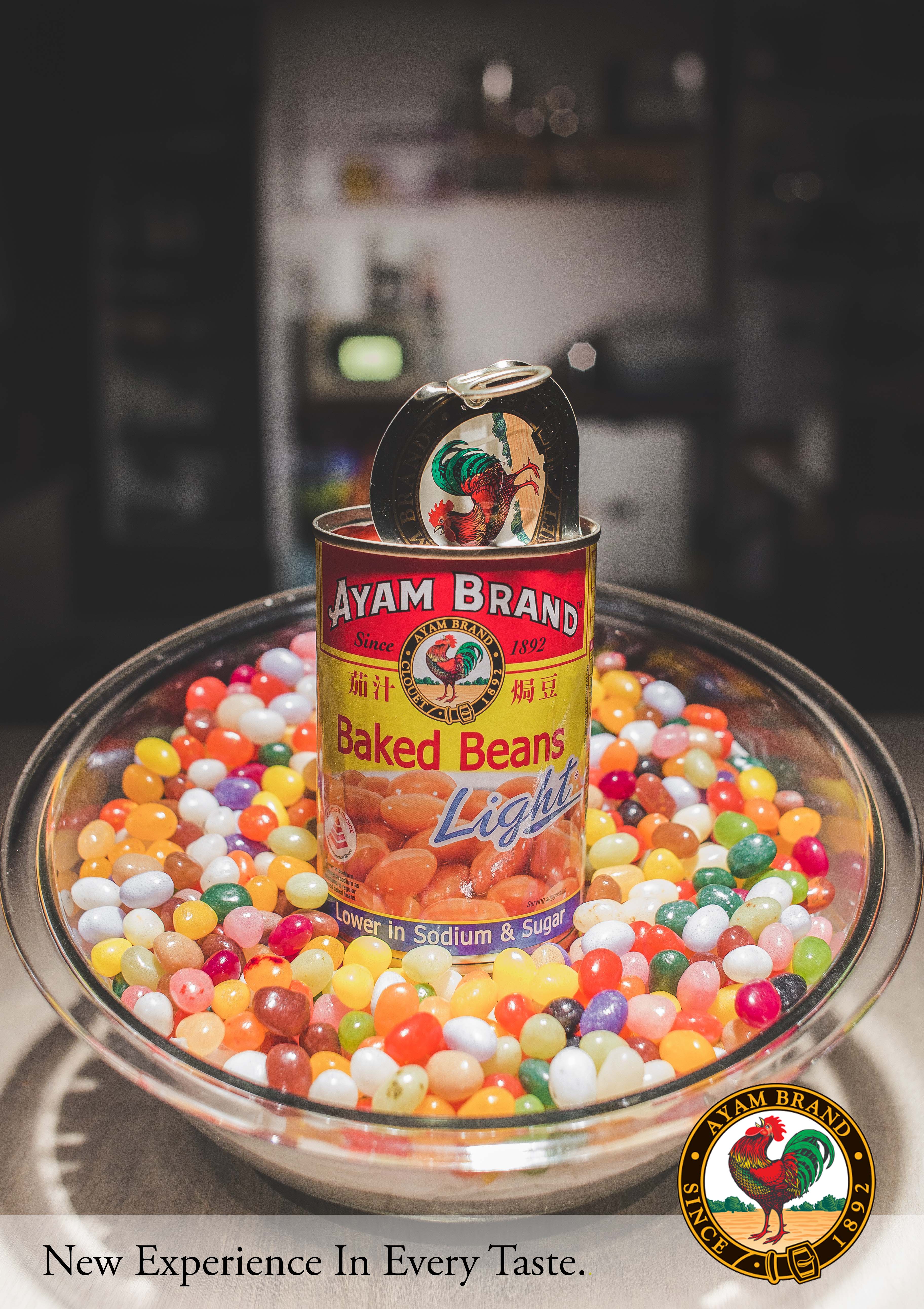
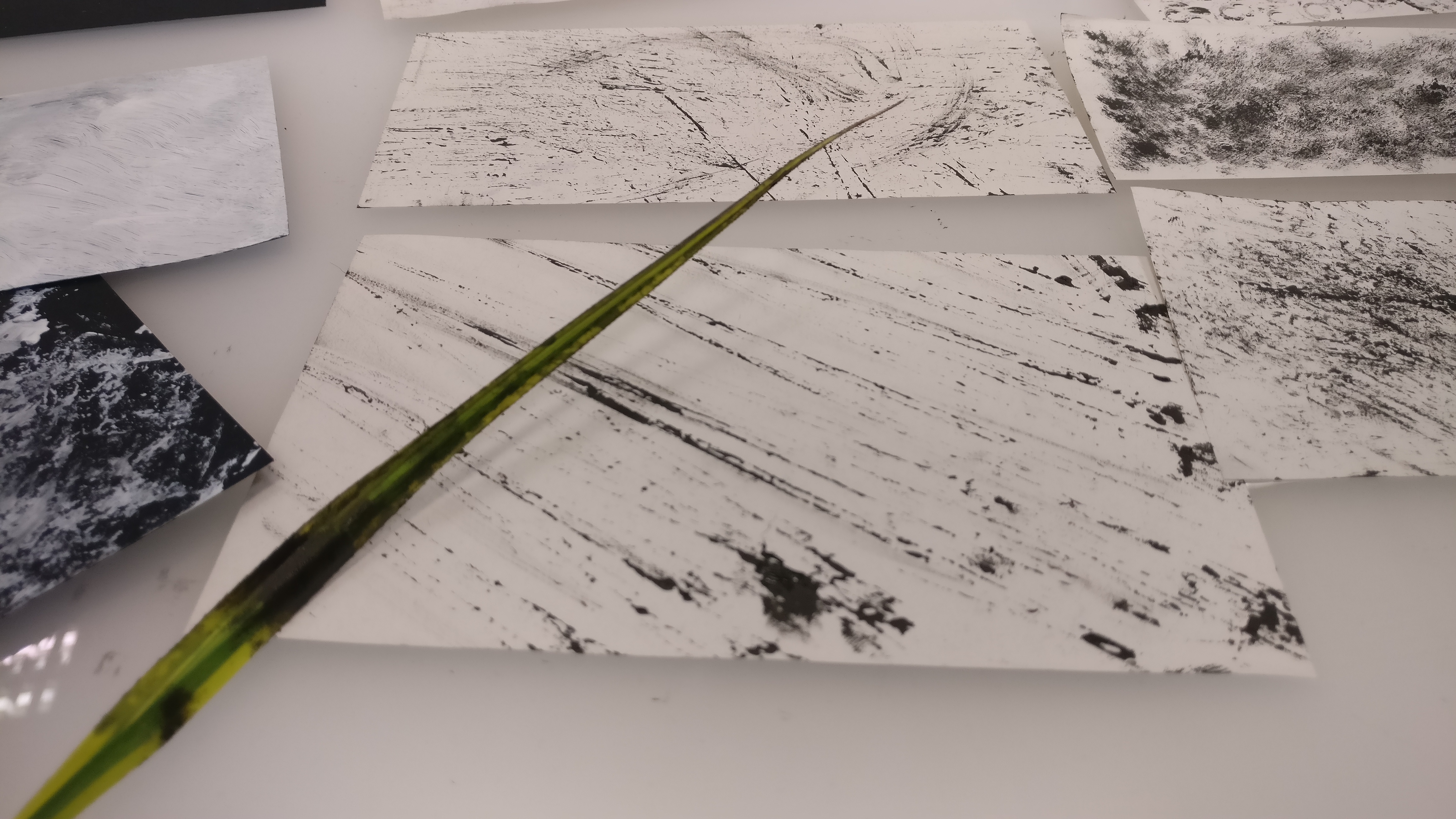
It was fun using random leaves that I found in the neighborhood, so I decided to process with the mark making. The results was good, it gives a whipping effects which describes the feelings as anger.  But it was too repetitive which is one of the major problems that I am facing.

By using food can also produced very unique effects. This was one of my favorite biscuit back in my childhood days. After the outcome of the effect, I felt it looked more like a emotion for fear. which narrow down into the emotion, panic.

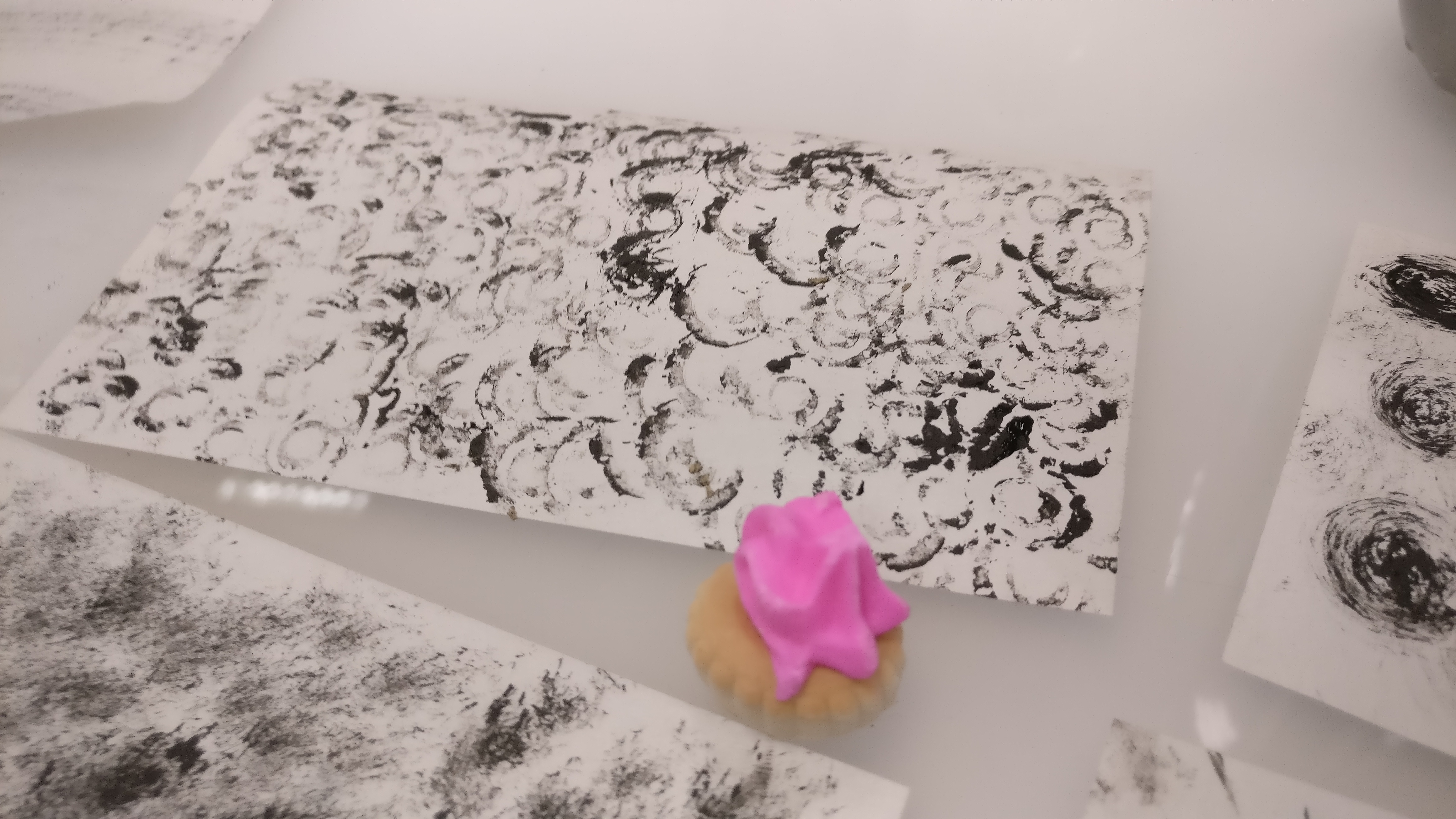
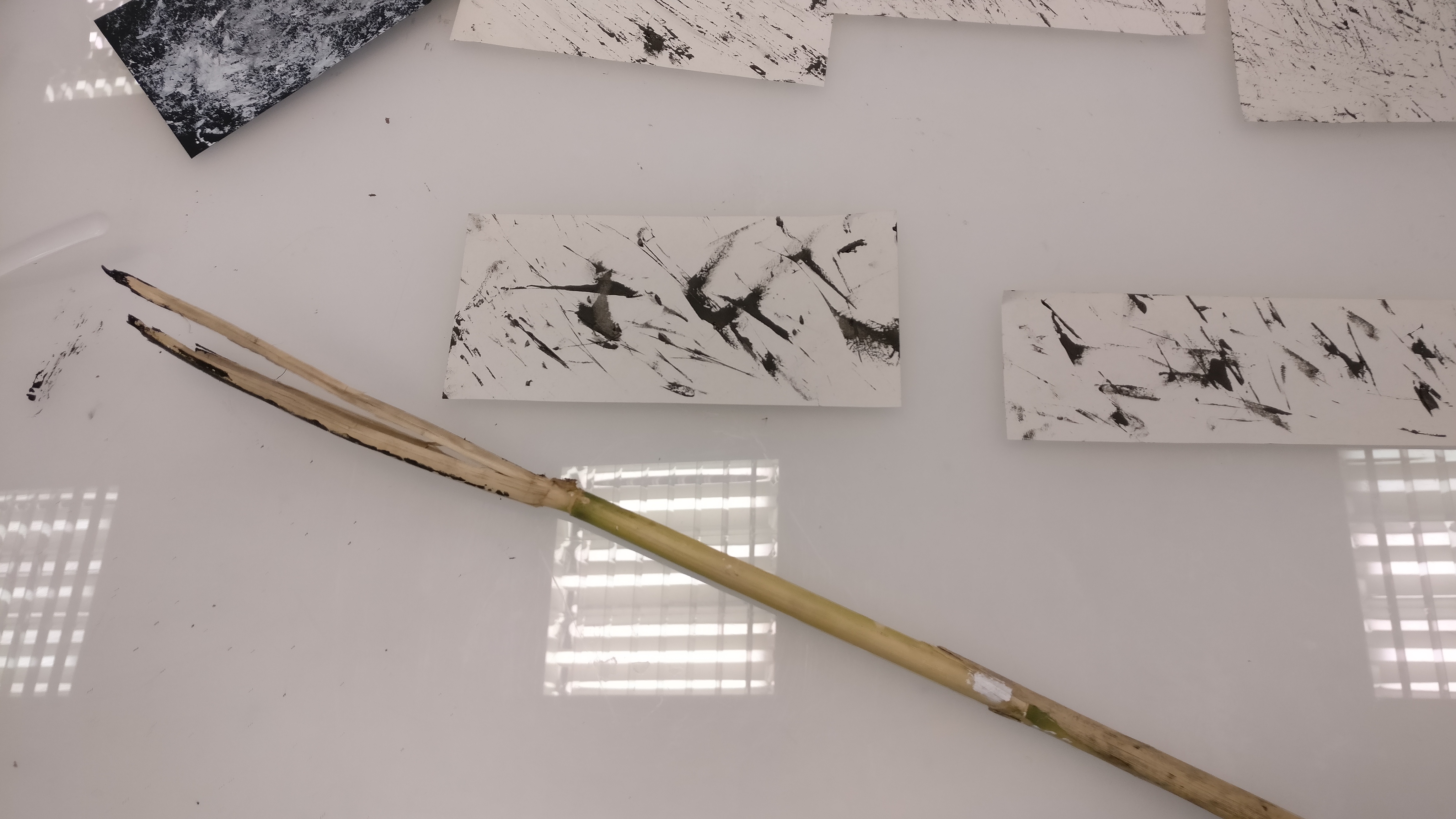
This was one more interesting object, wooden stick that I found in the neighborhood. When I picked up the interesting branches it looks like a cane which our parent used to cane us pretty badly. I felt that cane representing anger, as our parent used to hit us using cane, whenever they cane us its like a relieved for them. It gives off a whipping effects too, which like blood spreading out of the wound.
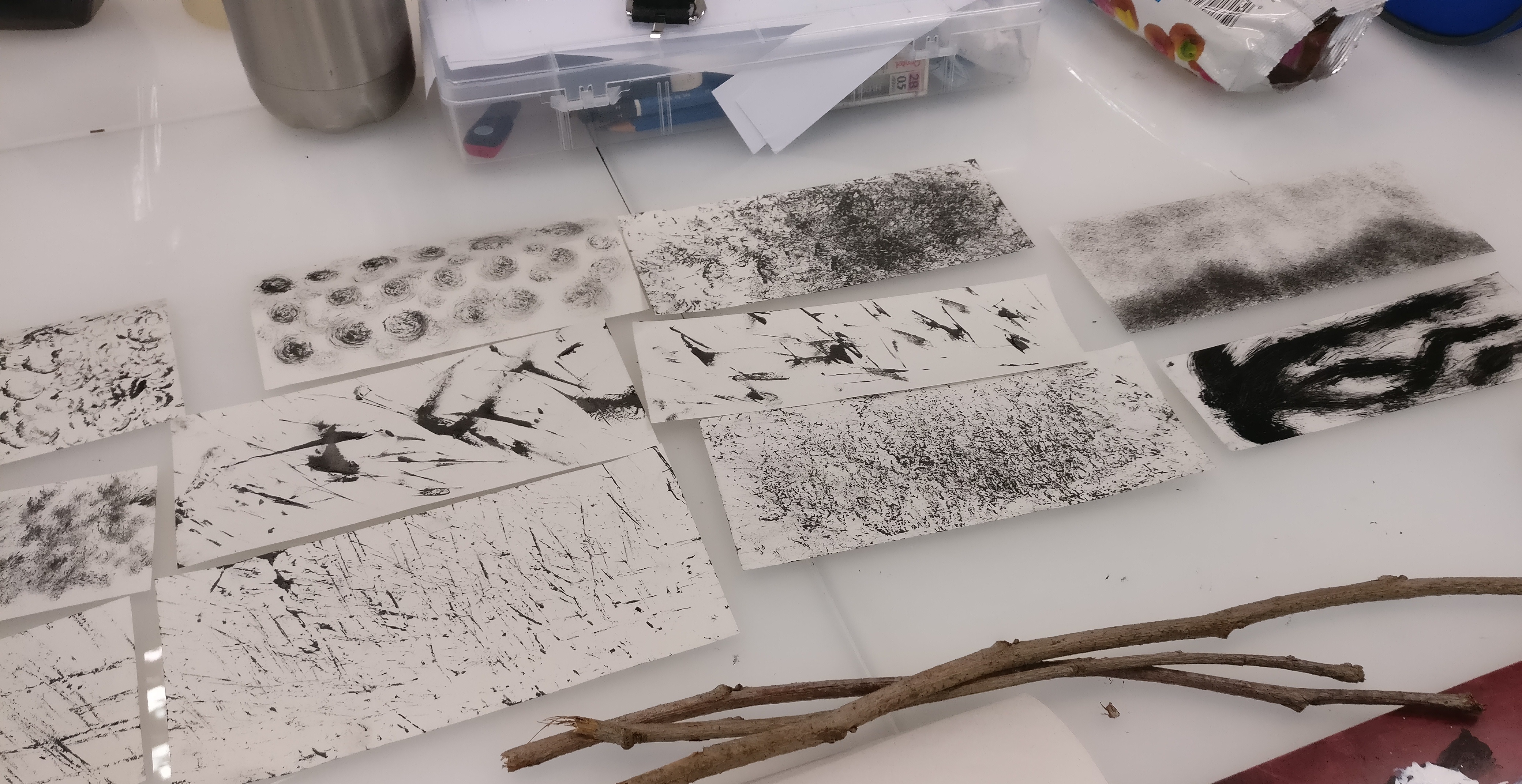
Overall, it was a fun experience doing the mark making and also finding the right objects to illustrate our emotions in it. What I learnt is that repetitive and too literal icons will not look much appealing to our artwork.

Project 1B “Paradox” – Health and Greenery

Collage done by Shawn Ong.

My idea behind the artwork is to promote Health & Greenery at the same time by using “Garden By The Bay” as a local location. As Singapore are moving towards to clean and green enviroment, by building more parks and running tracks which encourages people to run while enjoying the scenery at the same time.

Project 1A – “Strange Encounter”

Artwork created by Shawn Ong


3 Stages of Life – “Strange Encounter”

3 Pieces of artwork that I created using found images on the internet and collage it together using photoshop which also based on first hand experience of what I’ve seen in the train. A very few examples like the kid which they are living in their own world, colors and happiness existing in their life, another one is about a working adult struggling his work-life-balance and lastly, a old man who knows he’s old and slow but yet he wants catch up his pacing which resulted stubbornness in life.

Project 1A – Research on “Strange world collage”

Credits to Sammy Slabbinck

Collage Artist and Re-animator – Sammy Slabbinck

One of the most favourite art works that I found during my research on "Strange World Collage" done creatively by Collage Artist "Sammy Slabbinck" I really love the way he composite the elements by combining vintage and contemporary images which really stands out of the whole composition. His unique styles and proportions of the images through foreground to background which aim to creating powerful yet simple visual works that spread through with a sense of humour.


Sammy Slabbinck's Work - http://sammyslabbinck.tumblr.com
http://installationmag.com/photographic-memory/
Credits to Anthony Gerace

Meticulous and Mesmerising collage work from Anthony Gerace

I was very impressed by the two-pieces of collage work created by Mr Anthony Gerace. The very first impression that was given to me was that these images contain a hidden message behind it. As we can see the missing pieces in the artwork, which also sparked my curiosity and questioning ourselves the purpose of the artwork. What I really felt was that the artist wanted us to fill in our own imagination of what the models might look like and it also has a deep meaning of telling us that " Beauty is in the eye of the beholder ". The red lipstick that the artist added in also has a meaning of representing confidence and it also a source of strength. The color, red also has a very strong contrast that the artist wanted us to focus and listening to what the artwork have to say.


Anthony Gerace’s work - http://a-gerace.com https://www.pinterest.com/pin/508484614164808257/ http://news.upperplayground.com/news/tiling-collages-by-anthony-gerace

Mark Making Artist “Agnes Ceclie” – Through thick and thin.

This amazing pieces of mark making art was done by Italian artist “Agnes Ceclie” I was amazed by the black ink she uses through thick and thin lines to express her thoughts and ideas behind the painting.  As we can see the expression of a human figure which allows the viewers to think deeper and able to relate to this beautiful painting.


Credits to Agnes-Cecile (aka Silvia Pelissero)