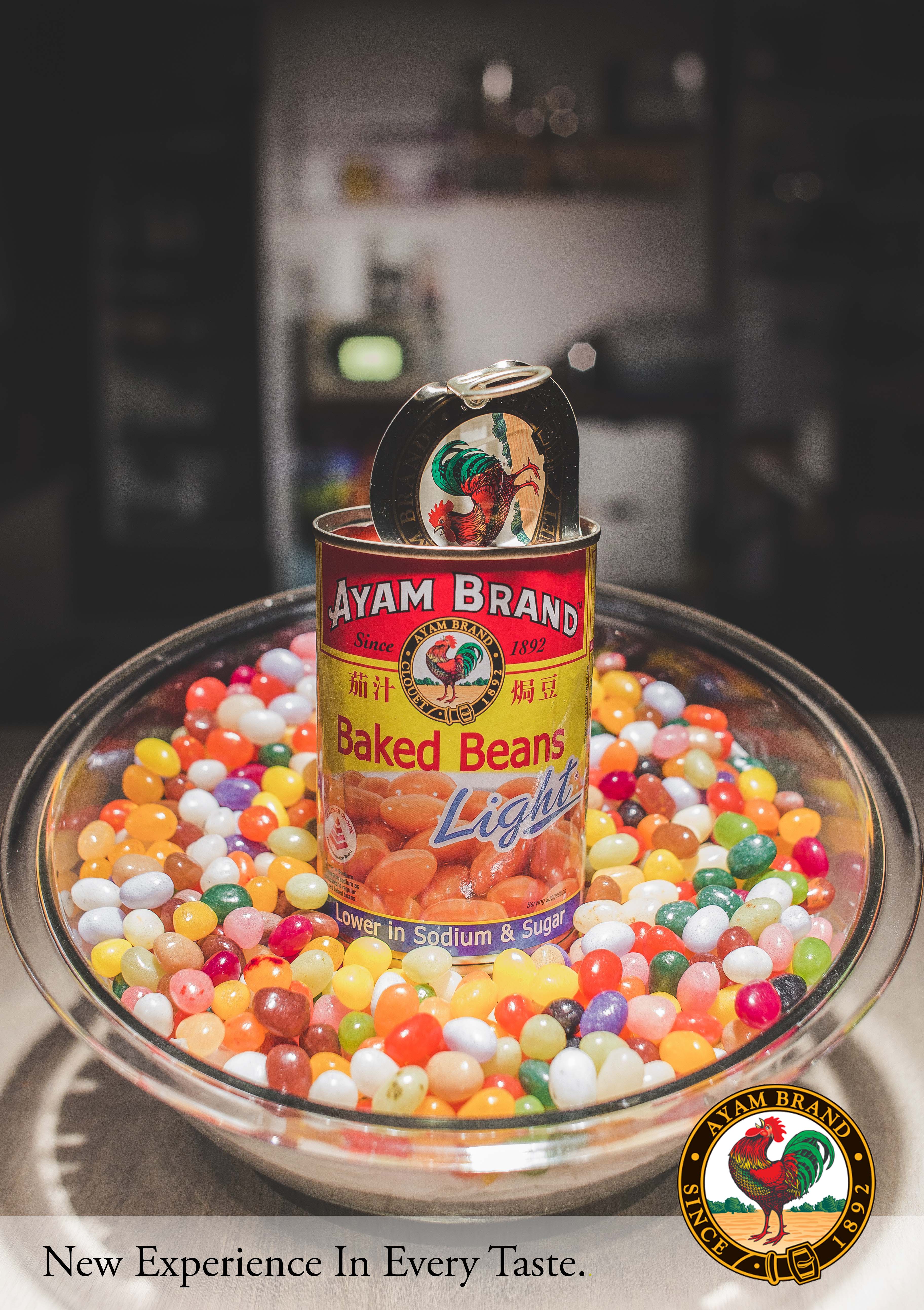
Project 2: Create an advertisement with the non-perishable food item that you have received from the exchange. consider the various concepts introduced by Roland Barthes in his analysis of an advertisement and the layer of meanings created through the interplay of linguistic message, Image & Meaning, Dennoted messaged, connoted Message.

Brain Storming & Sketch
Baked beans was one of the most interesting product that I got in class during the exchanging for our new 4D assignment Project 2: “Image & Text”. In the above as we can see a rough sketch of my initial idea which by placing the product in the middle filled with jelly beans around. As we know baked bean doesn’t really have any unique flavor in it.
(Foreground)
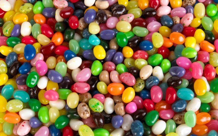 Jelly beans has lots of different unique taste and in colors, By replacing the baked beans into jelly beans it gave a sense to the viewers a whole new experience of eating baked beans. Which linked to my slogan “New Experience in Every Taste”
(Mid Ground)
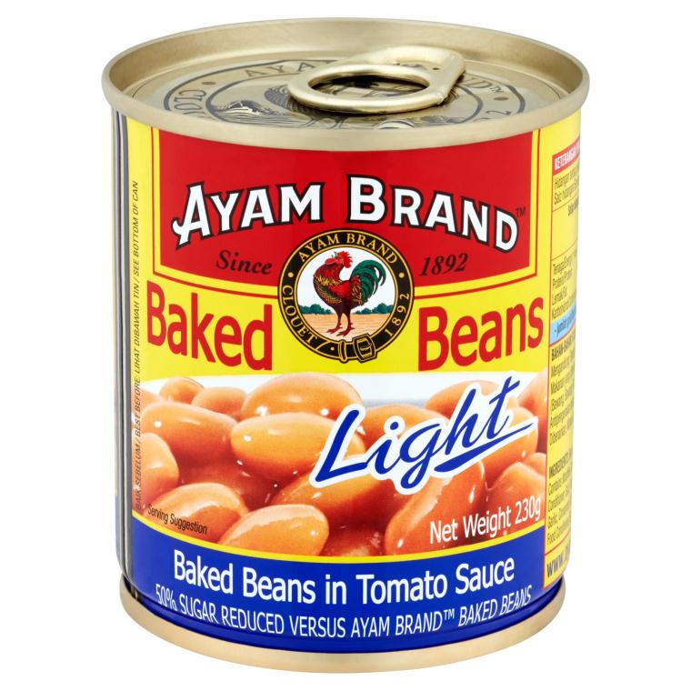 As the actual Baked beans can that I got doesn’t really look appealing so I decided to use this brand for my main subject.
(Background)
 By putting kitchen as a background, it shows that where the product is belongs to. As whenever we see a kitchen it reminds us like our mother’s cooking. It brings a warm feelings to the viewers as a connoted message. This will be a challenge because I wont be shooting the images in a real kitchen set. It will be like a office setting but by putting familiar objects, it will look exactly like a kitchen. Stay tune for the image!
Final Artwork

This is the final layout of the artwork that I created using the ideas that I sketched out previously.
Challenges
I felt that there’s always room for improvement in the artwork, like example the art directions can be improve and of course the ideas behind this advertisement poster can be more clear cut and more in-depth. I will definitely do more research and improve my artwork in the near future.
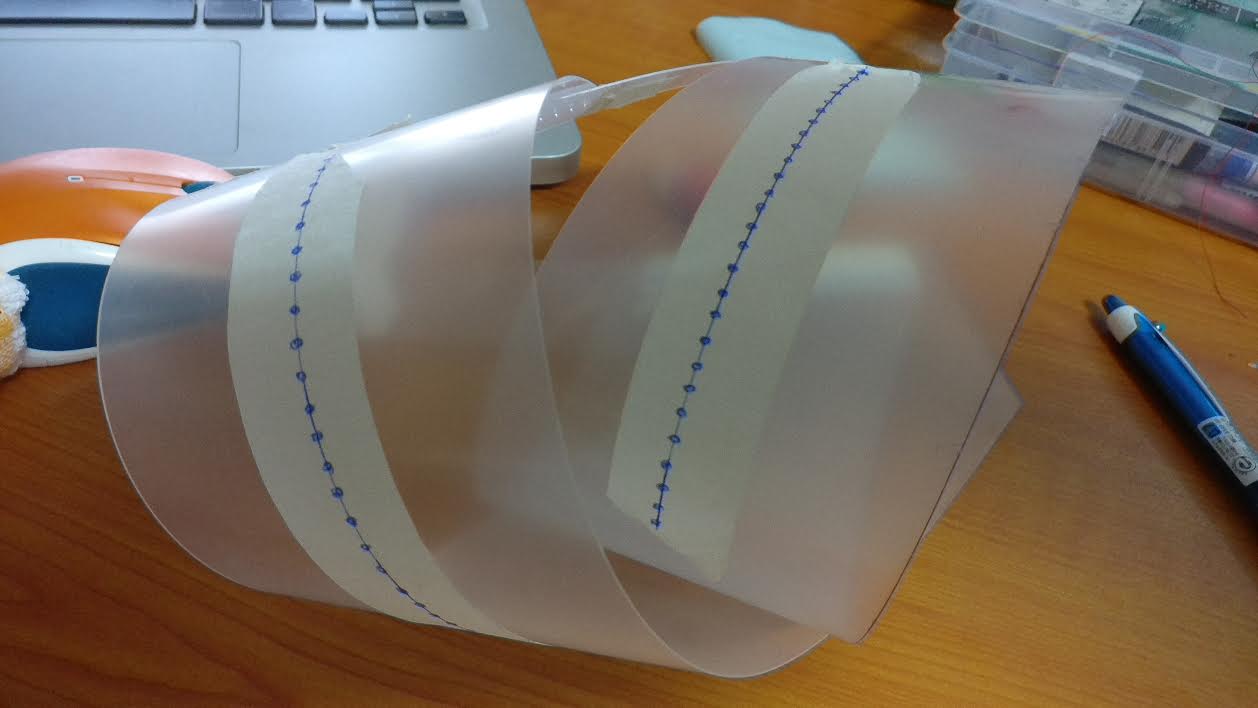
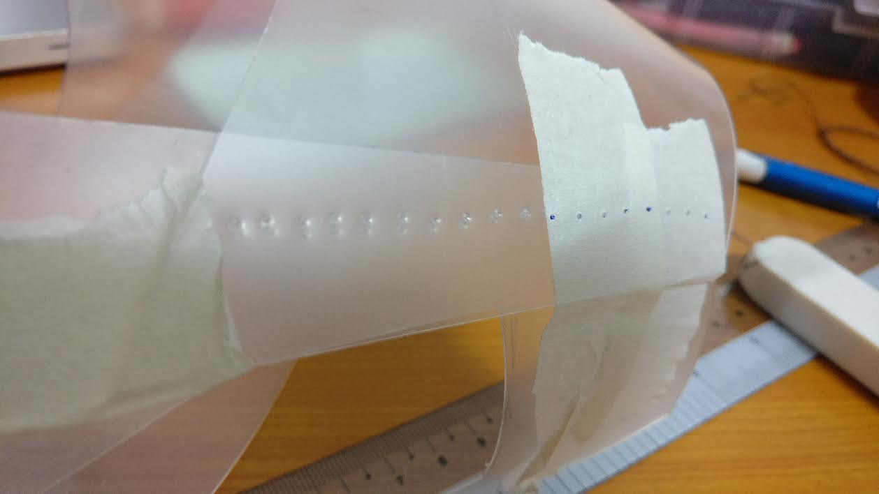
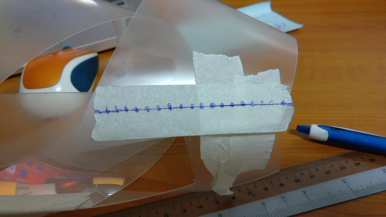
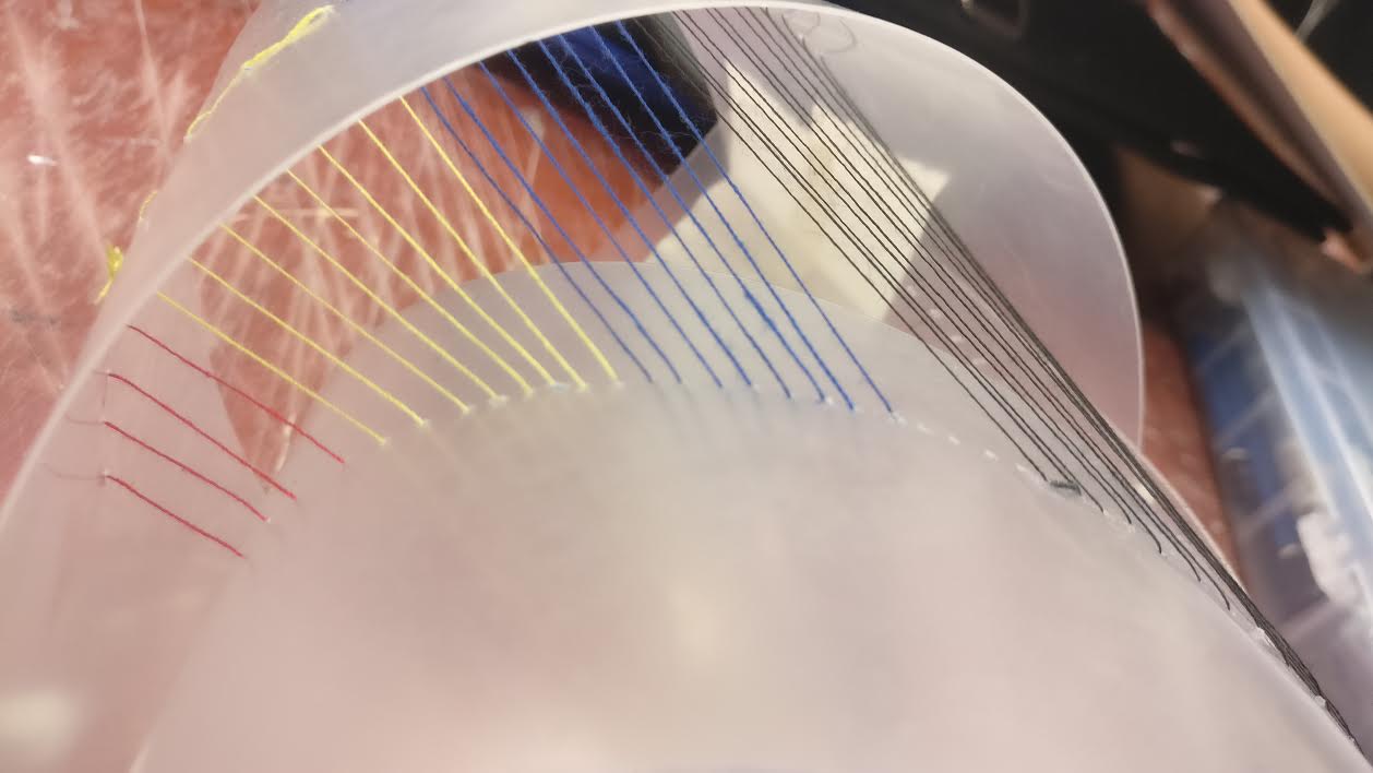
A clearer picture of the middle session which I really like the tensions of the strings.
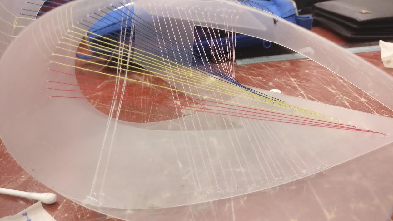
I felt that, there's a lot room of improvement to my final artwork, like the strings can be a little more tensions to it like not tangling around. But overall, it was a good and fun experience exploring the ideas and training our sewing technique.

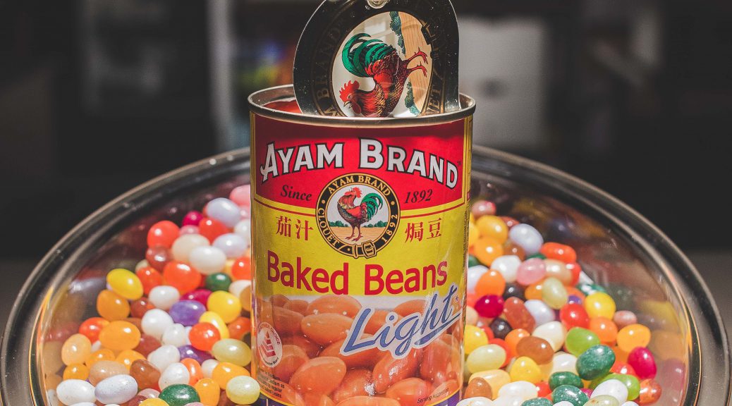

 Jelly beans has lots of different unique taste and in colors, By replacing the baked beans into jelly beans it gave a sense to the viewers a whole new experience of eating baked beans. Which linked to my slogan “New Experience in Every Taste”
 As the actual Baked beans can that I got doesn’t really look appealing so I decided to use this brand for my main subject.
 By putting kitchen as a background, it shows that where the product is belongs to. As whenever we see a kitchen it reminds us like our mother’s cooking. It brings a warm feelings to the viewers as a connoted message. This will be a challenge because I wont be shooting the images in a real kitchen set. It will be like a office setting but by putting familiar objects, it will look exactly like a kitchen. Stay tune for the image!