2d Que Sera Sera Final

Standard

“I ask my mother what should i be~”

Mother : a big disappointment

Image result for disappointment gif

Oh well.

The whole concept of my works are based on 2 principles: hard work and no handwork.
This principle is a very shallow mould that has been used to craft many career paths in Singapore and created many stereotypes in occupations and the series explore the dark side of this stereotype.


My name is 

comp2

and i’m an animator

In this composition, vintage cartoons has been my first inspiration to be an animator but going through a course in game arts and animation and working a short period of time in the industry, not every amateur animator gets to make it big or even make it into the animation industry because of the traditional mindset that the design industry isn’t a prospective field. Therefore, i decided to play around with dark humour in the composition by having an vintage cartoon version of myself “attempting cartoon suicide” because he is unable to make ends meet. Vintage cartoons in the early 1900’s have a noise grain black and white overlay that creates a bleak vibe that compliments the dark humour and depressive emotion.

My name is

print-2

and I’m a comic artist

Comics and manga have always been a big source of inspiration for my art and design works for a long time. I’ve always described myself have the super ability to chiong finish my work when the deadline is close and i wanted to over exaggerate this like an “ultimate move” in mangas. My intial “G” is portrayed in the white spaces and scultped by the darker values as a play on comic framing. Initially there were a lot of messy lines and i looked towards old school comics like Astro boy and Doraemon to have a cleaner feel and decided to use grey values instead of lines to create depth.

Related image

oneeeepunchhhhhhhhh

 My name is 

print4

and I’m a loan collector

We have now transitioned into the series of what happens when i don’t work hard at all and what is the possible career choices i would end up with in Singapore. Stereotypical Singaporeans/mums would assume that without hard work we would end up as cleaners or gangsters, my approach with this was a more educated and well groomed “ah long”. Typical ah longs would splash paint and write O$P$ on the walls of their victims, my approach would be to seek late tuition fees from students and make my message known publicly.Therefore I’v decided to use the concrete wall outside ADM which is well know to be an instagram worthy spot. The chinese characters are part of my name 黄仁杰 and the 仁means kindness meaning to say that i demand for my kindness to be repaid which has lighter and more polite way of asking for debts to be repaid.This is also done in the Chinese primary school handwriting assignment format to bring the educated and formality context forward

My name is

comp1noblood

and i am a loan shark

This composition is a play on shark bites. Usually a pig’s head is an aggressive message/tone that Ah Long’s use that is very crude and i wanted to show this crude tone in here. The pig’s head is being bitten off by a shark which sculpts my initial “G” into it and floats in this blue background to enforce the idea of “deep six” which means burial in sea which ties in to the shark idea and also show that play time is over.

newcomp

However this composition by itself disjoints from the previous 3 as it lacks the element of design school in it. Therefore an idea to remedy this would be to tie in with the earlier composition of the loan collector and have this act like a poster in an open environment where it can be seen.

20170209_123259

final presentation

OVERALL
It is depressing to think about how the future will turn out but everything will turn out fine so as long as you enjoy what you do, be it loan sharking or designing 😀 (quote of the year 2017). I’ve enjoyed re visualising typography and have a fresher perspective on it apart from the fonts. Maybe it won’t be bad doing publicity for a loan shark firm 😀

Que Sera Sera- Process

Standard

I’M AN ANIMATOR… PROCESS

test

creating a caricature of myself with inspiration from Mcbess and adventure time cartoons. I’ve edited the pose to myself attempting suicide to enforce the dark humour of this piece.


20170204_225317

Composition drafts

images

I’ve decided to reference this certain title composition because of its iconic place in history and how it dramatises the spotlight idea.

I’M A COMIC BOOK ARTIST… PROCESS

20170204_225323Composition ideation for the comic artist idea when

and i’m gonna regret this so much

test2

Initial concept of having a comic with my nickname on the title. This is a play on the “notice me senpai” meme but my meme game is not as strong as carol tho. Problems with this composition was the focus wasn’t on re-visualising the typography and was rather on type face and font without prior experience to what kerning or lettering is..which triggered someone (sorry)

So i tried to experiment with using the exaggerated line of action in this composition to form the letter G. May or may not try to incorporate a bit of narrative in this one.

20170204_225349


comp3


I’M YOUR FRIENDLY NEIGHBOURHOOD MONEY LOANER/ DEBT COLLECTOR 

Initially i wanted to print out the ntu late fee notice on their website but it involves a lot of word and fonts.Therefore 2 words, RE VISUALISE AND ILLUSTRATE.

20170204_225331 20170204_225342

Im trying to play on the idea of the loan shark culture in Singapore involving pig’s head, red paint and O$P$ signs. The reinforcing concept would be how to play on the idea of a failed designer turn loan shark doing publicity for debt collecting.


Image result for o$p$ loan shark
oss


Idea of O$P$ but with my Chinese initial instead in a nice clean educated format.

The pig head is given a shark bite to form the letter G. Still experimenting with the blood splatter or not.


Hello my name is

Standard


Image result for my name is jeff gif

Nah my name is Gerald

For this class assignment, i wanted to explore ways i can “weird out” my name and the context vs content thing..

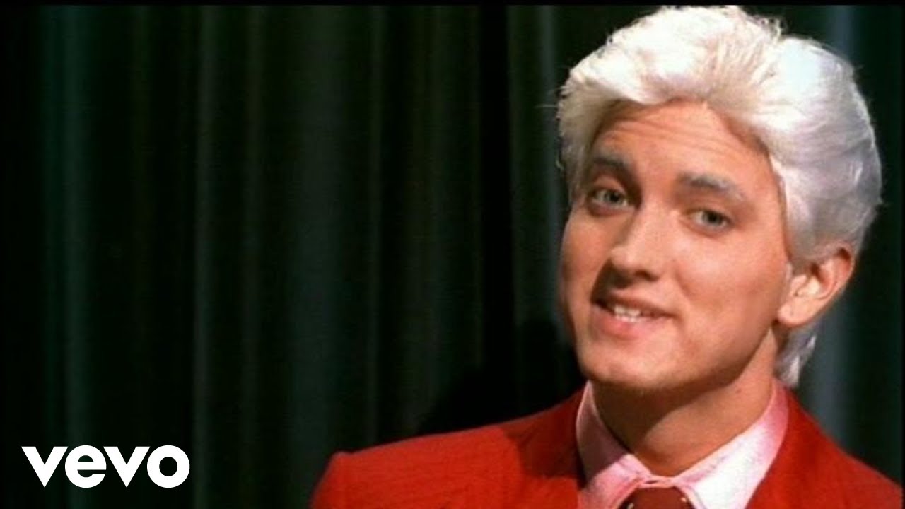
mnmThis composition heavily references pop culture. In the early 2000’s, eminem released his hit song ” My name is”  which came to my mind immediately and i wanted to twist the context to my initials as well as let people instantly realise whats the play on the concept.

Hence i used my initials “g & w” in the m&m chocolate brand typography because of how m & m and Eminem sounds exactly the same as well as a depressed looking m&m chocolate mascot to mirror the dark yet fun connotations of eminem’s songs as well as sort of parody how designers are mostly tired and overworked.

Image result for eminem my name is

huang

I used my surname huang and did it in a calligraphy style as an experiment on chinese style of typography. Most people would use chinese names and use it to express their heritage or culture.
My context here is to focus on my surname mainly because in Chinese families, the burden of carrying the name of the family, mainly the surname, would fall on the son and i come from a family of 4 sisters , me being the eldest son. Therefore my surname is very significant to me although now that i think about it, it would be better to play on the idea of having 4 sisters into the composition to reinforce the idea.


For my final idea, i wanted to did something along the lines of animation. Flipbooks have a special place in my childhood, doing short animation clips during class and seeing a ball bounce in between the textbook pages. I wanted to do something quick as well as have the idea of who i am in terms of personality. The joker (very overrated tho) is someone i identify with in terms of weirdness and always wanting attention and make serious people laugh (in a good way). ezgif-com-optimize

Overall i enjoy the challenge of conceptualising and executing design work within 45 mins. 😀


Que Sera Sera – Research and Visual Library

Standard

This assignment will be the death of me.

Anyways,

I’ve come face to face with my life long dilemma: What do i want to be when i grow up? 

Besides being a professional disappointment, I’ve thought about the spectrum of jobs which i could specialise in : ANIMATOR , STORYBOARD ARTIST, COMIC BOOK ARTIST, GAME ARTIST, CONCEPTUAL ARTIST

On the topic of jobs, i also thought about the jobs under the negative spectrum or also know as the
” no more job liao 怎么办”: Ah Long (professional money loaner), Ah Beng (professional street bouncer), tattoo artis ( professional ink on skin guy)

Image result for ah beng

Unorthodox AF. Just the way i like it.

Animator / Artist:
This is doing things within my comfort zone and knowing that there will be a vast general genres or aspects of animation, i want to link back the idea of my future job to my past inspirations that let me to the path im on and that would be vintage cartoons and comics i used to read or watch as a kid.

images-5
images-2Identifying the typographical aspects of vintage comics and cartoons

There’s a trend of using cursive or strong bold blockish fonts against black and white background which sometimes compliments the noodle style of animation in the cartoons.

images

Comics and especially manga  loves to use exaggerated fonts to express an emotion in the sound effects or creating ambience in the frame. What i like is how it over dramatise the font size and action which compliments the action of the character.

images-3

download

Mcbess is an illustrator that sorts of take the vintage style of drawing cartoons and illustrating it in the 21st century context. A very hipster and vintage style which might be useful in future ideation. Gorillaz has music videos which also mimics or upgraded this style of animation for modern music videos. Cuphead is a game that is based of the old vintage mickey mouse series with colour which breathes a breath of fresh air into the game industry.

Ah Long /  Ah Beng
A very interesting concept and something unique in Singapore culture lol. This leads me to explore more on the Singapore typography scene and finding a link between the traditional Chinese gangs in Singapore and typography/calligraphy /ink.

This exploration leads me to consider calligraphy or silkscreen on newsprint as a possible medium, An inspiration would be Kult studio in Singapore which did this piece on calendar paper which i tot was interesting in the medium and typography aspect.

kultgallery-chungkingexpress

credits go to Kult Studio