


 Longing
Affection
Intimate
 Cheerfulness
Contentment
Relief
Energetic
Hope
Irritation
 Rage
Rage
Hate
Disgust
Anxiety
Rejection
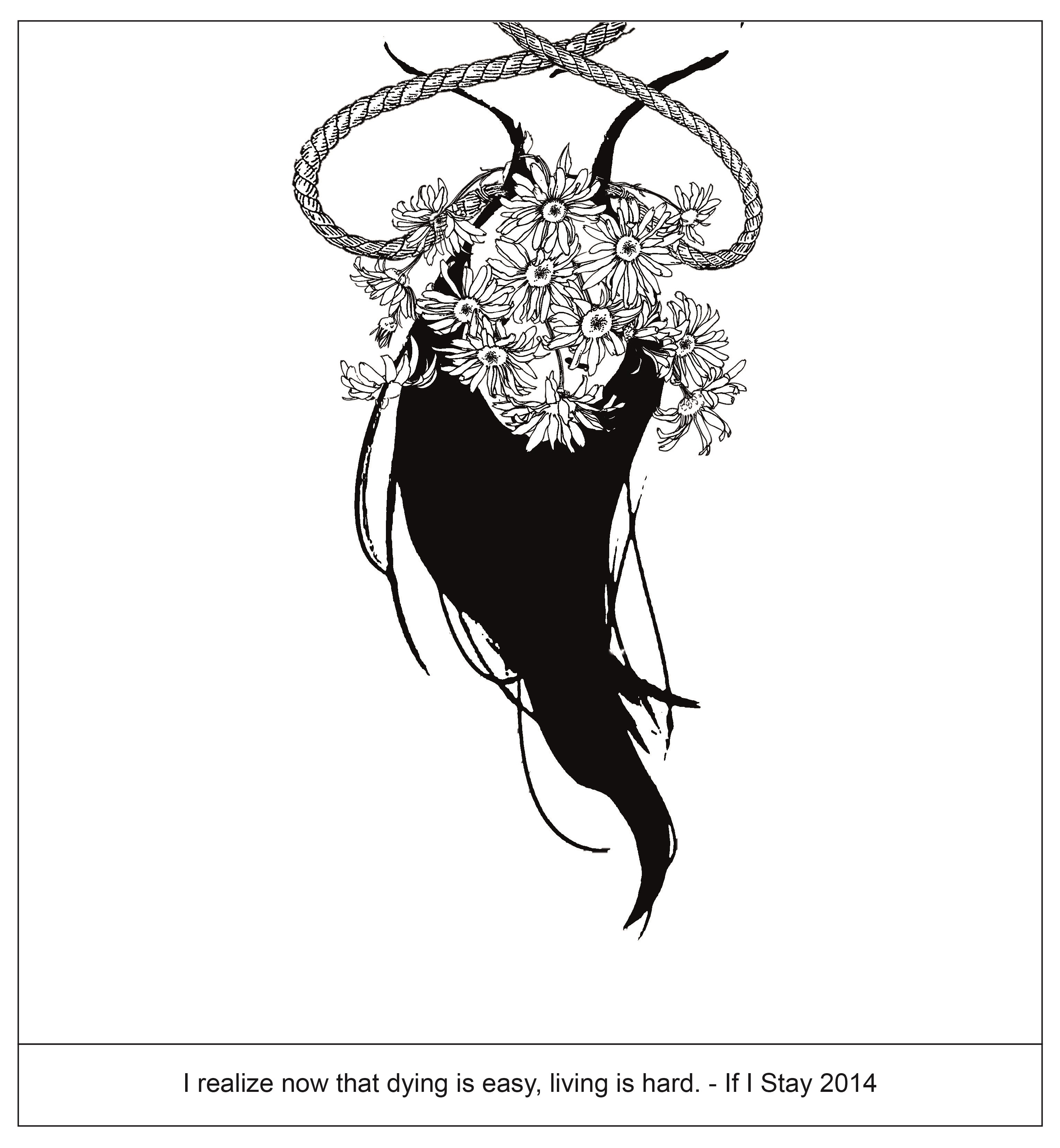
Suffering
Sorrow
Curiosity
Timid


Click the links below to view my process.
Process v1
Process v2
Process v3
Color Research
Process v4
Process v5
First Equation
 +
+

=

Second Equation

+

=

Third Equation

+

=

Fourth Equation

+

=

For all the 4 equation, the lips are tetrad 2. I want the lips to have a good sense of contrast with the background but not too big of a different.

As for the background, I make use of the clock hands to create a path to have a contrasting colors. For this, I uses complementary colors for all 4 equation.

Reflection
Throughout the whole project, I was very lost in the style that I want to use. As seen in my process, I wanted to go for digital collage which I was inspired from Julien Pacaud, however the use of colors for collage is challenging and I still can’t have a good control of it. Thus I abandon that idea and went on to research more on the different style I can use. The whole process of finding the style I want to go for is tough. If I can’t decide on a style, I can’t start my project at all. As I further research, I chance upon pop art where the use of color there is very strong. Finally, I know where my project is leaning towards and I start on my composition.
To have a better direction of what my project is going towards, I came out with a narrative to it. I titled my project “Me at this time”. Where I want to portray my life staying in hall and attending class. It’s basically a day in my life. At certain time of the day what am I doing. With this in mind, I have a better idea of composing my design and what element to add in my project.
Although when I first received the project brief, I was like this is going to be challenging as we will be touching on colors and it’s definitely not something I am strong at. Throughout the whole project, although at some point of time I was stuck, I am still glad that I finally find a direction that I want and completed this project. I was pleased with the outcome and thankful for all the feedback I received from Mimi and friends.

As I go on and explore on different composition, there are some fail composition.
Morning in Bed

The bed there just makes the overall design very flat.
For this, I feel that the background gets a bit too boring, thus I added some colors at the background for the final composition.
Don’t want to get out of bed
I cannot decide where to position the cloud where it symbolize dream, I tried these two different composition and received feedback that it look weird in a way or another.

Where this composition look too complicated at the background.
Getting coffee in canteen

I tried putting myself into the coffee, however it doesn’t seems to work at all.

For these, I feel that the view of the coffee can be further improve. Thus for the final, I changed to another type of view for the coffee cup.
After all the fail composition, I finally come out with the final one that will be shown in the next post. All these process really do help me out in finding out which one work best for each composition.
Missing
She wake up to a typical morning, nothing seems unusual to her. However, things start to get strange when she starts brushing her teeth without toothpaste, wearing socks with only one side and same goes for the shoes. More and more things are missing from her daily life. What is missing?
The idea of this project is linked to my project 1 and 2 which is about pairs. Through the video, I want the audience to start thinking what is missing in it. Throughout my 3 project, the idea I want to bring out is that we should not neglect some items in life just because we are so used to them being placed together. If any of them is missing, then we start to wonder what is wrong.
This project is the continuation of my previous project on pairs, thus the idea developing is not as tough as previous 2 project. I picked out a few item from the previous project and add them into my video. In most of the scene, I used a frontal view, so that the audience can have a closer view of the item. The overall project was interesting to explore, and receiving feedback on how to improve my video really helps too.
How I come about with the title Missing? In my video, not all the item comes in pair (a set of two things used together). They are just items where our brain automatically link them together. With the idea of allowing the audience to start thinking what is missing, thus I used this title.
I decided to go for this style for my project 3. As mention previously, I will be using Me at this Time to present my work. Here is the work that I have done and will be improving on it.

I used illustrator to create my face using this photo as reference.

What are some things to improved on are adding more details for the face features and also adding a neck will make the composition more complete and not look so weird.

I used a bed to represent my hall and added a clock that stops at 7.30 which is the time that I wake up for classes.
What are some things to improved on a is the scene it too plain. Maybe changing the setting and the clock to something more funky will helps. Will try and explore for this part.

I used cloud to symbolize dream, where she is sleeping and do not want to get out of bed. There is also a character holding balloons drifting among the cloud, which represent she still want to wander in her dreams.
Project 3 is all about colors. Thus, after having some ideas on how I want my whole composition to look like, it’s time to do some research on colors to complete my work.

Primary Colors: Red, yellow and blue
In traditional color theory (used in paint and pigments), primary colors are the 3 pigment colors that can not be mixed or formed by any combination of other colors. All other colors are derived from these 3 hues.
Secondary Colors: Green, orange and purple
These are the colors formed by mixing the primary colors.
Tertiary Colors: Yellow-orange, red-orange, red-purple, blue-purple, blue-green & yellow-green
These are the colors formed by mixing a primary and a secondary color. That’s why the hue is a two word name, such as blue-green, red-violet, and yellow-orange.

Complementary
Colors that are opposite each other on the color wheel are considered to be complementary colors (example: red and green).
The high contrast of complementary colors creates a vibrant look especially when used at full saturation. This color scheme must be managed well so it is not jarring.
Complementary colors are tricky to use in large doses, but work well when you want something to stand out.
Complementary colors are really bad for text.


Analogous
Analogous color schemes use colors that are next to each other on the color wheel. They usually match well and create serene and comfortable designs.
Analogous color schemes are often found in nature and are harmonious and pleasing to the eye.
Make sure you have enough contrast when choosing an analogous color scheme.
Choose one color to dominate, a second to support. The third color is used (along with black, white or gray) as an accent.

Split-Complementary
The split-complementary color scheme is a variation of the complementary color scheme. In addition to the base color, it uses the two colors adjacent to its complement.
This color scheme has the same strong visual contrast as the complementary color scheme, but has less tension.
The split-complimentary color scheme is often a good choice for beginners, because it is difficult to mess up.

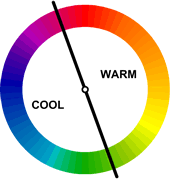
Warm colors are vivid and energetic, and tend to advance in space.
Cool colors give an impression of calm, and create a soothing impression.
White, black and gray are considered to be neutral.

Pure Color
These are colors that are not mixed with other hues. They’re usually incorporated into bright designs.

Tints
These are colors mixed with white. They convey a lighter, more peaceful, and less energetic feeling than pure colors. They’re also considered more feminine.

Shade
These are colors mixed with black and are effective in communicating mysterious, dark, evil, or dangerous moods. Shades can work well with gradients when used with either a pure color or lighter shade.
Colors also represent emotions. How different people see different colors and feel differently.

Here are more emotions in relation to colors.

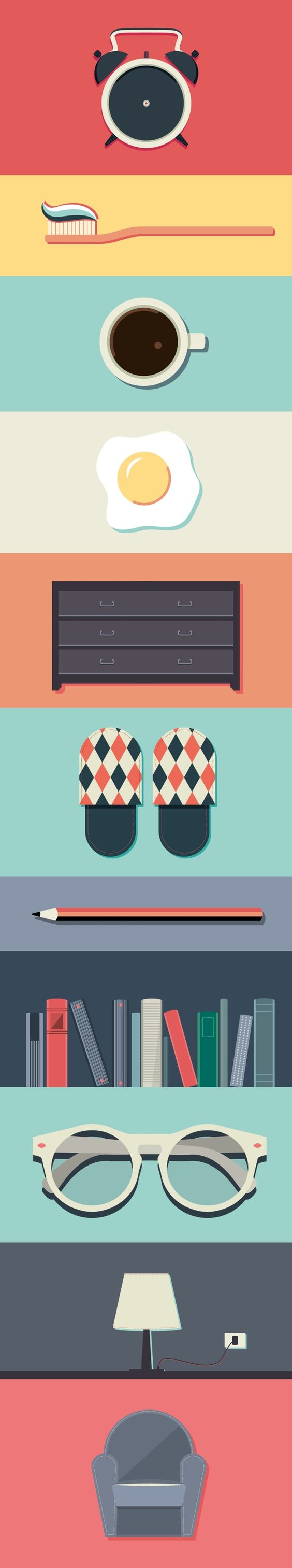
Me at this time
The idea for my 4 setting will be what am I doing at certain timing. Here are some of the settings that I have brainstormed and will be working on it. It’s like a day of what I am doing during the weekdays when there is school.
7.30am Tired me + morning in hall = don’t want to get out of bed
8.15am Exhausted me + canteen = time to get coffee
9am Energetic me + school = time to start working
2pm Drained me + late afternoon in hall = nap time
7pm Recharged me + night in hall = rush assignment
At first I was going for the digital collage style. However I realize that it is quite hard to play with colors there. I am still trying to figure out on the go.
I went on and try a different style which is pop art or comic style. Where I also included myself into the composition.
7.30am Tired me + morning in hall = don’t want to get out of bed

I was thinking of combining different style for different columns.
Me (comic style) + Setting (digital collage/flat design)
However, I feel that it might be too messy for my whole project and it might not sync well with one another. Still trying to work on it.
Here are some examples that I found on Pinterest for pop art.


Here are some examples that I found on Pinterest for flat design.


After receiving some feedback on using simplified pattern. I can first think about the images as simple overlapping patterns before developing them to complex masses.
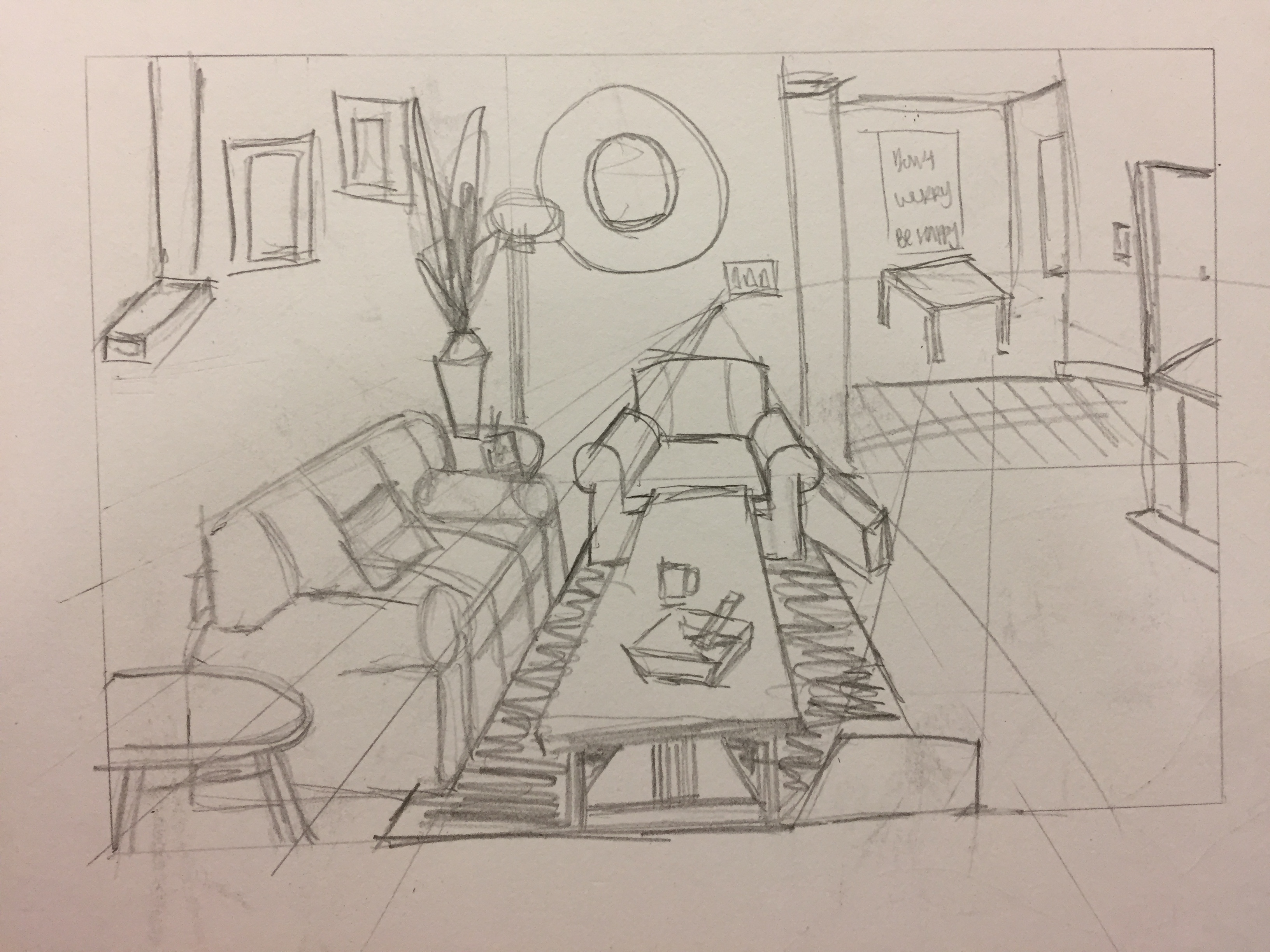
Thus I went on and try drawing simplified figures in rooms. I used images online and tried drawing from there. I miss out some area and did not add into the drawing as I find it too overcrowding at certain area.


I also tried drawing perspective which is something I am weakest in. I can’t seem to get the point right. Still trying to figure out on the go.