Part II of Zine: Neighborhood Explorer we are required to create a 8-page zine design. The previous post was some research that I did on zine layout.
Concept 1
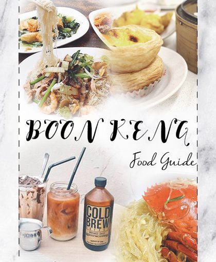
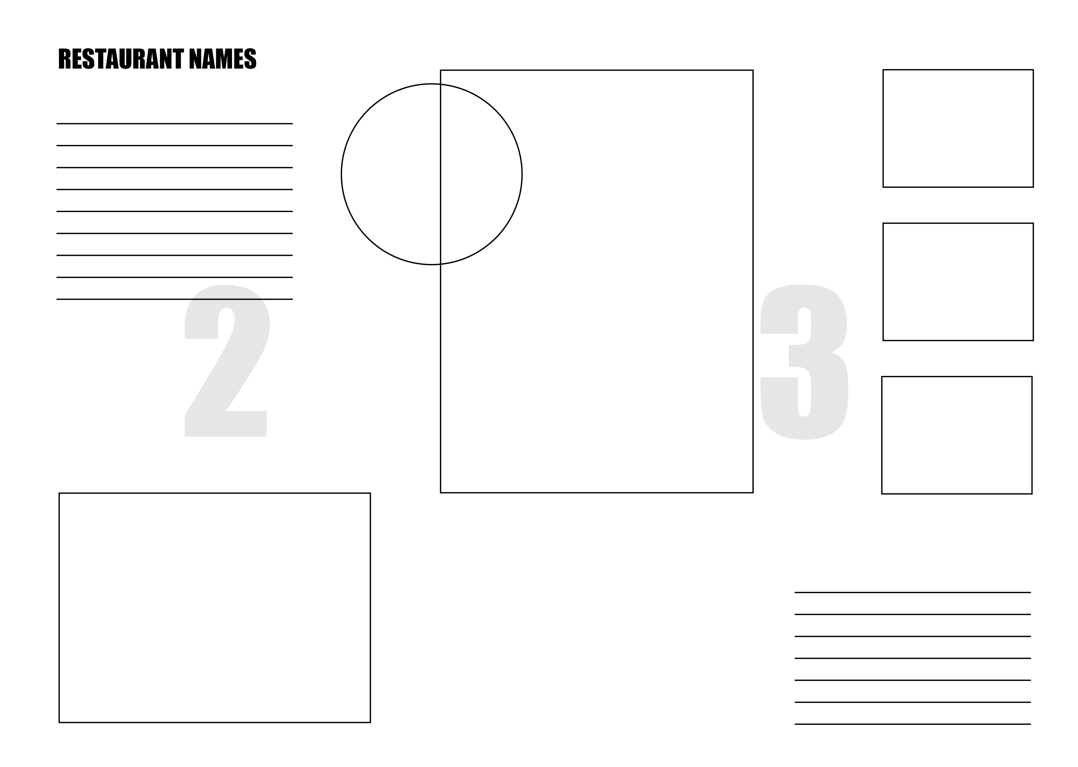
The zine design will be based on the food around Boon Keng. Initially, I planned to focus on 3 restaurants from the previous project. There will be description of the restaurant, address, opening hours and travel distance from Boon Keng Station.
*Last spread layout is not done yet.
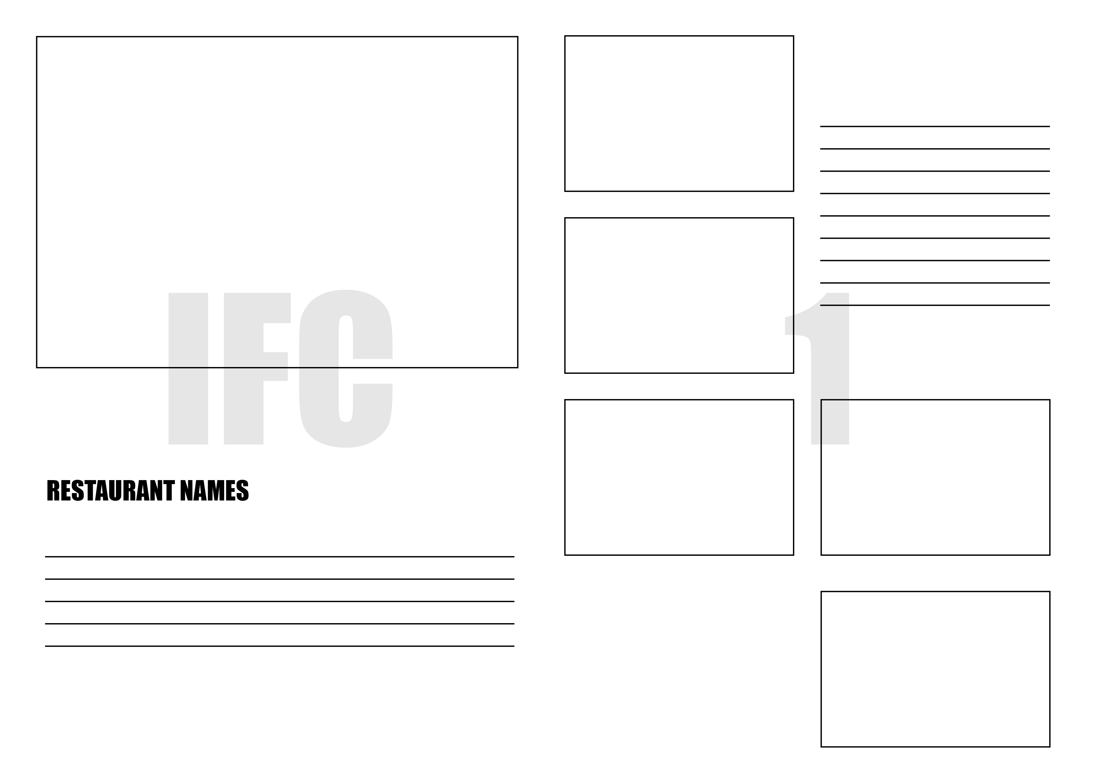
Sample Layout

The feedback that I received was to categories the food type according to the customer that will be attending the restaurant. Some examples are hipster favorite spot, supper lover and etc. I need to take note of the style that I am going for.
Concept 2
There will be 3 different themes and each for one spread respectively.
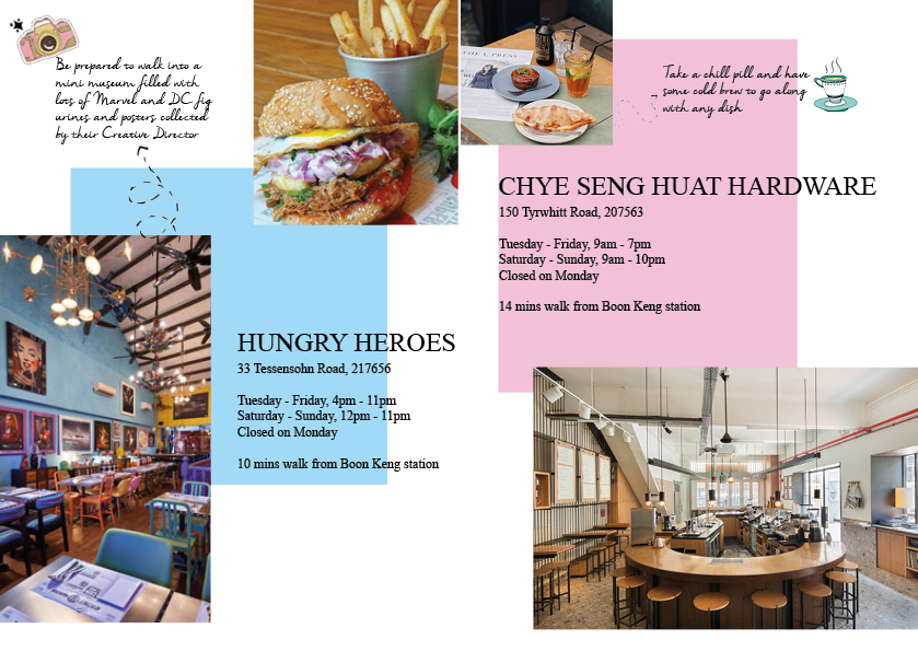
Theme 1: Café Lover
Hungry Heroes
- 10 mins walk from Boon Keng Station
- Tuesday – Friday, 4pm – 11pm
Saturday – Sunday, 12pm – 11pm
Closed on Monday
- 33 Tessensohn Road, 217656
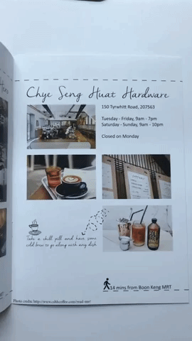
Chye Seng Huat Hardware
- 14 mins walk from Boon Keng Station
- Tuesday – Friday, 9am – 7pm
Saturday – Sunday, 9am – 10pm
Closed on Monday
- 150 Tyrwhitt Road, 207563
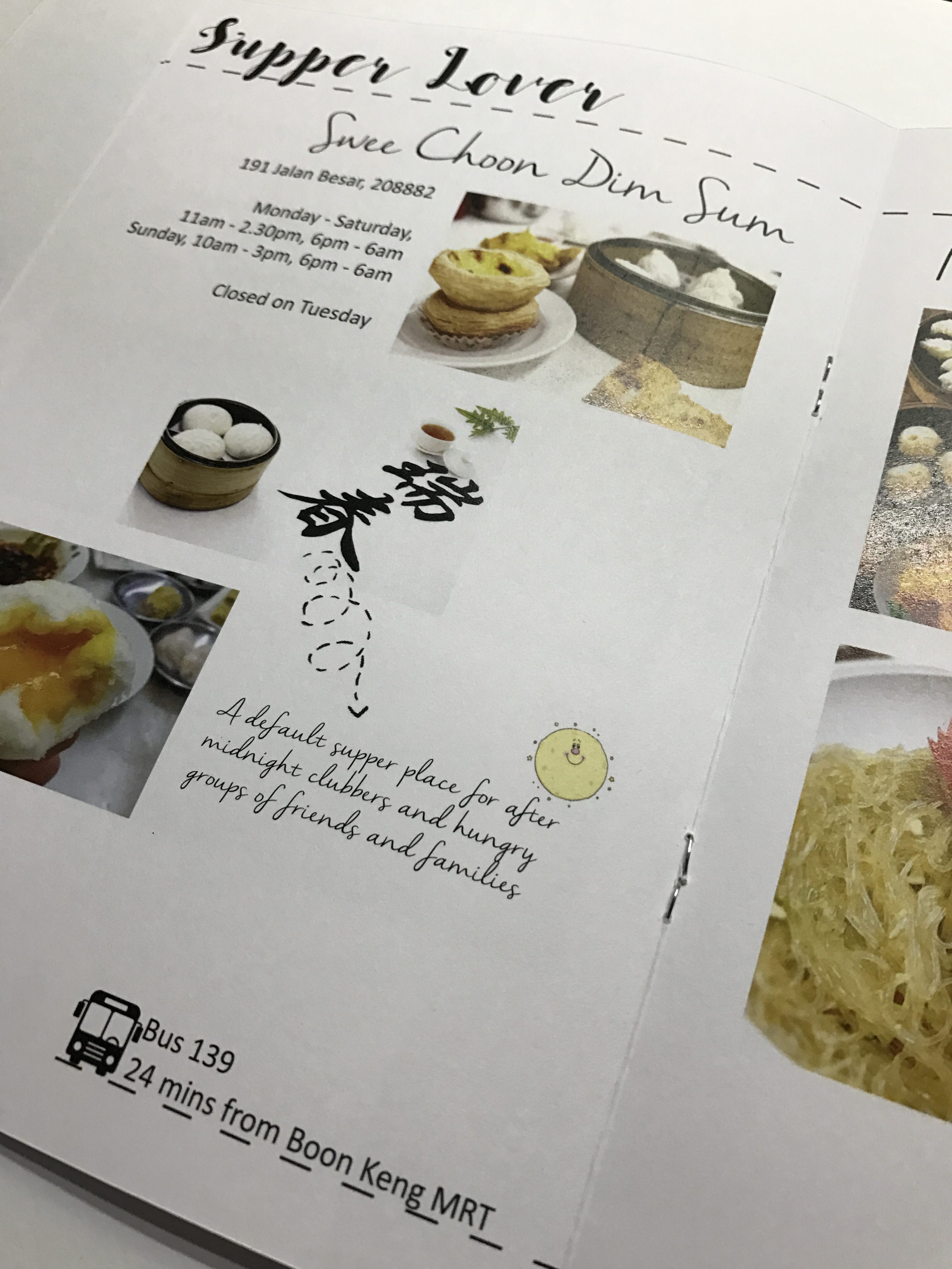
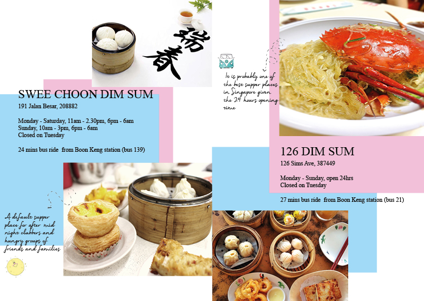
Theme 2: Supper Lover
Swee Choon Dim Sum
- 24 mins bus ride from Boon Keng Station (bus 139)
- Monday – Saturday, 11am – 2.30pm, 6pm – 6am
Sunday, 10am – 3pm, 6pm – 6am
Closed on Tuesday
- 191 Jalan Besar, 208882
126 Dim Sum
- 27 mins bus ride from Boon Keng Station (bus 21)
- Monday – Sunday, open 24hrs
Closed on Tuesday
- 126 Sims Ave, 387449
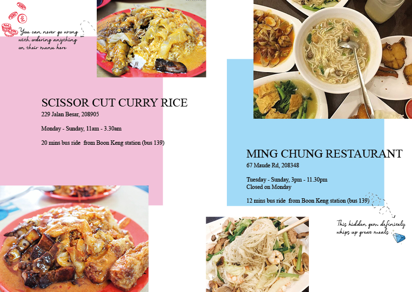
Theme 3: Economical Lover
Scissor Cut Curry Rice
- 20 mins bus ride from Boon Keng Station (bus 139)
- Monday – Sunday, 11am – 3.30am
- 229 Jalan Besar, 208905
Ming Chung Restaurant
- 12 mins bus ride from Boon Keng Station (bus 139)
- Tuesday – Sunday, 3pm – 11.30pm
Closed on Monday
- 67 Maude Rd, 208348
Version 1
I decided to go for a more minimalist style in order to bring out the vibrant colors of the images. However, this doesn’t bring out the individual theme. Some suggestion was to add caption around the images and add some mini illustration around. I need to identify my art direction and credit the images.
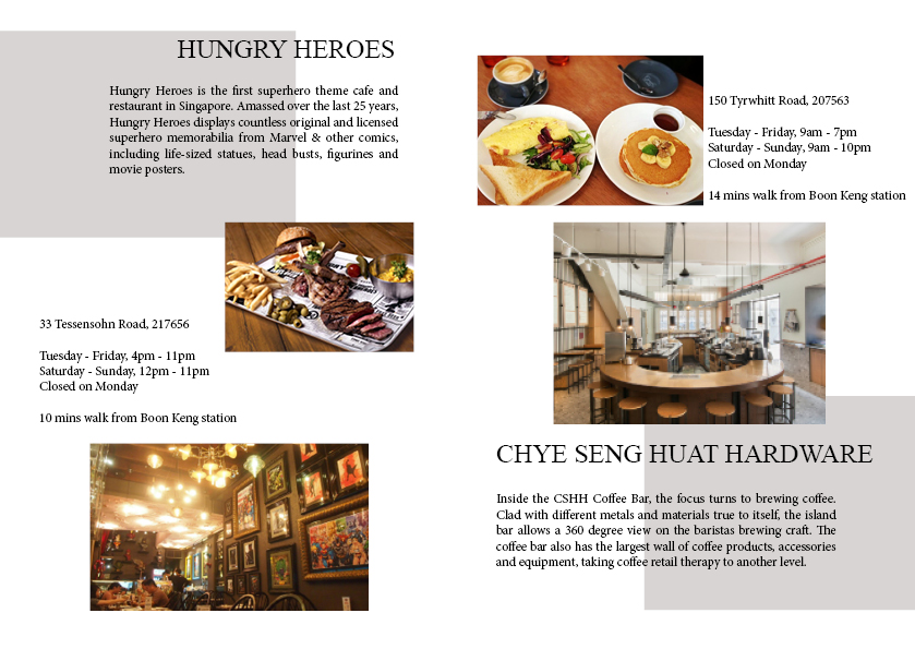

Illustration on images
Version 2
I added in the illustration and caption around the images and changed the color of the box. The reason why I change the color because after adding in the illustration, I feel that it turns into a more “fun looking” layout thus adding in colors will bring out the theme more. However, it only complicates the layout.
Final
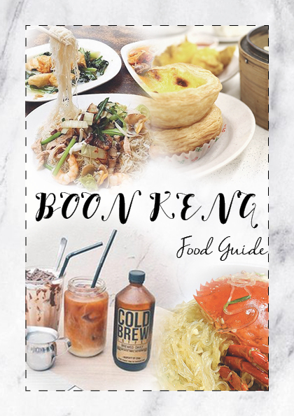
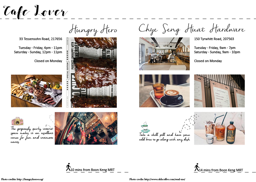
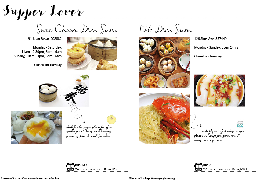

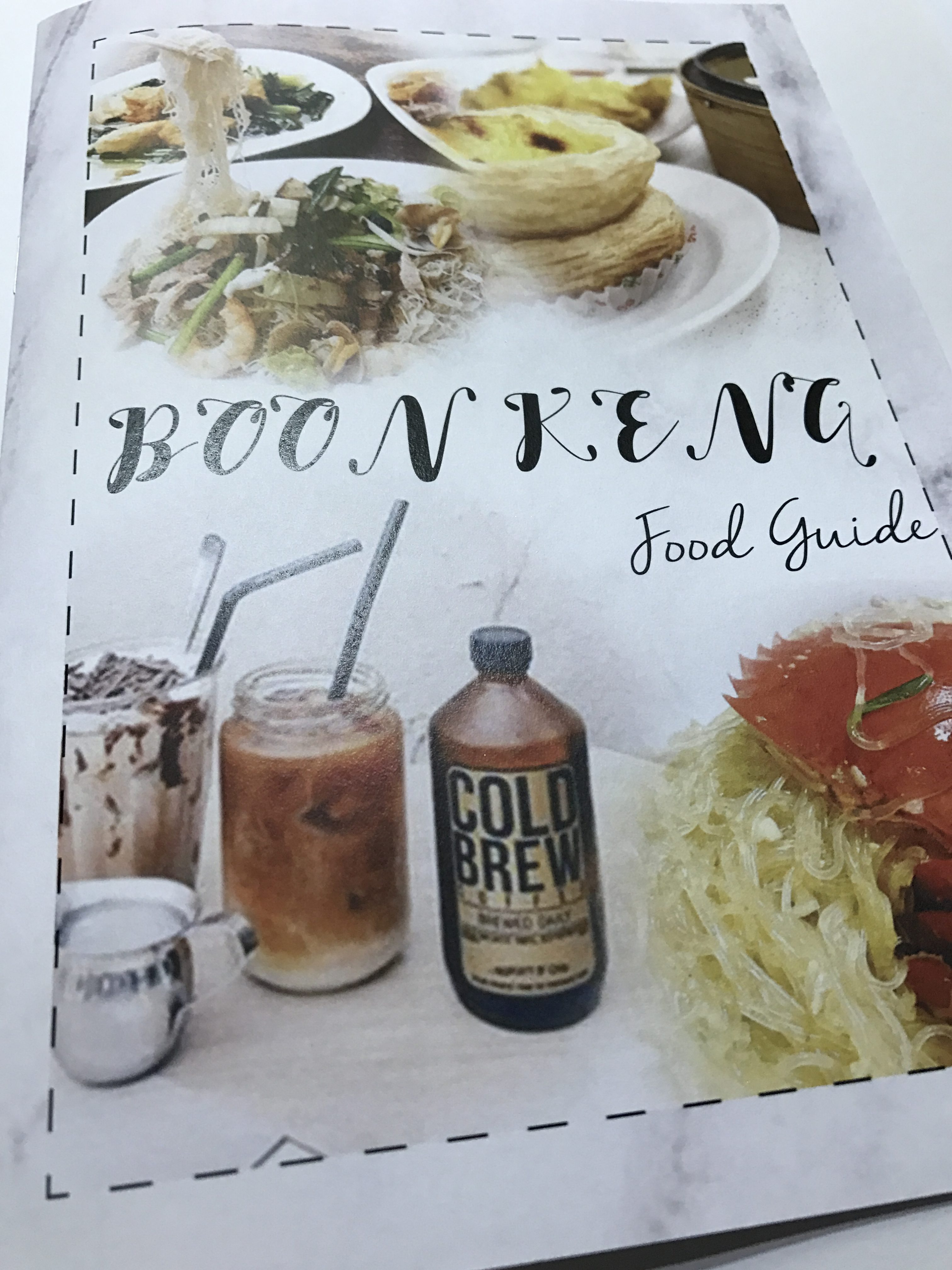
After receiving all the feedback from Joy and friends, I have improved my design multiple times. I have removed the background boxes and added in dotted lines as my art direction. After consultation, the feedback that I received was to make me zine more uniform. After looking at the dotted line that branch out to the caption, they gave me this idea of adding more dotted lines around my zine. Adding a header for each theme definitely helps to identify the different theme as it was not obvious previously. One thing I need to learn is to better integrate the element together.
Reflection
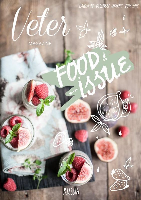
This project allows me to explore more into Zine and understand the concept of Zine. Since it is the continuation of part I, it makes things easier as I can work on what I have and bring it over to part II. For me, the difficult part about this project is coming out with the overall theme and laying out the pages. It is challenging to integrate all elements together in a spread, and having to do 3 spreads required a lot of testing. I have to take into consideration the position of images, the information to add in and the font type for the information. Upon completing the 3 spreads, the front cover is also a problem. I do not have any idea how I want my cover page to look like. Since the zine is about food, I received comment on adding food images. As for the back cover, I decided to keep it simple as I do not want it to overpower the cover page. Even though it was challenging but I definitely enjoy exploring into different zine layout.