Deforestation comes in many forms, including fires, clear-cutting for agriculture, ranching and development, unsustainable logging for timber, and degradation due to climate change. This impacts people’s livelihoods and threatens a wide range of plant and animal species.
Concept
To explore on the issues of deforestation and raise awareness of how harmful it can be.
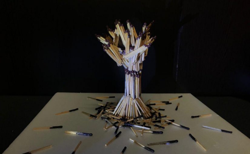
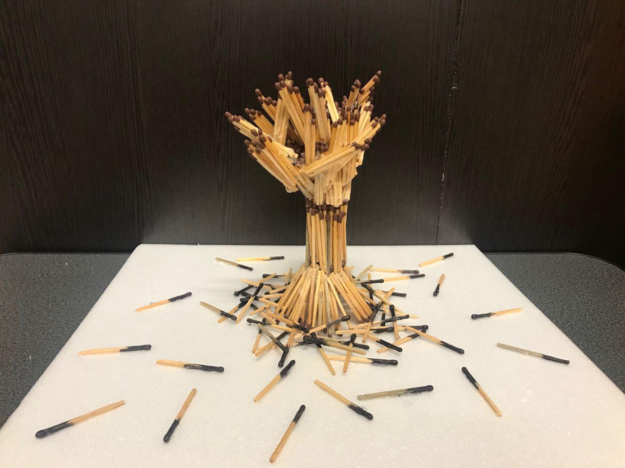
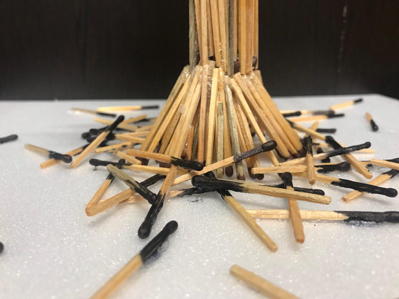
Installation
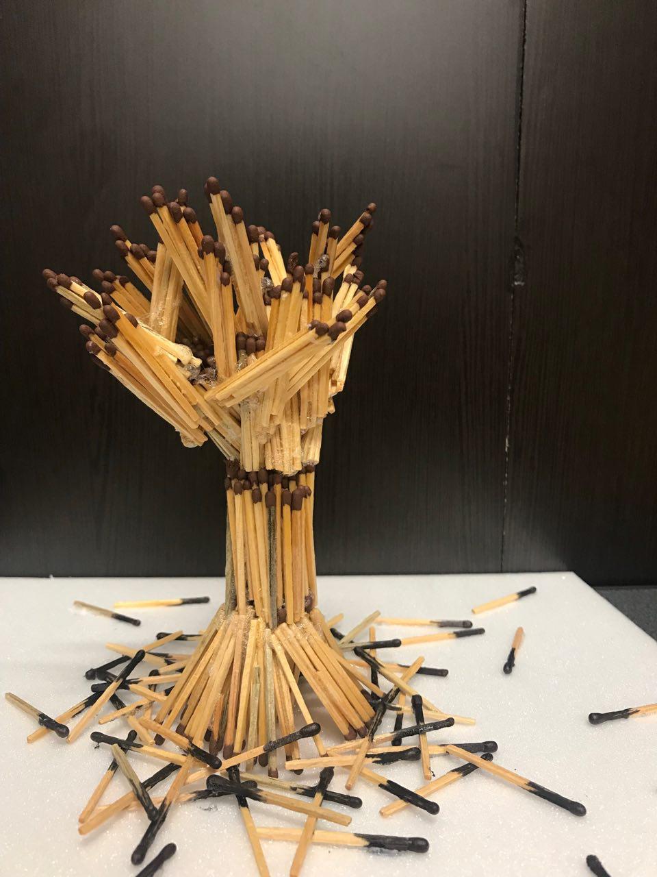
A tree made up of matchsticks in a room. The use of matchsticks is to indicates how this vicious cycle work where humans kill trees to create object for human use but yet harming the environment that affects humans too.
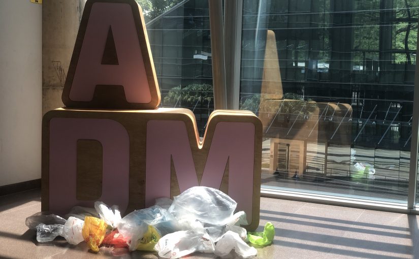
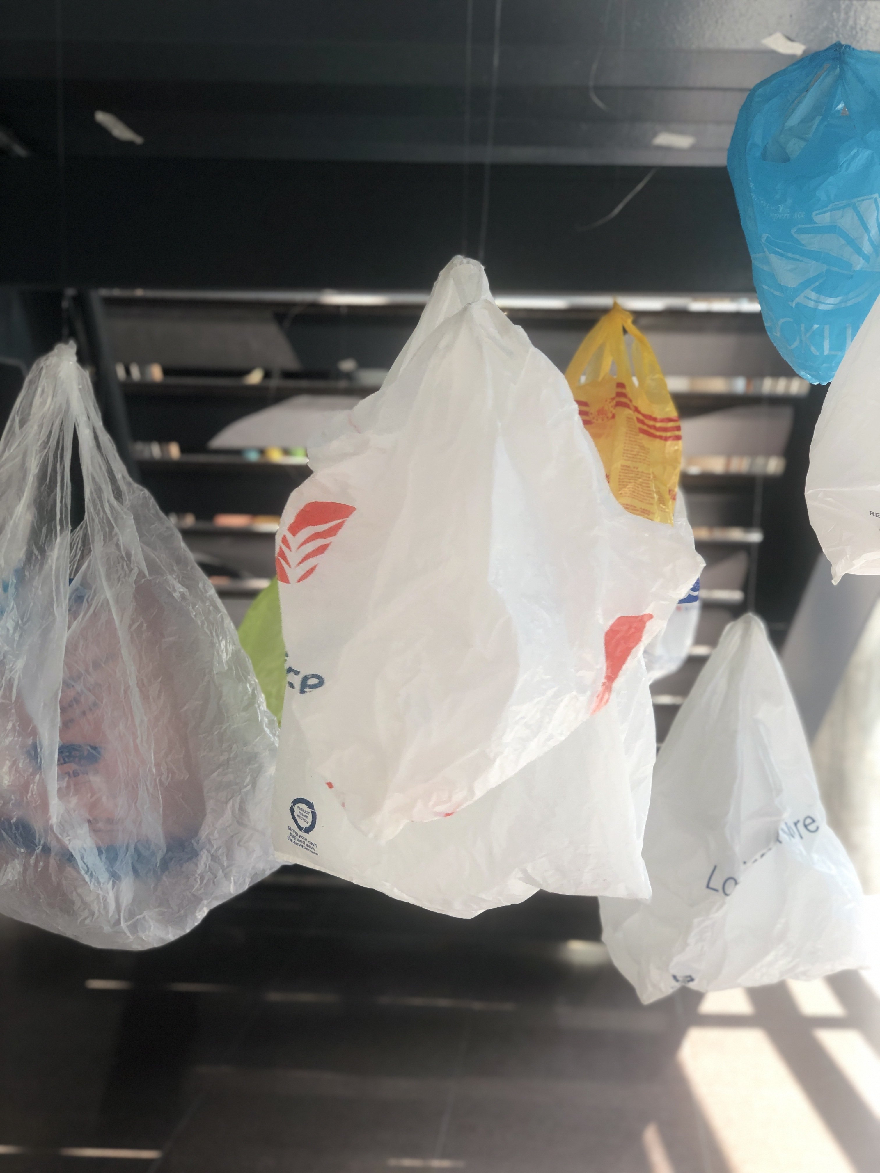
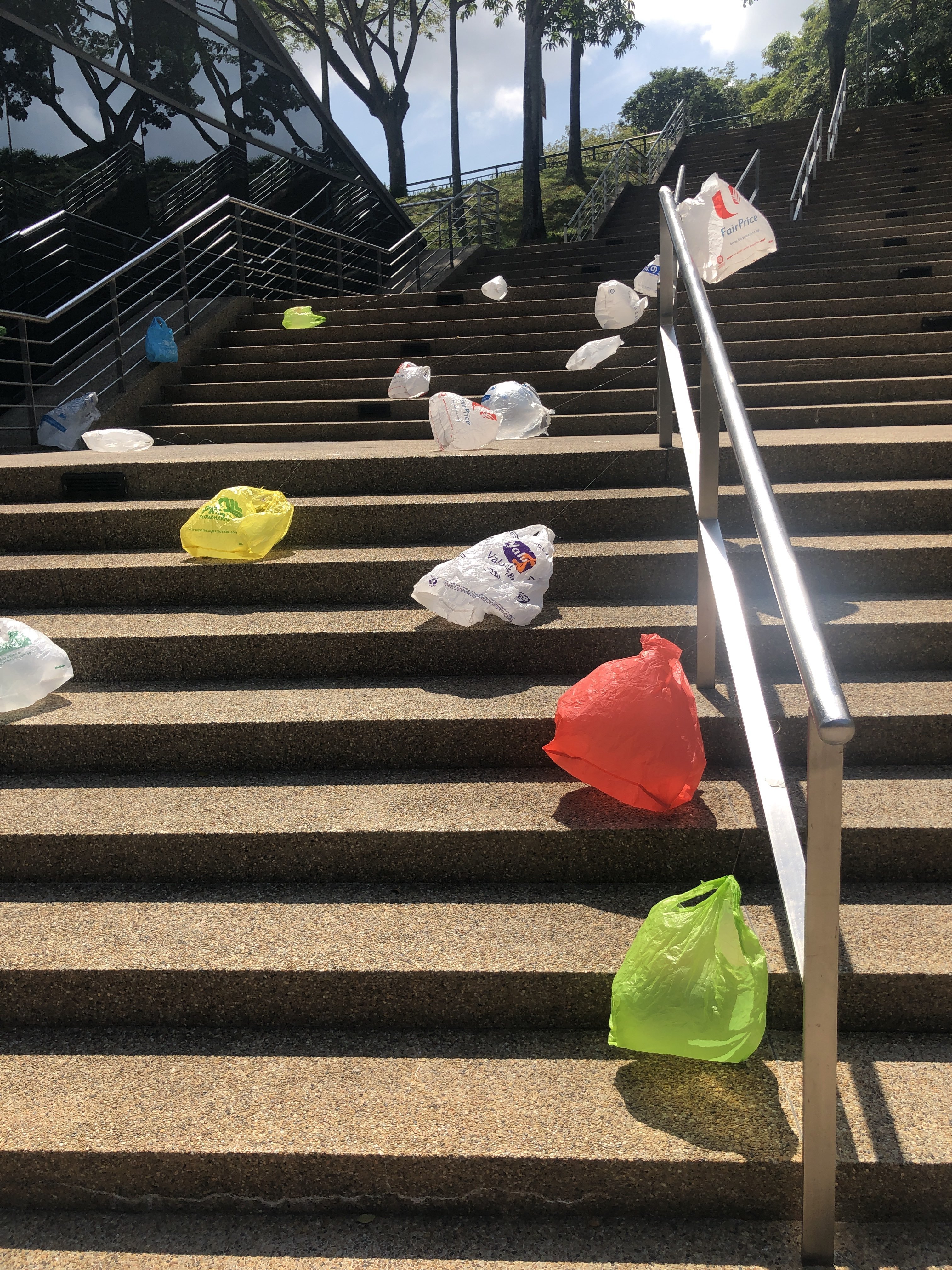
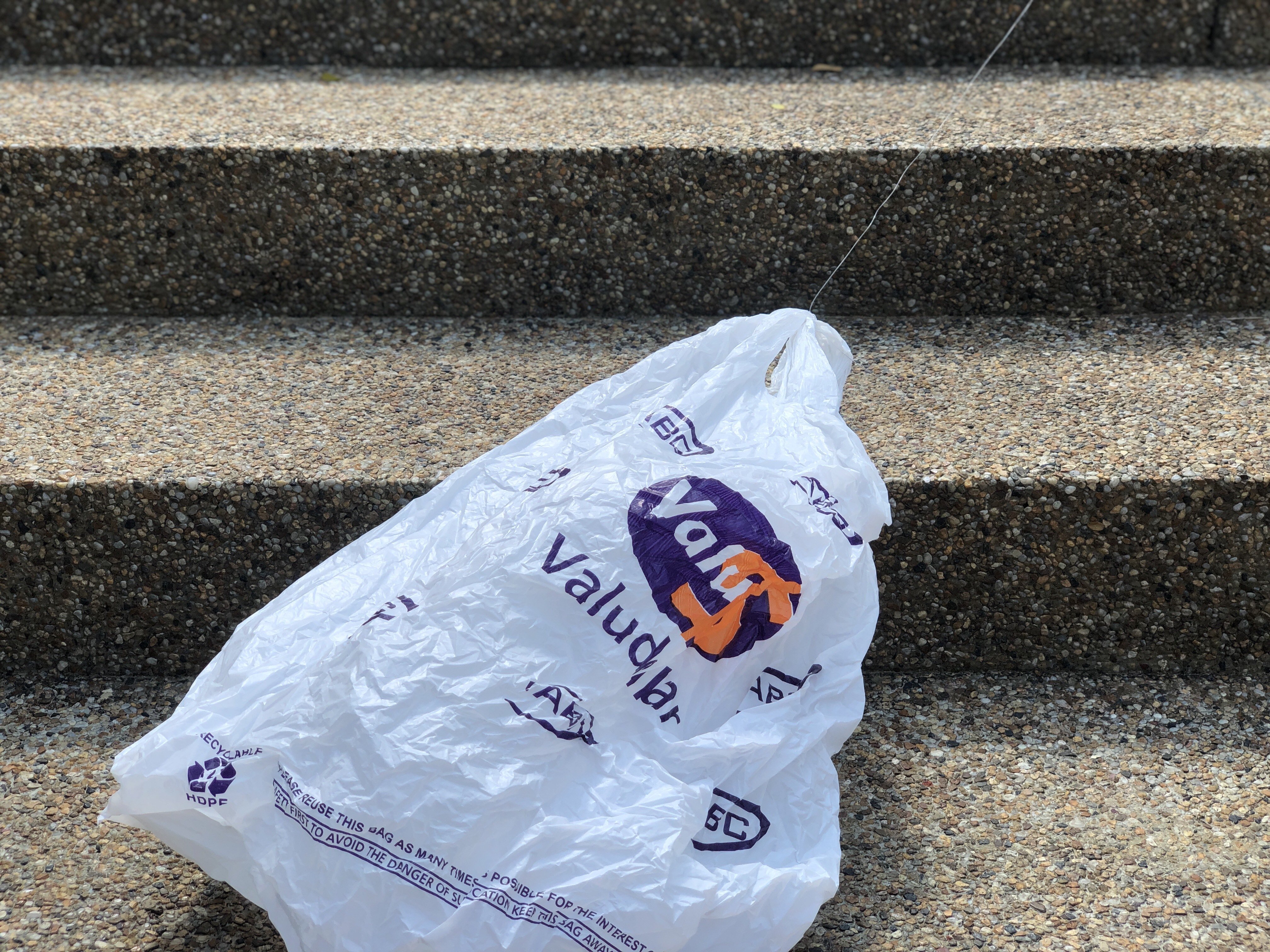
We have become used to plastic bags to carry our stuff around. They’re cheap and handy and readily available. But is it really worth the negative impact to our environment? Plastic doesn’t biodegrade. It’s forever. Adding on, the production of plastic used 8% of our oil resources and pollutes the environment with toxic air too.
Therefore, in this assignment, we are trying to bring about the awareness of plastic bags through placing them at different locations around ADM.
Plastic
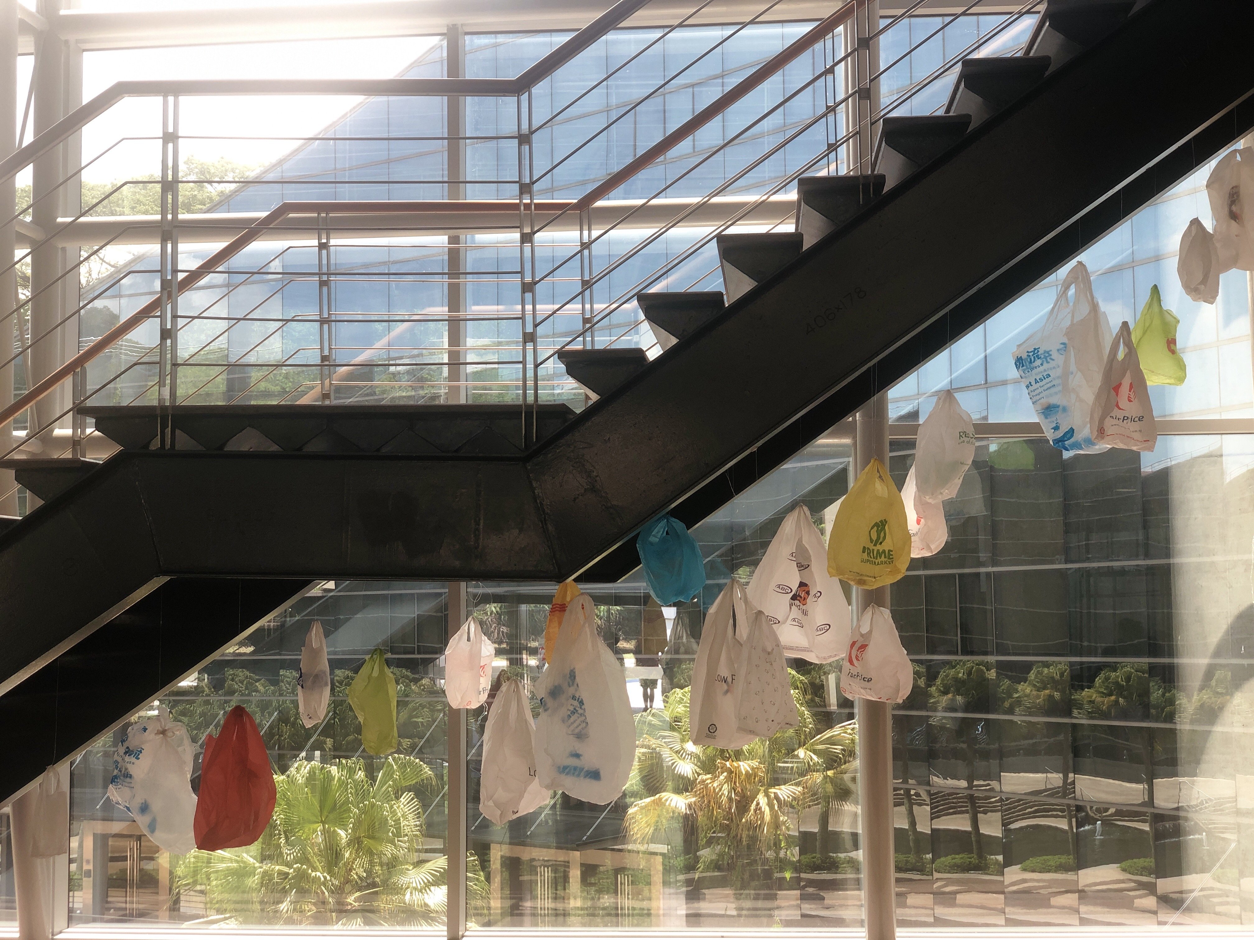
Firstly, we remind the audience about the convenience of carrying plastic bags around by hanging them from the ceiling. We have become used to plastic bags to carry our stuff around. They’re cheap and handy and readily available. But is it really worth the negative impact to our environment?
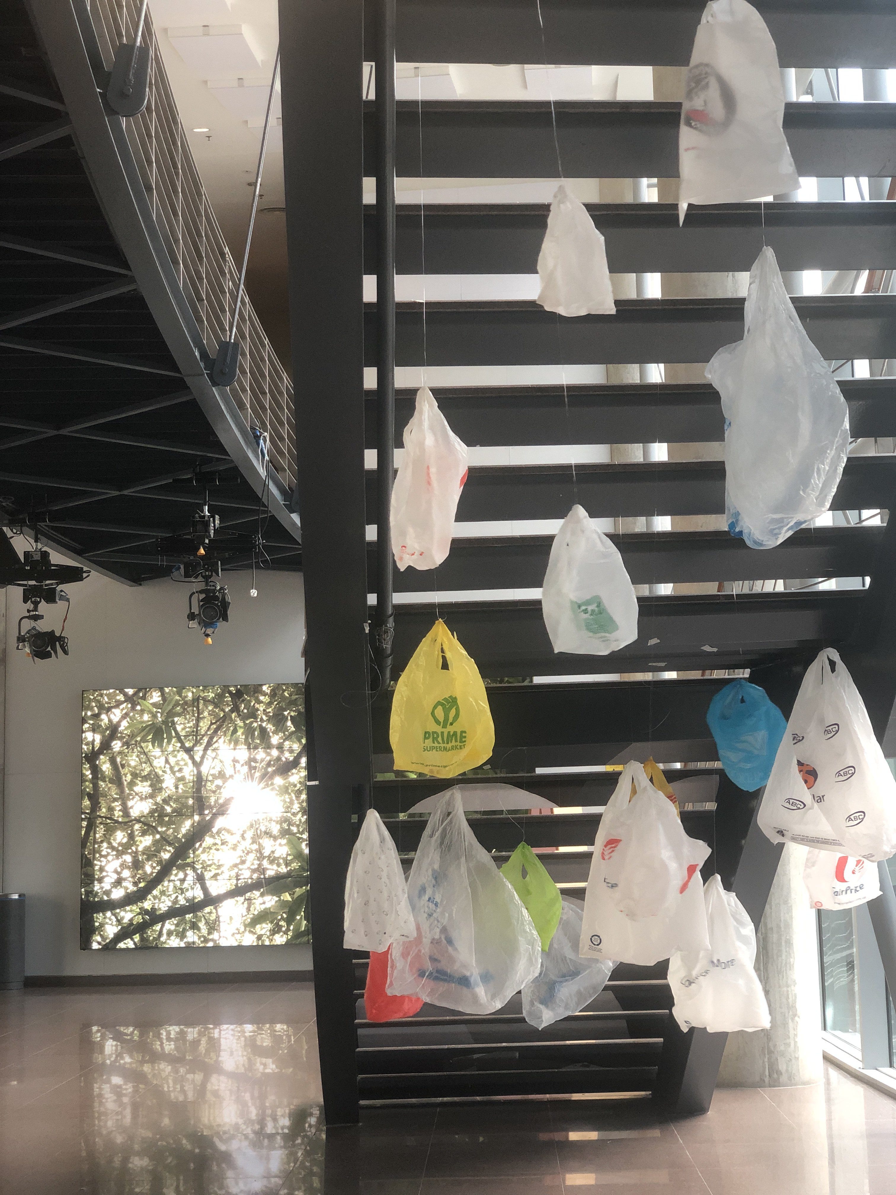
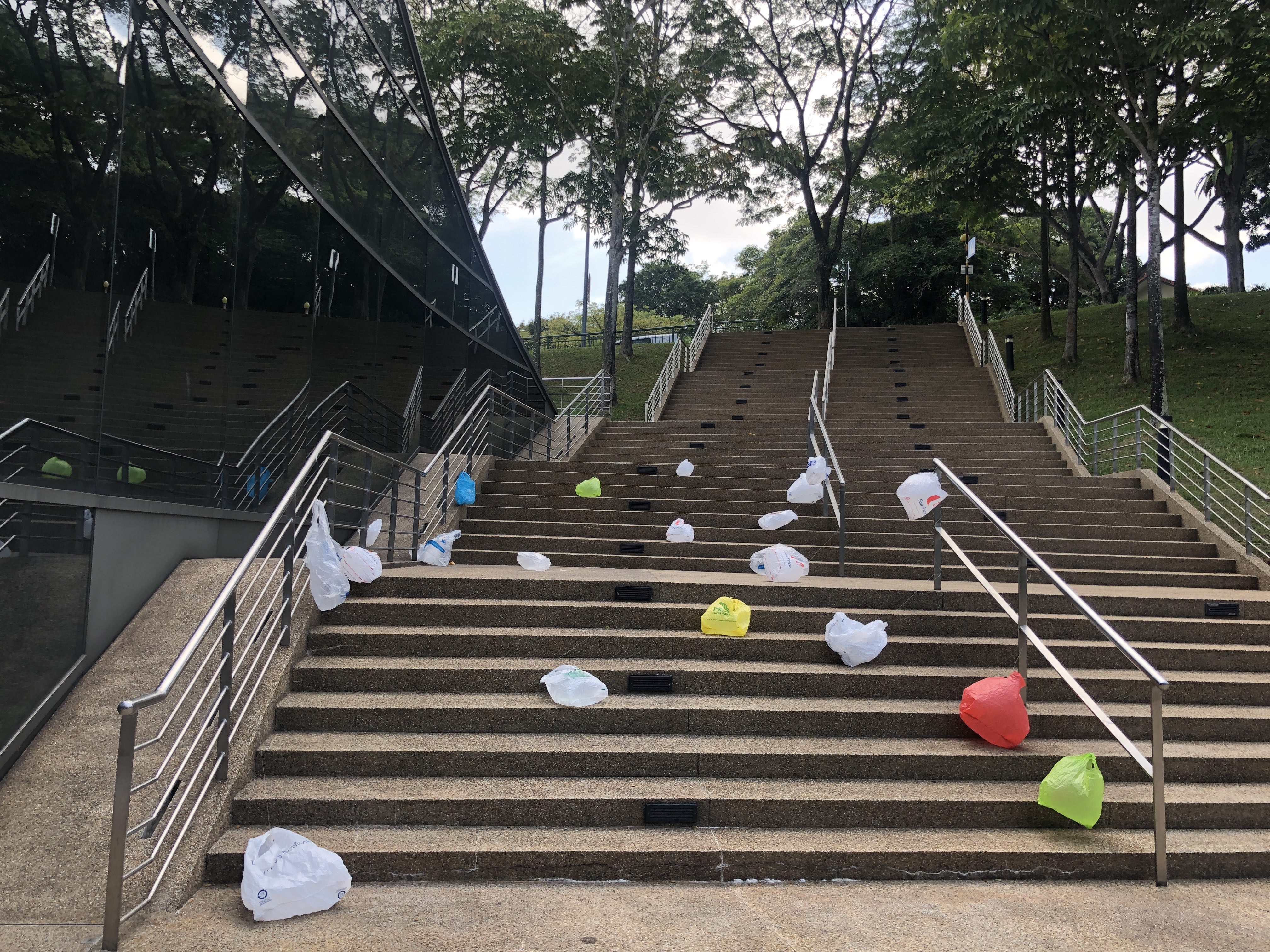
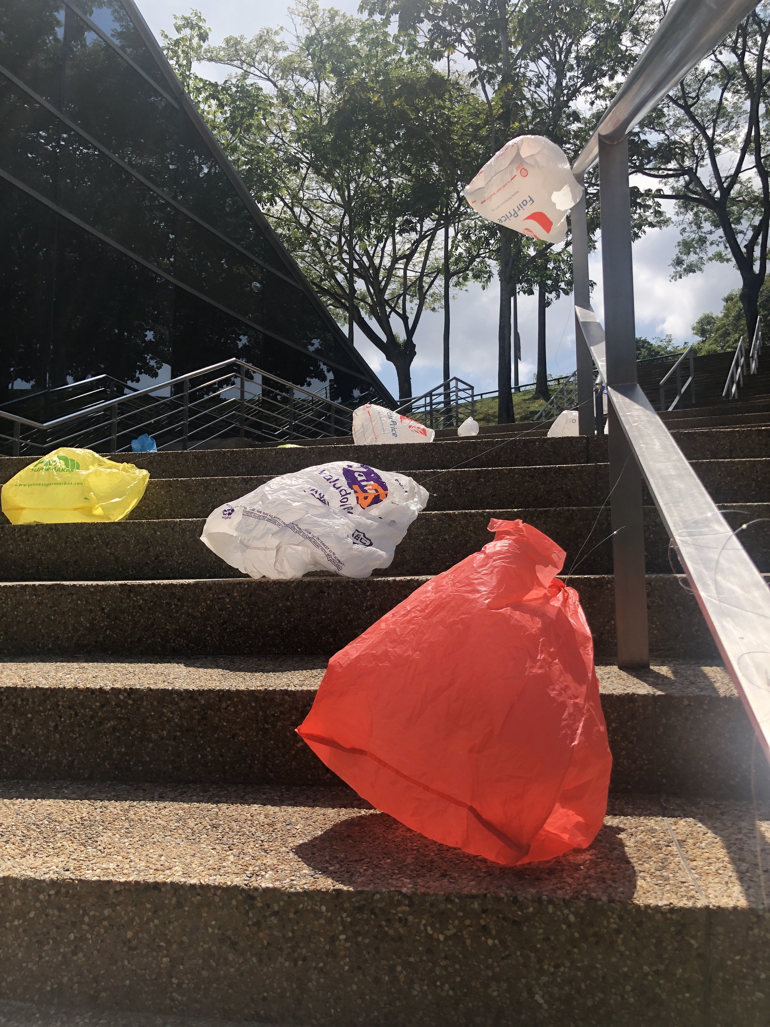
Plastic waste can be found everywhere, however, only 1% to 3% is recycled. By dumping plastic waste into the oceans, plastic degrades itself into little pieces where marine animals mistook them as food and kills them. Therefore, we have decided to strategically place plastic bags along the stairs such that every step someone takes, they can see the number of plastic waste humans are producing.
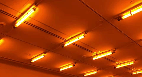
This work definitely leave a deep impression on me. The very first time when I visited this space, my friend screamed and asked me “AM I COLOURBLIND” and I was like “HUH?!”. Then the lady who work there told us that its normal and explained that its part of the experience.
At first we will only see saturated yellow light that makes all colours appear to be shades of yellow, grey and black. However, once you are in the room long enough and get comfortable with the space, with the degree of abstraction it entails, and that’s when we can start paying attention to what is happening with our vision.
In this space, it is covered in light from mono-frequency lamps that emit light of around 589 nanometres in wavelength, in the yellow region of the visible spectrum. This work shows how the brain adjust the colour of known object to make them appear the same colour in radically different lighting conditions.
Olafur Eliasson created a series of environments that explore the scientific effects of light and colour on our vision.
I think what the artist want us to understand that our sense of perception is not fixed and it changes with our environment. He transform the space into a room filled with a single colour when it “force” us to view things in a single manner. Thus if our perspective is altered, many things would appear different to us. Colour can play a big role in people recognising certain object, thus by removing colours will we view the object different? Or will our brain tell us that its still its original colour?
Thoughtful Interaction Design
A Design Perspective on Information Technology By Jonas Lowgren and Erik Stolterman
Being thoughtful is about being reflective. To reflect means that you use your critical mind to examine your role as a designer; …… A thoughtful designer is someone who takes on design as a serious and important task and who tries to become a designer with the ability to create fascinating, authentic, and useful digital artifacts.
We as a designer are aware that what we create is able to influence people, like spreading a message through the work. However, do we actually know the definition of being a designer? As designer, it is important to understand what our roles and responsibility is about.
The definition of a designer online, “a person who plans the look or working of something prior to it being made, by preparing drawings or plans.”
In this reading, it allows us to understand further on our role as a designer and make us think of what make one a “good” designer. This reading also talked about the relationship between a designer, the client and the users.
The client typically pays for the design work and makes final decisions about whether the results are acceptable.
To be honest, it is easy to forgo our role as a designer when facing difficult client. Like the sentence above, the client have the final say in everything as they are the one paying for the final product. The reading also mentioned that every design process is unique and the outcome can never be predicted. Sometimes, many designer chose to let go of certain aspect in the process of satisfying the client expectation and deadline. However, it is all part of the design process and it’s something designer must go through.
If the outcome can be predicted, it is by definition not a design process.
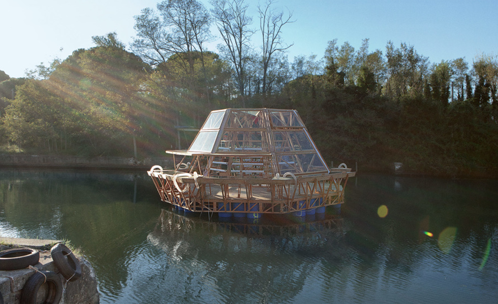
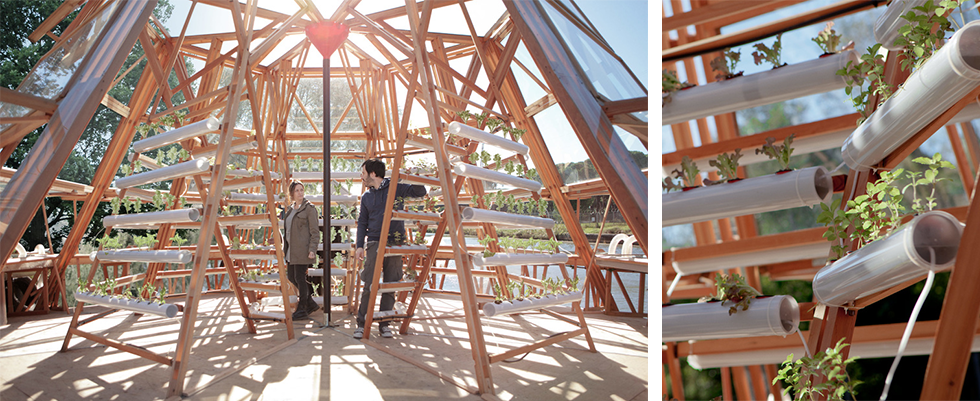
Jellyfish Barge
Jellyfish Barge is a greenhouse boat, a floating crop cultivator that does not rely on soil, fresh water or chemical energy. It purifies salt or polluted water with desalination units that produce up to 150L of clean water per day. Also, Jellyfish Barge is built with low cost technologies and simple material like recycled plastic drums. With technology, user can monitor and control Jellyfish Barge remotely. This creation do not need any power source but generate with solar panels.
This is created with regards to the prediction of global demand for food that will be 60-70% higher than today. Agriculture is the human activity that relies most on the existing water resources. Due to the change in climate, many areas are more vulnerable to the problem of water and food. With this creation, no water is needed to grow agriculture and produce more food which helps solve the problems faced.
THE RESIDENTS
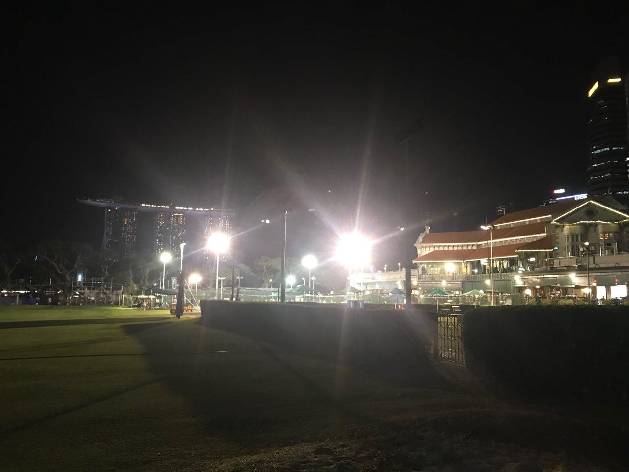
National Gallery Singapore (Supreme Court Wing, facing The Arts House)
The first exhibit that I came across and realised that it was nicely mapped onto the building. It is interesting how the projector is placed slightly off centre and still managed to mapped accordingly to the building. Looking at it from the side does not really affect the visuals much but the street lights was kind of affecting the visual from the front view. I didn’t managed to find the description board, thus I feel that the location of the description board is important for audience to know what they are watching.
Front View
Location of Projector
THROUGH HER EYES
National Gallery Singapore (Supreme Court Wing)
We arrived in time to watch this exhibit from the beginning and it started off with a black and white visuals along with text. However, the visuals was hardly visible and only the text can be seen clearly. I think it was due to the surrounding lights as there were spotlights coming from opposite the building. The second half of the projection was more vibrant and colourful which is more visible as compared to the first half. Thus, colours do play a part in the visuals that you want to project and also considering all the external problems that might surface.
Vibrant Visuals
Surrounding Lights
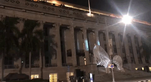
SECRETS OF THE SAND, WRITTEN IN THE STARS, SNAPSHOTS IN TIME National Gallery Singapore (City Hall Wing)
This exhibit was directly beside the “Through Her Eyes” exhibit, thus confusing many audience if they were a single or separate piece. The visuals is nicely projected onto the building but due to the surrounding lights, some of the details was lost again. I personally like how they make full use of the building structure to creates the animation where it feels like they are forming the building. I think they face the same problem as last year where there were trees directly in-front of the building. Those trees blocked off some of the pillars where the animation is projected on. However, I think due to the projection on other pillars, it kind of allows the audience to visualize the animation on the affected pillars even if there were trees blocking.
Something different this year was the light structure in-front of the building. I was guessing that it is supposed to help enhance the whole experience with the projection going on. However, I personally don’t feel connected with it because I expected the projection and light structure to work together better.
Side Facade
Overview
Obstruction
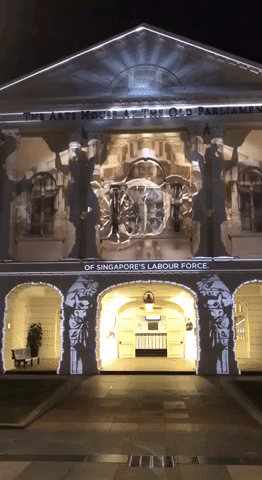
STRONGHEARTS: THE PEOPLE OF THE SINGAPORE RIVER
The Art House
This exhibit also make full use of the building outline to create the animation and was nicely mapped onto the building. Due to its location, the projector was placed directly opposite and at a nice distance where the visuals was much clearer as compared to other exhibit. Also, the description board was placed in a comfortable position where audience don’t have to walk to far off just to get an idea of the projection.
INTERSECTIONS: THE STORY OF BELONGING
Asian Civilisations Museum
They used vibrant colours which I feel that it helps with the projection on building. Even with surrounding lights, they are able to stand out and make people want to view it. As there was another exhibit from the festival in-front of the projection, it kind of “guide” the audience to where they should stand and watch the projection.
Resonance
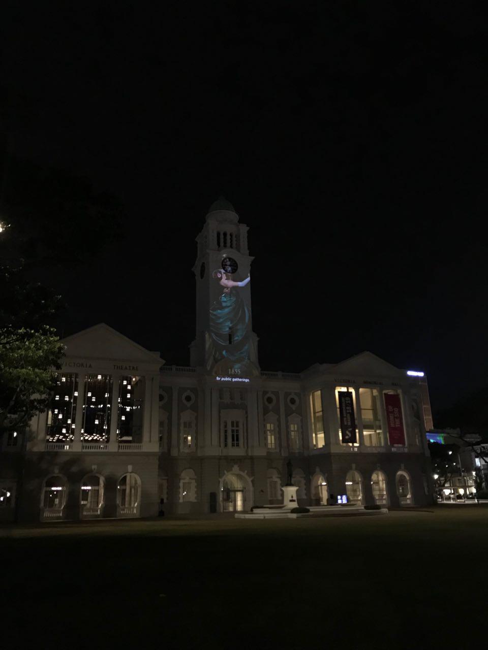
PORTRAITS OF PERFORMERS FROM THE PAST
Victoria Theatre and Victoria Concert Hall
The projection was projected on the middle façade and not the whole building façade which I think was due to the full length window on both end which make it difficult to project anything on it. Using only the middle façade, they still make full use of the height of the building and work around with the canvas they have.
Other exhibits from Light to Night Festival
Sticks
Resonance
This festival was held concurrently with I Light Singapore which make it difficult for audience to differentiate which exhibit belongs to which festival. I personally also didn’t managed to differentiate thinking that only the projection mapping show was part of Light to Night Festival and not the other installations.
OVERALL REVIEW
Placement of Description Board
The description board was located directly under the building where I find it a hassle to actually walked over to read the description. As projection mapping show is best viewed from a distance, a description board should also be placed nearer to the viewing area as to indicate that the audience are able to view it from there. Especially for the projection show at the National Gallery, the audience is viewing from across the building, in order to read the description, they have to cross the road to find out more about the show which was inconvenient.
Festival Map
The whole festival is spread out across a wide area but the online map provided was not specific enough for people to navigate through the area. We have to walk quite a bit to find out where are the different projection show and some of the work was found randomly because we happened to came across it. For the exhibits at Esplanade Park, we couldn’t find any of the exhibits and almost mistook a Chinese Festival light display as the exhibit.
Reflection
I feel that projection mapping is not just about creating visuals and putting it up on a building, there are so much more to consider when it comes to the final outcome. Taking into consideration the building façade, how the artist going to make use of the building structure to make the visuals more interesting and giving it life. Does the content projected on that specific building have a meaning to it? Also, there will be a lot of external factors that will affects the overall experience like the surrounding lights and the environmental sound.