2D – Project 3 “Ego” | Process v4

I decided to go for this style for my project 3. As mention previously, I will be using Me at this Time to present my work. Here is the work that I have done and will be improving on it.


1
Tired Me

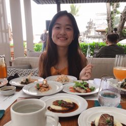
I used illustrator to create my face using this photo as reference.

img_1131

What are some things to improved on are adding more details for the face features and also adding a neck will make the composition more complete and not look so weird.


2
Morning in Hall

I used a bed to represent my hall and added a clock that stops at 7.30 which is the time that I wake up for classes.

What are some things to improved on a is the scene it too plain. Maybe changing the setting and the clock to something more funky will helps. Will try and explore for this part.


3
Don’t want to get out of bed

I used cloud to symbolize dream, where she is sleeping and do not want to get out of bed. There is also a character holding balloons drifting among the cloud, which represent she still want to wander in her dreams. 
2D – Project 3 “Ego” | Process v3

Me at this time

The idea for my 4 setting will be what am I doing at certain timing. Here are some of the settings that I have brainstormed and will be working on it. It’s like a day of what I am doing during the weekdays when there is school.

7.30am Tired me + morning in hall = don’t want to get out of bed
8.15am Exhausted me + canteen = time to get coffee
9am Energetic me + school = time to start working
2pm Drained me + late afternoon in hall = nap time
7pm Recharged me + night in hall = rush assignment


At first I was going for the digital collage style. However I realize that it is quite hard to play with colors there. I am still trying to figure out on the go.

I went on and try a different style which is pop art or comic style. Where I also included myself into the composition.

7.30am Tired me + morning in hall = don’t want to get out of bed

m1
Tired Me

I was thinking of combining different style for different columns.

Me (comic style) + Setting (digital collage/flat design)

However, I feel that it might be too messy for my whole project and it might not sync well with one another. Still trying to work on it.


Here are some examples that I found on Pinterest for pop art.

4faf974507efd407fb34a711f835eb47

6e444dc57ec98ffbaabd288f40f00eae

75fabb7a45e0bc0539547d971a0c313c

130d7e443327b3c353670de316a3263f

db03be50badd278f48100841ac845787

f028bcceb23bf1000057a42b77dcfe6a


Here are some examples that I found on Pinterest for flat design.

bfd62d208111c23a8bd2838c59cbc5e5

065058d45d4c88967d5b9ad1ce36ce1c

4c0012121052849f026ac04c59184285

2D – Project 3 “Ego” | Process v2

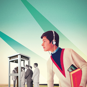
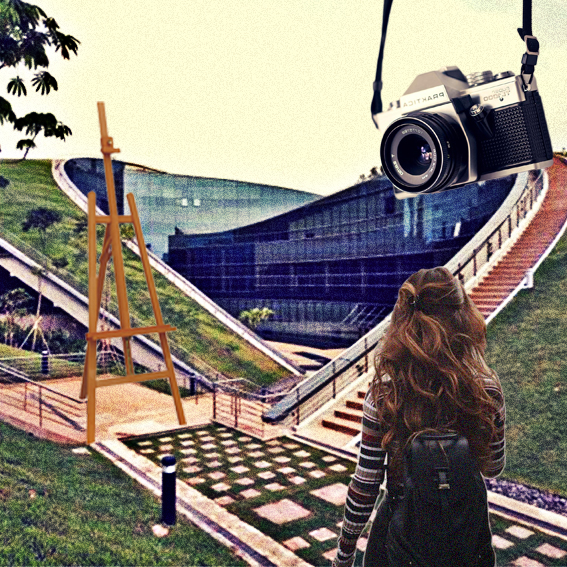
Initially, I wanted to create a character that represent me throughout the project. However, after doing more research, I decided to discard the character idea and go for digital collage.


Julien Pacaud

He concentrates particularly on “retro” visuals from the 1900s to the 1970s, and this, in addition to a great fondness for Magritte and a strong taste for the geometric, produces scenes and environments that playfully evoke the fascinating mythology of a not-too-distant future.

6d444bd1411c2359-ur-dossierweb-sansinternet

2114205d01de8ef3-morningstaradvisor-thumb

bfd32a786057b2a7-eden

cab38c2baed8ce1d-kurl

fb27384458f45f0a-protocol002

8babcba9172db652-80yearsofabsence

b0ddc9d9c793ea2f-ur-dossierweb-findelhistoire


First Draft

m1
Curious me

+

s1
First day in school

=

e1
Anticipating the journey

My work now is too flat, the contrast between each element is not strong enough. Thus, I will play around more with the different element and determine which element is the focus.