
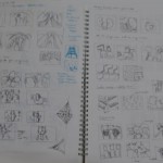
Sketch book:
-

- Sketches
-

- Sketches + Ideation
-

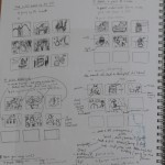
- Initial layout
-

- Initial layout
-

- Initial layout + Colour schemes
-

- Final layout sketches
-

- Final layout sketches
-

- Final tryouts
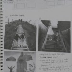
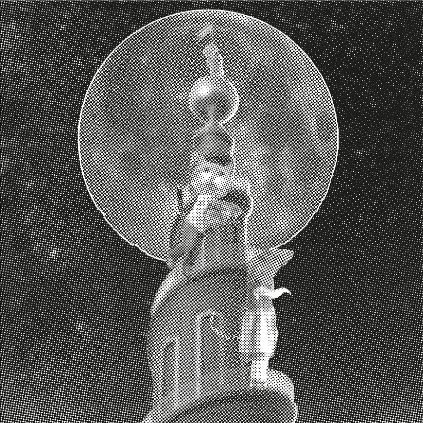
Final works:

Me, A Better Me, An Ideal Me and Me in 5 Years
Explanation:
1, Me
Bright Personality + Things I Love = All about me
(Bright Personality) I love bright coloured clothes and the curved lines that are connecting the items together shows that all these are interconnected, which shows about my own personality that is positive. Therefore, many colours are seen.
(Things I love) I love paper cuts, origami and nature. Hence, I incorporated all the things I love together. With the colours use shows the nature feel.
(All about me) I decided to add all the bright coloured clothes and things I love together with my name to show that all these depicts who I am. As a result, bright colours are used.
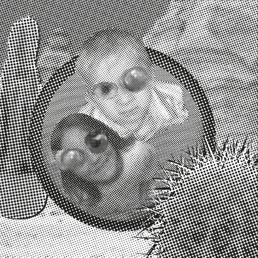
2. A Better Me
Patient – Distraction = Creativity Thinking
(Patient) I feel that I need to be more patient with anything I do and when I am with people too. I decided that paper cutting would show patience. The colours chosen shows that despite being impatient (red), there is a need to stay calm and composed (green).
(Distraction) Nowadays I’m distracted with all the gadgets and social media that connect me to the world. There are times that I need to be more focus to concentrate on what I need to do or even take a break. I decided to use a transparency of myself to show my distractions. The colours used are quite eye catching (purple, orange and green).
(Creativity Thinking) When I am more patient and less distracted, I can think more creatively and ideas just pops out. The overlaying of things with my face shows there there is more freedom in creative thinking. The colours I chose was to show that I need to stay calm (blue violet and green) and focus (red and yellow) for creativity to flow.
3. An Ideal Me
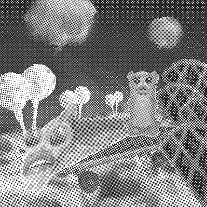
Enjoyment x Escape from the busy world = Rest/ Relax
(Enjoyment) I love desserts and one way of enjoying life is this. Even though I do not have a sweet tooth but sweet things makes me happy and joyful throughout the day. A wide range of colours are used to show how enjoying oneself can be.
(Escape from the busy world) Since there are so many things to do and many times rushing to meet deadlines makes me want to escape from here to somewhere more comfortable. The hot air balloon (red) depicts me wanting to fly away from the cold world (blue) even if the world seems bright (yellow).
(Rest/ Relax) I wish I can take a break from all the busy schedules and take a moment to enjoy myself by resting. My forms of resting is lying on the bed to have a good sleep and lying on the beach to hear the sounds of nature. The colours used are to depict rest (blue, green and purple) and enjoyment (orange).
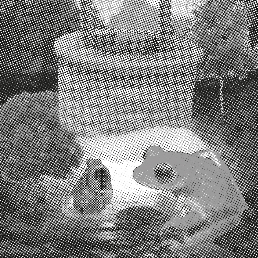
4. Me in 5 years
Ideal Room + Designer = Travelling
(Ideal Room) I wished that I can decorate my room according to my own style and preference. A place where I can chill out, rest, do my work and anything I want. The colours chosen are about myself and a simple room decor would make me contented.
(Designer) I see myself to be a designer in 5 years time. A work desk where all the necessary items are used by a designer. I would love to continue to draw, paint and using digital platform to create my own identity and style. The colours shown are to show that I need to be passionate (red), determination (yellow) and calm (blue) to produce the best design works.
(Travelling) I hope that I can travel to my dream asian country, South Korea, to enjoy the rich culture, food and scenery. They are also great in Interactive design which I would love to learn from them and the advancement in technology makes me tempted to work there. The colours used are to show how enthusiastic (yellow) I am to explore, confidence (blue) that I would be able to work there and my ambition (purple).


Recent Comments