Picking up where I left off in the research post, once I finalised the jobs, I begin to start work on the assignment. I broke down each job to its basic elements and from there, picked out a couple that I felt could adequately represent the job. In order of creation:
hairy-legged sock model
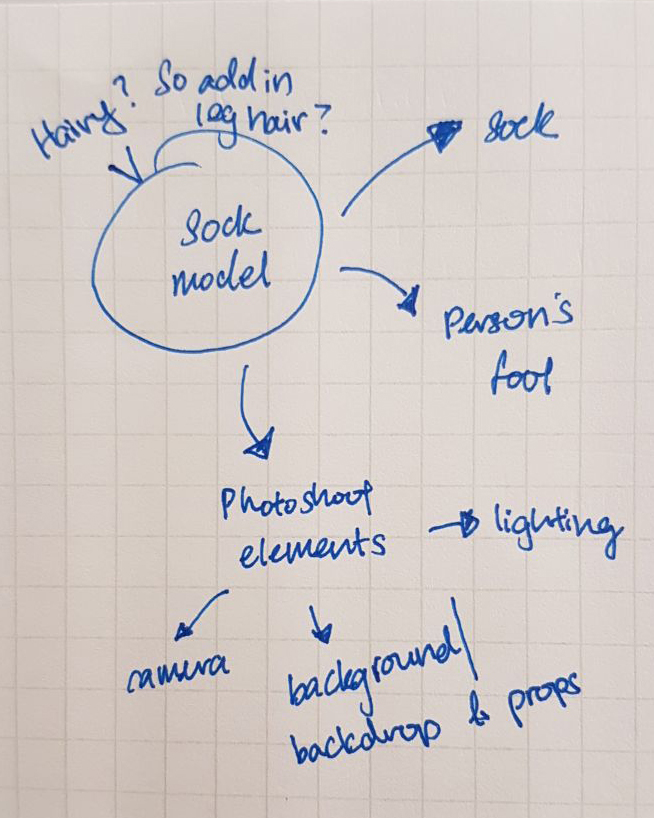
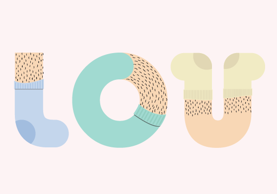
For ‘Hairy-legged Sock Model’, I broke it down into hairy-legged and sock model, and sock model being further broken down to just the socks and the foot. Initially, it was supposed to be just sock model but after sketching it out, it felt kind of boring and conventional so I decided to draw in leg hairs as a joke. I showed it to a friend and she loved it so I decided to keep it in for the humour. I then did a rough sketch of it before starting work in Illustrator. Initially, I wanted to draw the words out from scratch. However, after playing around in Illustrator for a little while, I decided to use an existing typeface and from there, add on elements of the job, ensuring that the resulting typeface would be consistent (hopefully?).

After diving through my font book, I finally selected Bauhaus 93 as my base typeface. The typeface had jumped out to me because of how the ‘L’ looked kind of a like a sock and I figured with a few editing here and there, the typeface had the potential to look like a foot in an adorable pair of sock. I also decided to go with a pastel colour palette as I wanted the whole feel of the piece to be whimsical and dreamlike.
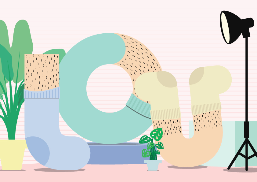
The last part of the process was to create the backdrop for these new typefaces. When I think of models, I immediately think of either runways or photoshoots. I decided to go with a photoshoot kind of backdrop, with the inside there “posing”. I took reference from Happy Socks, an online company originating from Sweden, that produces socks with some pretty out-there designs. Drawing inspiration from the photos from their shoot for the Beatles’ sock collection, as well as how some fashion bloggers do their video/photo backgrounds, I came up with this backdrop for the typeface.


stuffed toy killer

The next composition that I came up with was the one for Stuffed Toy Killer. How I interpreted this one was quite straightforward as well. When I think of stuffed toy, I think of the stitching detail. To represent the ‘killer’ portion of the job, I decided to include rips and holes in the typeface. To further emphasize the message, I decided to include a pair of scissors in the background.


The typeface that I decided to use as a base for this particular concept is BoB. The variation in width in the typeface is what attracted me and I thought the ‘L’ looked almost like the arm of a teddy bear (do you see the trend now? I just look for typefaces that kind of look like the objects that I want to illustrate :’)). I also decided to go with a colour palette that is bright and vibrant to create a contrast between the “dark” occupation and the innocence that stuffed toys seem to be associated with (or at least I see this association in my head, what with the whole idea that it is usually kids that own stuffed toys).
I decided to pick a cutting mat for the background because I had this idea in mind whereby the stuffed toy killer is actually a person that is very much into sewing and DIY-ing and so he/she just takes apart these stuffed toys and try to merge them back together (think Sid from Toys Story but less… sinister?). And so I figured the person might use a cutting mat as a base for easy measuring and cutting of the fabric and what-not. To make the piece seem a little darker, I decided to add this vignette-like effect. It also helps to further emphasize how the letters are the main focus of the piece.

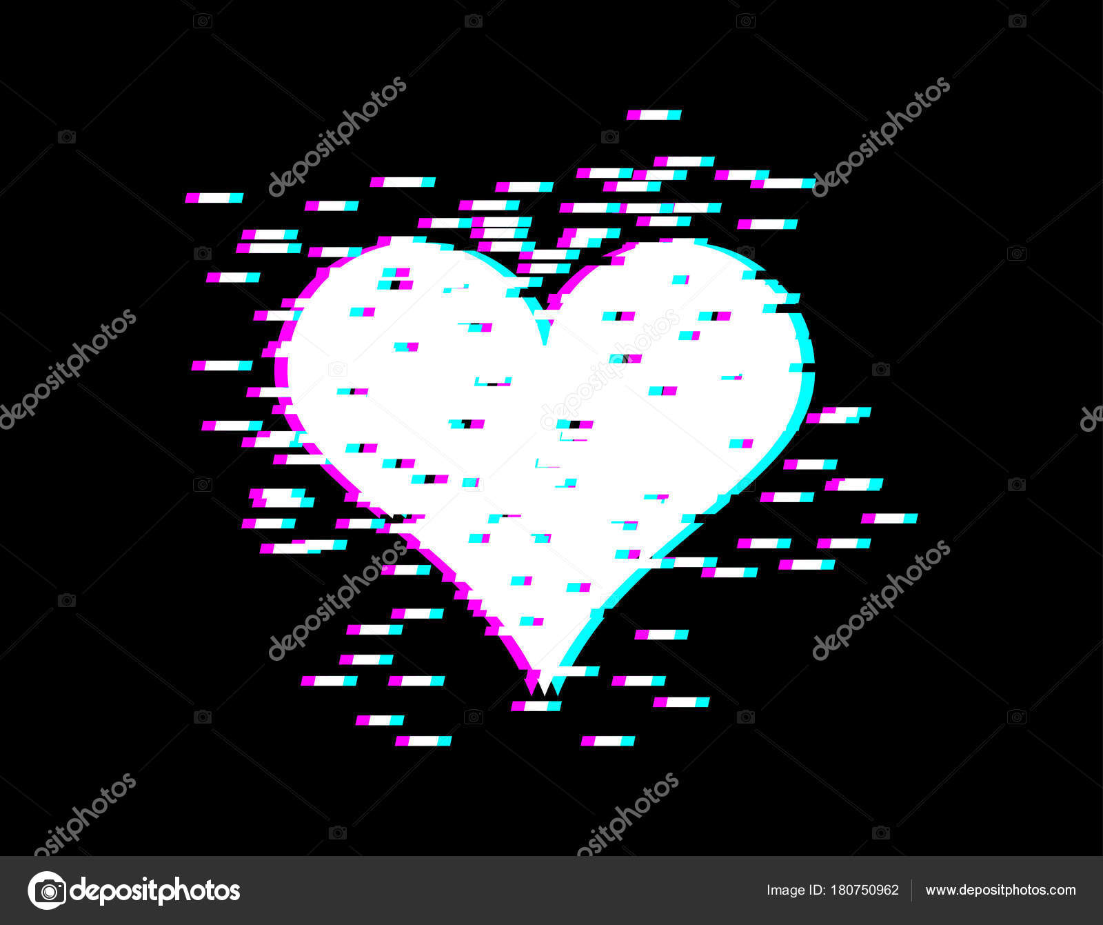
glitchy designer

I feel like such a dysfunctional person at times and it is my goal to become a designer in the future. SO WHY NOT COMBINE THE TWO TOGETHER??? Breaking down ‘Glitchy Designer’, I thought I could use the icons of design software like Adobe Illustrator, Photoshop and InDesign to represent the designer aspect. And then include glitch effects for the glitchy aspect of the job.
I wanted to make the icons from scratch so I needed to identify the font used by Adobe in their icons. A general google search told me that the font used is called Adobe Clean but the font is not available for use by people outside Adobe because this is their corporate font. Another quick google search told me that a pretty decent alternative is Ubuntu so that is what I downloaded and used on the Adobe icons.

Initially, I wanted to use the original colour of the icons for Illustrator, Photoshop and InDesign (these 3 icons were selected because I feel they are the 3 most common programs I, personally, had to use while I was working as a junior graphic designer) but then I felt like the whole glitchy part aspect of the job was not really coming through as much as I hoped it would so I decided to change the colour of the icons to shades of red and blue, of different opactiy, which created this pretty interesting effect. The icons were first created using Illustrator. I then threw them into Photoshop and warpped and layered them to get the completed typeface.

As for the background, I decided to go for these lines of different thickness and opacity to create this sort of static background. I then further warped the lines to give a sense of dimension to the piece.

memphis art collector

I have a soft spot for the Memphis design movement, even though it was pretty short-lived. Even though this job is not really very odd as compared to my other jobs, there are specific elements that I could incorporate into the design and that is what I ended up working with. I broke the job down into Memphis art prints and then a gallery wall, where a collector might display his/her collection.


I decided to create 6 different print, each with a letter of my name in it. I opted for a bright colour scheme because that is a characteristic of Memphis art. I also chose this really quirky typeface called Flat Tyre for this concept to fit in with the fun and whimsy feel that I wanted the piece to have.

reflection
This assignment was a pretty tough one for me as I kind of had a creative block mid-way through the project. I guess one important takeaway from this project is to not be afraid to reach out to others to ask them for their opinion. Particularly so, from seniors or generally people who are more exposed and experienced in design. Yes, it is scary and but it is a good exercise for me to learn how to accept criticism and justify my designs. So shoutout to Syl for looking through my stuff and giving me feedback. I will never say this to you in real life because I think your ego does not need any more boosting but I think your designs are pretty darn good and you are a really nice senior.
Another thought I had while working on this project was the there isn’t really necessarily a bad typeface. Different typefaces have different uses and I guess, we as designers, need to figure out when and where we can use which typefaces. Majority of the typefaces that I used for this project might be considered bad type, with the exception of Bauhaus 93 perhaps (I can hear the lead designer at my previous workplace shouting at me for my poor type choices), but I personally, I feel like it is because of all these weirds quirks in the typeface are what gives it character and help me express what I wish to express in my designs.
All in all, this project has been a pretty fun one and it feels good to be using Illustrator once more. Cheers to the completion of this project and I look forward to the completion of the next one (actually not really because I am really unsure about my concept but that is a story for another post. For now let’s just focus on the fact that I’ve complete 1 assignment). WOOHOO!