The Crystal Goblet or Print Should be Invisible

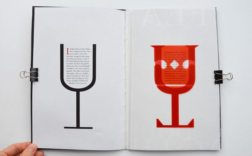
Beatrice Warde uses a pretty interesting metaphor in her essay, comparing the craftsmanship of a crystal goblet to typography and printing. In the essay, she uses the aforementioned metaphor to bring her point across, on what is her definition of good typography and the sort of mindset a good typographer should have. And I do agree with her, for the most part. 

Typography does require a lot of attention to detail and precision, particularly so when dealing with editorials, or any collateral that has a fair amount of text. Besides having to take into consideration the overall aesthetic of the layout and whether or not everything is consistent, the designer has to ensure that the text is laid out in a legible and readable manner, so as to ensure that the reader will not struggle to read nor get bored while reading the text. At the same time, whatever creative execution the designer does in the end must not distract the reader from the message of the text. As Warde puts it, “Type well used is invisible as type, just as the perfect talking voice is the unnoticed vehicle for the transmission of words, ideas.”, this I think is particularly apt., especially so for one is dealing with content-heavy collaterals. 

Warde also then goes on to describe the book typographer’s job as that of “erecting a window between the reader inside the room and that landscape which is the author’s words” and and further goes on to emphasize her above idea by saying “I have a book at home, of which I have no visual recollection whatever as far as its typography goes; when I think of it, all I see i the Three Musketeers and their comrades swaggering up and down the streets of Paris.”, this I still agree for the main purpose of a book is to convey the author’s ideas and the book typographer’s creative decision should not be obvious, at least not to someone who has no sensibilities about typography.

What I do not agree with is her point “it is mischievous to call any printed piece a work of art, especially fine art: because that would imply that its first purpose was to exist as an expression of beauty for its own sake and for the delectation of the senses”. This is not necessarily true as fine arts, while it had originated from a place of focusing on “aesthetics for aesthetics’ sake”, has gone on to take more meaning. Fine arts may have existed as merely an expression of beauty for its own sake back in Warde’s time but in modern day context, may not be true anymore. Furthermore, Warde goes on to say “the type which, through any arbitrary warping of design or excess of çolour, gets in the way of the mental picture to be conveyed, is a bad type.”. I agree that while warping and too much colour can prove to be a distraction, it really depends on what is the function of the piece of text, as well as the message behind it. Sometimes, these warps and excessive usage of colour can help for viewers remember the message much better. Take for example comic sans, where its unevenness makes difficult to read. This forces the reader to slow down, so as to better be able to absorb the text, allowing them to remember more. 

All in all, Beatrice Warde makes an interesting and compelling point about good typography and printing, most of which are still relevant today. However, there are certain points that may not be as relevant to us anymore, due to the changes in society and the changes in trends in art and design. 

Once again, credit must be given when credit’s due. The cover image is taken from here and was created by Samuel Gorham
Typographer of the Week: Neville Brody

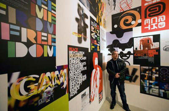
One aspect of Neville Brody that I admire is his willingness to continue to explore and challenge boundaries in graphic design, despite facing negative feedback from his tutors and even after nearly getting expelled from college. It is this adventurous spirit, this perseverance that allows for new discoveries to be made and for new methods to be developed. It is something that I guess us as designers have to learn: to have the courage to pursue concepts that might not be popular or deemed as too unconventional – not commercial enough. I feel like this is especially important to do so in school, where we might be too focused on our grades and always try to skew our work to match what we know the professors like. It is during this period of time where we have the most creative freedom, where we have the most room to explore, and we should take the opportunity to really fully explore instead of sticking with what is safe or what we already know would appeal to people. 

As for what I can learn from his design style, it would be his dynamic typographic layouts. I really like how simple but dynamic his works are. For example, the poster below utilises just texts and two colours but with a slight tilt to some of the letters as well as the body copy, combined with the contrasting scale of the words, he is able to produce such a poster with so much character and energy. Neville Brody

Image result for neville brody record cover design

Much can also be learnt from his layering of simple shapes, text and texture over photographs to create something interesting. With a few elements, he is able to imbue so much character into a piece of work and that is something that I hope to be able to emulate in the future. 

Thinking with Type | Reflection

WHERE. HAS. THIS. WEBSITE. BEEN. ALL. MY. LIFE???????

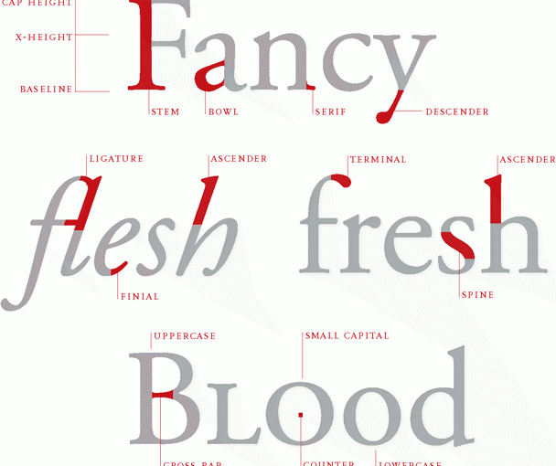
Personally, I feel like this website would be really useful for someone who has just started learning about the intricacies of typography, or even graphic design (I would have really appreciated this website when I first started doing graphic design). It is quite comprehensive and contains definitions of important terms as well as the general dos and don’ts. They have also included examples after each general topic, which helps for us (the general viewer) to better understand the applications of each concept. I also really appreciate how easy it is to navigate to each specific topic on the website, allowing me to jump to specific areas which I may be unsure about. 

I found the website really helpful, especially the section on letters where they broke down the anatomy of the letters as I am still unable to remember the terms. But other than that, after looking through the website, I not only got to revise what I’ve already known but also got to learn some new tips that I could potentially apply to future projects, especially for the upcoming poster projects (VC (i) also has a poster project woohoo). I definitely would keep this website bookmarked so that I can constantly go back and refer to the website. 

Type Speaks! | Reflection

I think it never did occured to me how much effort it took to design and create typefaces. Having grown up in a time when computers were becoming a commonplace household item, when letterpresses had already long been phased out and made obsolete, I was brought up not really aware of the challenges that typographers and graphic designers from the past had to go through. Also, the man mentioned in the beginning, “Practically everybody looks at printing, everyday, yet I don’t think there is one person in the thousand that ever stopped to think where we’d all be if printing type never existed.” and the woman’s response was “Most people are willing to go along taking it for granted.”. Sadly, this is the reality of things. However, it is good that such a video is preserved and digitalise so that the future generations can come back and refer to it and understand the intricacies required for the process. 

Having gone through the letterpress workshop in school, I already had some idea of how much effort was needed and how time-consuming the process was when it came to printing books in the past. However, I forgot to take into consideration the amount of work that goes into designing the typeface, creating the mould for each letter (and numbers and special characters as well) before finally using the mould to create each metal block. And having to repeat this process for each font size (yikes), This video helped put things into perspective for me and I’ve never been more glad to have been born in the generation that I am in and to be able to enjoy all the modern technologies that help make the process of designing much easier than it was before. All in all, I now have greater appreciation for the traditional method of printing and am grateful for how much technology has evolved, making printing so much easier and so much accessible to the masses. 

Typographer of the week: Massimo Vignelli

I would like to start off this reflection by saying I admire how firm he is in his ideals and his emphasis on creating works that are clean and concise. To strip all things ornamental and to create a piece of work that focuses purely on communicating the message clearly is not something every designer is able to do, for the fear of being boring. And I do agree with the line “The content, not the designer, is what is screaming for attention.”. It brings to mind another manifesto that several designers adhere to, which is “Form follows Function”. The designs produced would then be consumer-centric, practical and timeless. Until maybe someone else comes up with a more refined design. 

However, I do not agree with how strictly Vignelli adheres to his ideology and criticises styles that do not follow his ideology. No doubt, content is king when creating designs however, it does not hurt when the designer puts in their own take on things. If a designer’s signature style of, say for example layouts, help to further drive the message home, it is not a bad design neither it is it junk or trash. Also, I do not really agree with his limited font choices. Sure, the fonts he listed are very good fonts, well designed and versatile. However, at the same time, they are too neutral and may not always help to further emphasise the message. Furthermore, take into consideration if we are designing for specific target audiences in mind. When designing for younger children, would Futura really be the best font to use? 

I do understand where Vignelli is coming from though. One must understand the history and how design came to be at where it is right now. Once must also know the rules before they come in and attempt to break them. I myself use the grid system when it comes to doing layouts and I find it immensely useful. Having a grid system in place might be seem as limiting but it helps guide new designers along. Also, it provides some kind of a boundary that forces us to think out of the box, to create designs that are interesting and exciting,