Are my post titles too cryptic? I will probably go edit them once I am done with the whole of assignment 2 but for now, they shall stay because yes, I am terrible at documenting the process of creating. A little heads-up, this post is going to be mighty long because of the breaking down of the design compositions before a little write-up on the silkscreen printing process. So yeah. Go grab a mug of tea (or whatever preferred beverage of choice) and a snack. Go on. I’ll wait. Ready? Okay, let’s dive straight into my design process.
SO. From the previous ridiculously long list of quotes, I have further narrowed to 3 quotes. How I did decided the elements to be added into my design composition was pretty simple. It was either that the element appeared in the quote itself, the element represented a word that appeared in the quote or it was a part of the movie. For example, here is the thought process I had for my first quote:
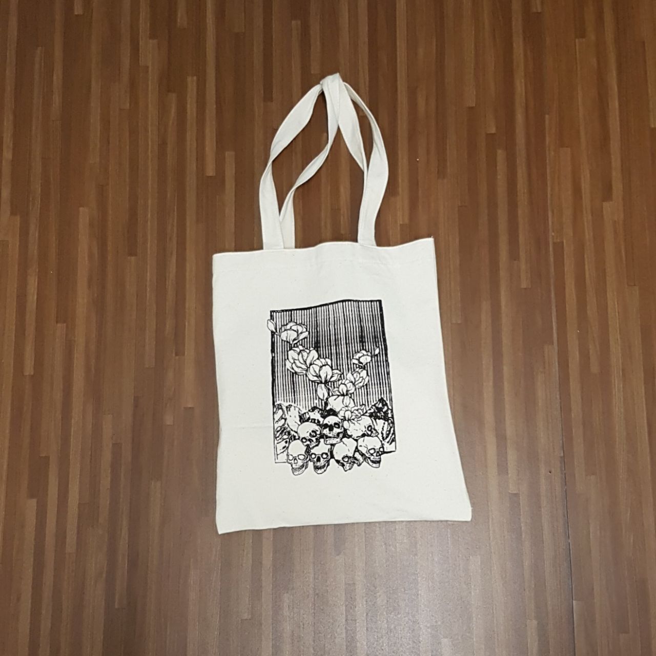
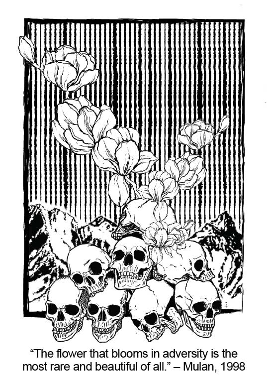
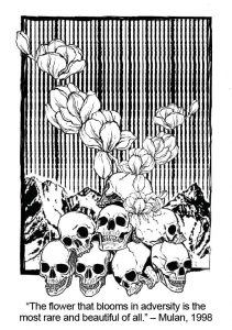
“The flower that blooms in adversity is the most rare and beautiful of all.”
So flower. And bloom. I represented it simply by using a picture of flowers blooking. Very literal and maybe a little safe but I feel like that makes sense to me and it could provide a link back to the movie. I decided to use magnolias because fun fact: Mulan’s name translates to magnolia flowers. Her surname Hua (花) is the Chinese character for flower and her name itself (木兰) is the name for magnolia. So yes. Magnolia flowers. Woohoo.
Adversity is defined as “a state or instance of serious or continued difficulty or misfortune.”. Somehow I felt like it could be represented visually by mountains because we always describe a losing situation as fighting an uphill battle and thus mountains can also be seen as representing a difficult situation. Furthermore, in the movie, Mulan’s first battle was in the mountains. With this, I went ahead with the addition of mountains into the composition.
‘Rare and beautiful’. I honestly felt like I ignored these 2 words in the end as I felt that the flowers on their own could signify beauty. Rarity, not so much but I guess that is the flaw in the design. On hindsight, maybe I could have played around more with the lines in the background of my design as well. However, what’s done has been done and so here is the result:
To be honest, the layout was done in Adobe Illustrator instead as I was more familiar with that software as compared to Photoshop. However, the images were edited in photoshop before being saved as PNGs and tossed into Illustrator for the final laying out process. Another confession: I did not do any sketches before hand. Which was probably why my design process took so long. But I felt that I kind of already had very specific images in mind when I sat down to do the compositions for this assignment so I guess it is fine. And this would probably explain why there are no other variations of the design because I played around with the layout for a really long time and did not save any of the compositions until I was really, truly, happy with them.
To me, I felt that the skulls represented adversity as well because from Mulan’s point of view, going to war and having to see the people around you die, that is a challenge in itself. And thus, from the mountains and the skulls, rises the magnolia flowers.
Moving on, my second quote:
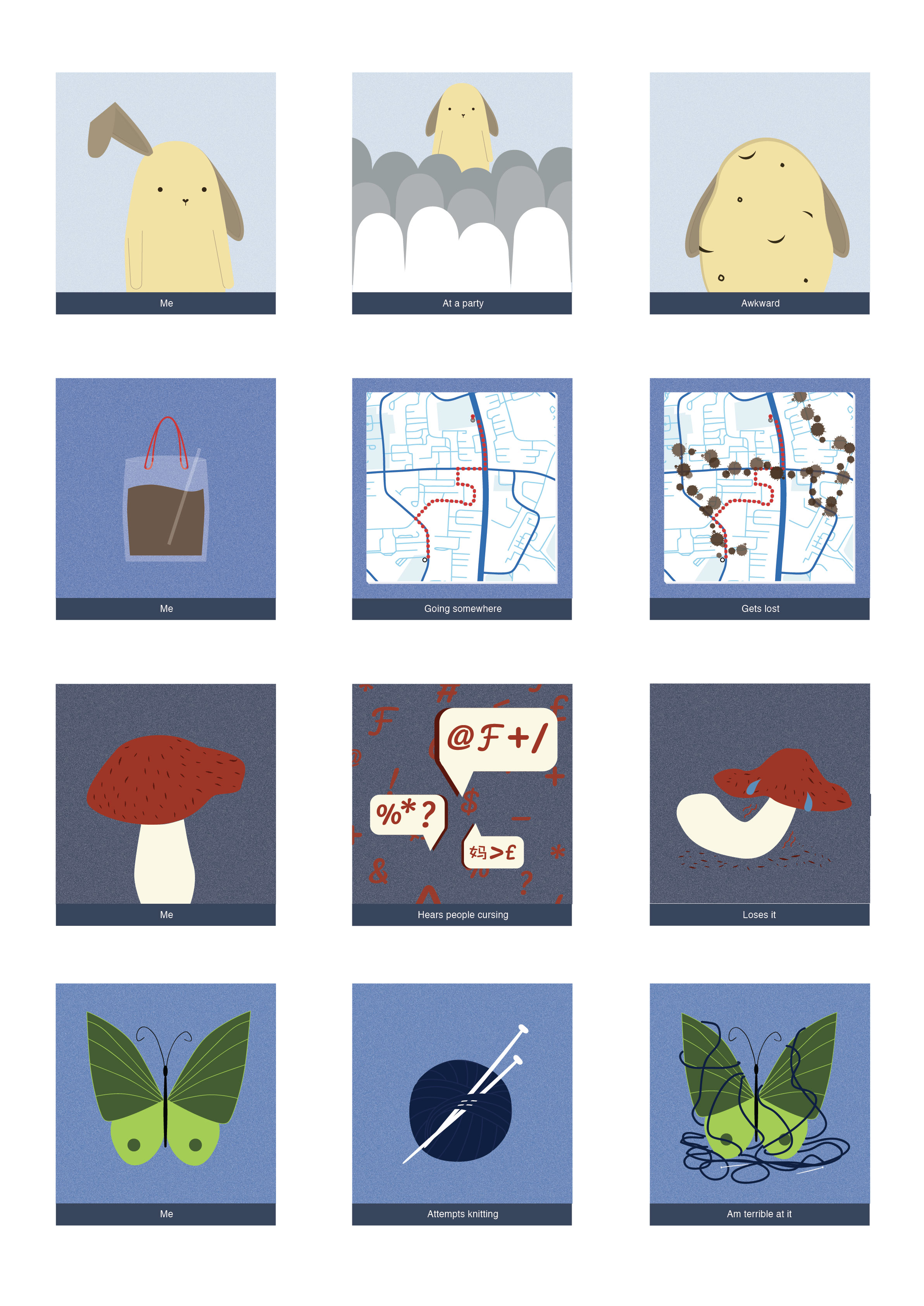
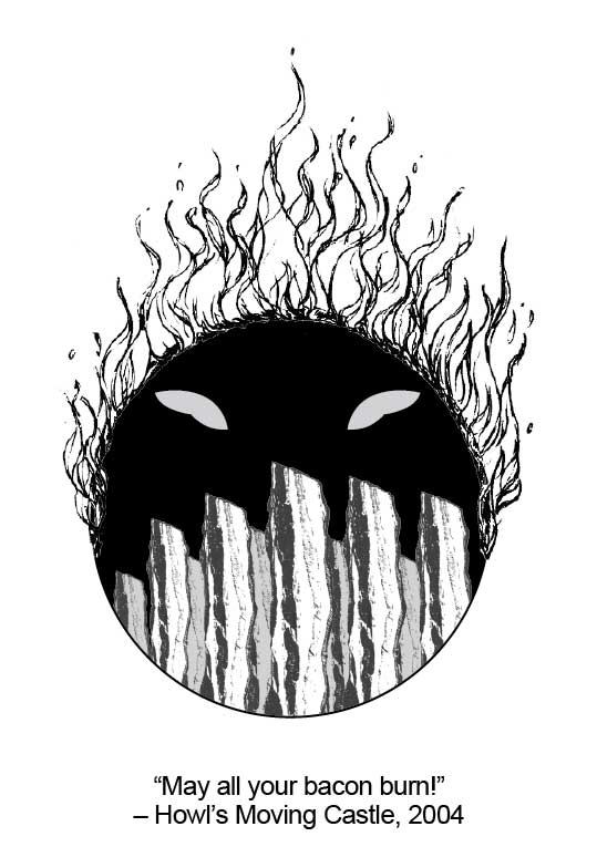
“This time is cabbage?”
This is from the 2016 Japanese film, If Cats disappeared from the World. Naturally, the quotes does not make sense, not unless you catch the movie (in which case, let me just put it out there. 10/10, would totally recommend). And plus because the quote is so short, there really is not much for me to work with. I will be creating 2 design compositions based on this quote.
Time is represented using clock. Cliche I know, but the message is clear cut and gets to the viewer straight. In the first design, I used clock hands to represent time while in the second design, I went ahead and used a time piece instead. Cabbage is being shown in the first design, through the print in the background, which is actually the cross-section of a cabbage. In the second design, it is seen replacing the numbers in the time piece. The cat, silhouette of a person riding a bike, the film strip and the phone are actually elements from the film itself. I decided to include these elements in because if I had just played around with clocks, timepieces and cabbage, the design would not have been very interesting.
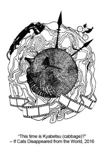

Another random thing to point out about my design process: I kind of start off by deciding what kind of general shape I want my design composition to have. This is more obvious in the second design for the cabbage quote and for the last quote.
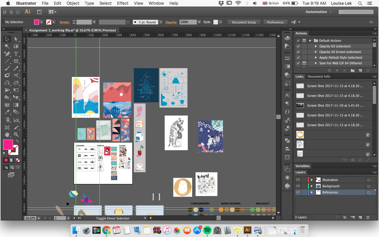
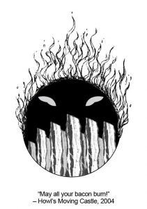
“May all your bacon burn!”
I don’t know why but I just find this quote so adorable. Similar to the second quote, there really is not much for me to work on. But, instead of adding on a ton of elements from the movie, I decided to try to just stick to words from the quote itself, trying to go for a more minimalistic approach for this final composition. It is the most plain out of the four compositions, and if I had given myself more time to experiment, perhaps the design would have turned out a little better. In the final design, I added in these little oval bumps to represent the character that uttered this line in the movie.
Okay. WE ARE DONE WITH THE FIRST PART. Let’s move on to the second part, which is silkscreen printing. Shoutout to the awesome senior that helped us out for the entire process: Clara. She was really patient, friendly and really looked out for us. I aspire to be like her if I do get to do this 2D silksscreen printing work-study in my second year.
The whole process went like this:
1. Wash the silkscreen, let it dry in the dryer for a little while.
2. Once the screen is dried, apply emulsion onto both sides of the screen. Put it back into the dryer to dry, for approximately 30 minutes. This step is done in the dark room and the emulsion should not be exposed to white light, therefore the screen with the emulsion should not be brought out of the dark room at this point.
3. Once the emulsion is dried, we can start to prep the screen for the exposing of our design onto the screen. To do so, determine how you want the design to appear when printed before attaching it onto the screen. A tip from Clara was to lay out the transparency on a flat surface, in the way we want our design to appear when printed, before putting the screen over it and flipping the whole thing over and securing the transparency down with clear tape. Once done, place the screen into the machine to expose.
4. Once the design is exposed onto the screen, we can proceed to wash off the emulsion. The area exposed to the light will remain on the screen while the area blocked by the transparency will be washed off. Once the excess emulsion is washed off, the screen will have to be dried before it can be used for printing.
Printing gave me a little bit of anxiety because once you do it, there is no turning back and there is no way to go back and fix the whole thing. Overall, I did a few test prints on a sheet of newsprint before doing the actual printing on the tote bag. A tip would be to just do it confidently and to apply even pressure. Shoutout to my classmates Alena, Amber and Athirah for helping me press down the screen throughout the printing process. It was a pretty fun experience and I did learn a lot through this whole process. Below is a picture of 1 of the totes that I printed. Honestly, I need to learn how to take more photos throughout my whole work process.