Zine – Final

A zine is a small circulation of self-published work that may or may not consist of original work, and reproduced cheaply. It may be either print, or hand-written, though the formal is used more commonly.

I had many ideas for this project, though upon consultation with Mimi, I decided to limit my scope a little tighter. It could have been even more limited, as the outcome was still rather broad.

The initial idea was to do a travelogue, similar to series such as Lonely Planet or Globe Trekker, based on locations that I had travelled to, except that it was from the point of view of a smaller object, in this case, a doll.

14405689044_fdf5cf4982_o 14406820085_f4dc19e53b_z

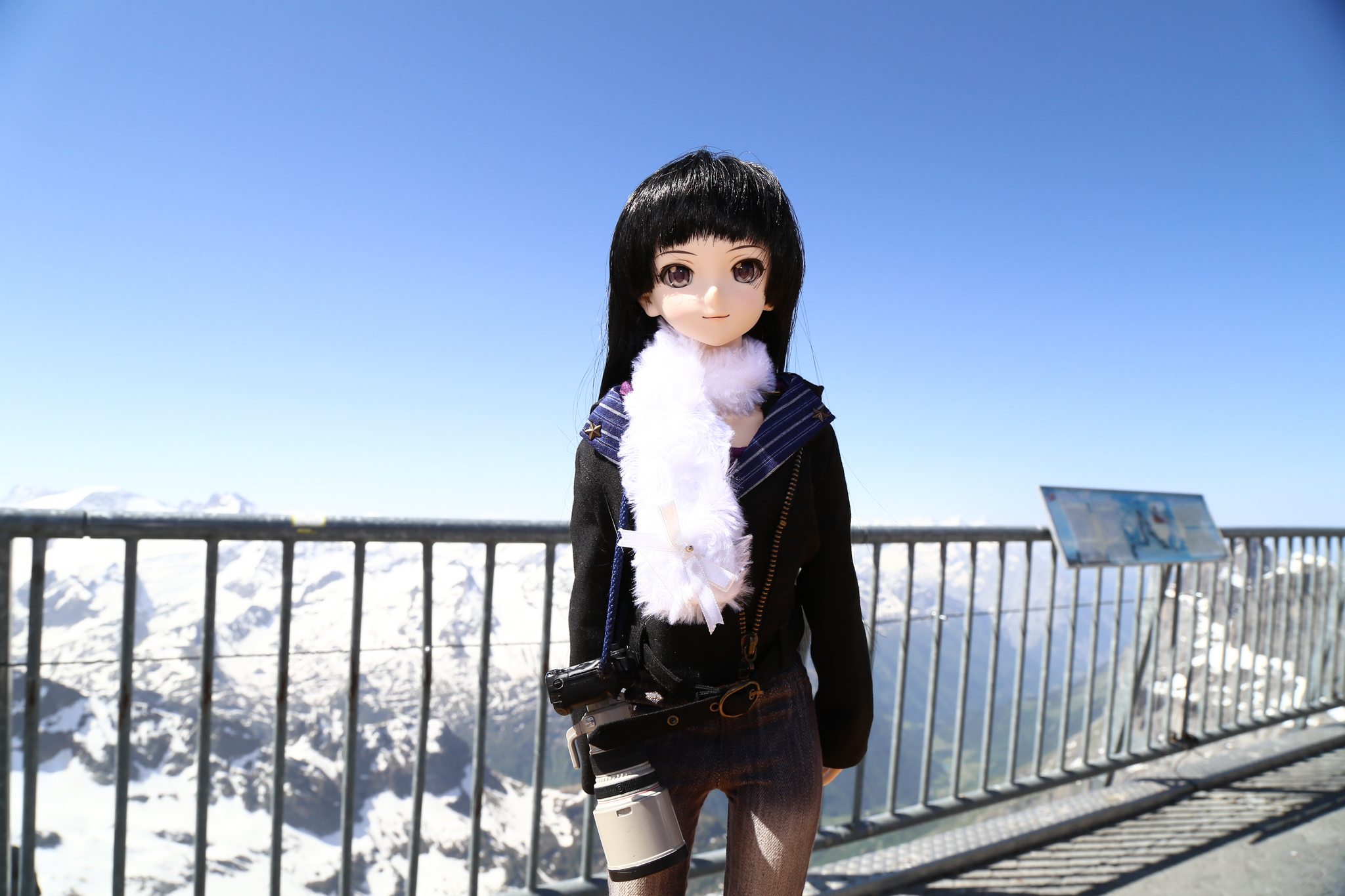
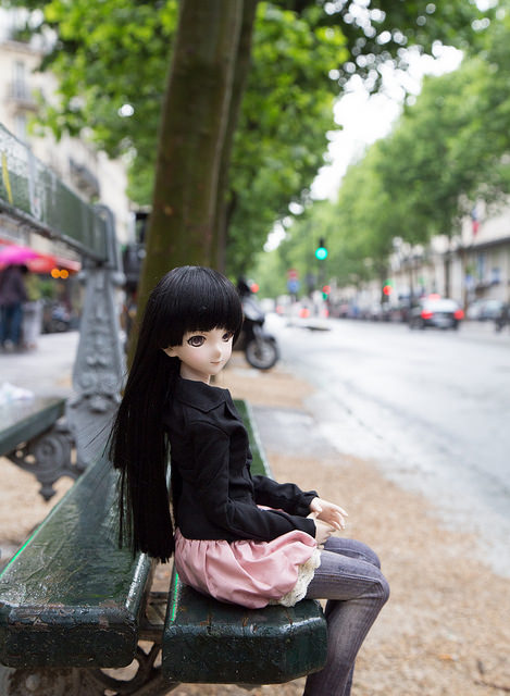
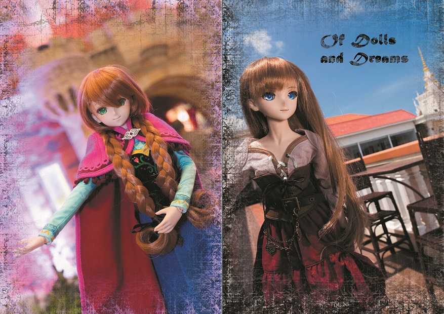
Image on the left was taken atop Mount Titlis, Switzerland. The other was taken in Paris, France.

The initial layout was planned in the following manner:

Page 1 and 8: Cover

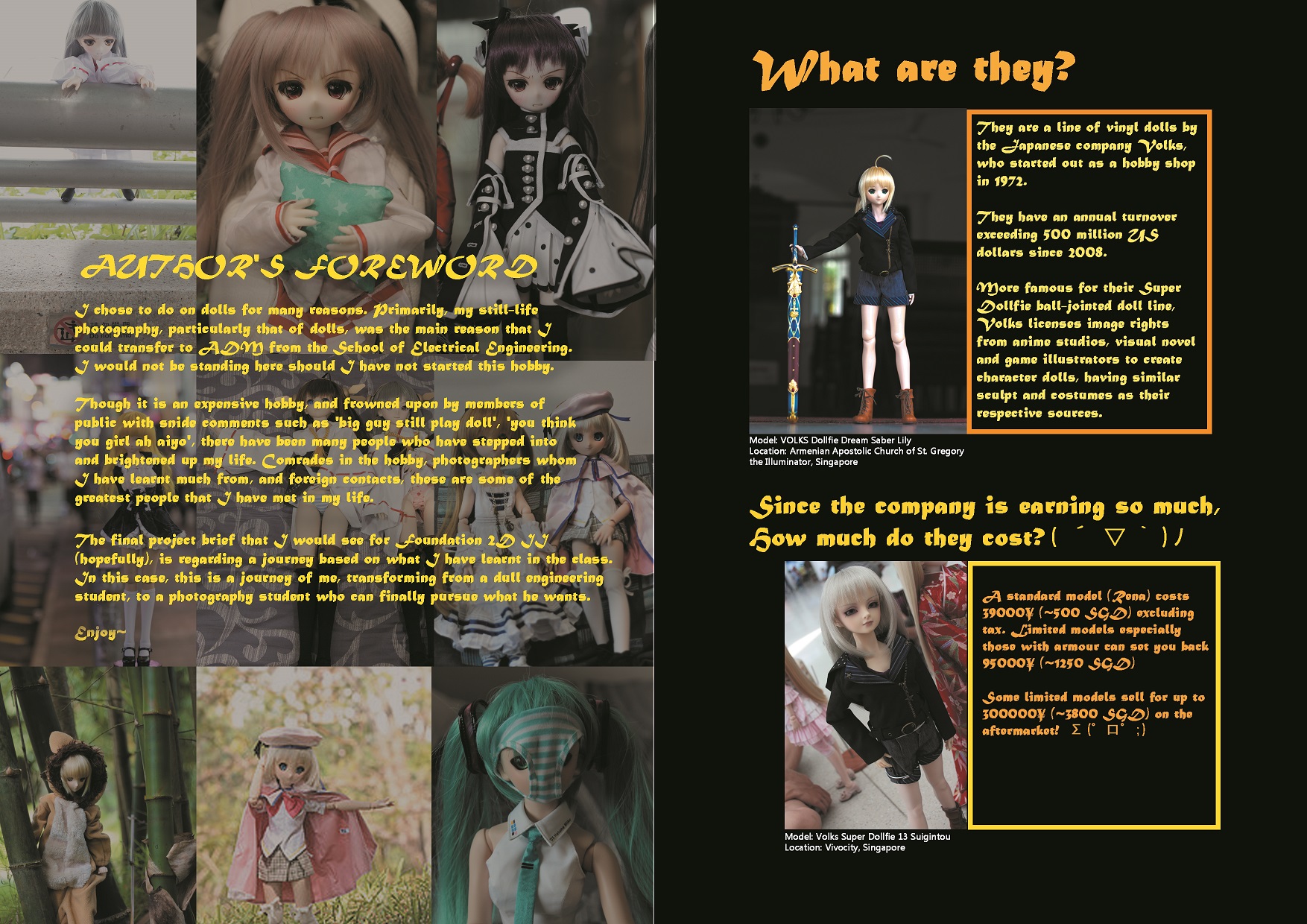
Page 2: Author’s foreword

Page 3: Description

Page 4: Information

Page 5: Explanation, how to get dolls

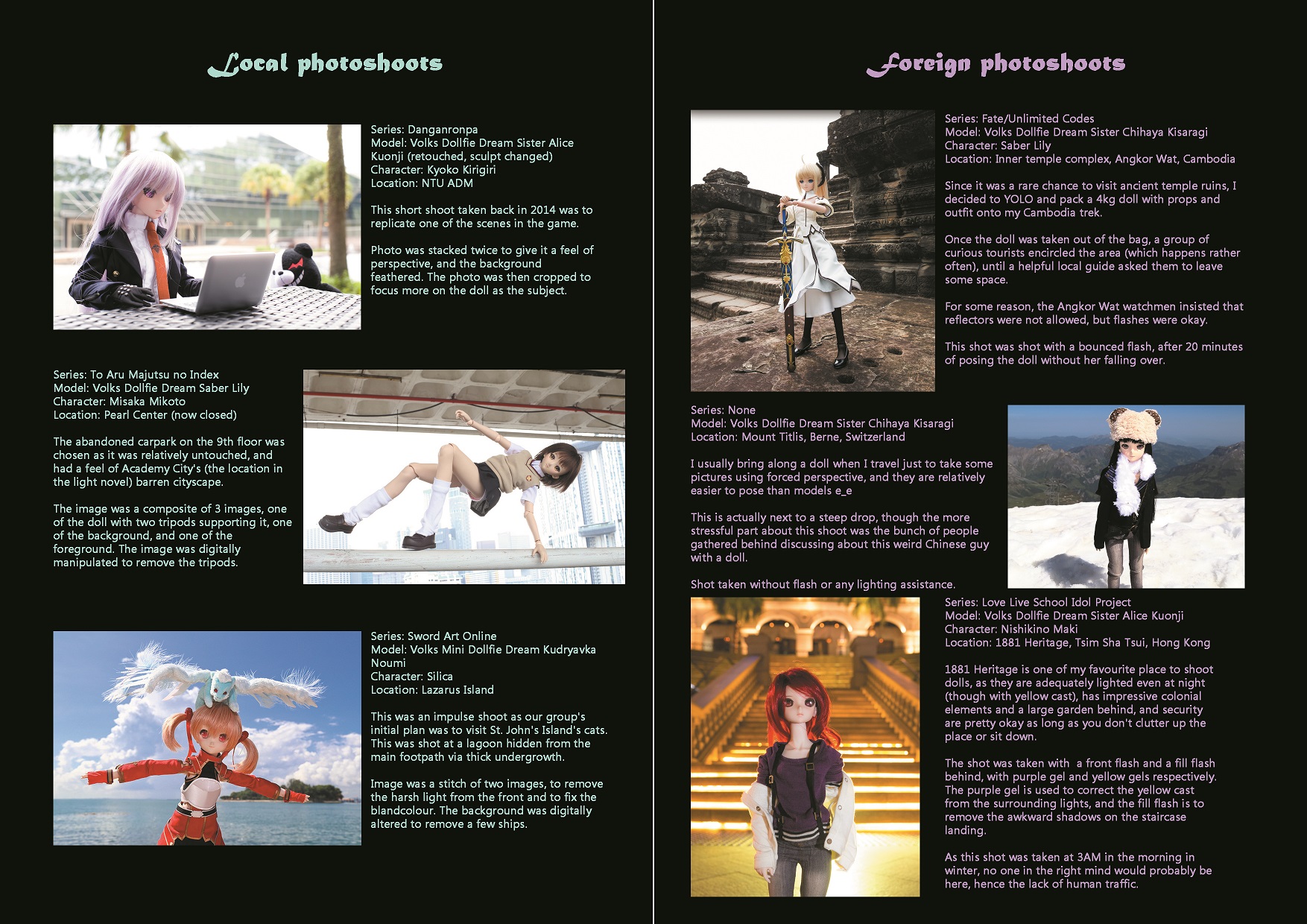
Page 6, 7: Different photoshoot locations and recommendations


However, upon discussion with two graphic design friends, they recommended that the photoshoot locations be shifted to the background (Page 2, 7), and the explanation and foreword be located at pages 3 and 6 respectively, so that it would be the first thing that potential readers see when they open up the zine.

The zine was designed to be a booklet for doll events, organised not only locally, but in foreign locations, and hence, the information must be striking, and catch attention. It was designed to be cheap (~50 cents per booklet on 80 gsm paper, full colour), and accessible. Gloss paper was rejected as it was prone to scratching for some particular reason, and the colour was not as attractive.

2d3_3 process1 2d3

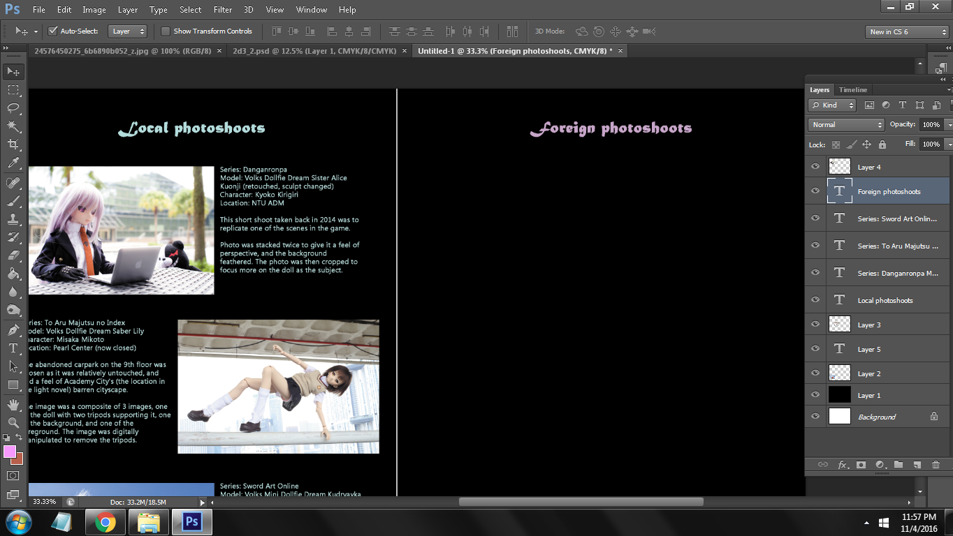
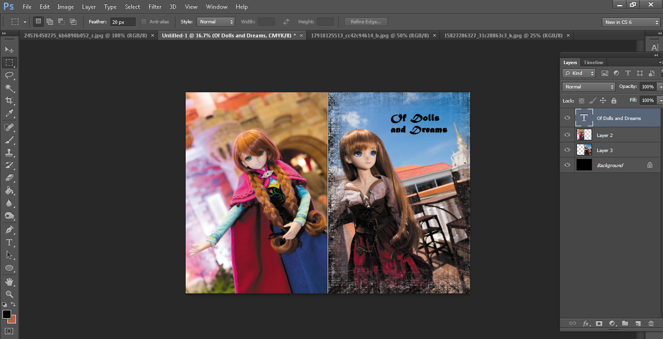
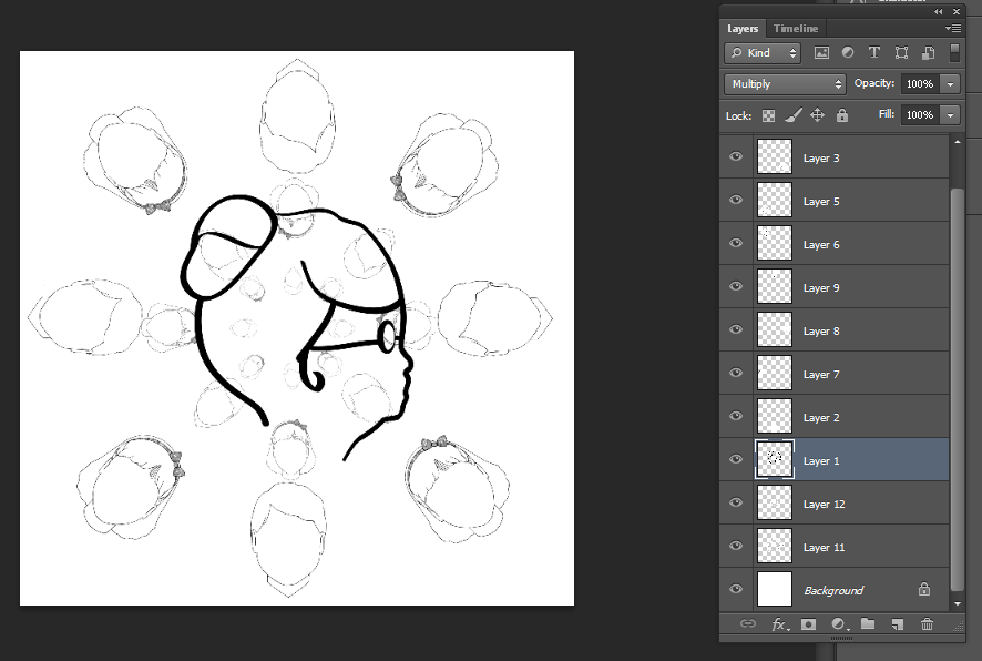
The image was primarily done in Adobe Photoshop CS6, as my Photoshop CC and InDesign were locked due to issues with Adobe Creative Cloud. A faint white line of 2px diameter was included in the center of the image, this is to facilitate folding and stapling of the zine upon printing completion.

As InDesign was not available, adjustment and alignment of pictures took a significant amount of time, as it had to be adjusted pixel by pixel.

The font choice was MT Script and Microsoft Tailue. Tailue gives a gentler feel than Arial (too broad), and not as boring as Times New Roman. MT Script gave a slight ‘exotic’ feel to the text, though on hindsight, it should have been replaced with another font, as the font itself was not the easiest to read, and was particularly large for its size.
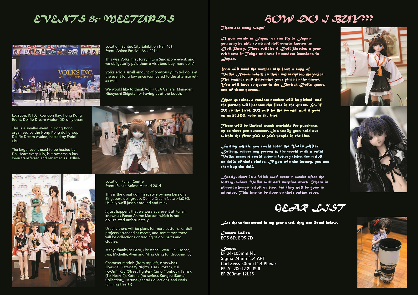
Final product:

2d3_12d3_3_22d3_22d3_4

On hindsight, I should not have boxed up the text as it looked awkward. The bleed was an issue as well, as the printing shop that I had visited had a larger than usual amount of bleed, causing the zine to change in dimensions; the top part had to be trimmed to accommodate the excess bleed in the lower part.

Next, I should have maintained a colour scheme, and used a similar background such as that in the author’s foreword page. Though vibrant, I felt that it was too inconsistent.

Finally, I would like to thank Mimi for her efforts in imparting graphic design knowledge to us. Though I am not the most active in class, nor do I have a good attendance (oops), I have learnt a lot of tips and techniques in this class that I would definitely put to future use.

2D Project 02 – Rhyme

Personally, I find the second project to be more of a challenge. Although I have experience in photoshop, I do not usually use it for design. Furthermore, as I am from a strong Chinese background, rhymes were literally non-existent in my life until Primary 2 or 3, where my English teacher would request us to do some readings.

I prefer my designs to be direct, straight to the point, and not overly abstract. This is important as rhymes were used to convey information, and it is primarily targeted at younger children. Thus, I can not diverge too far from the original idea and produce something that looks like Dali and Picasso’s secret love child.

I have also felt that being given rhyme 03 was both a godsend and a curse, as this rhyme is simple, and direct, but however, it lacks creative space unlike the other two rhymes.


Final images and research

Image 01: There was an old woman who lived in a shoe.

Print1

This image consists of heels, just in case it is not obvious enough. The primary inspiration came from a slightly startling observation. The layer of heels upon another heel was a result of days of observing a wolf spider with its egg sac, and subsequent release of its offspring.

In the case of this rhyme, ‘There was an old woman who lived in a shoe’, it could be considered that there were multiple smaller shoes living in another larger shoe (the shoe home), as I preferred not to directly associate the old woman in the first verse of the rhyme.

The original heel was converted to black and white using Illustrator’s pen tool, which I found ridiculously troublesome and I eventually changed to another method, which will be explained in the following rhyme image. The colour curves were edited to result in more minimal midtones, and more blacks and whites. However, some midtone was retained so the heels actually looked like what they should be. Colour halftone was kept small (4 pixels) so that the heels did not look odd.


Image 02: She had so many children, she didn’t know what to do


The image consists of a line art of an old lady, with line art of both male and female teenagers arranged in circular fashion, with three different scales. The teenagers were positioned at a 45 degree difference, while the scale changes in a multiplier of 4 from the inner circle towards the outer circle.print2

The inspiration for the old lady’s line art comes from Emma Webster, or the Granny from the Looney Tunes series.

The number of characters (8) in a circle consists of largely religious overtones.

In Buddhism, the Dharmachakra has 8 spokes. Buddha’s Four Noble Truths resulted in the Noble Eightfold Path.

In Christianity, there were 8 people on Noah’s Ark. The Antichrist was also the 8th king in the Book of Revelation.

In Chinese culture, the Eight Immortals were 8 demigods (duh). In Taoism, there are 8 trigrams of Ba Gua.

In Hinduism, Lakshmi has 8 forms.

In Islam, the throne of Allah is carried by 8 angels.

In Judaism, Hanukkah is a 8-day holiday that begins on the 25th day of the Kislev. Circumcision is also conducted on the 8th day of a baby boy’s life.

The arrangement of the design was similar to the halo of Russian orthodox icons of Christ. The other influence was from the opening sequence in the anime series Himouto! Umaru-chan, though the number of characters was reduced to create a strong sense of symmetry.


Christ,_the_Pantocrator gif_umaru_maracasses_by_jonyboss875-d91jqxm

The image was imported in PNG format (and thus transparent), reducing the need to edit the background. Layers were added on and shifted around.

research2

Image 03: She had so many children, she didn’t know what to do

Image 3 is a totally different image compared to image 2, as I included mainly photographic techniques, and contrast. The old lady’s face is positioned roughly similar to the curavture of a nautilus shell (golden ratio). The center of focus of the children’s faces are 1/3 from the edge of the image. The images of the children were then laid over one another, with a few adjustments such as horizontal flipping and change of scale to provide a sense of depth.

There is not much inspiration to this photo, as I wanted to produce an image that shows the kindly aspect of the old lady with the energetic and bubbly liveliness of the children.


print3_2


Gaussian blur was introduced to reduce the impact of the slightly sharp edges as a result of cutting out the image from the background. The halftone size (8 pixels) was relatively large, this brought out the old lady’s features in comparison to those of the children behind. The image of the children behind was edited, with contrast reduced. The entire image was then converted into greyscale by desaturation.

research3

Image 04: She gave them some broth without any bread

The image is that of a prominent set of hands holding an oversized bowl of soup/broth, and a series of smaller hands waiting to receive it.

The outstretched hands, a sign of receiving, is also a sign of the children being hungry and waiting for the last meal of the day. The larger set of hands defines that the giver is the authority, and also has a more literal meaning; a mature lady will definitely have a larger set of hands than young children.


print4

The image is edited by digitally removing the background and smoothening edges. Contrast was set to minimal and the sliders on curves were pushed all the way down, creating an opaque black image from a colour image. The sets of hands were copied and pasted, with a rotation of 35 +/- 4.8 degrees, randomly accounted for by the computer. This is to create a sense of individuality for the different children, in direct contrast to image 02.

A line is straight, has no thickness, and extends infinitely

Which is what I would think a line is had I not transferred out of engineering school.

Due to a absolute amount of luck, my sketchbook and first draft was lost overseas. However, I will discuss my inspiration behind my artwork in as much detail as possible.

I prefer simplicity over detail, and most of my works were drawn with either a pen with a 0.5mm tip, or a Pilot ‘extra-fine’ marker. These were my basic tools when I started out drawing, and became my most handy and favourite, apart from digital media.

As I still conduct teaching and conducting classes externally, I have to maintain a regimen of at least 3 hours of piano practice a day, and some of my influences come from my experience, piano theory, music history, and the pieces which I select. I would attempt to describe the above in laymen terms, as it may be harder to understand for those new to classical music.


Anxious

Anxiety is a feeling of unease or concern about an uncertain outcome. I based my artwork off Sir Peter Maxwell Davies’ monodrama, Eight Songs for a Mad King. This was before he had became known for his calm demeanour in further works in the 1970s. One published version of his work is known for the arrangement of music staves in the form of bars of a bird cage, similar to the actual work where actors were placed in bird cages. The monodrama ends with the actor smashing his violin, which is literally the end of his anxiousness as well. My artwork displays a line drawn by a loosely held pen, which follows the pitch of the main baritone in Eight Songs for a Mad King. It advances slowly initially, following the king’s speech, and increases in pace as we reach the climax.

Lyrical


To me, lyrical represents the deep emotion that flows through upon a performance or act. I chose the piece that almost caused me to fail my music exams, Ludwig van Beethoven’s Piano Sonata No. 14, or known as the Moonlight Sonata. Specifically, I chose his third movement (in C# minor), as it is one of the pioneering works by Beethoven where he shifted the most important movement of the sonata to the last movement. It is very fast and agitated (presto agitato), has heavily accented notes (sforzando) and many tough arpeggio sequences. It maintains its harmony through liberal usage of piano (Italian for playing softly) while creating climaxes and notable points by fortissimo passages (Italian for playing very loudly and forcefully). I used a quill pen to note points of inferences from the piece onto the artwork, where it is represented by notes, rests, key signatures and clefs. The lines connecting the notes are squiggly, irregular, but connected without sharp angles. This represents not only a display of emotion, but also a sense of direction linking one note to another, and progression.


Bizarre

Bizarre is just plainly, strange. I based my artwork off multiple influences, which includes H.P. Lovecraft’s non-human organisms, fate, and guilt, specifically from the Cthulhu mythos. Additionally, they include an amalgamation of biological tissue with machine parts, seen from the Digimon series, and extraterrestrial and mecha elements from the Evangelion series. My work involves a huge wall of a single element, with individual objects being connected to each other via guts, metal parts, pipes, wires or related items. There is multiple usage of metal parts bolted onto flesh, and tentacles writhing from random crevices. The medium used is pen, and any mistakes done during drawing were converted to another object instead, increasing the strangeness of the entire piece.

In the final presentation, a clump of synthetic plastic was stuck onto the artwork (which was initially used to mask a major mistake). It provides a feel reminiscent of fur, yet thin enough to be hair. The colour is unnatural. It was done by melting down synthetic wig with dye, and forcing it at high pressure into cold water through a casted mold. The dye is not fully mixed, resulting in patches of light blue and white. It accentuates the weirdness factor of the work, an essential part of being bizzare. The line from left to right loosely represents Cthulhu (Lovecraft), Ochu (Final Fantasy), metal-based Digimon (Digimon), Marlboro (Final Fantasy), Angel 01 (EVA), Tentacruel (Pokemon)