A zine is a small circulation of self-published work that may or may not consist of original work, and reproduced cheaply. It may be either print, or hand-written, though the formal is used more commonly.
I had many ideas for this project, though upon consultation with Mimi, I decided to limit my scope a little tighter. It could have been even more limited, as the outcome was still rather broad.
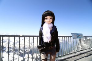
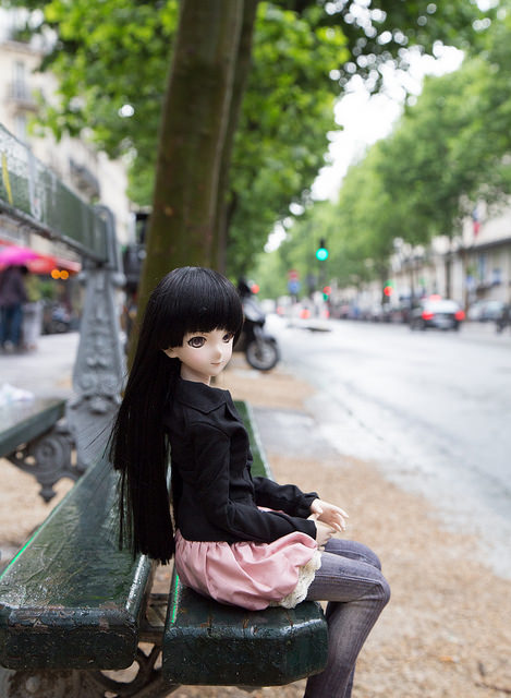
The initial idea was to do a travelogue, similar to series such as Lonely Planet or Globe Trekker, based on locations that I had travelled to, except that it was from the point of view of a smaller object, in this case, a doll.
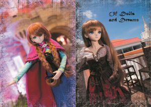
Image on the left was taken atop Mount Titlis, Switzerland. The other was taken in Paris, France.
The initial layout was planned in the following manner:
Page 1 and 8: Cover
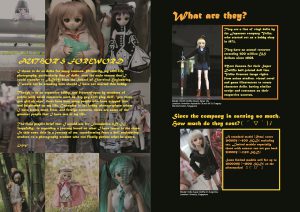
Page 2: Author’s foreword
Page 3: Description
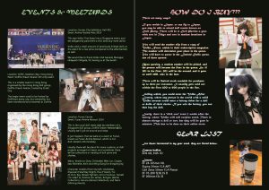
Page 4: Information
Page 5: Explanation, how to get dolls
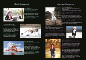
Page 6, 7: Different photoshoot locations and recommendations
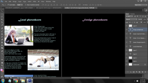
However, upon discussion with two graphic design friends, they recommended that the photoshoot locations be shifted to the background (Page 2, 7), and the explanation and foreword be located at pages 3 and 6 respectively, so that it would be the first thing that potential readers see when they open up the zine.
The zine was designed to be a booklet for doll events, organised not only locally, but in foreign locations, and hence, the information must be striking, and catch attention. It was designed to be cheap (~50 cents per booklet on 80 gsm paper, full colour), and accessible. Gloss paper was rejected as it was prone to scratching for some particular reason, and the colour was not as attractive.
The image was primarily done in Adobe Photoshop CS6, as my Photoshop CC and InDesign were locked due to issues with Adobe Creative Cloud. A faint white line of 2px diameter was included in the center of the image, this is to facilitate folding and stapling of the zine upon printing completion.
As InDesign was not available, adjustment and alignment of pictures took a significant amount of time, as it had to be adjusted pixel by pixel.
The font choice was MT Script and Microsoft Tailue. Tailue gives a gentler feel than Arial (too broad), and not as boring as Times New Roman. MT Script gave a slight ‘exotic’ feel to the text, though on hindsight, it should have been replaced with another font, as the font itself was not the easiest to read, and was particularly large for its size.
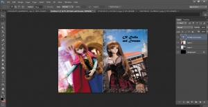
Final product:
On hindsight, I should not have boxed up the text as it looked awkward. The bleed was an issue as well, as the printing shop that I had visited had a larger than usual amount of bleed, causing the zine to change in dimensions; the top part had to be trimmed to accommodate the excess bleed in the lower part.
Next, I should have maintained a colour scheme, and used a similar background such as that in the author’s foreword page. Though vibrant, I felt that it was too inconsistent.
Finally, I would like to thank Mimi for her efforts in imparting graphic design knowledge to us. Though I am not the most active in class, nor do I have a good attendance (oops), I have learnt a lot of tips and techniques in this class that I would definitely put to future use.
