DISCLAIMER I have no intention of slander. What is portrayed is in line with an experimental art direction I am trying out. Thank you 🙂
PART 1
Location chosen: Katong/East Coast
I chose this location because just solely based on space, it just seems like theres so much to explore!
Together with previous knowledge, I headed down to Katong and during the visit, I realised I could categorise Katong into 3 different groups.
Upon entering/ being in the area, the first time I noticed was the distinct shophouses. Traditional Peranakan is probably the most prominent attribute of Katong.

With a bit of research, Katong was a dwelling place for the wealthy which hence attracted the English-educated middle class, including Peranakan and Eurasians.


Vibrant colours is clearly distinctive to the Peranakan culture to reflect of its vibrancy. In its food, it also acts as a quality control to ensure that the colouring is due to the use of natural foods. Coconut and coconut flakes is also very prominent in the making of the kuehs because Katong, where the Nyonya’s reside, used to be filled coconut plantations.


Apparently, the reason why these houses are painted so vibrantly was due to the fact that this houses were meant to be villas when the rich came to take a seaside vacation before land was reclaimed and the shores lines got pushed back to the east coast area.
While being in Katong, I came to realise that there was 2 shopping complex that was a distinct contrast to the Peranakan scene.


As per observation, Roxy Square and Tanjong Katong Shopping Complex is more refined as compared to the other parts of Katong due to the air-conditioning and the tiled floors. However, due to it’s quietness and the lack of patrons, it actually gives off an eery vibes. This is further emphasis by how there is quite a number of shops that are closed and with the metal shutters down. Maybe due to their lack of renovation, they use dim lightning as well. The energy there is very dead- it feels as if these people/ shop tenders are just running their business without any sense of belonging. There were beauticians, tailors, dodgy jewelry sellers and also old school food courts.
After doing some research, Roxy square seems to be once a thriving cinema owned by the Shaw brothers and they were the first in the cinema operating industry. However, it ceased operations and the cinema no longer existed.

As for Katong Shopping Centre, it was also once the first in the air conditioning shopping malls. However, it is among a few malls going through en-bloc sales where the government is like “re-claiming” the shops.
In general, I think that there is so much left unexplored to this aspect of Katong because of the over glamorisation of the “prettier” side that kind of over shadowed the old true gems of then thriving Katong.
It was also obvious, just like almost every other part of Singapore, Katong has largely been infiltrated with a lot of modern cafes and chill pubs.


The hipster exposure given Katong a very laid back chill vibes. Nothing is fast paced because there’s no offices around but instead just really like rows of restaurants/eateries. Not to mention, the high number of caucasians in the area also helps because (stereotype) they really know how to enjoy and are of much slower pace.
Initially I wanted to pick just one sole category to focus on for my presentation. However, after consulting Joy, for the presentation, we concluded that instead of just focusing on one, I could perhaps analysis how one aspect of Katong is affected by/affecting the other aspects. This is so that I won’t limit myself right from the start.
I ended up picking how Roxy Square was affected by its surroundings.
The first stage, I did a small scaled text interview with my 5 of my friends.


General consensus that I got is that the mall is generally run down and its customers group is generally its old returning ones.
It seems like Roxy Square actually saw increased patrons when the condominiums surrounding it currently started to sprout. Yet, at the same time, competition has also increased with the arrival of i12 and the previously mentioned hipster lane across it, both of which appeals more to the younger generation.
The second stage was to do an online research.
Online, there seems to be limited information on Roxy Square. Hence, for this portion, I mainly focused on Roxy Theatre.

Taken from: https://timesofmylife.wordpress.com/2008/01/10/my-old-katong-pt2-roxy-and-palace/
Roxy Cinema, in 1931, was thriving and very popular.
The weekend morning shows were equally popular with people rushing to tie handkerchiefs on the wooden chairs’ armrests to reserve seats after paying 50 cents.
What accounted for the popularity can be contributed to the pilots coming from the near-by Seletar Airbase and Kallang Airport.
Roxy Cinema was then sold by the Shaw Brothers in 1978 and now stands in its place Roxy Square which was completed in 1984. However, Singapore went into its first post-war recession in 1985.
The third stage was to head down once again to find out from both the shop owners and patrons on their opinions on Roxy Square.
As for patrons, I wanted to come with something interactive as a survey method so as to act as a conversational starter as well as to not scare people away. Hence, the following were adopted.

This board was that they could coil their responses around their answers.
 This one was so that they could stick and vote their top 3 adjective of Roxy Square.
Upon doing this exercise, I find that patrons were actually coming back to Roxy Square often. The reason for this was because the nature of services that Roxy Square offers require them to come back again- such as tuition centres, laundry services and tailoring services.
As for shop owners, I did a short interview with them and these are a few questions that was posted:
1. How long have you been here for?
2. What made you want to stay?
3. What changes have you seen through these years?


 (Screenshots taken from the video interview, faces blurred out just in case they are uncomfortable)
In the interview, it can be observed that the shop-owners have been around for a long time. Most of them retain their old customers. Currently, the MRT construction has caused them inconvenience because of the removal of Roxy Square’s overhead bridge which led to the flow of customer traffic to decrease. However, they still stay optimistic.
In conclusion, I feel that Roxy Square have lost its glory days. In my opinion, Roxy Square’s future seems bleak. But, I can see that shop-owners are still pinning their hopes on the MRT construction to hopefully see revival in its patron counts.
Full Presentation compilation can be found here: https://docs.google.com/presentation/d/1kLhxZBdB4PKDDit7UoNUdhuOMIjVqszym2OBFgLeNvM/edit?usp=sharing
Part 2
Bridging into Part 2, I wanted to bring across various aspects of Part 1 into Part 2. I wanted to bring across the concluding point in Part 1 as my message.
Going into this, I wanted to have interactive elements as well to make it feel like a personalised and homemade zine, which I felt was the beauty of zine.
My inspiration for the zine are:


I wanted to go for a grungy style as well because the tone for my zine is going sarcastic regarding the developments of Roxy Square.
My initial sketches for the zine was:
First Page
Without much thought, I just wanted to pluck the logo into the middle.
Spread 1

Page 2 to mark make with elements of Roxy Square such as its grill doors and its tiles. This is so that I can bring across the still-ness of Roxy Square and how low its patron-ship is.
I drew inspiration from:

B O U N C E by Narciso Custódio, via Behance
Page 3 was to have a quote and make a slit at where the adjective is. The purpose of this will be explained later.
I drew inspiration from:

EVERY FREEDOM NEEDS A FIGHTER Creative Poster via Behance
Middle Spread

For page 4 and 5, I wanted to have many many pictures of corners of Roxy Square, this is because I wanted the middle to be an overwhelming feel of loneliness and sadness. The pictures would show empty spaces.
I also did this because with regards to Page 3 which have the cut outs, this would read the quote’s adjectives with emptiness and loneliness. The quote which is originally
The cinema was popular with Katong residents during weekends, the highlight being the Saturday night screenings. Some of the screenings were so popular that there was a black market for tickets once the screening was sold-out.
Would then become
The cinema was popular with Katong residents during weekends, the highlight being the Saturday night *depicting empty spaces and up to viewers interpretation*. Some of the *depicting empty spaces and up to viewers interpretation* were so popular that there was a black market for *depicting empty spaces and up to viewers interpretation* once the *depicting empty spaces and up to viewers interpretation* was sold-out.
I really wanted this portion in because I love how it would act as a window from page 3 to page 4 and 5, symbolic of how Roxy Cinema’s glory days was lost and foreshadowed how Roxy square is moving into a bleak future. Also, the whole point of having a picture instead of a word also helps with leaving it up to the reader’s interpretation since the future is always up to someone to predict and not fixed.
Spread 3

As for Spread 3, I wanted to do coupons because this was symbolic of how the businesses at Roxy Square provided services but what value of the return is contradictory.
Page 6 was also to further emphasis the results of the findings, of how the nature of the services require a re-visit which is why patrons comes back more than once.
Page 7 is to emphasis as well that it almost seems as if the only mode of transport to the mall was by MRT and not any other means because of the amount of significance placed on how much the construction of MRT could help the mall.
I was intending for this coupons to reflect the olden SMRT tickets.
Last Page

For this last page, it will be the back of the coupons. At the back of coupons, it will usually end with ‘Terms and Conditions’, so that is what I intending to create a set on my own as well.
Initially also wanted to add a tag at the back in reflection of my survey method but removed it because it didn’t aid in sending across my message.
Experimenting
Initially, I wanted to mark make elements of Roxy Square onto the 2nd page. However, due to size and space constrictions, I turned to making cardboard prototypes to mark make with.

I would consider this a feel because the mark made follows very closely to the cardboard texture which is not reflective of the actual gate material. With this jagged texture, in my opinion, doesn’t send across the sense of stillness which I was looking for. Hence, I decided to scrape the idea.
For the quote, I tried out the lino-cut method at first just to tie in together with the mark making initially. I attempted to keep it only in the right page however, I experimented with spilling into the left page and also changing the orientation of the alphabets.
Overall, even though this method does give off the handmade feels which I was inclined to, there were a few things that I realised after.
- I didn’t appreciate the font that the alphabet stamps came it. It was too fun for the message I was trying to send across.
- The placement of the cut outs, which is affected by the quote, is too symmetrical when I reflect it.

I also started on laying out the front page.
With just plucking the logo of Roxy Square into the front, I also used the same lino-cut set of alphabets to do up ‘GONE WRONG’. However, i still didnt want to settle on it because for me personally, the balance of it was off.

Going digital
Spread 1

To begin, I went to get film captures at Roxy Square because the filter that a film camera has is very uniquely homemade as well.
I started off with the layout of the first spread. Took me a while to be pleased with the sizing and distance between each.
At this point, it also came to my attention to be alerted of design motifs and colours which we could bring into our zine.
With the following as reference,


I wanted to use Red and Green to emphasis important information because of the logo. Also, incorporated the font element of having the negative space filled through my zine.
I attempted at adding this iridescent title design to Spread 2. However, the colour overlay has led too way too much details being lost. Even in the midst, I also wanted to attempt at Risograph printing. However, with Joy’s suggestion not too because even then a single colour, it will cause my details to be lost.

Hence, I decided to scrap the idea.
Final spreads:
First Page

Ended up going back to the tiles look and attempting to make it look like its falls apart, together with ‘GONE WRONG’, it was to convey the skeptical future of Roxy Square.
At this point, I didn’t want to use different font even though in the punk style, it was common and evident for different fonts to be used. Hence, I decided to colour in the negative space myself to make every one alphabet different.
Also, incorporated a paper cut-out style together with drop shadow to enhance the punk homemade style. As for the background, an ivory paper texture was also chosen for the same reason.
Spread 1
As previously mentioned Spread 1 was more of a prelude into Roxy Square so it showcased what Roxy Cinema was but with the windows, it shows a sneak peak of Roxy Square. The three lines on the left also hints at the fact that Roxy Square didn’t do as well due to the recession.


This is how the windows/slits look like. I have also added illustrations (such as the screen of the word ‘screening’ and ticket details for ‘tickets’) surrounding the slits so that the meaning of the quote is not entirely lost.
Spread 2
I have colour coded the images. The red ones are those which uses symbolic objects to send the message such as a smokers corner with no smokers or even 2 sales signs to heavy promote. And the green ones are empty spaces of the mall. This changed arrangement is to work hand in hand with the first spread.
As for the initial plan of just putting images, Joy suggested that I should perhaps illustrate small portions onto the second spread of how it would have looked like in the past so that the contrast is evident and that the message would be much clearly brought out instead of just purely staring at many photos.
However, with the lack of confidence in my illustrations skills and that the fact that with the window element it could all be too much, I decided to bring back the 3 words from the survey results. With the aid of words, this helps the viewer understand the spread more.

Spread 3
Spread 3 was the coupon spread which turned out to be my favourite spread because it send the message clearest in my opinion and also my voice is evidently heard through the use of my own handwriting.
I decided to use photos from the site straight. I specially used threshold on the SMRT and arranged the logo and details so as to bring out the MRT construction process.

Last page
Last page’s Terms and Conditions brings forth the sarcasm of how the MRT will only be (predicted) done by 2024 and Roxy Square has to last til then.


I bought the 45mm skip rotary cutter from Art Friend and made them actual coupons!
Overall, I am quite happy at how the zine turned out. A little interactivity, a fresh idea, photography- everything that screams me. Along the way, I have also learnt so much about using various elements to send my message across. Considering layout was also very new to me. Genuinely enjoyed myself for this one!


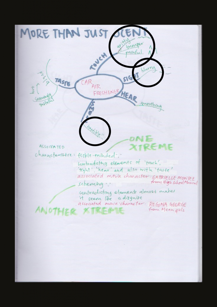

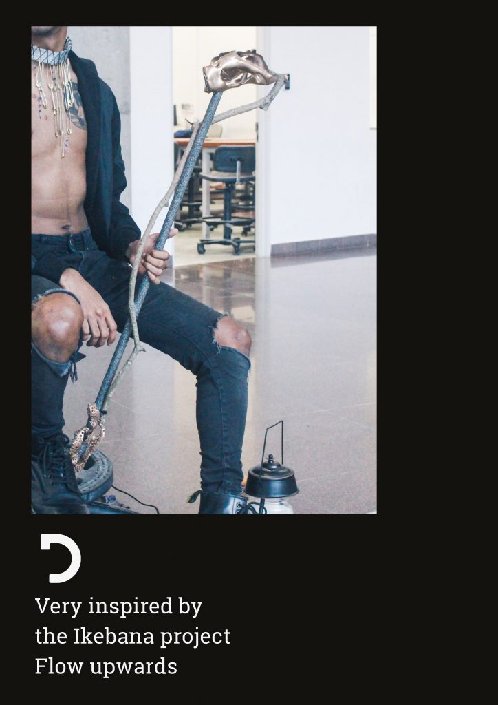
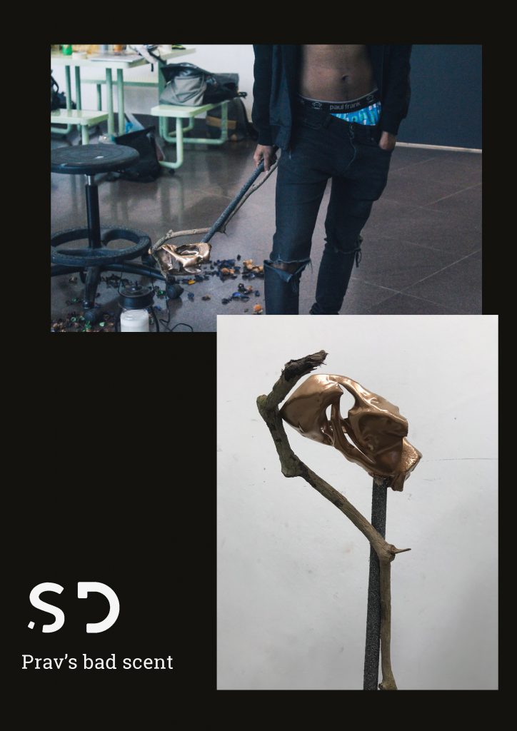
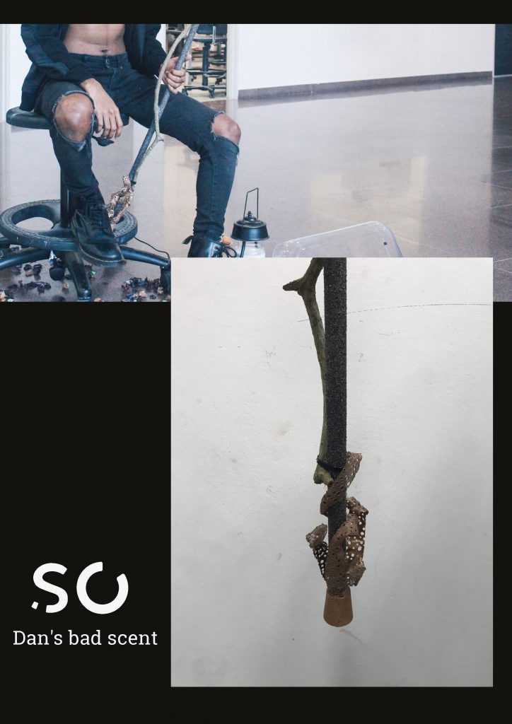
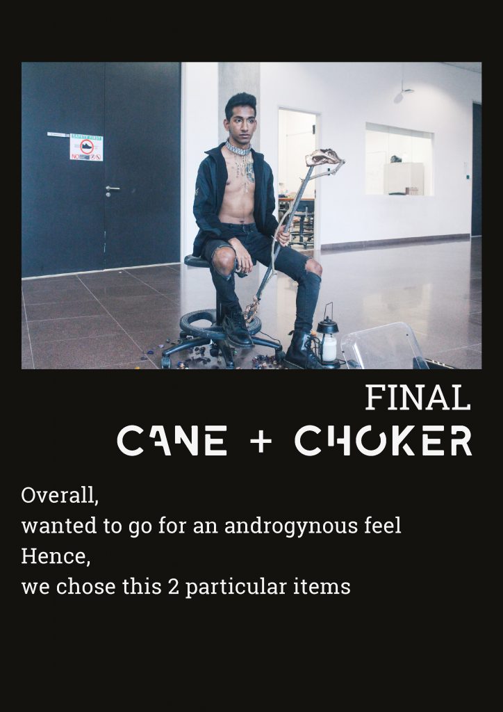
 In attempt to texturise and give my bottle a gritty feeling
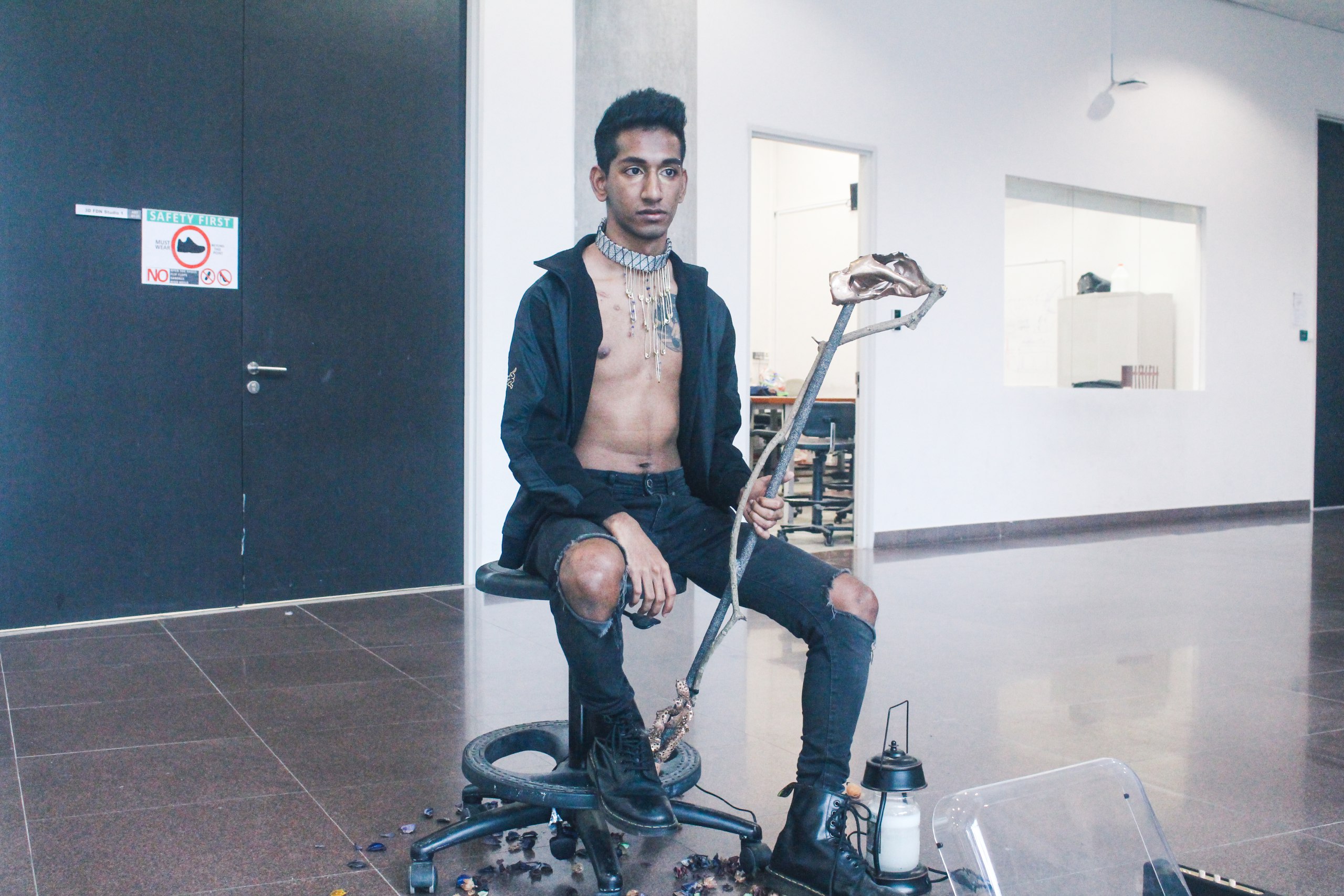
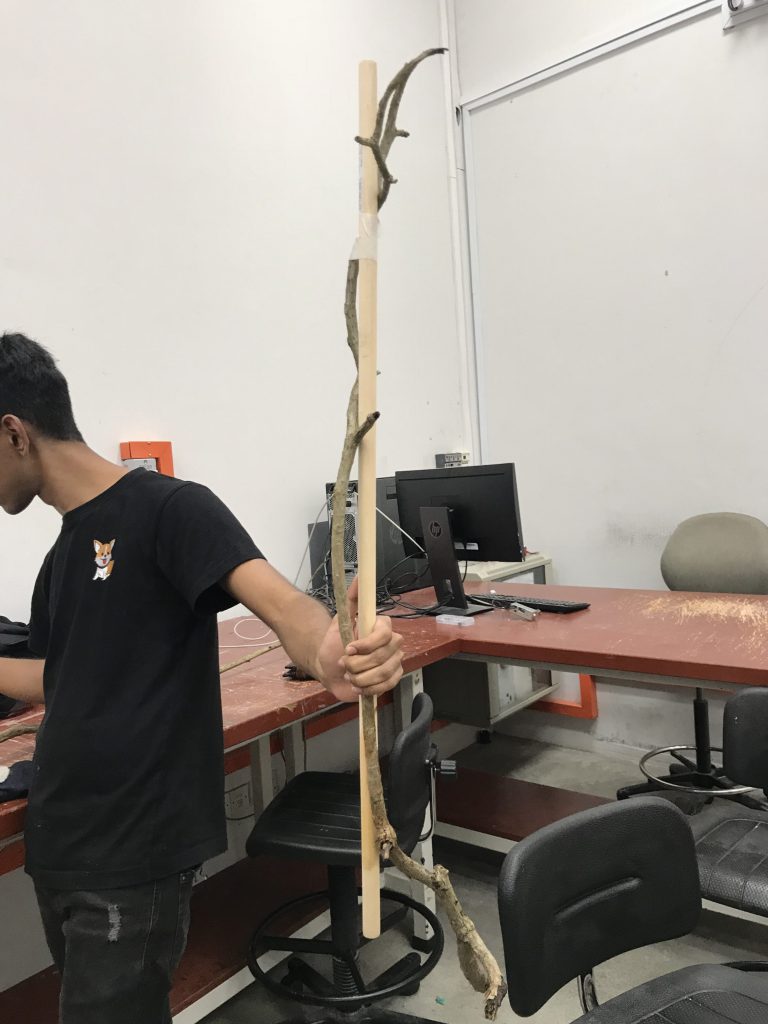 Had to carefully pick and carry a huge branch from Canteen 2 to ADM
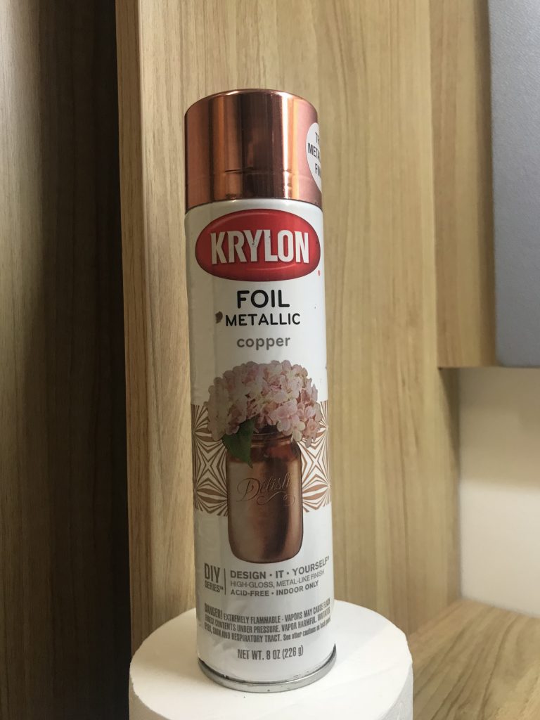
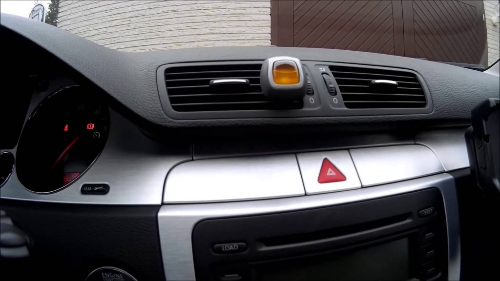
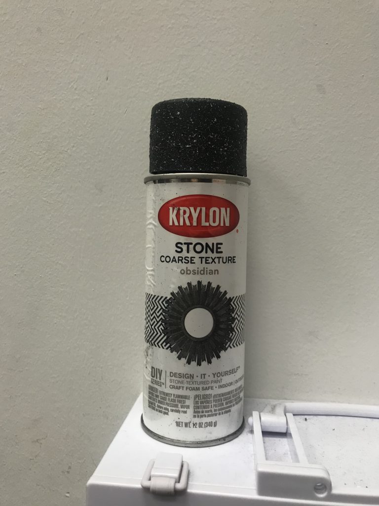 Spray painted our pole with a stone texturising spray in make the pole in line with my bad scent of air freshener because this would replicate the road
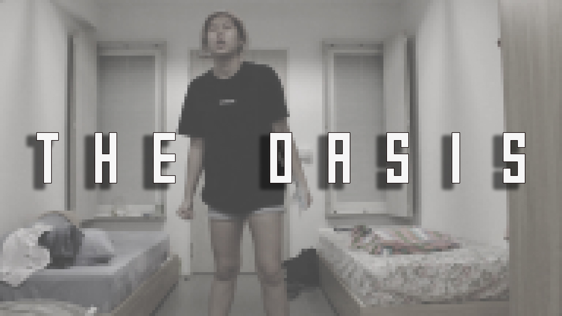

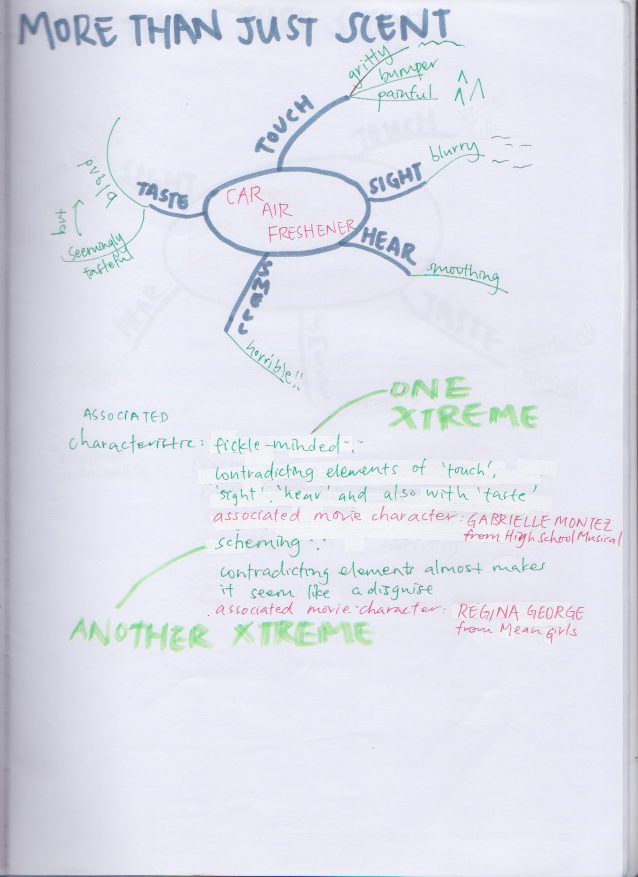
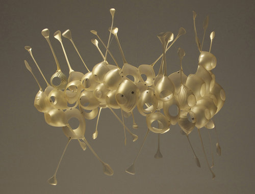

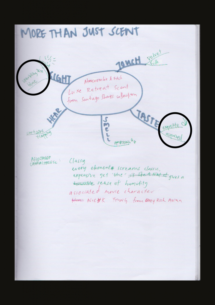
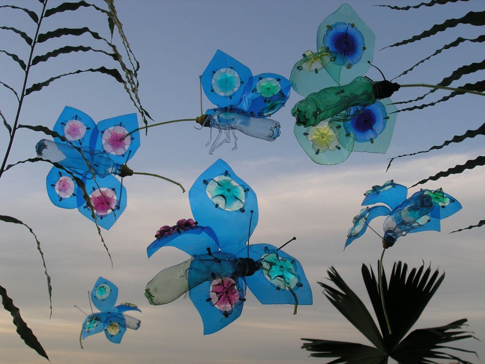 Morpho Butterflies
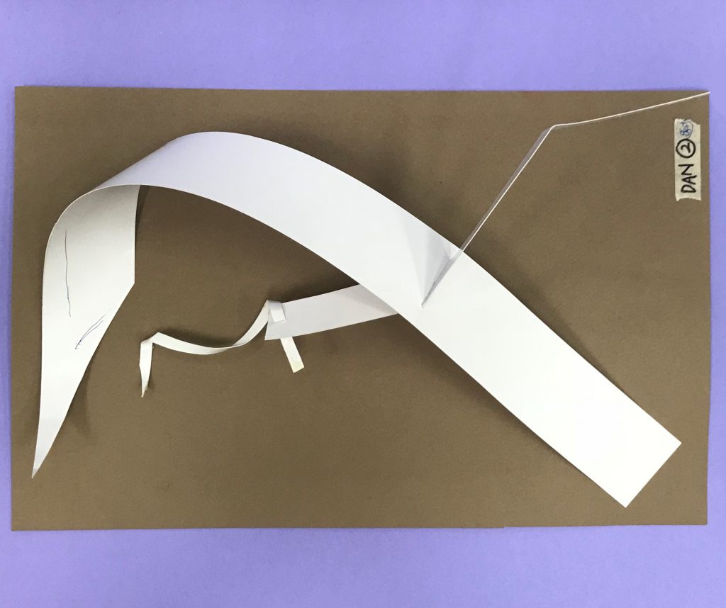
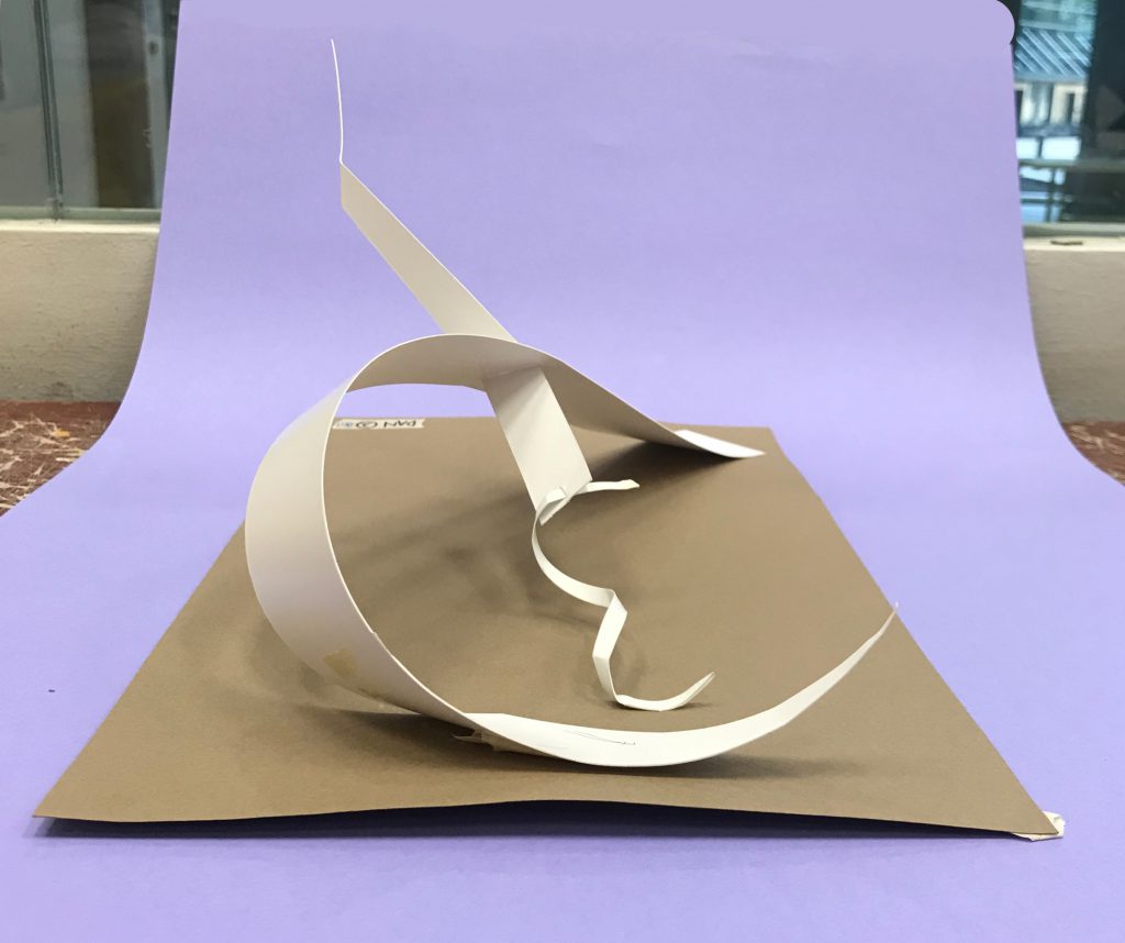
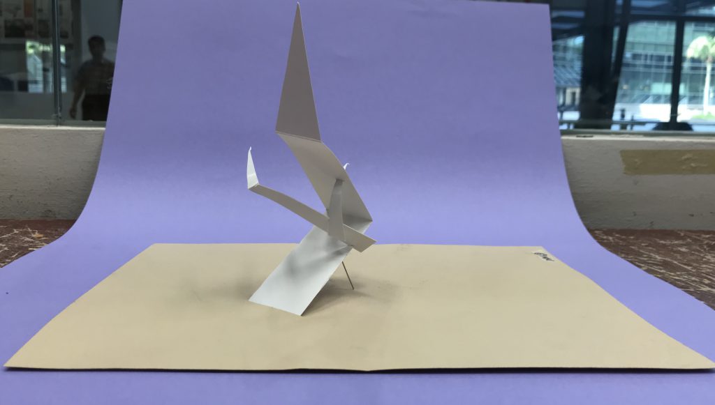
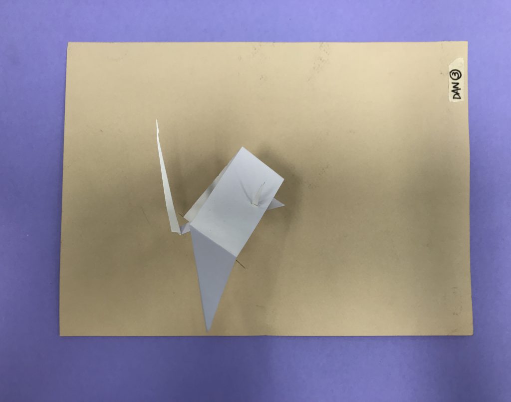
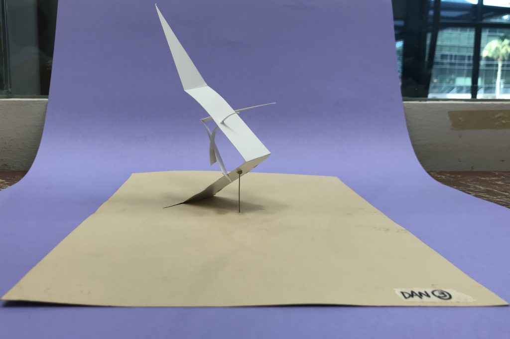
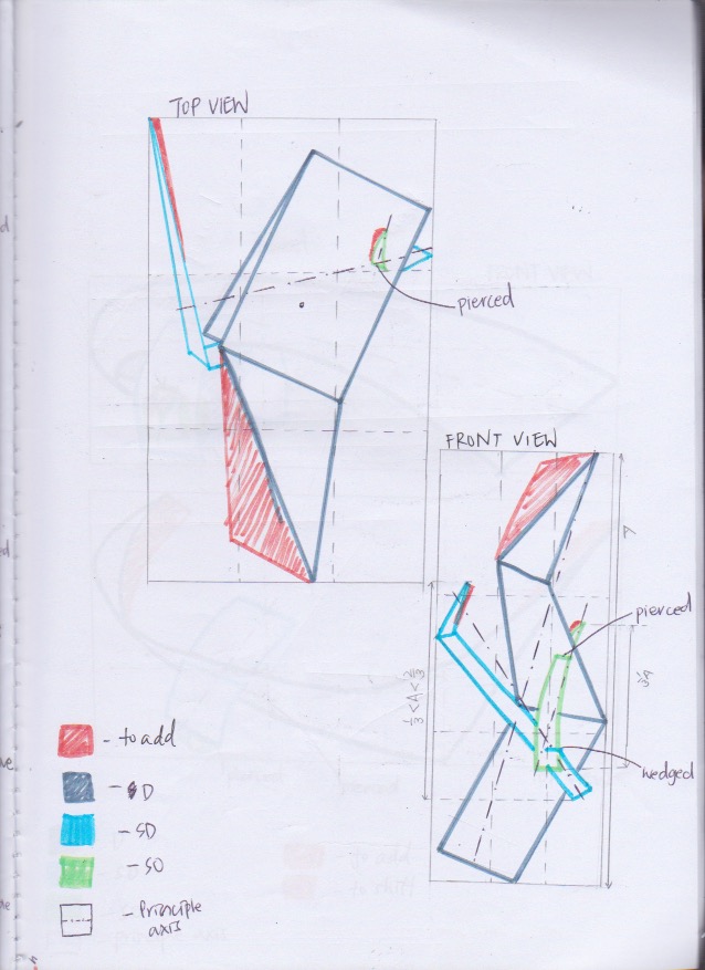
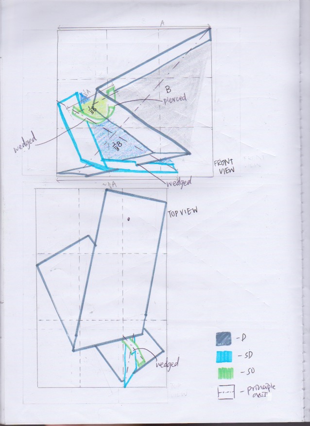
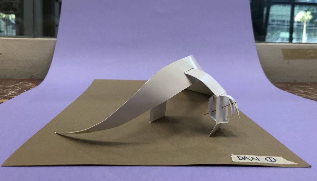
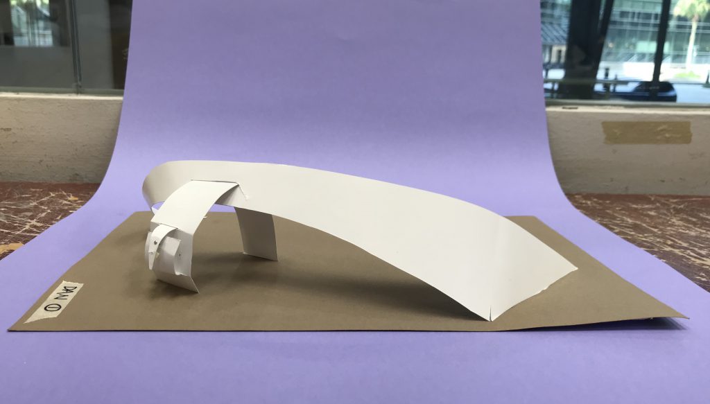
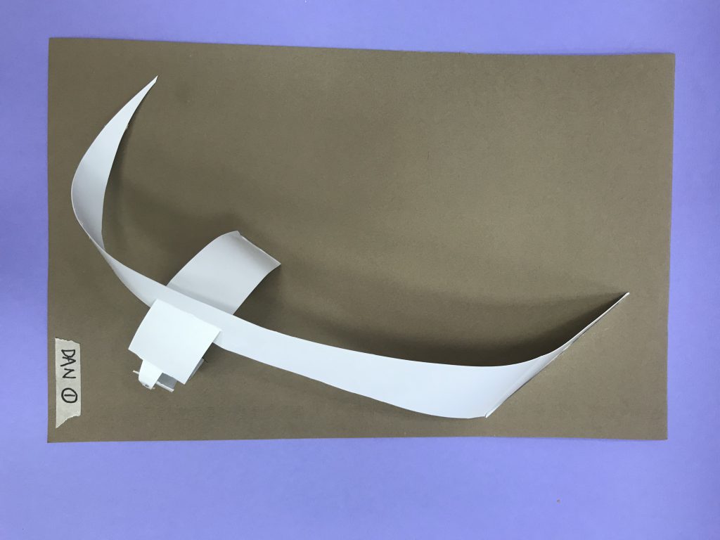
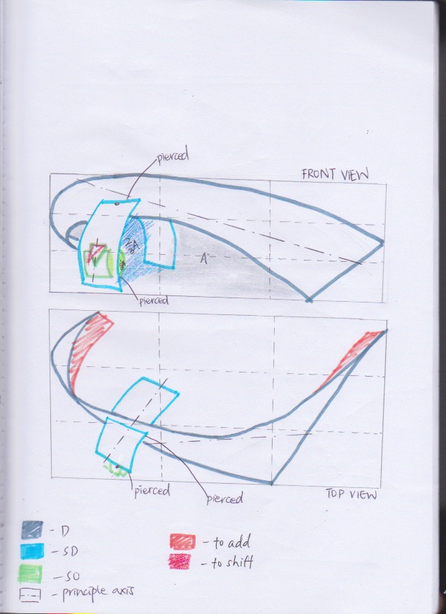
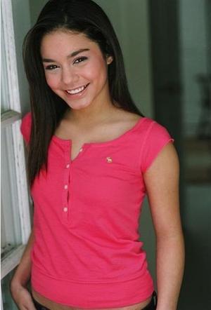
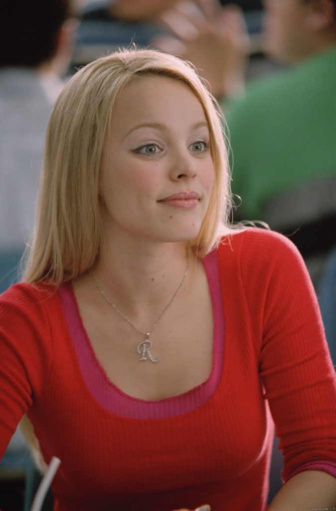
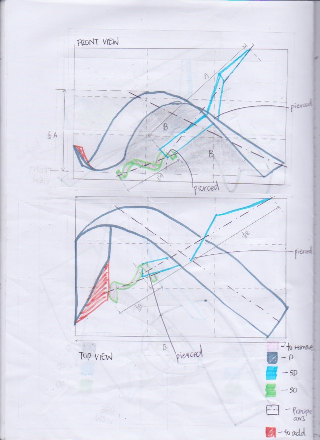 2D Sketch Analysis
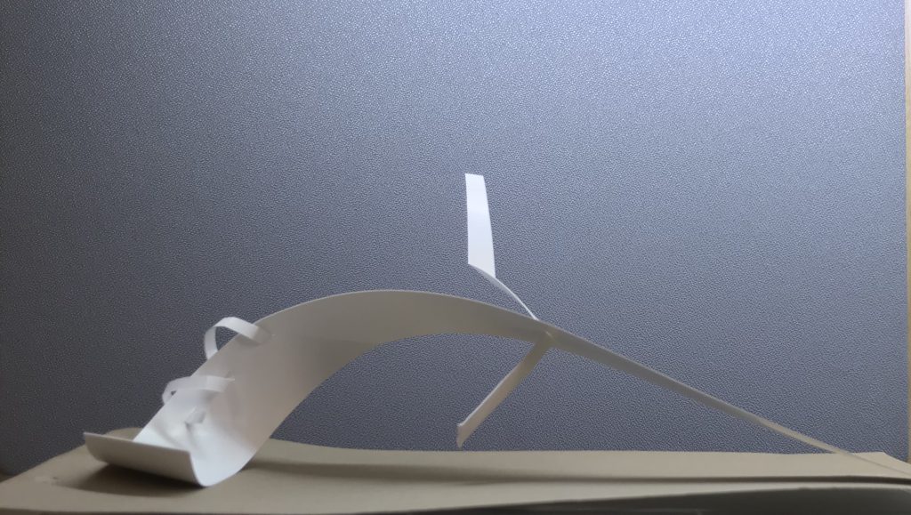
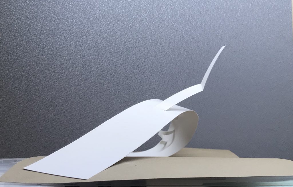
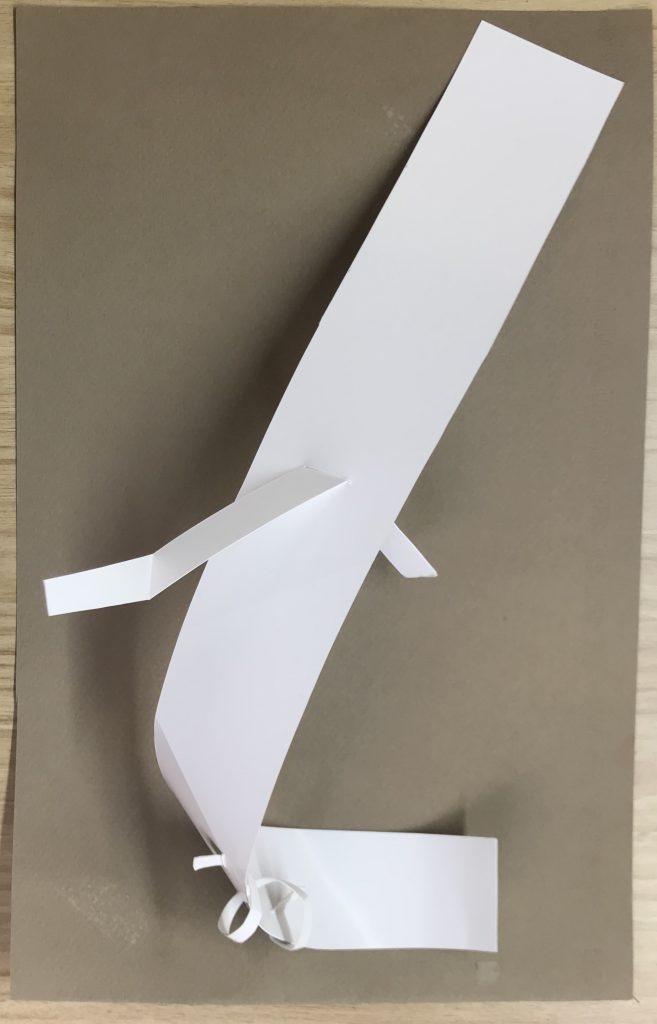
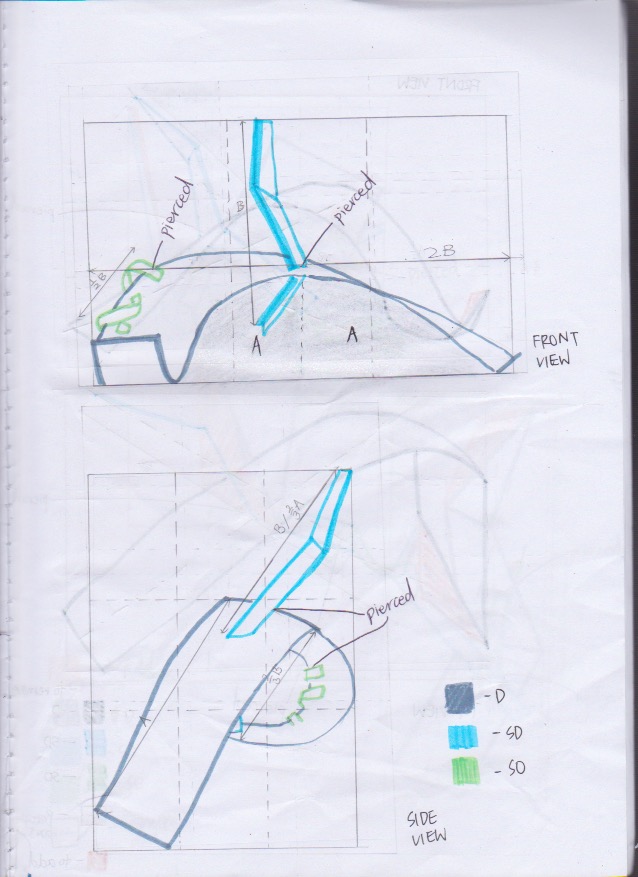 2D Sketch Analysis