
Movement: DADA
key ideas
- Focus is not on the aesthetics but about relating to the middle class.
- Concept behind the artwork discusses difficult questions about society, role of the artist and purpose of artwork.
- Use of everyday objects with little manipulation by the artist.
dada ARTIST: HANNAH HOCH
ABOUT
One of the few active female artists in her era, whose works address the issues of politics, society and gender (particularly about the status of women).
Medium / methods
Photomontage by collaging unrelated photos to form meaning.
style / approach
She incorporates pop culture elements to deliver powerful messages about pressing issues of her time. Her works often address politics, society and gender (particularly about the status of women in society). By using pop culture references that the public is familiar with, she brings her message across effectively.
artwork: high finance (1923)

On first glance, the artwork is composed in an abstract, bizarre way, but in a precise and unified manner.
The artwork features two bankers whose heads are too big for their body, with half their heads sliced off. Behind them are two shot guns, aimed by and at the banker at the same time. Both are carrying tools of destruction and the man on the left has a piston over his hand and trigger of a gun over his face.
I can’t seem to grasp the meaning behind this piece but commentaries state that the artwork is criticising industrialism and financial power during post-WWI Germany, about military complexes and bankers who finance them.
This carefully curated and composed piece, if rearranged, may imply that if one element is not in its proper place, would push everything else out of order, similarly to the world of “high finance” during that period.
takeaways
Use iconic / relatable imagery to communicate message through their underlying semiotics.
dada ARTIST: kurt SCHWITTERS
about
Active during the Great Depression in Germany, he made his artworks out of trash found on the streets (what a way to up cycle and save the earth huehue).
He also worked on art journals, illustrations and advertisements. He published his own magazine – Merz journal and wrote poems and musical works in experimental forms.
Medium / methods
Collage using printed media and found objects.
style / approach
His collages are always arranged in a harmonious way and usually start with one object first, then expand by adding more objects afterward. The adding of objects over time evolves his work to larger proportions and forms new meaning as it changes.
artwork: Merz Picture 32 A. The Cherry Picture (1921)
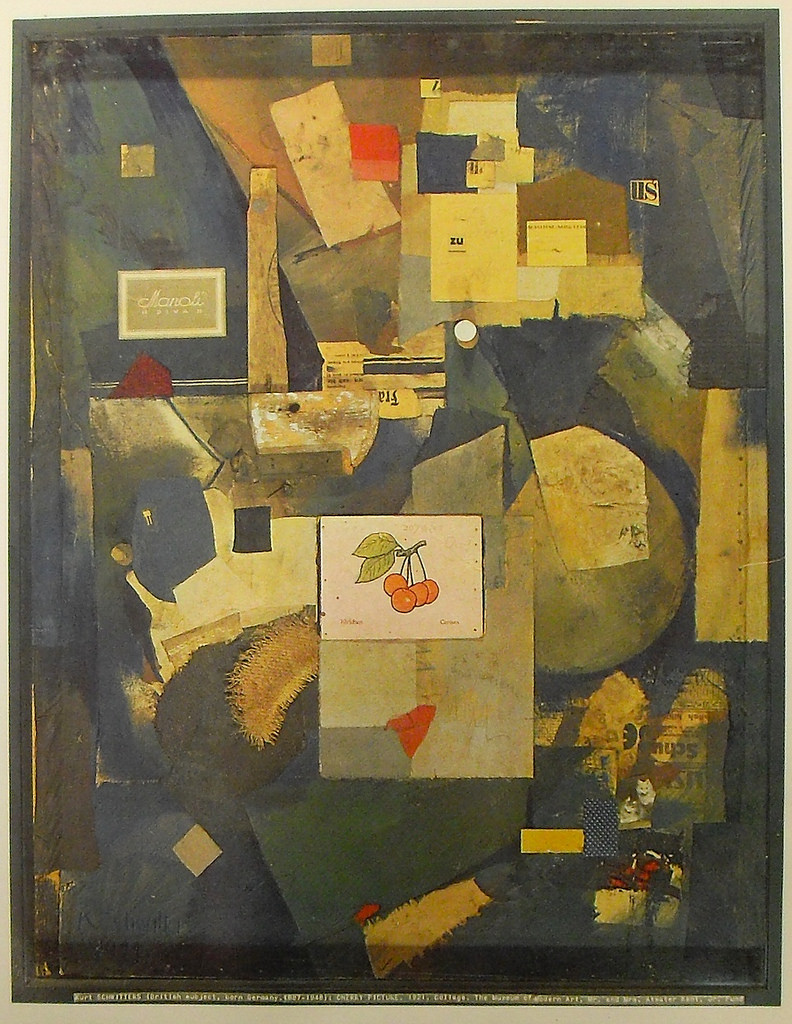
The picture of the cherry is what my eyes fixate on among the abstract shapes in the rest of the frame. It is positioned cleverly exactly in the center, with its pink / red colours contrasting against the vast blue in the background.
Schwitters creates a sense of depth and breaks away from the traditional one-point perspective by overlapping rectilinear cut outs with darker and lighter colours. The darker areas being the blue and lighter areas being the yellow. There is a harmonious balance between the colours which deviates from having an illusionistic hierarchy.
The fine print in the cherry picture are German and French words for “cherry”, where he scribbled “Ich liebe dir!” which translates to “I love she!”. The grammatical error conveys the irrationality and arbitrariness of conventional systems, using language as the symbol in this work.
He also used text from product labels and newspaper clippings in this piece which stems from commercial culture and probed the viewer to think about the connection between art and everyday life.
Movement: Russian Constructivism
key ideas
- Focused on construction over composition (choice of materials and the properties / functions behind them)
- Design of functional on objects (function over aesthetics)
- The form of the artwork is dictated by its materials
- Mass production
rc ARTIST: Vladimir Tatlin
about
Originally trained as an icon painter, Vladimir Tatlin broke away from the traditional visual concerns of painting and explored the potential of other materials he could use, often metal, glass and wood. He was a supporter of the Communist revolution in Russia and crafted his works to serve its goals.
Medium / methods
Metal, glass and wood.
style / approach
He incorporated key lessons from Pablo Picasso’s Cubist reliefs and Russian Futurism into his work, which arrives at an outcome somewhere between sculpture and architecture.
artwork: Corner Counter-Relief (1914)

Even though Russian Constructivism is focused on material and function over composition and aesthetics, the placement of each material achieves a sort of balance and harmony in the composition. There seems to be a visual hierarchy in the work, using materials of different shapes, sizes and 2-3 main colours. And it’s interesting how the strings of the instrument-like object pierces through the grey rectangular sheet in a diagonal angle, and then taper down to a vanishing point. I feel this helps to unify the elements in the artwork together.
The choice of installing this artwork in the corner of the room is quite witty as it is symbolic of where religious icons would usually be placed in a pious Russian household. It is as if Vladimir Tatlin is implying that modernity and experiment should be Russia’s new gods.
Sources
http://www.theartstory.org/movement-dada.htm
http://www.theartstory.org/artist-hoch-hannah.htm
http://www.theartstory.org/artist-schwitters-kurt.htm
http://www.theartstory.org/artist-tatlin-vladimir.htm