


Tag: research

DN1009 Graphic Form Project 1 Creative Process Journal
Research
Art Movements:
- Dada/Dadaism – Questions the society, role of an artist, and the purpose of art
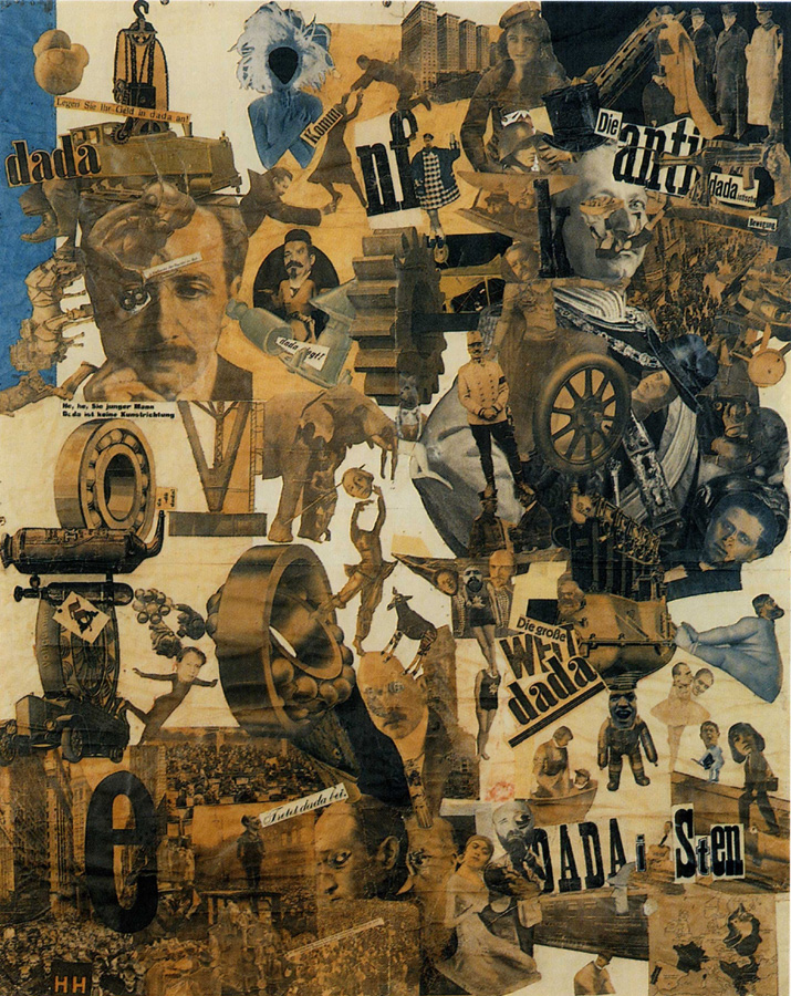
Hannah Höch (1889-1978)
- A German photomontage artist active during the Dada movement.
- Combined unrelated images to form startling or insightful connections.
- Challenged the status of women in the social world of her times.
Famous works:


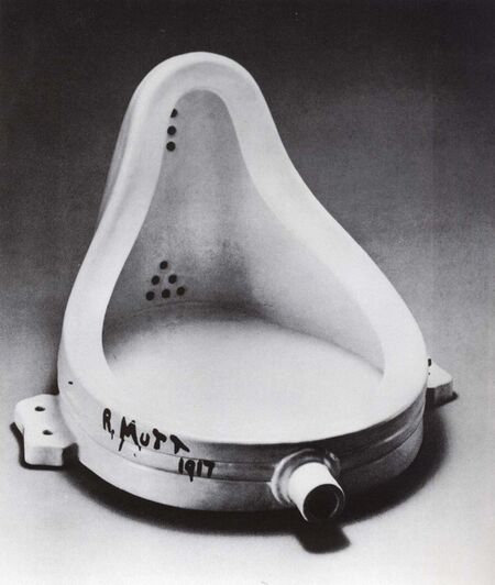
Marcel Duchamp (1887-1968)
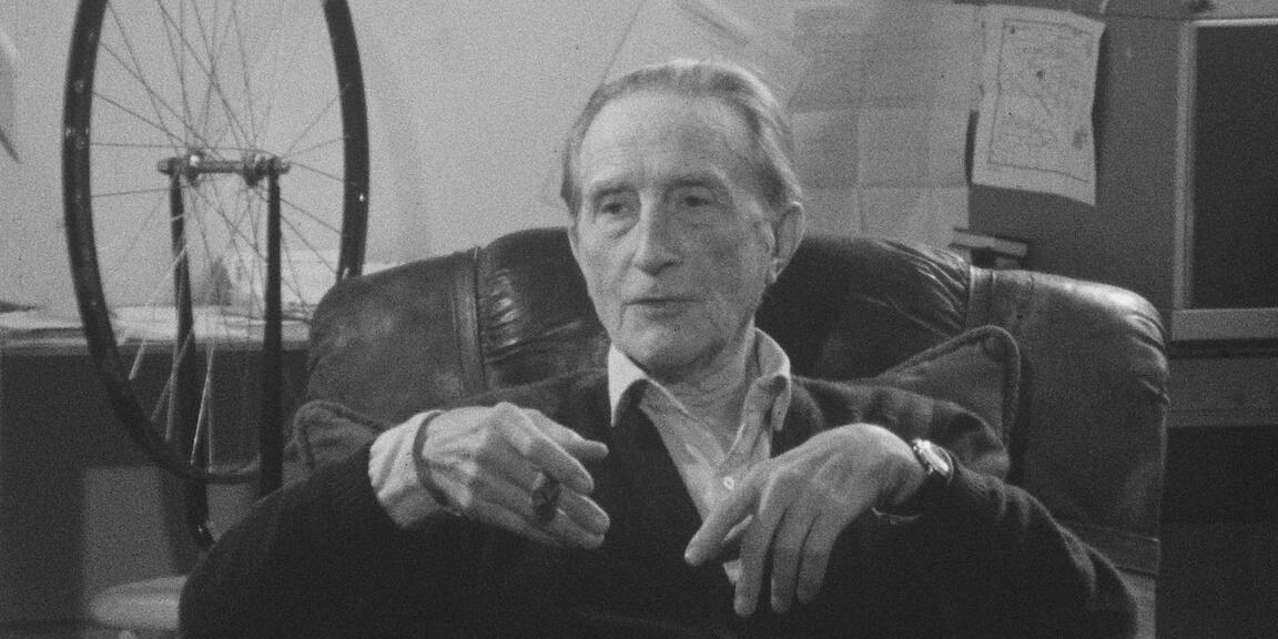
- A French painter and sculptor who refused to follow a conventional artistic path
- “readymades” – turning everyday objects into art
- Also associated with Cubism, Surrealism and Conceptual Art
Famous Works:


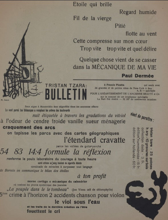
Tristan Tzara (1896-1963)

- Considered the founder of Dada
- Organised performances to shock audiences as a way to spread anti-art
- “cut-ups” – recomposing images and text that were cut, forming an artwork of chance and juxtaposition
Famous Works:

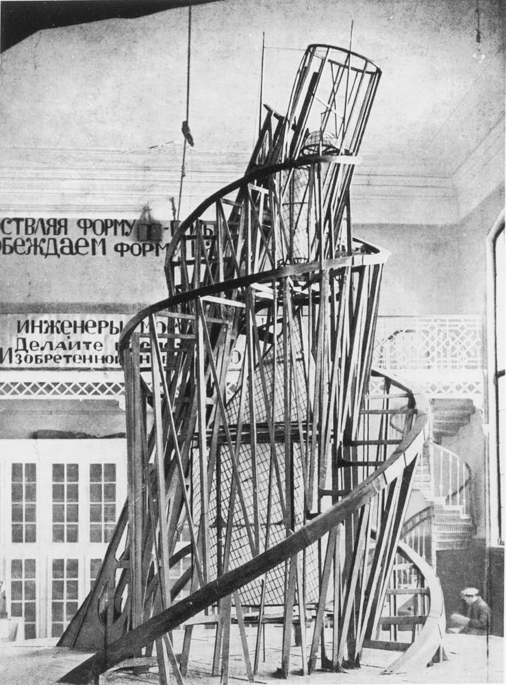
2. Russian Constructivism – Abstract, modern and minimal. Geometric, experimental and rarely emotional. Focuses more on the material and form.
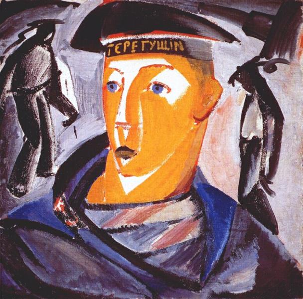
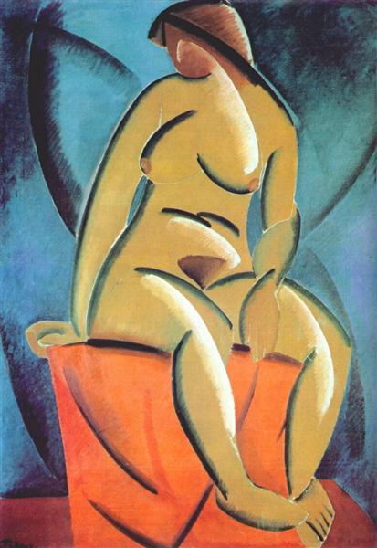
Vladimir Tatlin (1885-1953)

- Wanted to bend art into one that had practical uses
- Focused on technology and the machine
- Likes to include curves in his works.
Famous Works:
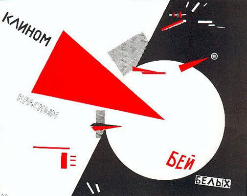
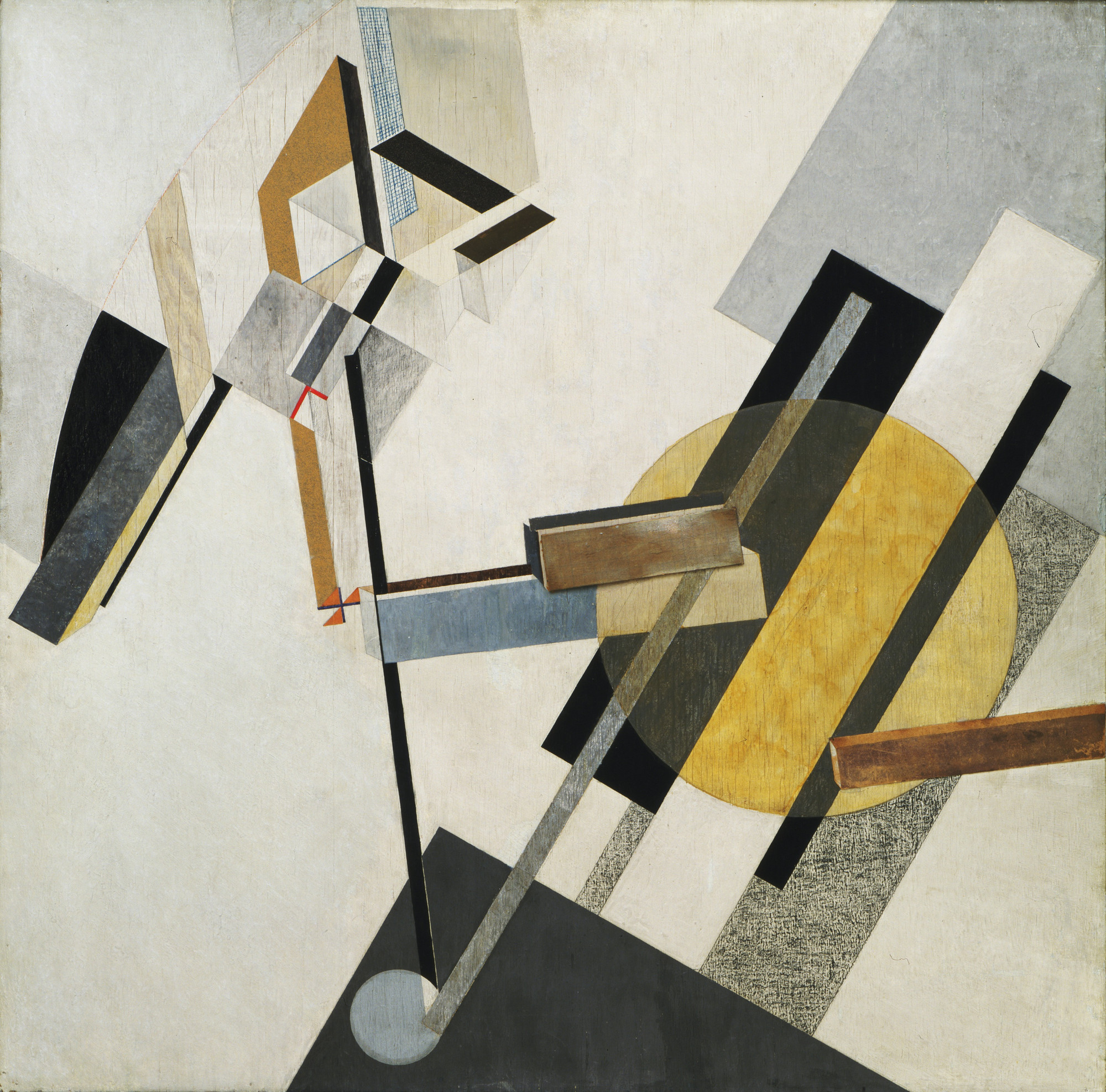
El Lissitzky (1890-1941)

- Made works with strong political statements
- Used basic colours and shapes
- Influenced the De Stijl and Bauhaus movements
Famous Works:
References:
https://www.theartstory.org/movement-dada.htm
https://www.theartstory.org/artist-hoch-hannah.htm
https://www.theartstory.org/artist-duchamp-marcel.htm
https://www.widewalls.ch/dada-collage-readymade/
https://www.theartstory.org/artist-tzara-tristan.htm
https://www.dadart.com/dadaism/dada/037-Tzara.html
http://www.arthistoryarchive.com/arthistory/constructivism/
https://www.theartstory.org/movement-constructivism.htm
https://www.theartstory.org/artist-tatlin-vladimir.htm
https://www.theartstory.org/artist-lissitzky-el.htm
Images:
https://www.stmuhistorymedia.org/wp-content/uploads/2017/05/Hannah-Hoch-Self-portrait-in-Mirrors-1931-Image-via-artblastcom-770×466.jpg
https://www.ft.com/__origami/service/image/v2/images/raw/http%3A%2F%2Fcom.ft.imagepublish.prod.s3.amazonaws.com%2F4a57d4e4-81de-11e3-87d5-00144feab7de?source=next&fit=scale-down&width=700
https://www.berlinischegalerie.de/fileadmin/_processed_/csm_hoechst_f24c48aa5e.jpg
https://upload.wikimedia.org/wikipedia/en/6/6b/Hoch-Cut_With_the_Kitchen_Knife.jpg
https://d3i6li5p17fo2k.cloudfront.net/en/rimage/pivot_half_1152/image/4414/f6a3171449b93d7524d3a110a43c031a
https://d7hftxdivxxvm.cloudfront.net/?resize_to=width&src=https%3A%2F%2Fartsy-media-uploads.s3.amazonaws.com%2Fi-8Le397-h2ZTgLM1iMegw%252FMarcel_Duchamp.jpg&width=1200&quality=80
https://upload.wikimedia.org/wikipedia/en/thumb/7/74/Marcel_Duchamp%2C_1919%2C_L.H.O.O.Q.jpg/620px-Marcel_Duchamp%2C_1919%2C_L.H.O.O.Q.jpg
https://cdn.mdr.de/kultur/tristan-tzara-102-resimage_v-variantBig24x9_w-1024.jpg?version=13828
https://www.theartstory.org/images20/works/tzara_tristan_2.jpg?1
https://www.dadart.com/dada-media/Dada-no-7.jpg
https://bestarts.org/ba/wp-content/uploads/2015/01/Vladimir-Tatlin-top.jpg
https://www.moma.org/interactives/exhibitions/2012/inventingabstraction/?work=226
https://uploads7.wikiart.org/images/vladimir-tatlin/the-sailor-self-portrait-1912.jpg!Large.jpg
https://uploads6.wikiart.org/images/vladimir-tatlin/model-1913.jpg!Large.jpg
https://bestarts.org/ba/wp-content/uploads/2015/01/El-Lissitzky-top.jpg
https://www.theartstory.org/images20/works/lissitzky_el_2.jpg?2
http://www.moma.org/media/W1siZiIsIjE1MTA3NSJdLFsicCIsImNvbnZlcnQiLCItcmVzaXplIDIwMDB4MjAwMFx1MDAzZSJdXQ.jpg?sha=3e9f0871a4490ad4
http://deliver.odai.yale.edu/content/id/cd31e5b7-c029-41ef-adb5-1c4f7ca50666/format/2
Process
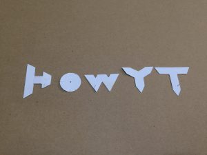
When I first started thinking of ideas/jobs for this project, my four jobs were quite normal and all circus themed (juggler, bubble artist, clown and popcorn seller). I was told to make the jobs more interesting by adding random words/elements to it so it became: egg juggler, bubble artist in a cactus farm and funeral clown (I hadn’t thought of the 4th one yet). I first tried making the elements and objects of each job look like the letters and sketched them out on paper.
Egg juggler: egg, juggling
Bubble artist in a cactus farm: bubble wand, bubble, cactus
Clown: colourful/red afro, red nose, balloons
Popcorn seller: uniform, red and white stripes, popcorn
Juggler: balls, juggling
Bubble artist: bubble, bubble wand
Clown: balloons
Juggler: Juggling

I was told that that wasn’t what I was supposed to do and I should incorporate the elements into the letter itself with bending them. I thought the bubble artist in a cactus farm would be the easiest so I tried it out first.
1 Bubble artist in a cactus farm -> Bubble in a cactus farm
Elements: Bubble + green, spikes
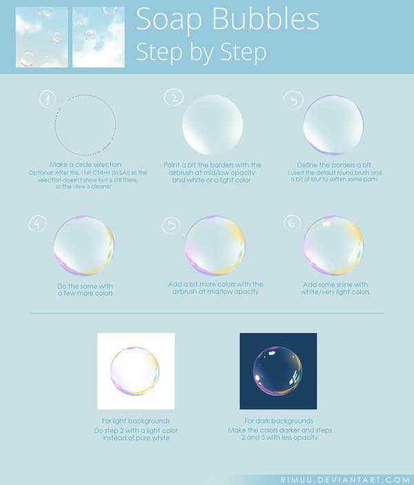
Using the elements of a bubble and cactus, I came up with 2 designs using the font called rns baruta as the font is fat and round, which is similar to that of a bubble. I realised that I couldn’t show the bubble artist part so I ended up changing the job to a bubble in a cactus farm.


I didn’t know which design was better so I tried both again digitally to compare (just the letter ‘o’). I followed a tutorial on pinterest to draw the bubble.


I liked the look of the bubble on the left more but it looks more like a cactus in a bubble farm instead. I was also told that the one on the right looks more interesting so I decided to go with that design.
To do the final design, I first brought the image of the font to illustrator to image trace it. Then I opened the vector in krita and drew the green bubbles within the font area by selecting it. I added the spikes after I was done with all the bubbles.

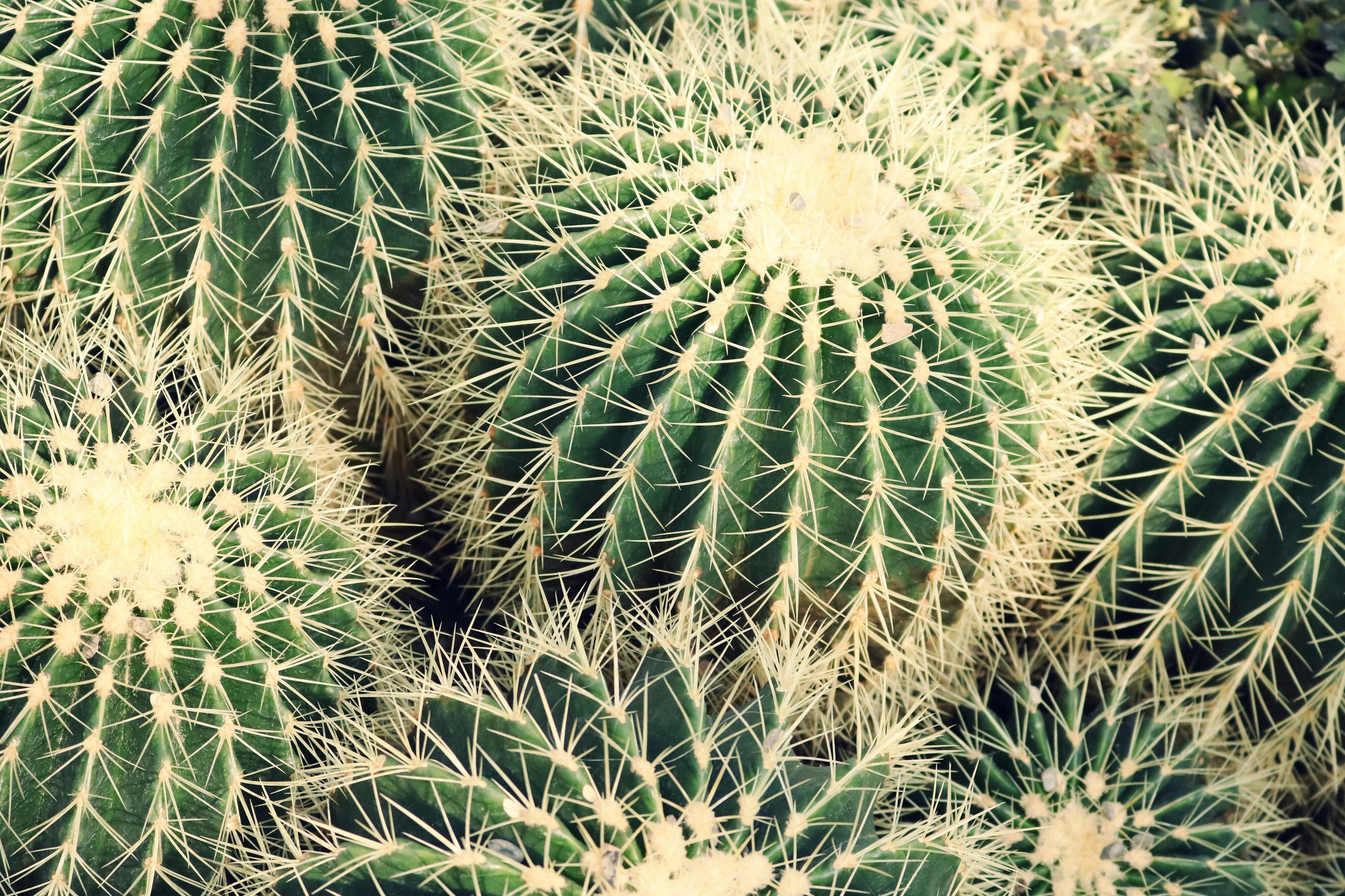
As cacti are usually found in the desert, I decided to use a picture of the desert for the background. I also tried to vary the positions of the letters as bubbles don’t usually stay in a straight line. After looking at pictures of cacti, I realised that the spikes weren’t dark green so I changed them to a lighter colour that is similar to those of the actual cactus spikes.


2 Funeral Clown
Elements: Casket/coffin + colourful afro & polka dots
For the design of the funeral clown, I used the fat face font as it looks more formal and rigid, which is a font suitable for funerals.


I didn’t really like the colours in my sketch so I did it digitally and experimented with the colours. I referenced the colours of an actual coffin for my design. I also made the borders of the letters slightly darker to give the coffin a bit of depth.


I felt like the one with red polka dots looks quite plain and the polka dots don’t seem to pop out like the colourful ones so I ended up picking the colourful ones instead. For the background, I wanted to use a white cloth/curtain to make it look like a wake but I couldn’t find a good picture of it and I also couldn’t draw it so I ended up using a photo of candles which could also represent the solemn occasion.

3 Bankrupt Gambler
Elements: Poker cards + torn money(?)
Since this was supposed to be a gambler, I decided to use a poker card character font for it. I started off with adding different gambling elements to my design and using empty pockets to represent bankruptcy but it didn’t seem to express bankrupt gambler well and it was also very messy.


I was told to choose only one element to represent gambler so I decided on the poker cards. I drew the outline of each poker card and pasted images of poker cards on the outlines one by one and trimmed away the parts that were overlapping. I added stitches to the money attached to the poker cards to represent money being torn and also like the patched up clothes of poor/homeless people. I added a reddish/pinkish background as I felt that it represents someone in the red (bankruptcy).


In the end, I felt that the bankruptcy part wasn’t very obvious, so I included a broken piggy bank in the background.

4 Misfortune Cookie
Elements: Skull + Slip of paper, cookie
For this design, I used a font called djb hunky chunky. It is fat and has a slightly irregular shape so I felt like it looks like a cookie. I wanted to use another font at first so the font used for the sketch is different. I wanted to write bad fortunes on the slips of paper but I was told it would be better to use symbols.


I referenced a illustration of a fortune cookie for my design. I used the colours of the fortune cookie for my drawing and tried to make it look hollow. Then, I added the textures, cracks and the slip of paper for each of the letter. I also added skulls on the papers to represent the misfortune.


Fortune cookies usually come in packets but I wanted to show them placed on a plate, in a random order. The picture I chose was of a broken plate as I thought the broken plate is also a sign of misfortune.

Fonts + Images:
https://fonts2u.com/rns-baruta-black.font?ptext=HOW&size=4https://www.deviantart.com/rimuu/art/Soap-Bubbles-Steps-674625970
https://images.pexels.com/photos/1054016/pexels-photo-1054016.jpeg?cs=srgb&dl=botanical-cacti-cactus-1054016.jpg&fm=jpg
https://images.pexels.com/photos/90407/pexels-photo-90407.jpeg?cs=srgb&dl=africa-camels-desert-90407.jpg&fm=jpg
https://www.fonts.com/font/typetogether/abril-fatface/fatface-regular
http://www.fanagans.ie/download/1/Coffins%202017%20Resized/Elm%20.JPG
https://png2.kisspng.com/sh/c794b96cb0bb42b40ca63c47d32db42e/L0KzQYm3U8MxN6JBiZH0aYP2gLBuTfl1NZZ7gd42Y3zyh7A0kPhwfJDsitN5aImwcbf5j702aZNqfKIAMnXmRIHtWL41PWI2TKo5OEG4QoO7VcQ3OWEATqkCLoDxd1==/kisspng-it-evil-clown-photography-afro-5abed052ec40f8.4511480815224546109677.png
https://www.urbanfonts.com/fonts/Card_Characters.fonthttp://pngimg.com/uploads/money/money_PNG3529.png
http://pngimg.com/uploads/scar/scar_PNG15769.pnghttps://www.publicdomainpictures.net/download-picture.php?id=188256&check=c976544b7a2d76d851f9ac7547685c4a
https://upload.wikimedia.org/wikipedia/commons/thumb/1/14/English_pattern_king_of_hearts.svg/2000px-English_pattern_king_of_hearts.svg.png
https://upload.wikimedia.org/wikipedia/commons/thumb/5/5a/Ace_of_spades.svg/2000px-Ace_of_spades.svg.png
https://upload.wikimedia.org/wikipedia/commons/thumb/1/16/English_pattern_jack_of_diamonds.svg/2000px-English_pattern_jack_of_diamonds.svg.png
https://upload.wikimedia.org/wikipedia/commons/thumb/b/b3/English_pattern_queen_of_clubs.svg/2000px-English_pattern_queen_of_clubs.svg.png
https://upload.wikimedia.org/wikipedia/commons/thumb/0/07/Ace_of_hearts.svg/2000px-Ace_of_hearts.svg.png
https://upload.wikimedia.org/wikipedia/commons/thumb/f/f1/English_pattern_king_of_spades.svg/2000px-English_pattern_king_of_spades.svg.png
https://upload.wikimedia.org/wikipedia/commons/thumb/e/e6/Ace_of_diamonds.svg/2000px-Ace_of_diamonds.svg.png
https://www.dafont.com/djb-hunky-chunk.font?text=HOW&psize=l
https://www.astrology.com/images-US/games/game-fortune-cookie-1.png
https://pxhere.com/en/photo/1164088
https://upload.wikimedia.org/wikipedia/commons/thumb/5/53/Skull_and_crossbones.svg/1066px-Skull_and_crossbones.svg.png
Final Outcome

Reflections
This project was very challenging for me as I have not attempted digital painting before and I don’t really know how to use photoshop and illustrator. I ended up spending more time on the drawing than I expected. For the colours of the design, I chose them based on the reference images without thinking too much about the colour palette. I could have spent a bit more time on it to make the design better.
Problems with each design:
– bubble in a cactus farm: The bubbles didn’t really look that round after adding the spikes, I could have added the spikes to follow the form more closely instead of putting it in random spots and directions.
– funeral clown: It still ended up looking quite flat even though I tried adding a darker border to show depth, it might have worked better if I tried using a 3D font for my design instead.
– bankrupt gambler: I think I chose the wrong font as the font is too thin so I couldn’t add much to it and it is also quite hard to see the details. I could have also tried to make the tear more obvious. Without the background, it might be quite difficult for people to figure out the job.
– misfortune cookie: I realised that the fortune cookies appear to be floating and not on the plate as I didn’t add shadows. The slips of paper also look flat due to the lack of shadows. Also, I could have taken a photo of actual fortune cookie crumbs on a plate for the background.
Although there were many problems with my designs, I learnt a lot about digital art while doing this project. I think it was quite challenging, having to incorporate the elements of the jobs into the letters instead of just bending the objects/elements into the letters. It forced me to focus on the details of the jobs and think about how to communicate it to the viewers.
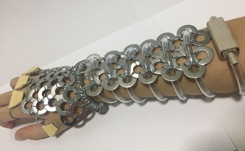
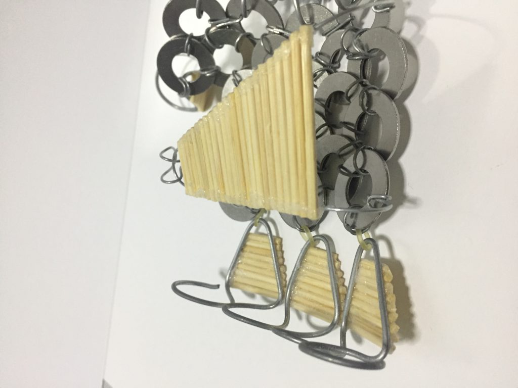
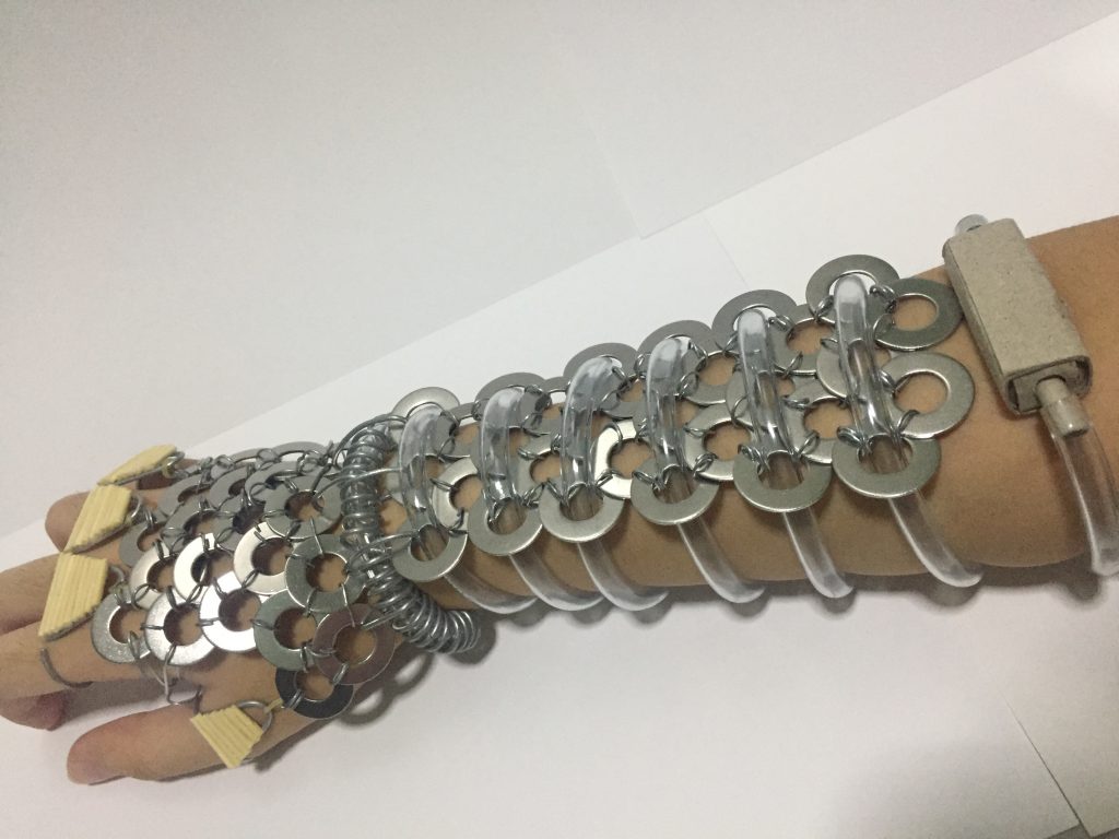
DN1003 Foundation 3D Assignment 3: For Emiko’s Kind (Part 2)
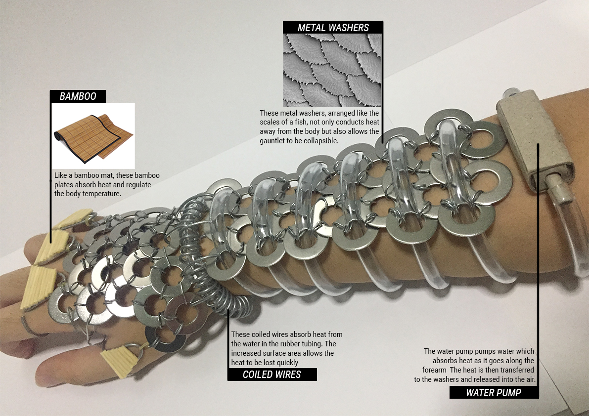
A Bio-radiator for Emiko’s Kind
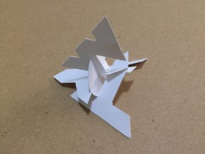
After working on part one, I was thinking of what I could make with the material.
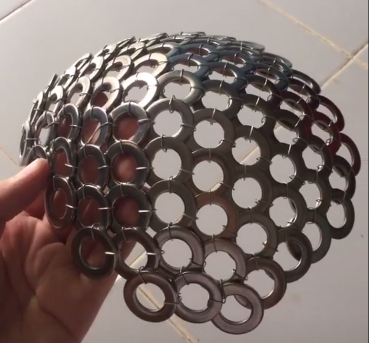
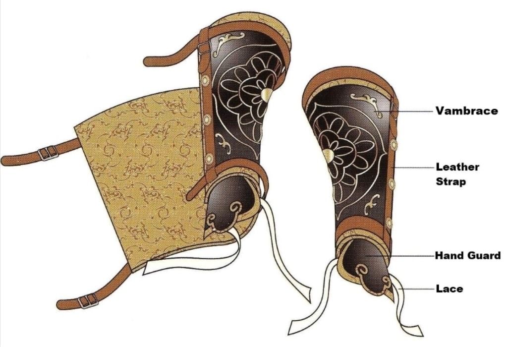
Because of the way it can curve, I wanted to make a cap or head gear but I felt like it would look like a torture device. I also thought of making it an arm piece.
I ended up choosing to make a vambrace (arm guard).
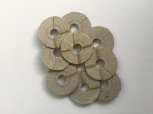
I struggled with the organic material so I tried changing the material of the washers to cardboard and making rings out of paper to connect it to the metal washers but they look weird and out of place.
I also wanted to use cotton, but I realised they trap heat instead of cooling down the body.
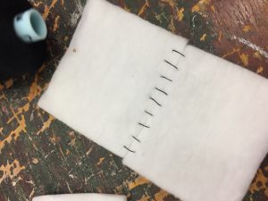
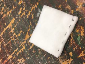
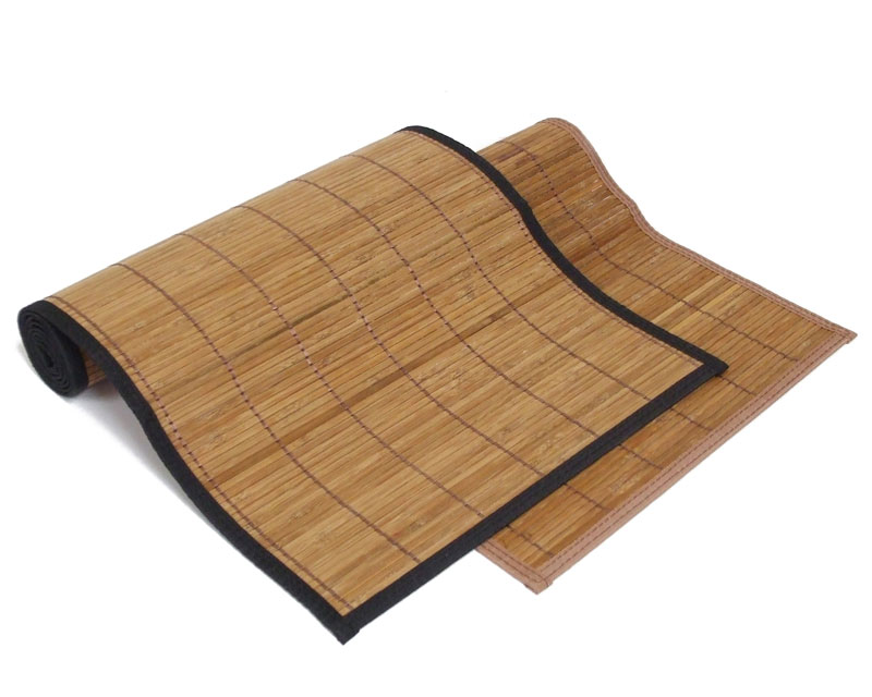
In the end, I decided to use bamboo tooth picks to mimic bamboo mats that absorb heat and regulate the body temperature.
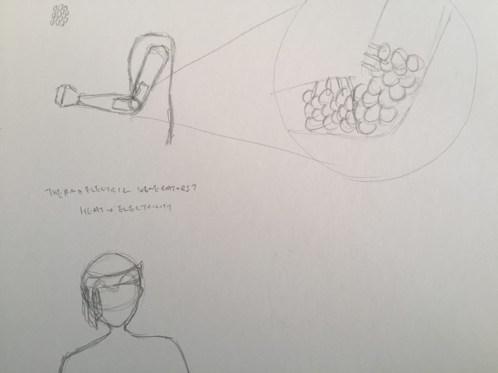
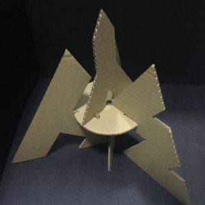
We also had to do research on bio radiators and I sketched out the main components of a bio radiator
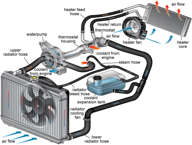
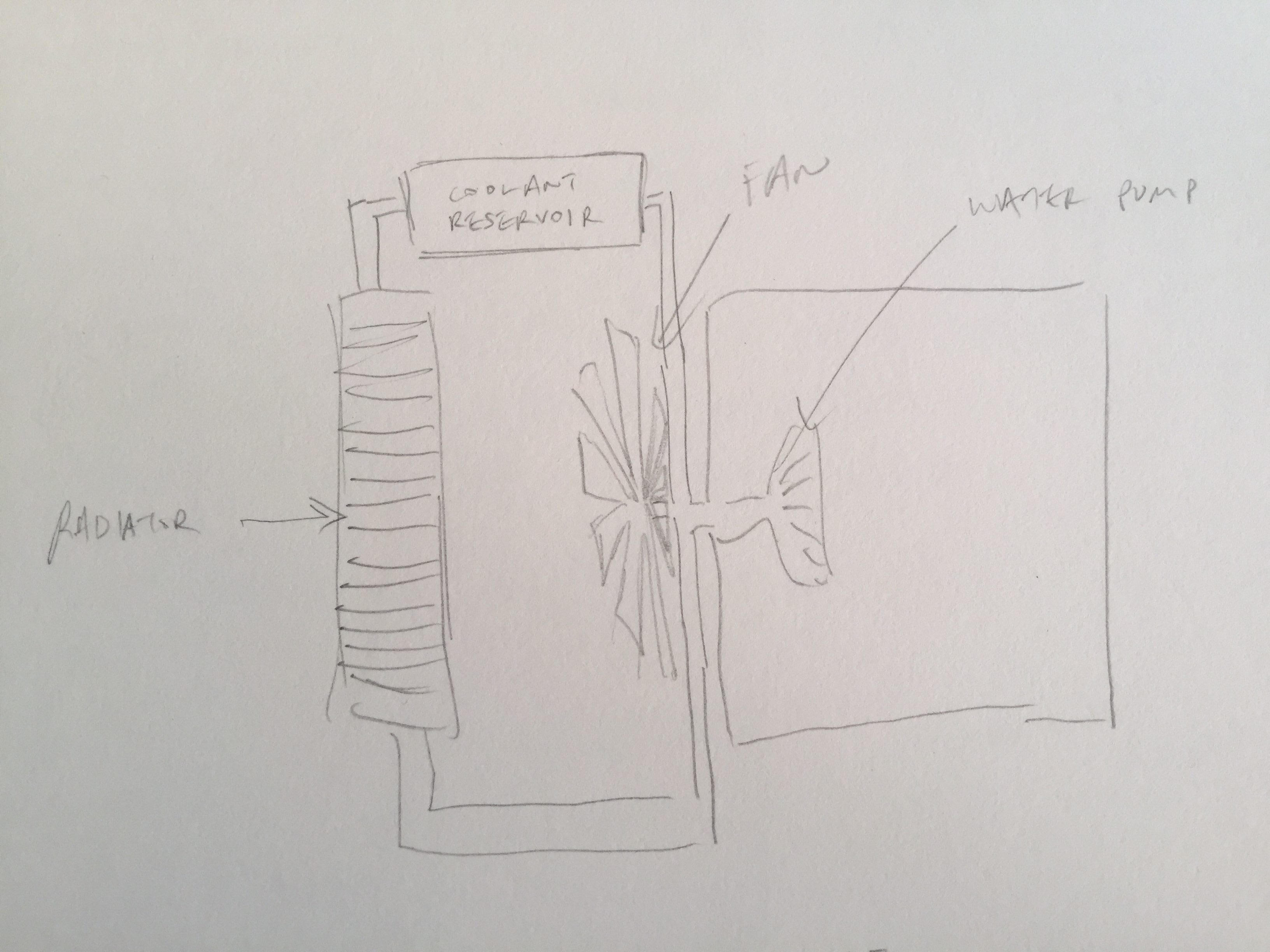
I decided to use the water pump system and mimic the large surface area of the radiator by coiling wires and rubber tubing
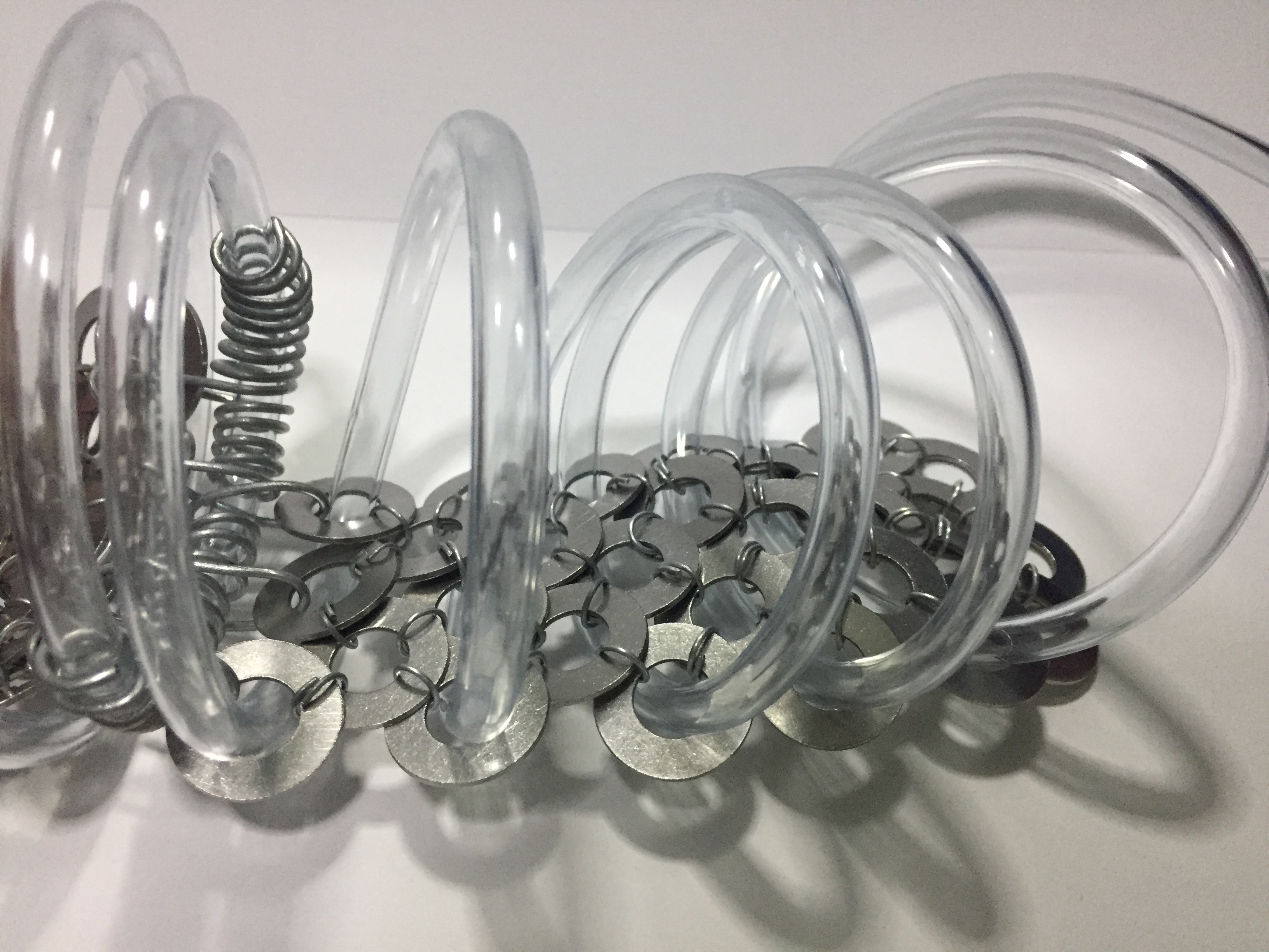
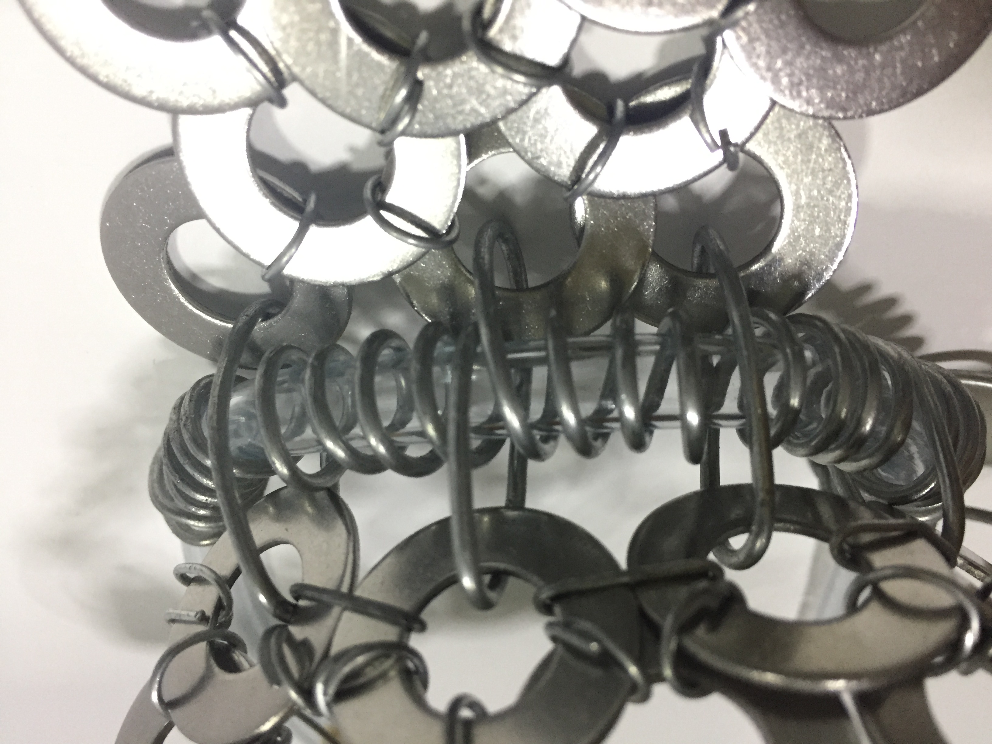
Because of the properties of the washers, the vambrace is also collapsible.
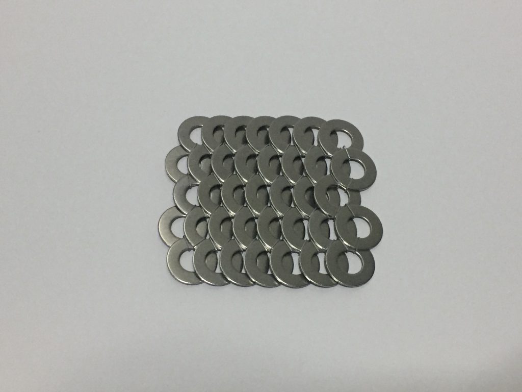
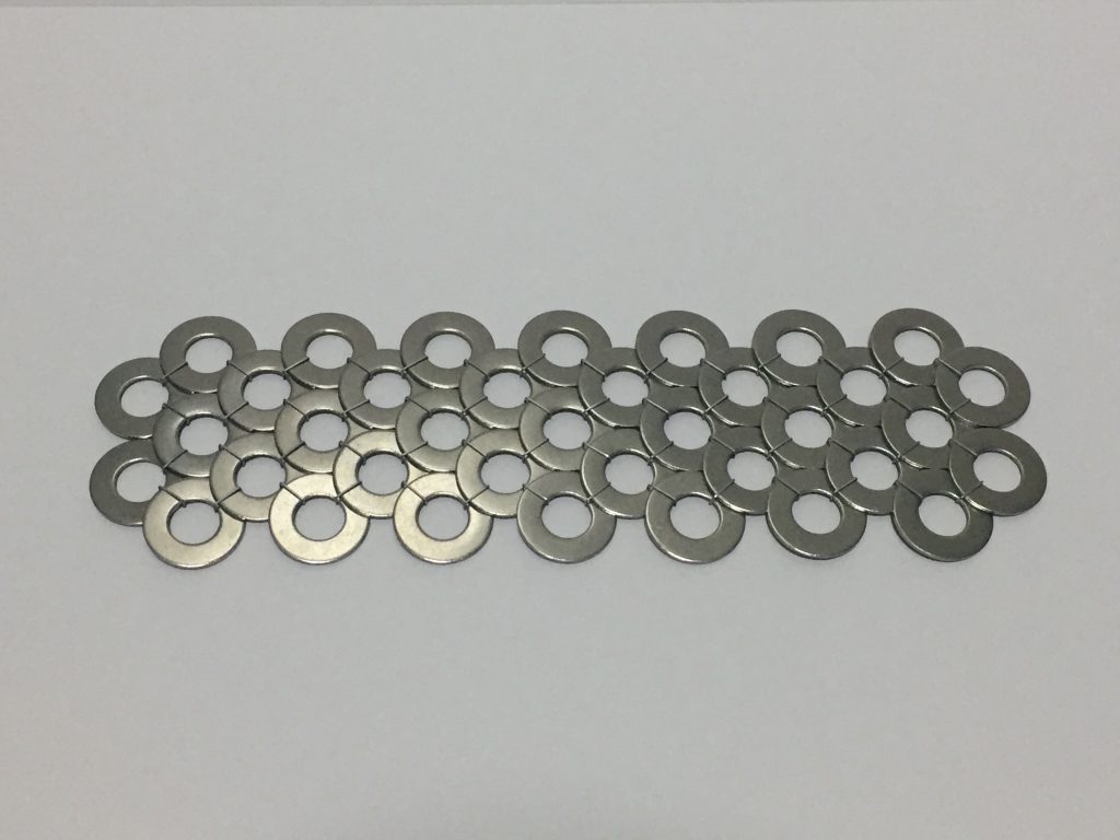
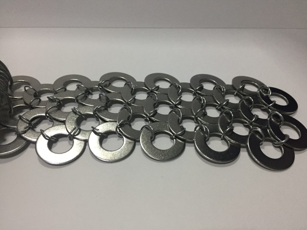
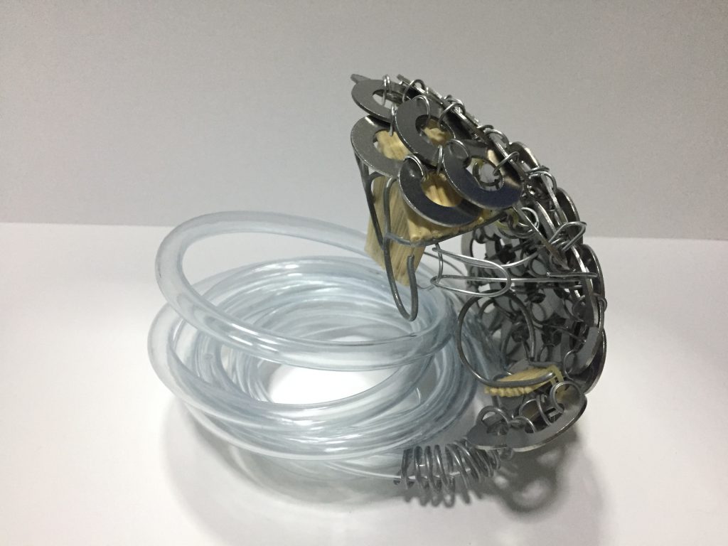
The Final Work
References:
“Song Dynasty Commander Armor.” Digital image. Accessed November 21, 2018. https://i.pinimg.com/originals/f4/8c/b7/f48cb7937bf98dfea3bcf021b38892ae.jpg.
Digital image. Accessed November 21, 2018. https://www.setadirect.com/images/images_big/ mats/cm713.jpg.
“How a Radiator Works in Automobile.” Digital image. Accessed November 21, 2018. http://www.mechanicalbooster.com/ wp-content/uploads/2017/12/how-radiator-works.jpg.

DN1004 Foundation 4D: Research on Video Artists
DN1003 Foundation 3D Assignment 2B: En Pointe
Act I (Yellow) of Triadisches Ballett (Triadic Ballet)
After watching the video and doing some research on the dance piece, I derived 2 words from the dance and tried to think of ways to express the words
- Mechanical
- Wooden kinetic sculpture/Wood + Strings (Puppet)/Robot?
- Geometrical
- Different shapes
While researching for kinetic sculptures I found a reference that reminded me of the double pendulum and I was thinking that I could make use of physics toys (Drinking bird, Helicone, Perpetual motion machine) in my sculpture.
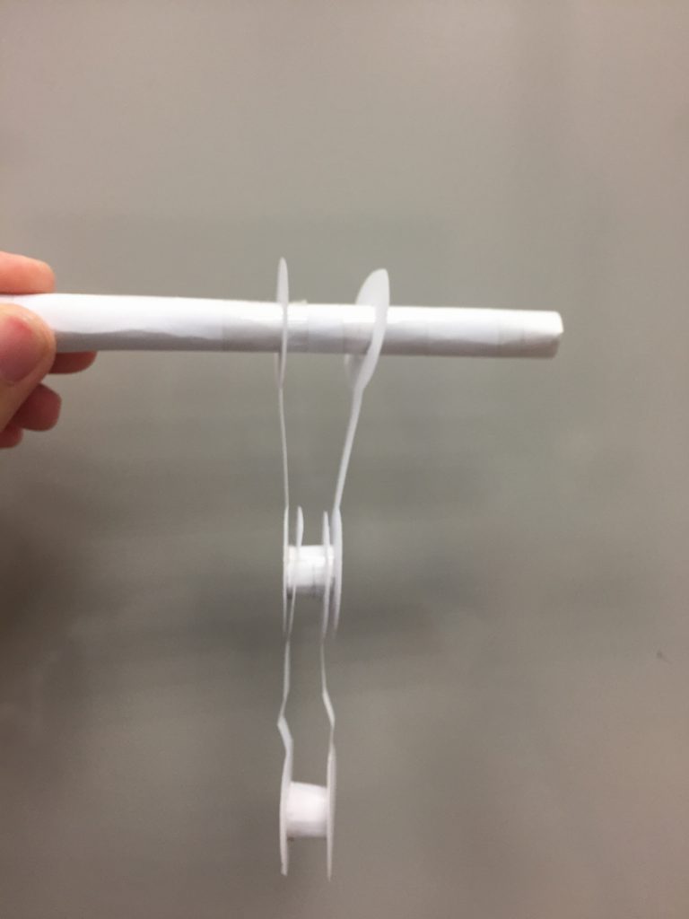
I first tried making a double pendulum with paper and inserted clay in some areas to make it heavier. I realised it was quite difficult to make it work so I didn’t use it.
I also thought of making a puppet or robot since the dance was rigid and it reminded me of this exhibition I saw in Taiwan.
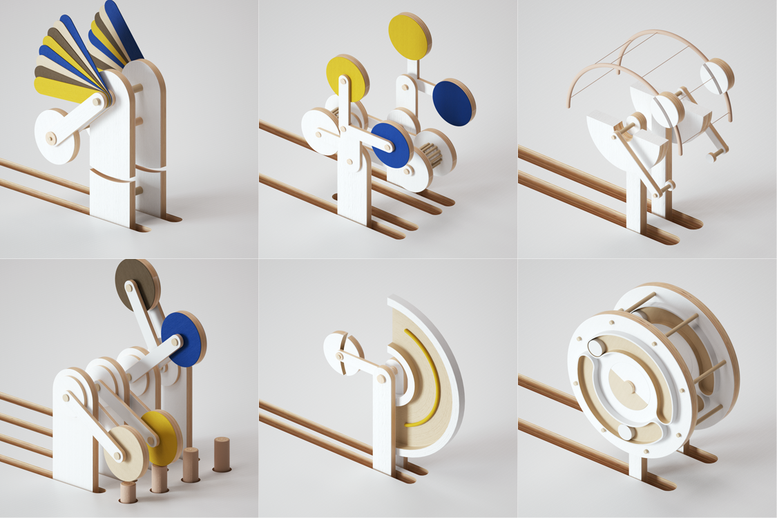
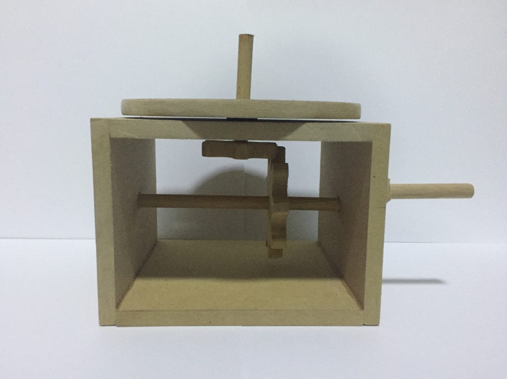
After the group consultation, I got to know that the video is supposed to show Flow vs Rigid/Natural vs Mechanical. I went back to watch the video and I thought it looked like a kids show, so I was thinking I could make a mechanical toy with natural materials.

While researching on mechanical toys, I found a website that teaches people to concepts behind the toys and how to make it (http://www.mechanical-toys.com). The website shows that the mechanical toy works by turning the rotational motion into an up/down one but I wondered if it was possible to change the axis of rotation instead.
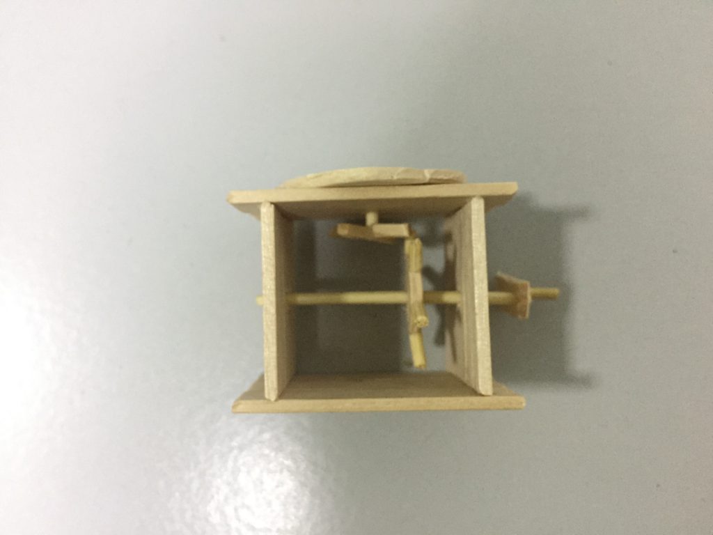
I tried to research on that but only found bevel gears which I can’t really make without a machine or 3D printer so I decided to just go ahead and make a small model to see it the normal gears could work.
Since the small model worked, I decided to stick with the idea and make the large one. For the large one, the measurements of the gears needed to be more accurate so I used a template to help me get the measurements (http://woodgears.ca/gear_cutting/template.html).
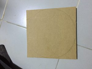
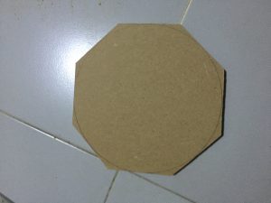
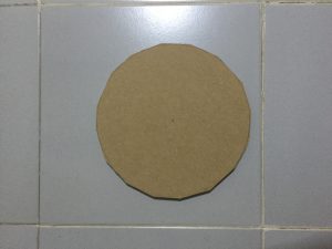
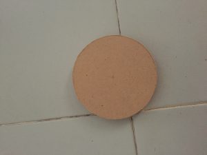
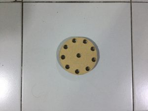
To make the gear, I first cut the wood to the size I want the gear to be. Then, I cut the corners to form an octagon and then into a hexadecagon. Afterwards, I sanded the edges to form a circle. Finally, holes were drilled into the circle so I could cut out the teeth of the gear.
After assembling the model, I realised that the gears weren’t smooth enough so I took them out and sand the teeth of the gears to make them slightly rounder.
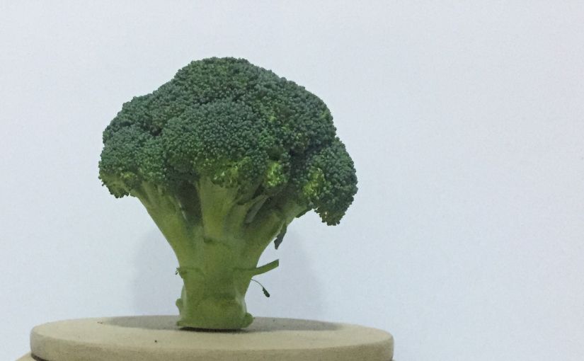
I was told that I could put a natural object on top of mechanical base to show the contrast between the natural and mechanical elements. I did some research and found an artist (Myeongbeom Kim) that uses a mix of natural and man-made materials in his sculptures.

I wanted to add tree branches at the top to make it look like a carousel. I couldn’t find a lot of tree branches so I took it from a plant instead.


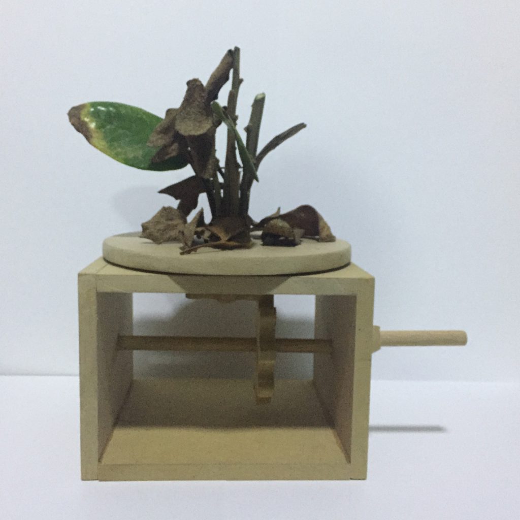
It ended up looking quite interesting but it did not have the impact of the dance so I tried to think of other natural objects that would have the shape of a carousel:
- Mushroom -> hard to find a large one
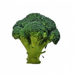
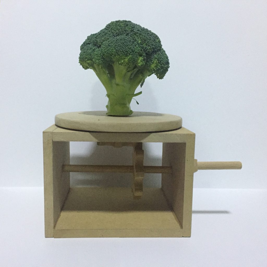
- Broccoli -> has the same impact as the video (unexpected, weird), also resembles a tree where wood comes from
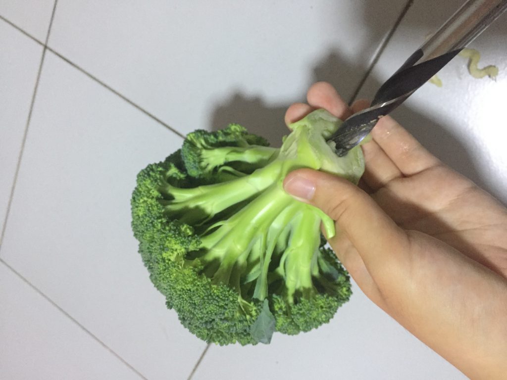
In the end, I decided on a broccoli. I drilled a hole in the broccoli and attached it the the mechanical base.
DN1003 Foundation 3D Assignment 2A: Polyhedron Dreams
RESEARCH
Planes
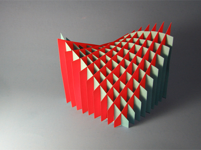
After knowing we had to use basic geometrical planes for the model, I tried searching for planar sculptures and found this interesting sliceform planar sculpture.
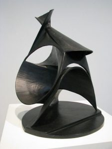
In class, we learnt that the planes don’t have to be flat. The sculptures made by Naum Gabo and Antoine Pevsner are some examples that consist of curved planes.
Lines + Planes
I thought that the idea of using straight lines to form a curve was interesting. There was a picture of a sculpture similar to this being shown in class but I couldn’t find a picture of that sculpture.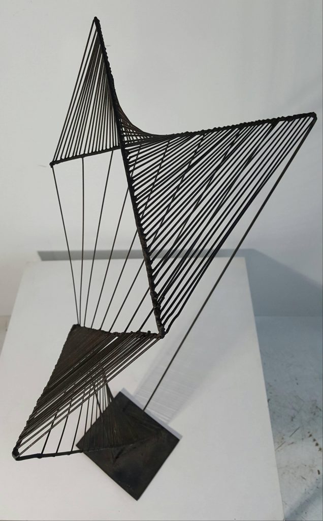
References:
https://sculpturecourse.files.wordpress.com/2011/11/v-sliceform-color1.jpg
https://i.pinimg.com/originals/15/97/95/159795ec2662ada1d8ad38e5ce9745e2.jpg
https://dg19s6hp6ufoh.cloudfront.net/pictures/613064517/large/The_Black_Lily_%28Spiral_Construction%29__1943_Bronze_by_Antoine_Pevsner.jpeg?1470823148
https://a.1stdibscdn.com/archivesE/upload/f_10624/f_59992931479599137307/20161119_124320_master.jpg
PROCESS
Planes
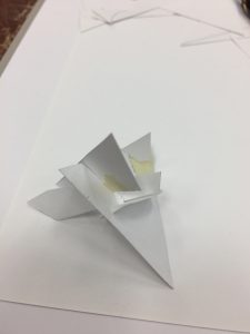
At first, I wanted to use the letters from my name to form the model.
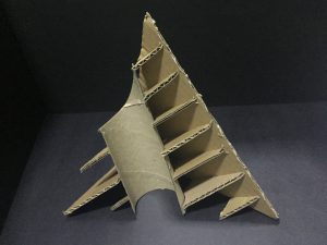
I made a small model using paper to see if it works, then I did a larger model with cardboard.
After I realised that we were suppose to use basic geometric shapes for the planes, I tried experimenting with the different shapes and arrangement using paper.
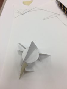
I wasn’t satisfied with what I made and since it wasn’t done with proper measurements, it would be difficult to replicate it with cardboard. After researching, I decide to make a sliceform model so I tried it using paper again.
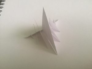
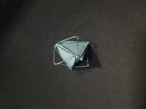
The model ended up looking symmetrical and boring so I thought of making it look different from every side. I wanted it to show a square, circle and triangle on each side. It was difficult to do this with the small model so I made a larger one with cardboard.
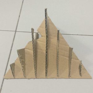
As I had to make sure the model only took up the volume of the tetrahedron, I couldn’t really vary the shape of the model so I decided to cut up the shapes instead. I also tried to include a curved plane into my model.

Lines + Planes
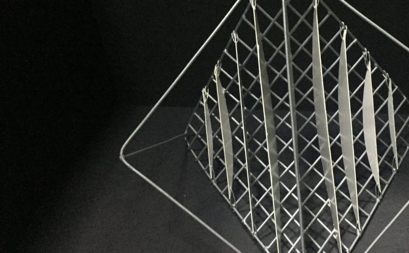
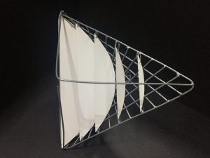
I tried to use blutack on a small wire model to figure out how to make the curve using straight lines as blutack can stick on to the wire without glue. When it worked, I did it with wires on a slightly larger wire model.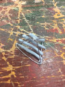
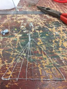
I wanted to use the idea of making the model look like a square, circle and triangle on each side since I could break free from the tetrahedron structure for this model. I found out that a tetrahedron can fit into a cube and decided to work on that idea and extend the tetrahedron.
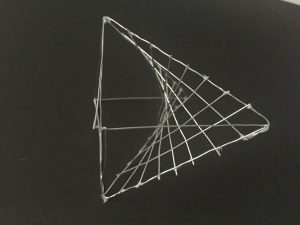
I liked how it looked so I decided to make a larger wire model and soldered to wires together. Then, I realised that there weren’t any planes so I added so planes that were similar to that of my sliceform model but tried it on the smaller model first. I found that it kind of puts emphasis on the curve made by the straight lines. I tried putting the planes on the outside and inside of the model but it didn’t look as interesting when the planes were outside.
As I felt that there wasn’t a disintegration, I tried making smaller models to add on to the larger models but they didn’t seem to fit and looked like there was too much going on.
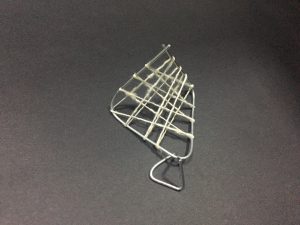
In the end, I just left it as it was and didn’t add the smaller models.
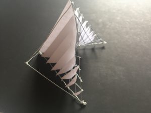
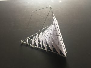
FINAL
Planes
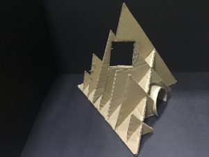
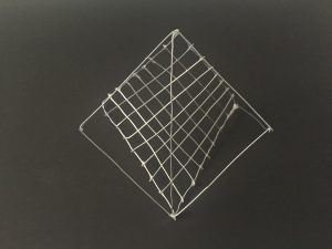
The final model is a sliceform model of a tetrahedron with cutouts that form a square and a circle. It also includes a curved plane.
Lines + Planes
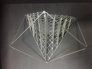
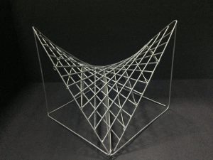
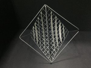
The final model looks different from every angle and still uses the idea of the sliceform from the planar model. It is breaking away from the tetrahedron structure.

DN1004 Foundation 4D: Image Analysis Presentation

This is a poster for a WMF knife.
As you can see, the background is quite plain and it looks like a table.
This allows the viewer to focus on the carrot and the cutting board in the middle of the poster.
Both the carrot and the cutting board are sliced.
What we can infer from this is that the knife used to cut the carrot is so sharp that it can also cut through the wooden cutting board
I believe that the carrot is used here not just because of its striking orange colour as compared to the background but also because raw carrots are quite hard.
That also implies that the knife is sharp.
At the bottom right hand corner, the caption says “Sharper than you think. The WMF Grand Gourmet knife with Damasteel blade.”
“Sharper than you think”, once again it emphasises on the fact that the knife is really sharp.
“Grand Gourmet knife” tells us that the knife is of high quality.
And Damasteel is a stainless steel with very high cleanliness.
This shows that the knife is not just sharp and of high quality but also very clean.
Image: http://1.bp.blogspot.com/_4R1YTsjaAnk/TCzdhwrr8bI/AAAAAAAAHLM/iTfXWxP1PkU/s1600/33.jpg