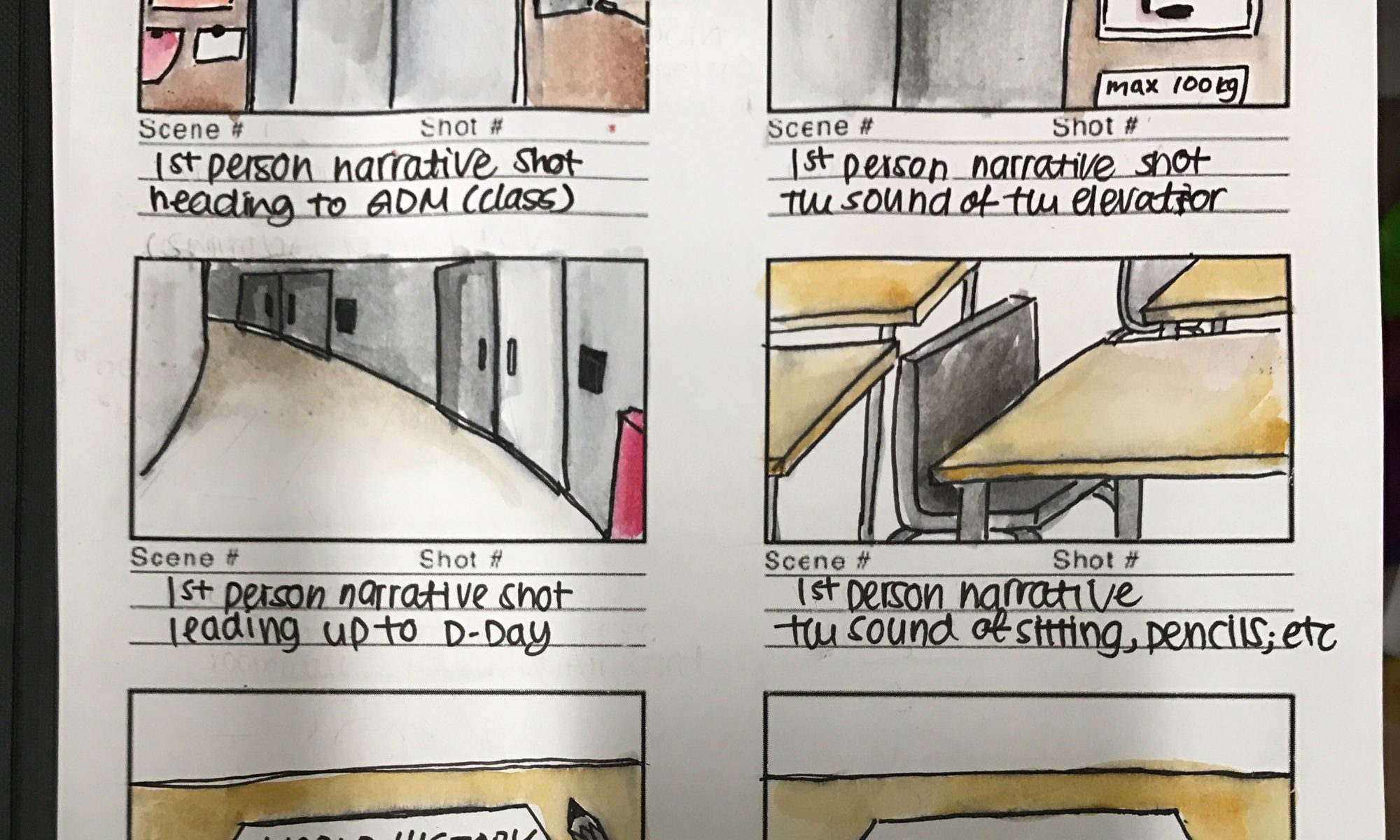
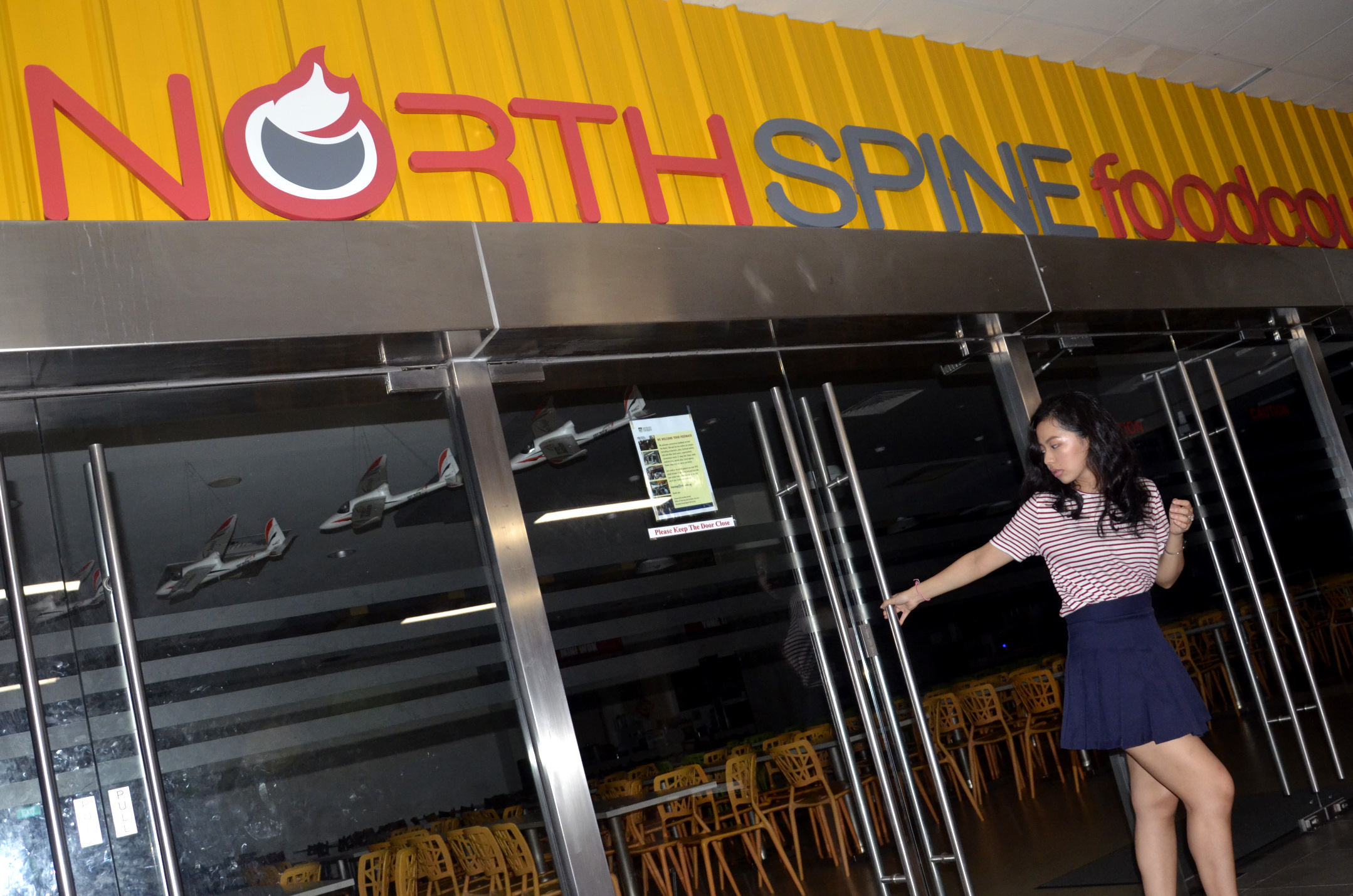
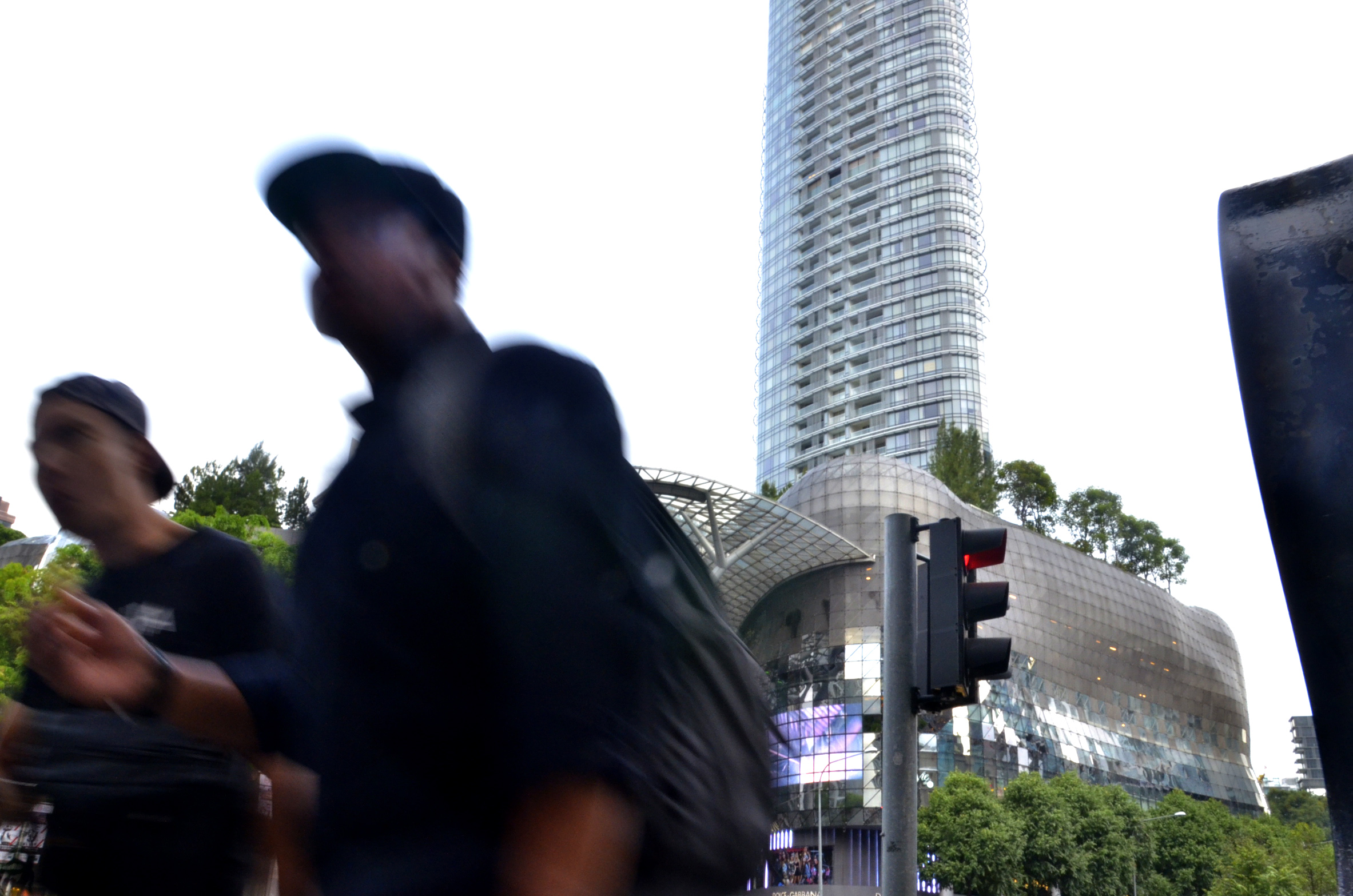
To help us understand the concept of time, we were asked to take 30 second videos that described clock (real) time. We were introduced to the different times from clock time, to experienced time, edited time, and biological time. Real time is the time that we are most likely exposed to the most on a daily basis.
The first example is of an elevator opening. As we wait for the elevator doors to arrive and open to when it does and a flood of people swarm out.
The second example is the planned swing of the fan hung in the female restroom. People claim that the video seems longer because the scene is repetitive and the subject remains static with little variation.
While this last example is quite short, I thought it was a very different way to describe clock time. Especially when the ambiguity of the door closing opens the mind to other possible real times situations that could be happening on the other side of the door.
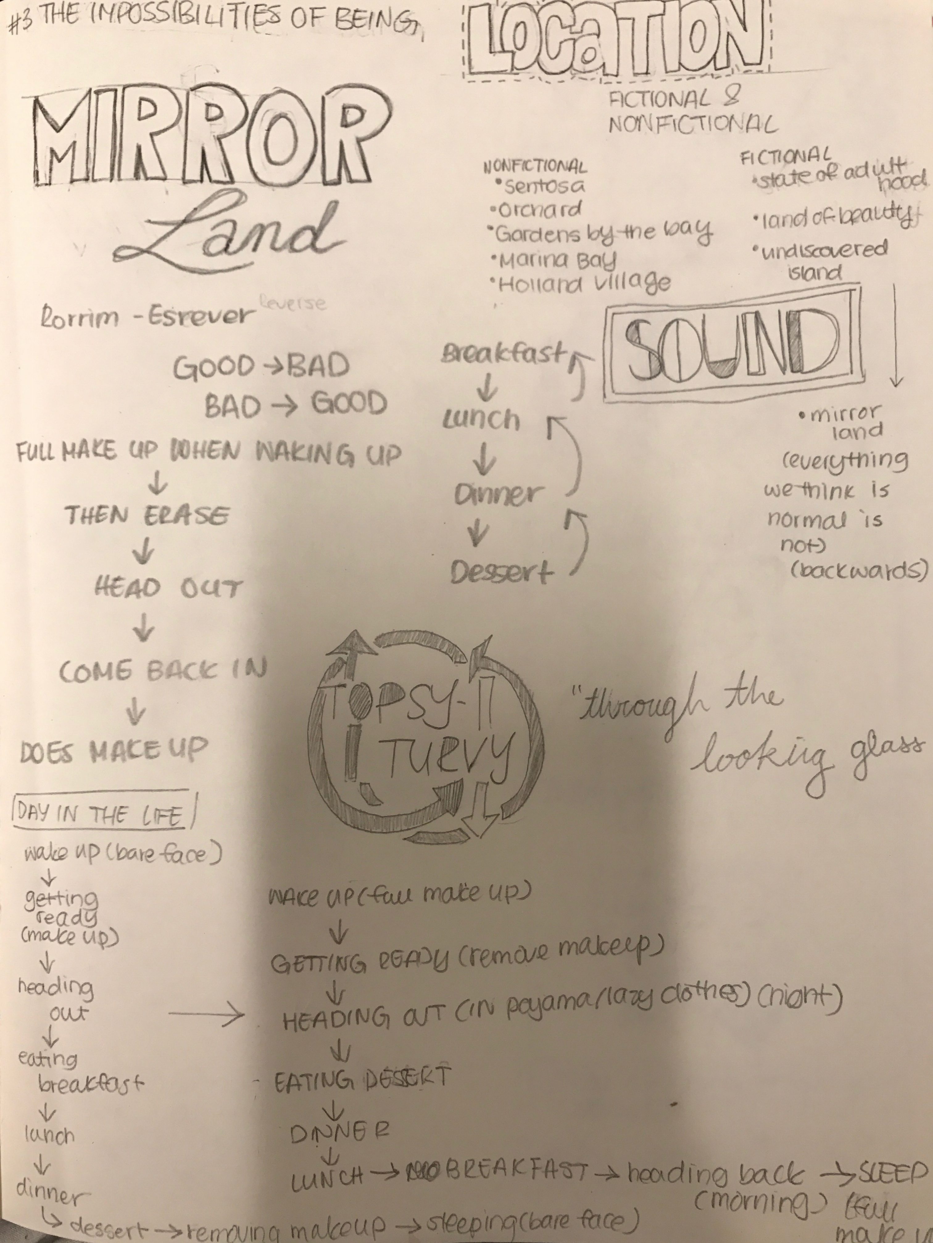
For Project 3 we were asked to research and understand the connection between sound and emotions. Depending on the sound being played, it can change the entire emotion of a situation or event. For example, a horror movie is less scary when there is no sound. Sound can build or break suspense, cause excitement or sadness, and even make us believe in what is not visually there. Our project began by choosing a location, either fictional or non fictional, and imagining the sounds we would hear in this location and the emotion we would like to evoke. The collective sounds we would record for this project would be considered a soundscape.
PLANNING
I faced some difficulty with this project, not only was it the first project I had to incorporate sound in to but struggled to grasp what the project wanted me to focus on. This led to the development and scrapping of several ideas.
Brainstorm
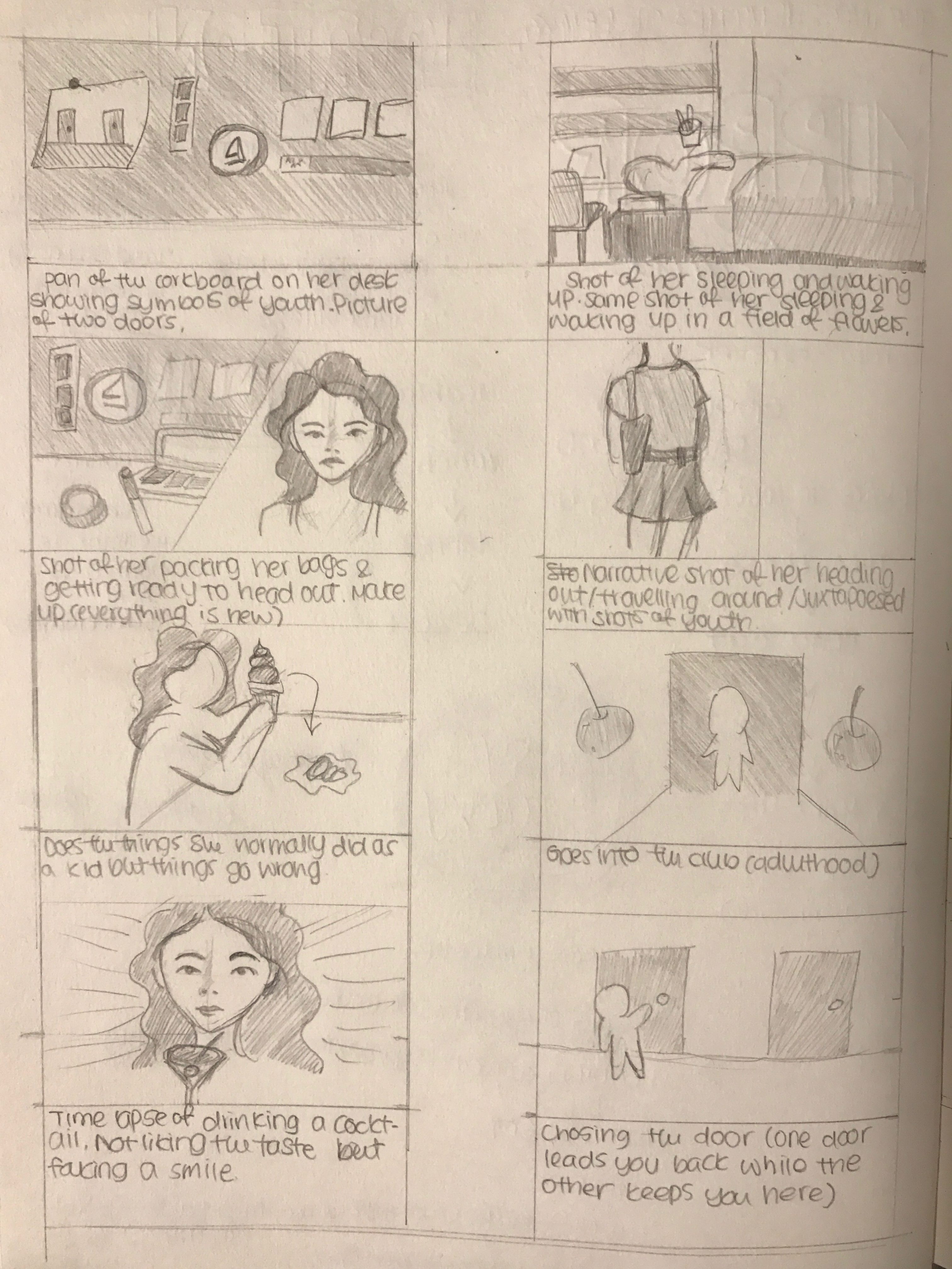
My original plan was to film a short narrative about a girl who wakes up to find out that she is now an “adult”. Everything she did when she was a “child” seems to fail her. Yet her initial excitement of finally being able to do the things she couldn’t do (go to clubs, wear make up, drink alcohol) blinds her from the fact that she can no longer enjoy her favorite activities from her past. Eventually, she realizes that she doesn’t like adulthood as much as she thought she would. Instead of going to the door she originally left from in the morning, she goes to the door next to it hoping that she can go back to the past.
Original Plan (Lo-Fi Board)
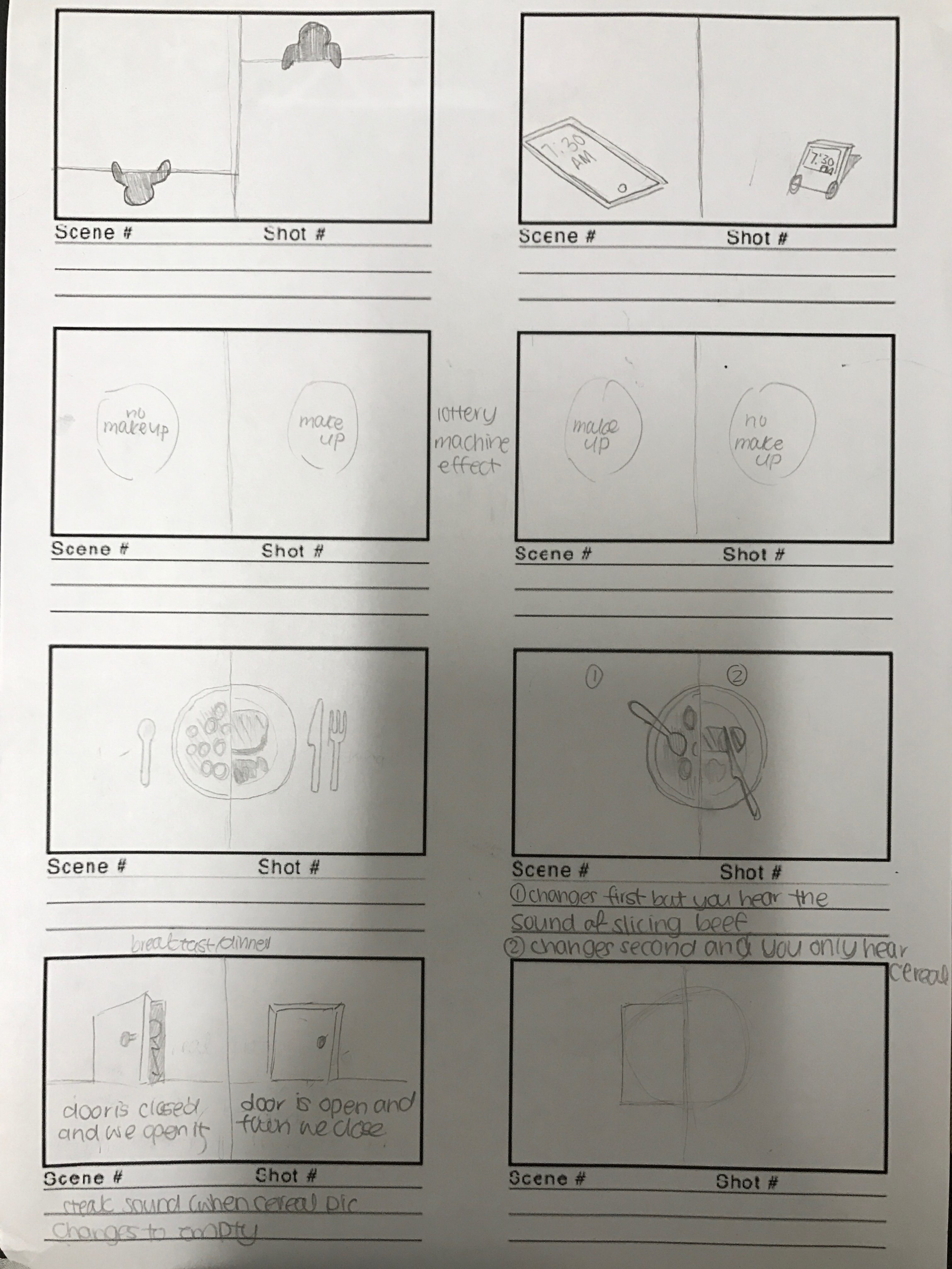
However, for this plan I focused too much on the narrative rather than the correlation between sound and emotion. I wanted to reflect my transition from teenager to adult as I moved from high school to university. In the end, I decided to start fresh; focusing more on the sounds that I could create. This led me to my second idea. Subversion. A technique we utilized in project 2 where we were given an object to describe and change meaning to. My character would enter an alternate reality where everything is reversed. Like a mirror-world, where everything seems the same but is not. Everything is backwards in this world, from the sequence of getting ready to the sounds that you hear. The day begins with waking up at night with a full face of makeup. The main character then leaves the house after removing her makeup and wearing her pajamas. After heading out the character would proceed to eat breakfast at night, lunch in the afternoon, and dinner in the morning. Yet, when the character is eating her cereal for breakfast, you hear the sounds associating with eating a stale dinner. The story ends with the the character returning home to putting on pretty clothes and makeup to sleep.
Second Plan (Lo-Fi Board)Second Plan (Hi-Fi Board)
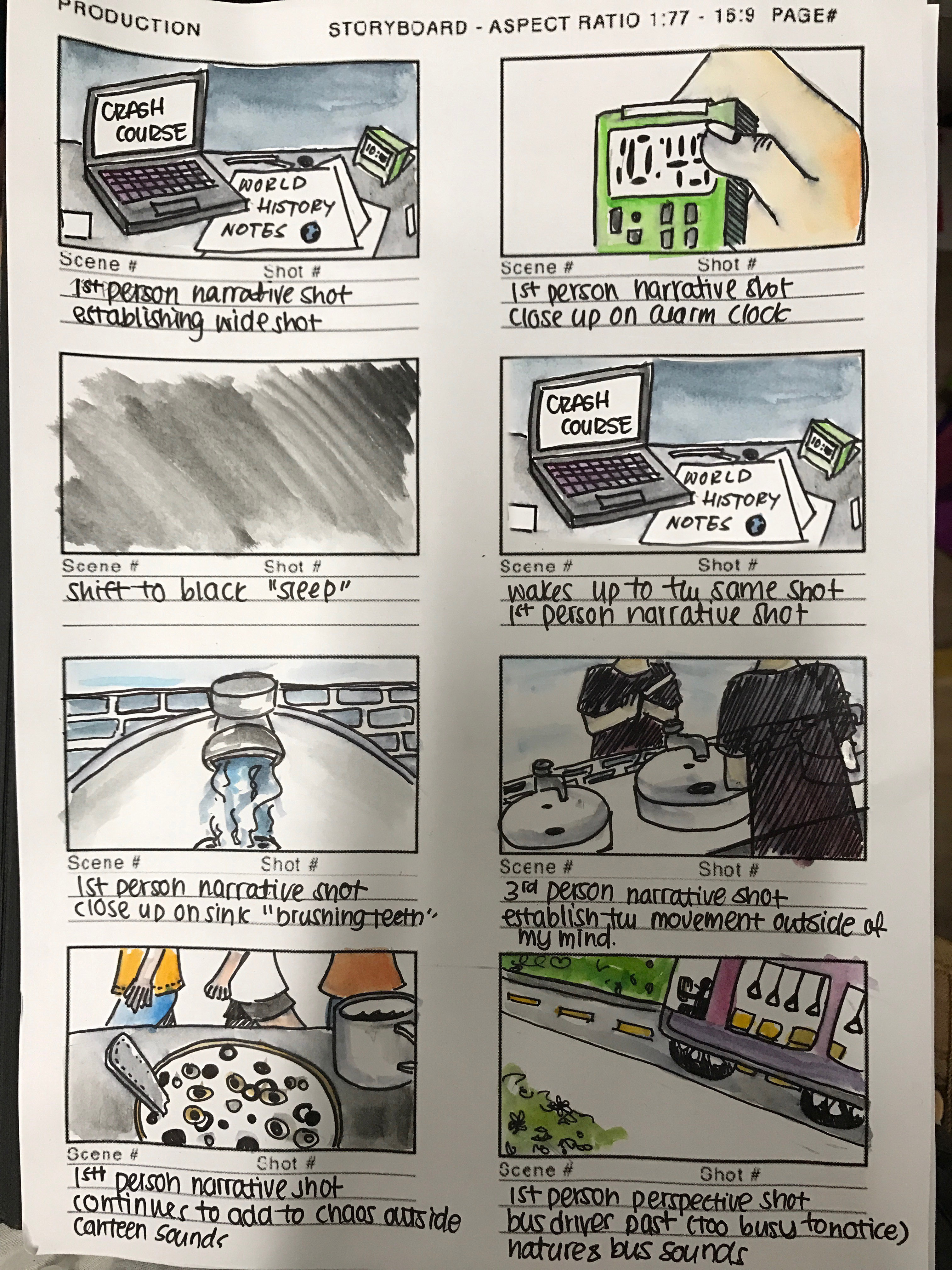
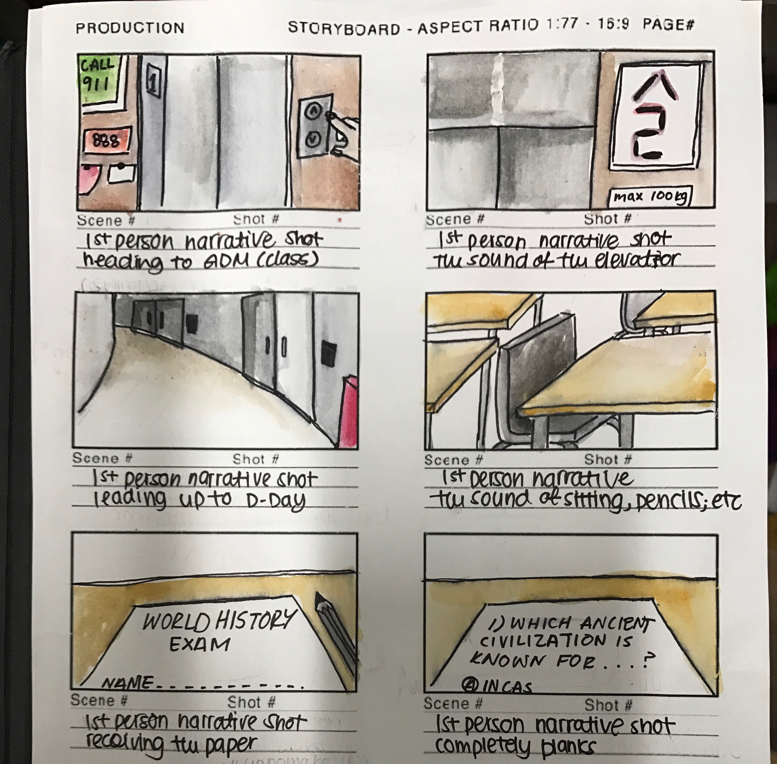
However, though I loved each project, I did not feel as if I was understanding the project fully. And after a fair amount of consideration I decided to change my idea. This idea I chose to stick with regardless of any feelings that would arise. The location for my idea was my head. I wanted to give people an insight into my head, especially the thought process that occurs throughout the day. However, I did not want to confuse the viewer because my mind could we a bowl of spaghetti at times. Which is why I chose to focus on my mind as the days lead up to a test. The goal of my video is to show the disparity between the outside world and my head. I tried to achieve this by playing a recording of my voice memorizing the information for my test over a soundscape of mundane everyday noises.
Final Plan (Lo-Fi Board)Final Plan (Hi-Fi Board)Final Plan (Hi-Fi Board)
My original lo-fi board for my video included an introduction into my mind. This would have helped the viewers better understand where the location of my video was. However, I decided to cut this scene from the final video because I felt that it broke form the first person narrative flow that is dominant in the rest of the video. This goes for the sixth thumbnail in my hi-fi board. Though it added to accentuate the contrast between my mind and the actions occurring around me (other people using the bathroom facilities), the break from the first person narrative broke the flow.
SOUNDS
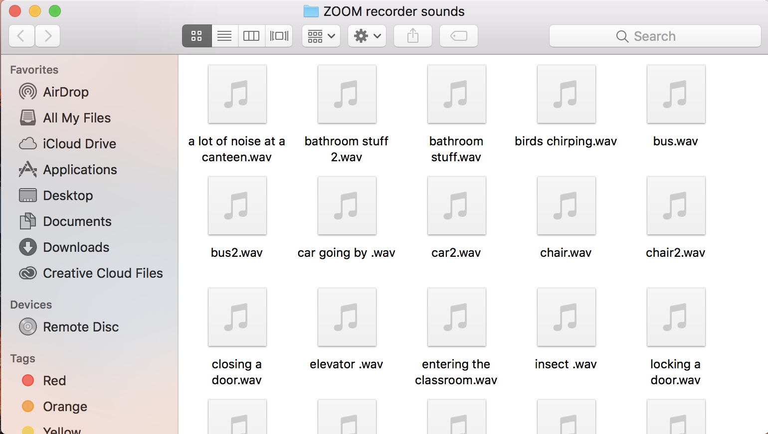
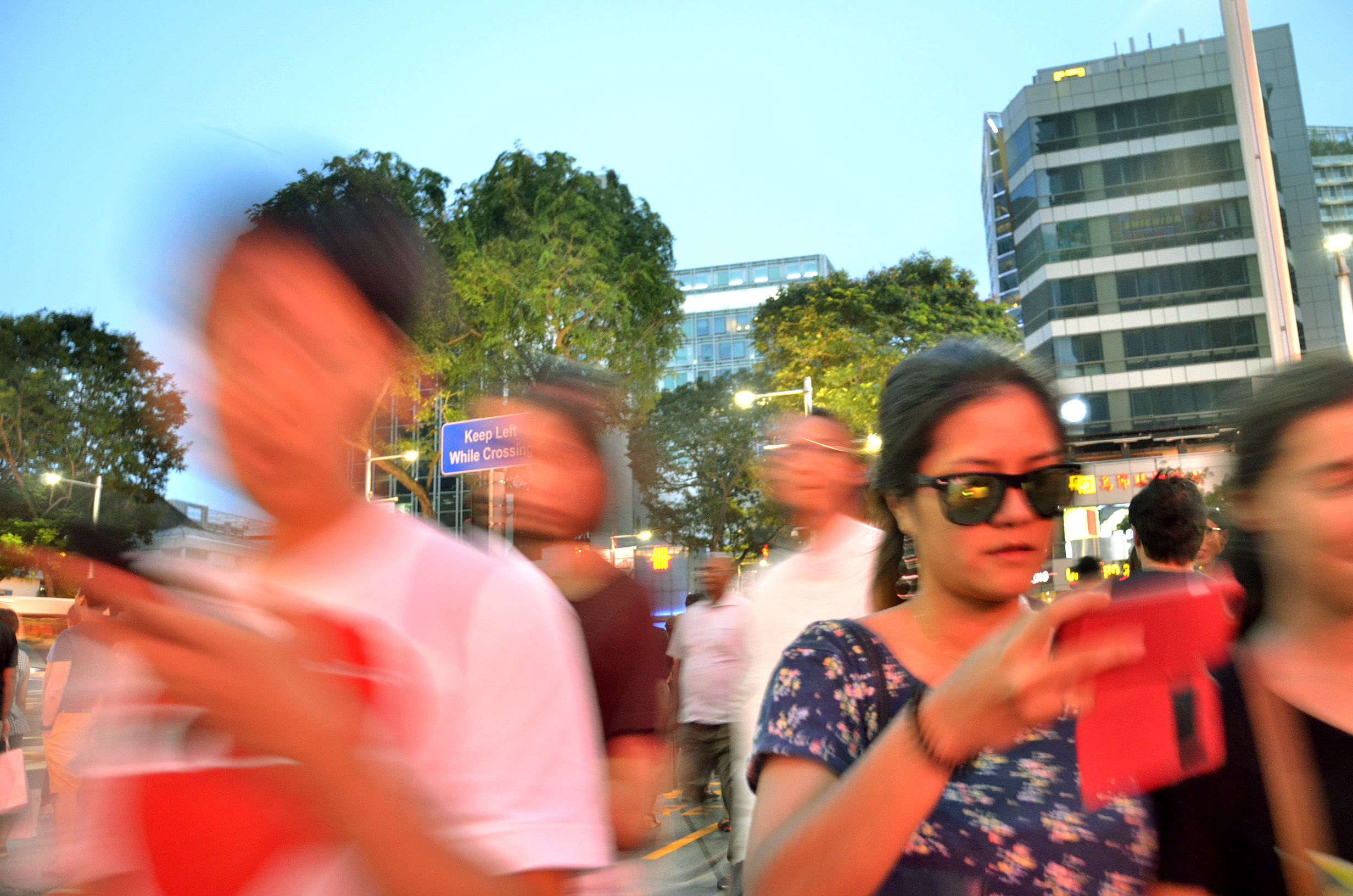
All my sounds except the cricket and explosion sound at the end of the video. I chose to record (using the ZOOM recorder I borrowed from the school) mundane sounds one would normally hear on a daily basis. The sounds include the running of tap, the leaves rustling, the cars driving by, and even the trite elevator sequence. The use of such a commonplace sounds was to emphasize the extensive disparity my consciousness felt during even an every day situation. This discrepancy from reality is prevalent throughout my life, not just the hours leading up to a major event. Drawing from those previous experiences, I focused on not the big moments of disparity, but the trivial instances.
The sounds are then overlapped by a recording of my own voice that continues to repeat a list of information related to the test. The voice is almost robotic in the sense that it is played on constant loop and stays constant throughout the video. My mind is so focused on engraving those points into my mind that I am oblivious to the sounds around me.
My original plan was to use moving images to create effects such as time-lapse and continuous transitions. However, due to time constraints, I ended up using still images as my visual aids for this assignment. Though an unexpected turn of events, I feel that the rigid nature of still images adds to the distance I feel with ever-flowing outside world.
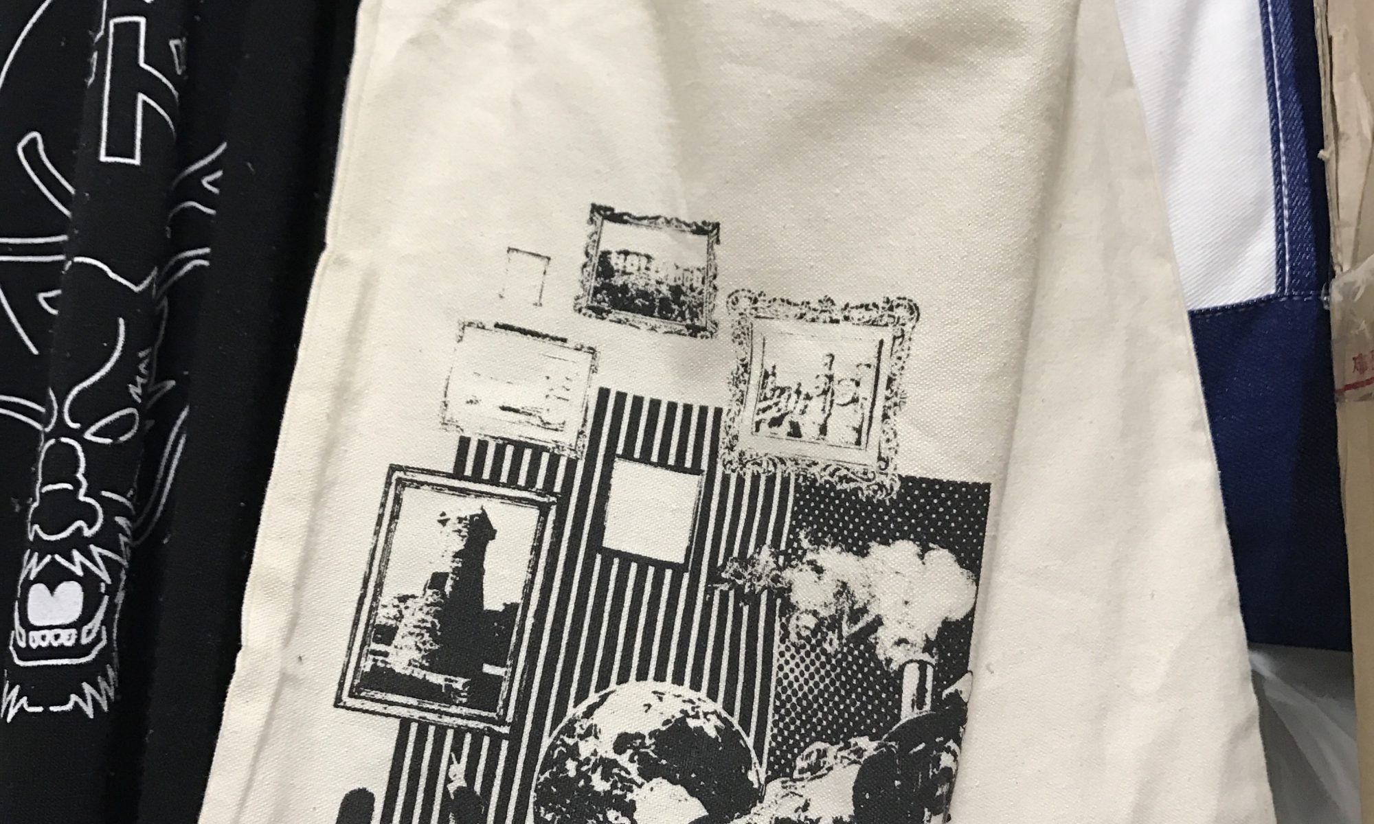
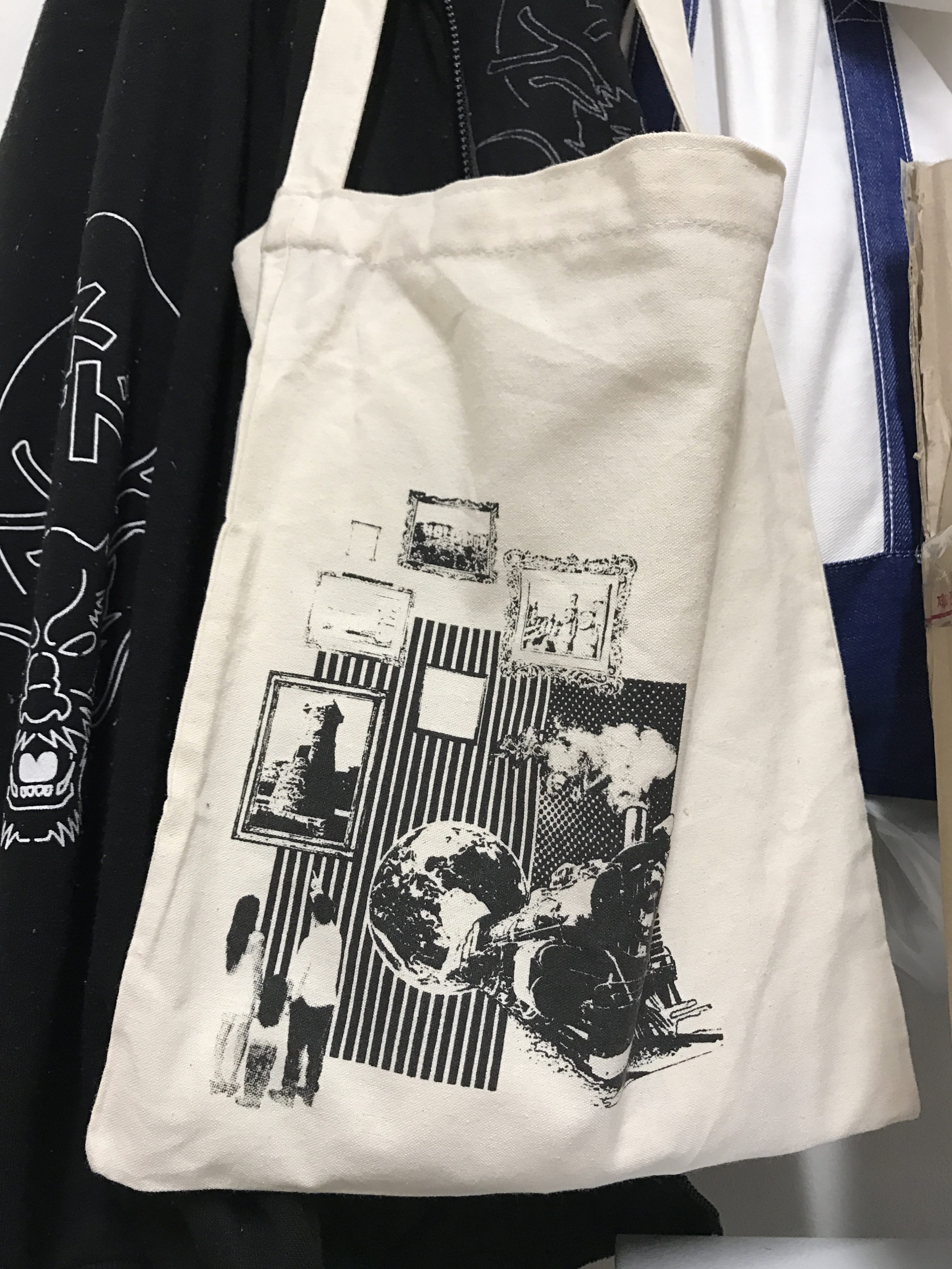
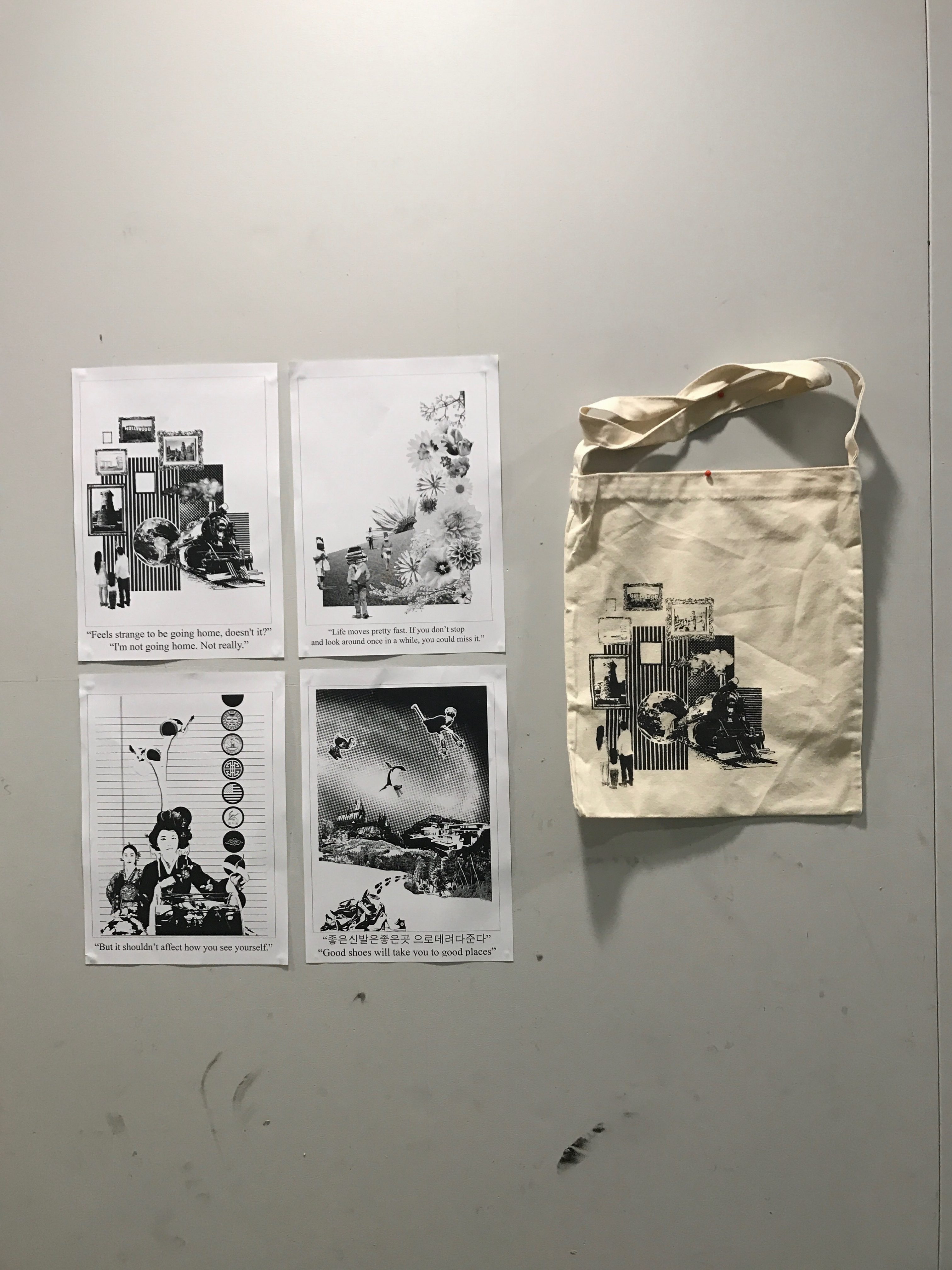
For our project 2 we were tasked with the mission of finding 4 quotes from either one or four different movies. Interpret the four quotes in our own unique way and create a black and white composition. We will eventually chose one of the four compositions and create a silkscreen that we would eventually screen on a tote bag.
Final Tote Bag in Action
Quote 1
“Life moves pretty fast. If you don’t stop and look around once in a while, you could miss it.”
Meaning
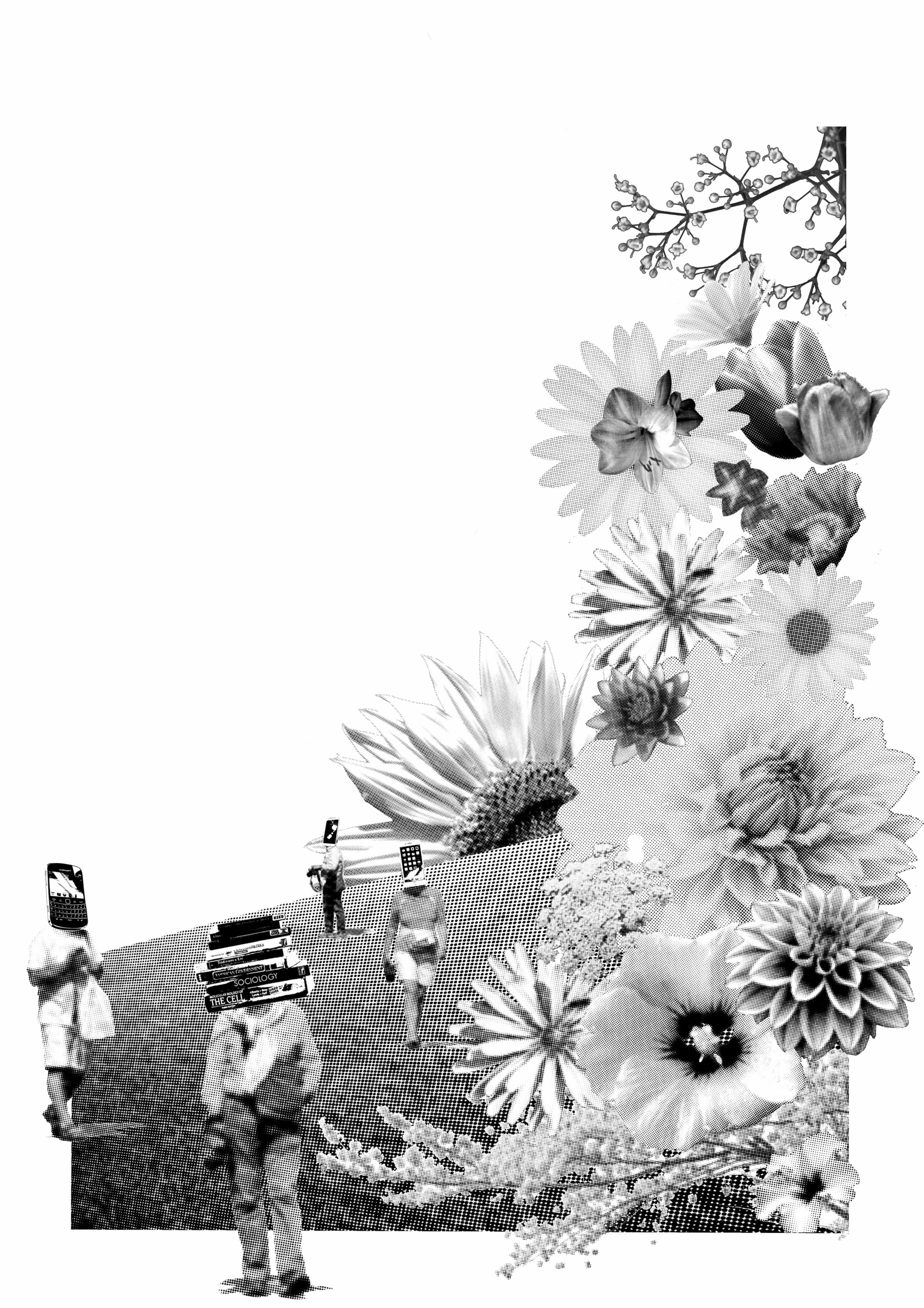
This quote is from the movie Ferris Beuller’s Day off. This movie is about a group of three friends who decide to ditch school to enjoy the best day ever. They choose to enjoy their day to the fullest; from driving their father’s Ferrari, sneaking into a restaurant, watching a massive parade, and simply enjoying life. The entire movie is based off of the quote above, the world keeps moving and we keep missing those amazing opportunities around us.
My Take: I took the quote through an objective view point. I did not relate it to any personal experiences, instead I tried to make it more universal. Flowers are always the topic of beauty and meaning. Each flower carries its own meaning unique to different cultures. Yet we only cherish a flower when it is fully bloomed, that is when the flower is at its prime. But we humans are too busy studying about biology instead of observing it, working for nature but never involving themselves in nature, or immersing themselves in social media. We miss out the beauty of nature and the world even though it is right infant of us, proliferating right under our noses.
The flowers on the right are supposed to be dominating and overpower, the dominance of the flowers represents that even though what we should is appreciate is that obvious to us, we are still oblivious to it. The people are even on a vast grassy field open to new possibilities yet still chose to be absorbed in the material world. They focus solely on studies and work that I chose to switch their heads with the tools they need to study and work. This irregularity of the human form draws our attention to it and makes us do a double take on the form. Originally, there were several globes that made up a hot air balloon with a person inside watching the flowers. Only this person was watching the flowers, everyone else was too busy. Yet, the hot air balloon and the woman took away from the composition as a whole. The composition looked chaotic and messy, which is why I chose to remove it from the composition as a whole.
“Life moves pretty fast. If you don’t stop and look around once in a while, you could miss it.” (Ferris Bueller’s Day Off)
Quote 2
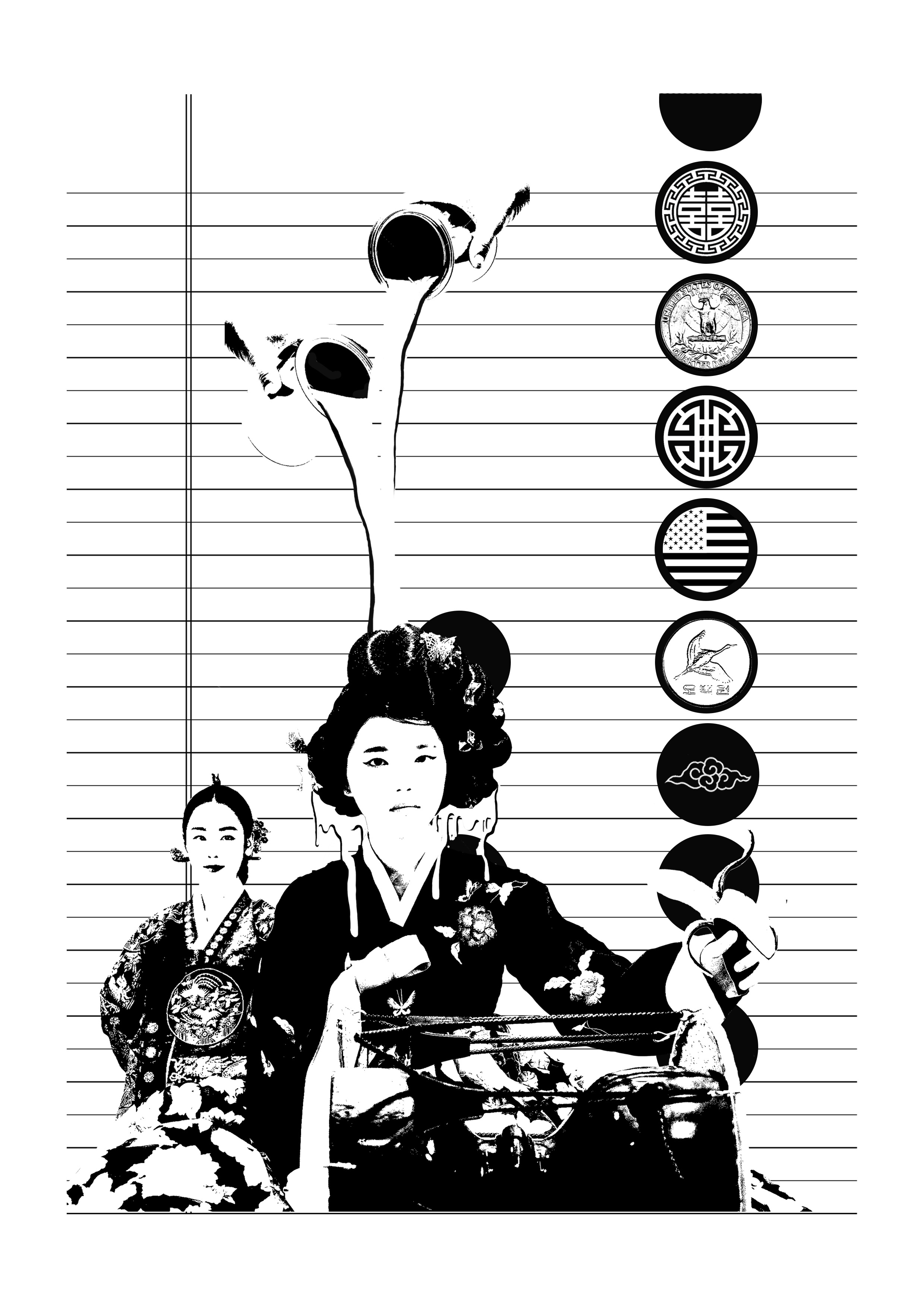
“But it shouldn’t affect how you see yourself.”
Originally, I took this quote too literally. I would refer to the movie on more than one occasion and in the end my composition looked more like a poster for the film. However, after a group consultation with several members of my class I dared to reinterpret it differently. I chose to add a bit of a personal flare to the reinterpretation by relating it to my personal experiences.
As I was growing up, I dealt with a clash of different cultures. I would often be called a “twinkie” or “banana” as a joke between some friends because of my “Third Culture Kid” personality. Using the previously mentioned experience, I reinterpreted the quote. The quote to me is stating that though there are people out their would perceive you, want you, expect you to be a specific way just because of certain influences. Nothing should affect the way I see myself- I should be the only one having the final say about myself. Western culture tries to have a dominant influence in my life by “throwing” western culture in forms like media, morals, and ideas. There is nothing wrong with the influence, merely that I would like to keep a nice balance between the two.
The composition depicts a girl in a traditional Korean Hanbok, she is holding a banana in her left hand. The form of the banana is pointing towards the girl, drawing our eyes from the girl to the banana and then back to girl. The banana is meant to represent a “twinkie”. A twinkie or banana is a slang term used to describe someone of Asian race who has been strongly influenced by Western culture. The patches of designs coming down the right side of the compositions are a mixture of Korean and American symbols that are supposed to resemble a Scout’s sash. A scout’ sash is supposed to hold patches that symbolize a mastery of a certain skill, in my case, finally finding balance between the two cultures. The buckets of white paint lead our eyes down the composition to the girl. The white paint came from the idea of “white-washing”. Originally, I was going to leave the background blank but a last minute decision urged me to find a suitable background. However, looking back, leaving the background white would have been cleaner decision.
“But it shouldn’t affect how you see yourself.” (The Duff)
Quote 3
“좋은신발은좋은곳 으로데려다준다”
“Good shoes will take you to good places”
Meaning:
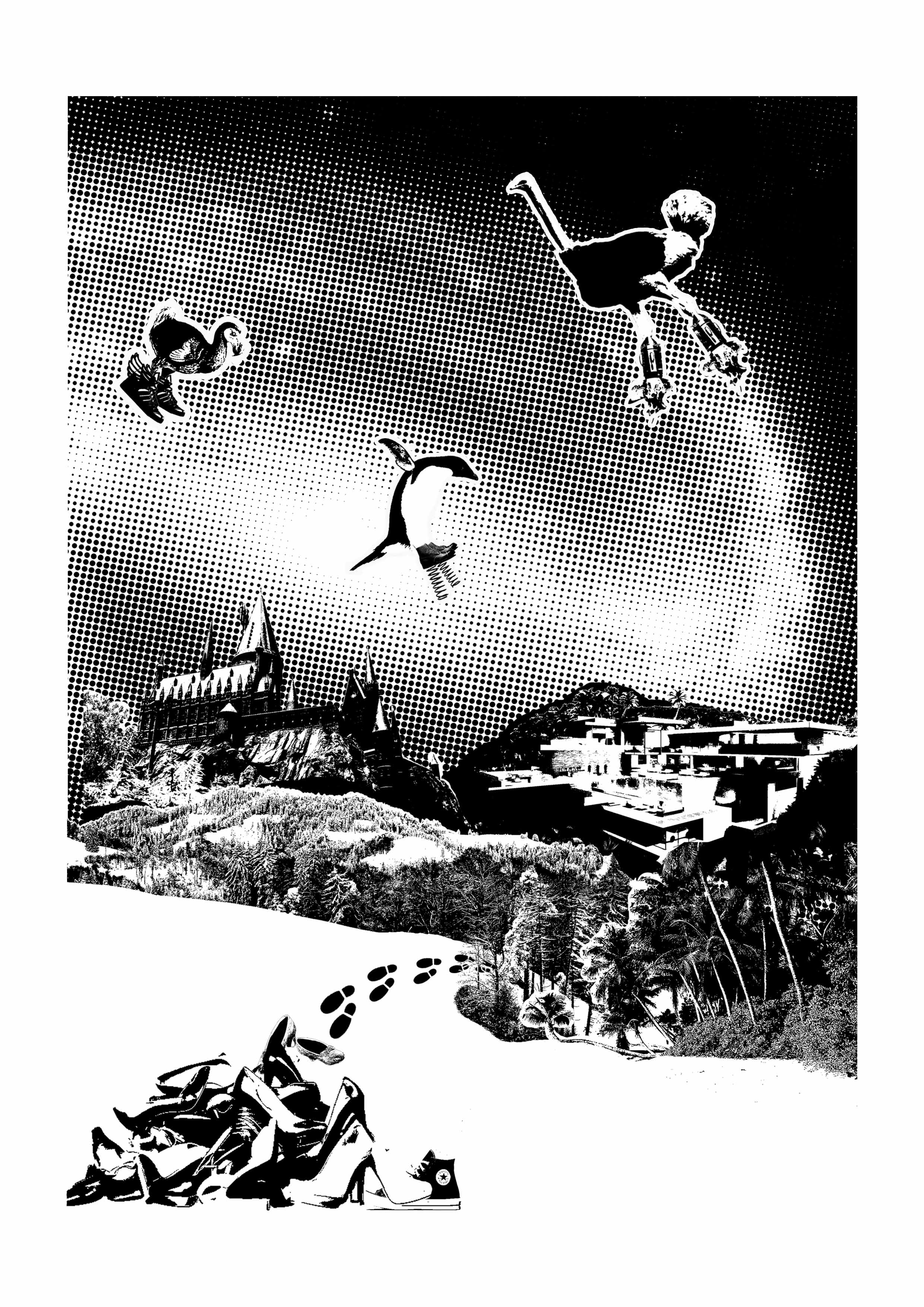
I chose this quote because I was feeling uninspired from my previous quote. I was taking my quote to literally and kept referring back to the film. So to counteract this, I chose another quote. I looked at this quote with a fresh mind and a new perspective. Instead of just accepting and agreeing with quote, why not agree with it but take it one step further. Yes you need good shoes, but sometimes you need something more. A good pair of Louis Vuittons or Jimmy Choos will not get you to where you want to stand (whether it be fictional or a goal), it requires hard work and thinking outside the box. This is why you see flightless birds finally flying because they thought beyond the norm and created products that would genuinely help them fly. They have finally reached their goals, which will allow them to bigger and greater things.
The galaxy background of the composition is meant to represent the endless possibility of “good places” that you can be a part of. The midground shows Hogwarts and a modern mansion. This creates a sense of symmetry between the vertical axis of the paper and a distinction between the background and the foreground. Hogwarts represents the fictional part (much like Land of Oz) and the mansion represents the nonfictional dream (having a successful and stable pay-giving job). And entering the deep forest to reach their dreams are a bunch of people who took the wrong pair of shoes from the discarded pile in the foreground. The discarded shoes in the foreground were left their by previous travelers who have either given or up or discovered the secret. The foot prints follow the line of the snowy hills and swirls out into the background by following the galaxy. This ultimately leads our eyes to the flying flightless birds
Final:
“좋은신발은좋은곳 으로데려다준다” “Good shoes will take you to good places”
Quote 4
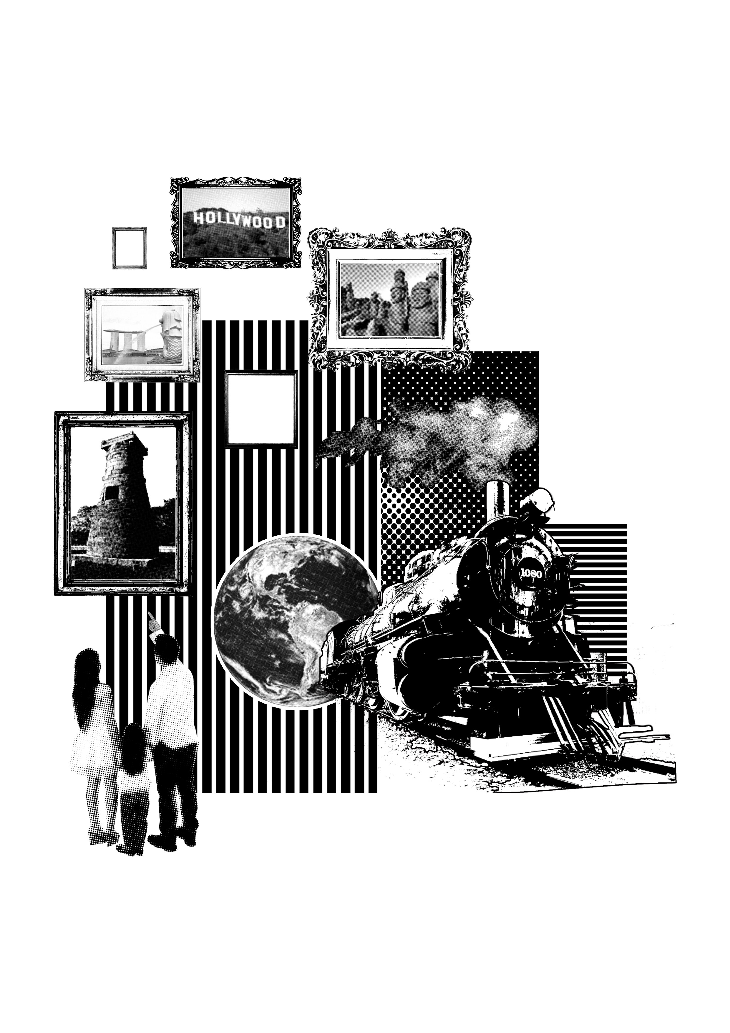
“Feels strange to be going home, doesn’t it?” “I’m not going home. Not really.”
Meaning:
I took this quote from my all time favorite movie and book series, Harry Potter. Specially, Harry Potter and the Philosopher’s Stones. This quote was at the end of the movie when the trio were boarding the Hogwart’s Express back home. Harry states that he is not really going home because he has realized that his home (after 12 years of never feeling comfortable at the Dursleys house) is Hogwarts with his friends.
When I think of home, I don’t think of one specific location. I think of several different locations. Because I moved around a couple times, witnessed different cultures, meet new people, I have realized that home isn’t always the place you grow up or where you’ve always known. Home is where you make it to be, the place where the memories are fondest to you or the place where your family or friends are.
The picture frames contain pictures of the places that I lived. The two empty frames symbolize the possibility of new places I will live in in the future. Below the picture frames is a family looking up at the different locations. The father is pointing his finger at the frames, teaching the girl about the places that were and the places that could be her new home. And to the right of the family is a train that protrudes out from the earth, ready to take its passengers (the family) to there next destination wherever it is. The train has a slight 3D effect where it feels as if it is popping out of the towards the viewer, emphasizing the movement towards the future.
“Feels strange to be going home, doesn’t it?” “I’m not going home. Not really.” (Harry Potter and the Philosopher’s Stone)
I ultimately chose this design to print on my tote bag.
Tote Bag:
I printed my screen on different bags and decided to choose the best from the ones I have already printed. This allowed me to take into consideration everything, from the positioning, overall paint distribution, and the color of the tote bag. And based on the thread count of the tote bag altered the transfer of the design and how much pressure we needed to apply to the squeegees.
For our second project in Foundation 4D, each student was given a random object to observe and subvert. I was given a pacifier. For our first task we were asked to observe the elements that make up our object and its function in our society. Task 2 required us to subvert the original connotation/definition of our object into something that is completely different. For task 3, we were told to take one picture from Task 1 or Task2 and add text to the picture. Converting the picture into a poster that either clarifies the original meeting or the subverted meaning. Like the previous project, this project is to be presented in photographs and use various angles and viewpoints.
Task 1 (Denotation)
A pacifier is a synthetic plastic mouth piece that parents insert in a babies mouth for them to suck. It is shapes so that it resembles the mother’s nipple and is usually used as a substitute for the nipple as the infant gets older/in public spaces. I wanted to focus on the pacifier objectively, removing cultural context and focusing on the pacifier as an object. Which is why I focused on getting closeups of the pacifier. The first images shows a closeup of the plastic part. This gives the audience a closer visual of the pacifier- the glossy and transparent quality.
Task 1 Part 1
The second image is a cropped version of another picture. This picture, though similar to the first one is different upon closer inspection. The pacifier is wet, as if it was just removed from a baby’s mouth. Depicting the function of the pacifier, a replacement mother’s nipple for infants.
Task 1 Part 2
The third image gives you a nice perspective of the pacifier from the angle many would see it on a baby. The placement and orientation of the pacifier creates balance between the three pictures as it mirrors the placement and orientation of the first image.
Task 1 Part 3
Task 2 (Connotation)
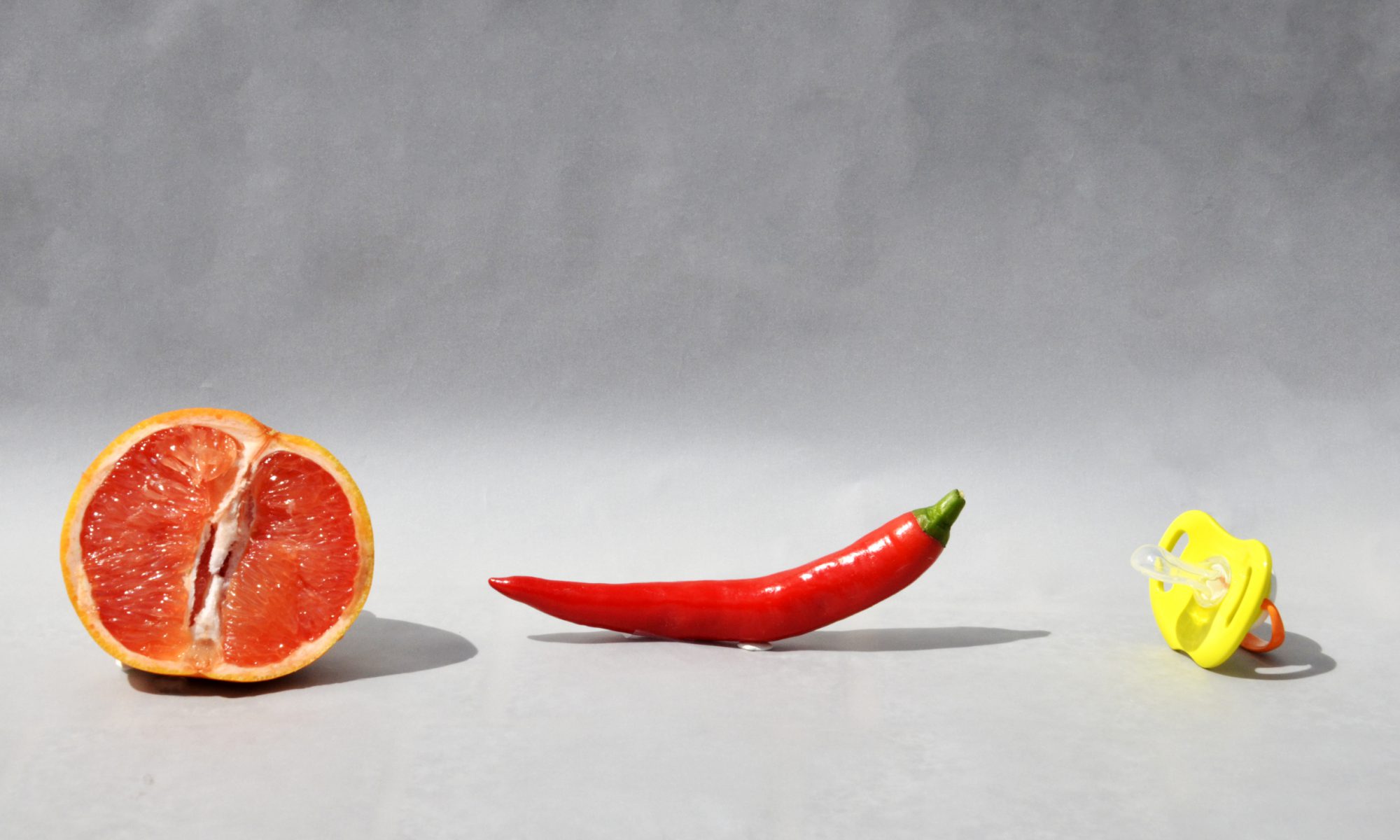
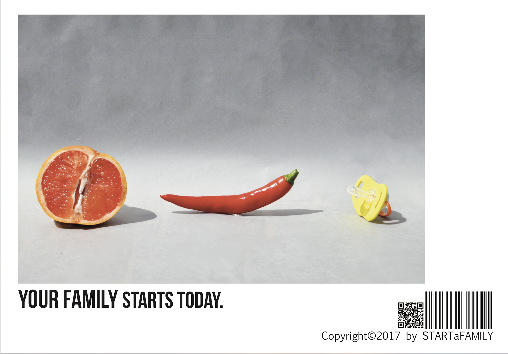
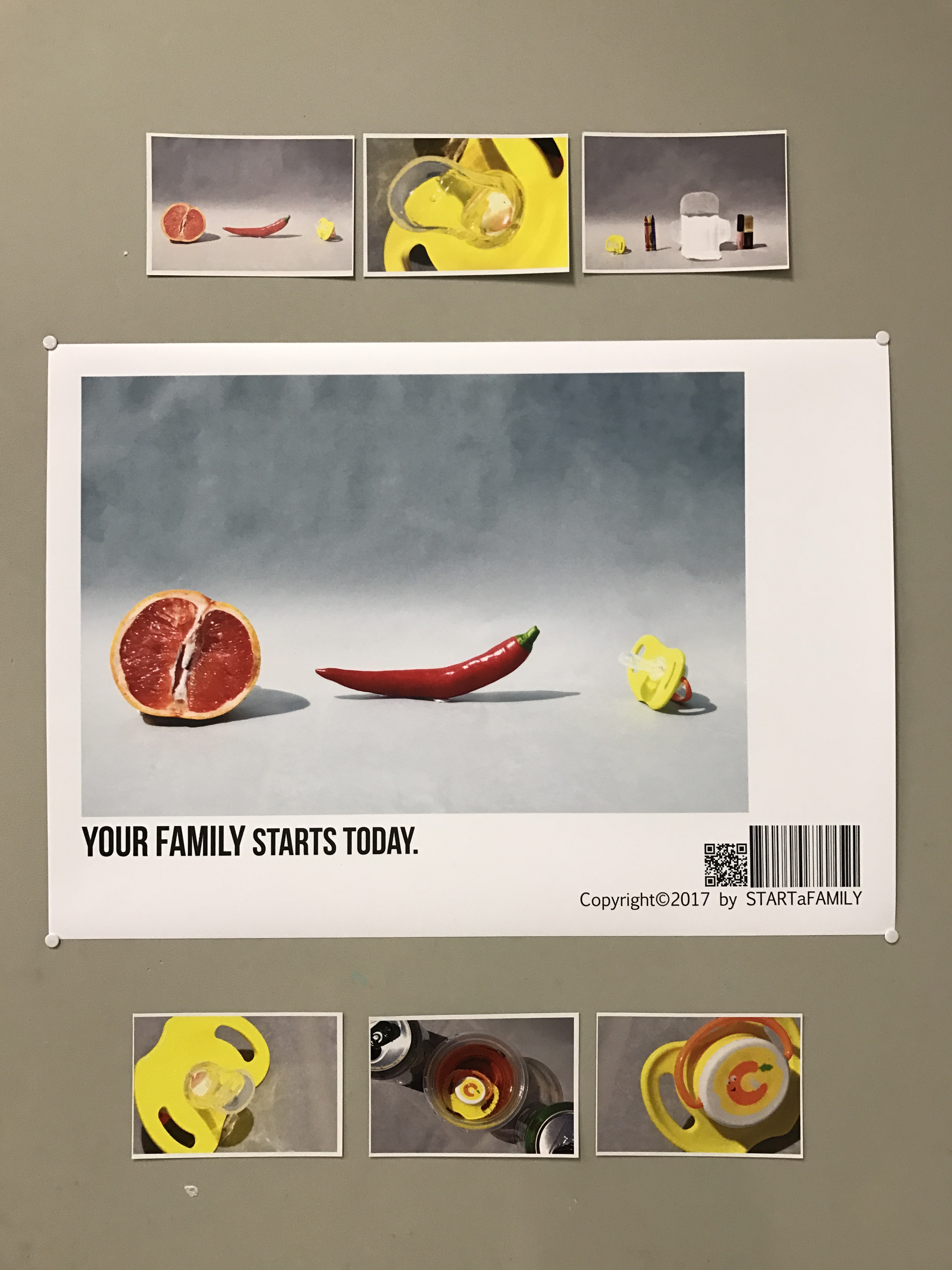
For our second task, we were asked to subvert the meaning of our object completely. Ultimately it was our decision to subvert our object while still retaining its qualities or abandoning all preconceived notions. I chose to subvert my pacifier by making it represent something more than a plastic nipple replacement. The first image represents the pacifier as a symbol for a baby. I leave it up to the audiences imagination and cultural influence to decipher what the remaining to objects (grapefruit and chilli) represent. The korean word for chili sounds very similar to the korean word for what it is symbolizing.
Task 2 Part 1
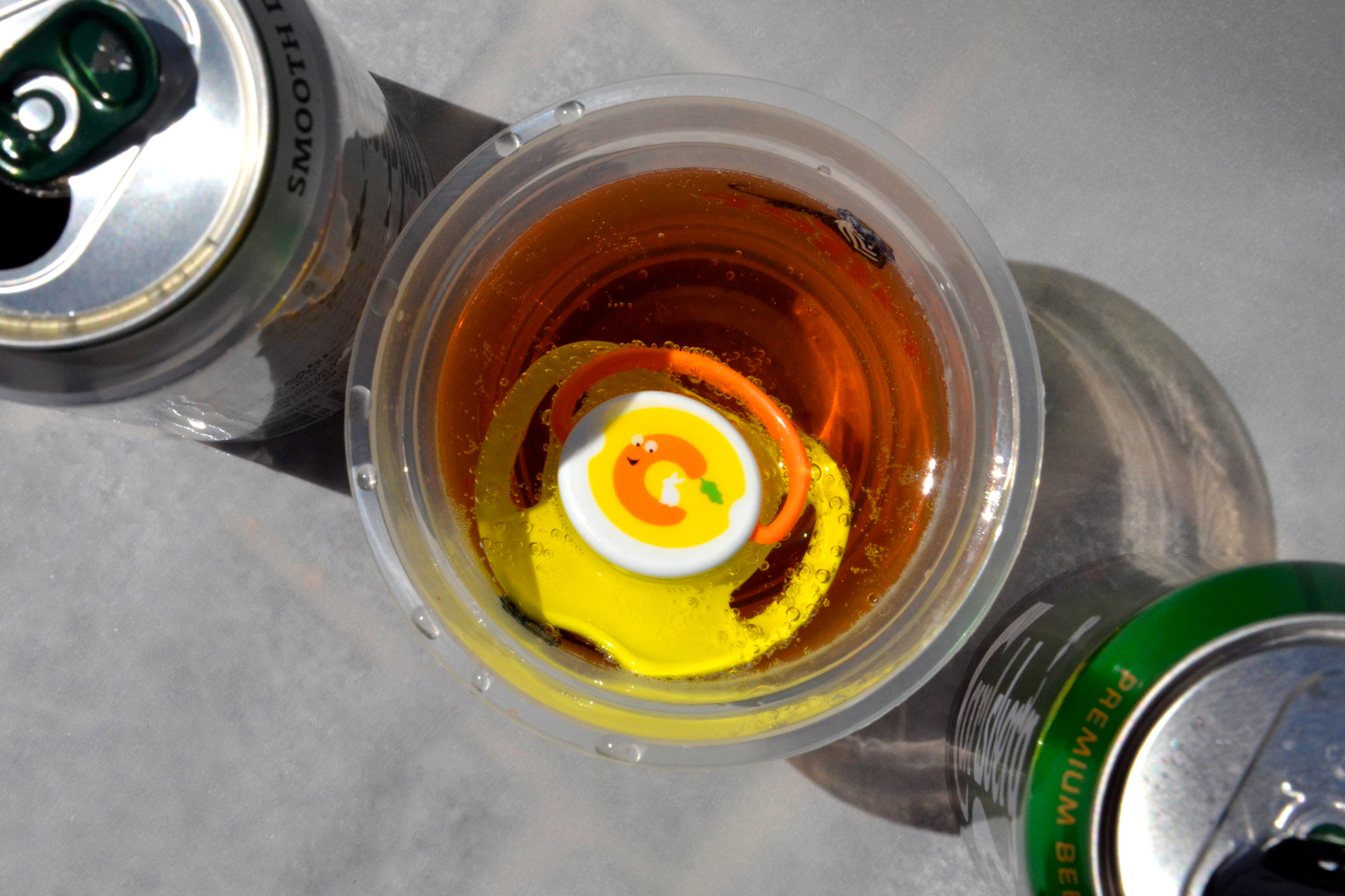
For the second image for task 2, I put the pacifier in a cup of beer from two different beers. For this image I took the second definition of a pacifier; someone who settles or calms a situation between to hostile parties. The mixed beer represents the “pacifier” (which I emphasised by placing the pacifier in the cup). I chose beer because beer seems to the most popular alcoholic drink that adults drink casually. People solve problems or discuss ideas at a pub drinking beer, people laugh and cry while drinking beer. The two different (green and white) beer represents two opposing people who settle their differences through beer, the best pacifier.
The last image creates balance in the series as it mirrors the sequential organization of the first image. And like the first image, the pacifier in this picture represents a baby or infancy. But in this context it shows the pacifier as a beginning rather than a product. The pacifier represents the most early stages of human life (specifically female).
Task 2 Part 3
Task 3 (Text and Image)
I added the text to this specific image in order to clarify and reestablish the meaning behind the image. Originally, the image was talking about the process required to make a child but now it is put under the backdrop of a fertility clinic . Which I feel I have succeeded in as my classmates stated that the image seemed very sterile and clinical. I changed the image to not only something visual but something that promotes and encourages.
Task 3
Research
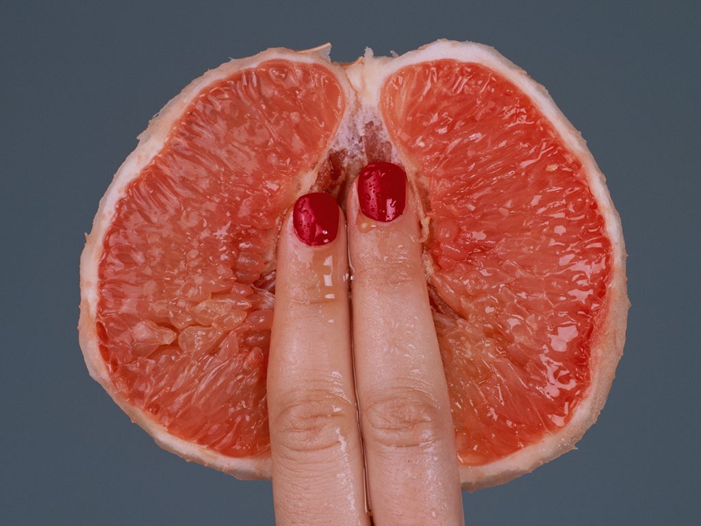
My unique choice in props came from a photographer who I discovered on Instagram. His name is Tyler Shields and his work has captured my attention since the day I followed him. He works with many celebrities and his images range from conservative to provocative. Many of Tyler Shield’s work is shot under studio light or harsh light that brings out the raw colors and textures of his subject. A couple months ago he uploaded an image of a grape fruit, which captured my attention for its unexpected connotation.
Tyler Shield’s Grapefruit
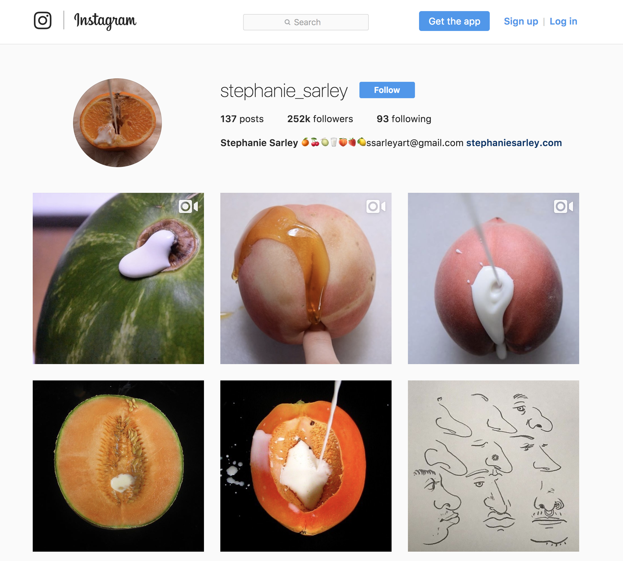
The use of a grapefruit to represent more than the bitter fruit is common in art and symbolism. For example artist, Stephanie Surely also uses fruit to bring about a different connotation to the fruit.
Stephanie Sarley’s Instagram Home Page
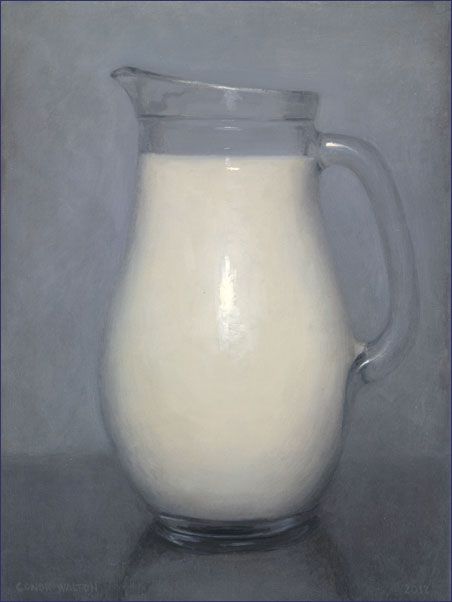
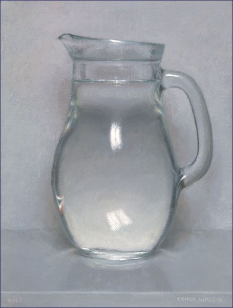
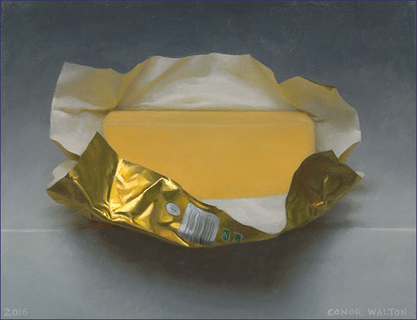
For placement, I wanted there to be a clear sense of unity between the objects within one frame and the series as a whole. I chose to shoot infront of a plain background and though my original intention was to have a completely starch white background, my final background brings presence to the image without taking away from the props. I accidentally got the wrong type of paper (tracing paper) but decided to adapt to it thinking that it might work even better than normal paper. And in the end it payed off, the tracing paper actually gave a little extra to the image and brought out an antique oil painting texture to it. Much like the works of Connor Walton, an Irish oil painter who paints beyond just the technicalities.
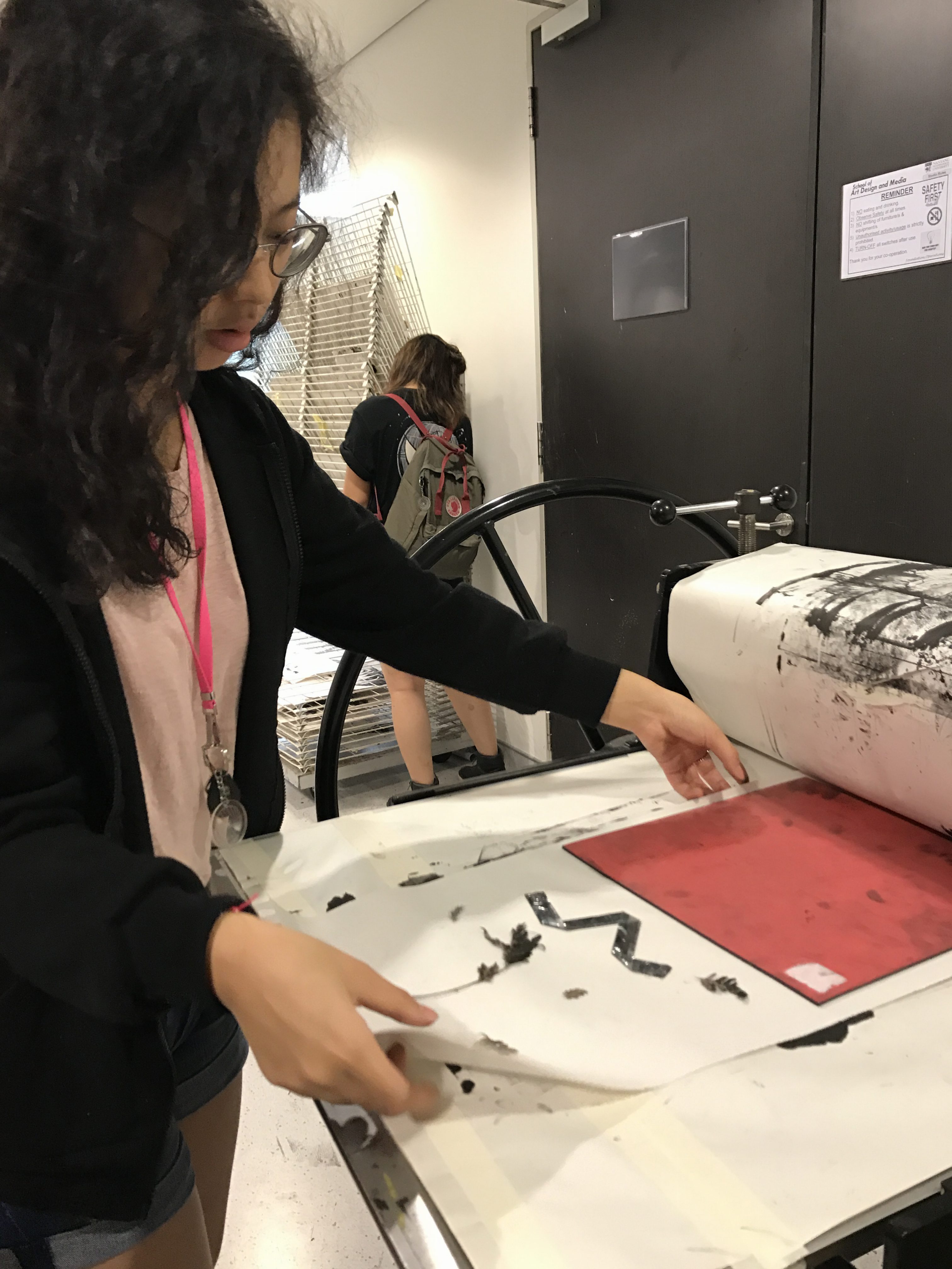
For our first project in Foundation 2D, we were tasked to express six emotions (or any of the sub-emotions within the chosen six emotions) using mark making. We were given the liberty to chose any media or method so as long as we kept it black and white. We cut our emotions into strips and pasted them on A3 mounting board.
Process
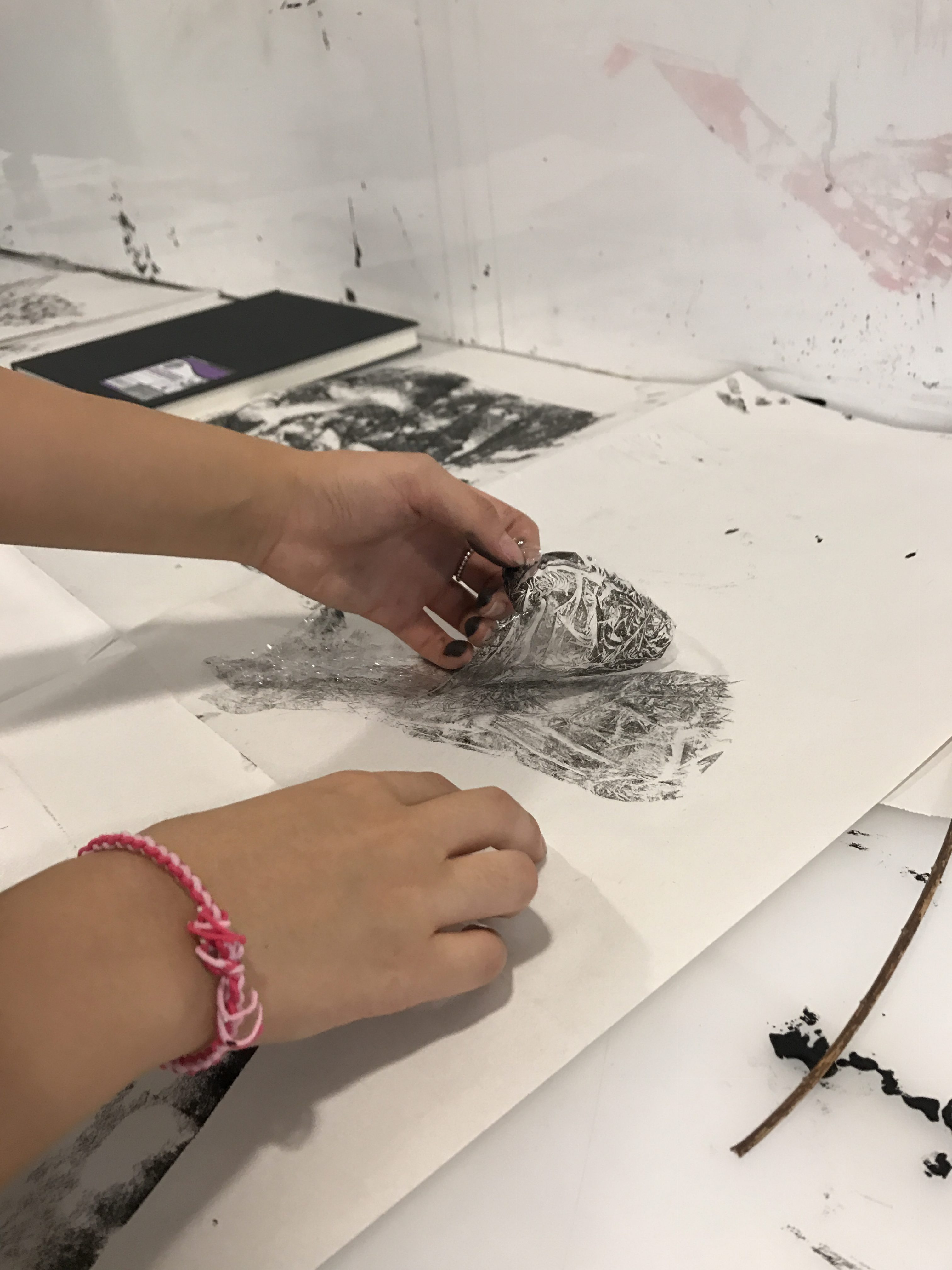
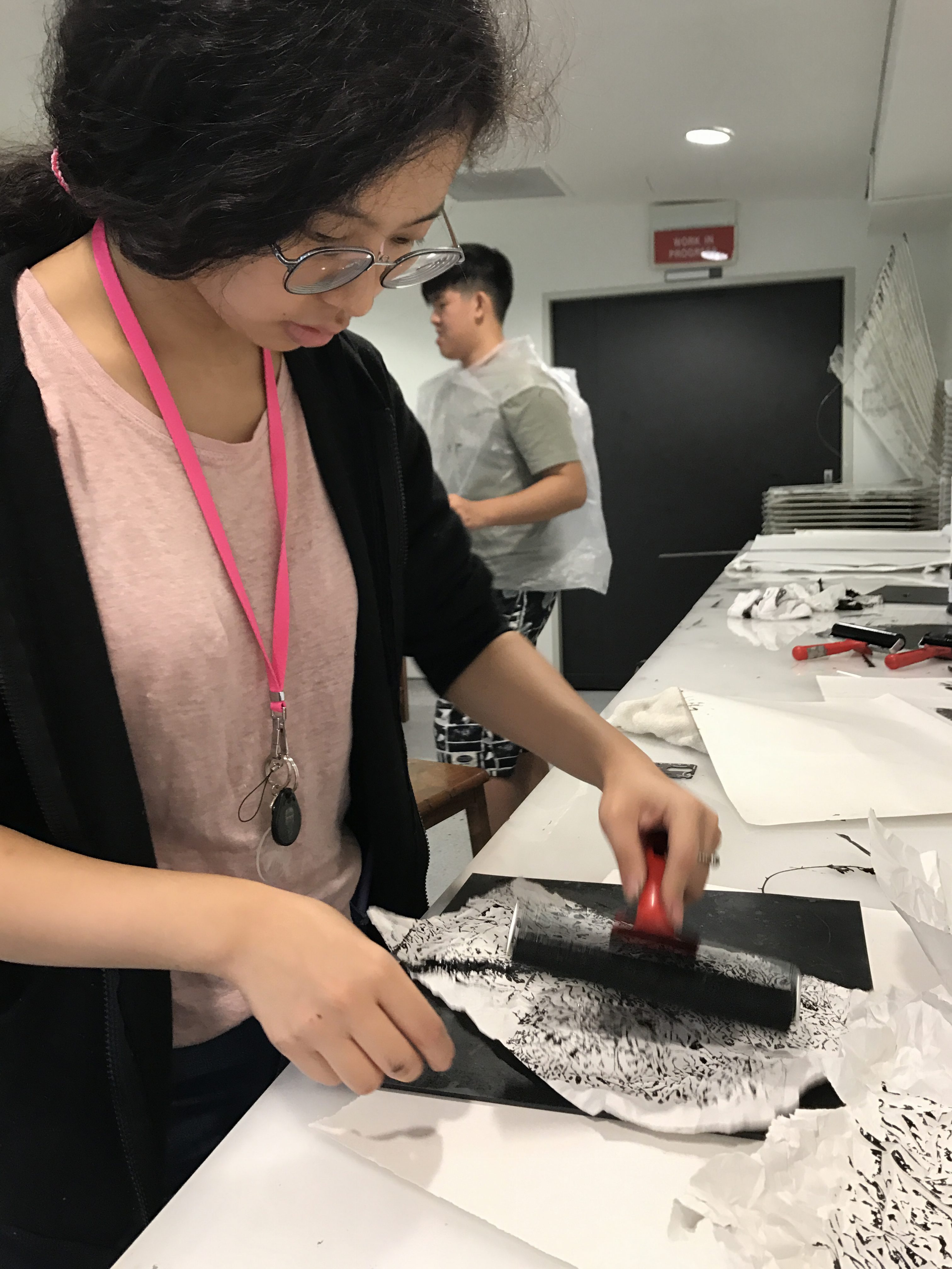
There was a lot of experimentation linked with this project because we were given the leeway to use whatever we pleased. From using different objects (organic and man made) to create our marks to using different media (paint and pen) as a way to make our marks visible, our experimentation lead the way to new ideas. Not only did I want to make the mark an expression of my emotion but also the medium and process I used to be related to why I felt what I felt.
Experimenting with Monoprinting
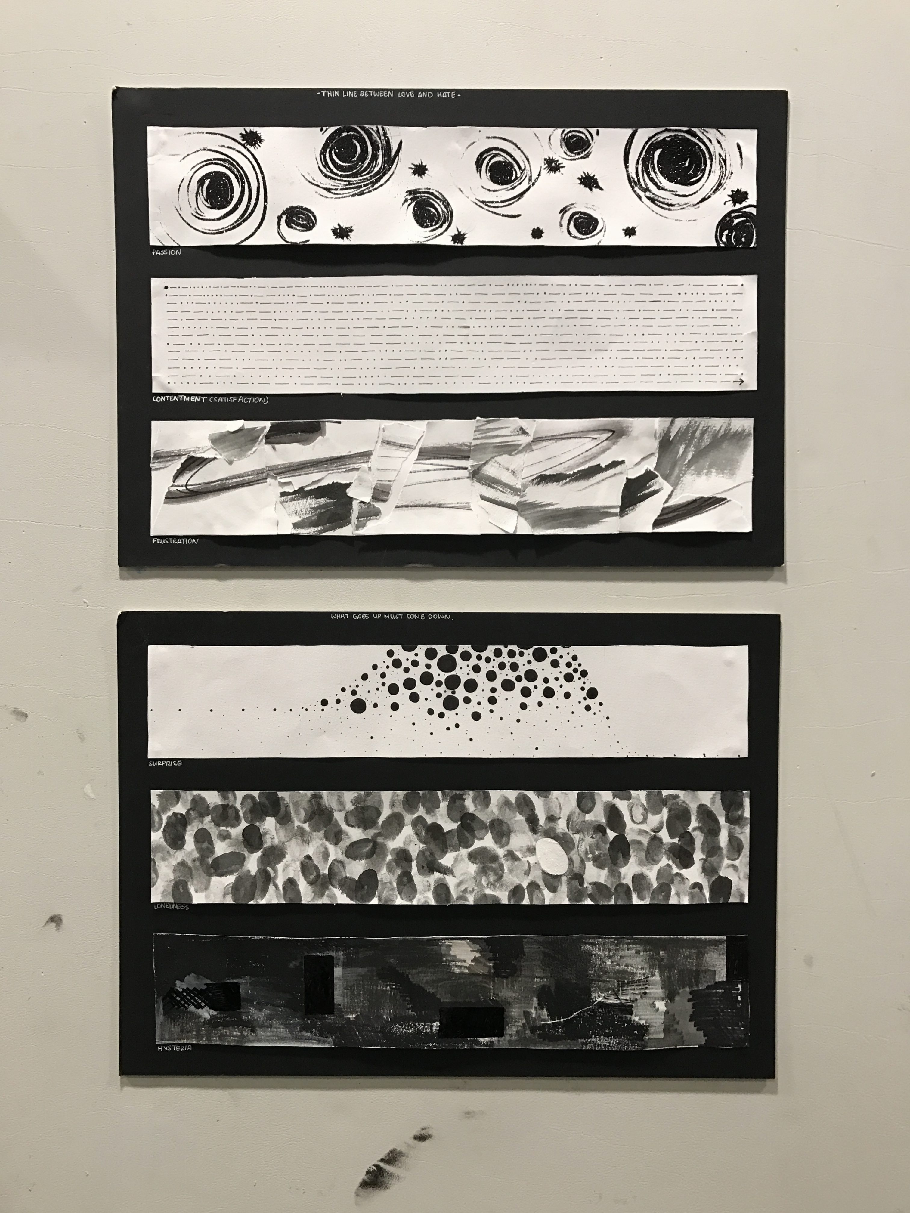
Passion (Let Your Passions Shine)
Glitter Option 1Glitter Option 2
For me, passion (a secondary emotion of love), can be seen in both a sexual or zealous emotion. Regardless, passion is the giddy love for something blooming into an intense love that strengthens you. I chose to demonstrate the first part of passion, the giddy start full of indecisiveness and innocence. Originally my intension was to replicate the fluttering of a heartbeat when you come to realize that the emotion you feel can turn into passion as well as the swirly tingles you feel in your stomach as you start to anticipate what you are passionate about.
Original IdeaOriginal Idea using Water Color
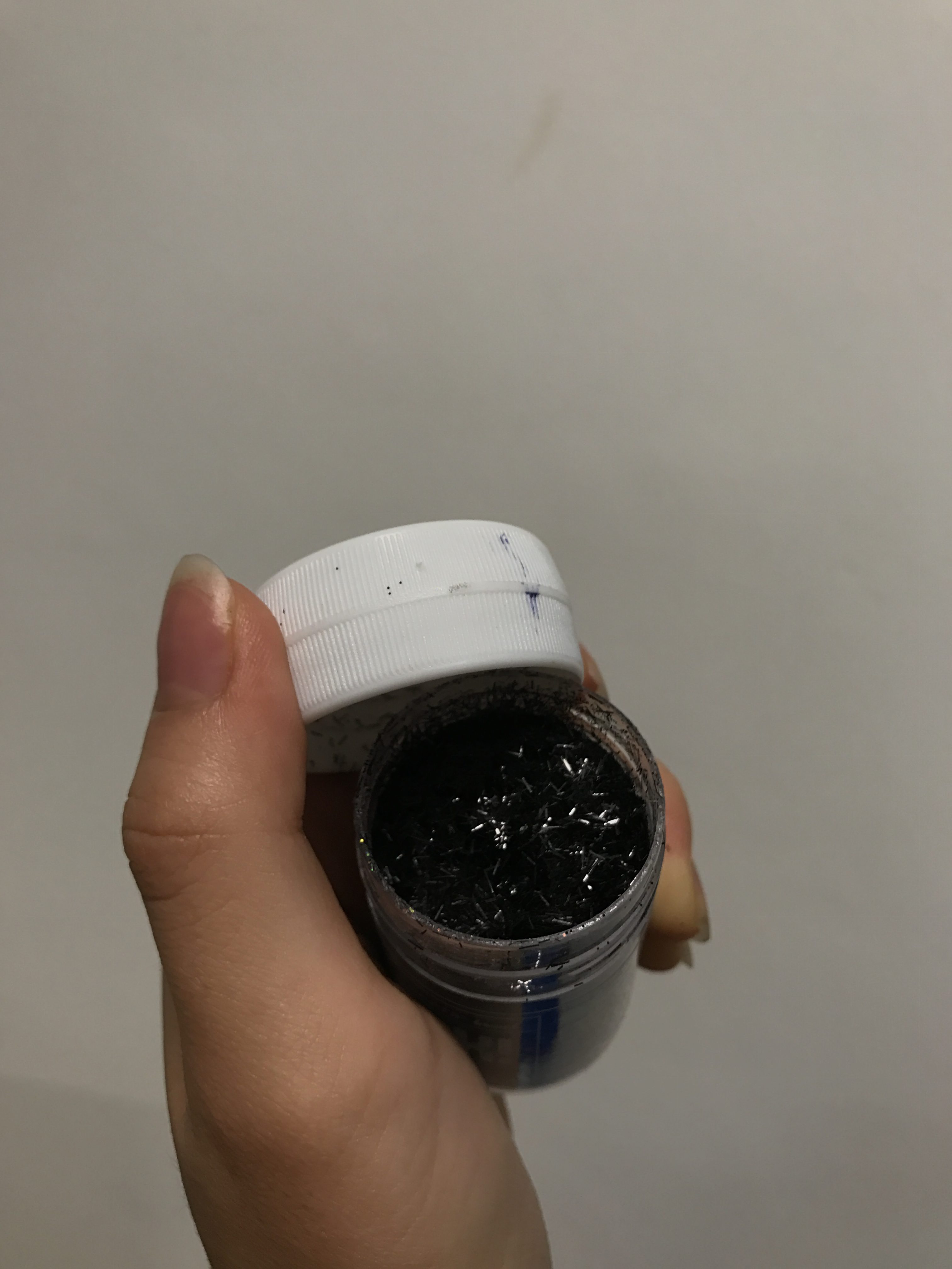
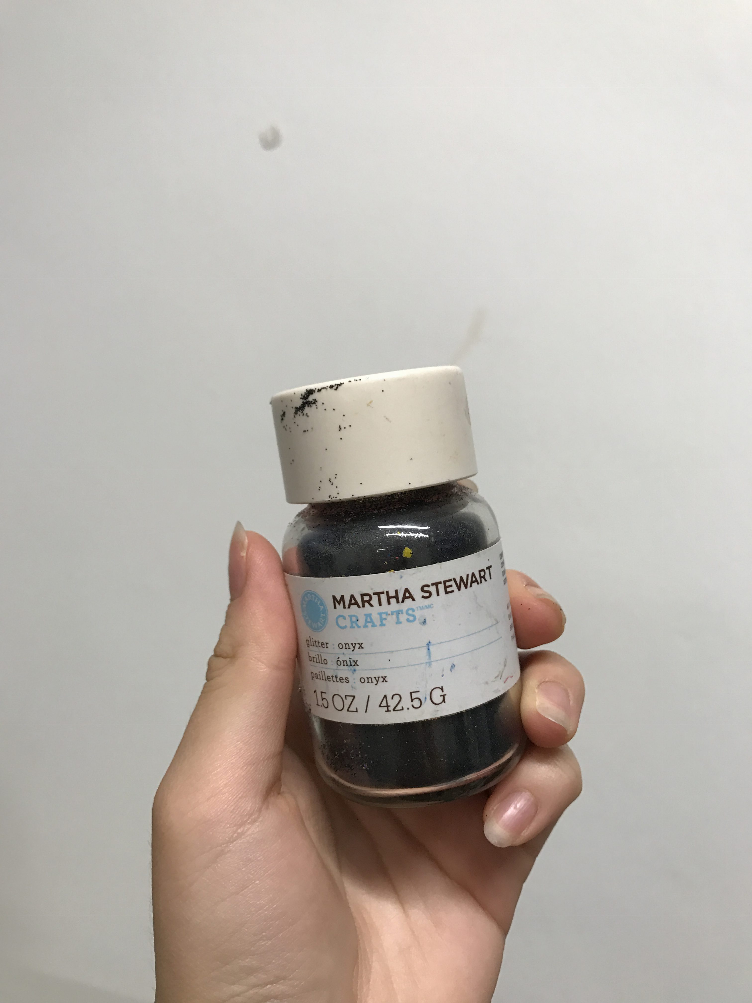
I started to realize that I did not feel my passion translated in my marks. Which is why I chose to switch to glitter; glitter has always been a constant in my life. Glitter is shiny and comes in all different types of colors and styles, it brightens up a dark room and leaves behind a unique texture. And like all the passions we have, we should let them shine and captivate the room.
First Experiment with Glitter
Even though the glitter is black in color, it still manages to shimmer and reflect the light.
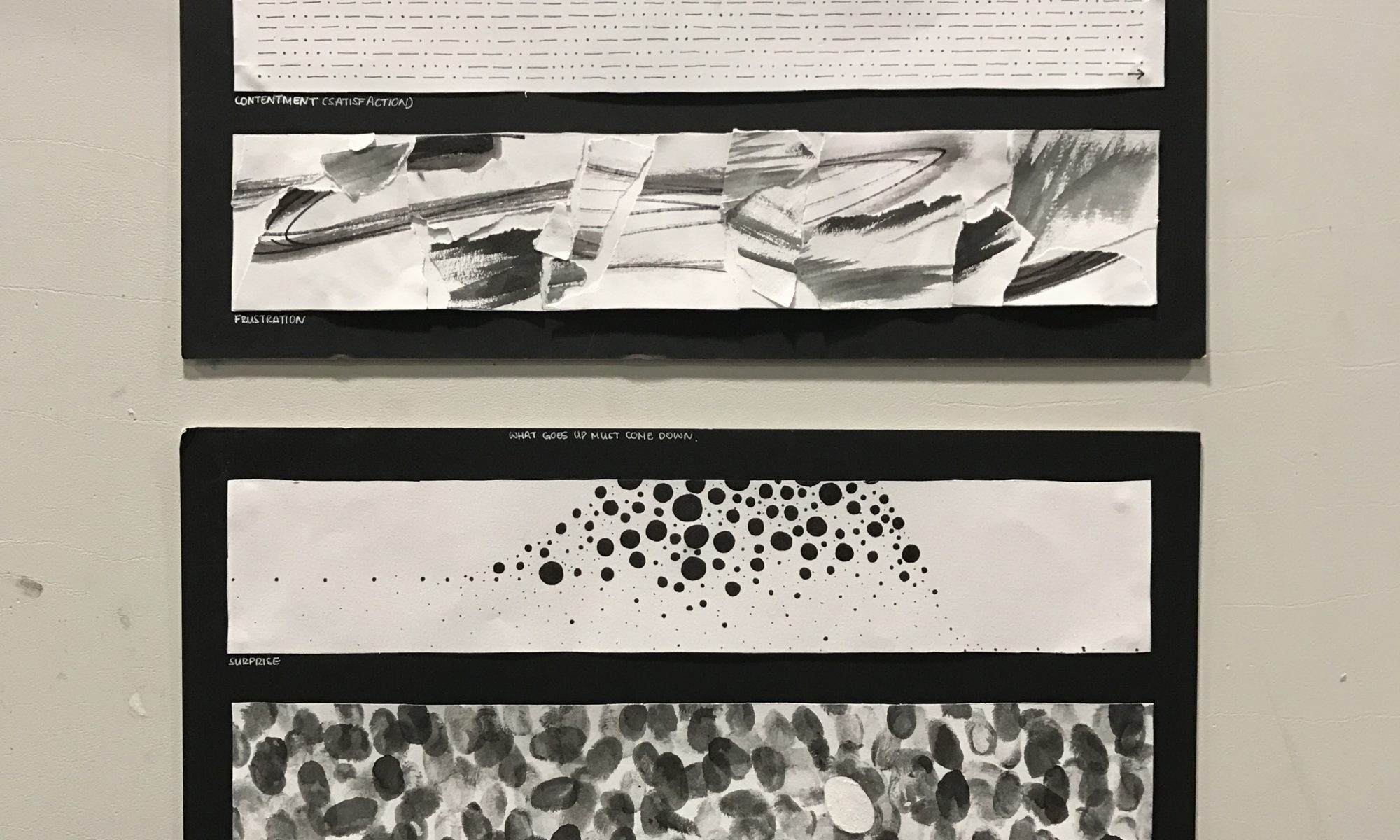
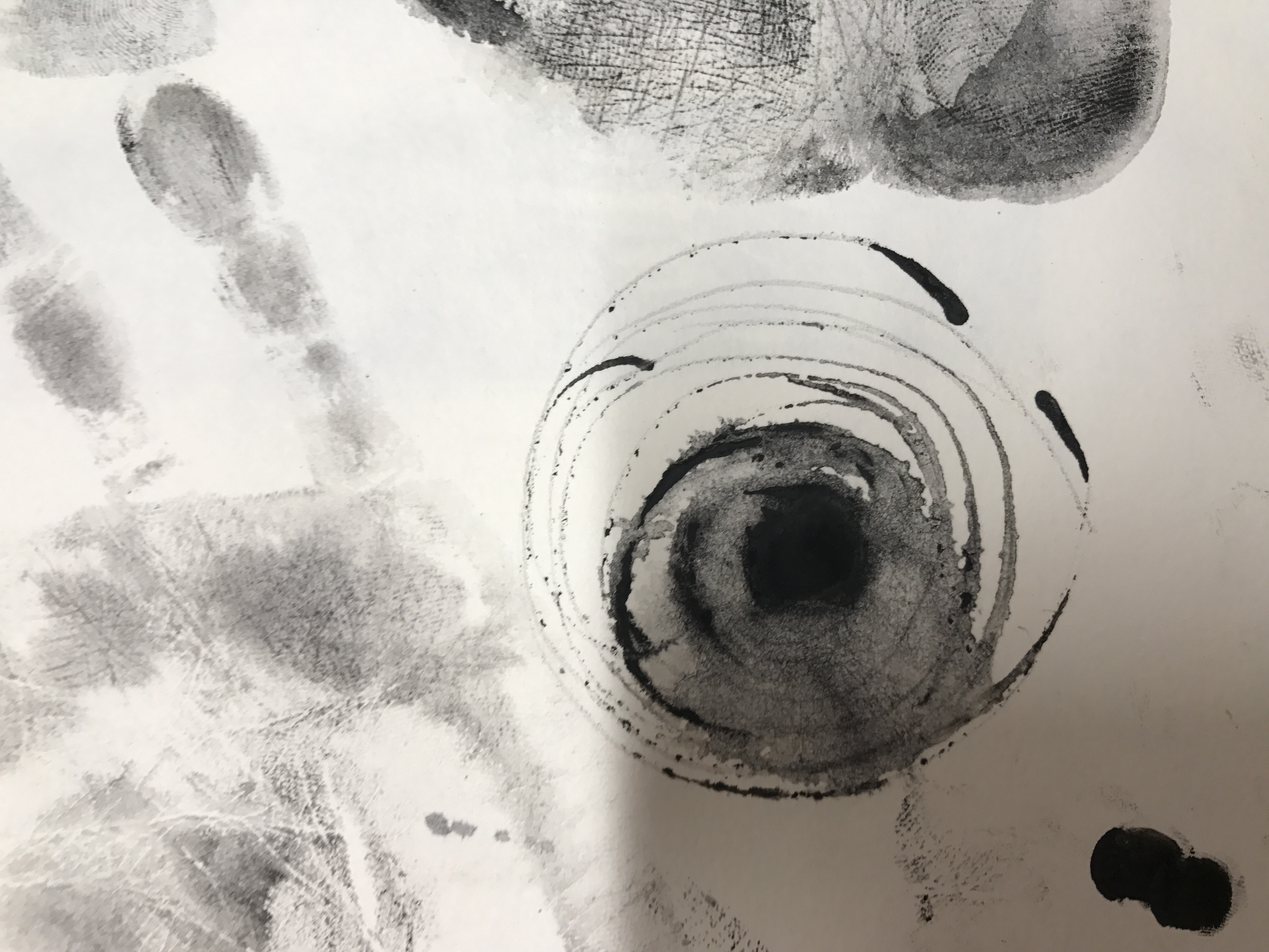
Contentment (When You Read, You Step Into Another World)
Reading has always been something that made me happy and now it has taught me to be content. I used to believe that since reading takes me away from reality, that it made me happy. However, reading shouldn’t make you love one world and hate another, instead it should help you see the world in another way. I use reading as an outlet as well as a tool to survive this world. When I read a childhood book, I not only feel satisfied but also reaffirmed.
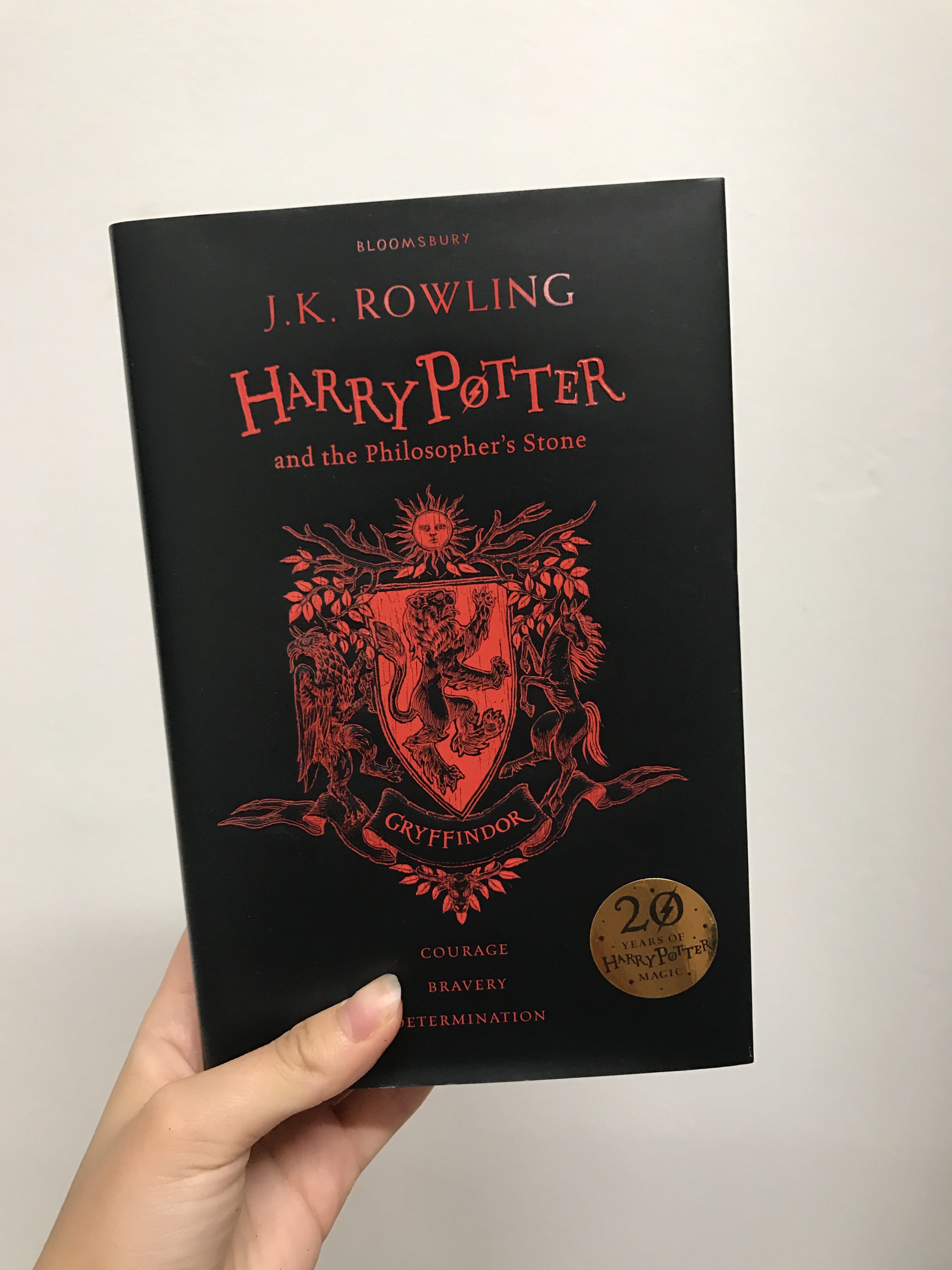
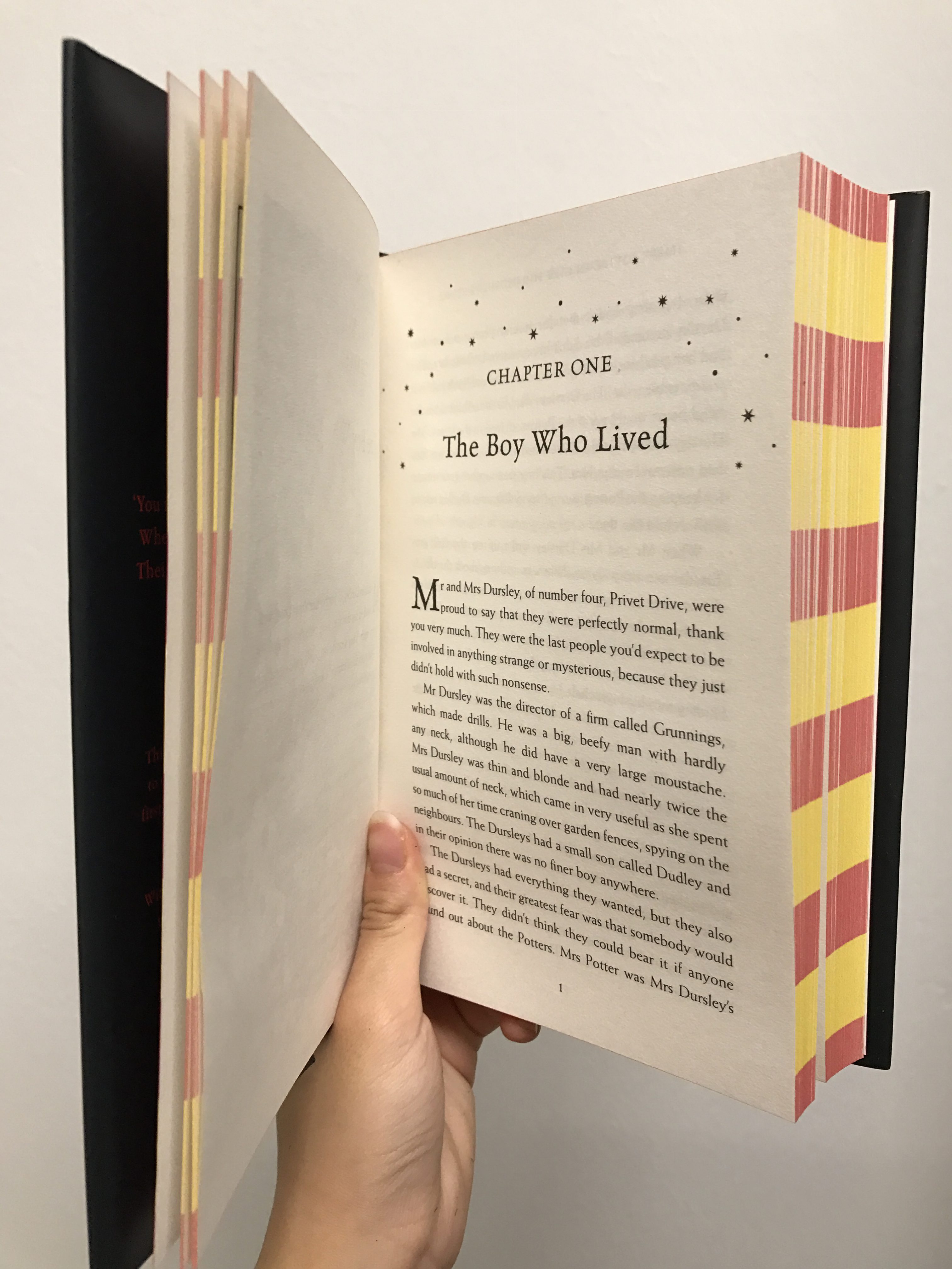
Harry Potter and the Philosopher’s Stone 20th Anniversary Edition
On that note, I analyzed the actions relating to my contentment. I noticed that when I was truly content and at ease, my head would continuously follow the words of the book without stopping. From left to right back to the left only to go right. Using this as a guide I chose to translate the first page of Harry Potter and the Philosopher’s Stone in morse code. I used this lines because thin lines tend to express a softness and calm rather than thick lines that invoke a heavy and dense feeling.
Harry Potter and the Philosopher’s Stone 20th Anniversary
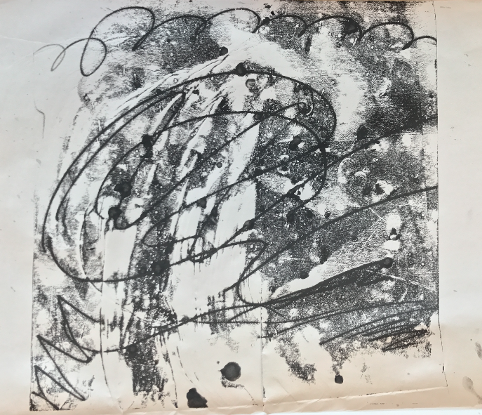
Frustration (Like a Volcano)
For frustration, I chose to express myself more through my actions rather than my marks. While my mark, a quick rough scribble that replicates the fleeting annoyance represents irritation (my original emotion). This was overshadowed by my use of collaging.
Annoyance
The collaging was accidentally created when my initial plan to create an “irritated mark” failed which lead to me accidentally ripping the paper as I was erasing the pencil marks. I tried to use this accident to my advantage as I realized that what is frustration other than being unable to achieve what you have set out to do and being unable to change the mistakes you have made on the way. The irreversible emotion of frustration is shown in the way my lines no longer add up to become one cohesive mark.
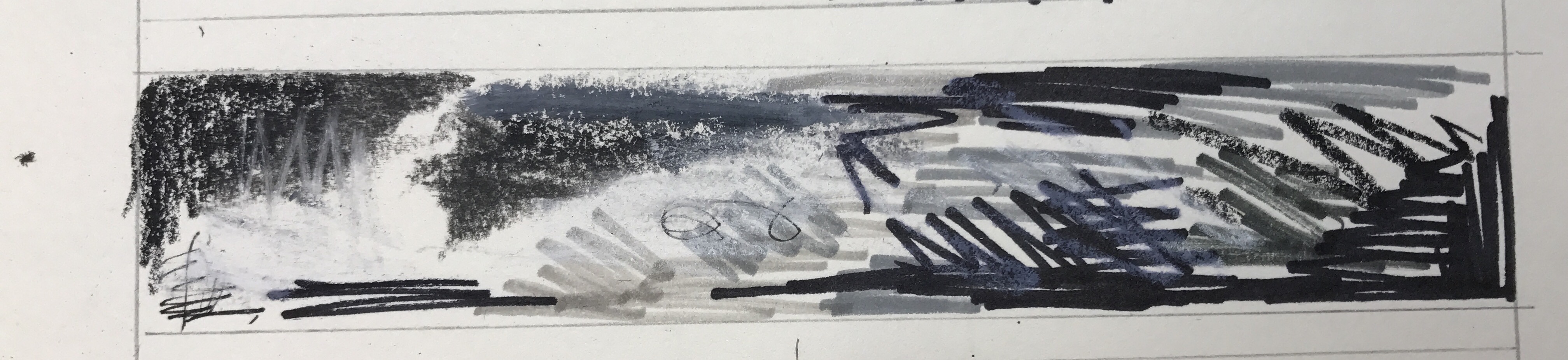
Surprise (The Baseline is Constantly Changing)
After reading an article in my SAT test, that talks about how the standard is constantly changing throughout generations I began to understand the whole “When I was your age” statement. Thinking back to this and using new knowledge I have garnered throughout the year, I have come to a new realization. That surprise is constantly being beat out by new surprises. We will never truly be surprised because we keep setting a level that needs to be overshadowed by our own desire to feel the same (or even better) surprise. I chose to express this by using the the circles (representing the balled up feeling we have before we a surprise happens) that keep floating down from an unidentifiable source. We will never know our peak surprise, nor will be ever see the circles pop.
Experimenting with Different Circle
I also used the Hero Archetype line to resemble the flow of the circles in order to explain the withdrawal symptoms and crash of surprise.
Loneliness (Even in a Crowded Room, Can’t You Help but Feel Lonely?)
Everyone feels lonely or alone at least one time in their life, whether it be physical seclusion or emotional seclusion. I chose to express this emotion through fingerprints.
My Brainstorm for Loneliness and Anxiety
Fingerprints are a unique attribute of a person that differentiates them from everyone else. I asked several people from my hall to lend me their fingers, and after masking the white area (which represents my finger print) with masking fluid, I told them to stamp random parts of the paper. I finished t up by adding my own fingerprints, which represents that though there are people like me, I still feel the sense of detachment from them.
Hysteria
When I think of hysteria, I think of the panic everyone has before a major examination or the night before the final submission for an art project. We want to finish something in time, whether it be memorizing or drawing so that we can have something to show them afterwards. I tried to represent this through my frantic rush to “cover the canvas black”, even leading me to color in the wrong color marker and thread (white).
The lines are rushed and messy, there is no order and everything seems haphazard. Nothing is completely filled in and even the medium used is not constant.
Experimenting with Frantic/Hysteric ActionsExperimenting with Frantic/Hysteric Actions
Final Project
Conclusion
Things I Learned:
That there are different ways to express myself
That it is okay to self reflect and dig deep into yourself (even if it means bringing up feelings that trigger my senses)
That experimentation and documentation is very important (I need to get into the habit of it)
Things I Need to Work On:
Being fearless with my experimentation (don’t be afraid to experiment more)
Confidence with my own work (my work is my own)
Time Management
Expressing my emotions using marks (not just representational and symbolism)
Documenting (I have never done it properly and it has yet to be a part of my routine)
Things I Struggled With:
Trying to express myself
Finding a way for other people to feel what I am feeling
Hoping that others would understand what I am feeling
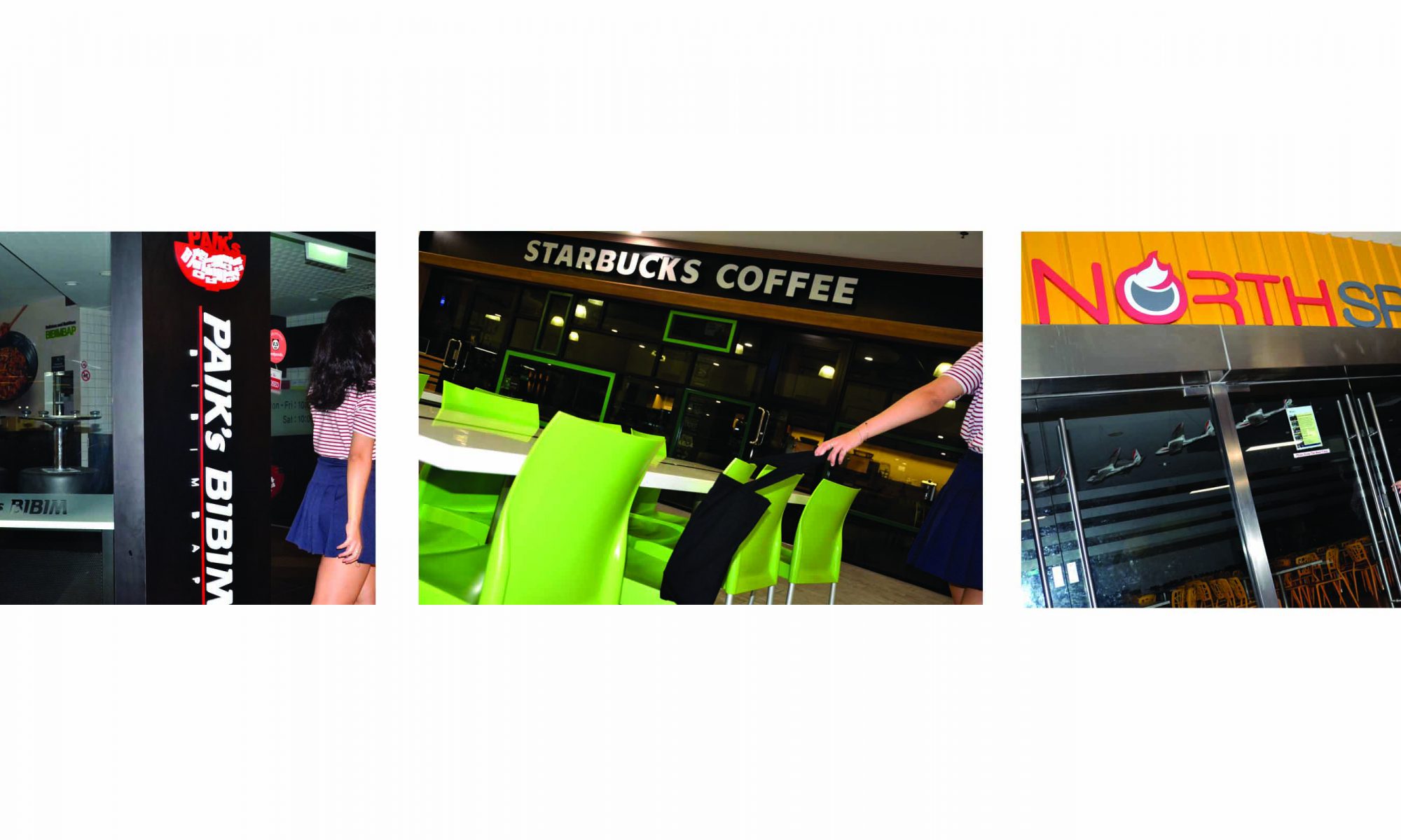
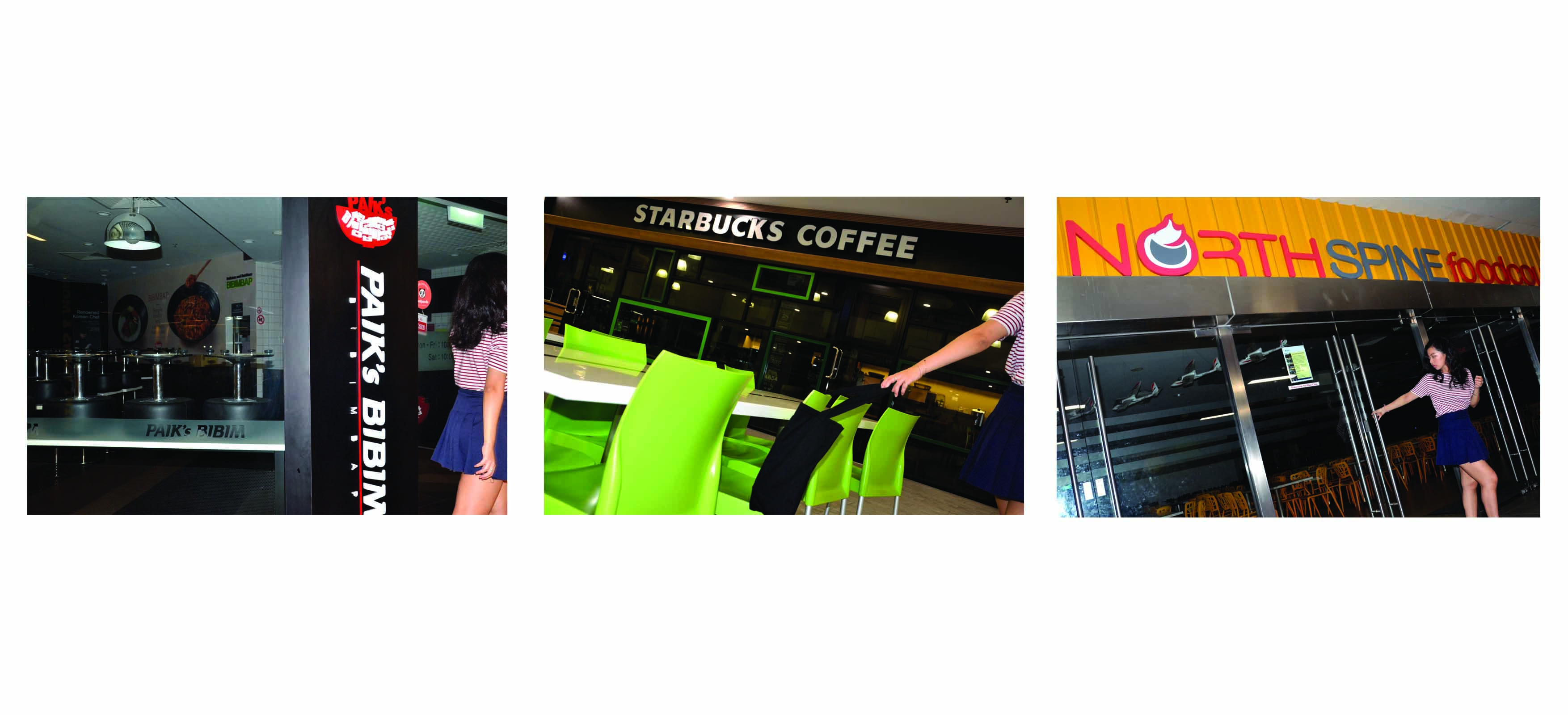
Our first assignment for our Foundation 4D class was to document a series of photographs that describe who we are. We were asked to use different techniques to tell our story, from varying vantage points to framing. There were three tasks; Task One was to depict our reality/personality in three pictures, Task Two was to express ourselves using objects that we hold dearly in three images, and Task Three was to express a place that fascinates us or connects with us in three to five images.
TASK 1
Task 1 Part 1Task 1 Part 2Task 1 Part 3
TASK 2
Task 2 Part 1Task 2 Part 2Task 2 Part 3
TASK 3
Task 3 Part 1Task 3 Part 2Task 3 Part 3
FINAL DOCUMENTATION
Final Documentation of Task 1, Task 2, and Task 3.
SHORT WRITE UP
Through this experience of curating myself, I have learned that there are more ways to expressing yourself then through words. The phrase “a picture speaks a thousand words” is relevant in my case because the pictures that I took captures my interesting life story, my love for a seemingly mundane object, and my fascination with Orchard in three to five images. I have tried my best to capture my feelings in these images but I am aware that I have so much more to learn and experience. This project has taught me that photo isn’t merely just dull documentation but intricate capturing.
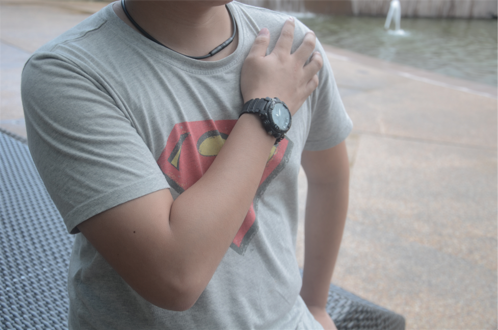
During our second Foundation 4D class of the year, we were asked to partner up and take pictures of one another. The partner was to stay still as I went around taking various pictures from various distances and angles. In the end, we chose three photos that we believed best depicted our partner.
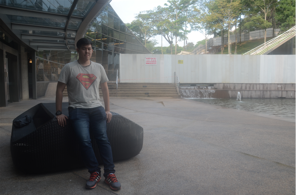
Long Shot Eye Level Picture of Shaun
This shot of Shaun depicts him in his new environment, ADM in NTU. The lines of the building lead our eyes to Shaun and to the rest of the scenery. This gives us enough information about Shaun both physically and location.
Wide Shot Low Angle shot of Shaun
This wide shot of Shaun shows him wearing his Superman shirt as well his watch. Our focus goes to his action of crossing his arm against his chest, reminiscent of the Pledge of Allegiance. The Pledge of Allegiance is the American expression that serves as a symbol of freedom, similarly Superman fights for America. This also displays his interest in cosplay and the comic book world.
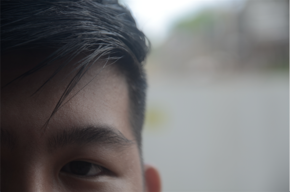
Extreme Close up Eye Level shot of Shaun
Shaun’s eye, eye brow, and expertly styled hair can be clearly seen with this close-up shot of his facial feature. Giving you a closer look at the figure shown in the first image.
Thank you Shaun for letting me take pictures of you!