Final Project – Submission

So this is my final draft and the one I submit.

img_1095

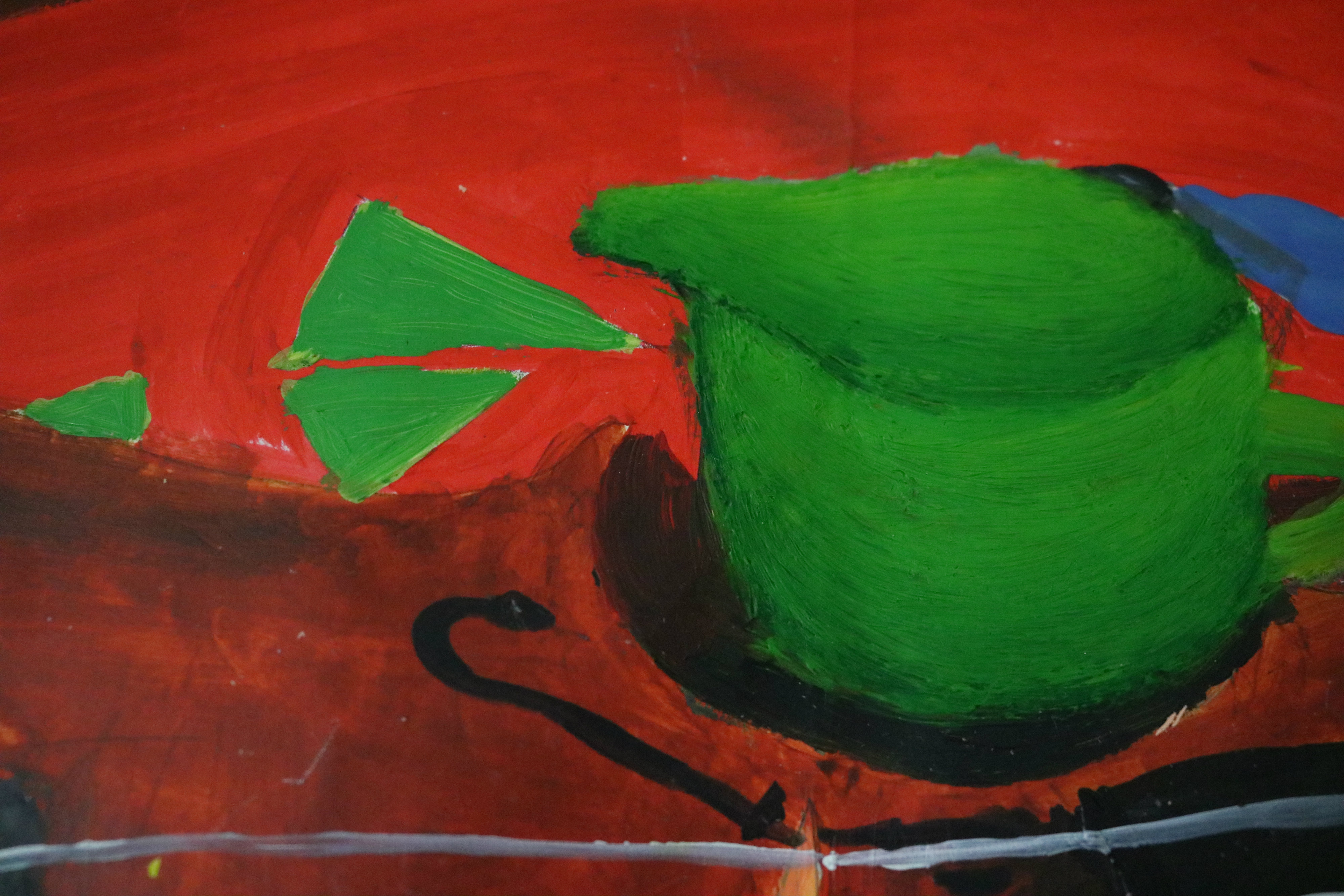
For this piece, I used warm colours for the front part (cream, brown, red, pink) and for the background I used cooler colours such as green and light blue to emphasise on the contrast.

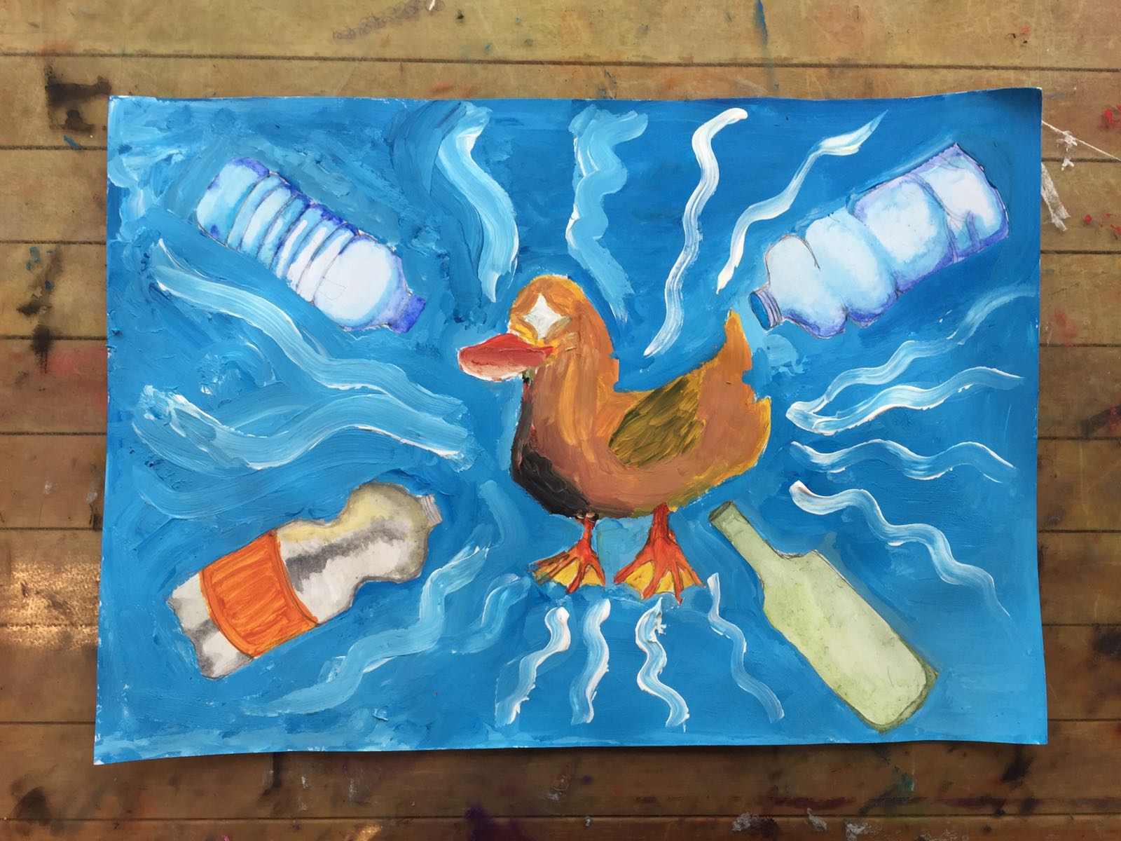
Composition rules that I used are ‘line of sight’ and the ‘rule of thirds’. The first thing you would notice when looking at this piece would be the puppy, as it is located at one-third portion of the canvas. As the puppy is looking down at the bento, it guides your eyes to move to the bento  and the chopstick and the pickle.  After that, the eyes on onigiri leads you to the lemon tea box on the left. Straw leads your eyes out of the canvas.

Principle of design I use is movement. I made use of perspective lines on juice box and bento box as well as chopstick to point towards the puppy so that viewer’s eyes keep looking back to the puppy.

The challenges that I faced while making this piece would be to make sure the colour consistency. It is difficult to maintain because once you do not mix enough paint on palette, it is difficult to create the same colour. Sometimes, I did not mix the colour well that can cause some part become slightly lighter or darker than the rest.

Another challenge that I faced is because the paint was not as smooth as you expect it to be.  Sometimes the texture on the paper becomes very rough, making it difficult to outline the item using a marker. Sometime, I also had to go out of line when outlining some part of the painting, especially the window and chopstick.

Overall, I find this module a very interesting experience and I would like to thank Joan and Keith for helping me in developing and exploring ideas to make this piece possible. Definitely looking forward for the next art class.

Final Project – Concept Development

Continuing from what I had researched before hand, I did some drafts and sketches so that I would know which concept and details that are the best for this final project.

This is my first idea and I think this is good because I also applied some composition theory such as ‘line of sight’ and the ‘rule of thirds’ which I will discuss more in my next post when the painting is done.

img_1086

I was not really sure about my skill in drawing anime. I got some experience in drawing manga before, but that was only for myself and I did that for fun. I never really know the right method, which pushed me to sketch and make more draft this time so that I know what am I doing. I like to tryout in small thumbnails instead of redoing this piece a few times, so that’s what I did.

img_1089

This is my sketch and tryout for the dog. This was painted in watercolours. At first, I tried to paint the pug on the left first, which I think does not look that good, that’s why I considered another type of dog. The results is not that bad, but since I would like to draw it in anime style, I’ll just stick to the pug.

img_1090

Drawing bento is no easy task. I need to think what does Joan like to eat in a bento box. How do I arrange and organise the items in the box. It’s like the art of plating that you usually see in Masterchef on TV. I would also like to thank Joan in suggesting me stuff so that I can picture the apt bento that can represent what she likes.

img_1092

This is my attempt in doing the food colouring, which was done in watercolour. It was really not that easy, and luckily I proceed to use acrylic paint which makes things easier.


Final Project – Research

For this final project we are partnering with one friend, and we are supposed to create an artwork based on our partner.

My partner is Joan Kuah, and I did not know her very well at first. Maybe this is a good thing for this final project as I get to know a lot about her, other than her outside personality and she the fact that she likes Japanese culture. Which in the end make me decide that I would like this project to portray my impressions about her and also about her liking.

First of all, let’s talk about what she likes. She likes watching anime, reading manga, and eating Japanese food. Her favourite Japanese dishes are sushi and cute bentos. Her favourite colour is pink, white and black. She also likes animals, particularly dogs and puppies. The reason why she is so into Japanese culture is because of its vibrancy and futuristic modern culture.

My impression about her is that she is very kind and always cheerful. There is this positive aura when you are around her, which makes her a very likeable and friendly person. She also talks a lot about her boyfriend, she borrows stuff from her boyfriend, even her grandma also cooks for her boyfriend. This fact makes me she her as a very loyal and honest person, which actually can be symbolised in a puppy.

This gives me and idea to draw a puppy looking at a cute bento box to represent both my impression of her and also what she likes. In order to build the concept stronger, I did some research on how to draw and paint realistic looking (using watercolour) of food and dogs. I did research using Pinterest, some ideas that I took from Pinterest are:

9f77f0c151d84735268e2368183f245a
Lobster Roll sushi painting by Mike Geno


211eb4b729a75cd9160c254dbc1fec55
Original Sushi Painting – “Response Denomination” by HeartVisionsStudio on Etsy


At first I would like to draw using watercolour, however after consulting with Keith, I decided to draw it anime style, with flat colours and outline the design with drawing pen to make it look anime alike. This is because anime style is more relevant to the whole Japanese idea. I decided to use acrylic paint to ensure the flatness of the colours. Which makes me look for anime related art such as:

2449e1dcf0409bfefe1f7d240de5566f
Bento – Illustration from: creampotatosoup.tumblr.com


b78335a554263f634c5837188b6dba5c
Bento drawing from: rocketorca.tumblr.com


be6cadff42252aaa1f48a0822188fa5b
Bento ~ hamsin illustration


About the dog, I decided to draw pug, as it is cute and I find it challenging to draw pug because of its folded skin and big eyes. Other than that, Joan is a chinese and pug is actually originated from China, that’s why this dog can be used to represent her. Some pug that become my inspiration:

667293-screenshot1593

1040000_1

cute-pug-dog-looking-for-food


As Joan has a very cheerful personality, I decided to use more bright colours and soft pastel colours to illustrate her personality.

More pins about my research can be found at: pinterest.com/dheamariesta/final-project/

Check out my this project development process on my next post!

Lino Cut – Assignment 6

Linocut is a print making technique, usually by carving wood but this time I used rubber to carve out the pattern. I find this experience just like making stamp.

photo1053234687057700782

The challenge in this assignment is to draw the print on the rubber the opposite way you want them to be printed. So for example, if you want a tree to be printed on the right of the paper, you should draw the tree at the left of the rubber before carving it. Another thing about this print making is that if you accidentally carve a part that you did not mean to carve out, you cannot undo the process, so you have to be careful and patient.

The first print that I am making is the ship in the sea. I took this idea from Pinterest. I did not add much detail as I wanted to check and try out the printing first.

img_1084

And then I carved more details such for the sky

img_1085

I tried another print pattern with a design that I drew myself. This is about a guy who is lost and does not know what he is doing in life, what’s his goal and a little bit depressed.

img_1083

Crayon Scratch – Night Painting – Assignment 5

Night painting is a new experience for me. We need to capture the moment at the right time, around 6-7 p.m. before the sun totally goes down and the sky gets dark. Which is why it is really challenging to sketch directly during night painting due to the time limit. I took picture of a few scenes beforehand, from different point of view as well and finally decided to paint this scene below:

photo1053234687057700781

I choose this scene because the gradient of the sky colour is so distinct and beautiful, making me curious on how I can apply this on paper using oil pastels and temporary black paint.

This is the final result:

img_1080_edited

The challenge that I faced while doing this assignment, is to mix the oil pastels colours to create a nice and smooth gradient for the sky, moving from the pinkish part to the blueish part. Multiple layers of oil pastels were applied, some colours used were: light pink, light lavender, peach, white, and light blue. As I coloured towards the darker part of the sky, I used darker shades of blue but still mixed it with light blue and light lavender.

For the grass part, I used shades of green, from dark green to light green. And when the black paint is applied, I scratched the dark green part less than the light green part, in order to create the impression that the grass is denser in the lighter green part.

Black paint was mixed with hand soap before applied onto the paper. I think the purpose of mixing the paint with soap first was to make the paint to get dry longer, so that there is enough time to scratch out the unnecessary part of black paint.

This leads to another challenge when scratching the black paint. Paint cannot be scratch when the paint is too wet as it will smudge. However, scratching the paint when it has already dry, is also another problem as it is more difficult to scratch. But, I think if there is not enough time to scratch everything in one go, I would just let the paint dry and I will apply more paint on top of it so that I can scratch again.

Below are some close-up photos:

img_1081

img_1082

Alternative Movie Posters

Hi, this is my first attempt in creating alternative movie posters. I know that I enjoy watching movies so much and it is quite fun to take a little detail from the movie and out it in the poster.

whiplash-alternative-poster-rezised

I can relate to this movie ‘Whiplash’ as it told the story on how challenging a musician’s life can be, particularly musicians in a symphonic band or any kind of band, really. I can look back when I was struggling as a rookie in my secondary school’s Symphonic Band and again, in university. I know I’m not good enough in using Adobe Photoshop as my editing for this Alternative Poster is not that smooth, but I hope I can improve over time.

Colour Mixing: Assignment 4

In this lesson, we learnt on how to mix and combine colours to create another colour or another shades. Basically, the theory is this:

There are 3 basic colours: red, blue and yellow. They are also called primary colours as seen in the triangle in the middle of the colour wheel below.

8557392707ea546e75f0914e8d6801f3

When you mix a primary with another primary, you will get secondary colours. Red + yellow = orange, yellow + blue = green, blue + red = purple. Secondary colours are complementary to primary colours opposite of it in the colour chart. So green is complementary to red, orange to blue, and purple to yellow. When you mix complementary colours, it will create a weird colour. However, if you use them side by side, it will help to distinguish one object to the other. Just like Christmas when they use red and green or NUS for making its logo orange and blue in colour.

Other than primary and secondary colours, we also have tertiary colours in which primary colours are mixed at different percentage. For example, more yellow mixed with a dot of blue, will results in yellowish-green, a lighter shade of green.

Colours are also categorised in two shades: warm and cool. Colours that give out reddish/yellowish shades are warm colours while colours that give out blueish/purplish shades are cool colours.

For the lesson, we practice mixing colours by painting still life. Here’s the photo of the object that we paint.

20160913_145743


The result:

img_1050


Some details:

img_1051

img_1052

img_1053

B/W Composition Assignment 3

In this lesson, we were taught the concept of compositions which are often used in painting and art pieces in order to guide the viewer’s eyes towards the direction we would want them to see. Compositions complement design principles that we had learnt the previous week, making the art piece more attractive.

Some of the techniques used in composition are:

    • The rule of thirds: 

      According to Wikipedia, The rule of thirds is a composition guide that states that arranging the important features of an image on or near the horizontal and vertical lines that would divide the image into thirds horizontally and vertically is visually pleasing. The objective is to stop the subject(s) and areas of interest (such as the horizon) from bisecting the image, by placing them near one of the lines that would divide the image into three equal columns and rows, ideally near the intersection of those lines. It basically a summary of the Golden Ratio (point no. 2)

    • The golden ratio
    • Line of sight

      The line of sight method uses subjects on painting to look at the objects we intend the viewers to see. As a result, we guide the viewers’ eyes using the objects that subjects on canvas look at.

    • Framing
  • Rule of odds

    By adding an extra element or subject in the painting with even numbered subject, the viewer’s eyes will be in discomfort because the odd numbered subjects create imbalance in the painting, our eyes move around the canvas among the subjects. This makes the painting distinctive rather than just the boring ones with even numbered subjects.

  • Simplification

    We can make viewers to focus on the primary subject by using this method. Simplification removes the unnecessary details that can make a clutter in an artpiece. It focuses on the primary subject and by using simple shapes, creates a balance.

Then we proceeded to watch black and white movies to sketch a few scenes with different compositions. Some scenes were close-ups, some were landscapes and shot from far away. After sketching, we colour them in three shades (black, gray and white).

For homeworks, we are supposed to do paper cut-outs from different movie scenes.

capture2

rsz_img_1042

The Artist (2011)

147351661933128

img_1043

The Grand Budapest Hotel (2014)

rs-18853-20140521-pulpfiction-x1800-1400688719

img_1044

Pulp Fiction (1994)

tumblr_static_dactkf54k944oo04o8o44oggw

img_1045

Little Mermaid (1989)

hd-godfather-win-10-wallpaper

img_1046

The Godfather (1972)

This last piece is particularly my favourite because I tried a different method in cutting the papers. For this piece, I did not use scissors at all. I just used the penknife given to us for the lesson.

First of all, I sketched the picture on black paper, and I labelled the part that are supposed to be coloured in gray and white.

Secondly, I traced the part the gray part using the penknife and therefore I cut holes for the gray part. Furthermore, I paste the black paper on top of gray paper.

Adding to the sketch, I make some shapes that are supposed to be white colour on the gray paper. And afterwards, I cut holes for the white part of the composition, and paste white paper at the bottom to finish off.

I really like this method of cut-outs as you do not have to estimate the shapes for shades in the picture which can result in the cut-outs not being balanced. In the zoom in version of my last piece, you can see the three layers in how I make this piece; black on top, then followed by gray and the last one is white.

img_1047 img_1048

Assignment 2 – Principle of Designs in Painting

In our second session, we learnt about the Principle of Designs. There are a few concepts that artists usually use in painting, however we focused on 4 principles: Balance, Emphasis, Movement and Rhythm. 

This is a group project, and within a group of 4 people, we paint based on topics that we get and make A3 size thumbnails of painting to form a storyline with each thumbnail representing one principle. Our group got the topic of duck and plastic bottle.

First of all, we create a draft of how the storyline in thumbnails and we call it Plastic Bottle and Duck Adventure:

WhatsApp Image 2016-08-30 at 17.06.29

The Balance Principle is the distribution of the visual weight of objects, colours, texture, and space. Elements on canvas should be balanced to make a design feel stable. In our case, we decided to make the design feel stable using soft-edged triangular shapes to make the sand dunes of the beach and the waves. Soft pastel colours were also used and blue colour was used for both the sky and the ocean to create a sense of balance in the painting. As such, we decided to paint the first scenario as such:

WhatsApp Image 2016-08-30 at 17.06.23

It’s a peaceful day by the beach

Emphasis is the part of the design that catches the viewer’s attention. Usually the artist will make one area stand out by contrasting it with other areas. Our group decided to make the main object (bottle) stand out among bags of trash my painting the bottle bigger than the rest and colour in differently, so that audience’s eyes will be attracted to the bottle first then the rest of the canvas.

WhatsApp Image 2016-08-30 at 17.06.24

But wait, take a closer look, there are lots of trash on the beach!

Movement is the path the viewer’s eye takes through the work of art, often to focal areas. Such movement can be directed along lines, edges, shape and color within the work of art. Our group decided to lead viewer’s eye towards the duck in the middle by using wave lines and the bottle pointing towards the duck itself. As a result, viewer’s eyes will always be led by these lines and end up looking at the duck in the middle.

WhatsApp Image 2016-08-30 at 17.06.26

There is a duck swimming in the sea. Duck is attracted by plastic bottles

Rhythm is created when one or more elements of design are used repeatedly to create a feeling of organized movement. Rhythm creates a mood like music or dancing. For this fourth design principle that we used, we create rhythm by using shapes such as triangles, squares and circles in  different sizes and colours. Tears were drawn in different sizes of the same shape to create the rhythmic feeling.

WhatsApp Image 2016-08-30 at 17.06.27

Oh no! The poor duck swallowed a bottle and ended up struggling and crying

Dots, Lines and Shapes – Assignment 1 (DA2002)

In the first lesson, I have learnt the different elements for designs: dots, lines and shapes. Combination of these three creates an artwork or an art piece. The way we organise these elements will showcase emotions and feelings when an audience look at our art piece. For example, confusion can be represented by swirl lines.

Our first exercise was to draw contrast between different adjectives and emotions.

IMG_0959

1st exercise: expressing different emotions using dots (Heavy vs Light, Fast vs Slow, Soft vs Hard, Angry vs Happy)

For second exercise, we listen to “Stranger Things” opening credit and we interpret the music using dots, lines and shapes.

IMG_0960

Interpreting music using dots, lines and shapes

Our first assignment was to interpret the feelings portrayed by an urban and nature photograph. Here’s the pictures that I have chosen to interpret in my assignment:

nature-and-environment-course Balinese field – Terasering (Nature)

Rocinha_Favela_Brazil_Slums

Brazilian city (Urban)

First of all, I made the brainstorming in thumbnails:

IMG_0957

And then I proceeded in drawing the first draft for interpretation of the Urban photo:

IMG_0955

Below is the first draft for interpretation of the Nature photo:

IMG_0954


Dessert for your palette