Project 5: Colour lino-cut print

Final Piece

5_1

Techniques used:

  • Analogus: I used different hues to make the books look 3-dimensional. 
  • Lino printing

Fell short of expectations

Message to convey: 

There are many incidents on teens’ suicide in Singapore. Even with the MOE trying to reduce the emphasis on academics and more on co-curriculum (change of PSLE format), the situation remains stagnant. Instead, while suicide rate in Singapore fell, teens’ suicide rate in Singapore reached a hike.

Learning should be a fun and interesting activity but when the focus is not on learning but more on the grades, unnecessary stress and high expectations are created. Occasionally, some of the young minds could not withstand the pressure put upon them by their parents, their peers and the society, leading to depression and worse, suicide.

Often, we only see the surface of the story and not what is going on inside these teenagers. Only when tragic happens then we realized we are focusing on the wrong things. If only we have care for them more, understand their agony, share their pain instead of putting them down over and over again. The fault lies with us, not them.

Research:

There has been increasing teens’ suicide incidents in Singapore over the years. It is reported that for those who were below the age of 30, more than 25% reported feeling troubled over their studies, as well as their relationships at school.

SOS said that more than two young people aged 10 to 19 committed suicide in every month last year which come to a total of 27 cases, which was twice as many as the year before and the highest in 15 years.

In 2015, a girl threw herself off a building after receiving two Bs in here O Levels.

In 2016, a boy plunged to his death because of two failed subjects.


Process

Planning

p5_1
Draft 1

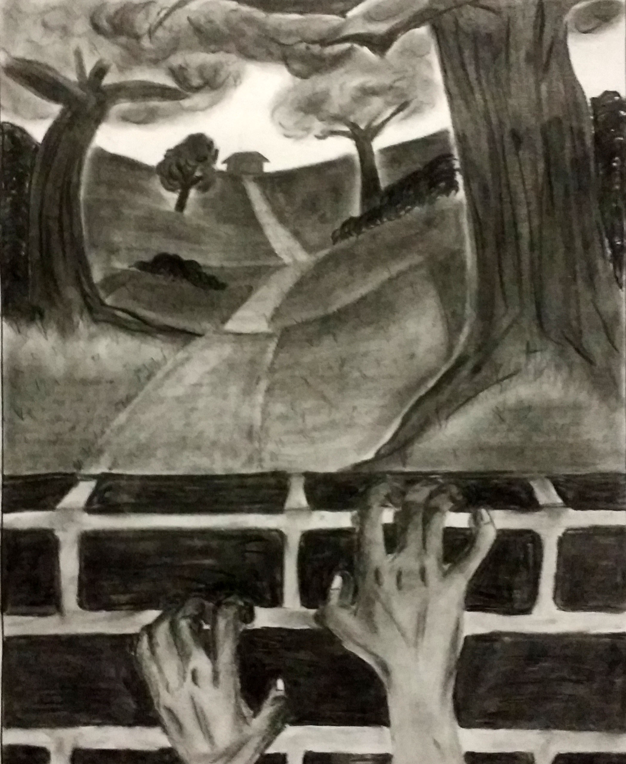
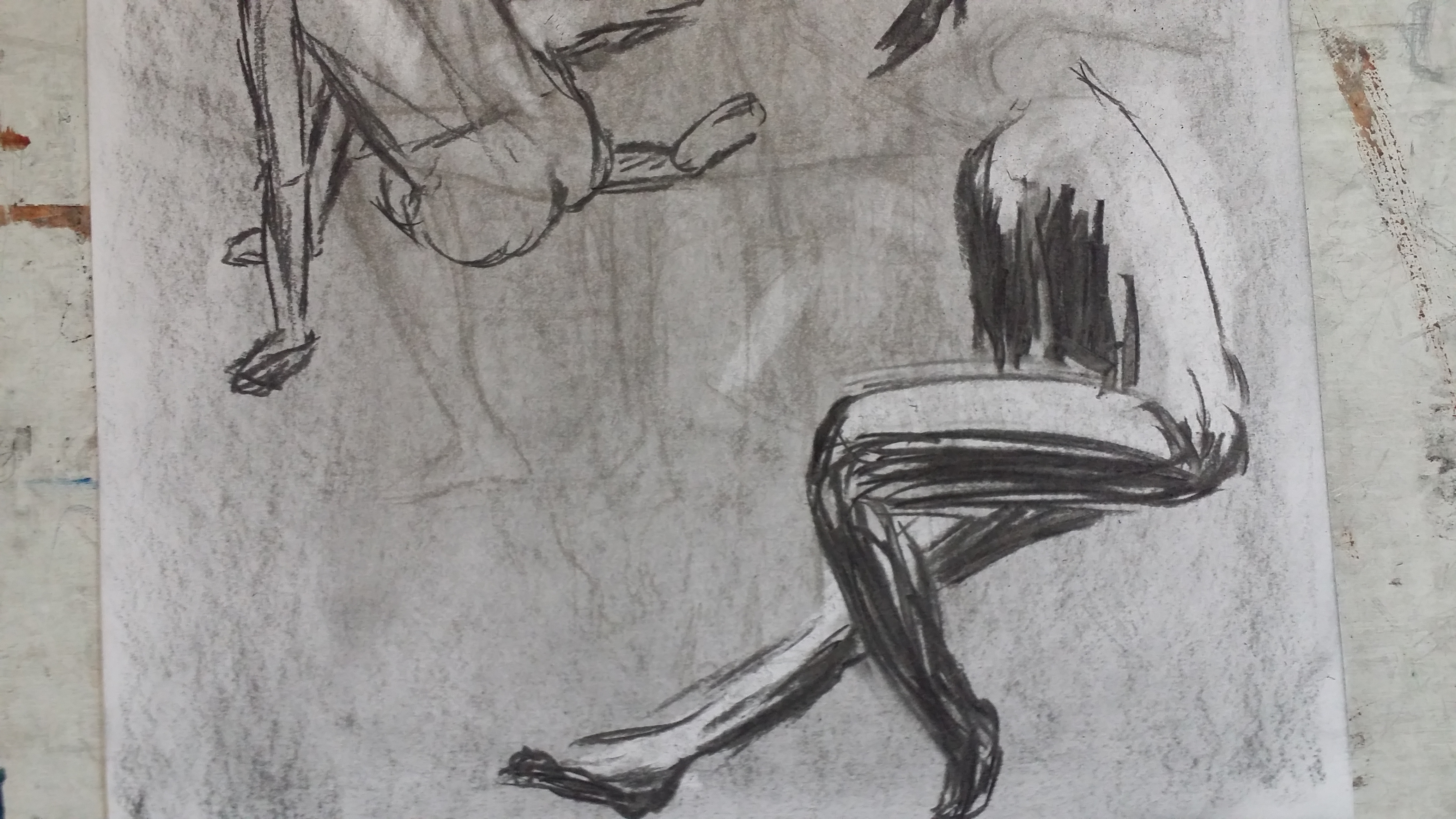
In draft 1, I wanted to show a girl diving down, trying to reach the exam paper. I wanted to portray students nowadays dying to try to achieve a high expectations imposed on them. I find the idea a bit plain so I added some floating stationery which are applicable to education.

I added in puzzle pieces because my idea was inspired by a student who suicide because she was just a few marks away from the result she expected and the puzzle shows the pieces (the few marks) she needed to feel completed.

p5_2
Draft 2

For Draft 2, the building which my character suicides will have a layout of an exam paper, which has a few multiple choice questions and also a pretty decent grade which the student is not satisfied with. The gloomy weather portray the morbid atmosphere.

Being the exam paper are more exam papers to indicate the endless examinations that students have to take throughout their life, which results in endless stress.

p5_3
Draft 3

I decided on draft 3 because it allows me to use lino-cutting and also paper-cutting. I came across stacks of books while finding images for my draft 2 and decided to improvise into draft 3.

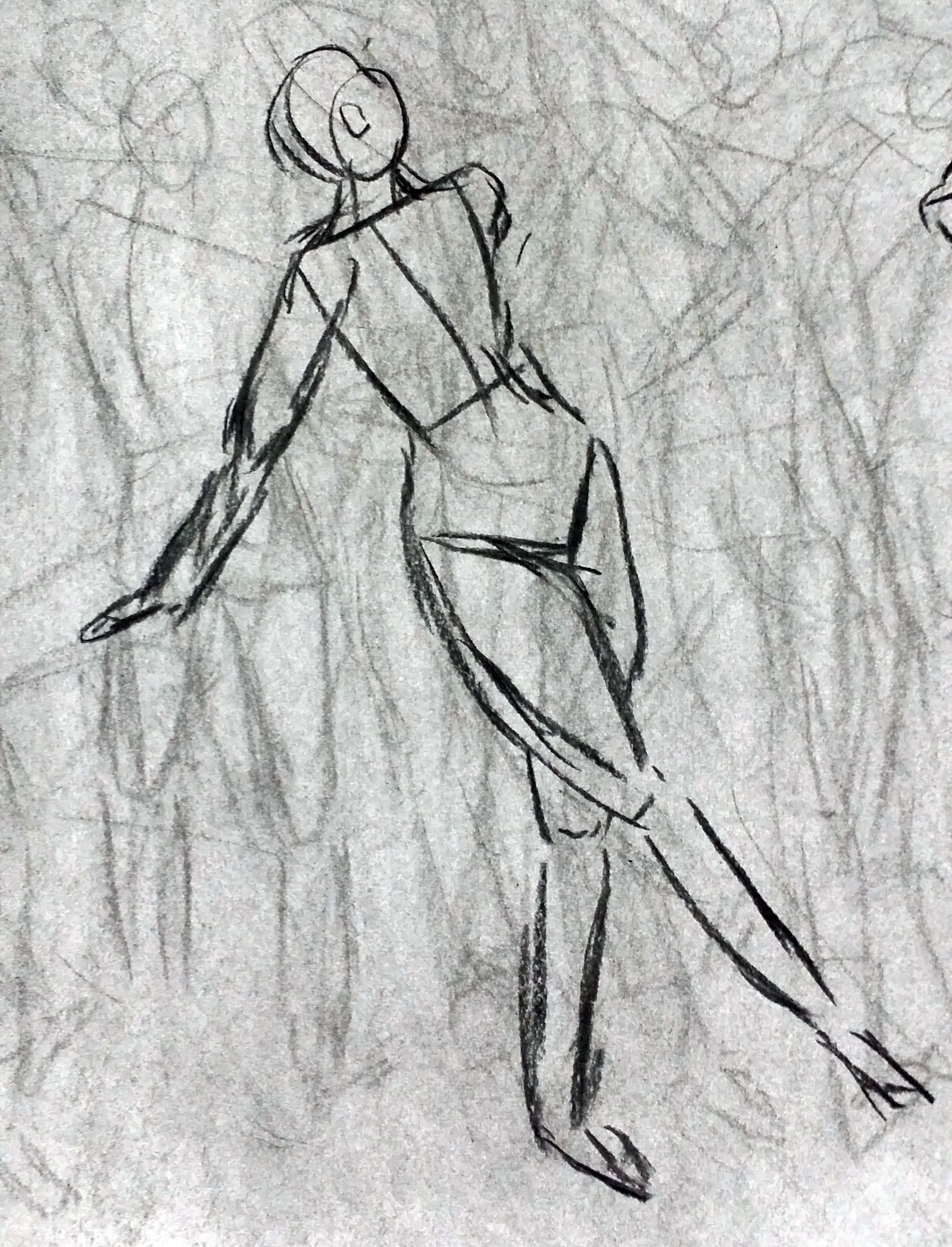
Here, the student dived off a stack of books into her exam papers instead of a building. However, the negative space on the left feels empty and so I decided to add a lino-cut there.

I decided to add a lino-cut of a girl with depression looking down at the exam papers with a sad face.

Testing printing

t_0
Progression

I wanted to print the lino-cut on a black paper as I decided to have black as my background. However, after many test prints, I could not find a nice shade of blue to shown on a black paper. The lino cut is not obvious enough as the blue is too dark and is not standing out from the black.

Thus, I choose a another background. I settled for dark blue because I wanted the lino-cut to be a fade image in the background with a “ghostly” feeling and dark blue matches the blue lino print.

After many trails, I finally find a nice shade of blue to be printed on the dark blue background.

5_2
Lino

Date: 14 November 2016

Project 4: Black & white lino-cut print

Final Piece

4

4_1 4_2


Story

After baby Arthur was born, Merlin secretly took him to be raised at the castle of Sir Ector, a loyal ally of the King’s. There, the young prince was raised as the bastard child of Sir Ector’s, and no one, not even Ector himself, knew the boy’s true identity. But Ector also had a son, named Sir Kay. And because young Arthur was thought to be a bastard child, Sir Kay and his friends teased and taunted him, and his adopted parents looked down on him. The poor boy grew up in shame of his birth, never knowing of his royal lineage.

Meanwhile, all was not well with the King. Just months after giving away his only son, Uther Pendragon turned ill, and died shortly after. With no heir to lead the kingdom, the country fell into despair. Rival dukes and lords disputed over who was the best fit to rule England.

In the midst of the turmoil, the nobles called on Merlin to find a solution. Having seen to it that baby Arthur was safe, he erected a large stone, on top of which sat an anvil, in a churchyard in Westminster, a region of London. Stuck in the anvil was a sword. An inscription on its blade read:

“Whoso pulleth out this sword from this stone, is right wise King born of all England.”

The sword was magic, Merlin explained, and only he who was fit to rule England could pull it from the stone. Nobles from far and wide came to try and pull the sword from the stone, but not even the strongest of men could accomplish the task. Eventually, the sword became forgotten, and England fell into greater ruin.

As the boy Arthur grew older, Merlin introduced himself to him. Merlin and the boy would meet after he had finished his chores for Sir Ector, and the two of them became close friends. Merlin tutored the boy in many subjects, always teaching him that knowledge was greater than brute force. For, although Arthur was a small, scrawny lad scarcely capable of lifting a sword from its sheath, Merlin saw in him the potential to be a wise and just ruler who would unite Britain, and rescue her from the chaos into which she had fallen. And so, through education and experience, the wizard helped the young prince to realize his full potential: a potential of greatness. The potential to rule with justice and compassion what would become the greatest kingdom ever known.

One day, when Arthur was fifteen, Merlin brought him before the Sword in the Stone. A crowd had been assembled, and was waiting anxiously. Arthur’s stepbrother, Sir Kay, was the first to try and pull the sword, but it would not budge. Then Arthur tried. The sword came loose. The crowd cheered, and Arthur was crowned King of England.

http://www.heroofcamelot.com/legend/sword-in-the-stone


Process

Trying out the different textures on a lino pad

t_1
Textures

It was not easy trying to create textures on lino especially the crisscross and the waves which I sort of failed to create the wavy feels. The short strokes and dotted lines were also difficult to make at first but after getting using the the tools, it became easier and more consistent.

The hardest part of lino cutting is controlling when to stop the stroke as seen from the inconsistent short strokes above. 

t_2
The textures on the lino pad

t_0

Lino cutting can be quite dangerous as we can easily cut our hands if not careful.

Planning for the two frames

p4_0_1
Frame 1: King Arthur pulling out the sword in the stone.

To start off, I feel that I should plan the black and white part of the lino as it may get confusing later on without a plan. Therefore, I wrote down the black and white portions with “white” being the portion to be carved. Also, because there will be different elements being black, I feel that I should use textures to differentiate the different elements. I noted that down on the planning.

In Frame 1, the main texture will be the robe and the rock. I wanted to create the cloth texture on the robe by creating the folds created by the movements and the body. For the rock, I wanted it to have a raw feeling.

p4_0_2
Frame 2: King Arthur on his throne.

In Frame 2, there are a lot of textures on the armor of King Arthur. The armor is divided into 3 parts: the cape, the chained armor and the shiny armor. I used crisscross pattern to show the chains on the chained armor and differentiate it from the shiny armor since both will be “white” on the print.

It will be quite confusing without this planning because Frame 2 has too many elements and it is difficult to differentiate the black and white just by looking at it.

Transferring the sketches onto lino pad

p1_0

I transferred the sketches onto the lino pad in a inverted manner because lino, when printed, will be inverted. 

Progression & test printing

p4_2_0
Frame 1 progression

Techniques used:

  • Black and white balance (left is white and right is black)
  • Textures: robe, stone
  • Suggestion of movement (hand pulling out the sword)

I started off with the outline and some raw and random strokes for the stone. I quite like the black and white in the hair.

Then, I put in the details.

Lastly, I improved the frame by adding in more folds because I feel that it is too plain and does not show the cloth material.

p4_1_0
Frame 2 progression

Techniques used:

  • Geometrical symmetry
  • Centralization of object to bring in focus
  • Textures: background, floor, armor

Similar to Frame 1, I did the general outline by carving out the major “white” portions.

Then I added in the details for the king’s armor. I like the rawness of the sword and also the texture on the armor.

I carved out the background as of my plan and regretted afterwards because I feel that it will look weird. But after printing in onto paper, it looks okay and create a texture for the background. Also, I use big and short strokes to create the texture of the stone-tiled palace floor.


Date: 17 October 2016

Project 3: Museum art critique

Art Critique 1

seaside

Seaside

Chen Wen Hsi
1951
Oil on board

Gallery Location: DBS Singapore Gallery


Initial response

What caught my attention was the vertical strokes of lines from afar. When I first looked at this art piece, it reminded me of the Gamcheon Culture Village in Korea Busan. I like how the artist uses colors to bring about the background, middle ground and foreground.

seaside_1
Gamcheon Culture Village, Busan, Korea

Analysis

Vertical lines are the main element of design in the art piece. The artist uses vertical strokes of different width and value of colors to differentiate the different forms in his art piece. Black sturdy lines (should be the trees or lamp posts) get smaller in width towards the top of the art piece, thus differentiating the background and foreground.

The diagonal lines across the art piece also serves as a guiding line, guiding our eyes to view the art piece from bottom left to right then to the details in the background at the top of the art piece.

Buildings are depicted using thick strokes of short vertical lines of different colors. The colors create implied lines, which serves as a guiding line too. The artist also uses atmospheric perspective as the colors at the background is not as bright as the colors used in the foreground.

The art piece as a whole is very abstract as it is made up of only vertical lines and colors. What is so interesting is that the art piece looks like a village as when seen from afar as a whole and when it is observed closer, it is harder to identify the forms the artist is trying to represent with his different strokes.


Background

Chen Wen Hsi was one of Singapore’s pioneer artists. A prolific painter who worked in a range of styles, he won acclaim for combining Western art with Chinese brush strokes in his paintings. He was also an influential art teacher at The Chinese High School and the Nanyang Academy of Fine Arts (NAFA) for many years.


Art Critique 2

beggar


Beggar

Tan Tee Chie
1953
Woodblock print on paper

Gallery location: DBS Singapore Gallery


Initial response

The facial expression of the woman is what caught my eyes first. I feel that the artist really portray her arrogance very well. The artist also make use of many different types of textures.


Analysis

In the foreground, the artist contrast the woman and the beggar. The artist portrays the difference in their classes through their height. The woman seems tall and high up there yet the beggar looks weak and miserly. The artist also makes the art piece balance by having black on the left (beggar) and white on the right (woman). Curved lines are used on the beggar (clothes and spine) which show softness while the horizontal lines used for the woman shows more rigidity, which also another type of contrast shown.

In the background, the buildings are combinations of shapes like triangles and squares. Different textures are applied to differentiate the buildings. Textures and patterns on the clothes of both the woman and beggar also add more details to the art piece. Wood are not remove very cleanly for the floor/road to show texture and create more dimension.


Background

Tan Tee Chie is best known as one of six key artists of the woodcut movement of the 1950s to 1960s in Singapore.

‘A Beggar’ is one of a series of eight prints that he produced during the heights of this movement, which highlighted the plight and hardship of the underprivileged in post-war Singapore.


Art Critique 3

war-and-peace

War and Peace

Hendra Gunawan
c. 1950s
Oil on canvas

Gallery location: UOB Southeast Asia Gallery


Initial response

Initially, when I first saw this art piece, it gives me a very peaceful feeling. I feel that the guy looking into the horizon is very satisfied with his life currently as seen from his half-closed eyes. The blue background gives a serene yet gloomy feeling.


Analysis

Many curvy lines are used in this art piece such as the clouds, the mountains, the rivers, the trees and even the clothing and hair of the two men. The curvy lines suggest flowing energy, probably wind blowing softly, portraying a very relaxed atmosphere.

The background is made out of natural shapes which are typical representation of the subjects. The trees and their leaves are represent in a simple yet recognizable form. The artist uses analogus to create the form of the mountain. The shadows give dimension to the men and the gun, giving them more details and stood out more as the foreground. The depth is also created using atmospheric perspective with the subjects receding into distance losing details.

The light source is at the top right hand corner, where the men are looking towards. The light source shine directly into the faces of the men, as if they are looking at a bright future or some happiness.

Blue fills half of the painting, giving it a tranquil atmosphere. However, the shades of blue used by the artist is dull, which gives the tranquility a gloomy touch. The dull colors in the foreground for the clothes and guns add on to the despair.

The artist uses the one-third rule by placing the background (the mountains and trees) in the right one-third and the two men in the remaining two-thirds. This give more focus to the two men in the foreground. The blue background balances the dull colors in the foreground.


Background

During Indonesia’s War of Independence against the Dutch, Hendra Gunawan (1918 – 1983) and other artists joined a group called Pelukis Front (Frontline Painters). While the group took part in battles, Hendra brought back numerous sketches from the battlefield and produced posters about the nationalist struggle.

War and Peace is a scene that takes place shortly after a battle. The fighters are relaxed but still on guard, looking into a distant mountain for strength and inspiration.

After the war, Hendra set up the art collective Pelukis Rakyat (People’s Painters) and was seen as one of the father figures in the Yogyakarta art circles. The collective enjoyed the patronage of Indonesia’s founding president, Sukarno.


Date: 26 September 2016

Project 2: Colour still-life cut-out

Final Piece

2_1_1

2_1

Idea & Planning

I started with the heels which are in red colour (warm colour). Then I added the tubes of paint in warm colours (red and yellow). To balance the still life out, I decided to use a blue tube of paint to balance out the warmness of the still life. I tried to use the one-third rule here with the tubes in one third, the heels in the middle, and lastly the negative spaces in one third. 

Techniques used:

  • Triad harmony: I used triad colours (yellow, red and blue)
  • Colour balance and proportion: The recommended proportion is yellow:red:blue = 3:6:8.
  • Analogus: I used 4 shades of brown to create the gradient on the bone. As there are some white parts too, I also used white and light grey yo create the tone. I also used 2 shades of brown for the padding of the heels.
  • Optical mixing: I attempted but it was not very well-done. I tried to use pointillism to create the trees outside the window. 
  • Creating shadows on the table

Process

p2_1

Firstly, I sketched out the layouts of my still life on the white paper.

p2_2

I started with the red heels. I observed that there are shadows on the heels. Initially I wanted to create shadows by poking holes on the areas with shadows so that when I paste the red paper onto a navy blue paper, there will be spots of navy blue on red. I had this idea as I was inspired by the pointillism method to obtain optical mixing effect.

However, the method did not work as I wanted to so I tried with lines and experienced with different thickness of lines. I decided to use thin lines in my final piece and depicts the gradient of the shadows by varying the distance between the lines.


Date: 19 September 2016

Project 1: Black & white composition cut-out

Final Piece

1_10

Story

It was just another day in Egypt. In a random pyramid, the coffin opened. The Mummy opened its eyes and began to walk. Out of the blue, the loose ends of its wrap caught its eyes. Out of curiosity, it began to start pulling the wrap and ended up as a pile of tissue papers.

Concept

I want to create an eerie atmosphere since we are using black and white papers only, therefore the Mummy story. Everything is very minimalist and focus on the subject I want to show, thus the centralization in most frames.  


Process

p1

Initial sketch of the 9 frames.

However, changes are made to frames 1, 2, 3 and 9 while doing the actual pieces. For frame 1, it is difficult to create the Sphinx statue therefore I substituted it with camel instead. For frame 2, I wanted to show a room with treasures and a coffin but it is difficult to create the 3-D effect of the treasure chest. For frame 3, I decided to improvise and create a 3-D effect of the coffin door that can open.


Frame 1

1_1

Frame 1 shows a camel and pyramids, depicting a scene in Egypt.

Techniques used:

  • Shadows to create forms of pyramids in the background
  • Use of abstract shape (triangles) as a recognizable form of pyramids

Frame 2

1_2

Frame 2 shows typical symbols carved in a pyramid, depicting inside of the pyramid.

Techniques used:

  • Use of abstract shapes (symbols) as a recognizable forms of Egyptian symbols

Frame 3

1_3

Frame 3 shows a coffin opening with a figure (the Mummy) inside.

Techniques used:

  • Use of abstract shape (human figure) as a recognizable form of a person
  • 3-D effect of the opening coffin door

Frame 4

1_4

Frame 4 shows the eyes of the Mummy, indicating the Mummy woke up from its deep slumber.

Techniques used:

  • Geometrical symmetry

Frame 5

1_5

Frame 5 shows the Mummy walking.

Techniques used:

  • Cutting lines on the Mummy to create texture of the wraps

Frame 6

1_6

Frame 6 shows the loose ends of the wraps that caught the Mummy’s attention.

Techniques used:

  • 3-D effect of the loose ends

Frame 7

1_7

Frame 7 shows the unwrapping.

Techniques used:

  • 3-D effect of the wraps by pasting twisting the white papers
  • Abstract representation of the unwrapping process

Frame 8

1_8

Frame 8 shows the unwrapping. (from another angle)

Techniques used:

  • Centralization of the object to bring in focus
  • Curved lines implying flow and actions
  • Use of abstract shape (figures) as a recognizable form of a person

Frame 9

1_9

Frame 9 shows a camel and pyramids, depicting a scene in Egypt.

Techniques used:

  • 3-D effect of piles of tissue papers

Date: 22 August 2016, Monday

Final

Assignment

Select volumes, planes and spaces that will present a definite sense of foreground, middle ground, and background (deep space) in the drawing. Also depict part of yourself in the drawing (at minimum 25% of the drawing area and maximum of 40% of drawing area).


Draft 1

Final Draft 1

Exploring with part of myself (hands and legs):

  • legs hanging out
  • crossed on leg, legs hanging out of the rooftop
  • being interactive with the landscape
  • climbing/grabbing on to something

Draft 2

Final Draft 2

Exploring the landscapes with foreground, middle ground and background:

  • attempting to use frame within frames with trees
  • creating reflections using a pond/ river
  • pathway as guiding lines to a small cottage
  • landscape of Singapore (use of atmospheric perspective)

From my drafts, I like the idea of my hands trying to grab/climb over a wall. The hands seem to be struggling or exerting a force, as if trying to escape desperately, which inspires me for my final piece. I have decided to draw a pair of hands trying to climb over a wall, as if trying to get over to the other side. Beyond the walls, I wanted to draw a peaceful scenery of trees, grasslands and a small cottage (which is from Draft 2).


Final Piece

Final

Title: Beyond The Walls

I drew a pair of hands, trying to climb over the wall, to escape to the other side where it seems peaceful – with green lands and a small cottage (give me a very warm and countryside feeling, calm and undisturbed).

After I have completed the piece, I realized that it has an eerie feel instead of the tranquility I wanted. But it also gives another meaning to the drawing. The pair of hands seem to be dirty and fragile, as if their owners are weak and had suffered a lot. The hands seem to be desperately struggling to get over the walls. The landscape beyond the walls may seem like a serendipity but it also has a slight unpleasant feelings given off by the curvy trees, as if it is a trap.

Meaning of the drawing

“Beyond The Walls” gives me a feel of the famous Berlin Wall. Therefore, with it comes the meaning behind the drawing.

It shows how people around the world are suffering, experiencing hunger, poverty and diseases due to the conditions of their country. The drawing seems like a person suffering from hunger is trying to escape from his war-torn homelands, to the other side – the better side. But at the same time, the other side holds unknown future, we have no idea what our future harbors, whether it is good or bad. But if we don’t fight for it, we will remain where we are.

Sufferings do not only confine to physical, it can be mental too. If we can get pass our mental barriers (the walls), the world offers us a lot of things to explore. It is good to go beyond the boundaries that bound us, and give our life a some adventures – laugh, live, eat, play and even fall in love. You will never know what is in store for you beyond the walls. Well, you only live once, so why not go for it?


Date: 18 November 2015

A bug’s eye view

CLASSWORK

Attempts of using eraser to create tones

CW10.12 CW10.13

CW10.14 CW10.15


HOMEWORK

A Bug’s Eye View

  • Enjoy being playful making a drawing from a bug’s eye view. Do your sketches first as usual and then a final drawing. Make up a short story as to what is happening (Not a whole story but what is going on in your scene). That is your write-up.
  • Remember to compose your whole picture plane. Make sure you have parts of your drawing intersect with the edges of the canvas. Remember the negative and positive spaces. See where your eye moves. If your eye gets stuck staring at the object you placed in the middle of the canvas then you need to make something to balance that out so your eye will moves to something else. Make sure your eye moves around the picture plane.

HW10.11

Sketch 1

My idea is inspired by the insects that like to crawl on my study table while I am studying, especially ants. I try to imagine myself in their perspective where everything on my study table is gigantic to them. I realized that since there is a lot of things on my study table, it would be like a giant maze for them to navigate around the table.

Therefore, I drew a pencil. I always have a mug on the table, hence I drew a mug too.

It is a challenge to get the perspective correct because the mug is supposed to be a distance away from the pencil. However, since the pencil is nearer to the bug, it should be huge too.

Sketch 2

Another perspective with the same inspiration from Sketch 1.

While I was drawing Sketch 1, I saw an ant crawling pass my paper and it hits me: the words on my paper will appear so huge to the ant and its view should so quite interesting. I tried to draw the words on the paper in a nice perspective but failed and decided to change to a world map instead. Since the ant is so small, it should be able to see one or at most 2 continents only, hence I decided to draw the unique and recognizable outline of Australia with the words “AUSTRALIA” on the continent.

In the background is supposed to be a noticeboard with a post-it with “GEOG (I)” written on it to complement the world map but it doesn’t turn out very well therefore I decided to leave it out in my final piece.


Final Piece

HW10.10I decided to merge Sketch 1 and Sketch 2. I feel that the world map is an interesting concept and to make the picture less dull, I decided to add in a pencil. I feel that adding in too much will make the picture more messy.

Story

The little bug is travelling the “world” and he has arrived at Australia. The continent of Australia is relatively small to him compared to the continent of Russia. From where he is, he can see the next island where he will enjoy more adventures and challenges. However, there is an obstacle between him and the next destination — a giant pencil with its sharp tip intimidating the little bug. Mustering the courage he had found during his journey here, he decided to go for it.


Date: 14 October 2015