COLOR Schemes

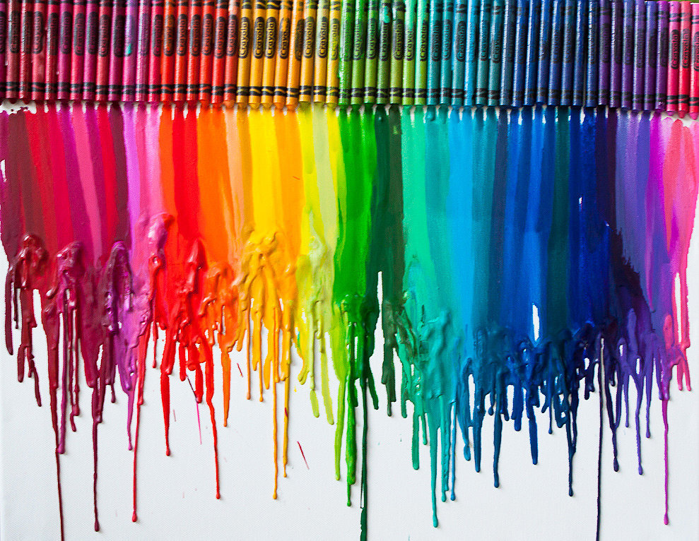
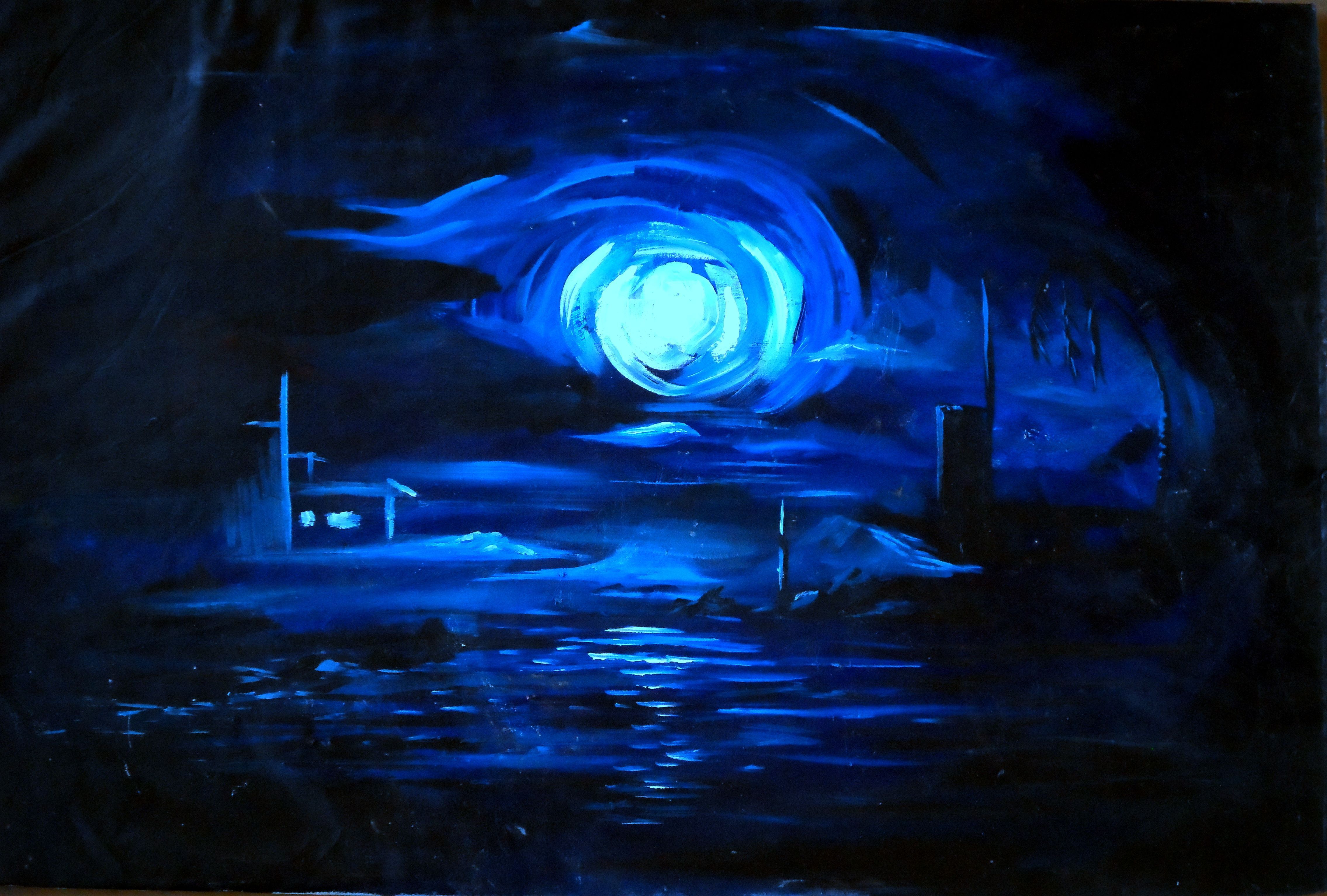
[Types of Color Schemes]


monochrome

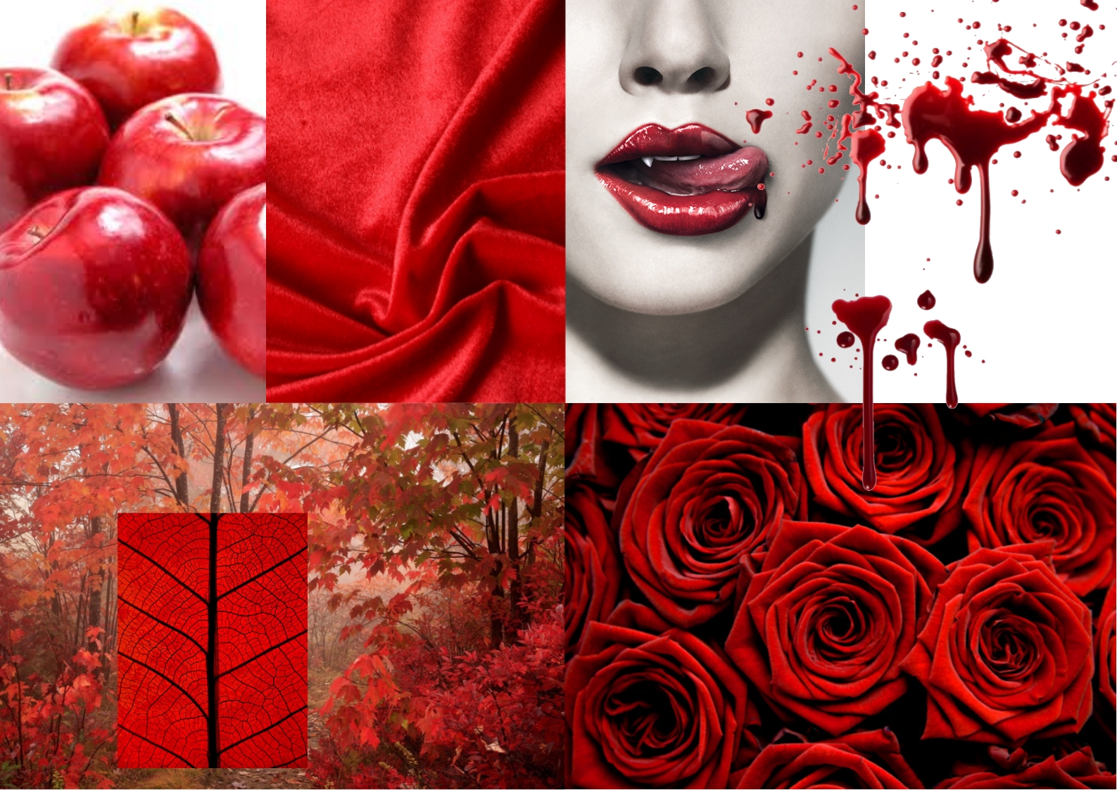
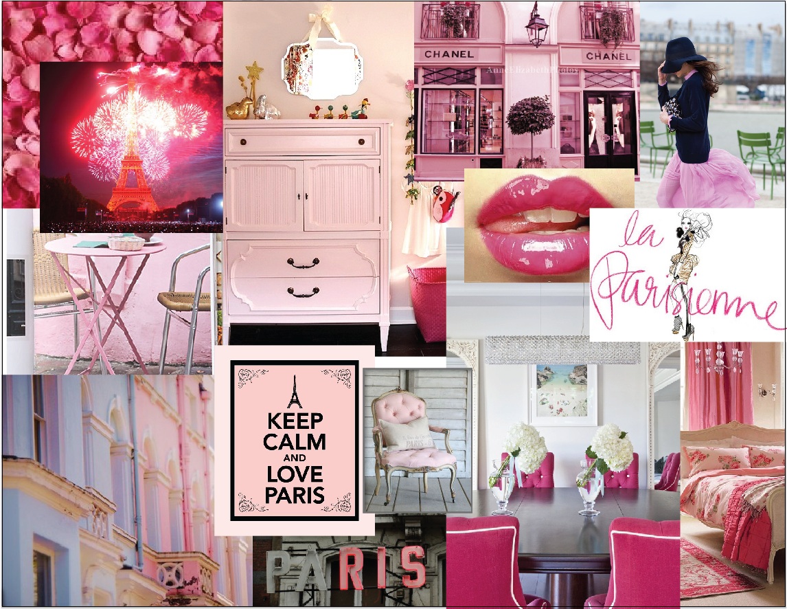
  • Monochromatic colors

Monochromatic refers to the use and variance to one hue within the color circle. Different harmonies are created by altering and combining different values and intensities of the same hue within a single composition. There are many monochromatic harmonies because of the subtle and closely related value possible within one hue scheme.

e.g. Monochromatic painting

BLUE_SEE_SCAPE-1374392865l


complementary

  • Complementary colors

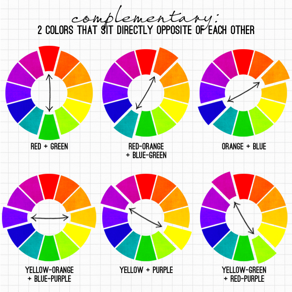
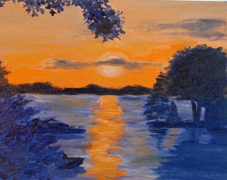
Complementary hues are located directly opposite each other on the color circle. When these pigments are mixed together in equal amounts, the result is a gray or achromatic color because the pigments absorb the primary light rays. If complementary hues are mixed in unequal proportions, they lessen the tone and intensity of the principal hue. Complementary hues are so named because when they are placed next to each other, they appear brighter, or of greater intensity, than when viewed alone or with an analogous hue.

e.g. Complementary color painting
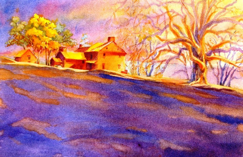
complement paint


split-complementary

Split-Complements:

The split-complementary (also called Compound Harmony) color scheme is a variation of the complementary color scheme. In addition to the base color, it uses the two “Analogous” colors adjacent to its complement. Split-complementary color scheme has the same strong visual contrast as the complementary color scheme, but has less pressure.

e.g. Split-complimentary colored painting
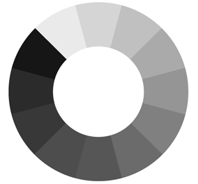
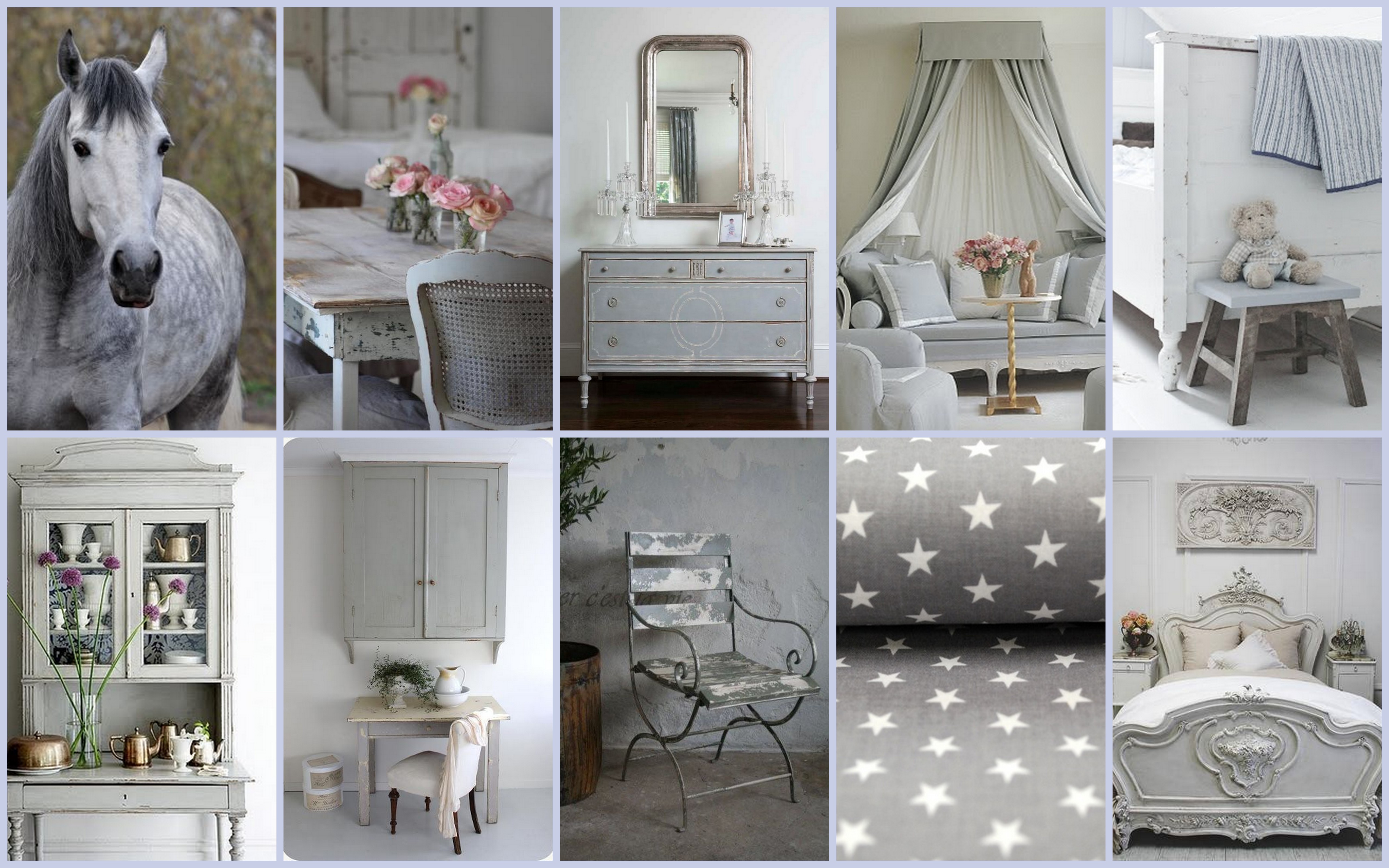
Gilpin House 3_1


all harmonies a

  • Achromatic colors

Achromatic means without hue or colorless. White, gray and black are achromatic or neutral because they lack color quality or hue. Black is absent of any color, therefore, it cannot reflect light. In additive mixing theory, white is thought of as the total accumulation of all color in the spectrum, thus light is the source of color.

The mixing of black and white pigments creates numerous tonal contrasts or gray values. This range of grays is important because it can indicate depth and relative distance within the visual field.

e.g. Achromatic coloured painting
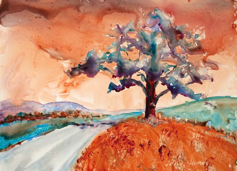
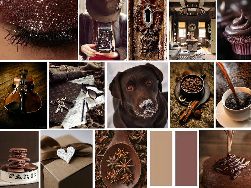
achromatic__not_monochromatic____painting_followup_by_kubokun-d5te3gl


 analogous

  • Analogous colors

Analogous color scheme are based on the combination of several hues located adjacent to each other on the color circle. Analogous color harmonies can be extended in both value and brightness to create a wide variety of interesting compositions.

There are many ways analogous color schemes are diagrammed. The color circle can be divided according to the warm and cool hues. Generally speaking, warm hues refer to red, yellow and orange. Cool hues refer to green, blue and violet. Warm or cool distinctions may be within a specific hue as well as the distinction between specific hues. For example, a “warm red” may be slightly yellow or orange, while a “cool red” maybe slightly violet or purple in appearance. The perception of warm and cool hues is relative.

Analogous color schemes do not have to be selected according to the warm and cool hues, they can also be diagrammed by selecting one principal hue for a composition. This doesn’t necessarily need to be a primary or secondary hue, but rather the hue that will dominate the final composition.  In addition, one or more hues on each side of the principal hue will give an analogous scheme.

e.g. Analogous coloured painting
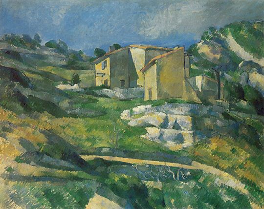
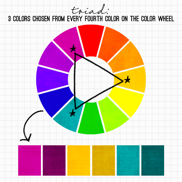
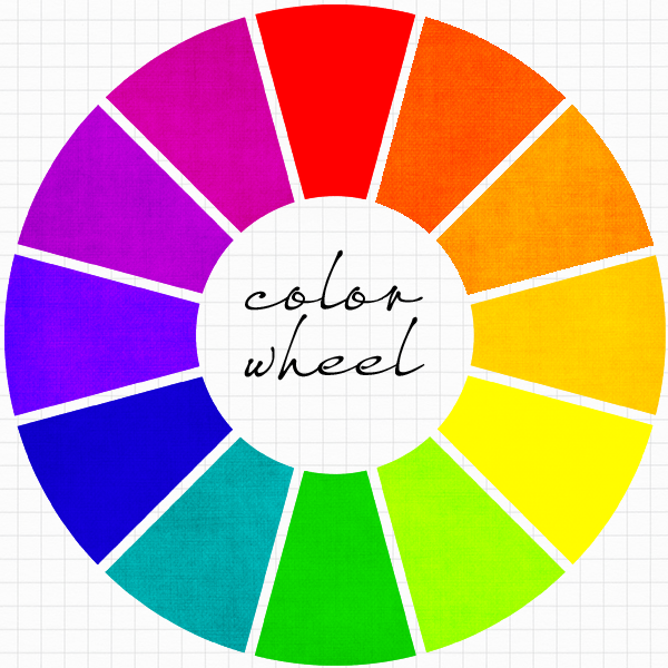
analogous paintinf


triad

  • Triad colors

Three hues spaced equidistantly around the color circle are called triads. By rotating an equilateral triangle in the center of the color circle, the hues of triad harmony can be determined. Since the primary and secondary pigments are equidistant from each other on the color circle, they combine to create color harmonies.

e.g. Triad Coloured painting
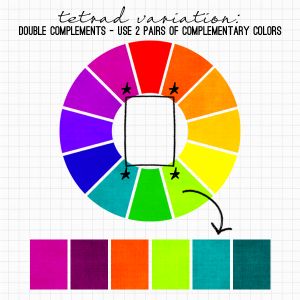
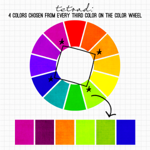
triad colors


tetrad-2


tetrad


  • Tetrad colors

Tetrad colors are composed of four hues that are two sets of complements. A tetrad can be diagrammed as a square or as a rectangle in side the color circle.

Rectangle:

The rectangle color scheme uses four colors arranged into two complementary pairs and offers plenty of possibilities for variation. Rectangle color schemes work best when one color is dominant.

Square:

The square color scheme is similar to the rectangle, but with all four colors spaced evenly around the color circle. Square color schemes work best when all colors are evenly balanced.

e.g. Tetrad Coloured painting

DSC_8424-801

COLORS & Its Meaning


Color is the visual perceptual property corresponding in humans to the categories called red, blue, yellow, etc. Color derives from the spectrum of light (distribution of light power versus wavelength) interacting in the eye with the spectral sensitivities of the light receptors. Color categories and physical specifications of color are also associated with objects or materials based on their physical properties such as light absorption, reflection, or emission spectra. By defining a color space colors can be identified numerically by their coordinates.


Because perception of color stems from the varying spectral sensitivity of different types of cone cells in the retina to different parts of the spectrum, colors may be defined and quantified by the degree to which they stimulate these cells. These physical or physiological quantifications of color, however, do not fully explain the psychophysical perception of color appearance.


The science of color is sometimes called chromatics, colorimetry, or simply color science. It includes the perception of color by the human eye and brain, the origin of color in materials, color theory in art, and the physics of electromagnetic radiation in the visible range (that is, what we commonly refer to simply as light).


Here is a table of colors and many of the meanings they tend to evoke, particularly in Western cultures. Notice how colors can mean very different things – it is not that the colors themselves have meaning, it is that we have culturally assigned meanings to them. For example, red means warmth because of the color of fire. Likewise, it means anger because of the increased redness of the face when it flushes with blood. Purple symbolizes royalty only because the only purple dye that was available for many centuries was very expensive.


Red: warmth, love, anger, danger, boldness, excitement, speed, strength, energy, determination, desire, passion, courage, socialism

RED MOOD BOARD

PINK: feminine, love, caring, nurture

mood-board


ORANGE: cheerfulness, low cost, affordability, enthusiasm, stimulation, creativity, aggression, food, halloween

orange-mood-board


YELLOW: attention-grabbing, comfort, liveliness, cowardice, hunger, optimism, overwhelm, Summer, comfort, liveliness, intellect, happiness, energy, conflict

moodboard.yellow


GREEN: durability, reliability, environmental, luxurious, optimism, well-being, nature, calm, relaxation, Spring, safety, honesty, optimism, harmony, freshness

media-powerpoint-mood-board-3-638


BLUE: peace, professionalism, loyalty, reliability, honor, trust, melancholia, boredom, coldness, Winter, depth, stability, professionalism, conservatism

pantone-color-of-spring-2014-dazzling-blue-mood-board


PURPLE: power, royalty, nobility, elegance, sophistication, artificial, luxury, mystery, royalty, elegance, magic

PurpleRain1


GRAY: conservatism, traditionalism, intelligence, serious, dull, uninteresting

2013-10-10


BROWN: relaxing, confident, casual, reassuring, nature, earthy, solid, reliable, genuine, Autumn, endurance

chocolate-brown-mood


BLACK: Elegance, sophistication, formality, power, strength, illegality, depression, morbidity, night, death

2013-11-12


WHITE: Cleanliness, purity, newness, virginity, peace, innocence, simplicity, sterility, snow, ice, cold

Mood-Board-Monday-Winter-Whites-January-28


Nursery Rhymes and Abstract Design

Yay! Done with project 2. Personally I’m pretty much satisfied looking at the final printed version of my best four nursery rhymes composition.

Overall, I find this project really fun and interesting. It reminded me a lot of my childhood time. This project not only taught me on the basic
design principles of creating creative design, but through this project, it developed my sensitivity on looking at composition and understand the layout and aspect of the design principles better. Besides that, I managed to pick up some Photoshop skills, which are rather quite new to me, this enables me to be much more proficient in using software such as
Photoshop and illustrator.

Apart from that, choosing the right format, in terms of the resolution and the art board size is the most crucial step before starting on any
design work.

Hence for my final four work, it all came down to an idea of using the basic design principles. Keeping my artwork simple yet it still retained the original meaning and some on the other hand had a sense of
symbolism.

If you could notice, most of my artwork, I left a lot of white space and this is one of my main key elements to my design that is what I would generally like to achieve. By doing so, it added a contrast and focuses
entirely on the the main subject or the foreground. This set of principles I picked up from the book of Using Design Basic – To Get Creative Result by Bryan L. Peterson. I also used a lot of perspective to create depth and forming the shapes into symmetry line to make the whole composition balance.

Okay I think I shall stop saying much and let my composition do the
talking instead. Enjoy!


All the Kings Men and All the Kings Horses 1All The King’s Horses and All The King’s Men

What i wanted to achieve in this composition was the use of repetition to create a sense of abundance, I particularly like how I had placed the horses that seems to be flying out from the chessboard in the “sky”. This really draws the attention as I had arranged them in a rule of third. And also having the illusion of depth.


All the Kings Men and All the Kings Horses 2

All The King’s Horses and All The King’s Men

I felt this was pretty cool, I used the crown to be a standing platform for the king and all his mens who are suppose to be guarding him. This was supposed to be some fun composition and added a bit of symbolism, by using the crown. The king is place in a rule of third position to address his importance and status. You could see there are some elements below that was scaled down to show the crown in a 3-Dimensional form.

 All the Kings Men and All the Kings Horses 3

All The King’s Horses and All The King’s Men

This composition is generally straight forward. I used lines to show the movement of the horses. Besides that it shows some rhythm going on.  Notice that I’m using little military soldiers to make the horizontal line, like a walkway for the horses. I left the white spaces as it is because i don’t want it to look too heavy. Well less is more.


All the Kings Men and All the Kings Horses 4

All The King’s Horses and All The King’s Men

I pretty much like the perspective here. It has a great balance to the whole composition. with the military soldiers arranged in a form of “V” if you could notice the arrangement. I added a wall texture on the background and foreground to give a little details, showing some characteristics of the place in this composition.


All the Kings Men and All the Kings Horses 7

All The King’s Horses and All The King’s Men


All the Kings Men and All the Kings Horses 6

All The King’s Horses and All The King’s Men


All the Kings Horses and All the Kings Men 5

All The King’s Horses and All The King’s Men


There was an old woman who lived in a shoe

There Was An Old Woman Who Lived In A Shoe


She had so many children she didn't know what to do

She Had So Many Children She Didn’t Know What To Do

The Cat & The Fiddle

The Cat & The Fiddle

The Cat & The Fiddle 2

The Cat & The Fiddle

the cow jumped over the moonThe Cow Jumped Over The Moon

Principles of Design

Given the project II brief, I was assigned into one of three group consisting of nursery rhymes: “Hey Diddle Diddle,” “Humpty Dumpty,” and “The Old Woman Who Lived in a Shoe,”

My assigned group was Humpty Dumpty. Hence I have to find images related to “Humpty dumpty” phrases. A total of ten images to be convert it into some dingbats that is of halftone, posterize, thresholds.

After which, I have to start creating a narrative composition that expresses each rhyme using only the given dingbats. The main aim of this project is to move beyond cliche solutions and habitual reaction to problem solving that leads to predictable results. Hence I have to manipulate, alter and deconstruct the images to re-invent new imagery.

But Before I start on the composition, there are Basic Design Principles I have to understand and take note in order to achieve a creative result for my narrative composition.


The four primary design principles are:

  1. Balance
  2. Contrast
  3. Unity
  4. Value & Color


  1. Balance

A design can create a mood simply by feeling organized and evenly balance. Sometimes a design can benefit by purposely unbalance feel.

image1   image2


  1. Contrast

Use of contrasting elements is a key to designing with impact. Extremes give a design interest and keep it from being static. Through careful use of contrast, a designer can emphasize the message.

image3image4

image6image5


  1. Unity

Unity may provide through the way the elements are assembled and through the choice of similar elements to begin with when appropriate. Several elements – from lines to type to shape – can be assembled to create a unified look that communicates the message to the viewer. The formal application of a unified structure to a format is sometimes called a grid.

image7 image8 image10


  1. Value & Color

Both value and color can be powerful communicators of mood. They can also provide order to a design and emphasize important elements.

image12 image13 image11