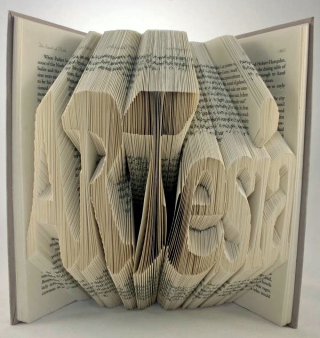
So here you go! The final four typographic portrait, I’m really satisfied with the overall concept of my typographic portrait. It is one of the most fun experimentation I did so far. I think I have met the objective of my concept which to create a 3-dimentional feel to the art work. I used various tools and materials to work and craft. I don’t really used digital here, except for layout and some prints.
Let me briefly share the idea and the story behind each portrait…
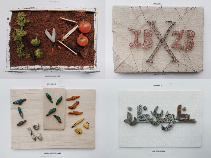
MY NAME IS
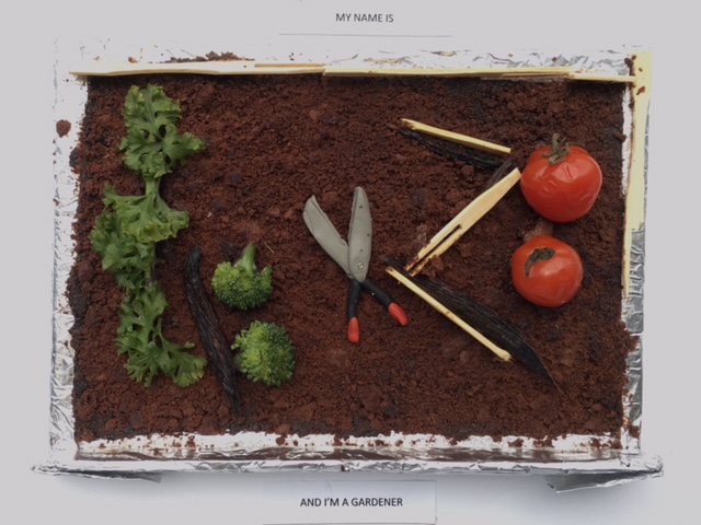
AND I’M A GARDERNER
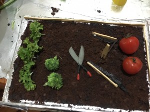
Nature has always been part of me, I always wanted to have my own plantation, for me it gives a sense of satisfaction to have your own garden when you see it grows and bloom. Hence my idea came about to create a miniature garden which has my initals on it.
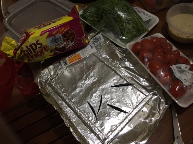
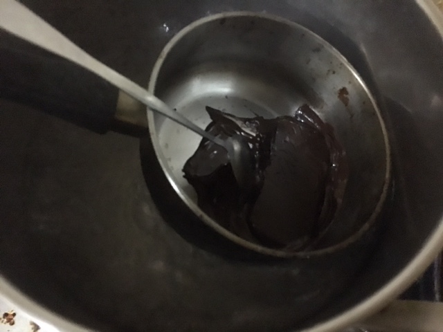
Initially I was thinking of using a real soil, but to think again I though I would like to experiment more by creating a similar effect with food product. And there goes my “edible garden”. I carefully play with typography using the parsley, vanilla essence sticks, tomatoes cherry and chocolates. All these are my favorites. I personally enjoyed much doing this.
I arrange them subtly to make it as natural as possible. Playing around with the space and making it rotate to a certain angle to evoke a sense of fun to it. In terms of color, I think I’ve choose the right one like red tomato cherry and green parsley that complement the whole dark brown look.
MY NAME IS
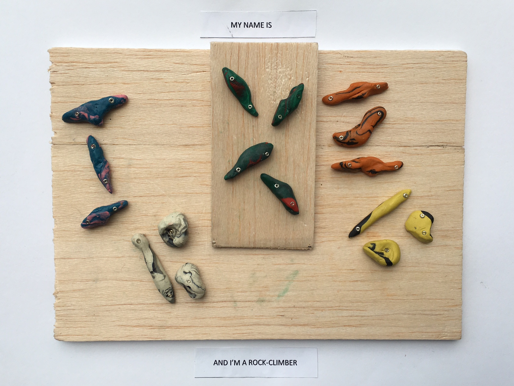
AND I’M A ROCK-CLIMBER
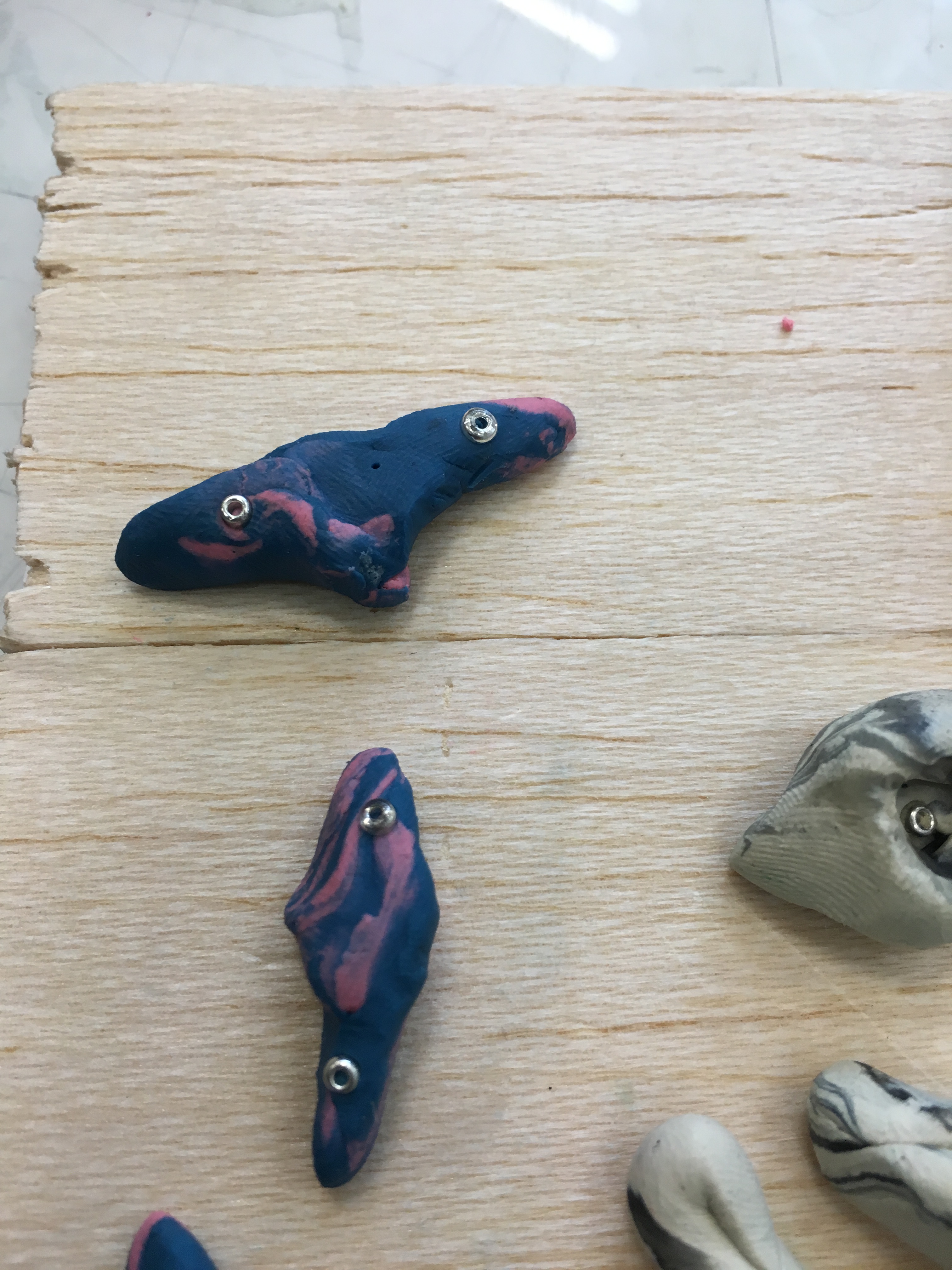
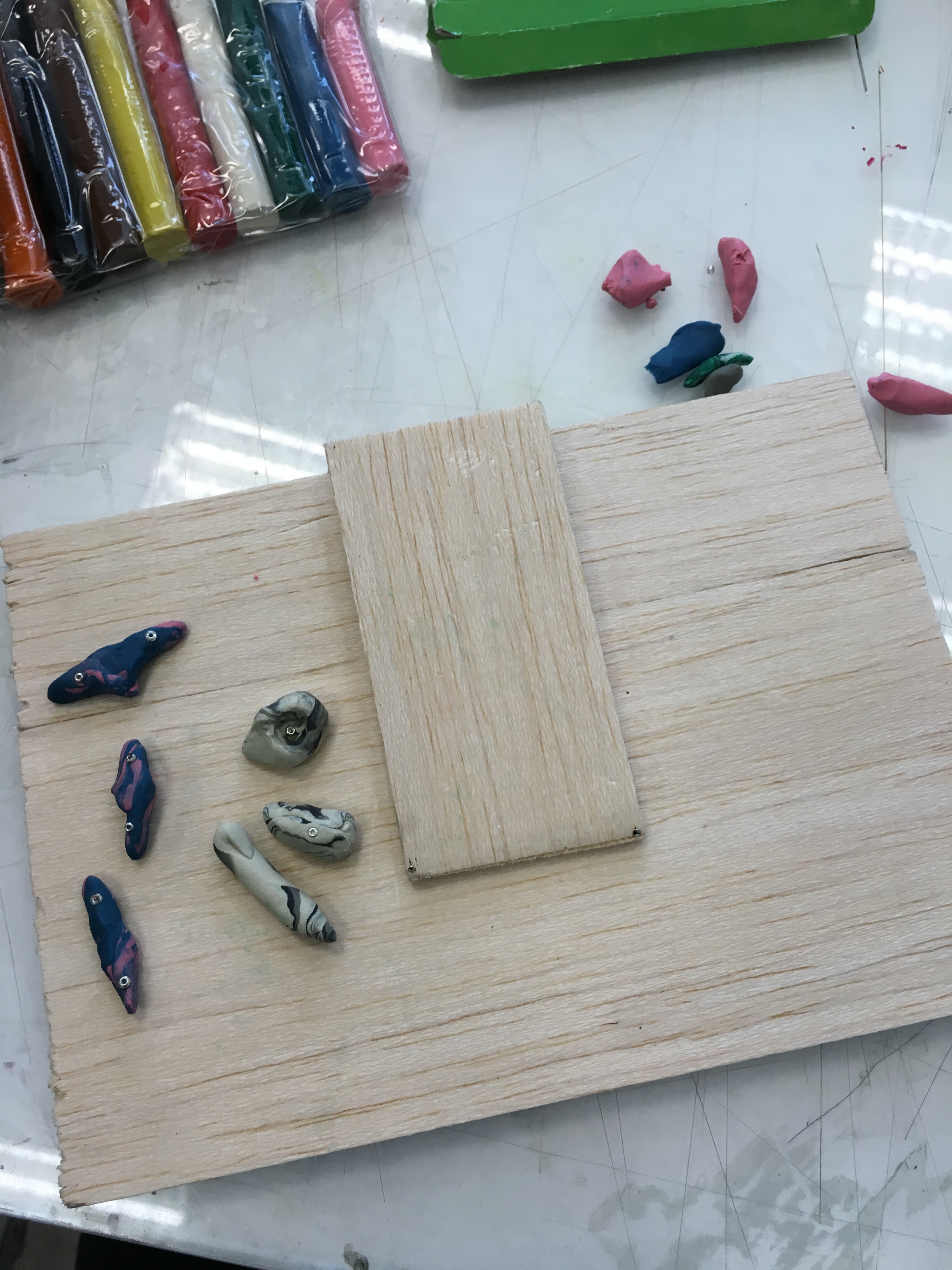
One of the cutest and simplest aesthetic look, but I believe it sent out the message across. I feel it look like a real climbing wall that I could climb anytime, Hahaha! I used some textured background like the wooden light brown wall that I usually see if I’m at climbing gym. I cut some parts, to create an inclined ramp, nailed and glue it so that it wont came off.
I used colored clay and making it much more dynamic by mixing two colors, for each group. Starting from letter “I”, is blue and pink which means reliability, caring and nurture, “B”, white and black that never go wrong together symbolizes pure, peace and also power and strength I posses during climbing. “X”, is red and green, which often we call watermelon, as there are such colors of tiles during my climbing, it also symbolized relaxation and energy, that I often get during climbing. “Z” is black and orange, which is consider to be powerful, cheerfulness and enthusiasm. And lastly “B” which is yellow and black that suggest liveliness and optimism.
All the tiles are given a thoughtful placement, with each letter that have a different color, it could be separated but still perceive as one group, this is the principle of gestalt that prof. Shirley taught.
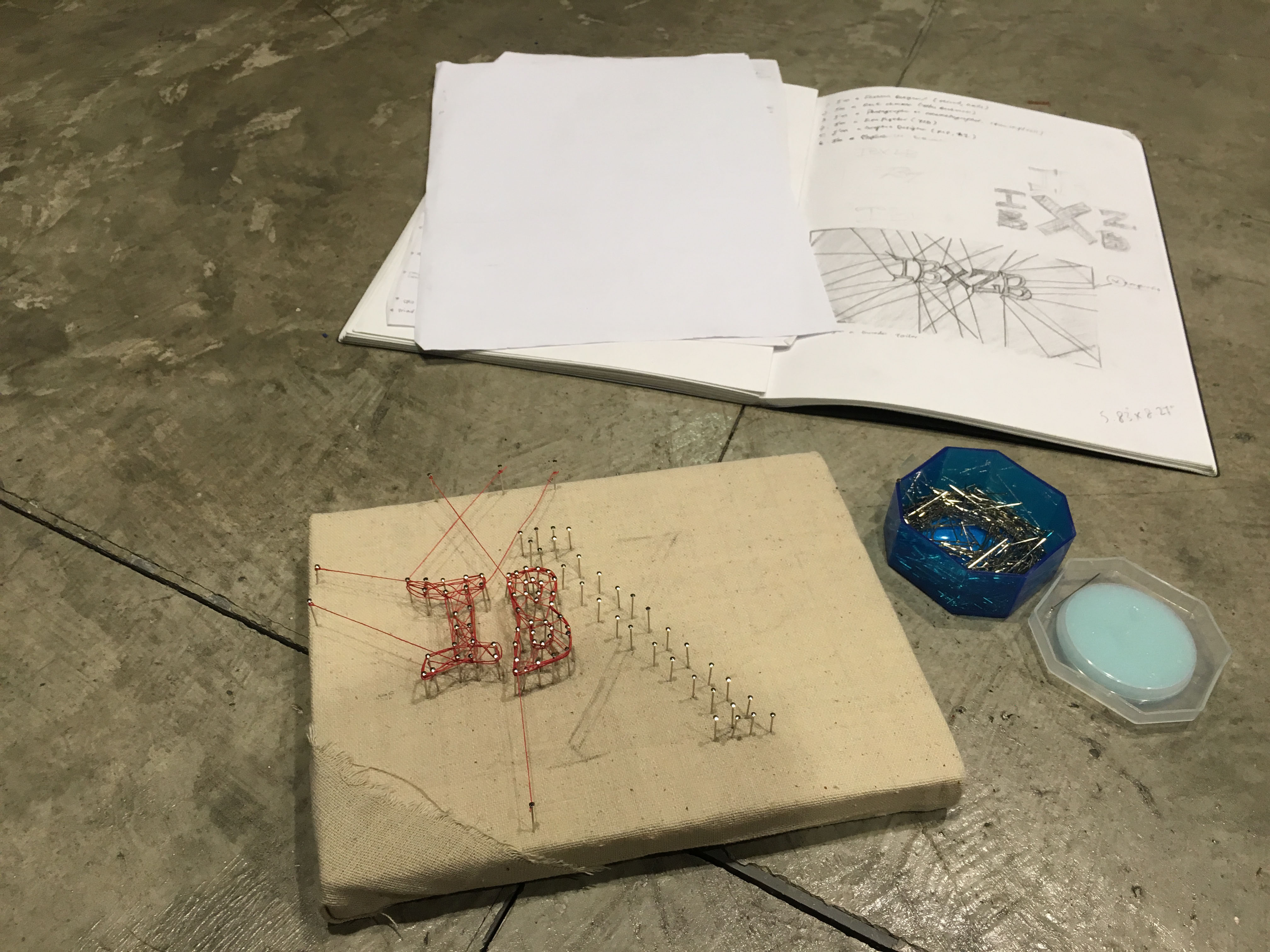
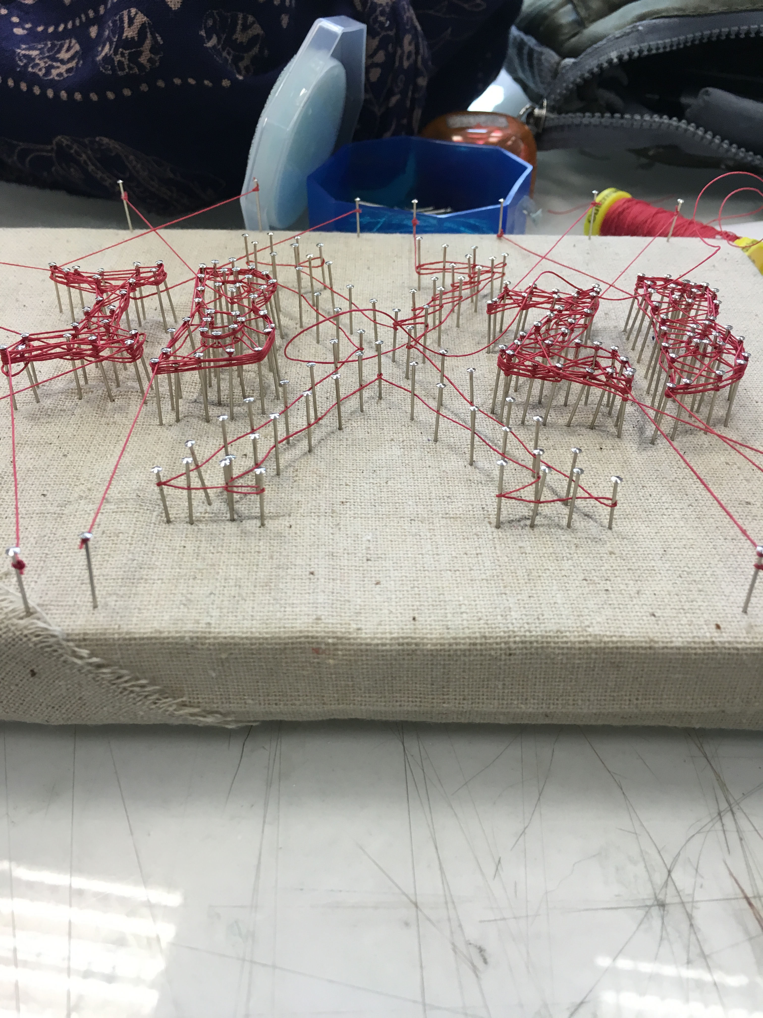
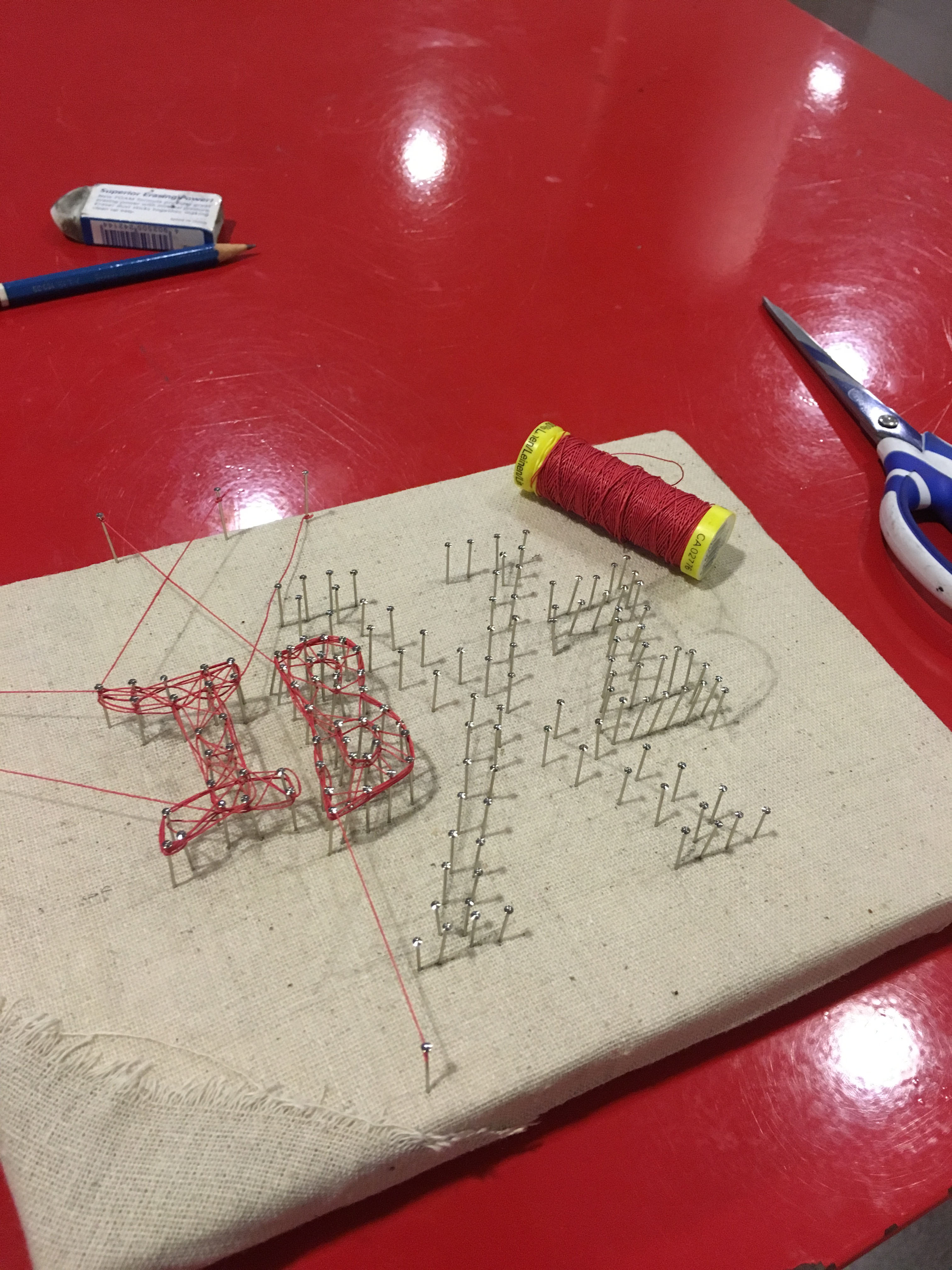
MY NAME IS
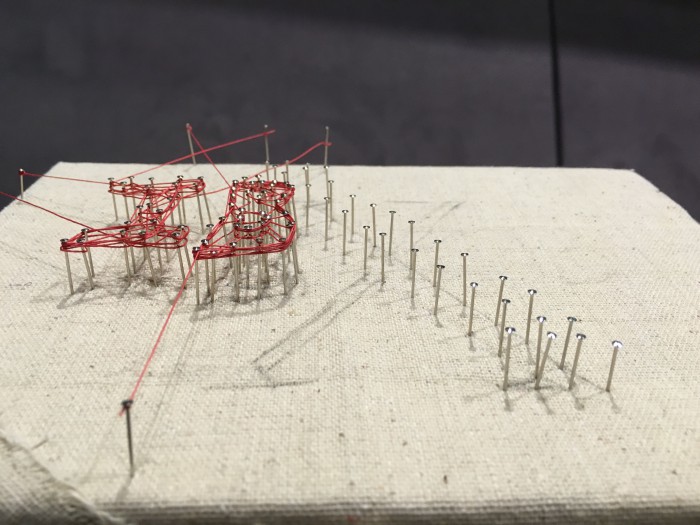
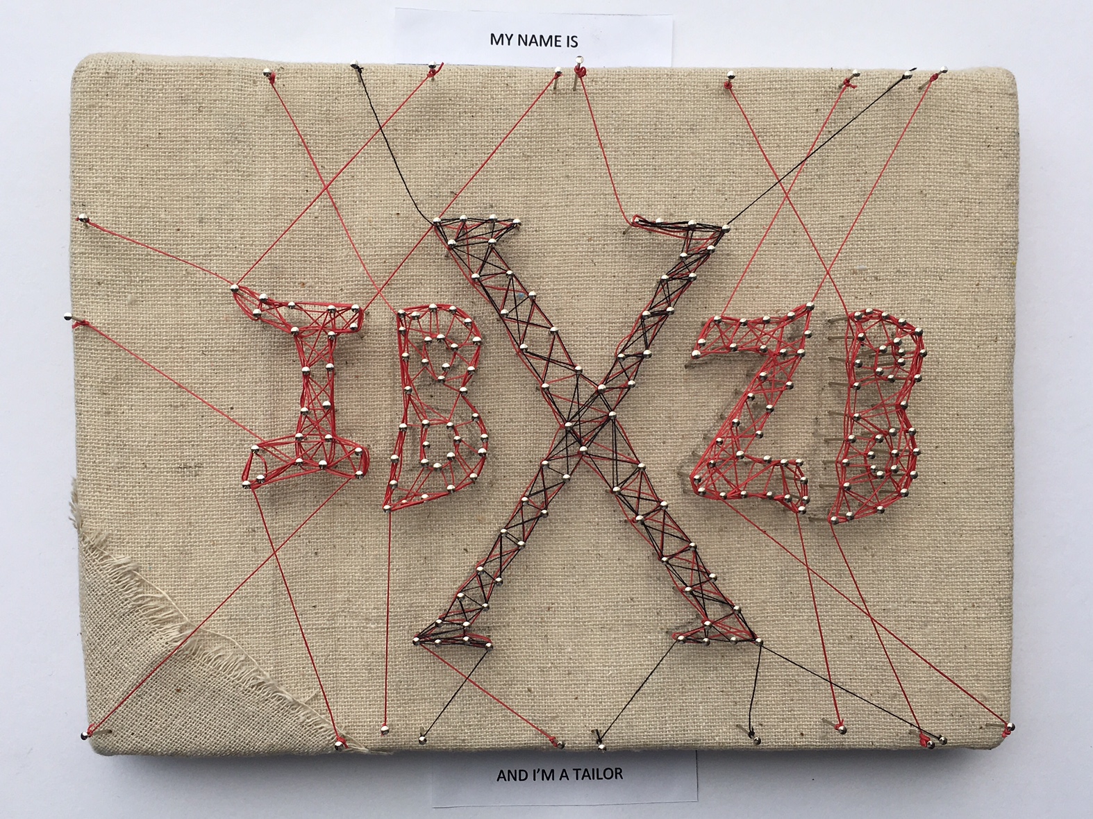 AND I’M A TAILOR
The idea of tailor came greatly because I enjoyed doing it, not that I’m a tailor but both my maternal and paternal grandparent were once a tailor. And I think I adopted the skills from them, even my mom used to make dresses and clothes for herself and my family, and I enjoyed watching it since I was little, until appoint that she let me try using it and that were I picked up the skill to sew. Hahaha!
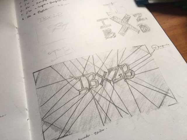
Therefore, this came back to the simplest set of tool which is the pin or needle and thread that tailor essentially need to make clothes. Just by using the tools, I thought it worked pretty well. I bought a khaki colored linen fabric for the background and used it to cover the Styrofoam which is supposed to be poked by the pins that would be a supporting or anchoring point for my thread on later stage.
I started putting the pins first and followed by attaching the thread, it may look easy but trust me my hands are quite big for such a small piece. Hahahah! I have to carefully poke the pin ensure the space between each pins are good and not too near or far. I intentionally made the “X” bigger to create some emphasis and also added a black thread to give some aesthetic so it wont be too boring.
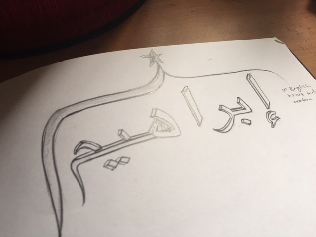
MY NAME IS
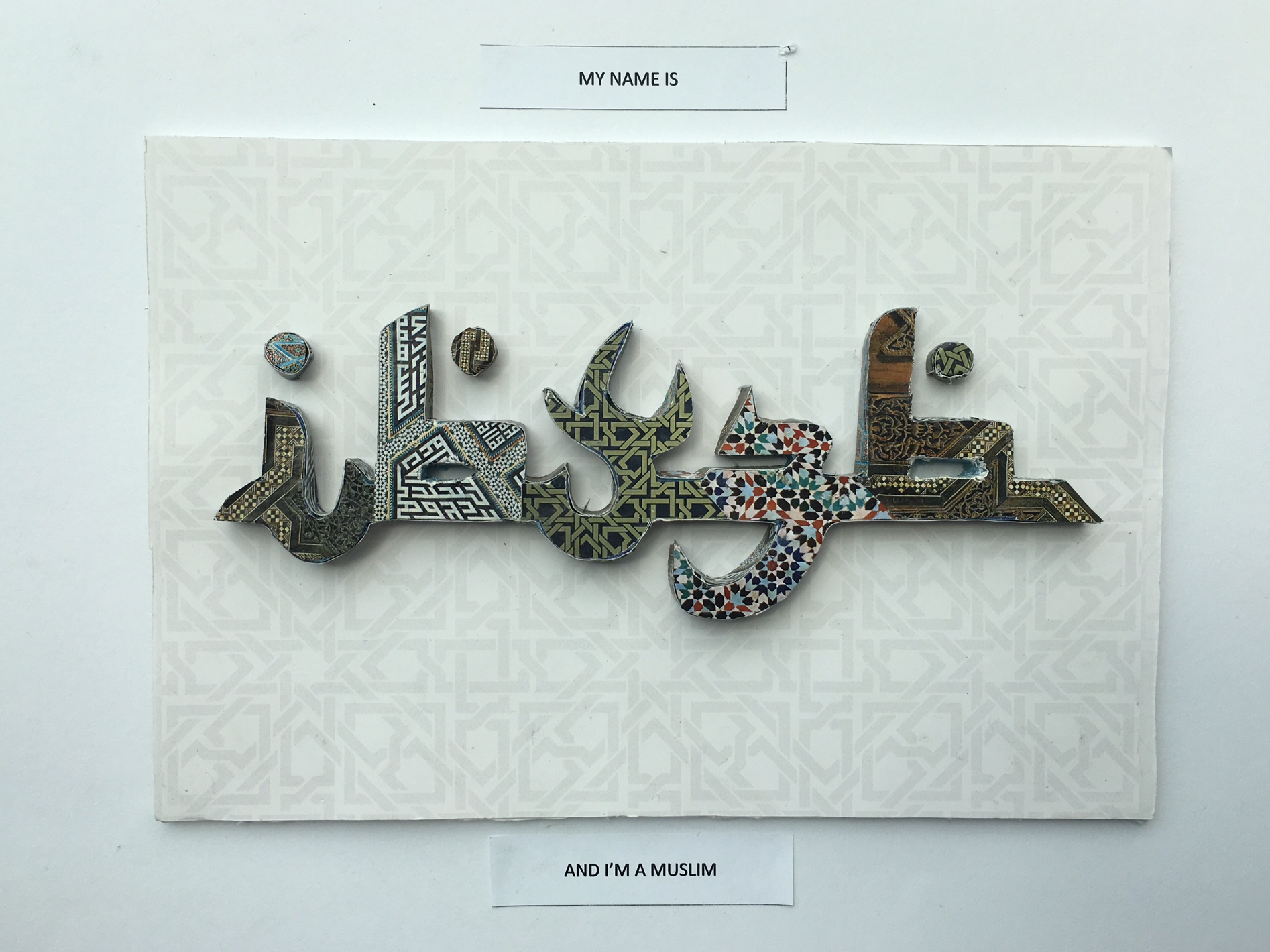
AND I’M A MUSLIM
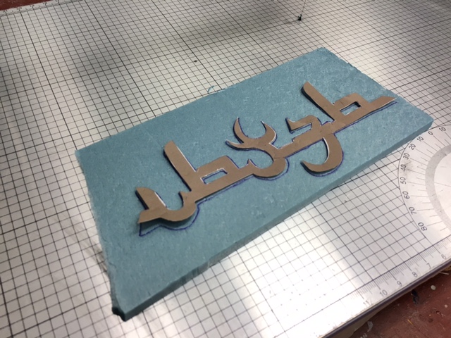
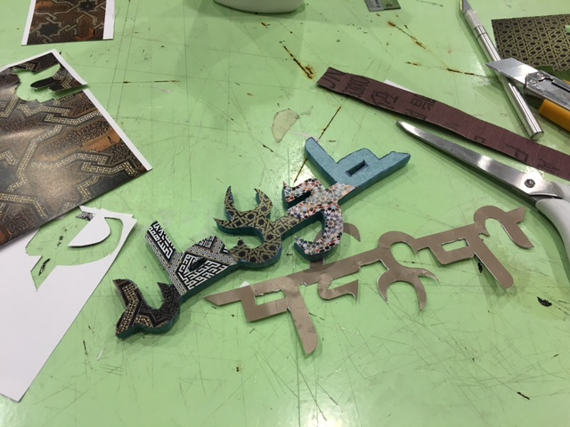
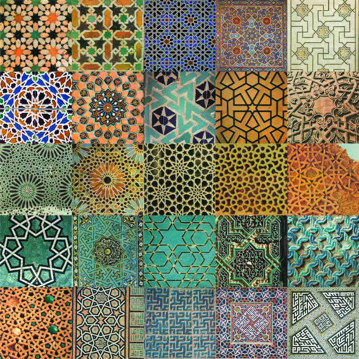
And so, since the start the semester I took an elective which is called symmetry. Ad there is one topic that discuss about the Islamic art. I’ve been fascinated by the pattern and so this gives me the idea of creating a papercut plus Islamic pattern to indicate that I’m a Muslim, because I think the Islamic art is the best representation of me being a Muslim. With this idea I created a typography in Photoshop of my initial “IBXZB” but giving it an Arabic font style. It was an idea from Prof Shirley and I think it is genius. So I further explore on it, and these gives me idea to include and Islamic pattern or art for my fonts.
Since most of my artwork is like a 3-dimentional, I decide to give some perspective to this one too, using blue foam and cut out my name, this was the hardest part I did so far, it is really time consuming because the word is small and cutting them need a lot of patience especially around the edge.
After I got my blue foam cut out, I cut all my patterns paper according to the way I wanted for each letters, I mixed and matched them around and to give some variation, i added a subtle background, again it is islamic pattern but it is white in colour. White background to give contrast to the type. and white also mean pure which is associated with islam religion.
I definitely love the final outcome. Overall I’m really satisfied and proud of this work of mine.